A Digital Heartbeat for the BHF
Mosopefoluwa Afolayan
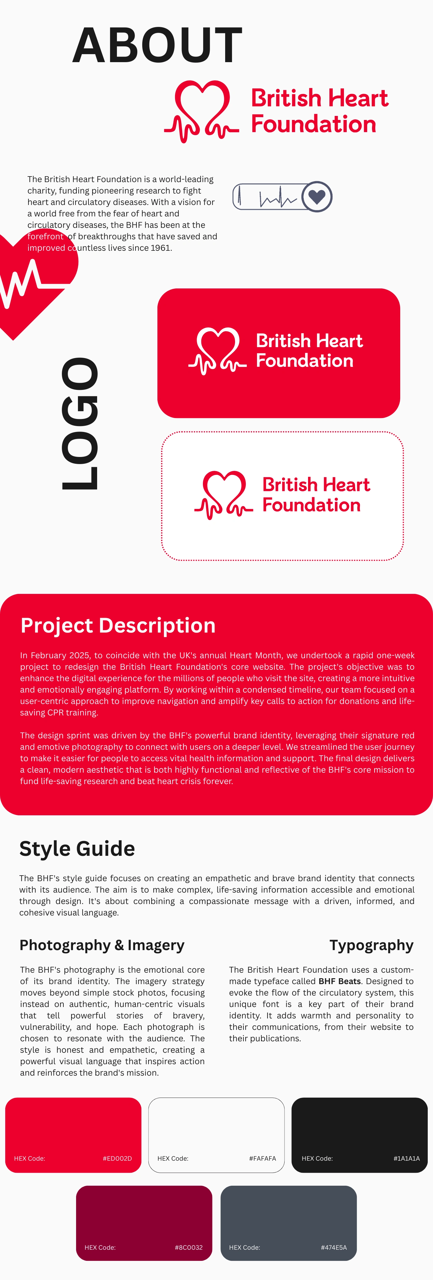
A complete webpage design showing the brand identity for the British Heart Foundation. The design includes a section with a logo, a project description with red and white text, and a style guide that defines typography, photography, and the brand’s color palette.
Project Overview: A Digital Heartbeat for the BHF. Click here to visit website.
Our mission was to transform the British Heart Foundation's digital presence into a platform as vital as its mission. The challenge was to create a user experience that was both deeply empathetic and incredibly effective. We needed to simplify complex, life-saving information, streamline the path to support and donations, and use design to tell the powerful, human stories behind the research. The project's success would be measured not just in clicks, but in impact, with every design choice serving the ultimate goal of fighting heart and circulatory disease.
The Strategic Approach
Our project was built on a bold, one-week design sprint in February 2025 to coincide with Heart Month. This rapid timeline was a strategic decision to deliver a high-impact solution at a critical moment for the charity. We followed a rigorous process:
Empathy-First Discovery: We began with an in-depth analysis of user needs, focusing on creating a stigma-free environment and a seamless emotional journey.
Agile Prototyping: We used Figma to rapidly prototype key user flows, allowing for quick iteration and collaborative feedback from the BHF team.
Unified Development: The final build was executed entirely in Framer. This enabled us to maintain a single, cohesive codebase and create a dynamic, interactive experience where design and functionality were perfectly in sync.
The Design Language
Our design was a direct reflection of the BHF's core values which are brave, compassionate, and unwavering. Every element was carefully crafted to inspire hope and action.
A Living Typography: We anchored the visual identity with BHF Beats, a custom typeface designed to evoke the flow of the circulatory system. Its unique character added warmth and personality, making a serious topic feel approachable.
Authentic Storytelling Through Imagery: The photography strategy moved away from traditional stock imagery. Instead, we used authentic, unposed moments that captured the raw human emotion behind the BHF's mission, building a powerful visual connection with the audience.
The Beacon of Red: The brand's signature red, #ED002D, was used strategically as a call to action and a beacon of hope, guiding users through the site and underscoring the urgency of the charity's work.
The Impact: A Transformed Digital Identity
The redesigned website delivered on its promise, providing the BHF with a powerful new digital platform. The project successfully streamlined their navigation, made life-saving information more accessible, and revitalized the brand's online presence, creating a highly effective tool that continues to drive donations and community engagement.
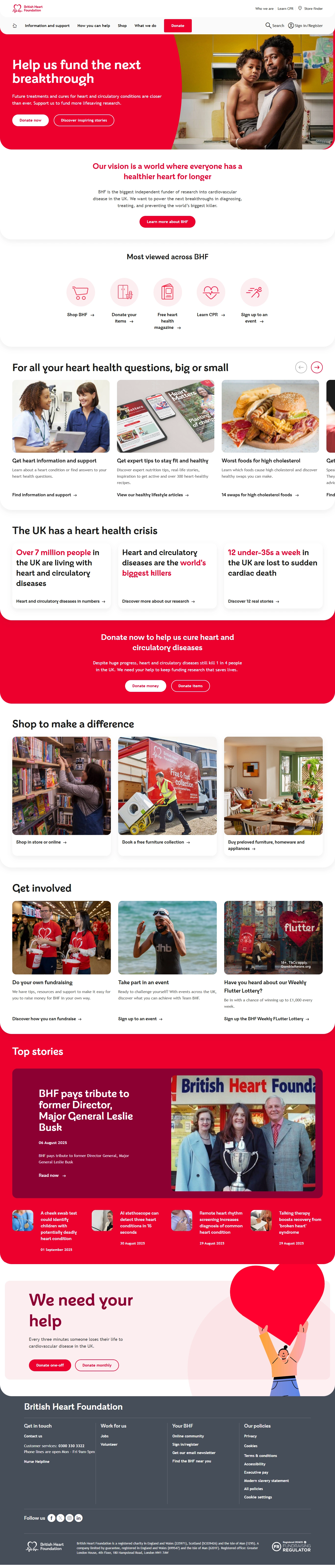
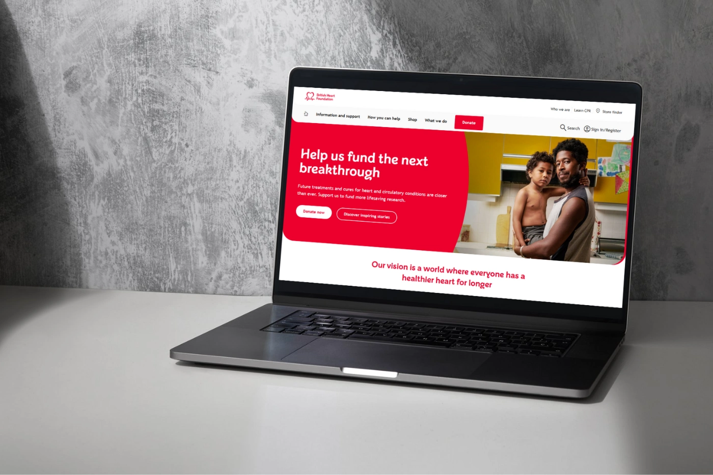
The British Heart Foundation website homepage, featuring a bold red and white color scheme. The top section shows a banner with text about a breakthrough and an image of a man holding a baby. Below are various sections with images and headlines about heart health questions, a heart health crisis, and ways to get involved, including photos of people exercising and in everyday situations. The bottom of the page has a banner with the headline "We need your help" and a graphic of a figure holding a large red heart.
Like this project
Posted Sep 9, 2025
Transformed BHF's digital presence with a user-focused design sprint. Delivered a top tier website for the brand.
Likes
0
Views
4
Timeline
Feb 1, 2025 - Feb 8, 2025
Clients
British Heart Foundation