Making onboarding easy


Making Onboarding Easy
When I joined Atomic Invest as the first designer in 2021, my first project was to design a white-labeled onboarding experience for a brand-new investing app — from the ground up. With no existing user base or flow to build on, we had to move fast, stay lean, and get it right.
Objective
Create a frictionless, user-friendly onboarding system that:
Complies with KYC and regulatory standards
Builds trust with first-time investors
Drives account funding and long-term engagement
Achieves a 50%+ completion rate from the start
Approach
Foundational Research
We conducted 10 interviews with users of apps like Wealthfront and Betterment. Key insights:
“I’m uneasy about sharing my SSN. I want to know why it’s needed and how it’s protected.”
“I value how quick and simple my current app is.”
Takeaways: Ease, transparency, and trust signals are critical.
Interviews with users
We also analyzed top fintech competitors to identify proven UX patterns, trust-building techniques, and copy strategies — especially around when and how to collect sensitive data.
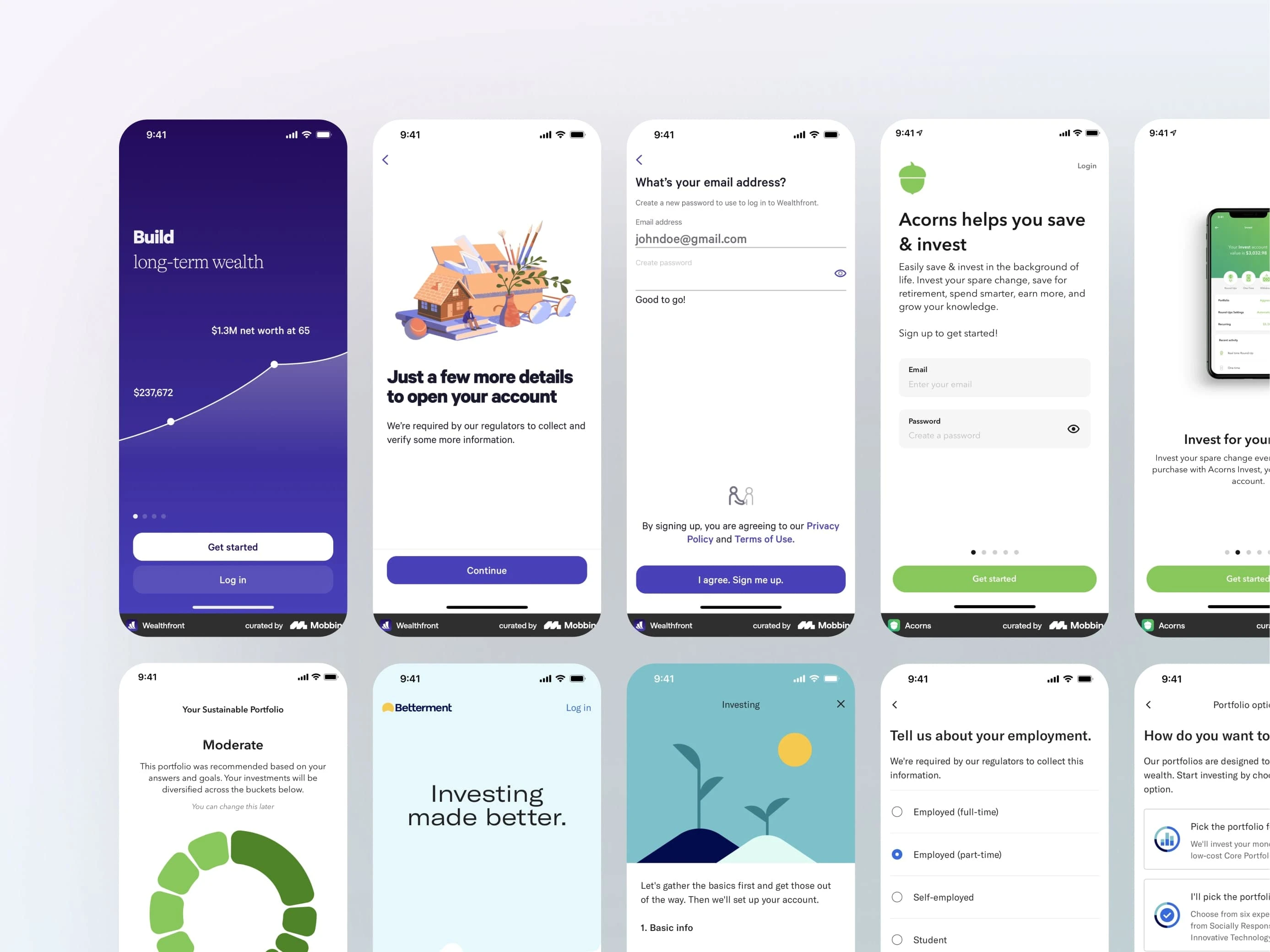
Competitor analysis
Design & Testing
We created multiple low- and high-fidelity prototypes and ran six rounds of usability testing. Key discoveries:
Early screens matter most → Clean, focused UI helped keep users engaged
Minimal upfront data → We removed optional fields to reduce friction
Give before you ask → Users saw a recommended portfolio before being asked to fund
Sensitive data last → Trust signals and placement reduced drop-offs
We worked closely with compliance and engineering from day one — holding daily syncs to align on backend logic, ID verification flows, and legal requirements.
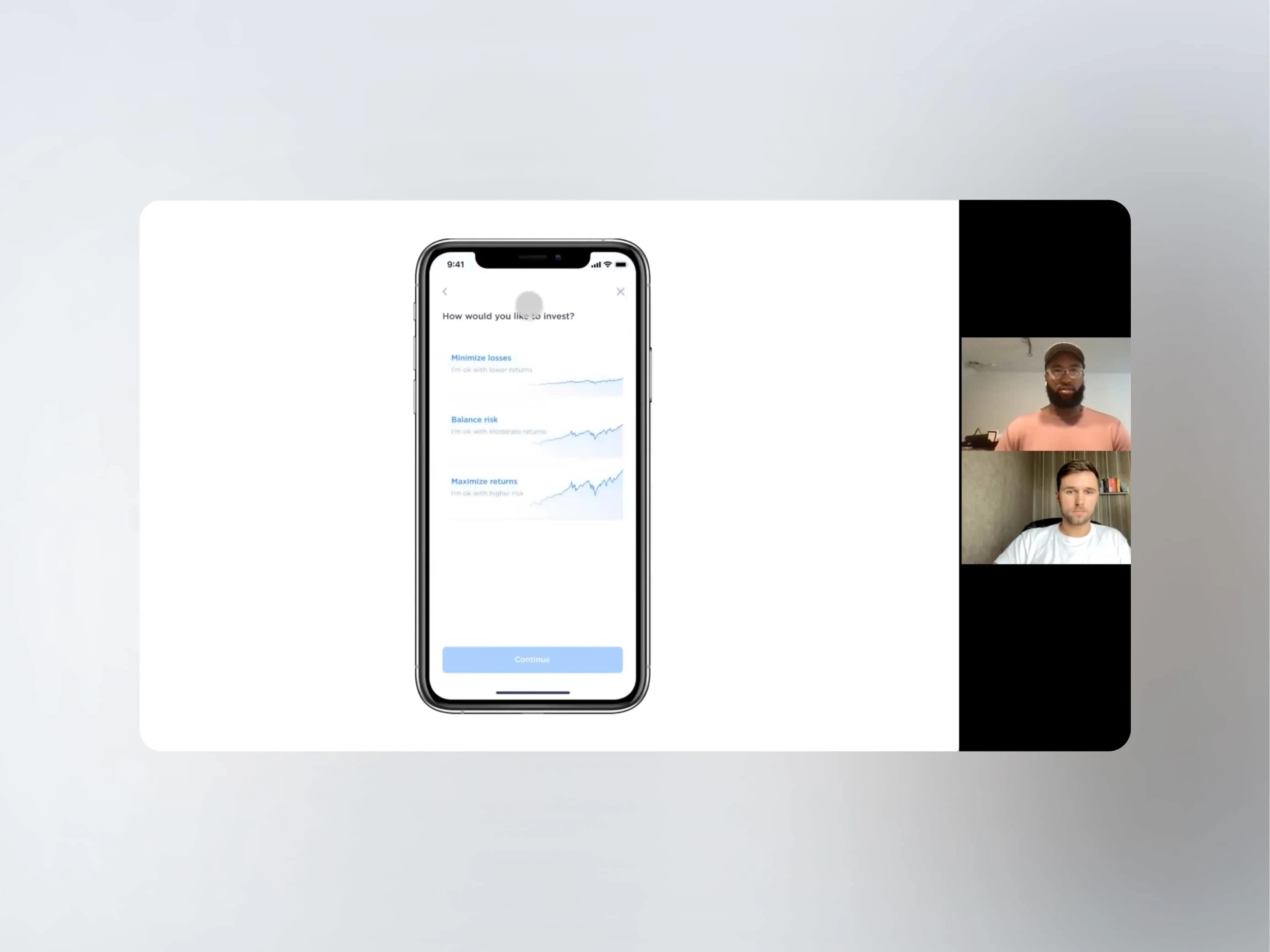
Usability testing
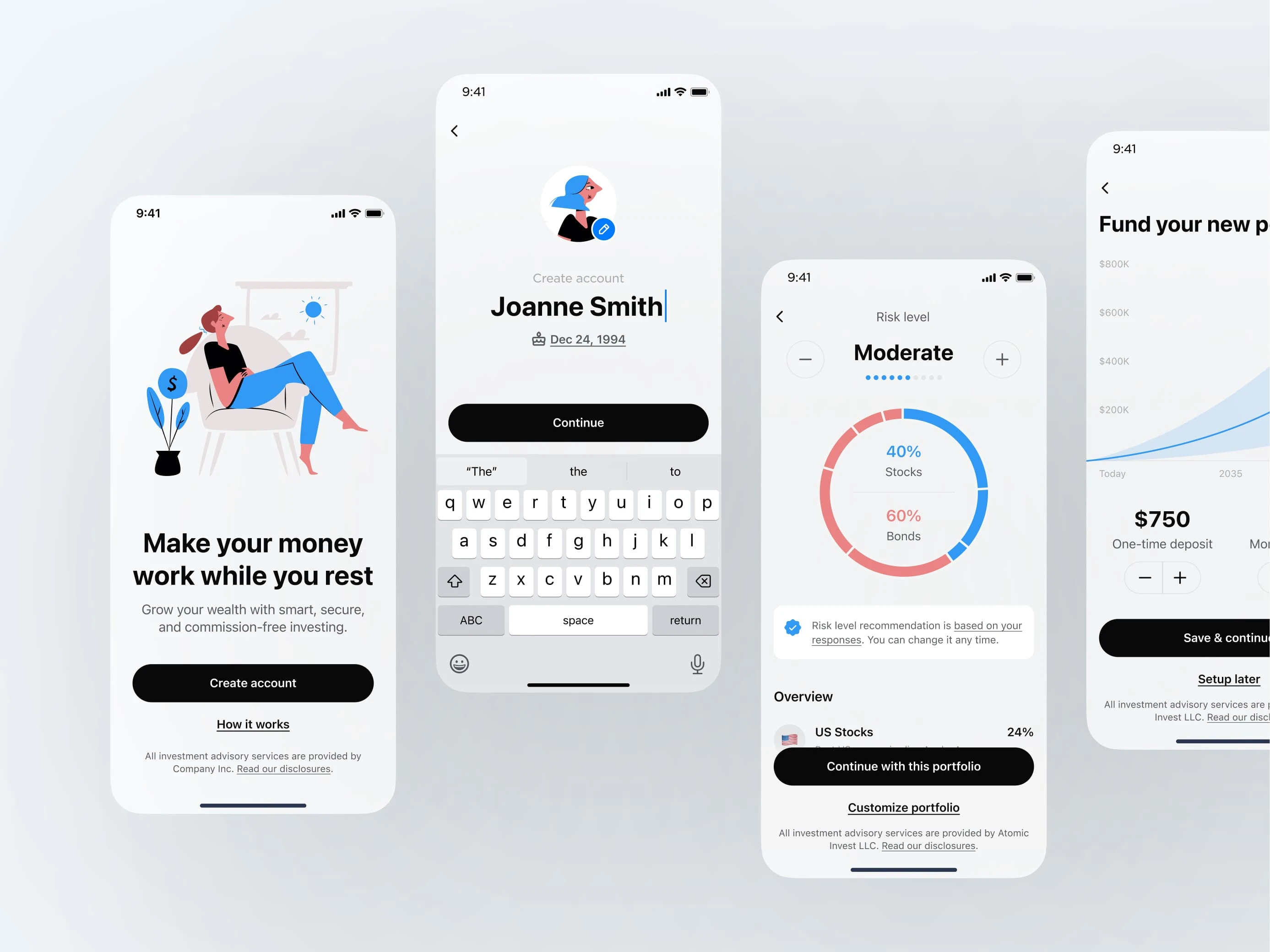
Final design
The first screens matter most
Early screens in any onboarding flow are often the most frequently abandoned because new users aren’t yet committed. To address this, we designed visually appealing, streamlined pages for basic data collection. We also captured contact details early to facilitate re-engagement if users dropped off.
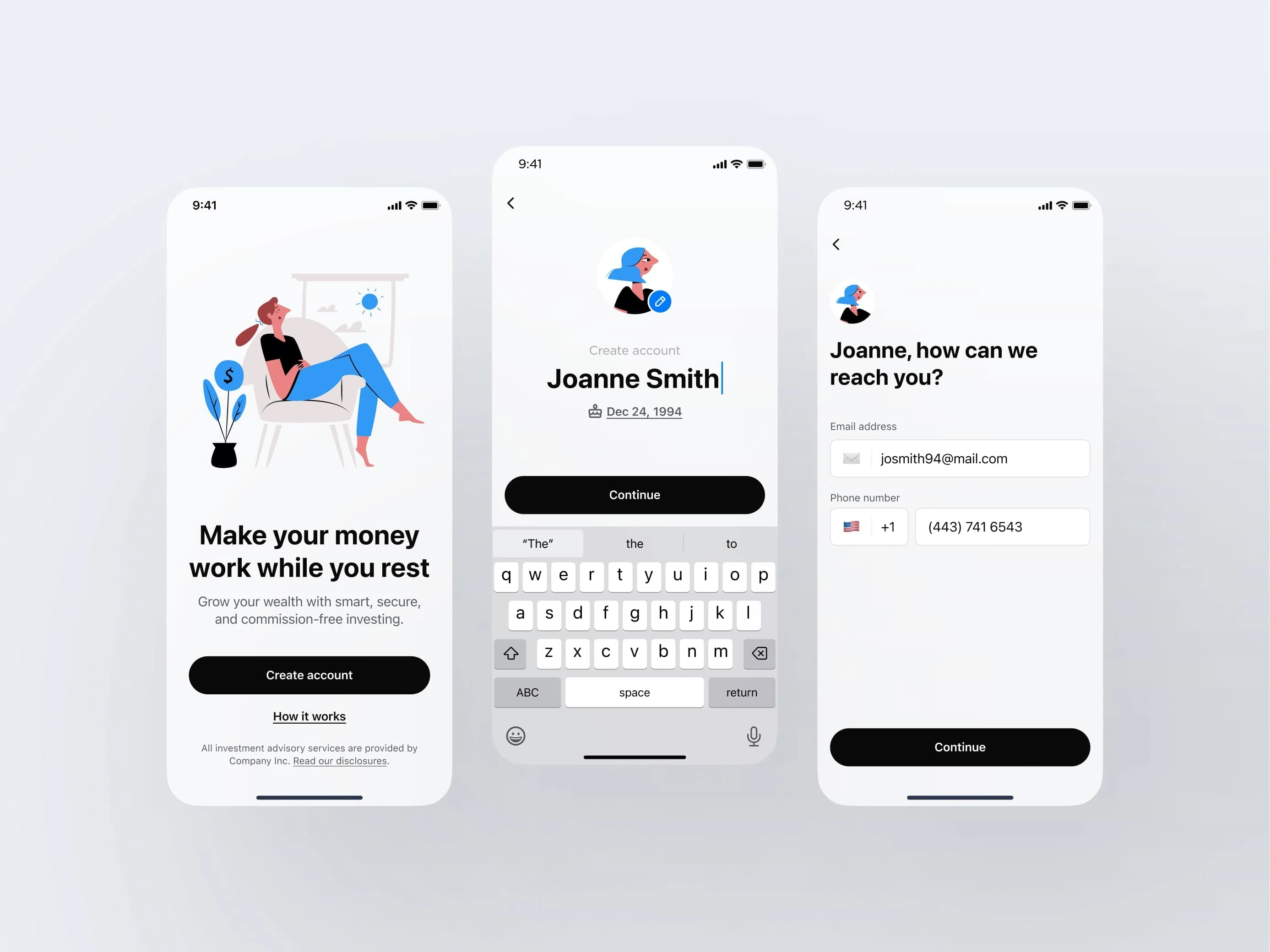
The first screens matter most
Keeping it minimal
It’s tempting to collect as much data as possible upfront, but our tests showed that longer funnels lead to higher abandonment rates. As a result, we removed any optional fields that could be collected later in the post-onboarding experience.
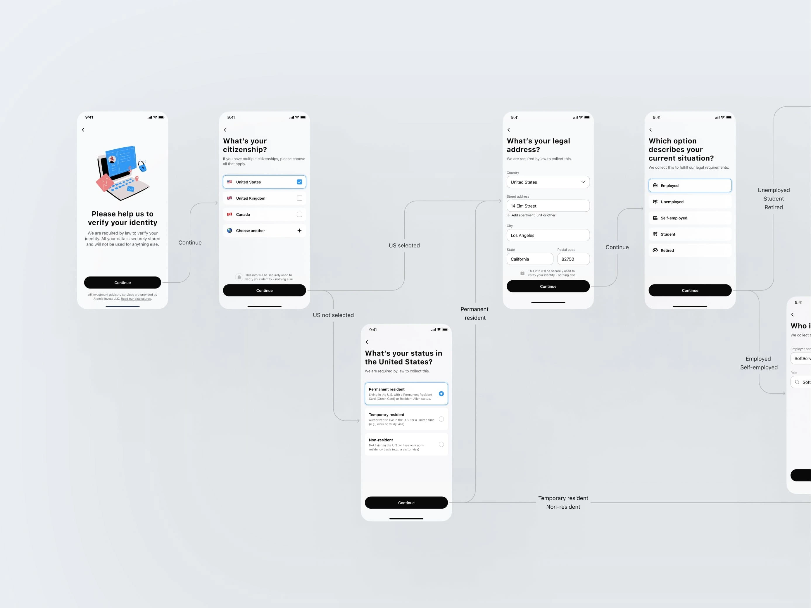
Keeping it minimal
Give before you ask
To motivate users to fund their accounts, we made the portfolio-building process interactive: users answered a set of questions to generate a recommended portfolio. Immediately afterward, they were offered one-time or recurring deposit options, alongside projections of how their account might grow. This step turned out to be the most engaging, with users frequently experimenting with different deposit amounts before ultimately deciding to fund their accounts.
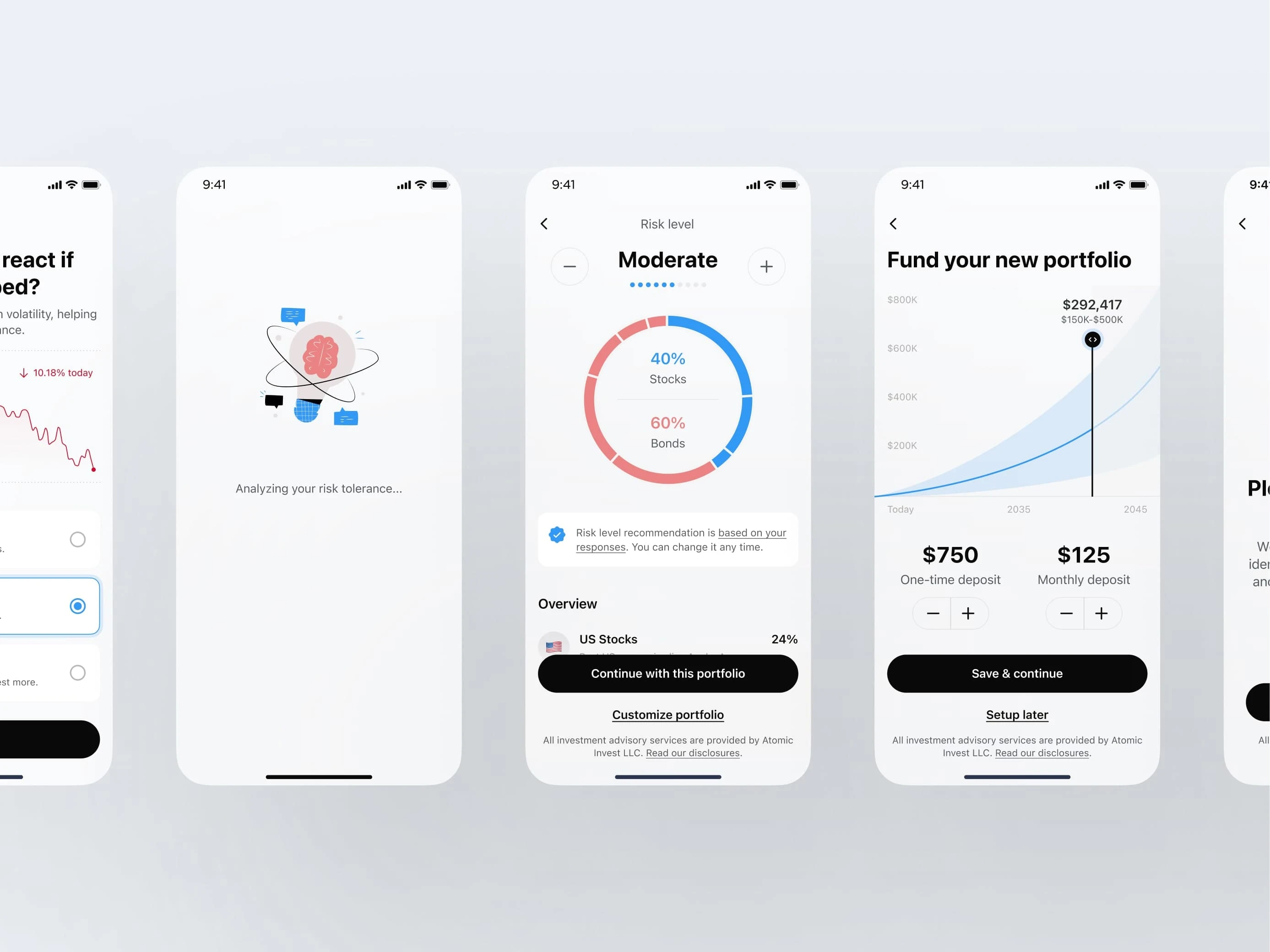
Give before you ask
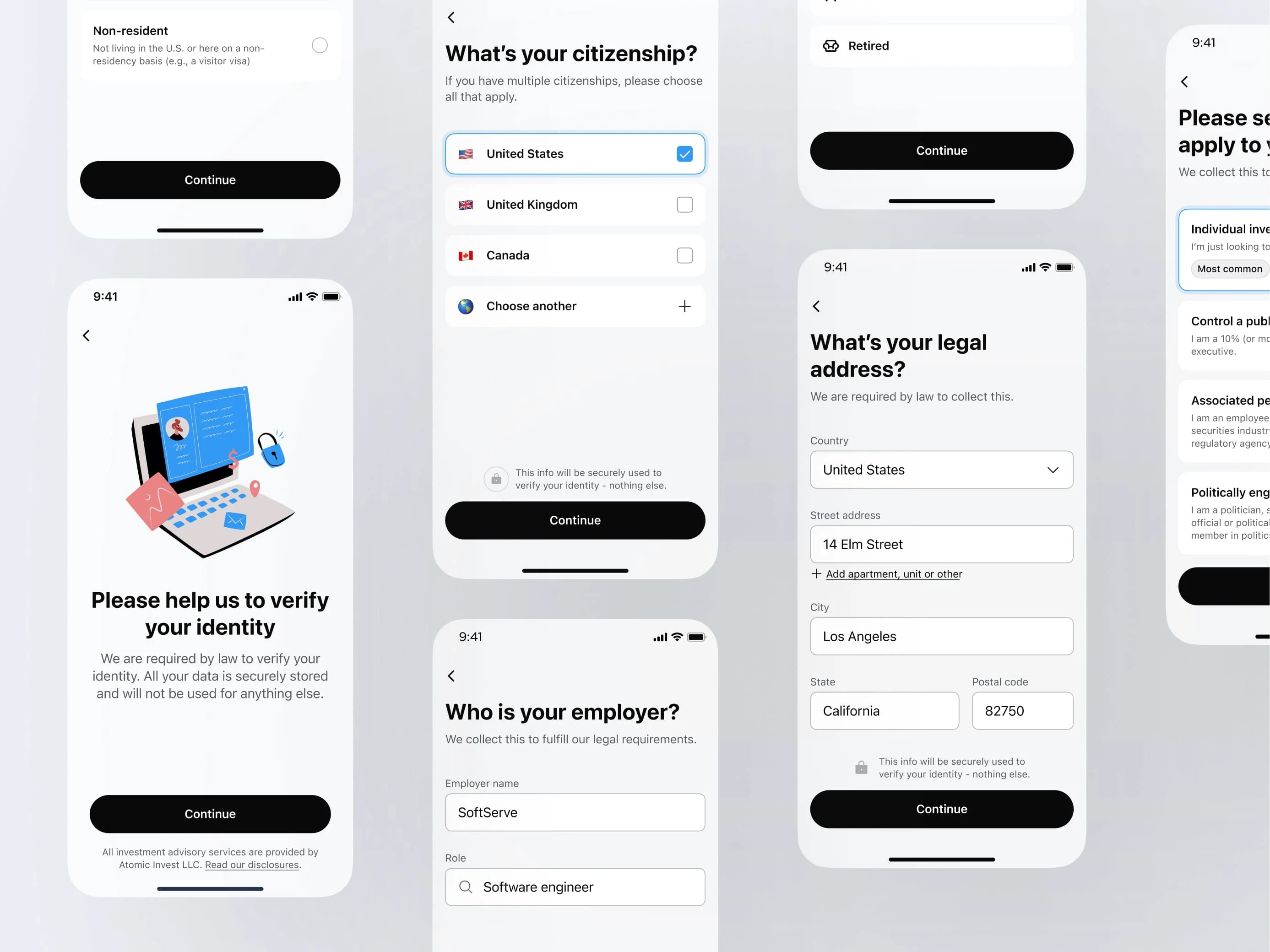
Ask for sensitive data last
People are cautious about sharing personal information with services they haven’t fully vetted. Trust signals - such as lock icons, encryption assurances, and clear explanations of legal requirements, are key to alleviating these fears. Additionally, collecting the most sensitive data (like a Social Security number) later in the process ensures that users are already more invested and therefore less likely to abandon the flow.
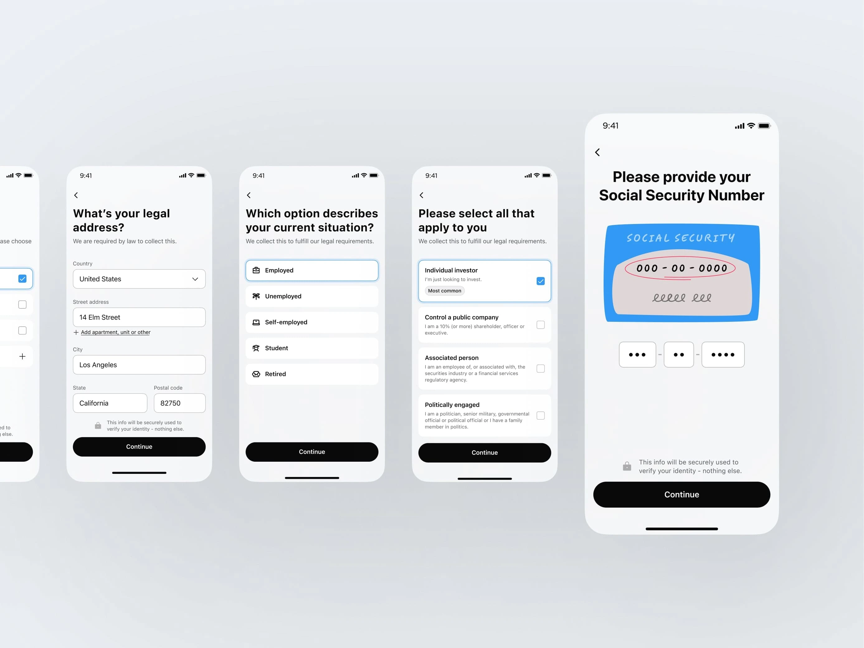
Ask for sensitive data last
Outcomes
✅ Completion Rate
47% completion at launch — near target
Post-launch tweaks (copy improvements, screen order) raised it to 52%
💸 Account Funding
69% of completed users funded accounts
Average: $55/month in recurring deposits
Raising the default amount over time lifted the average further
🔁 Iterative Improvements
Drop-off hotspots included address entry, employer info, and legal screens. Fixes included:
Address autocomplete
Streamlined employer input
Shorter, scannable agreement content
Together, these changes lifted completion by an additional 8%
Reflections
This project was a crash course in designing for trust under regulation. Working closely with compliance, engineering, and leadership helped me:
Translate complex legal flows into intuitive UI
Balance business goals with user empathy
Launch a white-label product that now powers multiple fintech apps
Above all, I learned that clear communication, thoughtful defaults, and iterative design are key to making fintech feel effortless.
Like this project
0
Posted Apr 6, 2025
Designed a compliant, trust-focused onboarding flow from scratch—achieved 52% completion rate and 69% funding with $55 avg. monthly deposits.


Saving Culture with a Modern Visual Identity

From Chaos to Clarity: Streamlining Financial Operations