From Chaos to Clarity: Streamlining Financial Operations


Management dashboard
I set out to build a financial management dashboard for professionals who manage client accounts—like Ops teams at financial institutions or independent advisors.
Goals
Leverage our infrastructure to streamline workflows
Help teams work faster while delivering excellent client service
Audience
Our users are finance and engineering pros who want:
Clear visibility into client data
The ability to take quick, effective actions
The Problem
⚡ Users were juggling too many tools: Retool, NetX, Fullstory, and even custom scripts.
Even worse, our own Atomic API lacked key capabilities, forcing teams to rely on manual workarounds to fill in the gaps.
Design Process
Research & Discovery
We started with feedback from early partners using our internal dashboard. To go deeper, we ran:
5 user interviews with external partners
Team sessions with our internal Ops group
Key insights:
Users constantly switch between tools to complete a single task
Many workflows are still manual, tracked in Excel
Low visibility into user actions makes troubleshooting slow and frustratings

Team sessions with internal Ops group
Brainstorm & Feature Planning
We used the Opportunity Solution Tree method to map outcomes → obstacles → solutions. This helped us:
Define must-have features for the MVP
Prioritize by feasibility and impact
Structure the dashboard into clear, actionable sections
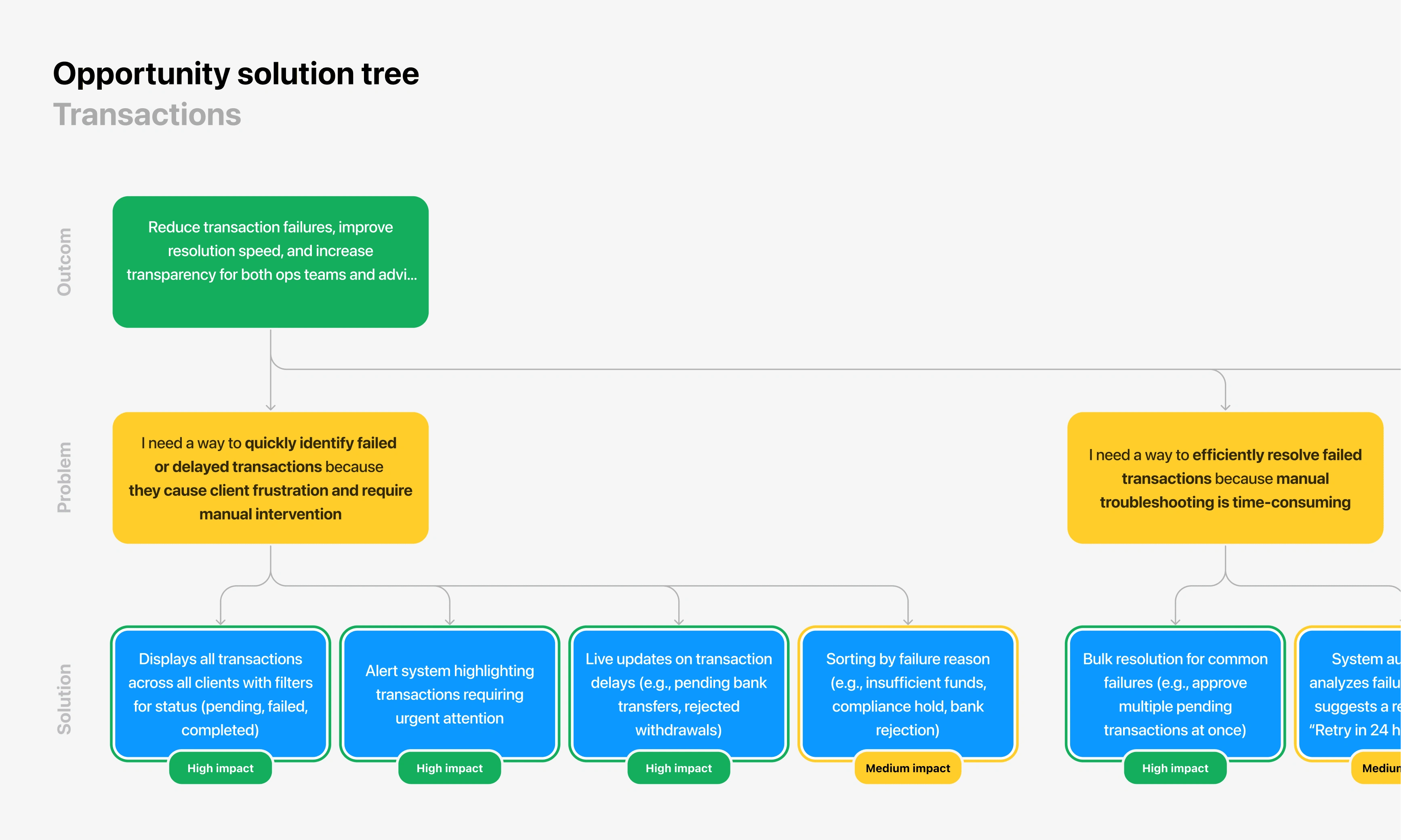
Opportunity Solution Tree
Collaboration with Engineering
Once we had a direction, I presented the vision to stakeholders and engineers. Some of the features users needed weren’t yet supported by our internal API.
To move forward, we:
Focused on high-impact, low-lift features first
Postponed complex capabilities (e.g., session replays)
Integrated external tools like Fullstory, Sentry, and Datadog as interim solutions
Added deferred features to the API team’s roadmap
Wireframes and Exploration
Testing & Iteration
We started testing internally to surface usability issues early.
Then, we soft-launched to a group of existing users from the old dashboard.
• Observed real-world usage
• Collected feedback via Slack + analytics
• Iterated quickly to improve clarity and performance
Final Design Highlights
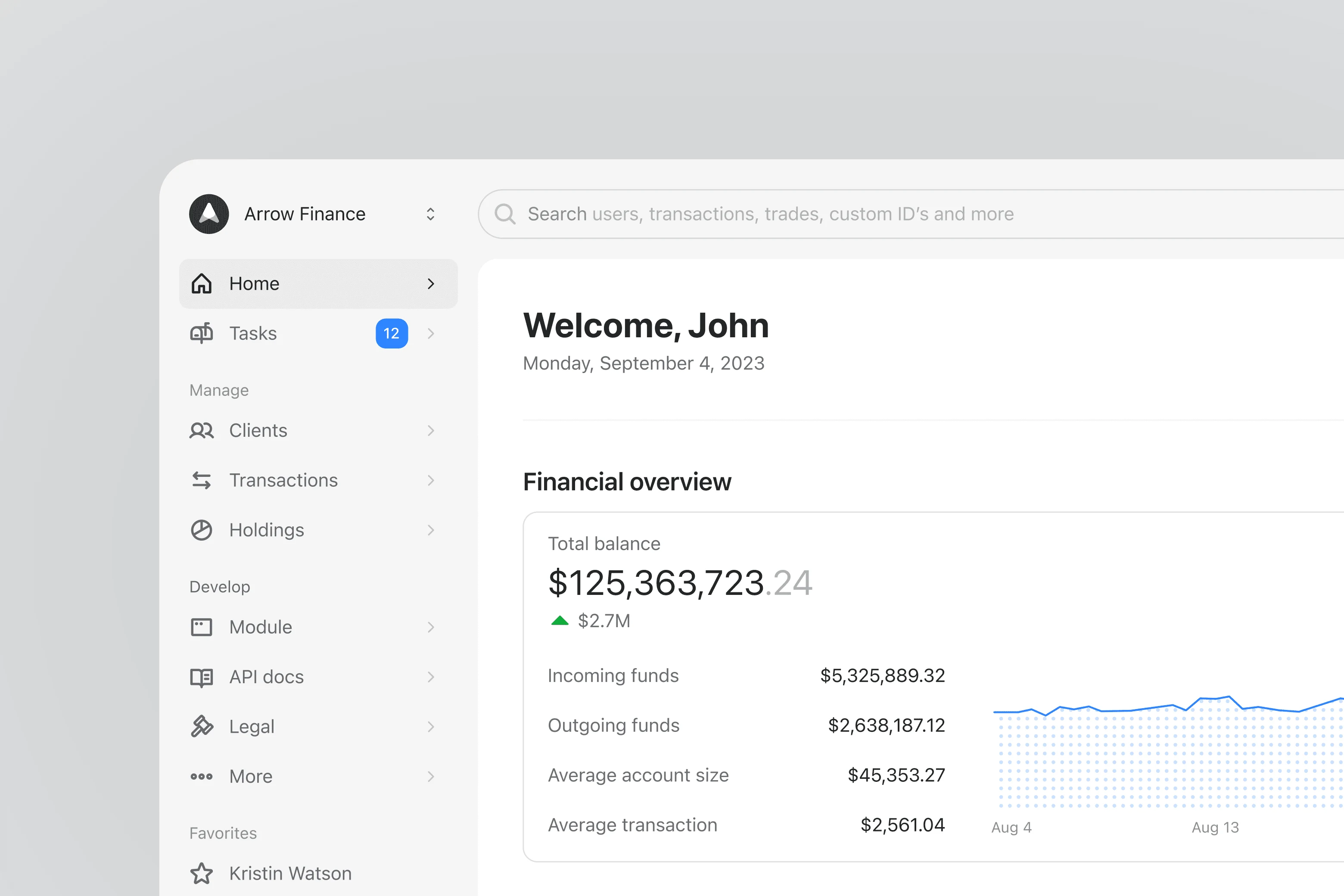
Homepage
Critical alerts + priority tasks front and center
Persistent, high-contrast search bar for quick access by ID
Favorites in the sidebar for faster task switching
Navigation built for speed and repeat use
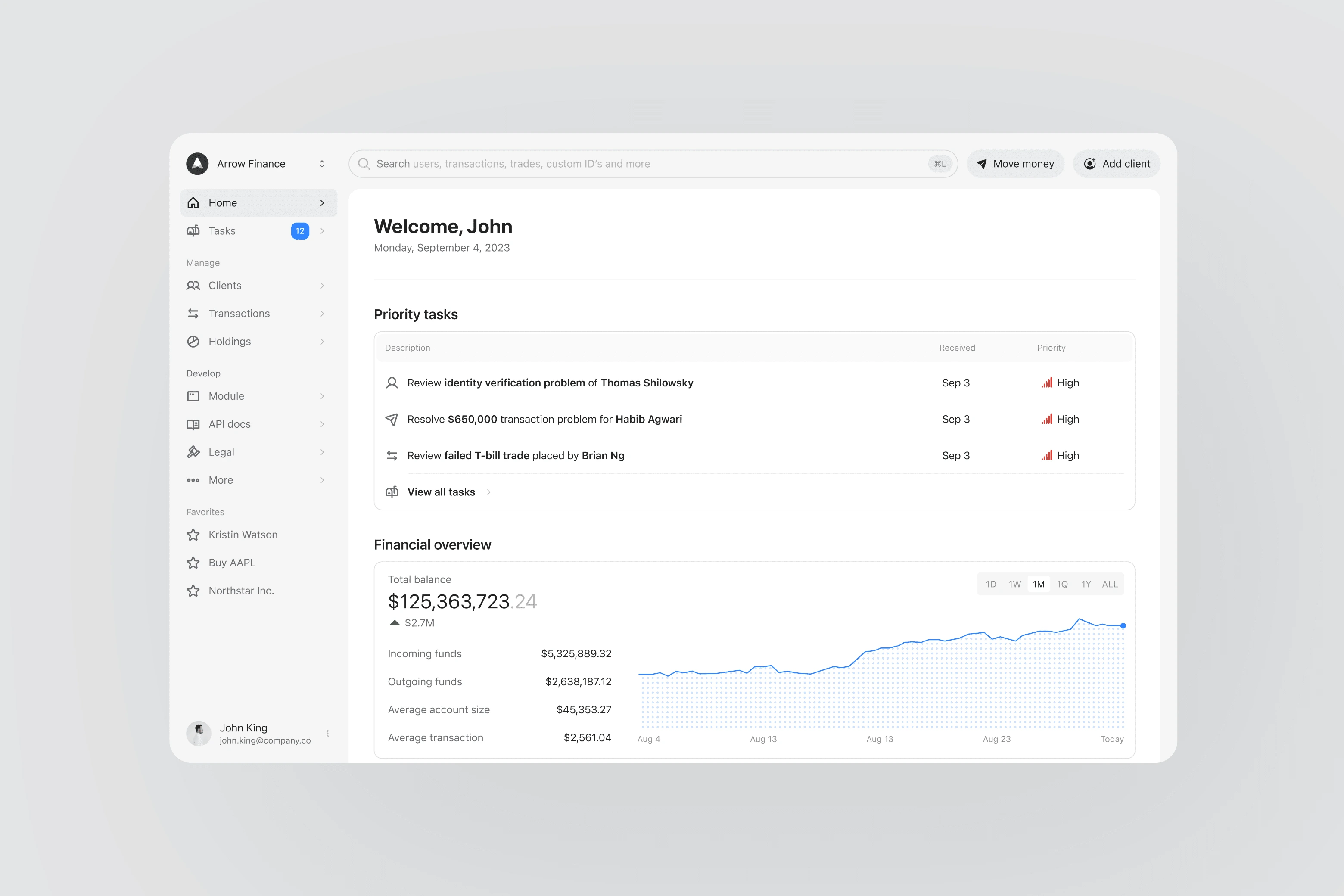
Homepage
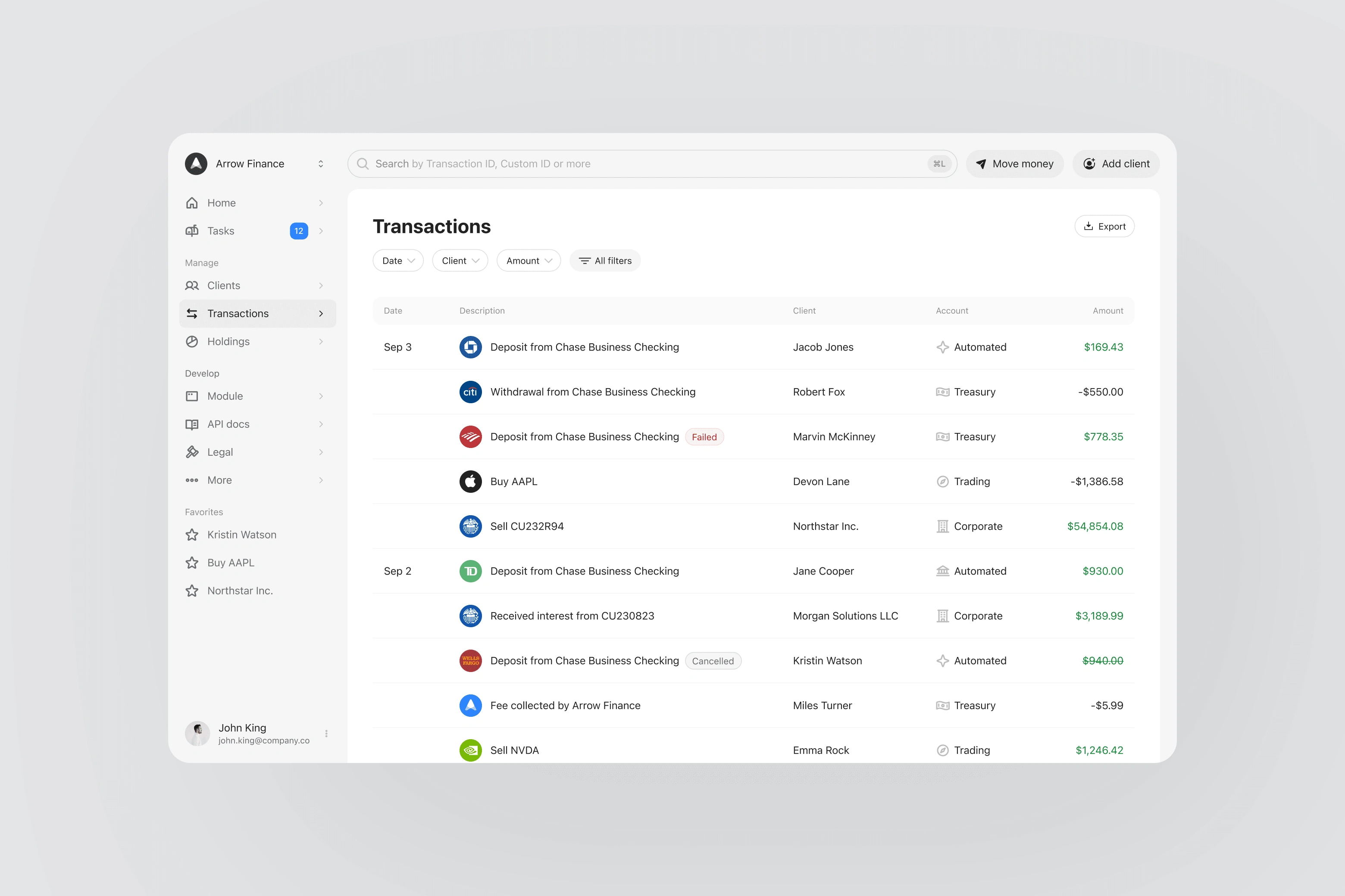
Transactions
Unified view of all transactions across accounts and sub-accounts
Filters by type, status, date
Linked metadata (bank, asset, vendor) for faster investigation
Same-day transactions grouped to reduce noise
Transactions
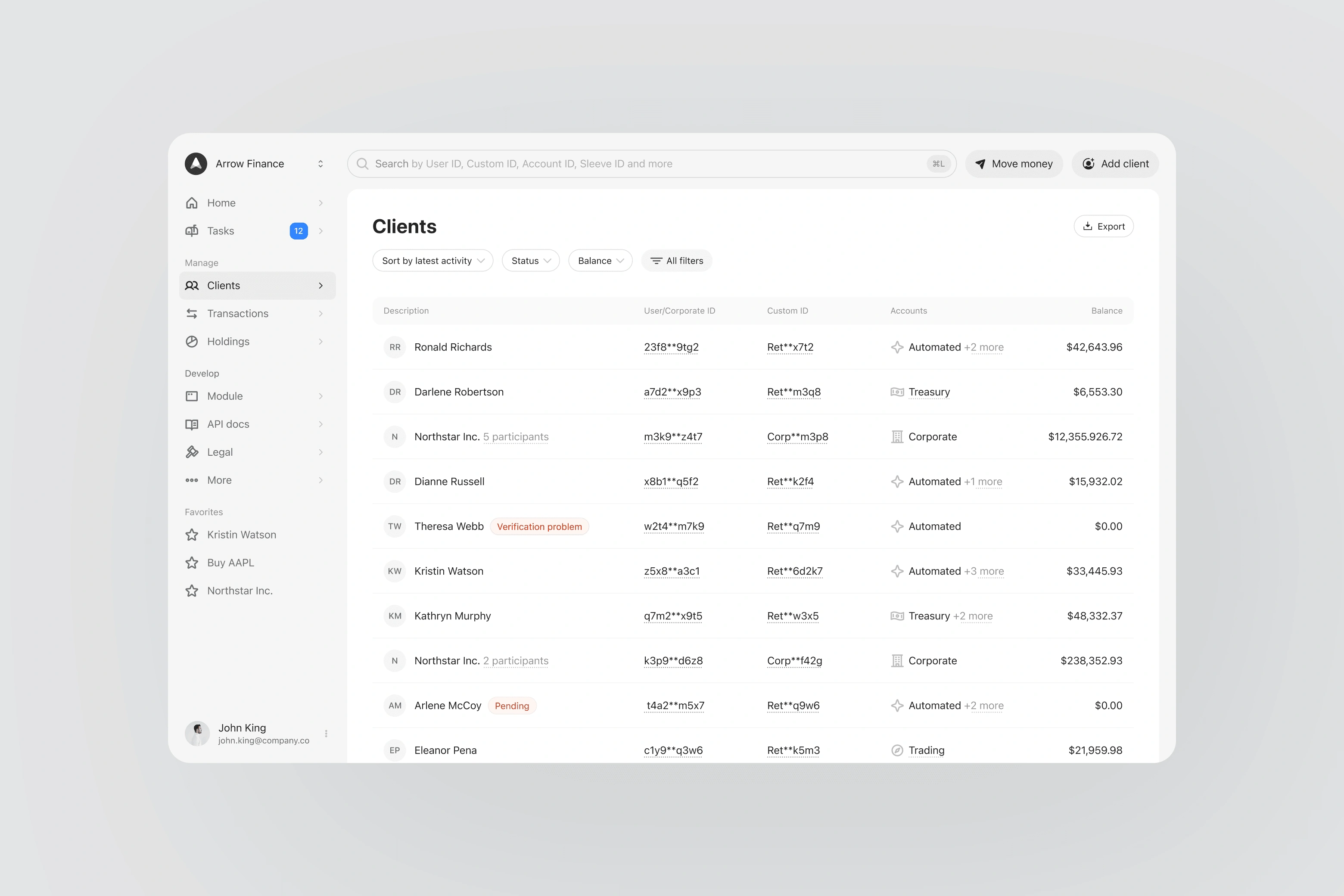
Clients List
Optimized for fast search and filtering
Clear visual distinction between individuals vs. corporate entities
Highlights clients needing attention
Clients
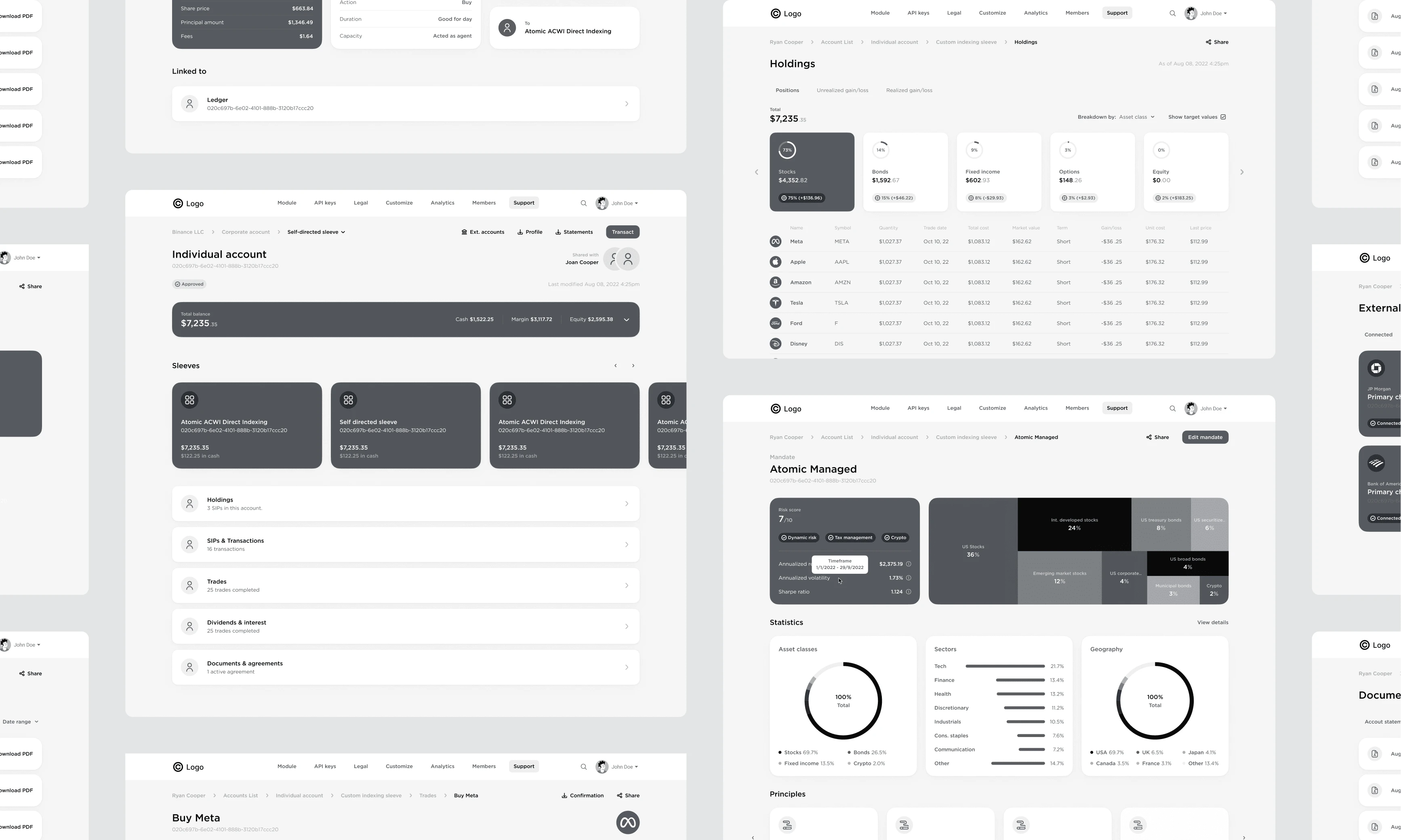
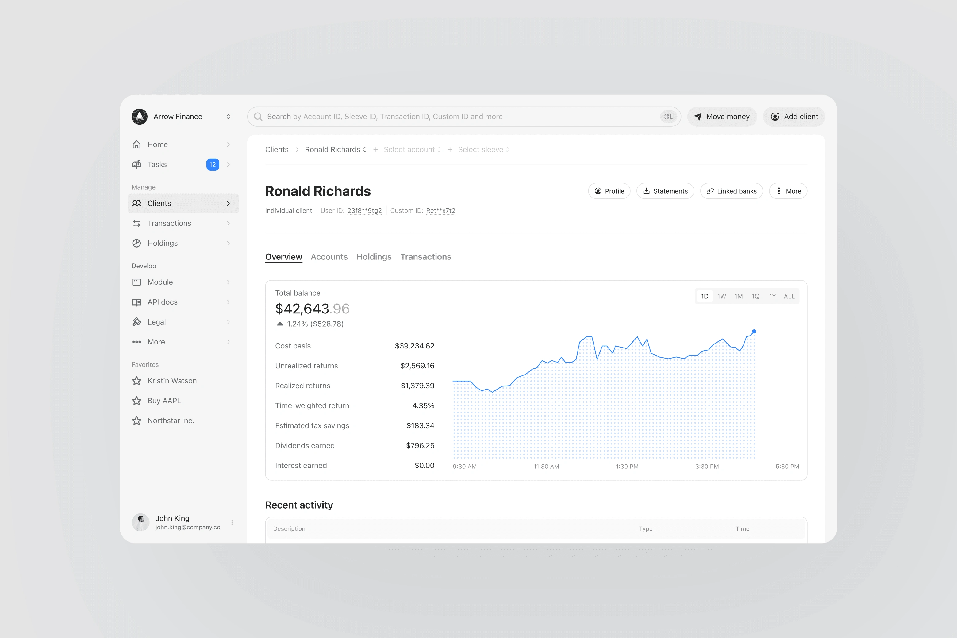
Client Details
End-to-end visibility into each client’s activity
Easy access to onboarding, compliance, and financial insights
Smooth transitions from summary → account → sleeve
Client Details
Outcomes
✅ Reduced Tool Overload
Consolidated workflows into a single dashboard
Decreased external tool usage by ~20%
Partner support inquiries dropped from 10/day to 6/day
✅ Designed Within Constraints
1 month for design → 2 months for development
Delivered a foundation that can scale with feedback + product evolution
✅ Faster Problem Solving
Time to locate a problematic transaction dropped from ~8 mins → under 1 min
Better alignment between UI, data, and backend capabilities
Like this project
0
Posted Apr 4, 2025
Reduced tool use by 20%, cut support requests by 40%, and dropped issue resolution time from 8 minutes to under 1 -streamlined, scalable, effective.


Making onboarding easy

Saving Culture with a Modern Visual Identity