Wanderlust 📱

Imagine a fusion of Instagram Reels and Google Maps - this is where Wanderlust comes in. It's a user-friendly mobile application that enables you to explore trending experiences across various cities and countries. With Wanderlust, you can easily save your preferred experiences and view them on a map. This way, when you're planning your next trip, you have all your saved experiences in one convenient location.
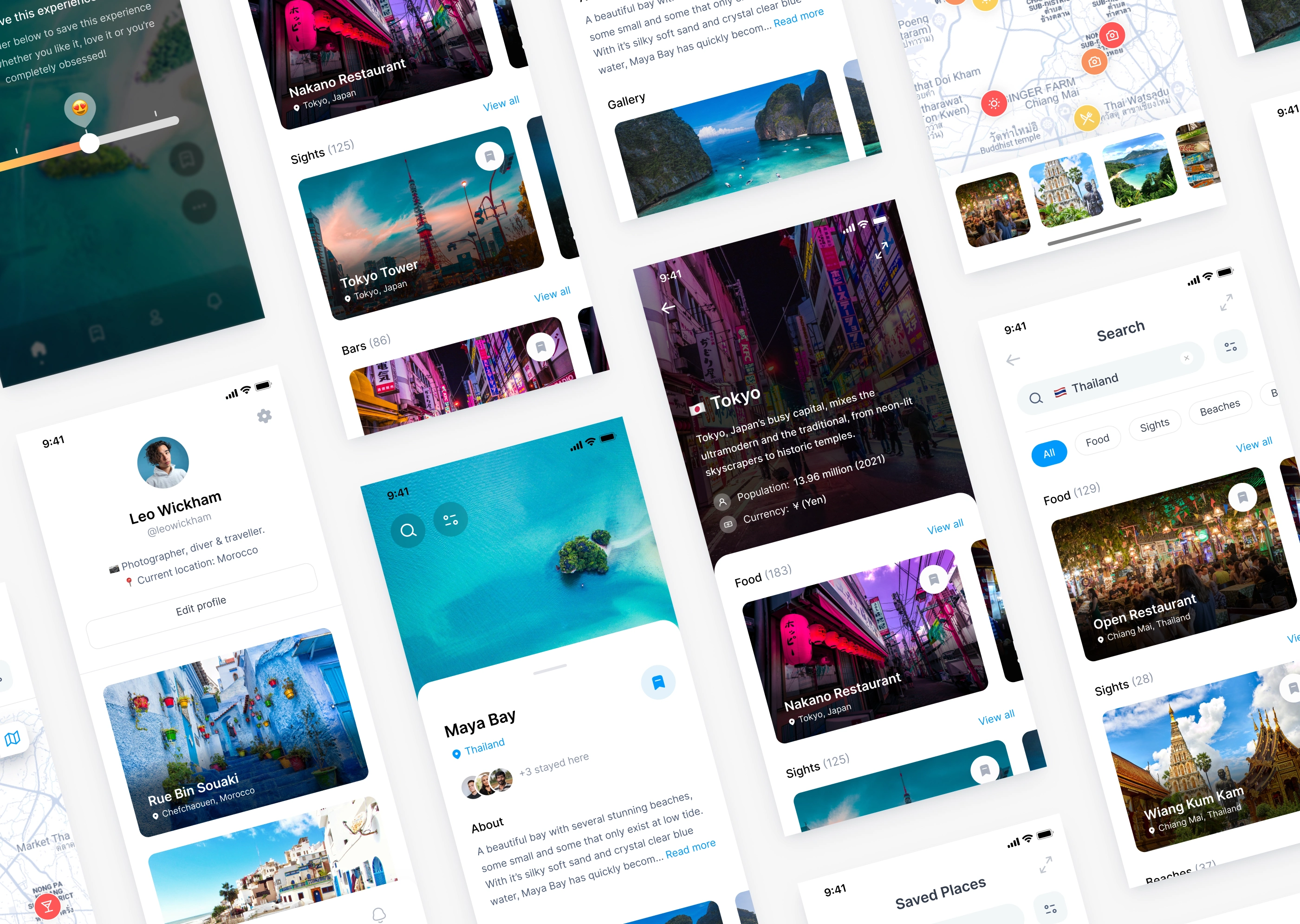
Wanderlust App Designs
The Brief
The team at Wanderlust had a clear vision in mind - to create a mobile app that's both intuitive and user-friendly, allowing users to effortlessly explore trending experiences across various cities and countries. They sought to make it easier for users to browse through experiences by city or country, or even filter them by category such as food, sights, beaches or bars. When viewing an experience, users should have access to all the relevant information such as a description, an image gallery, tags, and other things to do nearby. Moreover, they needed a feature that allows them to save experiences based on their level of interest, and then view them on an interactive map that shows categories and levels of interest for each experience. On top of that, the app required additional functionalities such as onboarding, search, profile pages and settings. The end goal was to create an all-in-one platform where users could easily plan and organise their travel experiences, making sure they have everything they need at their fingertips. Future plans for the app include booking trips through the app, managing your itinerary and sharing it with friends.
Wireframing
To kick off the project, I began by creating a wireflow - a powerful hybrid design document that merges the benefits of wireframing with flowcharts. By doing so, I was able to clearly illustrate the paths that users may take while navigating through the app, providing a comprehensive overview of its functionality. This, in turn, helped streamline the design process, ensuring that the final product was intuitive and user-friendly.
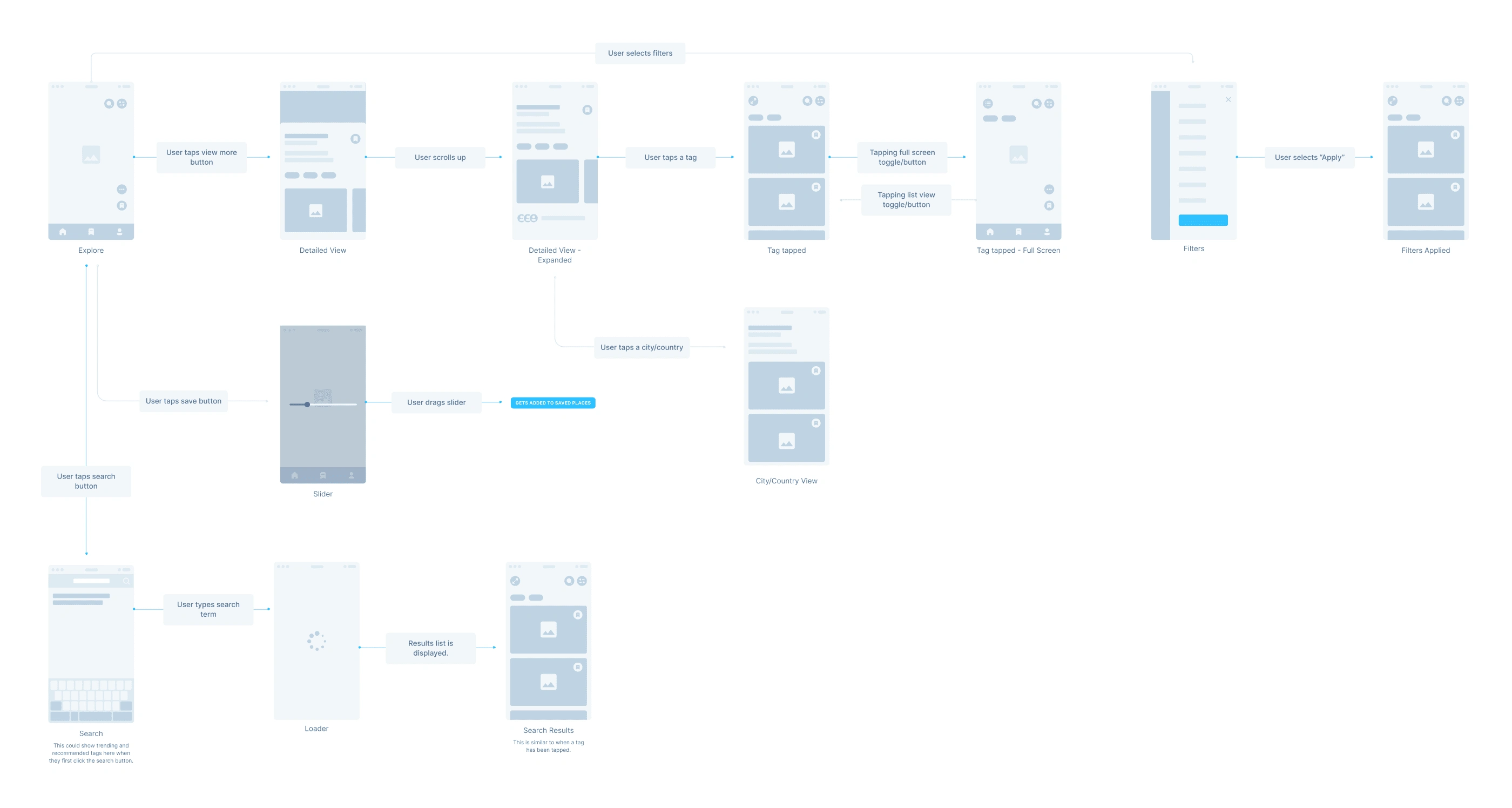
Snippet of Wanderlust Wireflow
App Designs
The Wanderlust app interface was carefully crafted to be sleek, modern, and uncluttered, with a primary emphasis on stunning visuals. To accentuate the app's content, I kept the background white, providing a clean and minimalistic look. After extensive research on colour psychology, I decided to utilise a calming shade of blue, associated with trust, serenity, and relaxation, as the primary colour scheme. Throughout the design process, I kept the user at the forefront, ensuring that the app was intuitive and effortless to navigate. The app's functionalities, such as searching, saving, and viewing experiences on a map, were designed with a user-centric approach, providing a seamless and enjoyable experience for travellers.
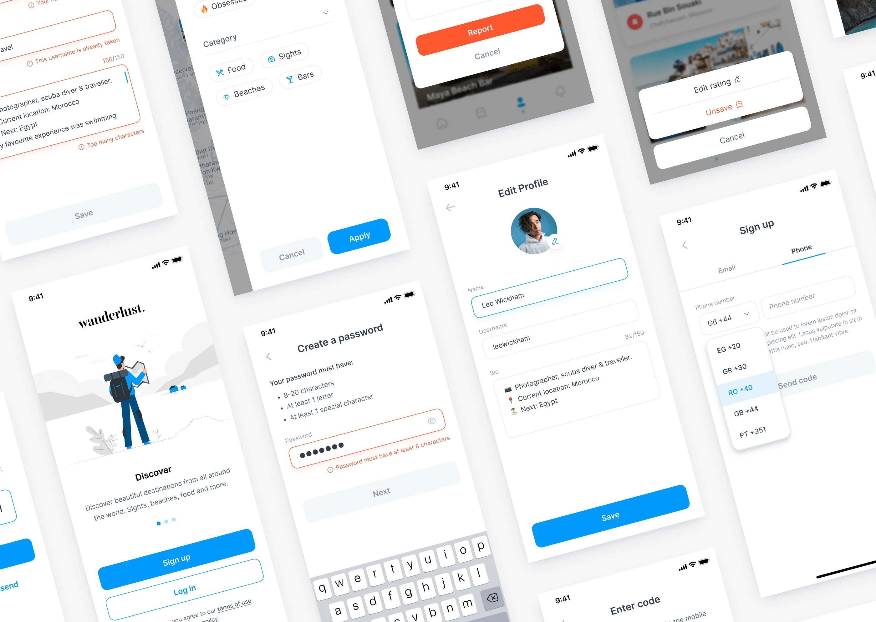
Wanderlust App Designs
“Jasmine has been a blessing. We are now on our 3rd project working together (2 app designs and 1 full rebrand + website design) with many more to come. Her joyful attitude, creative direction and eye for design detail are so much more than "just" a designer.”
- Florian Thompson, Founder of Apartment 17
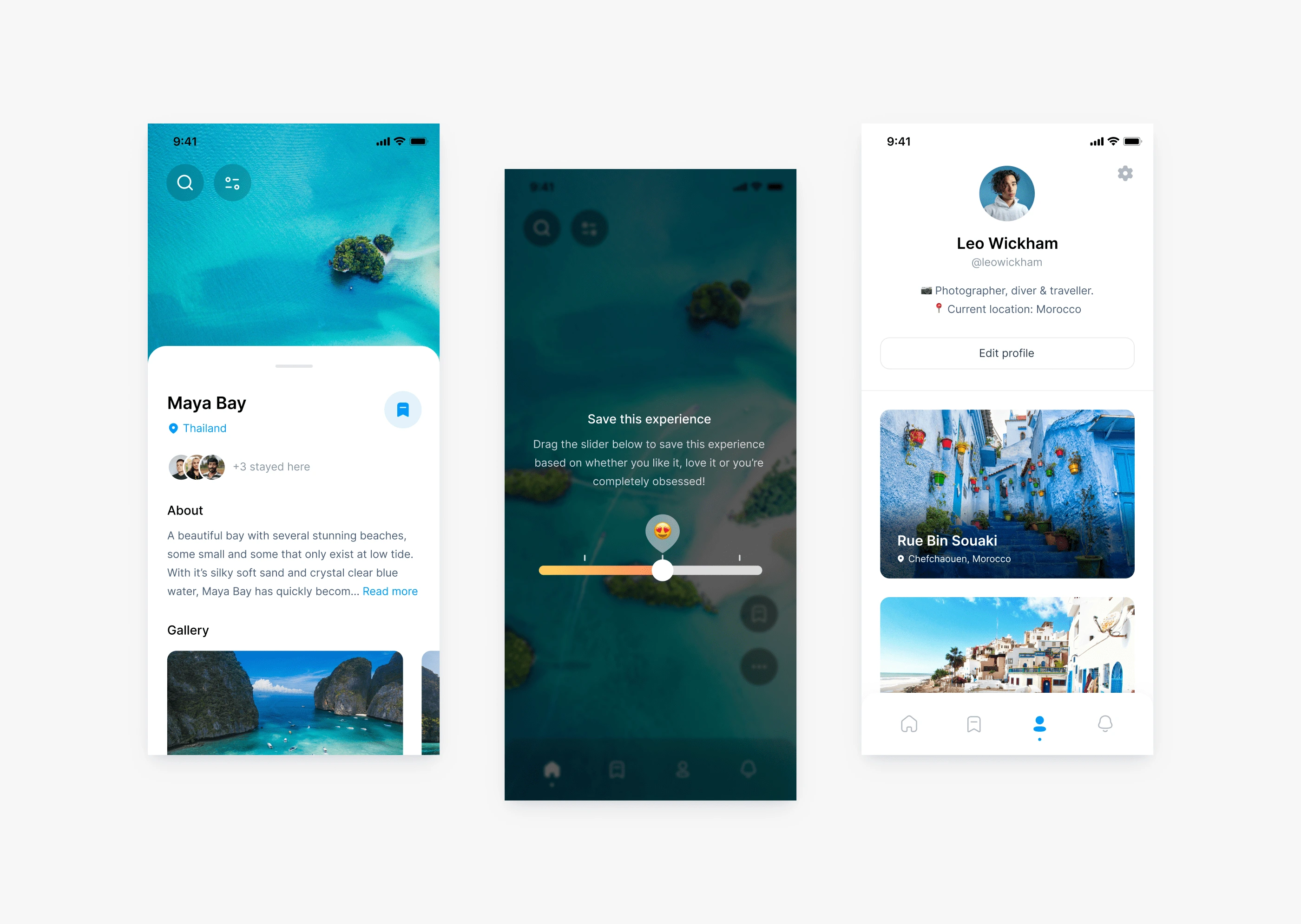
Wanderlust App Designs
Like this project
Posted Apr 11, 2023
Mobile app design for Wanderlust - a user-friendly mobile application that enables you to explore trending experiences across various cities and countries.
Likes
0
Views
64

