Concept: Hello! Brand Kit
Traveling made easier when meeting local guides and staying with locals to make your trip smooth
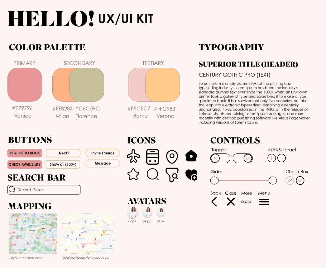
Hello! is a conceptual idea I created to make traveling easier for users who have travel anxiety. Below is the brand guide/UX/UI kit I created for this concept.
I picked summer-time colors and named them after Italian cities as everyone is familiar with Italy and the colors are to represent a fun, modern, and relaxing vibe. From there I chose the typography being bold but not so overly annoying and complimented it with a simple body text. After I had those elements put together, I went ahead and designed what the buttons, icons, and controls would look like if I were to put this into a UX/UI concept with a team or marketing strategy.

Like this project
Posted Jan 17, 2024
A travel brand kit concept I created that could help ease traveler anxieties and could be easily marketed to all ages.
Likes
0
Views
4


