Craigslist Webpage Redesign
Craigslist is widely used, but the design of the website isn’t up to date; therefore, I chose Craigslist for this project to give it a more modern design. Craigslist has a simple text based design and I wanted to adhere to the original vision while modernizing it.

The Problem
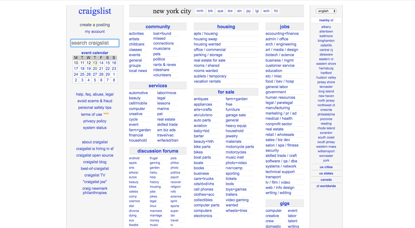
Craigslist home page
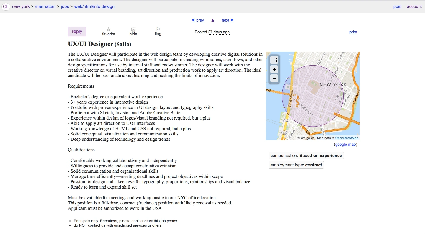
Job description on Craigslist
There are too many words on the home page.
The whole page is filled with links.
Users would have to look through the whole page to find what they need or use the search bar automatically. If users use the search bar right away, then the home page is not really useful.
Too many words would make users not want to return to the site.
In order to apply for a job you click the "reply" button, which it should say "apply" instead.
Persona Card
The redesign is based on this persona card

Persona Card
Journey Maps
Journey maps for Melissa Banks
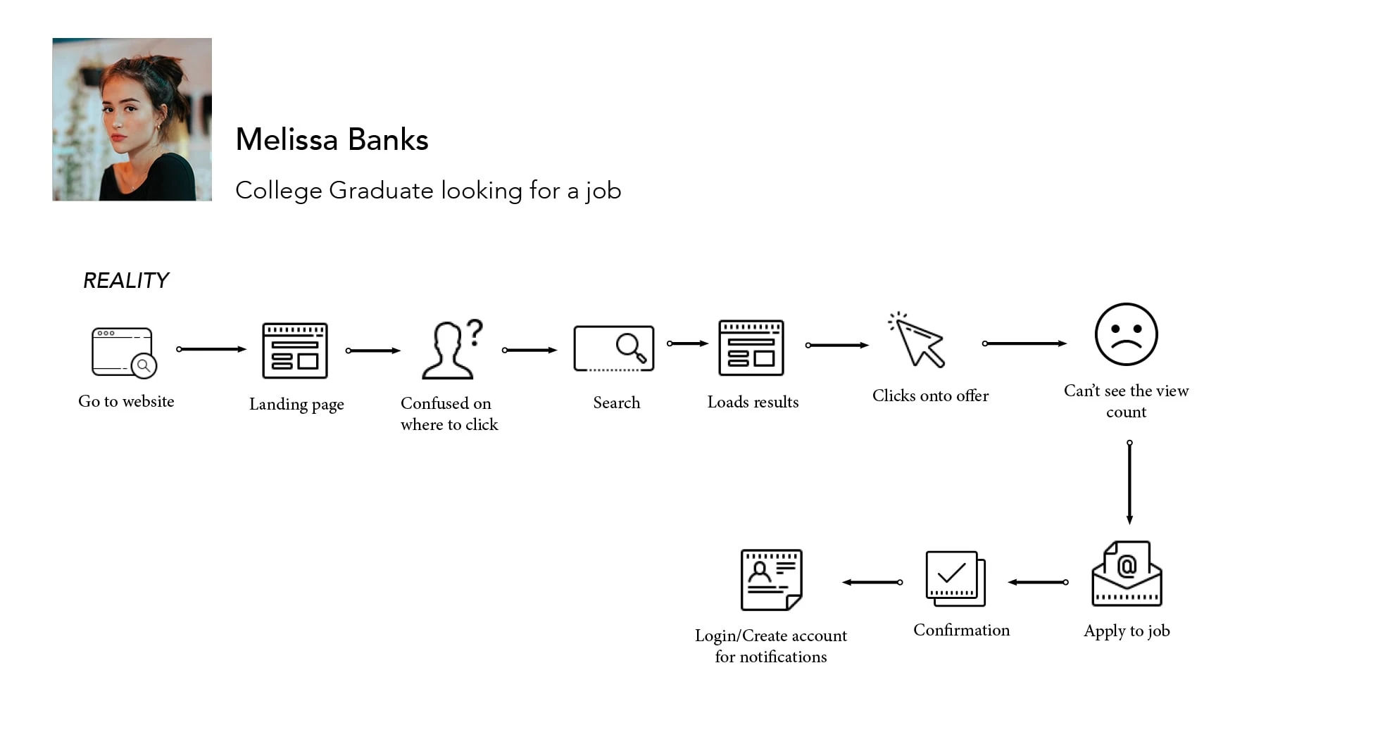
Reality journey map
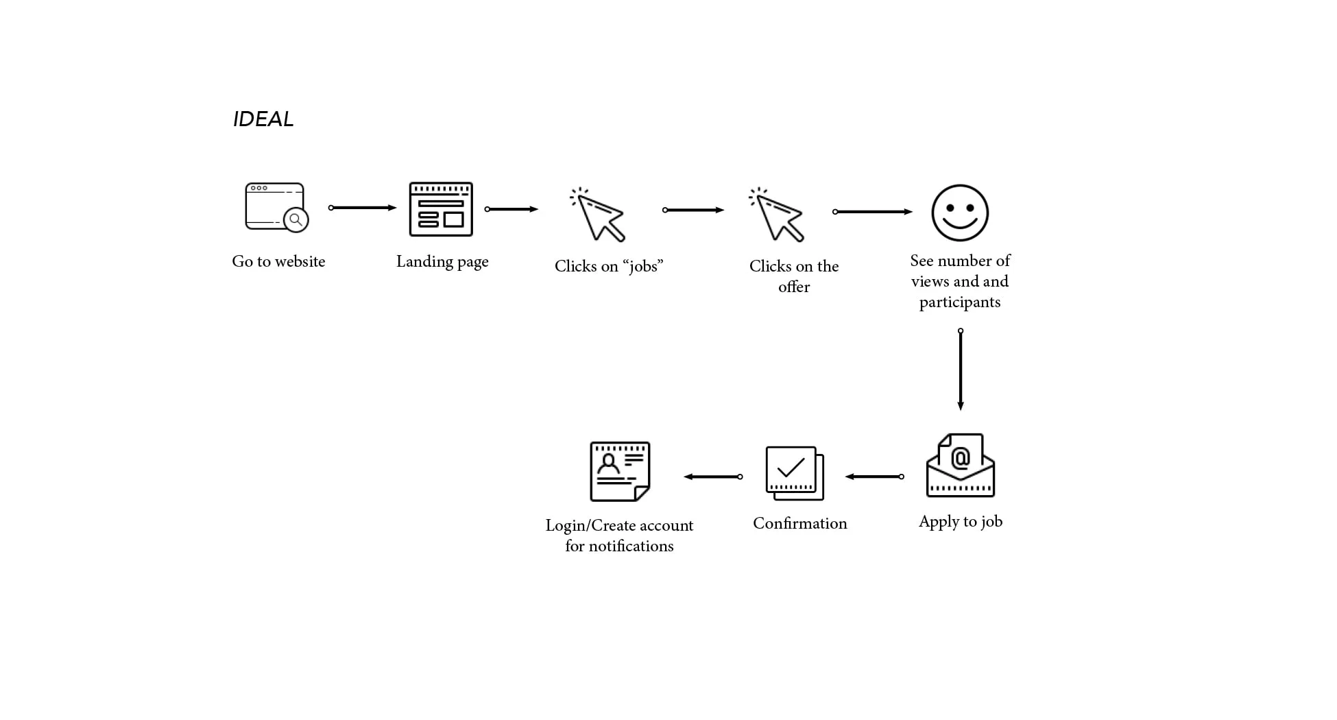
Ideal journey map
New Site Maps
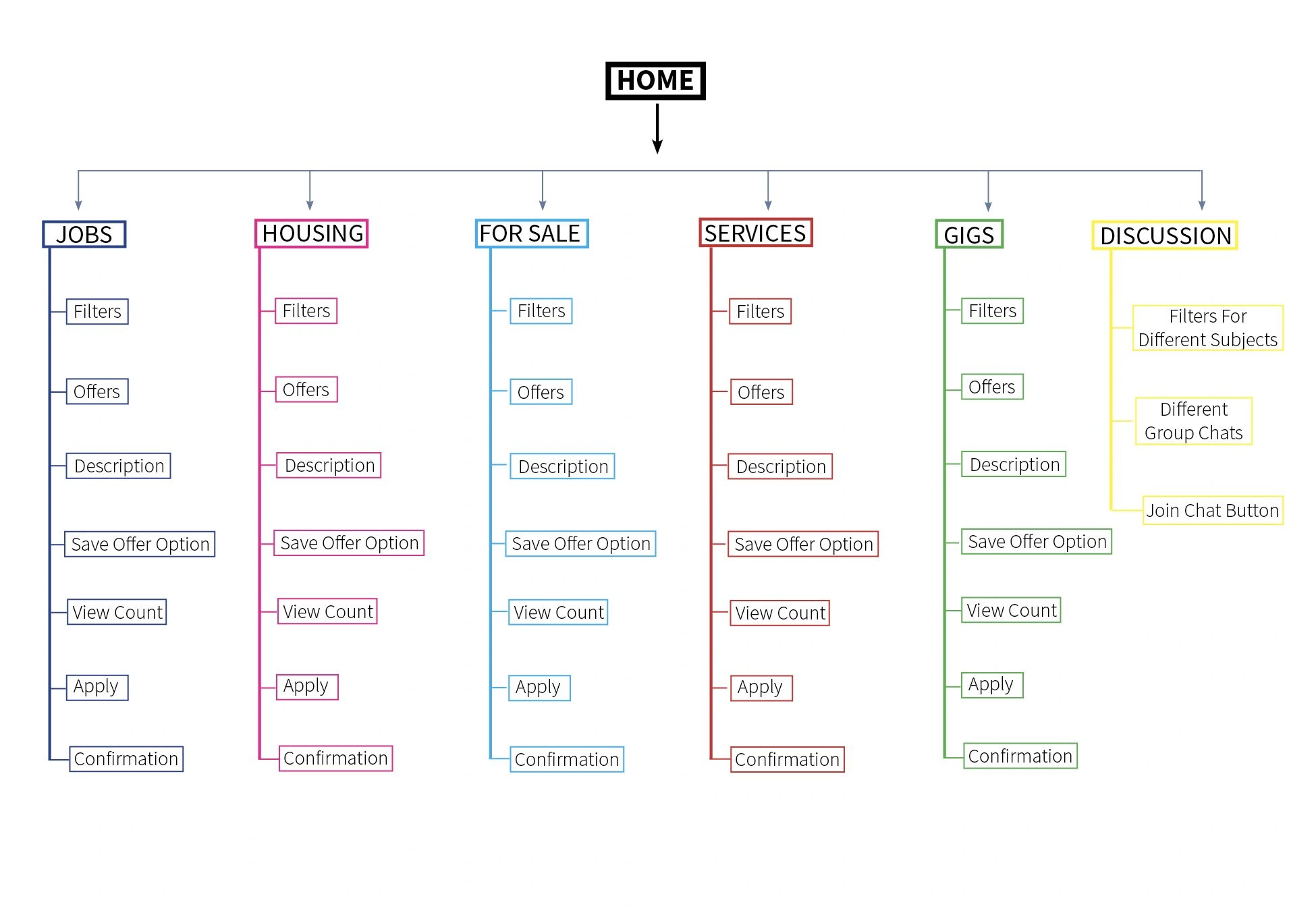
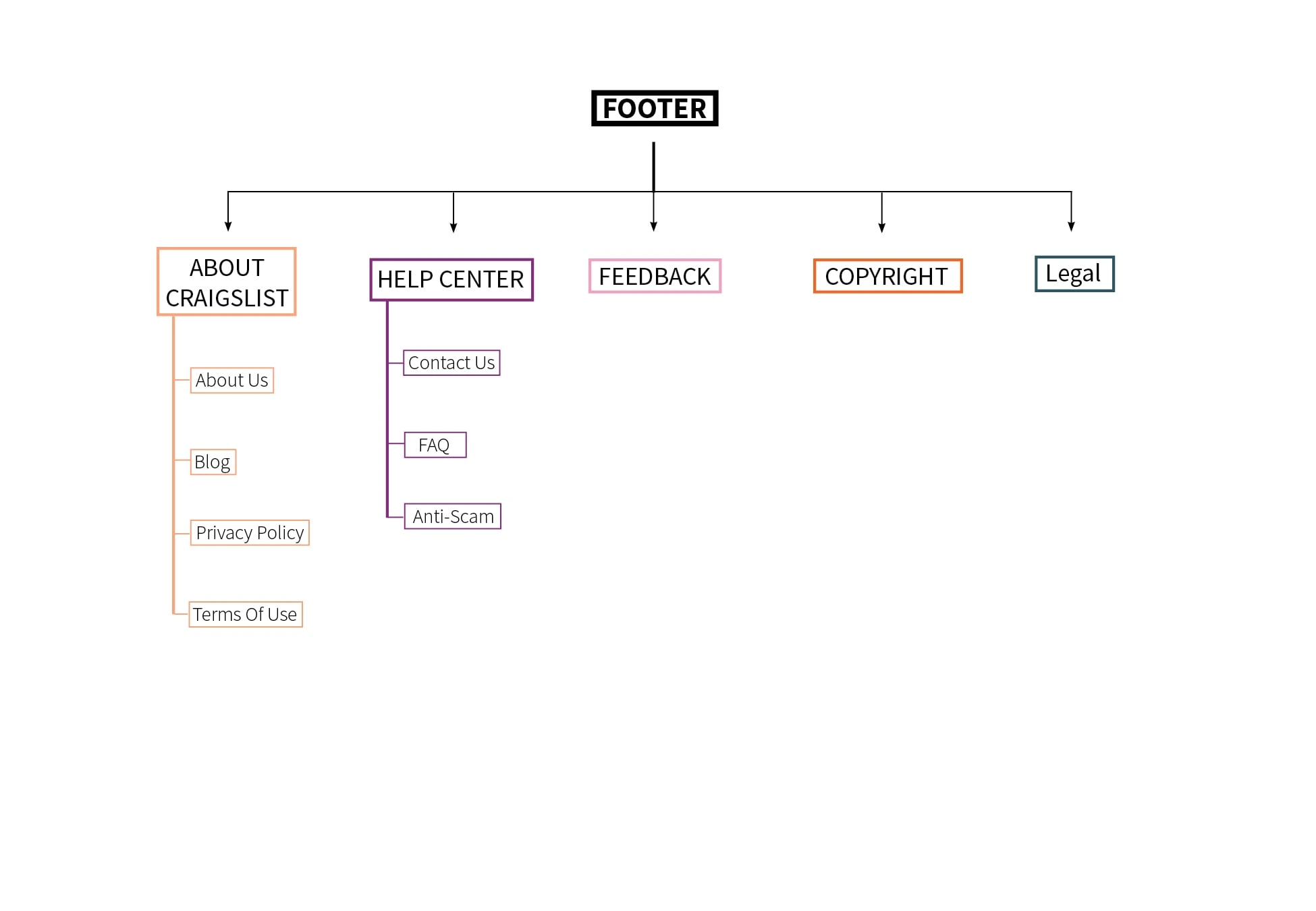
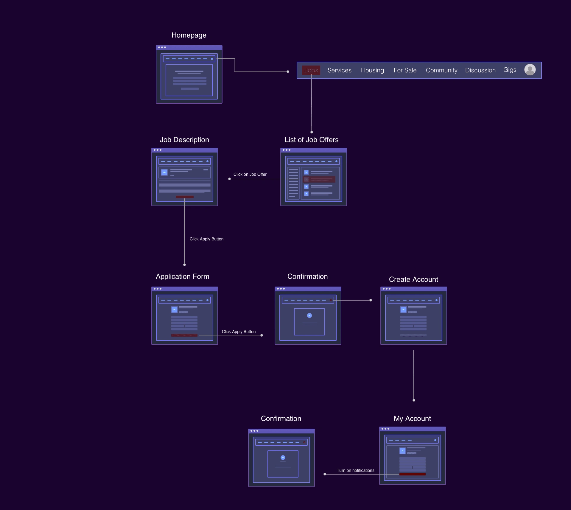
User Flow For Melissa Banks
Low Fidelity Wireframes
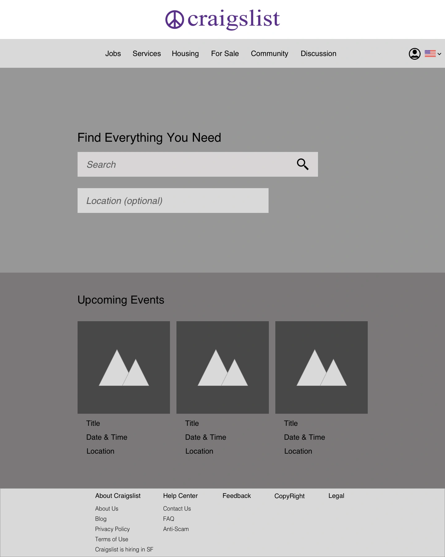
Home Page
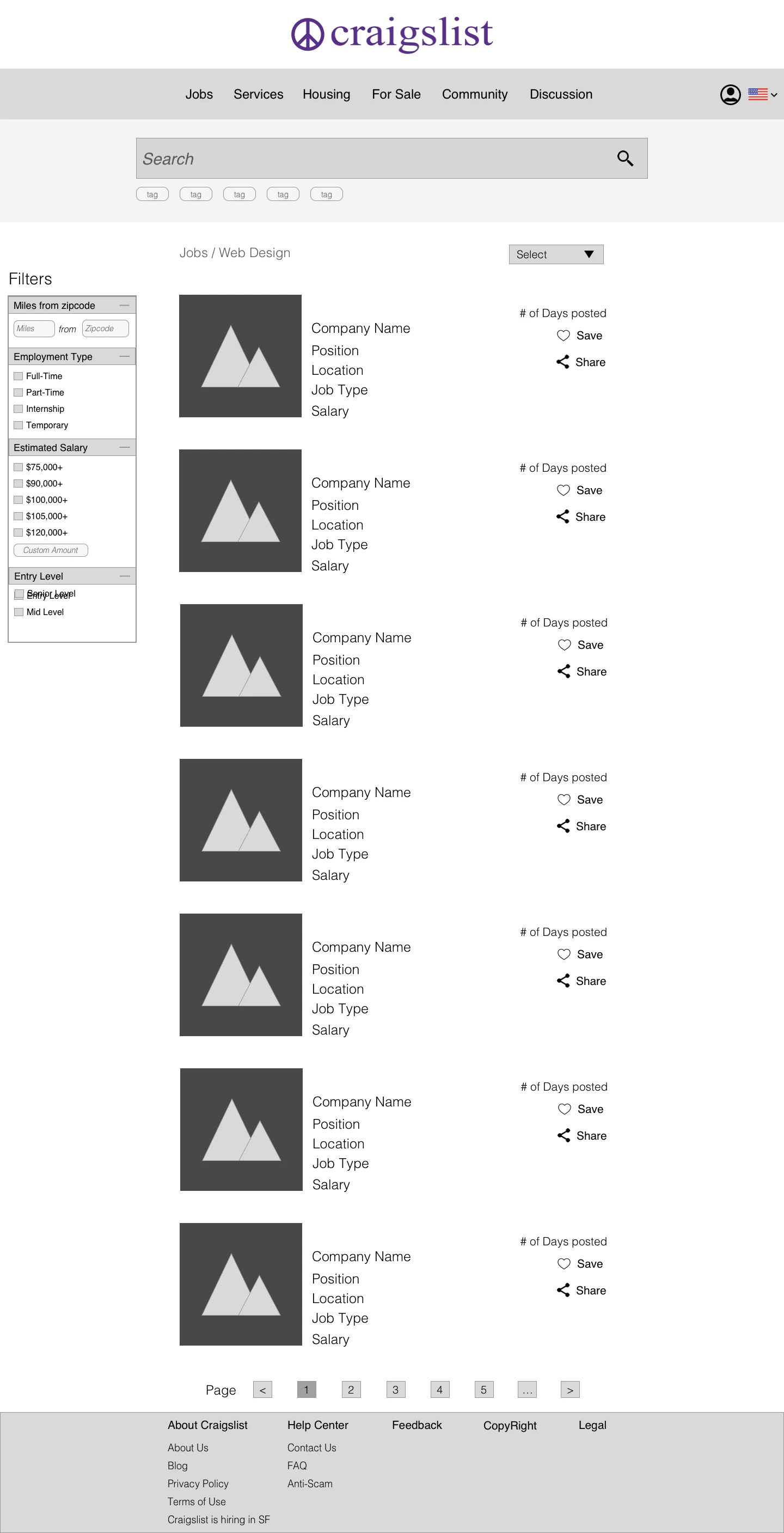
List Of Job Offers
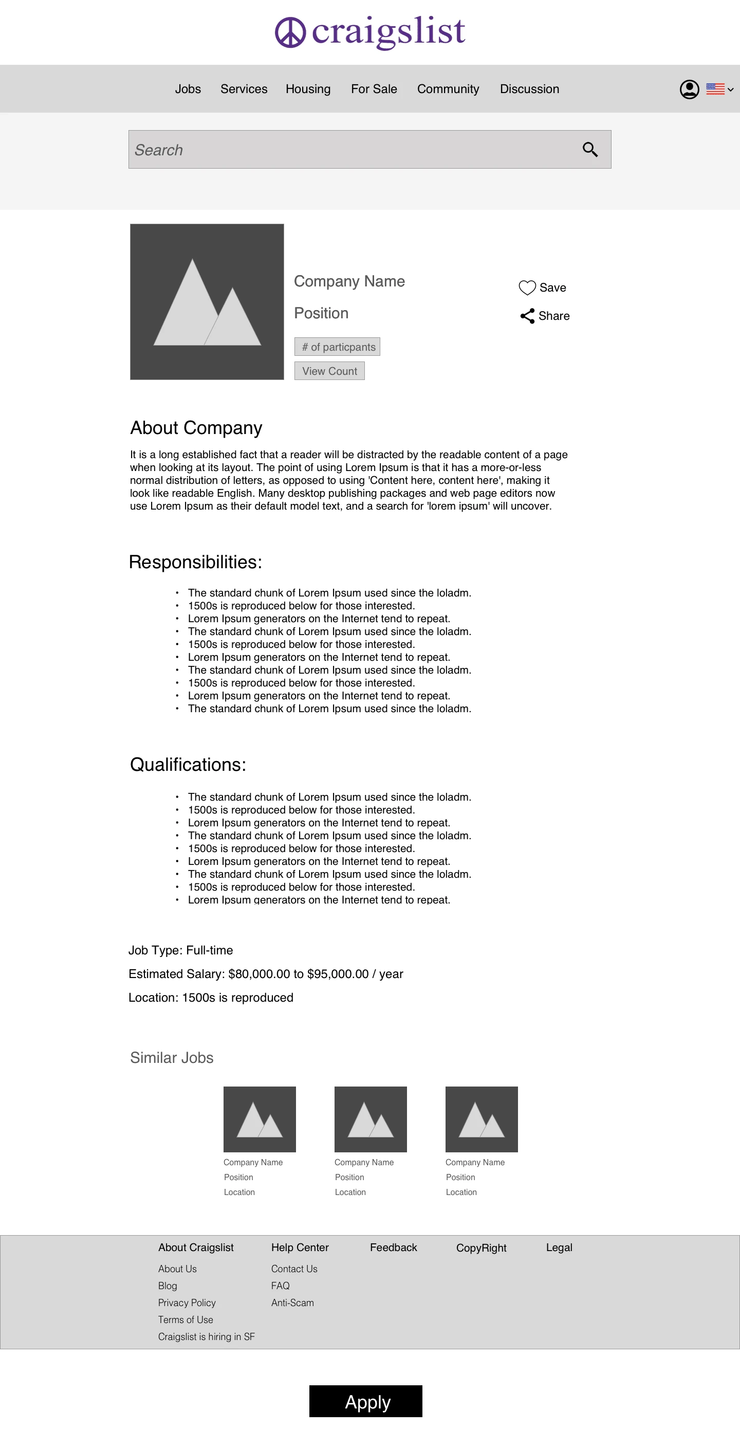
Job Description Page
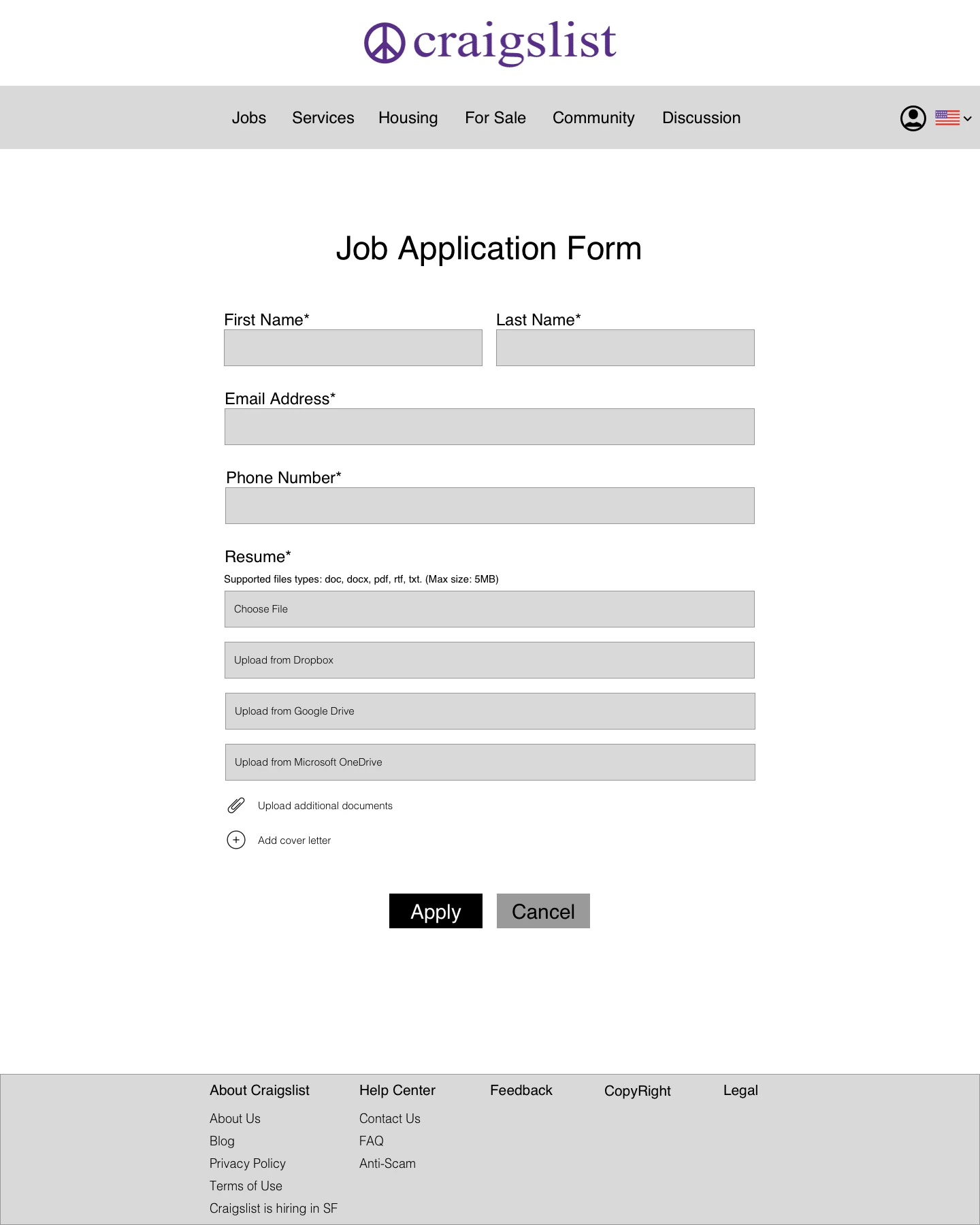
Job Application Form (when users apply)
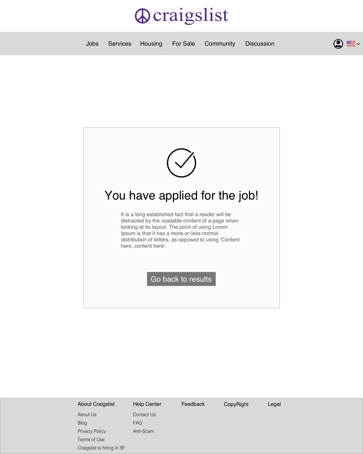
Confirmation After User Applies To Job
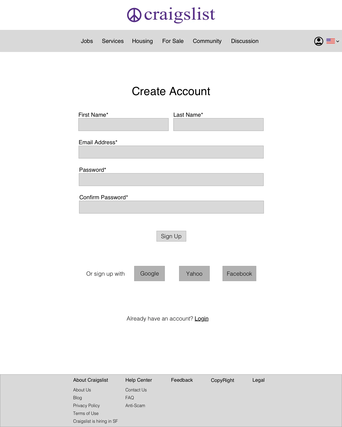
Create Account Page
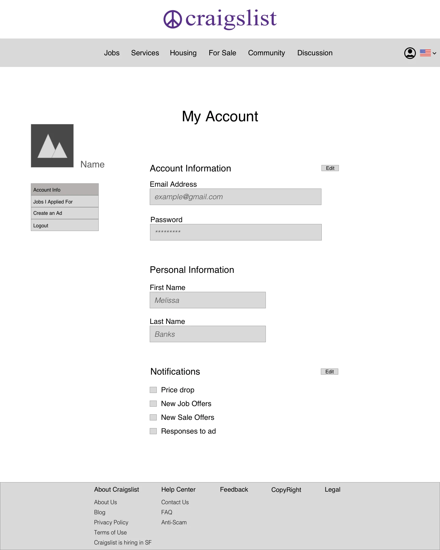
My Account Page
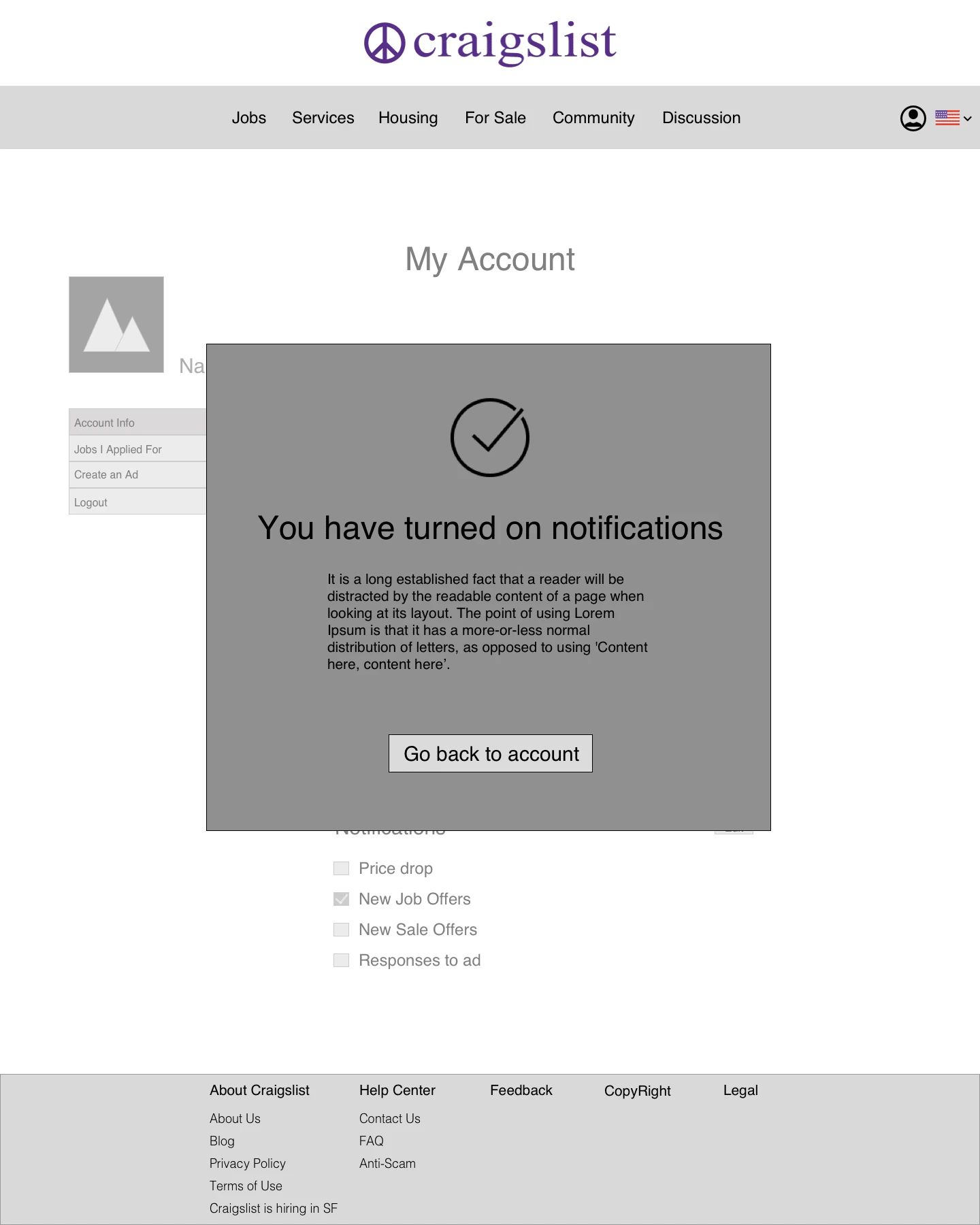
After Turning On Notifications
Library
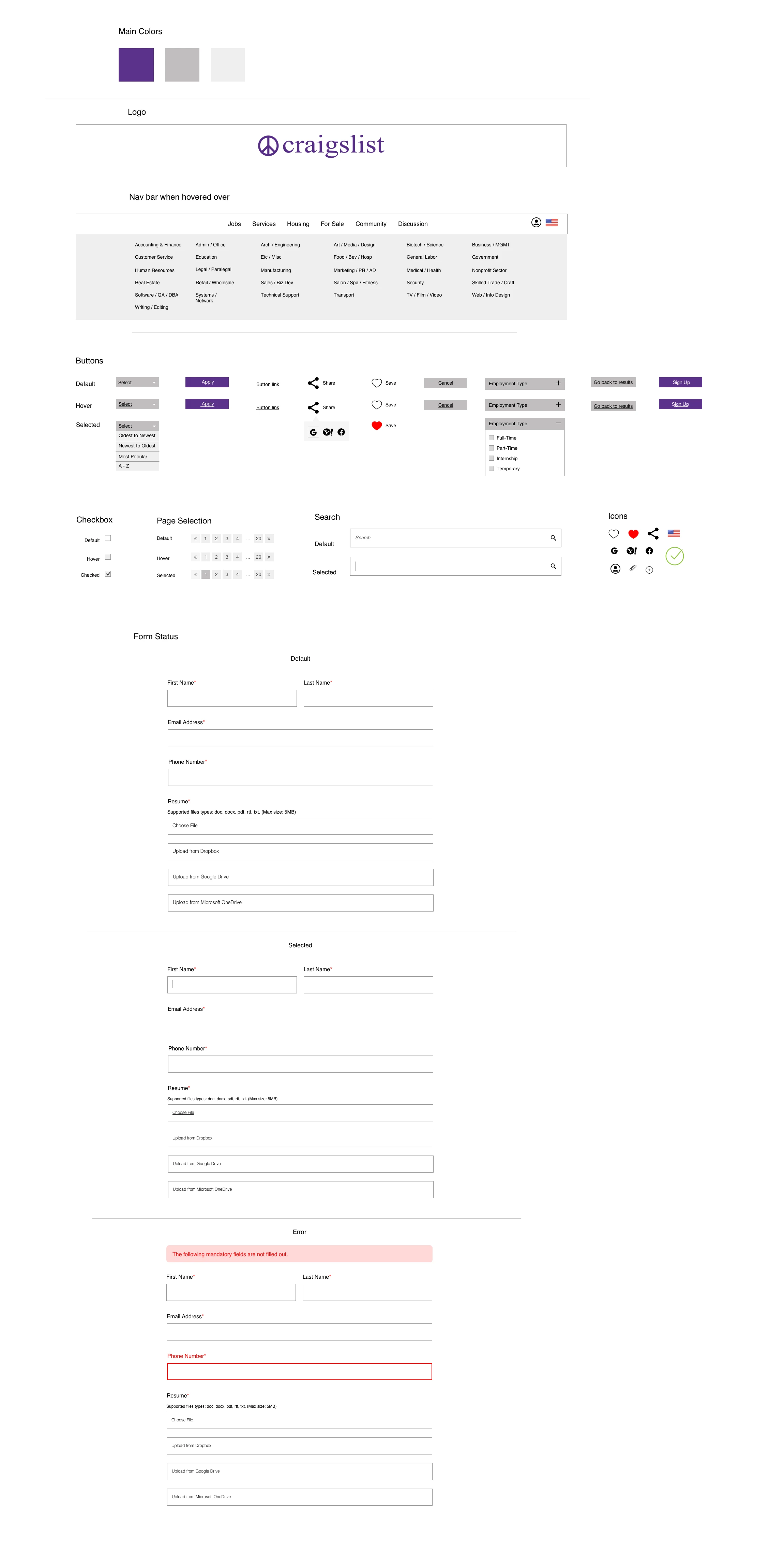
Visual Design For Desktop
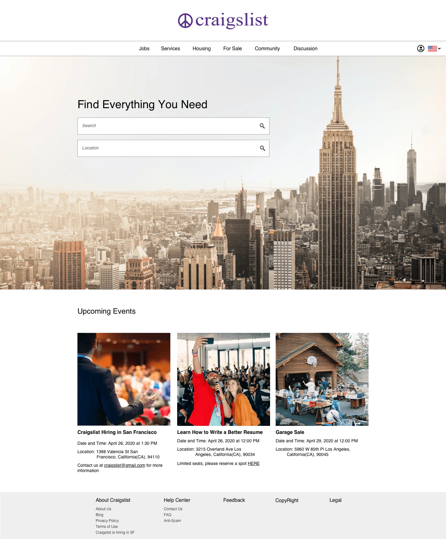
Home Page
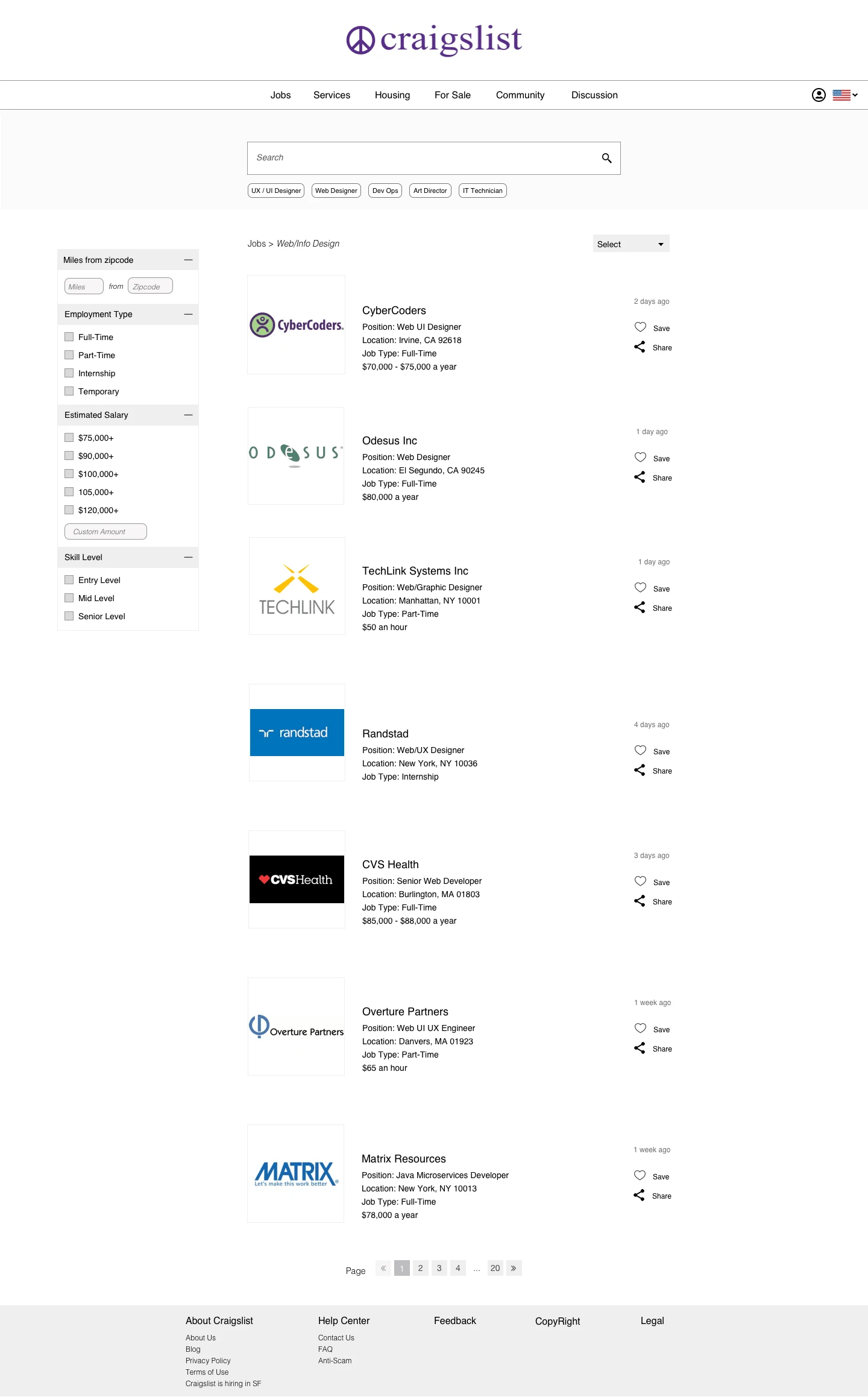
List Of Job Offers
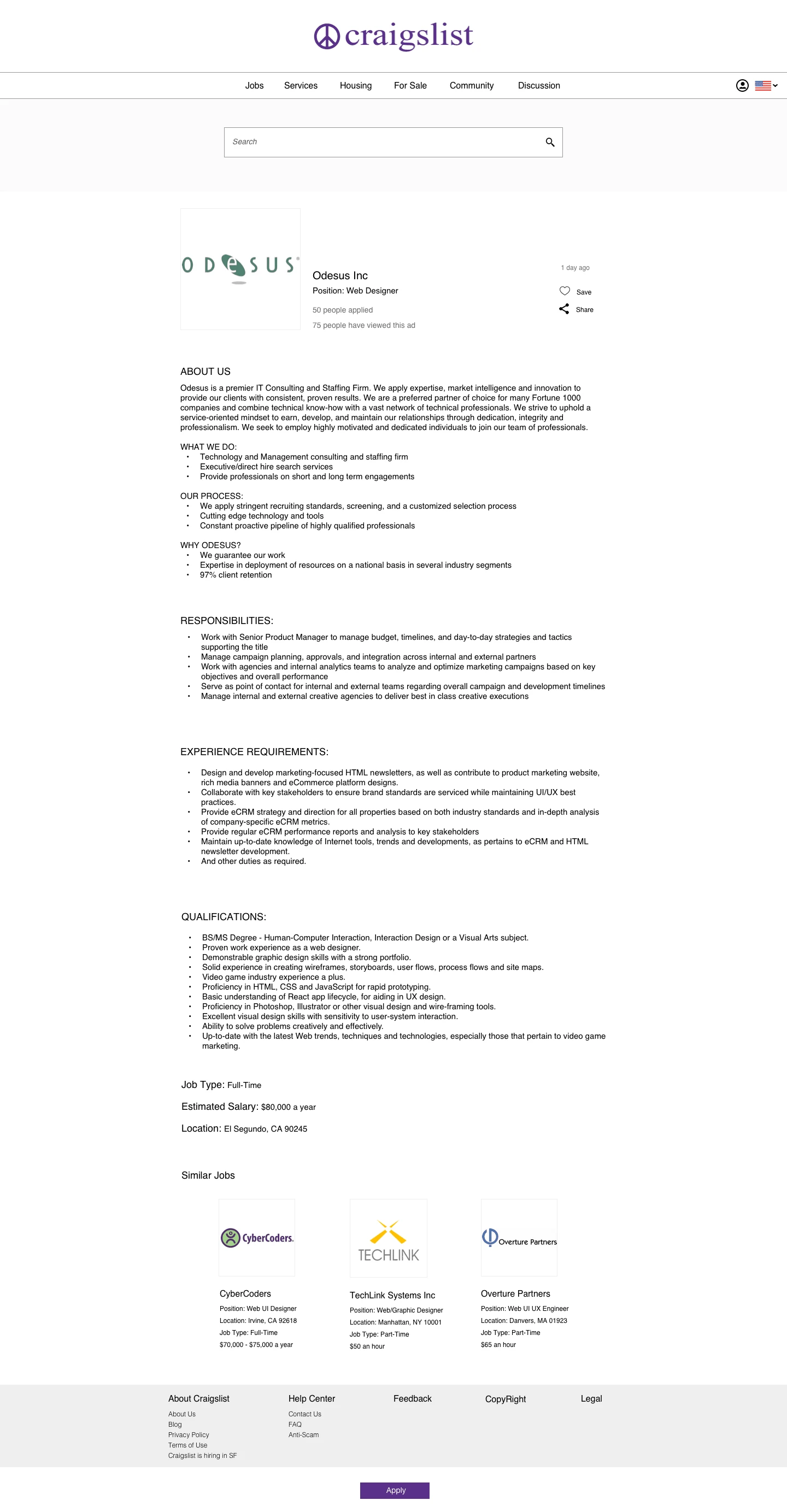
Job Description Page
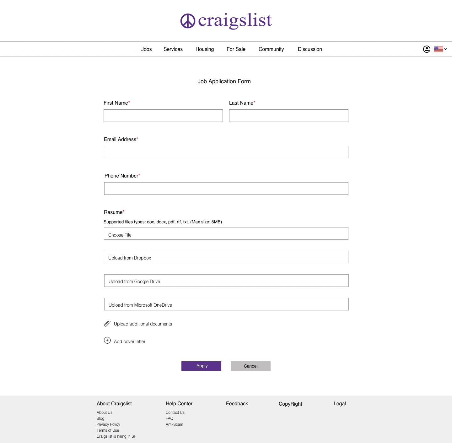
Job Application Form (when users apply)
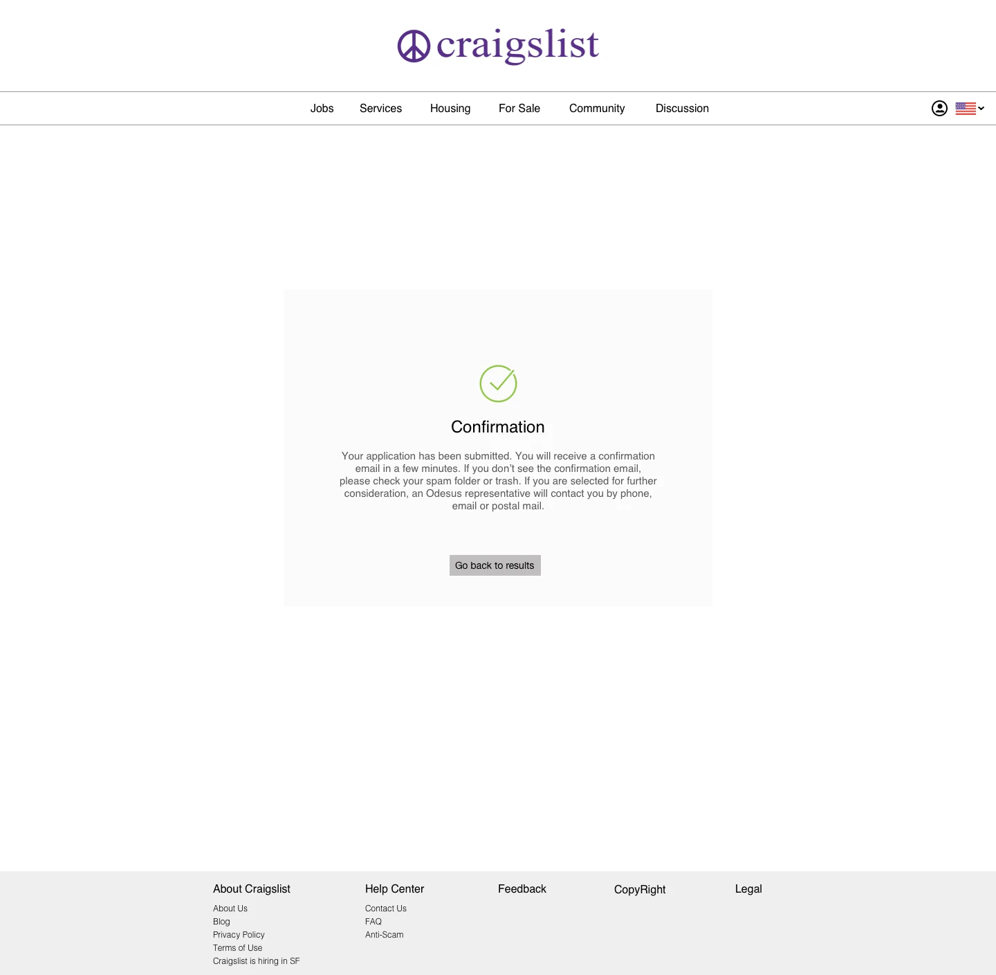
Confirmation After User Applies To Job
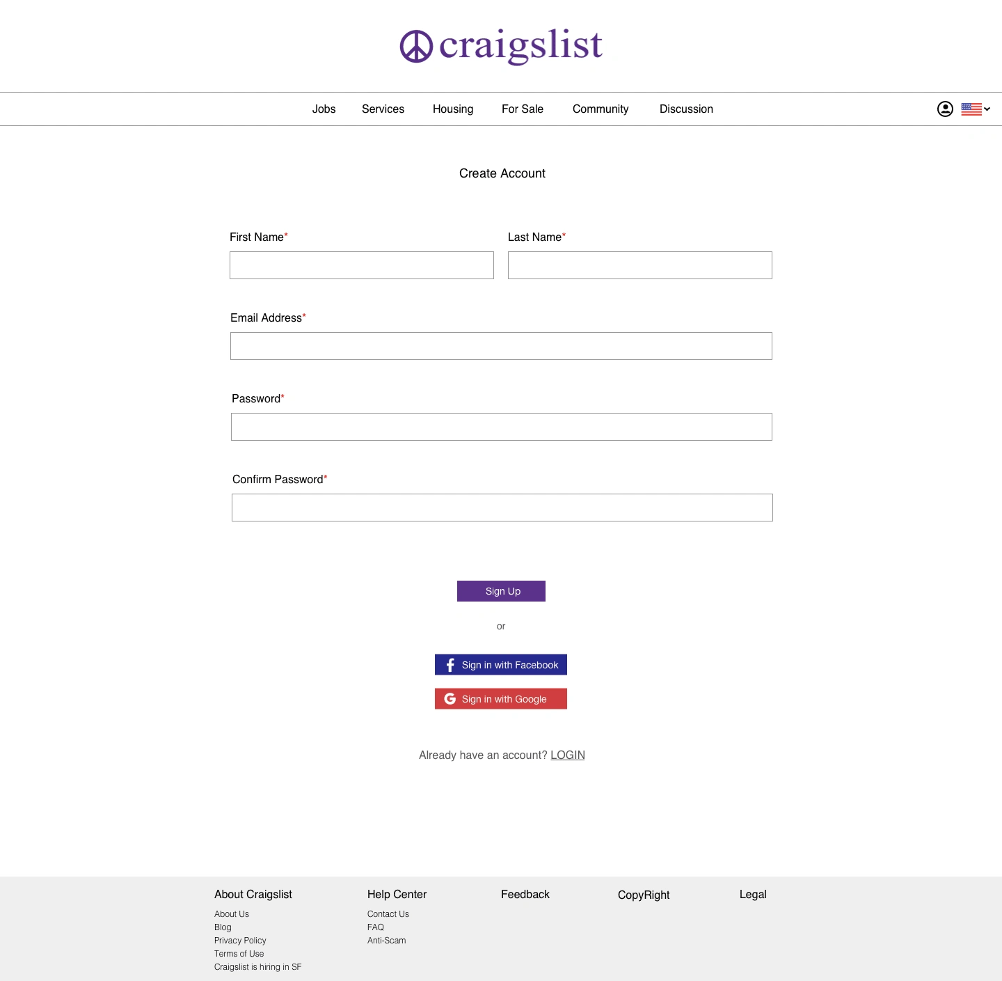
Create Account Page
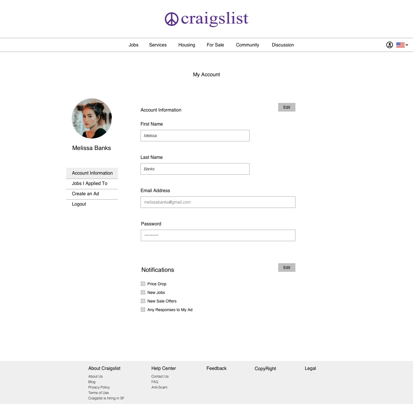
My Account Page
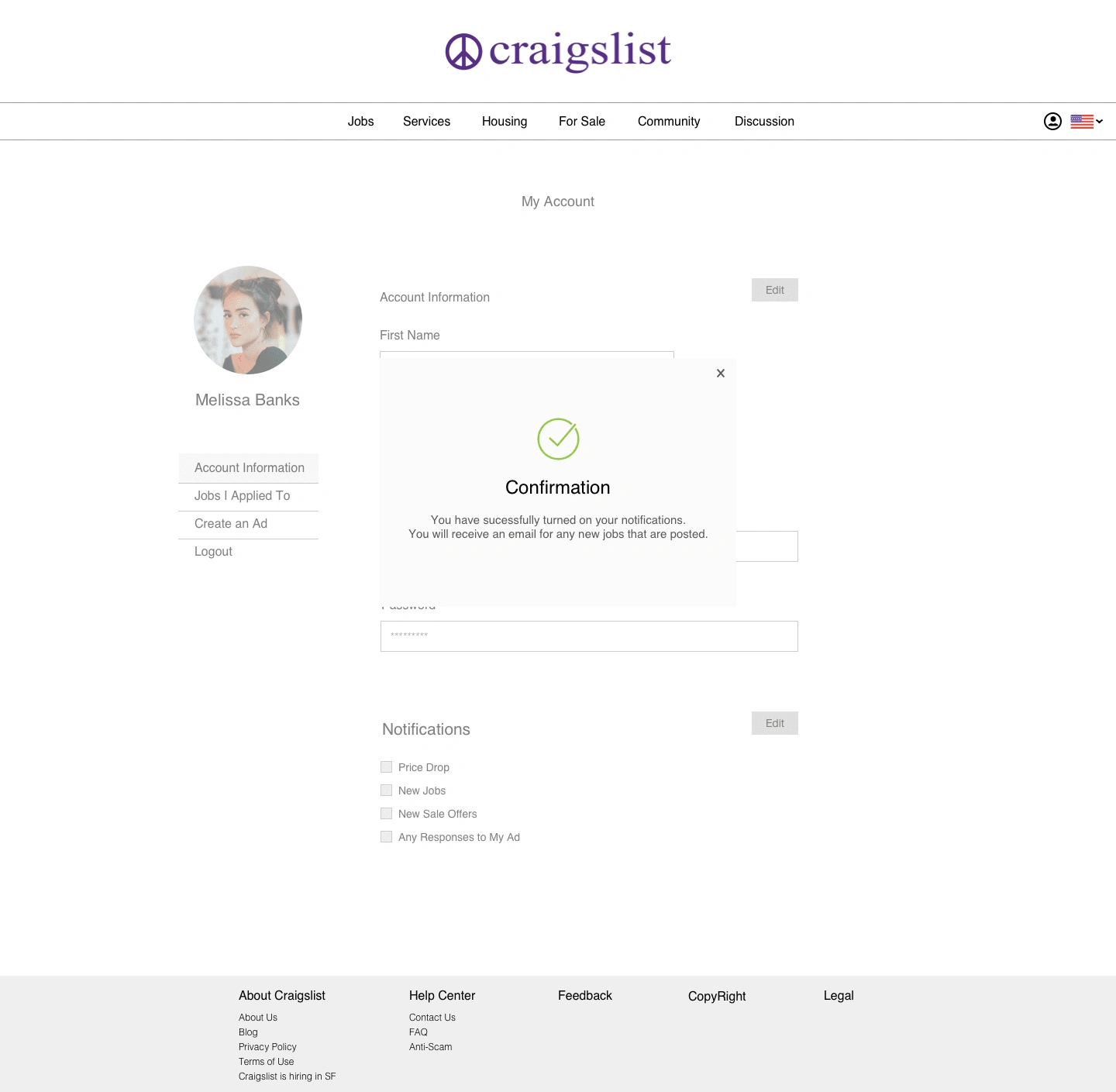
After Turning On Notifications
The Redesign
The redesign of Craigslist is more organized and has more hierarchy, which creates a better experience for users on the site. The webpages have more white space, so the pages aren't cluttered. The call to action buttons are more obvious as well.
You can view the desktop prototype here: https://carmenliu68883.invisionapp.com/console/share/Y315K4YL8B/478024525
Like this project
Posted May 15, 2022
A case study about the Craigslist website that includes a redesign concept to provide a better experience for users
Likes
0
Views
5


