Built with Framer
Dashboard Animation Using Rive
Raymond A.
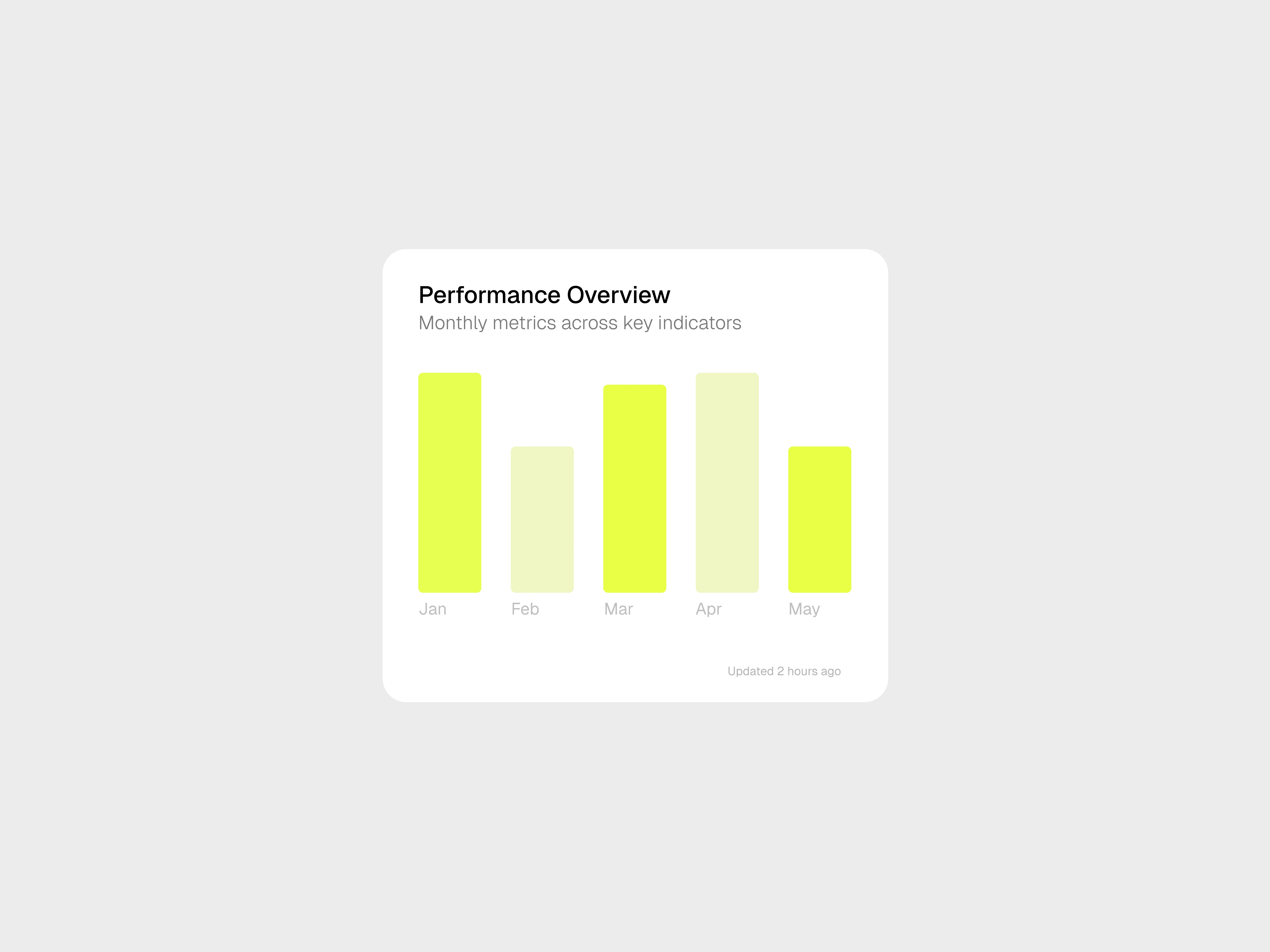
Static dashboard
Breathing Life into a Static Dashboard...
Dashboards are meant to inform. But the original static version of this data dashboard lacked any sense of rhythm or interaction.
The challenge:
How do I introduce motion that enhances clarity without distracting from the data itself?
The Idea:
Instead of overhauling the dashboard visually, I focused on animating the chart itself, using subtle micro-motion to suggest real-time updates and guide attention.
It needed to be clean, minimal, and elegant — just enough movement (Interpolation) to make it feel alive.
Breathe of Animation
Why Rive? Question is...why not.
Rive offered exactly what I needed:
Real-time animation rendering
Intuitive motion control
Lightweight integration for web/digital platforms
This gave me precise control over the timing, easing, and responsiveness of the animation.
The Execution
Using Rive, I built a motion sequence where all chart bars grow fluidly from a common starting point and settle into unique positions.
This animation gave the interface a heartbeat — making the data feel active, alive, and evolving.
Like this project
Posted Aug 11, 2025
Turned a static dashboard metrics into dynamic visual experiences that improve usability and user engagement.
Likes
1
Views
27
Timeline
Aug 4, 2025 - Aug 4, 2025