Built with Framer
Animating Feature Section Integrations with Rive
Raymond A.
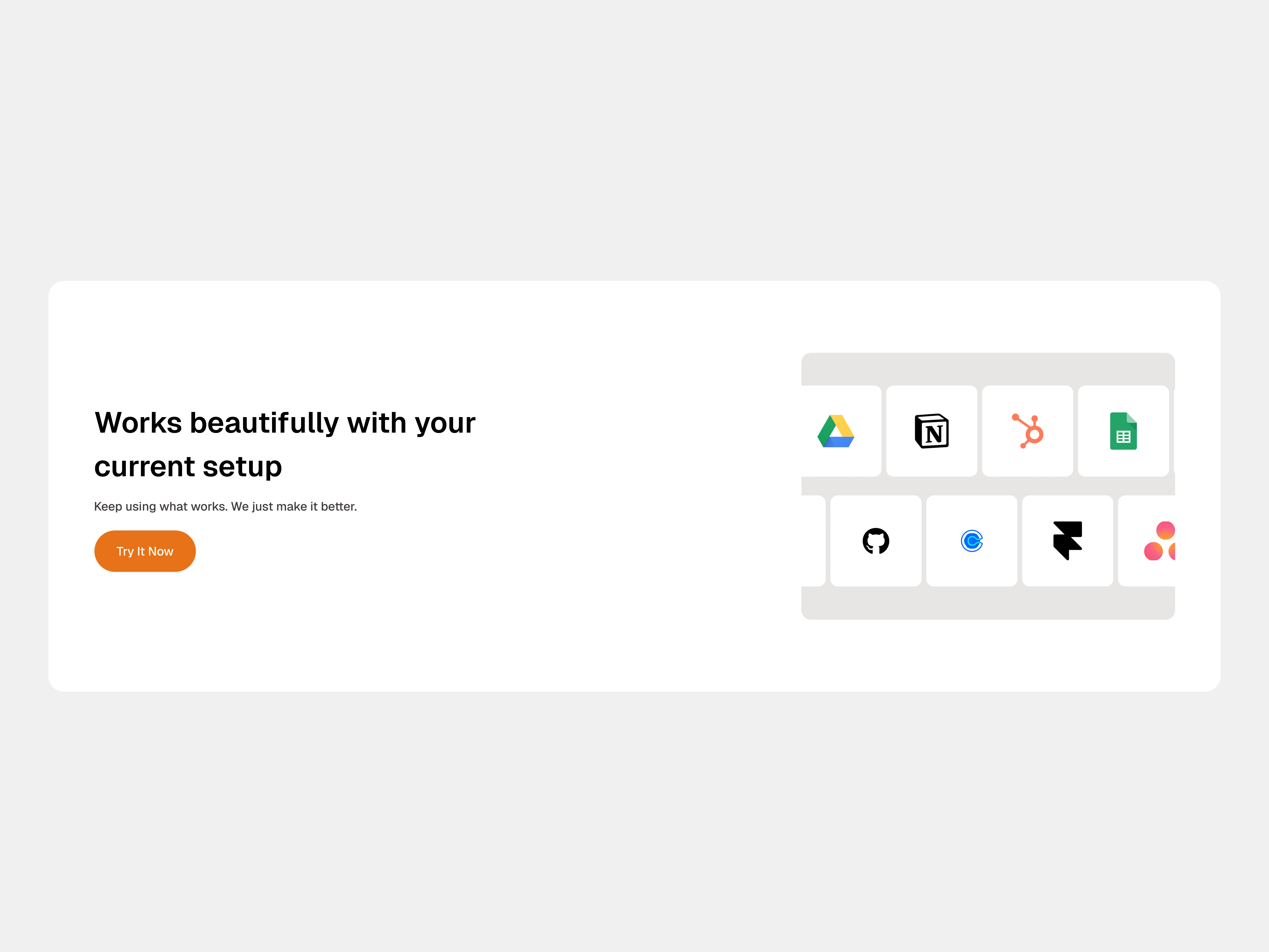
Even after completing the design, the integration card lacked spark — the logos of these powerful tools appeared motionless, offering no sense of flow or interaction.
The challenge: How do I introduce motion that highlights the ecosystem of tools while keeping the design clean and minimal?
Instead of overcomplicating the visuals, I leaned into animation as a way to create a sense of connection. Each tool icon would slide in from a different direction, subtly suggesting movement, compatibility, and flexibility. The motion wasn’t about decoration — it was about storytelling: every tool comes from its own world, yet they all land together seamlessly.
Why Rive?
Question is… why not?
Rive gave me everything I needed to bring this concept to life:
Real-time rendering that feels smooth on web and digital platforms
Precise motion control for orchestrating multiple directions without chaos
Lightweight integration so the animation runs effortlessly without bloating the UI
This let me experiment quickly with timing, easing, and direction until the movement felt natural and balanced.
The Execution
Using Rive State machine, I created a sequence where each integration logo enters with its own unique trajectory before gently settling into the grid. The effect? A lively moment of choreography that feels dynamic yet purposeful.
Instead of a static lineup of logos, the card now breathes. It communicates a message without words: “These tools fit right in with your workflow.”
Like this project
Posted Aug 19, 2025
I used state machine animations to bring the integration card to life, each logo enters from a unique path, adding rhythm, flow, and cohesion.
Likes
1
Views
7
Timeline
May 12, 2025 - May 13, 2025