Phool Patti Atelier: A Truck Art Inspired Maison

Muhammad Salman

Phool Patti Atelier — Pakistan's Truck Art, Made Real
A fictional luxury maison built entirely in Squarespace, giving Pakistan's truck painters the brand their craft has always deserved.
🔗 Live site: https://sphere-vuvuzela-p6nx.squarespace.com/
🔑 Password:
123456Built with: Squarespace 7.1 · Finish Layer (Block Animations, Transforms, Font Uploads, Stacks) · AI-assisted imagery
Role: Concept, brand identity, art direction, UX, build
Custom code: None
The Idea
Drive any highway in Pakistan and you pass a moving art gallery.
Truck drivers here spend months of wages having their vehicles hand-painted — florals, peacocks, mirrorwork, calligraphy, hammered chrome. Nobody asks them to. There is no commercial reason for it. No customer sees it. They do it out of pride.
It is one of the largest living folk art traditions on earth, and it lives on the back of a Bedford truck on the Grand Trunk Road.
I kept circling one thought: if this craft had come out of Europe, it would have a maison by now. A flagship. Numbered editions. A waiting list. Instead it has no brand at all — just thousands of masters working in workshops off the highway, painting objects that will be scrapped in twenty years.
So I built the house it never got.
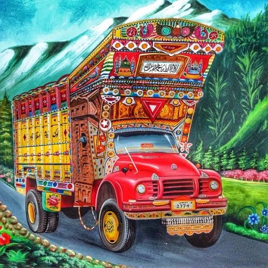
Phool Patti Atelier — named for the phool patti (flower-and-petal) motif style at the heart of the tradition — is a fictional luxury house for hand-painted heirlooms. Mirrors, cabinets, trunks. The same hands, the same brushes, the same motifs. A different object.
A website makes it real.
The Brand
Tagline: Painted by hand. Carried for a million miles.
Positioning: A maison, not a souvenir shop. Numbered pieces, named artisans, commissioned work.
Voice: Reverent and plain. Short sentences. The artisans are described as masters, never as folklore or local colour. Nothing "exotic," nothing touristy.
The decision the whole brand rests on
I refused to desaturate it.
The default move when presenting South Asian craft to a global audience is to mute it — strip the palette back to beige and clay, add whitespace, call it elevated. That instinct quietly agrees that this craft needs permission to be luxury.
It doesn't.
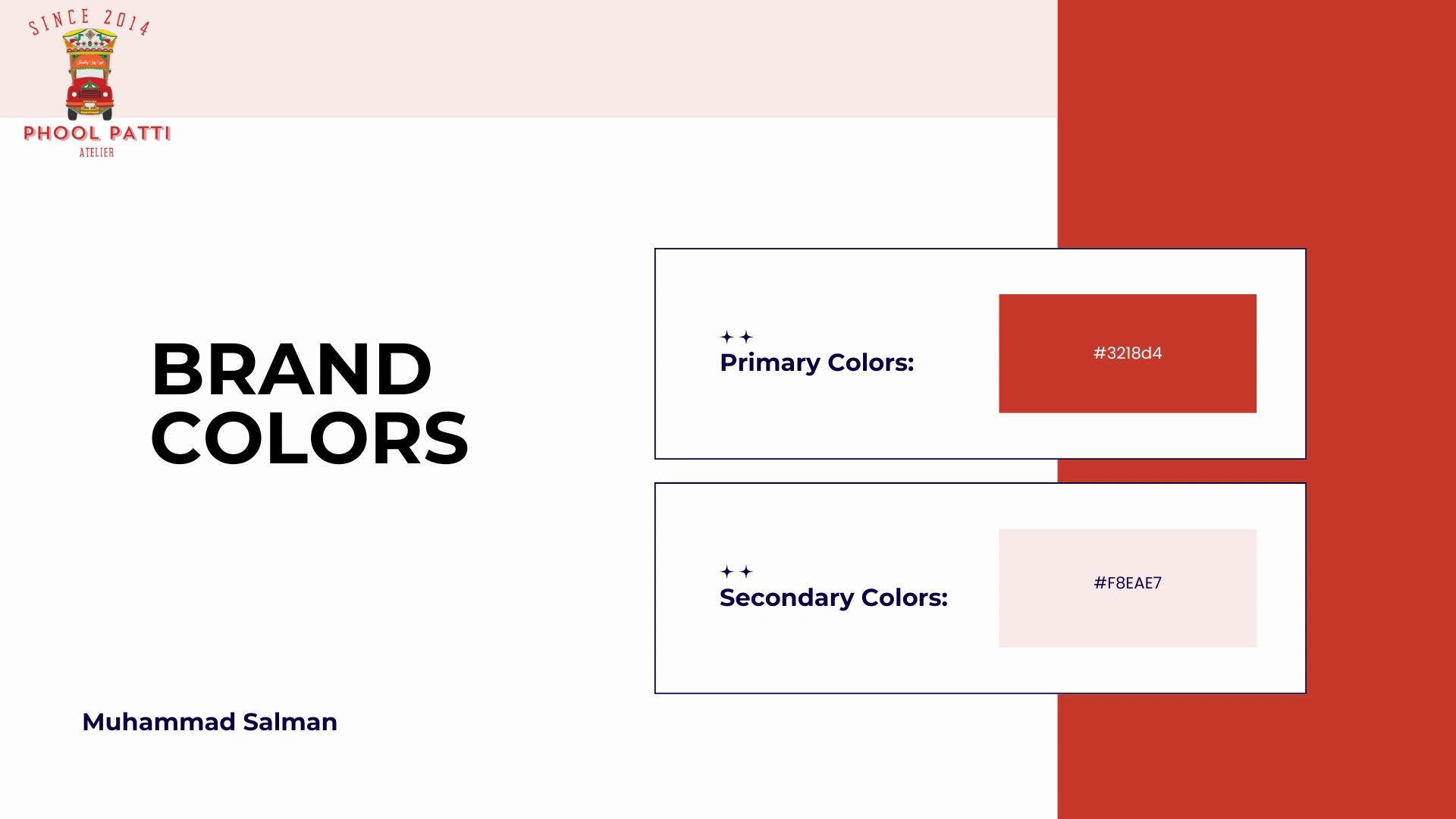
So every colour came straight off the trucks, at full saturation, and the layout does the work of making it feel like a maison instead. Maximalist colour, disciplined structure. That tension is the entire brand.
The Design System
System rule: one saturated colour owns each section, full-bleed. No section blends two brights. That single constraint is what keeps maximalism from becoming noise.
Color Palette
Typography
Typography
Three type rules:
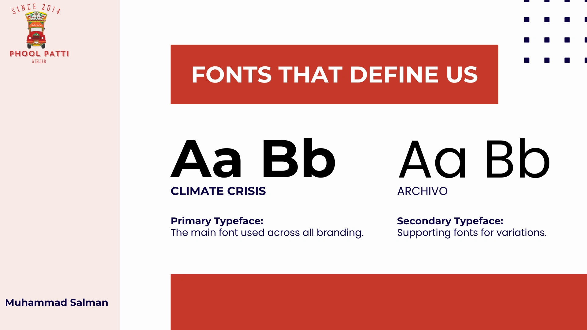
Scale contrast is extreme by design — 120px display against 14px labels. Truck art does exactly this: an enormous painted peacock beside hand-lettered text an inch tall.
One typeface family carries the whole site. With this much colour, a second display face would collapse it. The restraint lives in the type, not the palette.
A high-contrast serif was non-negotiable — the thick-to-thin stroke of the letterforms echoes the loaded brushstroke in the artwork itself. Squarespace's built-in library didn't have the editorial weight this argument needed, which is why I uploaded one.
Layout & spacing
Full-bleed colour sections, edge to edge. No containers, no white gutters. Each section is a painted panel.
Generous vertical padding, narrow centred content. Space around type is what makes saturated colour read as premium rather than cheap.
Products sit on a strict 3-column grid. Everything else deliberately breaks alignment.
Motion
Scroll-triggered rise and fade on section entry — content arrives layer by layer, the way a panel gets painted.
Infinite horizontal marquee, slow and constant, referencing a moving vehicle.
Sticker elements rotated 2–8° off-axis, each angle set by eye rather than by increment.
Design Decisions, Section by Section
1. Opening on hands, not product
The hero is a close-up of a master mid-brushstroke, shot in a quiet gallery space. Craft before commerce. You meet the maker before you're sold anything — which is the entire premise of the brand compressed into one frame.
2. The marquee as truck lettering
The scrolling PHOOL PATTI ATELIER band directly references the painted name panels that run across a truck's body. It stamps identity across the page without a single navigation element, and the constant horizontal drift keeps a static page feeling like it's in motion.
3. A gallery on gold
The collection sits on a full mustard field: Peacock Heritage Mirror ($1,280), Artisan Heritage Cabinet ($2,450), Caravan Heirloom Trunk ($1,850). Priced like heirlooms, because that's the argument the whole site is making.
Placing product photography on a saturated ground is a risk most luxury sites won't take. Here it's the point — the objects have to survive colour, because they were born in it.
4. The teal manifesto
Then the site stops behaving. Oversized serif type, sticker trucks in cut-out badges, deliberate asymmetry.
This section is the truck: loud, proud, joyful. Restraint above, celebration below. Placing it directly after the disciplined product grid means the shift lands as a decision rather than an inconsistency.
5. The scalloped border
The dark scalloped band is lifted from the painted mudflap trims and chappa detailing found along truck undersides. A specific citation, not a generic decorative divider — and the kind of detail that tells someone who knows the tradition that this was made by someone who knows it too.
6. Split footer
Black and ivory, hard-divided, with a single sticker truck and one instruction: SHOP NOW. The site ends on a mark, not a menu.
How I Used Finish Layer
Block Animations
Sections rise and fade in on scroll, so the page reveals itself the way a panel gets painted — one layer at a time. The motion is slow and consistent across every section, which stops it reading as an effect and starts it reading as pace.
Transforms
This is the feature that made the site. Every sticker truck and badge is rotated and offset by hand, off-grid. Truck art is never symmetrical — it's applied by eye, by a person, in a workshop. Transforms let me reproduce that imprecision deliberately, which is what makes the maximalist sections feel hand-placed instead of templated.
Process
Research and framing. Started from the tradition itself rather than from a layout — reading the motif vocabulary (phool patti, peacocks, mirrorwork, chappa trims) so that every decorative element on the site could be traced to something real.
The reframe. Landed on the single question that unlocked the project: what if these painters had a maison? Everything downstream — pricing, product naming, tone — follows from taking that question seriously.
Palette and type first. Locked the five colours and the type scale before touching a section, so the build was assembly rather than improvisation.
Imagery. Generated product and detail imagery with a single fixed prompt template — same lighting, same background, same depth of field — so the collection reads as curated rather than assembled.
Build. Structured the homepage as six full-bleed panels, then layered Finish Layer motion and transforms on top.
Mobile pass. Rechecked every section at phone width; Stacks did most of the heavy lifting holding layered compositions together.
What Was Hard
Resisting the urge to calm it down. Every instinct trained by minimalist portfolio design said tone the colour back. I had to keep reminding myself that muting it would have quietly conceded the brand's central point.
Making chaos legible. The manifesto section needed to feel unruly without becoming unreadable. The rule I settled on — stickers may touch letters but never cover them — is what keeps it on the right side of that line.
Restraint in type while maximising colour. The temptation with a bold palette is to make the typography loud too. Holding to one family, with contrast expressed only through scale, is what stops the page from tipping into pastiche.
Credits
Concept, identity, art direction, UX and build: Muhammad Salman
Built on Squarespace 7.1 with Finish Layer. No custom code.
Imagery: AI-assisted, art-directed to a fixed photographic template.
Phool Patti Atelier is a fictional brand created for the Squarespace Make It Real Challenge, in tribute to the truck artists of Pakistan.
Like this project
Posted Jul 22, 2026
Built a fictional luxury maison website for Pakistan's truck art using Squarespace.
Likes
6
Views
13