Designing a Seamless Employer Portal for Collective Health

Stas Udotov


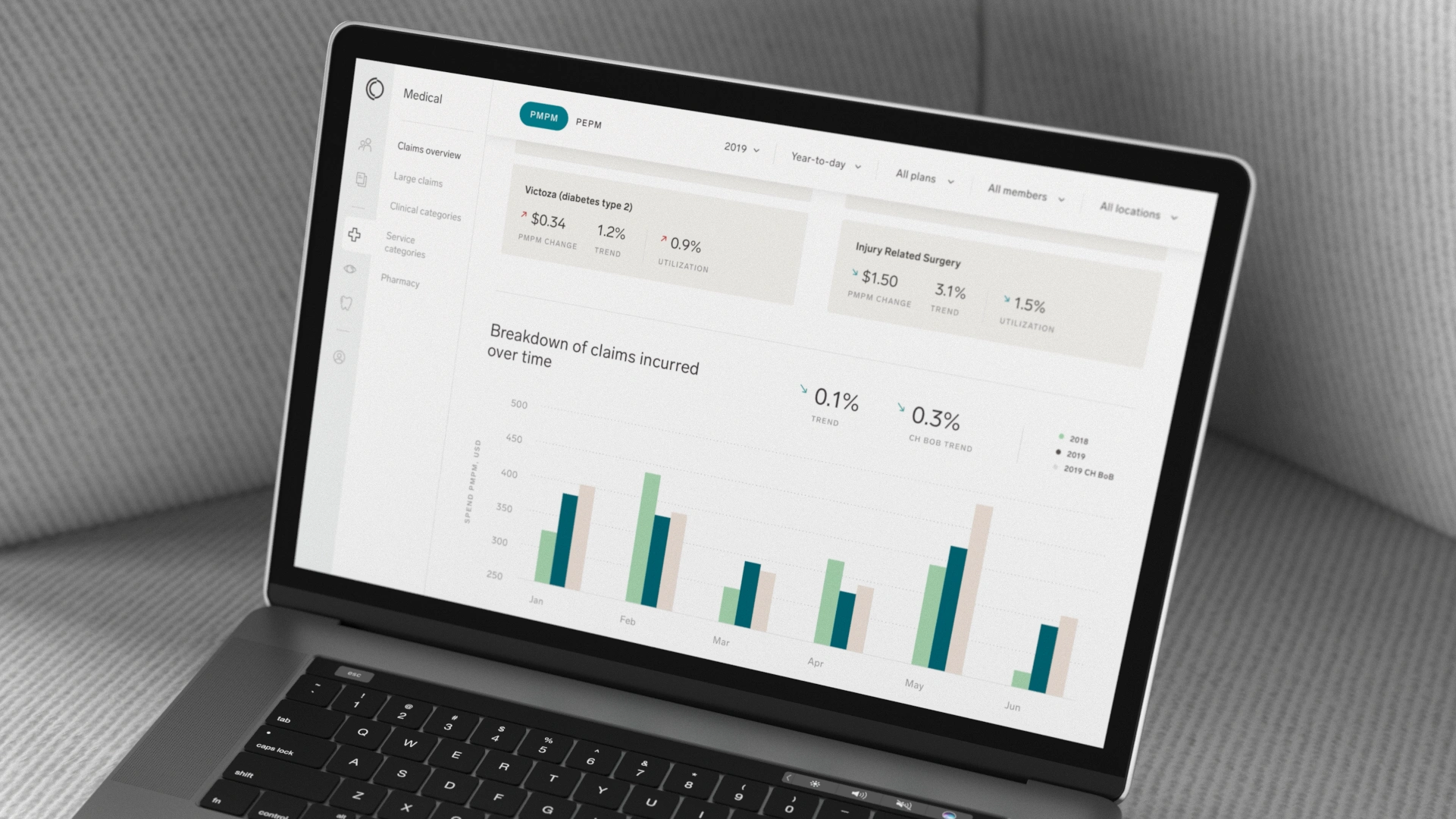
Collective Health Employer Portal: Making Complex Healthcare Data Actionable
Collective Health provides an integrated solution that helps self-funded employers manage health plans, control costs, and support employee care. Its platform brings together flexible provider networks, benefits programs, employee engagement, administration, and healthcare data within one connected system.
Collective Health already had an experienced internal UX/UI design team. As the company developed a new Employer Portal, it engaged Dworkz to provide additional design expertise and help create a seamless experience across a broad set of interconnected workflows.
The portal needed to support claims adjudication, plan administration, financial operations, member support, integrated analytics, and everyday benefits management. Dworkz collaborated closely with Collective Health's designers to shape an interface that made this complexity easier to navigate and made critical healthcare information easier to understand.
Services: UX design, UI design, information architecture, interaction design, dashboard design, and data visualization
Product: Employer healthcare administration and analytics portal
Primary users: Benefits leaders, HR teams, healthcare consultants, and administrators at self-funded organizations
The challenge
Managing a self-funded health plan requires employers to make decisions across many connected areas. They need visibility into claims, utilization, financial performance, benefits operations, program engagement, and member interactions. The information is both operationally complex and financially significant.
The Employer Portal had to bring these data sources and workflows together without overwhelming users. It needed to work for people with different levels of healthcare expertise, different responsibilities, and different expectations of the data.
The design challenge included several competing needs:
Provide a clear path through a product with many interconnected functions.
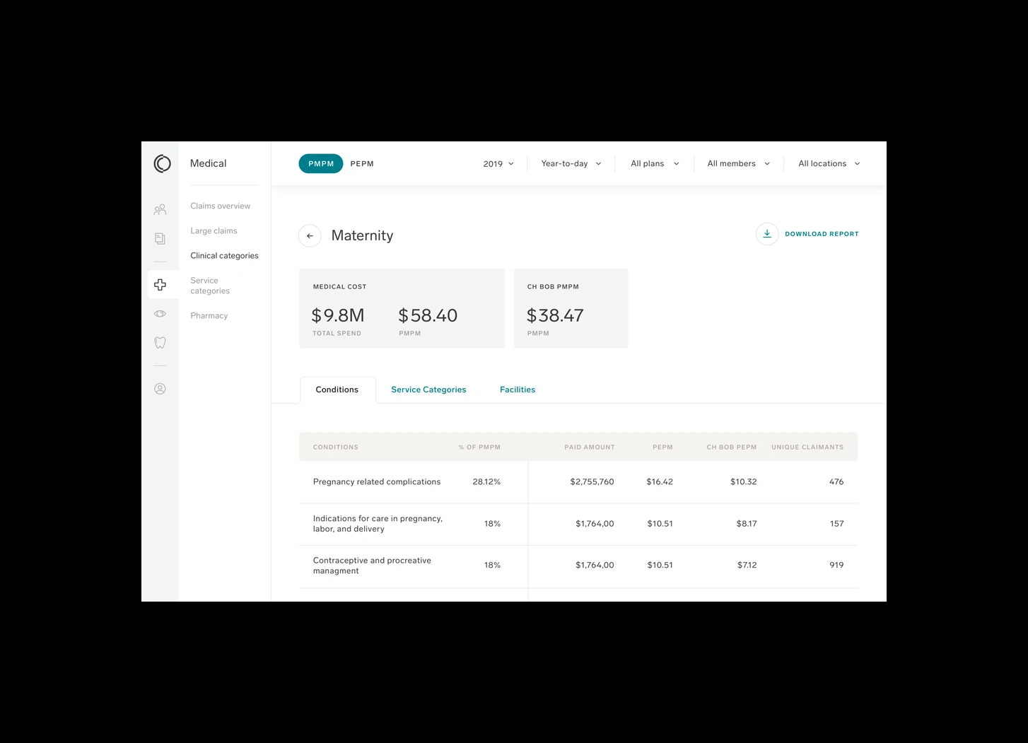
Help users understand what data they were viewing, how it had been filtered, and which period it represented.
Make complex comparisons possible without allowing controls to dominate the interface.
Preserve sufficient screen space for dense reports and visualizations.
Serve users ranging from newcomers to experienced, data-driven benefits leaders.
Connect operational data with insights and practical next steps.
Extend Collective Health's established product experience while working collaboratively with its internal design team.
The goal was not simply to place healthcare information into a dashboard. It was to create an environment where employers and consultants could understand performance, investigate changes, and manage their plans with greater confidence.
Building on existing user research
Before Dworkz joined the project, Collective Health's design team had conducted user research and identified three distinct audience groups:
Newcomers to self-funding, who needed greater context and guidance as they learned a complex healthcare model.
Multitasking catalysts, who managed numerous responsibilities and needed efficient access to everyday operations.
Data-driven leaders, who expected sophisticated analytics, comparisons, and evidence for strategic decisions.
Our first step was to understand these personas in depth—their backgrounds, responsibilities, challenges, goals, and expectations. This allowed us to build on Collective Health's research rather than repeat it, and to translate established insights into practical interface decisions.
The personas made it clear that the portal could not be optimized for only one level of expertise. It needed to make complex information approachable for less experienced users while retaining the depth and flexibility required by advanced users.
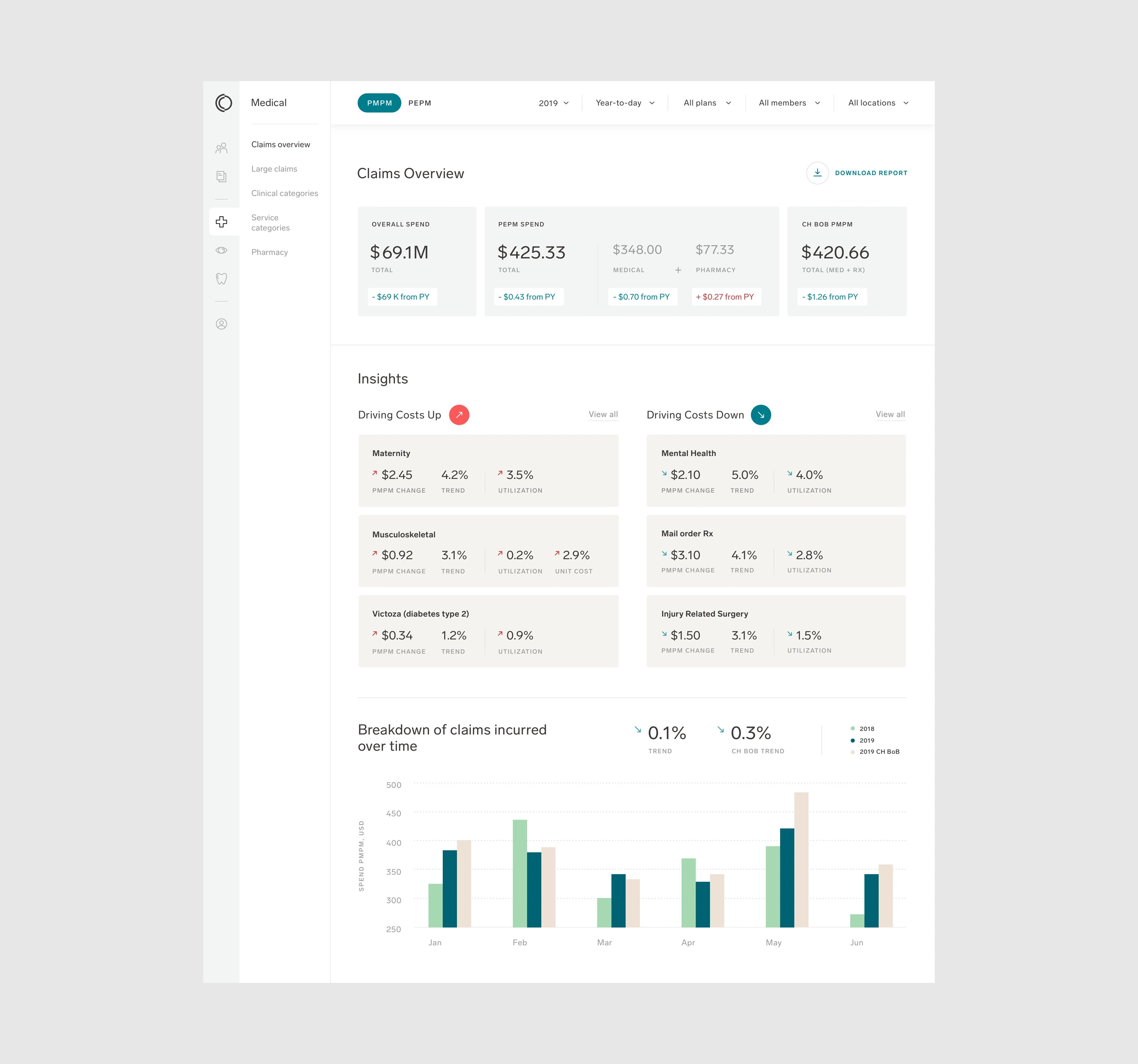
The design approach
1. Creating a clear navigation framework
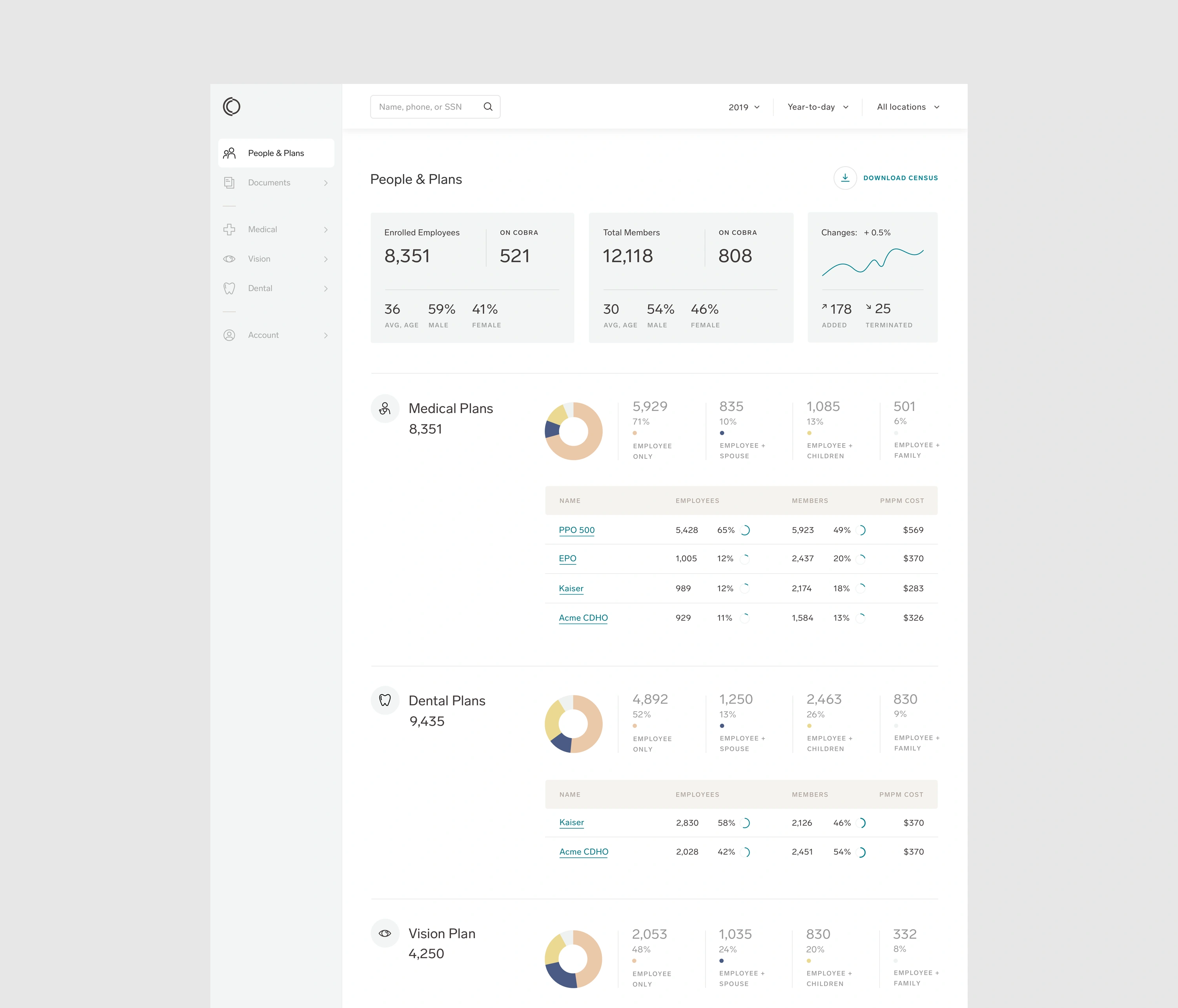
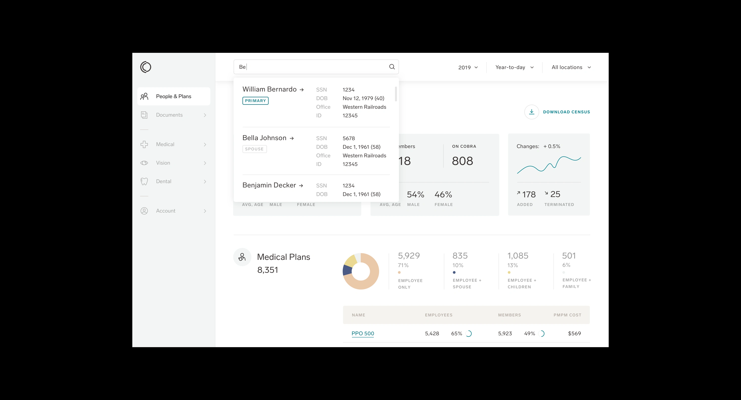
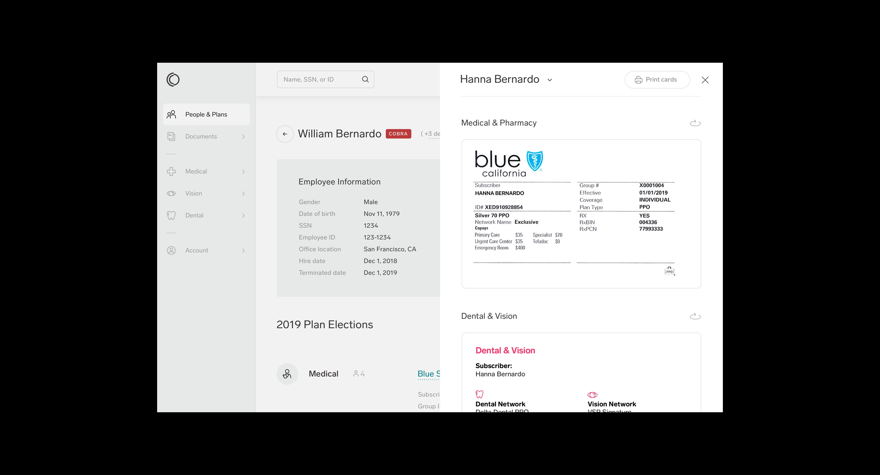
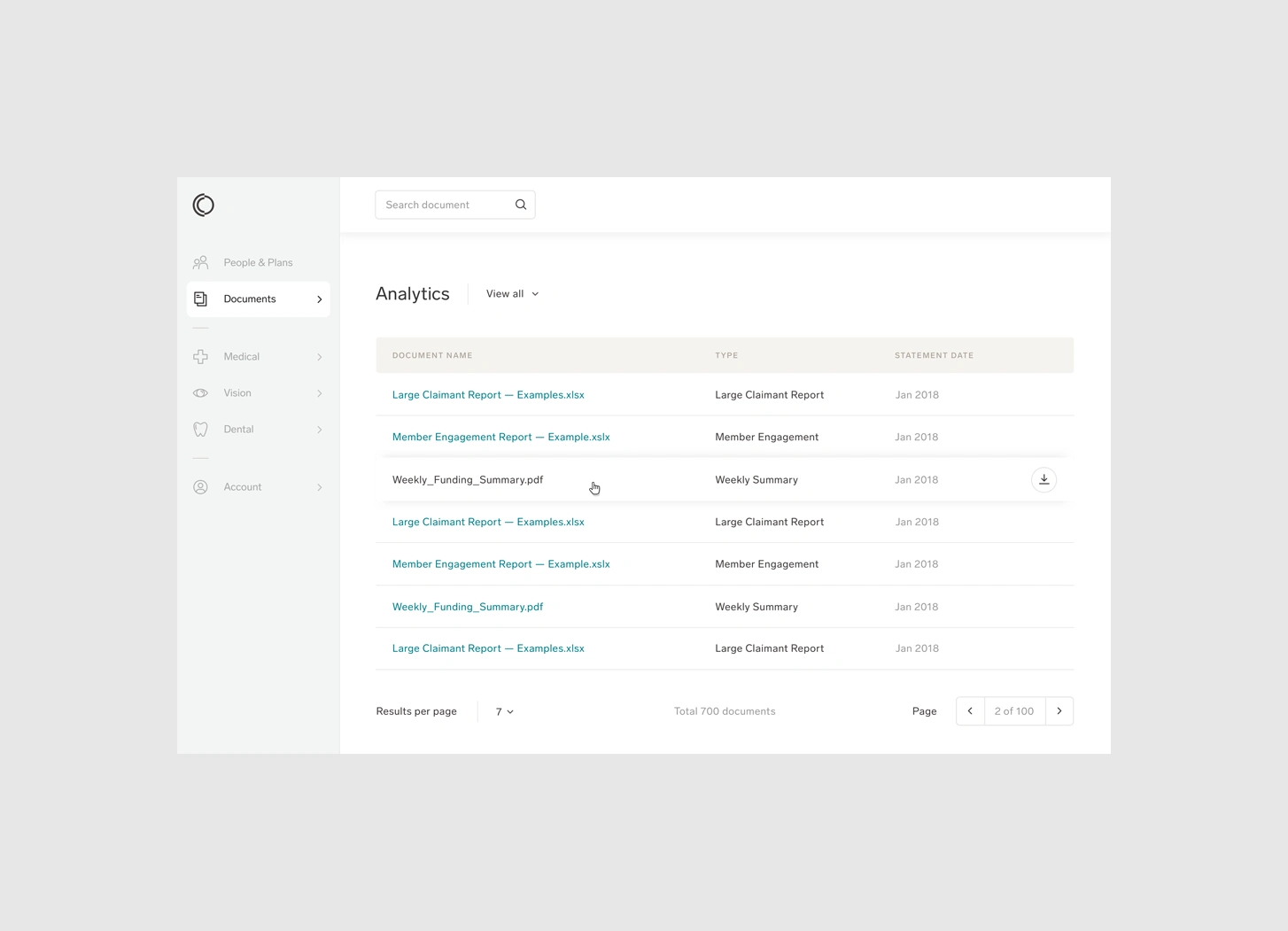
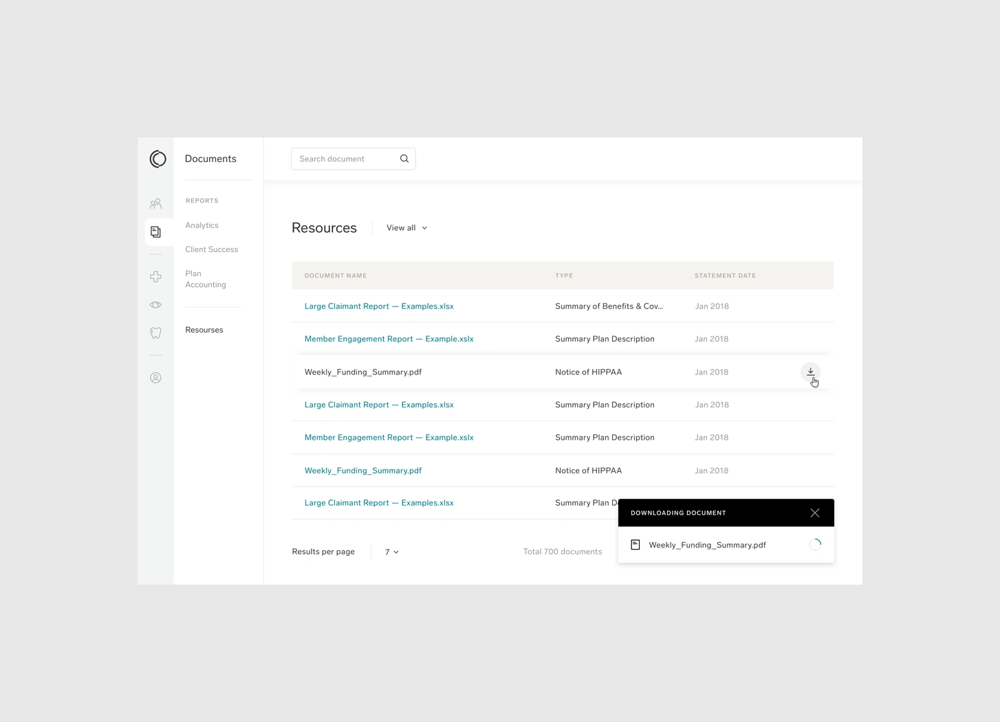
The Employer Portal covered multiple functional areas, from plan administration and member support to claims, finance, and analytics. Without a strong navigation model, users could easily lose their sense of location or struggle to understand how information related across sections.
Dworkz focused on making the primary navigation a stable framework for the entire experience. The structure needed to help users move between operational and analytical tasks while preserving a clear understanding of where they were and what level of data they were viewing.
Rather than treating each capability as an isolated tool, the navigation helped present the portal as one connected system for managing employer healthcare.
2. Designing filters for complex comparisons
Filtering was one of the most important interaction challenges in the portal. Employers needed to explore information across different dimensions and understand the context behind every chart, metric, and comparison.
The filtering system therefore had to make several things immediately clear:
Which criteria were currently applied.
What information was included or excluded.
Which date range the data represented.
Whether users were reviewing current performance or making a comparison.
How a change in filters affected the information on the page.
We refined the filter experience so that users could control complex data views without sacrificing the space required to display the results. The controls remained available and understandable, but the information itself retained visual priority.
3. Balancing data density with comprehension
Healthcare administration involves information that cannot always be reduced to a few simple numbers. The interface needed to accommodate detailed reports and multiple analytical views while remaining readable.
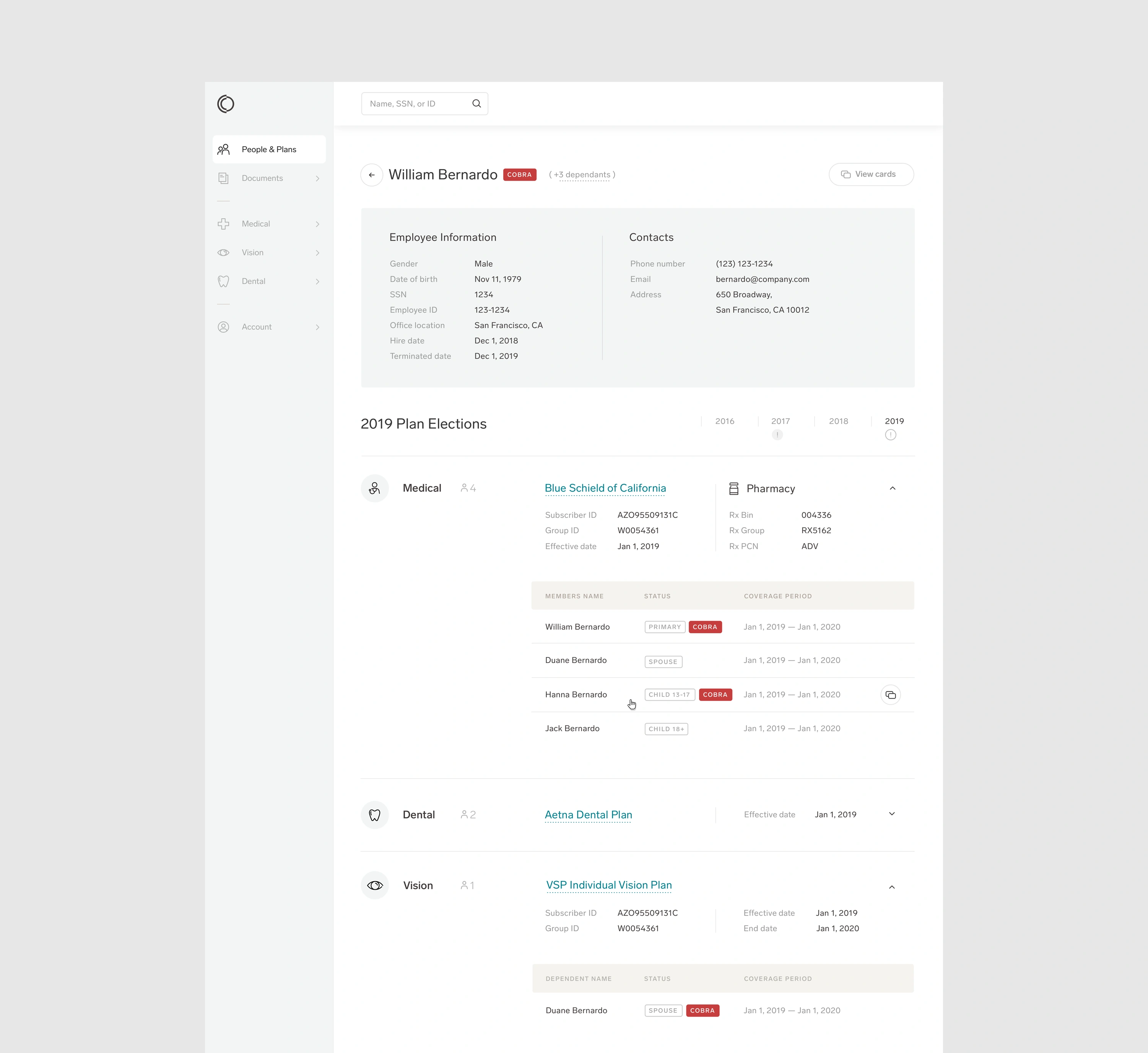
We optimized the layout to establish a clear hierarchy among summary metrics, visualizations, controls, and supporting details. Consistent spacing, alignment, labeling, and component behavior helped users scan dense screens and understand how information was organized.
This approach allowed the product to maintain analytical depth without making every page feel equally complex.
4. Connecting multiple views of plan performance
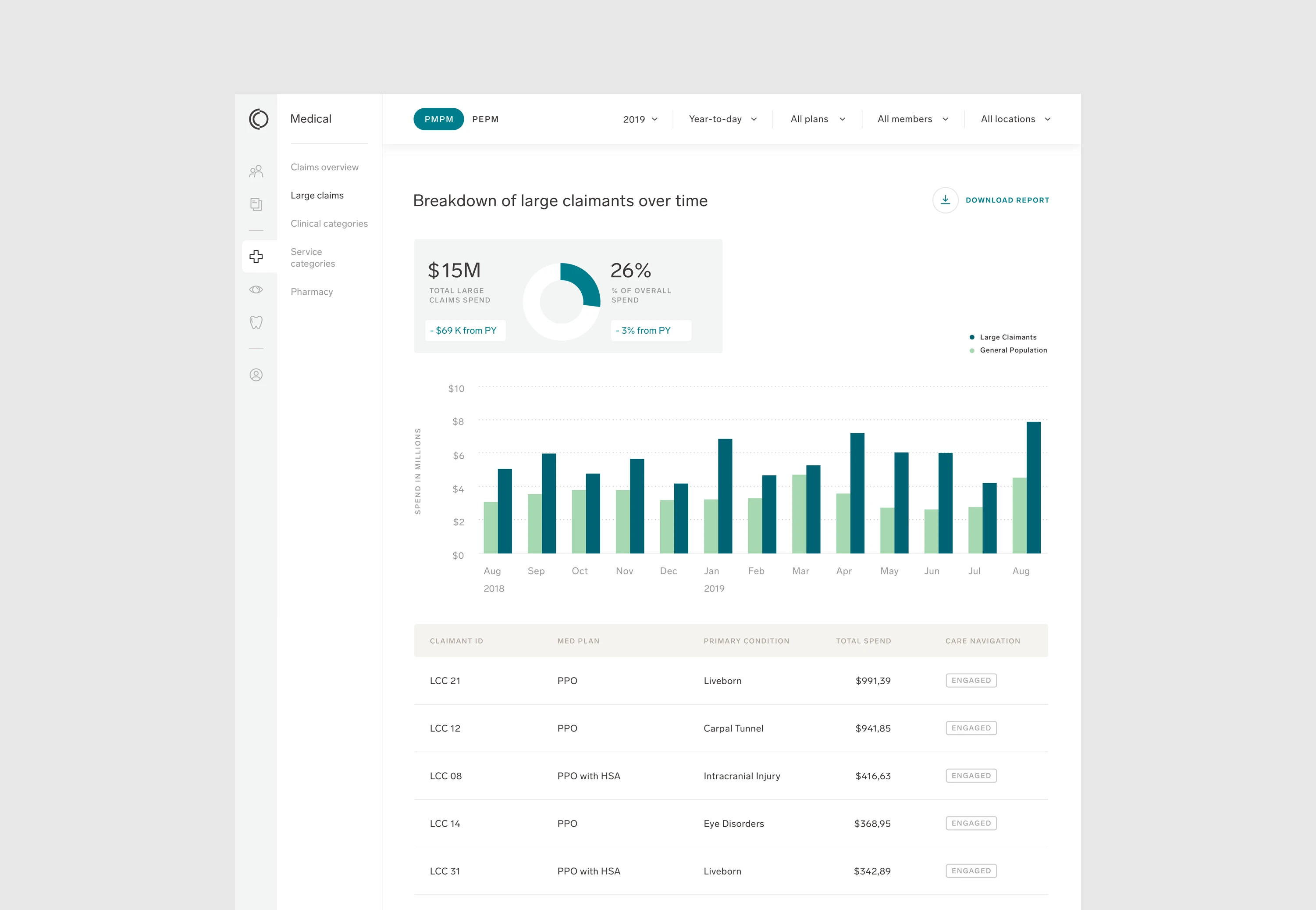
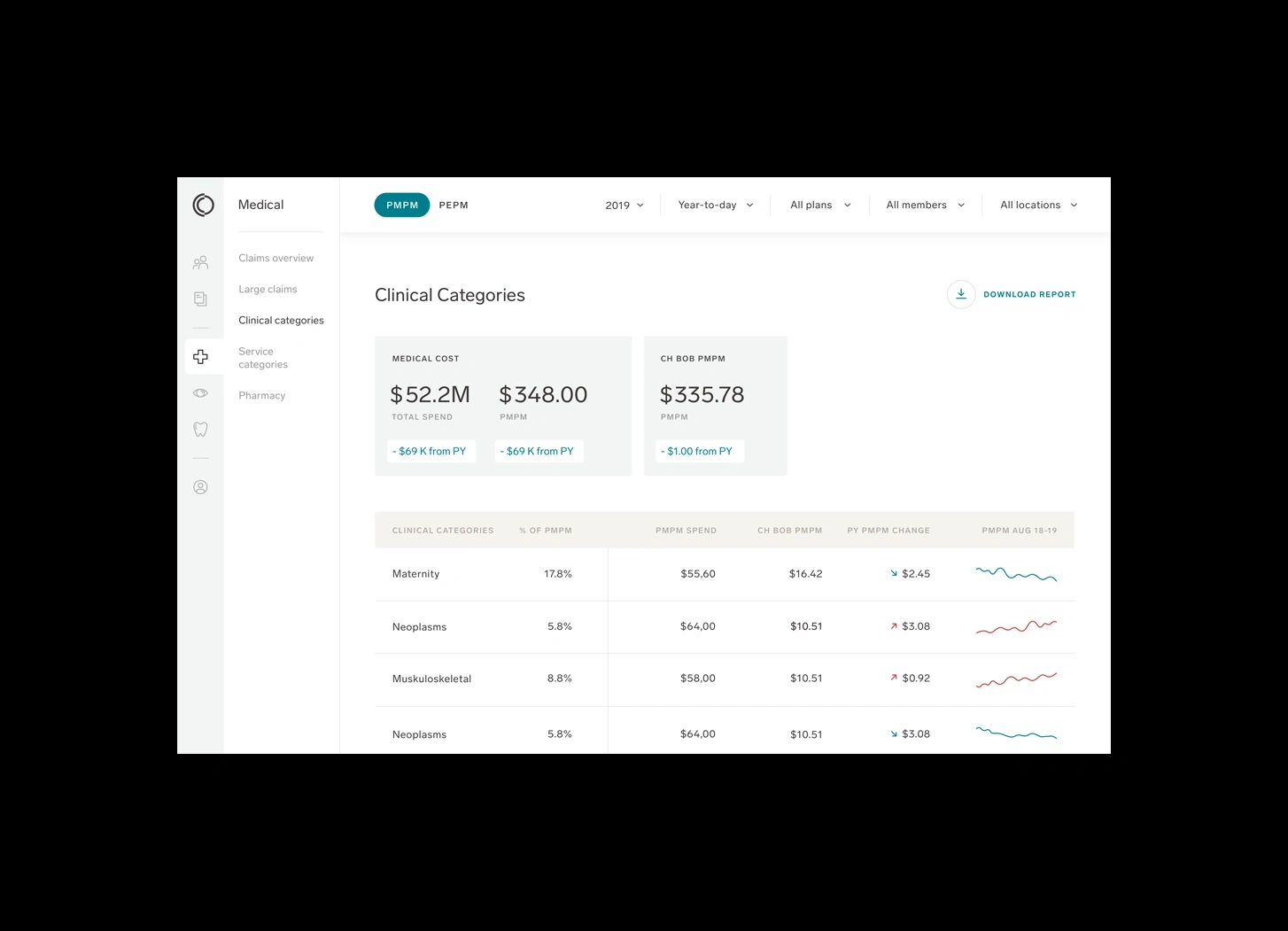
The redesigned portal brought together reporting and live dashboards across several important areas:
Claims and healthcare spending.
Utilization patterns.
Benefits operations.
Program participation and engagement.
Member service touchpoints.
Financial activity and reporting.
Unifying these views helped employers understand how different parts of their health plan affected one another. Instead of gathering information from separate sources before beginning an analysis, users could work from a connected view of plan activity.
5. Supporting both operational and strategic work
The personas revealed that different users entered the portal with different time horizons. Some needed to resolve immediate administrative questions, while others were looking for patterns that could inform future network, program, or benefits decisions.
The experience therefore had to support both kinds of work. Clear navigation and direct access to current information helped multitasking users complete routine tasks efficiently. Integrated reporting, flexible filters, and comparison tools gave analytical users the depth required to investigate performance and identify opportunities.
For people newer to self-funding, consistent structure and explicit data context reduced the knowledge required to interpret each screen.
6. Turning reporting into a starting point for action
One of the portal's most important objectives was to reduce the effort users spent assembling information. When data is scattered across reports and systems, teams can spend substantial time preparing an analysis before they can discuss what it means.
By bringing claims, utilization, program, operational, and member information into a connected experience, the portal allowed clients and consultants to focus more of their attention on insights and next steps.
Accurate financial operations and reporting also supported better control over waste and cash flow. The interface became more than a place to retrieve numbers; it became a tool for understanding the healthcare investment and deciding what to do next.
Collaboration with Collective Health's design team
This project required Dworkz to contribute within an established design organization rather than operate as a separate external team. Successful collaboration depended on understanding the research and product thinking that Collective Health had already developed, aligning with its broader experience, and providing focused design capacity where it was most valuable.
Dworkz worked closely with the internal team to explore user flows, navigation, filtering, layouts, and dashboard behavior. This partnership allowed the project to benefit from Collective Health's domain knowledge and customer understanding alongside Dworkz's experience simplifying complex digital products and data-intensive interfaces.
The shared process helped maintain continuity across the platform while moving the new Employer Portal toward a more streamlined and intuitive experience.
The outcome
The resulting Employer Portal unified critical healthcare administration and analytics within a more coherent product experience. Employers could access claims, utilization, operations, engagement, member, and financial information through integrated reports and live dashboards.
Clearer navigation and filtering helped users understand the data they were viewing and comparing. The layout preserved space for detailed information while improving hierarchy and comprehension. Together, these decisions helped Collective Health's clients and consultants spend less time gathering data and more time interpreting insights and planning next steps.
The portal also supported greater rigor, accuracy, and efficiency in the management of employer healthcare investments. More precise reporting and financial operations gave organizations stronger tools for controlling waste, managing cash flow, and evaluating plan performance.
By translating existing user research into a connected interface, Dworkz helped Collective Health create an experience capable of serving newcomers, multitasking administrators, and data-driven leaders within the same platform.
Key takeaways
Collaborated successfully with Collective Health's established internal UX/UI team.
Built on existing research covering three distinct employer personas.
Designed a navigation framework for complex healthcare administration workflows.
Simplified a sophisticated filtering system while protecting space for data and reports.
Made data scope, date ranges, and comparisons easier to understand.
Balanced dense healthcare information with clear visual hierarchy.
Connected claims, utilization, benefits operations, program engagement, and member touchpoints.
Supported both everyday administration and strategic plan analysis.
Helped clients move from gathering data toward interpreting insights and taking action.
Strengthened the clarity and efficiency of employer healthcare reporting and financial operations.
Like this project
Posted Sep 22, 2026
Designed a seamless Employer Portal for healthcare data management with Collective Health.
Likes
1
Views
2
Clients
Collective Health