Enhancing PubNub's Administrator Dashboard

Stas Udotov


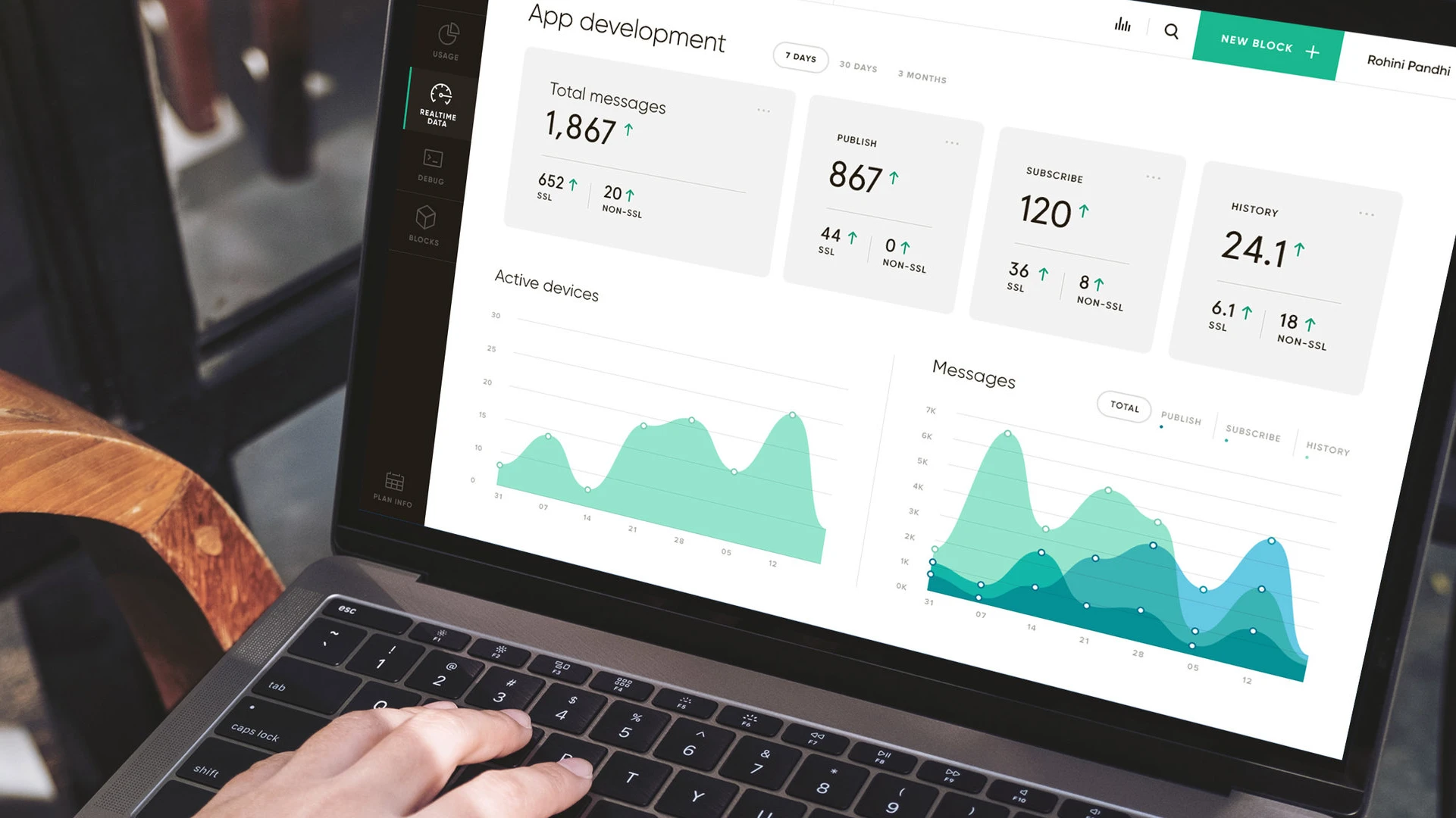
PubNub Administrator Dashboard: Simplifying a Complex Real-Time Platform
Project overview
PubNub provides the real-time infrastructure developers use to build interactive applications at scale. Its platform combines a broad set of capabilities—including publish and subscribe messaging, access management, presence, mobile push notifications, storage, analytics, debugging, and billing—within a single Administrator Dashboard.
As the platform expanded, the dashboard needed to make these increasingly sophisticated capabilities easier to understand and manage. PubNub partnered with Dworkz to rethink the user experience, modernize the interface, and improve how technical information and usage data were presented.
Services: User research, UX strategy, information architecture, interaction design, UI design, data visualization, and custom iconography
Product: Developer-facing SaaS administration platform
Users: Developers and technical teams building and managing real-time applications
The challenge
PubNub's customers needed to configure applications, manage keysets, explore platform features, monitor usage, troubleshoot implementations, and update their plans. As more functionality was added, these workflows became harder to navigate within the existing dashboard.
The redesign needed to address several connected challenges:
Make a technically complex platform easier to learn and operate.
Improve navigation across applications, keysets, configuration tools, analytics, and account settings.
Help new users find documentation, SDKs, tutorials, and training resources quickly.
Present real-time and historical usage data in a clearer, more useful format.
Give developers a more efficient way to configure and debug PubNub implementations.
Create a consistent visual language that could support continued product growth.
The goal was not to remove the platform's depth. It was to organize that depth around the way developers actually work.
Research and discovery
Dworkz began by meeting with PubNub's engineering team to understand the platform, its technical constraints, and the areas creating the most friction.
We then interviewed PubNub customers to learn how they used the Administrator Dashboard in practice. The research helped us identify strengths worth preserving, recurring usability problems, and gaps between the product's structure and users' mental models.
The findings gave the team a stronger foundation for redesigning the navigation and information architecture. Instead of treating every feature as a separate destination, we organized the experience around the core objects and tasks users returned to most often: applications, keysets, configuration, analytics, debugging, and account management.
The design approach
1. Reorganizing the platform around applications and keysets
Applications became the primary organizational layer, acting as folders for related keysets. Users could switch between folder and list views based on how they preferred to scan and manage their work.
Selecting an application revealed its keysets, including the publish, subscribe, and secret keys required to connect an implementation to PubNub. Selecting a keyset then opened a focused configuration area where users could manage capabilities such as Access Manager, Mobile Push Notifications, and Storage & Playback.
This hierarchy made the relationship between applications, credentials, and platform features easier to understand while reducing the effort required to move between related tasks.
2. Improving onboarding and feature discovery
The redesigned experience gave new and returning users clearer ways to continue their work. After signing in, users could access quick links to:
Start a tutorial led by PubNub's CTO.
Download the appropriate SDKs.
Review technical documentation.
Enroll in University of PubNub courses.
The login experience also used previously underutilized space to introduce new dashboard features. Together, these improvements helped users discover learning resources without interrupting their primary workflows.
3. Making usage data easier to interpret
We redesigned the App Usage and Real-Time Analytics experiences to provide graphical views of both historical and current metrics.
Users could review analytics for an individual keyset or see aggregated data across an entire application. This gave teams the flexibility to investigate a specific implementation or understand broader activity without leaving the dashboard.
The updated visualizations transformed raw platform data into information users could scan, compare, and act on more quickly.
4. Bringing debugging into one workspace
Developers often need to move between tools while diagnosing real-time behavior. To reduce that fragmentation, the redesign introduced a browser-based debug console within the Administrator Dashboard.
From a single tab, users could debug PubNub capabilities including Publish/Subscribe, Access Manager, Presence, and Storage & Playback. Consolidating these tools made troubleshooting more direct and kept technical context close to the configuration being tested.
5. Supporting configuration, extensions, and billing
The dashboard also provided access to PubNub Blocks—microservices designed to help developers add real-time functionality more quickly—and a Plan Info area where administrators could change billing plans or add features.
Bringing product configuration, extensibility, and account management into a coherent system helped reduce unnecessary navigation and made the dashboard feel like one connected product rather than a collection of separate tools.
6. Establishing a consistent visual language
The interface was refreshed with clearer layouts, improved data visualization, and custom iconography created specifically for the platform.
The visual system helped users distinguish actions and product areas while giving the dashboard a more cohesive, professional appearance. It also created a reusable foundation that could accommodate additional capabilities as PubNub continued to evolve.
Collaboration and implementation
Close collaboration with PubNub's founders and engineering team was central to the project. Design decisions were grounded in customer research and evaluated against the technical realities of a mature developer platform.
Working together throughout the redesign helped ensure that the proposed experience was not only clearer in concept but also practical to implement across the product's many interconnected workflows.
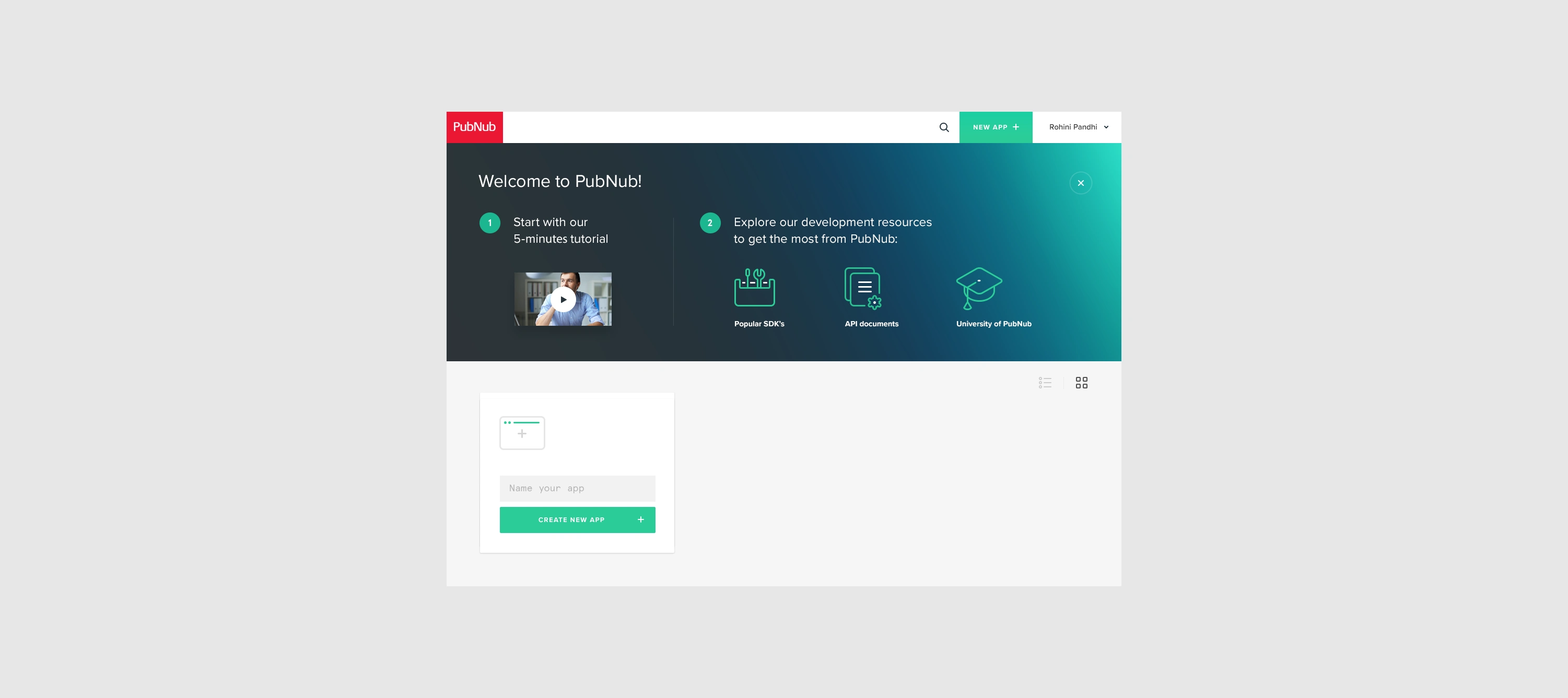
Once users log in to the updated Dashboard for the first time, they'll find handy quick links to start a tutorial led by the CTO, download SDKs, explore technical documentation, or enroll in the University of PubNub courses.
In the Admin Dashboard, Apps act as folders for Keysets. Users can conveniently switch between folder and list views based on their preferences.
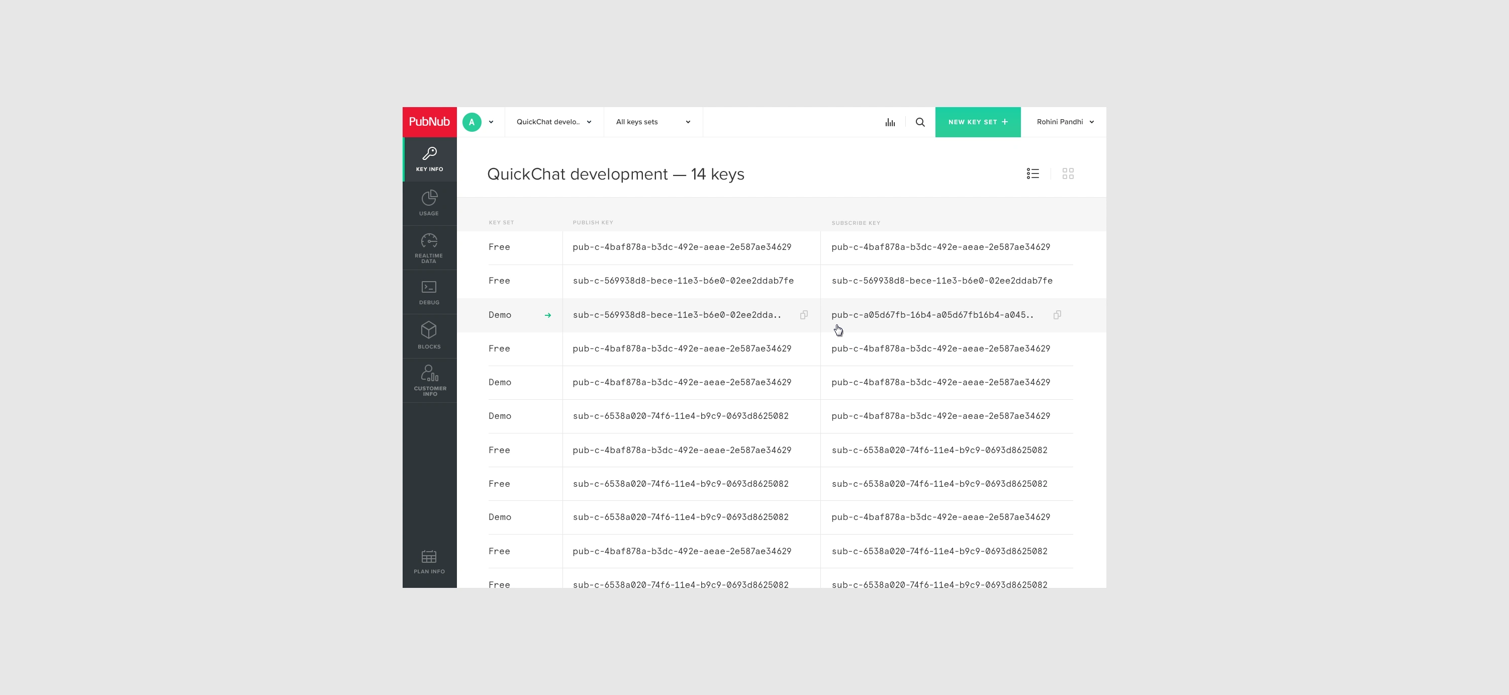
Clicking an App reveals its Keysets, which include the publish, subscribe, and secret keys needed for using PubNub.
Clicking on a Keyset takes the user to the Key Info section, where they can configure PubNub features such as Access Manager, Mobile Push Notifications, Storage & Playback, and more.
The App's metrics are visualized on the Real-time Analytics page. PubNub Keyset analytics can be viewed individually or in aggregate within the App.
The new debug console lets developers debug PubNub in a single browser tab. Users can debug the entire PubNub implementation, including Publish/Subscribe, Access Manager, Presence, Storage & Playback, and more.
Blocks, microservices that use the PubNub Data Stream Network, allow developers to build powerful real-time features quickly.
The Plan Info page lets Administrator Dashboard users change their billing plan or add features.
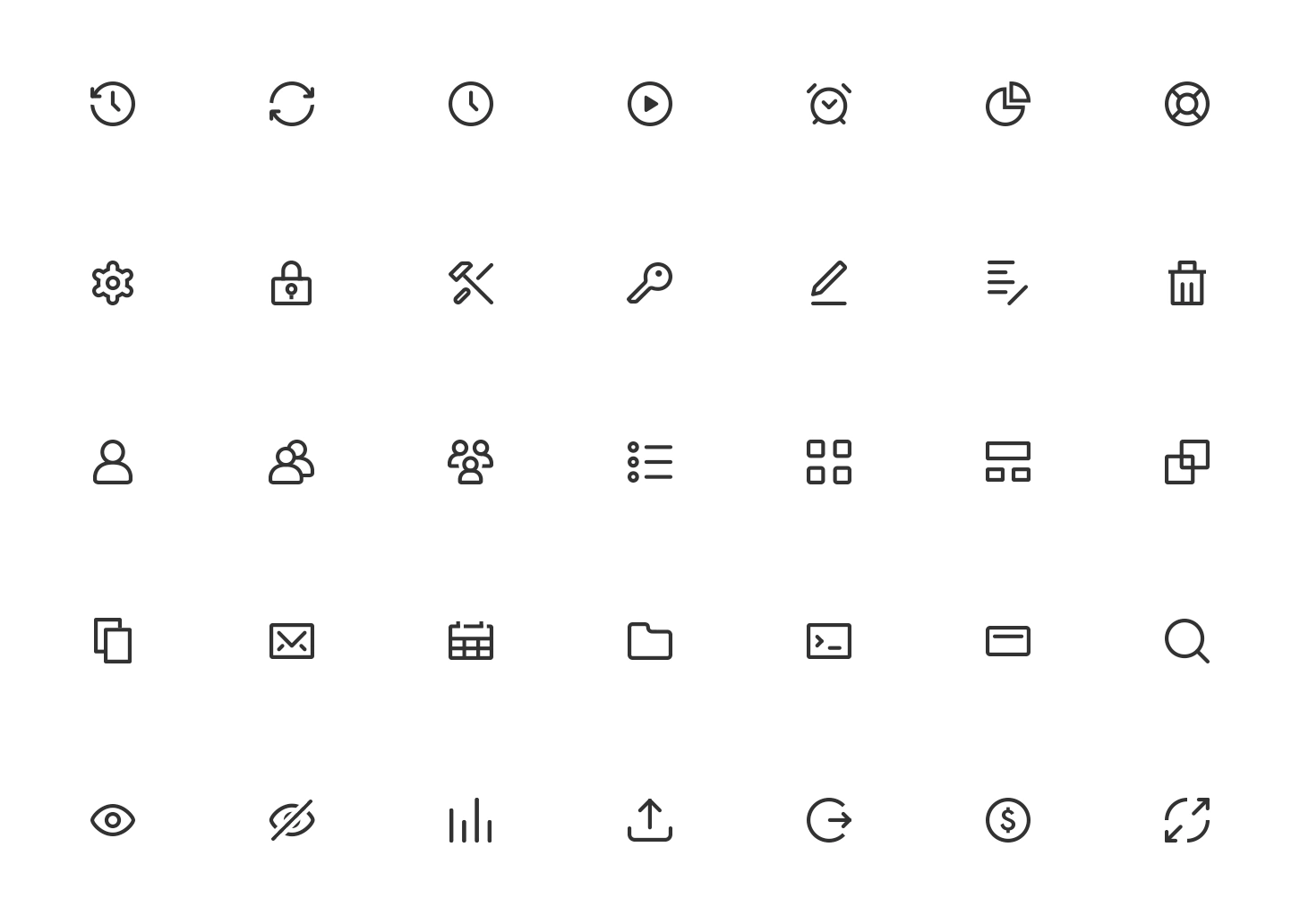
The PubNub Administrator Dashboard looks and works better with our custom iconography.
The outcome
The redesigned Administrator Dashboard made it easier for customers to manage applications, configure keysets, understand usage, discover resources, debug implementations, and control their plans from a unified interface.
According to the project results, customers responded enthusiastically to the release. More importantly, the streamlined experience, improved visualizations, and clearer interface significantly reduced the volume of calls to PubNub's customer support team.
The project demonstrated how research-led UX design can make a highly technical SaaS platform easier to use without oversimplifying its capabilities. By aligning the dashboard with developers' workflows, Dworkz helped PubNub deliver a more scalable experience for both its customers and its internal support organization.
Key takeaways
Customer interviews revealed where the existing product structure did not match users' expectations.
A clearer application-and-keyset hierarchy simplified navigation across complex technical workflows.
Improved onboarding connected users with SDKs, documentation, tutorials, and training at the right moment.
Historical and real-time visualizations made platform usage easier to understand.
An integrated debug console reduced tool switching during troubleshooting.
A consistent interface and custom iconography created a stronger foundation for future growth.
The improved experience helped reduce demand on customer support.
Like this project
Posted Sep 20, 2026
Streamlined PubNub's UI and data visualizations, enhancing the user experience.