Visual Identity for Cutoff Resonance Podcast

Stas Udotov


Cutoff Resonance: An identity for the people who shaped electronic music
Electronic music starts with curiosity. A sound is stretched, a rhythm is interrupted, a familiar texture becomes something unexpected. Behind those discoveries are people whose experiments helped shape a culture.
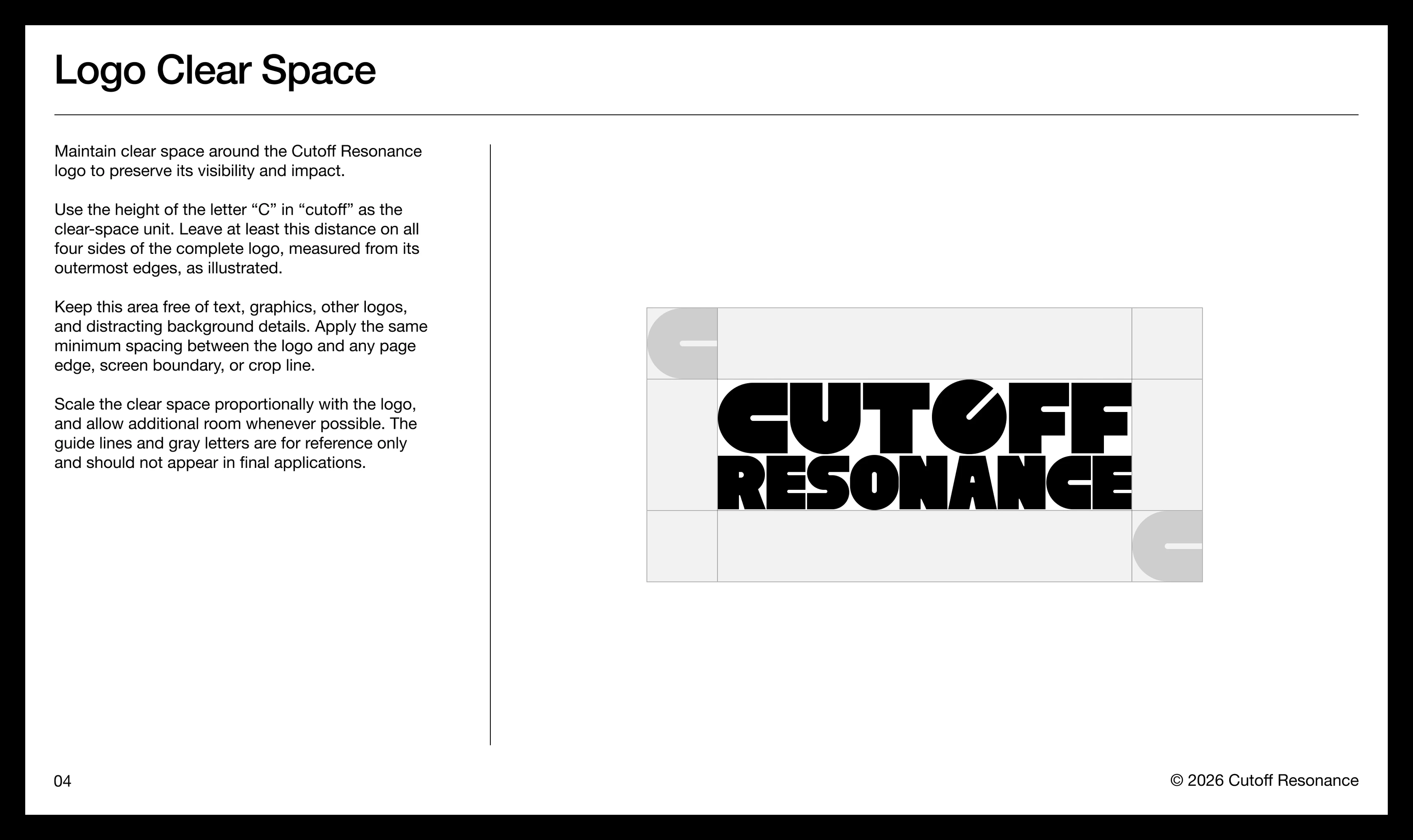
Cutoff Resonance is a video podcast featuring interviews with pioneers of electronic music. Its focus is the human story behind the sound: the influences, decisions, creative risks, and experiences that shape an artist’s work.
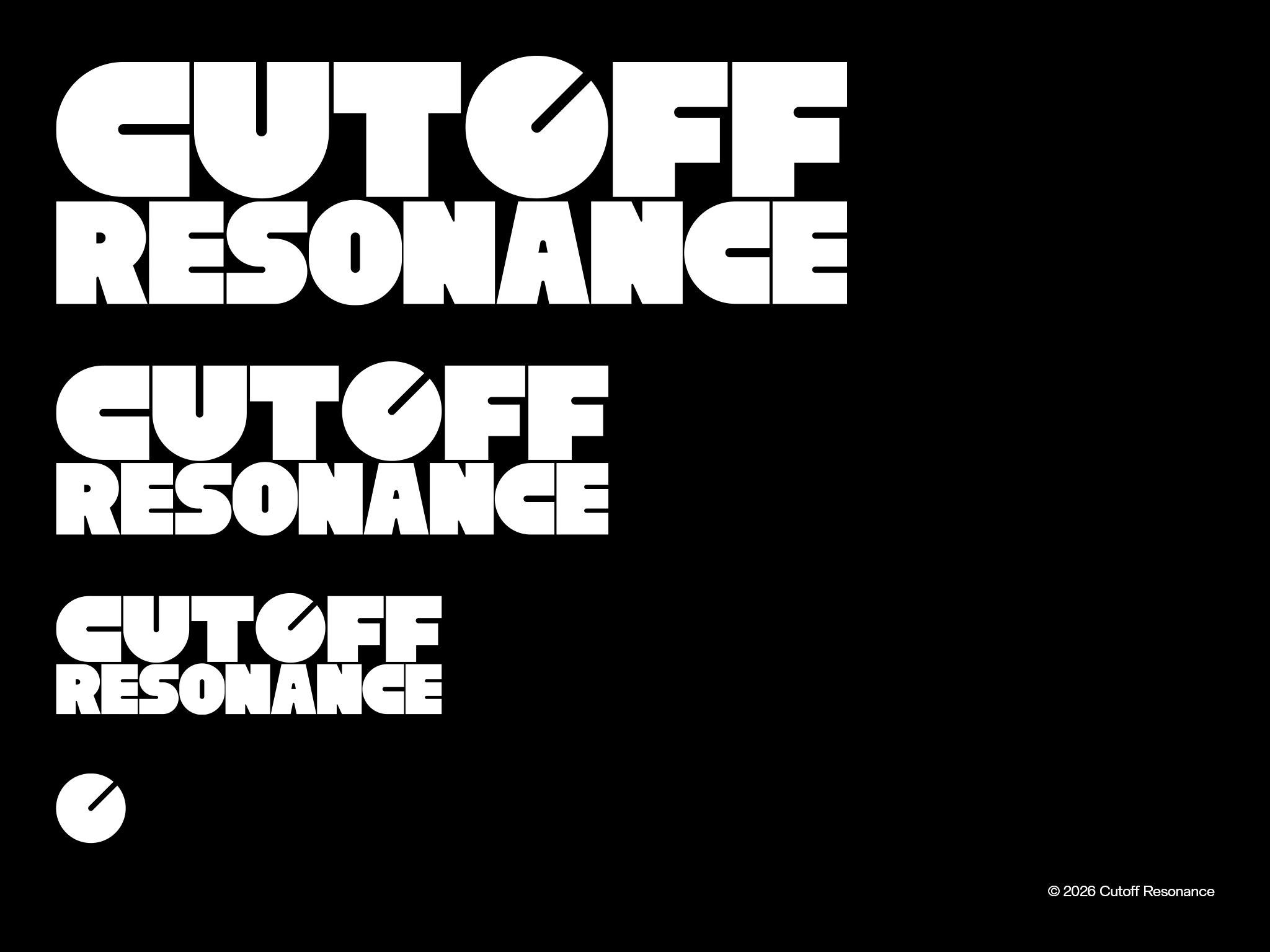
Dworkz developed a visual identity that connects those conversations to the craft of making music. A distinctive wordmark, a mixer-inspired symbol, and a restrained visual system give the podcast a recognizable presence while leaving room for its guests and their stories.
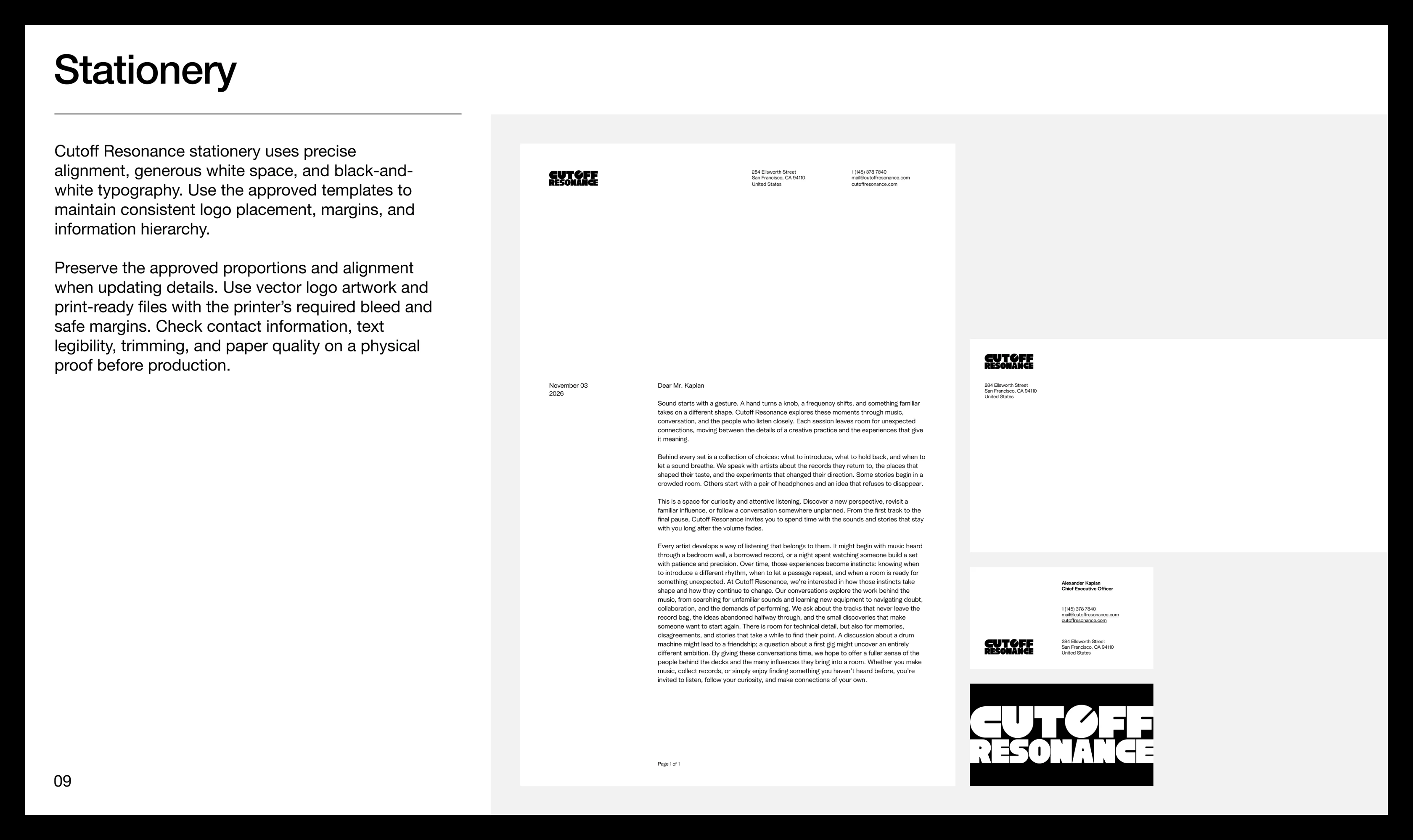
Scope: Logo design, brand symbol, typography, color palette, stationery, merchandise concepts, and brand guidelines.
Turning sound into a visual idea
The central design challenge was to express the podcast’s connection to electronic music while supporting the thoughtful, personal nature of an interview format.
The name provided the starting point. Cutoff and resonance are controls used to shape sound. Cutoff determines the frequency boundary of a filter; resonance emphasizes frequencies around that boundary. Together, they can change a sound’s texture, tension, and character.
That relationship gave the identity its central idea: a small, deliberate gesture can create a meaningful change. Turning a control becomes a visual reference to the experimentation at the heart of electronic music.
Building the idea into the wordmark
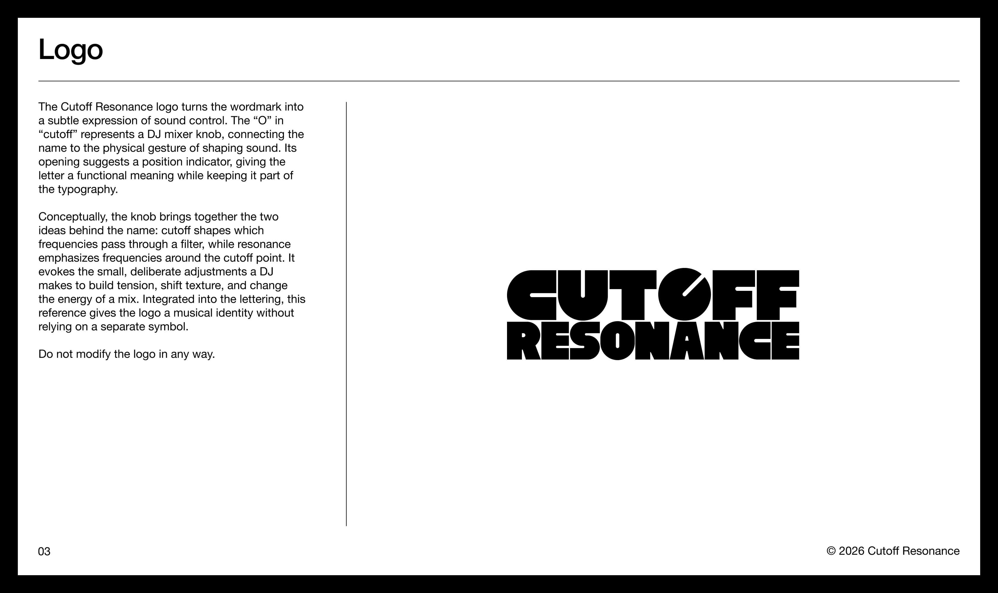
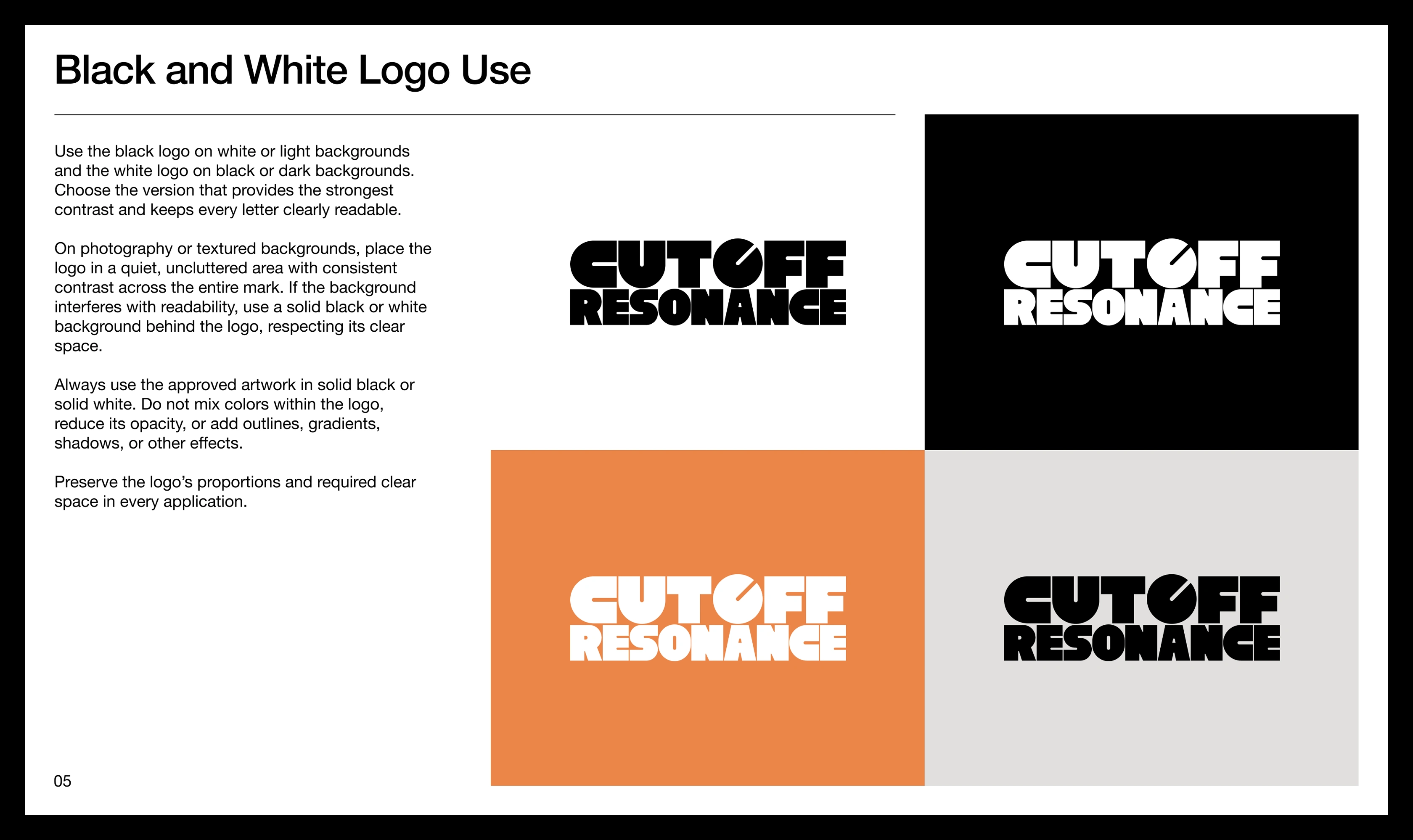
The logo integrates a DJ mixer knob into the “O” of “cutoff.” A diagonal opening acts as its position indicator, turning a letter into a reference to the physical act of shaping sound.
Because the reference sits inside the name, the wordmark carries the concept on its own. Viewers can read it immediately, then discover the musical detail.
Heavy, tightly arranged letterforms give the logo a strong graphic presence. The two-line composition holds the name together as a compact unit, while rounded forms and carefully shaped openings create a consistent visual rhythm. The knob belongs to that rhythm rather than appearing as an added illustration.
The resulting mark combines the precision of an equipment control with the expressive character of a music brand.
Giving the identity a smaller signature
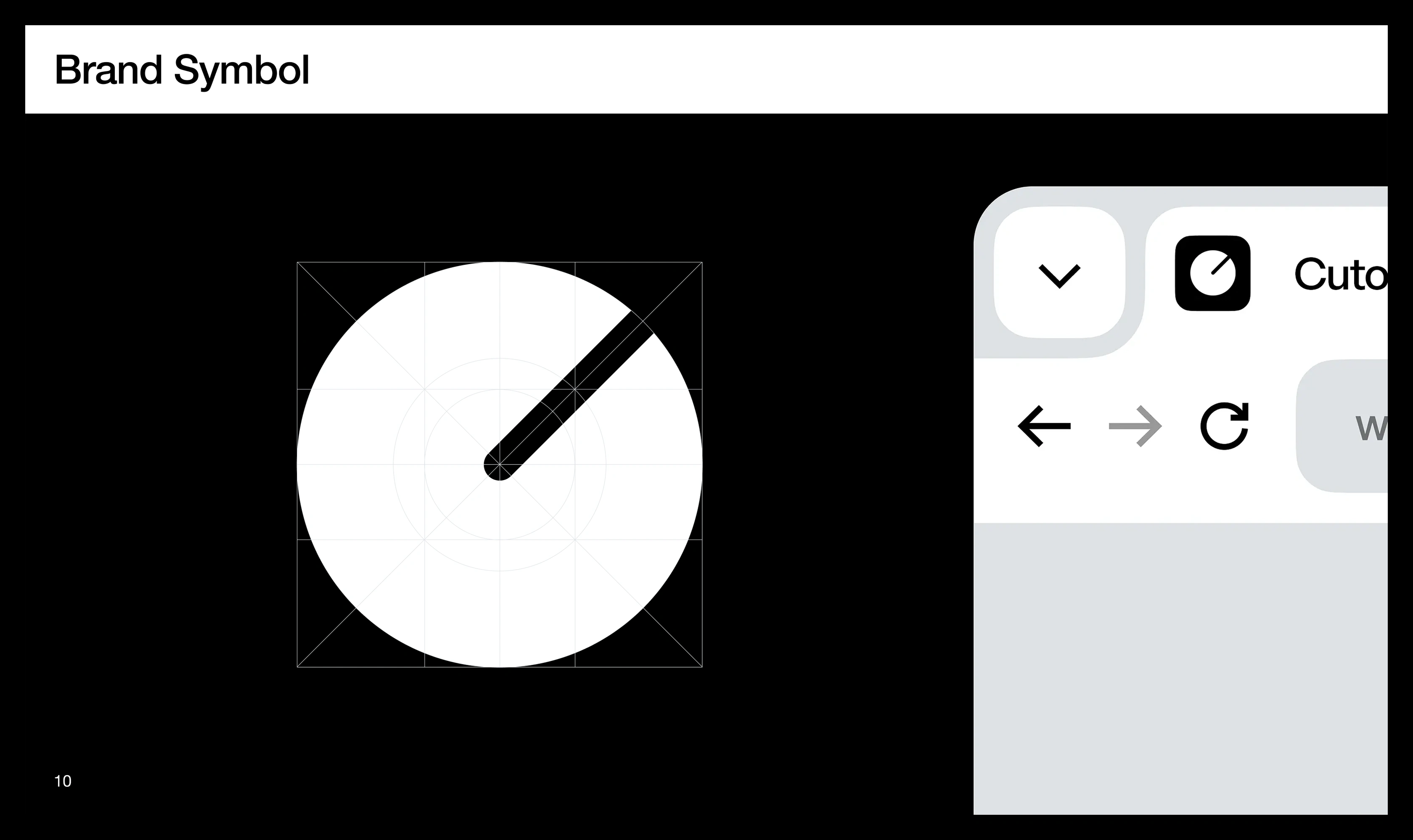
The knob also works independently as the brand symbol. Extracted from the wordmark, it retains a direct connection to the full identity through its circular form and diagonal indicator.
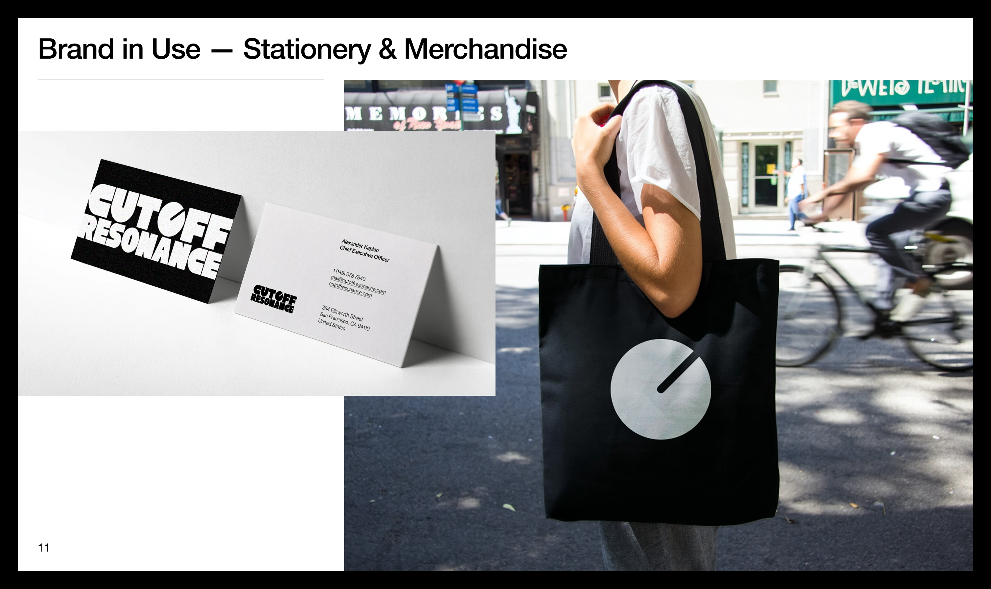
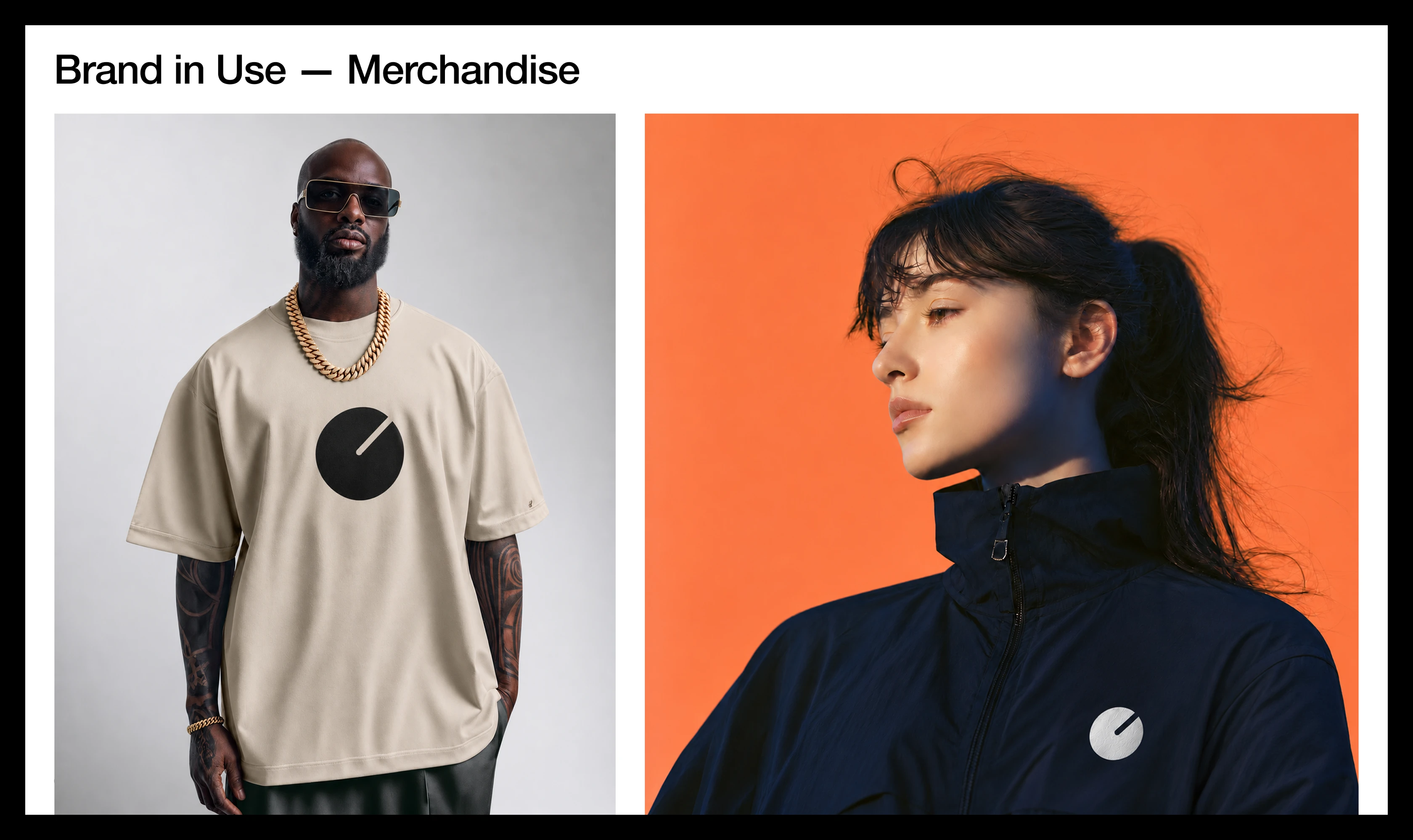
The guidelines demonstrate its use as a browser icon and across apparel and accessories. These applications give the identity two useful levels of expression: the complete name introduces the podcast, while the symbol provides a compact signature where space or context calls for a simpler mark.
On a tote bag or shirt, that same shape becomes a graphic people can wear.
Like this project
Posted Nov 5, 2026
Created visual identity for electronic music podcast Cutoff Resonance.
Likes
0
Views
1
Timeline
Oct 5, 2026 - Nov 5, 2026