Kantola LMS Modernization and Redesign

Stas Udotov


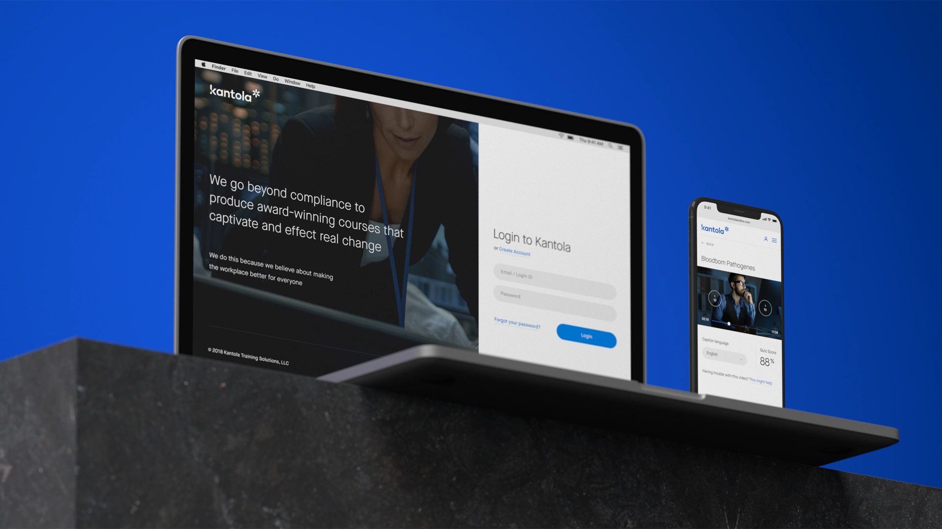
Project overview
Kantola Training Solutions produces workplace training videos and provides an online learning management system that helps organizations assign courses, monitor participation, and document compliance.
Kantola partnered with Dworkz to modernize an LMS whose core functionality had been developed over the previous decade. The product was capable, but its interface no longer made that capability easy to understand or use. The challenge was to create a clearer, more efficient experience while preserving the established functionality built by Kantola's engineering team.
Dworkz redesigned the user experience and interface and supported the work through front-end development. The resulting platform made it easier for administrators to create and manage training programs, monitor performance, and support different organizational structures. At the same time, it gave learners a more direct path to completing assigned training.
Services: UX design, UI design, information architecture, interaction design, responsive design, and front-end development
Product: B2B learning management system
Primary users: Training administrators, managers, and employees completing workplace training
The challenge
The existing LMS contained years of valuable functionality, but training-management workflows had become difficult to navigate. Administrators needed to assign courses, manage large groups of learners, oversee multiple locations, monitor progress, review quiz results, and demonstrate compliance. These tasks often required numerous interactions and exposed users to more controls than they needed at any one moment.
The product also lacked a high-level view of training performance. Administrators could access information, but it was difficult to understand the overall status of a program, identify learners who required attention, or move efficiently from an organization-wide view to an individual course or participant.
For learners, the experience needed to communicate essential information immediately: what training had been assigned, when it was due, how much had been completed, and what remained to be done. The platform also needed to make training accessible beyond a traditional office workstation.
The redesign focused on several goals:
Simplify the workflows used to assign, manage, and complete training.
Give administrators a clear overview of training performance and compliance.
Reduce interface clutter without removing important capabilities.
Support organizations with multiple programs, teams, and locations.
Make course status, progress, and deadlines easy for learners to understand.
Preserve the proven functionality of the existing platform.
Reduce the need for customers to contact support for routine tasks.
Understanding the existing experience
Dworkz began by examining the LMS structure and the workflows customers used most often. Rather than treating the project as a visual reskin, we studied how the system's navigation, controls, and information hierarchy affected everyday training-management tasks.
Looking at the product from the perspectives of both administrators and learners helped reveal where complexity was necessary and where the interface was making routine work unnecessarily difficult. This analysis generated opportunities to consolidate information, clarify system status, reduce repetitive controls, and create a stronger relationship between program-level reporting and individual learner activity.
One issue stood out: training managers lacked a useful high-level view of performance. Addressing that gap became a central part of the redesigned experience.
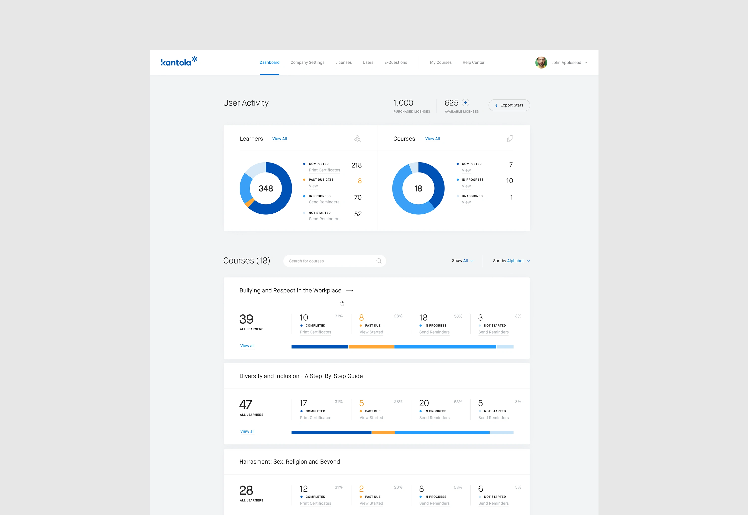
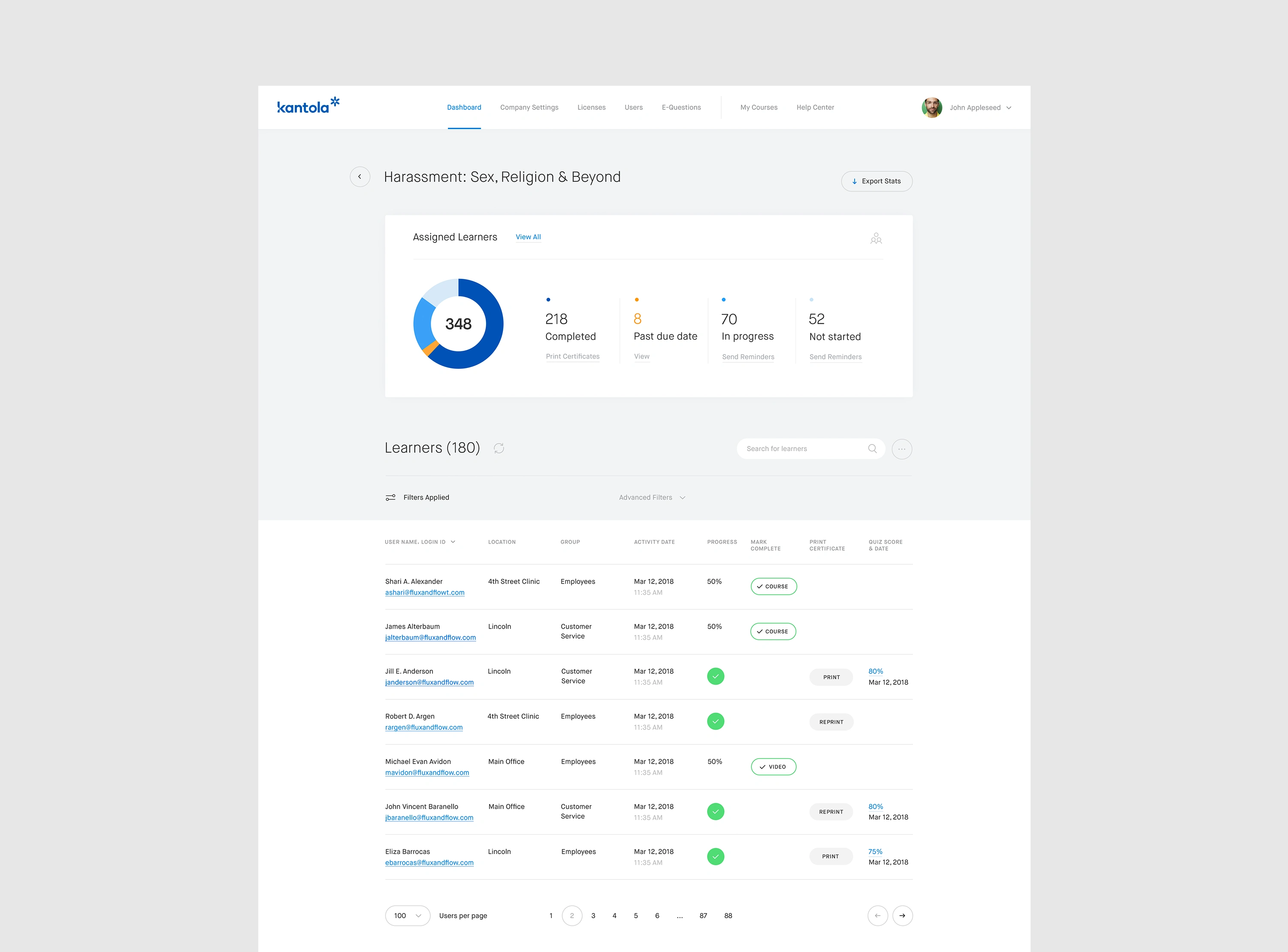
Course administrators can monitor learners' progress through the training dashboard, including their position in the course, quiz results, and last login, providing a comprehensive overview of their engagement.
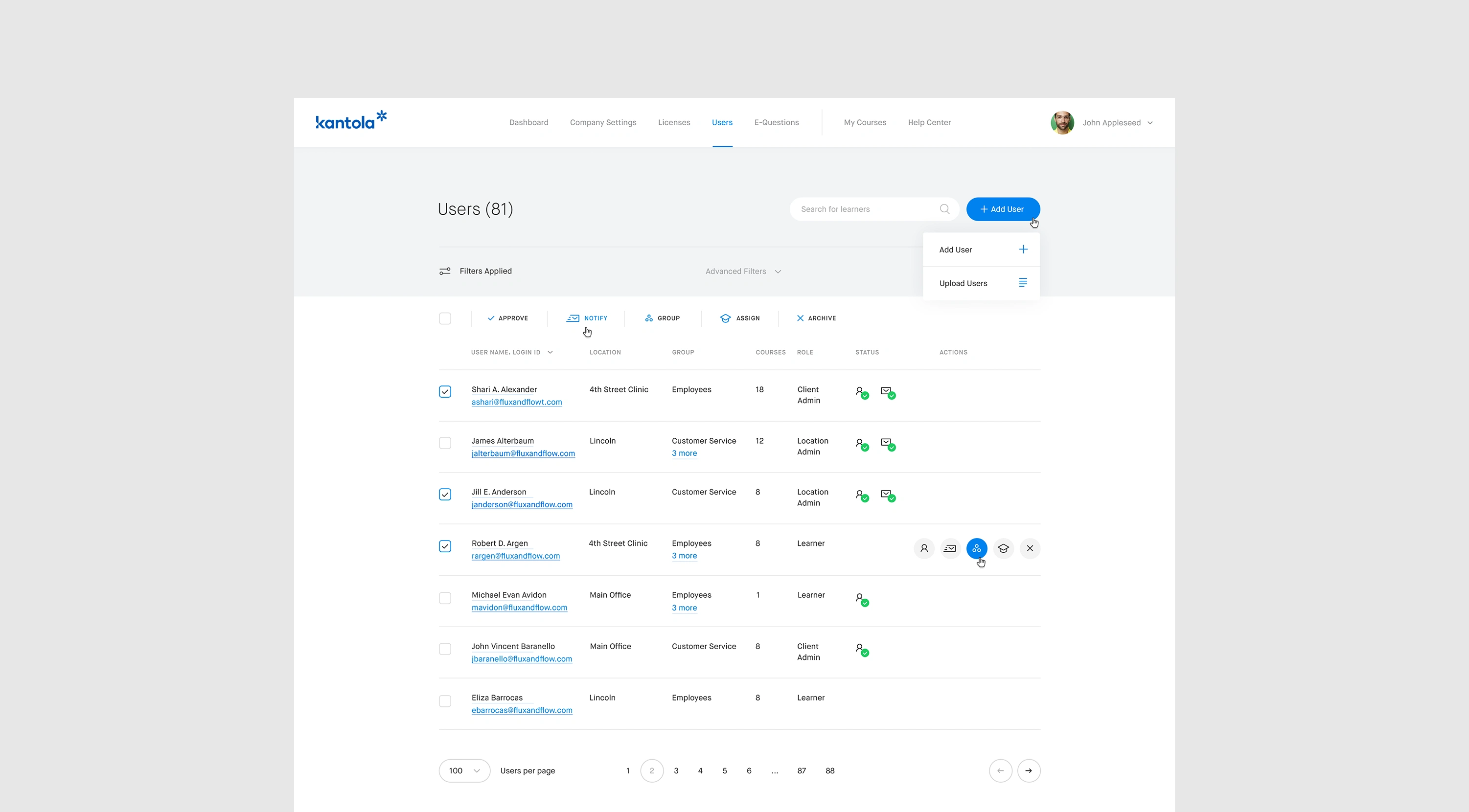
Managing learners requires a lot of interaction. We aimed to simplify the process by removing UI clutter and hiding repetitive controls until they were actually needed.
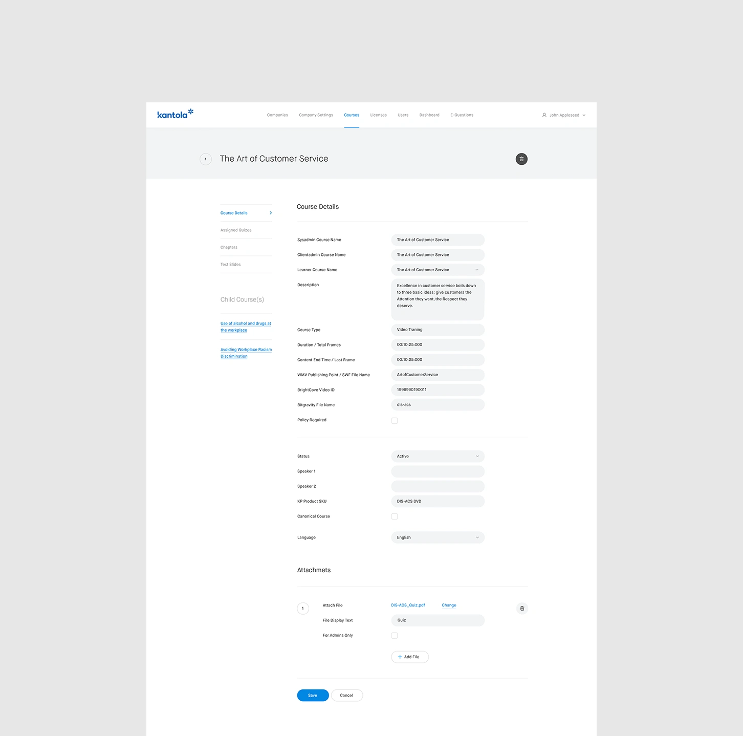
We made it easier for businesses to create learning programs and manage multiple training locations.
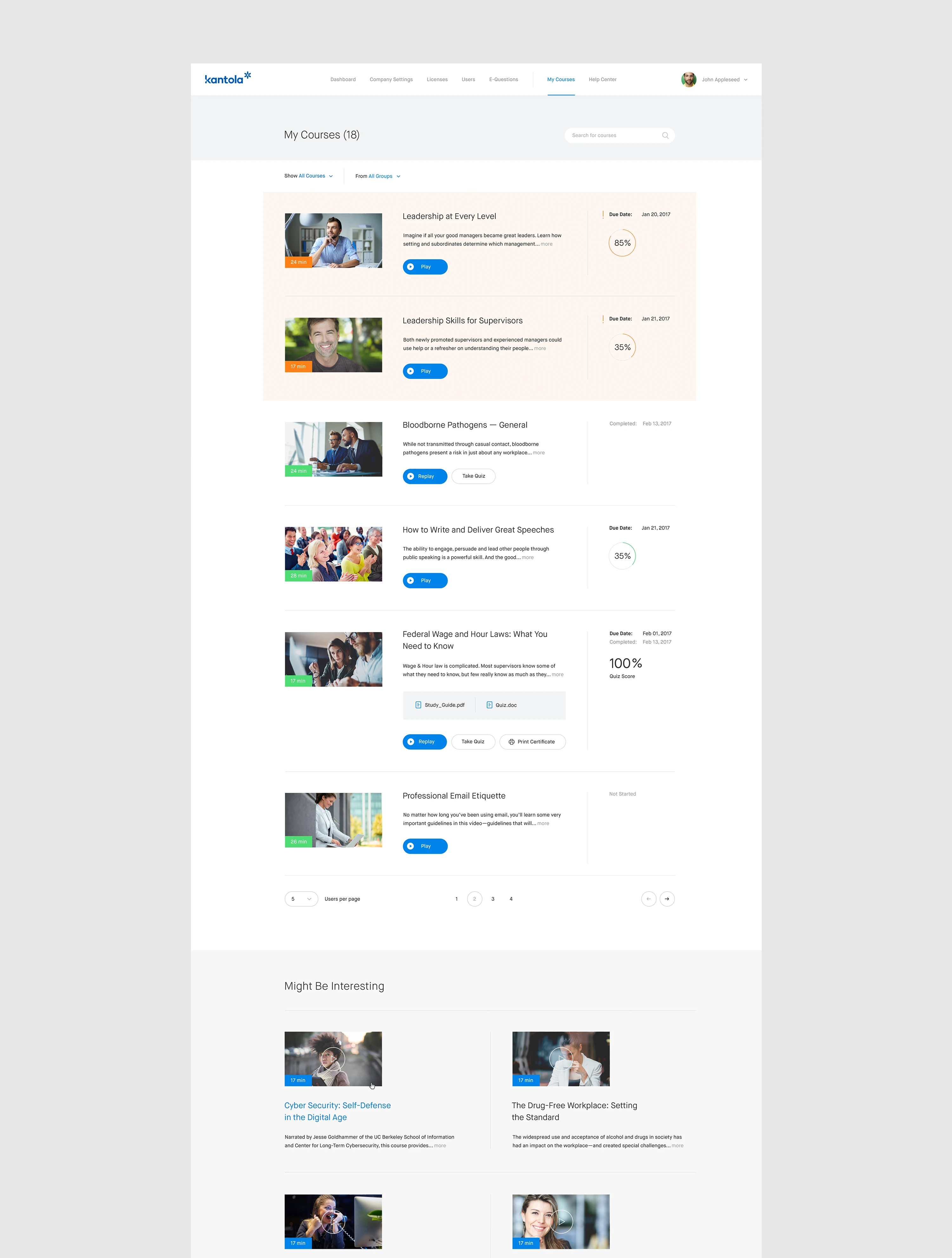
A personalized training portal lets learners view their courses, access additional training materials, and receive course completion certificates. We wanted the assigned course list to contain the most important information, such as due date, progress, and status, without extra navigation.
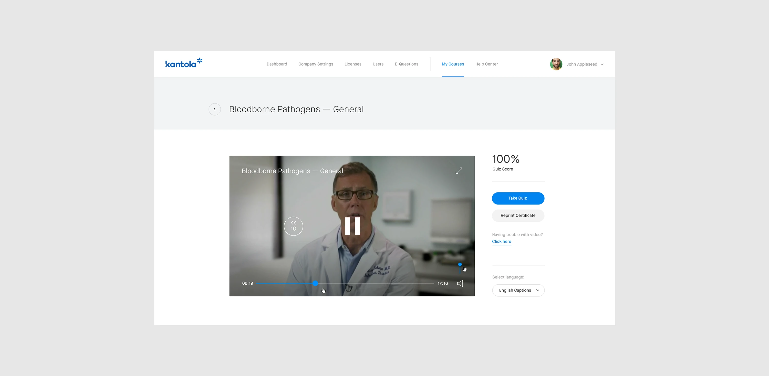
Building a video player that lets learners rewind and fast-forward within the already watched segment but not skip unseen parts was an exciting technical challenge.
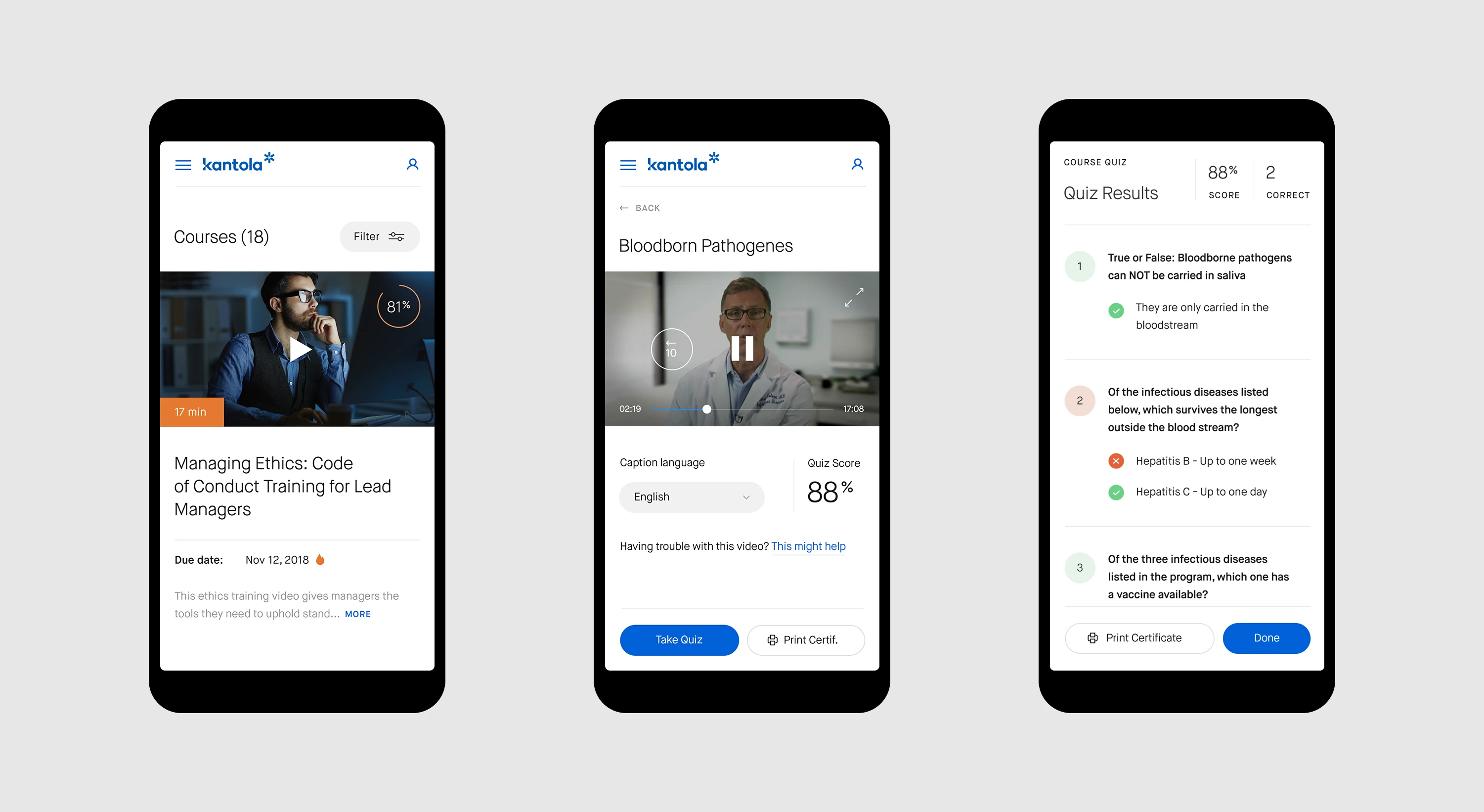
To accommodate on-the-go learners, we ensured easy access to training outside work desks, improving the overall learning experience.
The design approach
1. Turning training data into an administrative overview
We introduced a training dashboard that allowed administrators to see how learners were progressing without reviewing records one at a time.
Attendees were organized into meaningful status groups, helping training managers distinguish between learners who had completed a course, those who were actively progressing, and those who might require follow-up. This status-based approach made reporting easier at both the overall program level and within individual courses.
Administrators could also review important engagement details, including each learner's position in a course, quiz results, and most recent login. Bringing these signals together created a more complete picture of participation and made it easier to identify potential compliance risks.
2. Reducing friction in learner management
Managing learners is interaction-heavy by nature. Administrators frequently add people, update assignments, review status, and perform actions across groups of users. Displaying every available control at all times made those workflows feel even more complicated.
To simplify the experience, we removed visual clutter and used progressive disclosure to keep repetitive or contextual controls hidden until they were needed. The interface prioritized the information administrators needed to scan, while keeping relevant actions accessible in context.
This reduced the perceived complexity of the product without reducing its functional depth.
3. Supporting programs and multiple locations
Kantola serves organizations of different sizes and structures. The redesigned LMS therefore needed to work for a straightforward training program as well as for businesses coordinating courses across multiple locations.
We made it easier to create learning programs, organize participants, and manage training across distributed teams. The updated structure provided flexibility without forcing smaller organizations through unnecessary configuration.
4. Creating a focused learner portal
Administrators and learners enter the LMS with very different goals. Administrators need oversight and control; learners need to understand and complete their assignments.
The personalized learner portal was designed around that distinction. Each learner could view assigned courses, access supporting materials, and retrieve completion certificates. Course listings surfaced the most important information directly—including due date, progress, and status—so users did not have to open multiple pages simply to understand what required attention.
This made the experience more direct and helped reduce uncertainty around completion requirements.
5. Designing video behavior around compliance
Workplace training must balance convenience with completion requirements. Kantola needed a video player that allowed learners to revisit material they had already watched while preventing them from skipping unseen content.
Dworkz helped design and implement a player that allowed rewinding and fast-forwarding within previously viewed segments but restricted navigation beyond the learner's completed position.
This interaction gave learners control over review while preserving the integrity of required training. It also translated a business and compliance requirement into behavior that was understandable within the interface.
6. Making training accessible beyond the desk
Employees do not always complete training at a desktop computer. The redesigned experience therefore needed to remain usable across different devices and working environments.
We adapted the learner experience for on-the-go access, making assigned courses and essential information easier to reach outside a traditional workstation. Responsive behavior extended the usefulness of the platform while maintaining clarity around progress and completion.
7. Connecting design with implementation
Because the project involved modernizing an established platform, design decisions had to work with existing functionality rather than assume a complete technical rebuild.
Dworkz's front-end development involvement helped close the gap between design intent and implementation. Working directly with the product's interface made it possible to preserve proven capabilities, resolve practical constraints, and ensure that the updated experience remained consistent across interconnected workflows.
The outcome
The redesigned LMS gave administrators a clearer way to assign training, monitor engagement, oversee programs, and access compliance information. Learners gained a focused portal that made courses, deadlines, progress, materials, and certificates easier to find.
The project preserved the value of Kantola's established platform while making it feel like a purpose-built, modern product. By reducing clutter, improving visibility, and organizing the experience around the needs of each user group, the redesign also supported Kantola's objective of reducing avoidable support requests.
Following the release, Kantola received positive feedback from more than 16,000 clients about the ease of administering training and accessing information. Customer satisfaction rose to more than 99%.
I was continually surprised how quickly Dworkz team understood the user flow, made sense of it, and greatly improved the UI/UX.
— Allen Noren, CEO, Kantola Training Solutions
Key takeaways
Modernized a decade-old LMS while preserving its existing functionality.
Created a high-level dashboard for monitoring training performance and compliance.
Organized learners into actionable status groups for more efficient reporting and follow-up.
Reduced interface clutter through clearer hierarchy and progressive disclosure.
Simplified program creation and multi-location training management.
Designed a focused learner portal centered on assignments, deadlines, progress, and completion.
Developed video controls that balanced learner flexibility with compliance requirements.
Improved access to training across devices and working environments.
Combined UX/UI design with front-end development to maintain implementation quality.
Helped deliver an experience associated with more than 99% customer satisfaction.
Like this project
Posted Sep 21, 2026
Kantola LMS: Simplifying Workplace Training and Compliance Management
Likes
1
Views
2
Clients
Kantola Training Solutions