Bread of Life Giving Branding by Bilal HaiderBread of Life Giving Branding by Bilal Haider

Bread of Life Giving Branding

Bilal  Haider

Bilal Haider

Bread of Life Giving — Nonprofit Logo Design
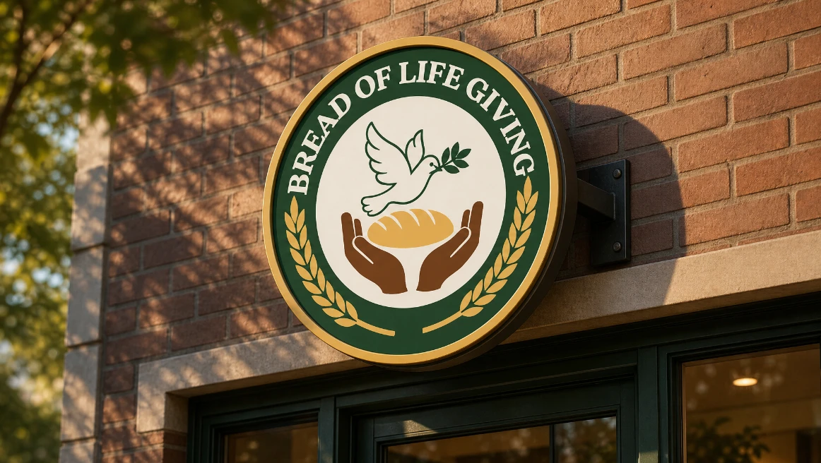
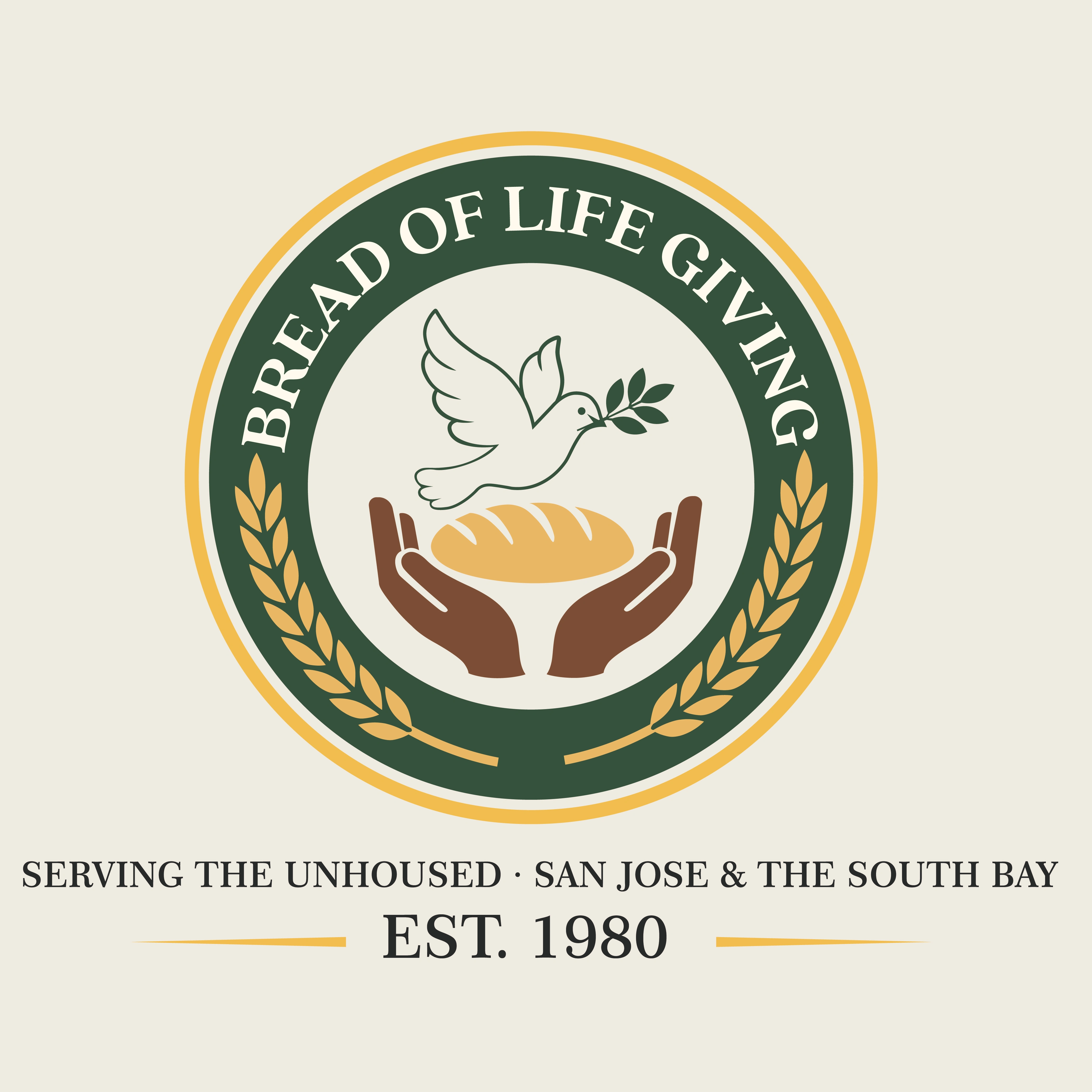
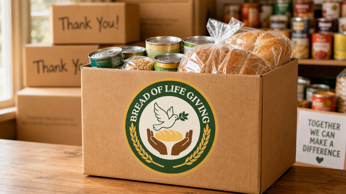
This logo was crafted for "Bread of Life Giving," a nonprofit organization on a mission to fight hunger and bring fresh bread to communities in need. Every element was chosen with intention: a dove carrying an olive branch soars at the center, symbolizing peace, hope, and renewal, while a pair of open hands gently cradle a warm loaf of bread beneath it — representing generosity, nourishment, and the simple act of giving. The circular badge format lends the mark a timeless, seal-like quality, often associated with trust and heritage, making it instantly recognizable as a mission-driven organization. Framing the emblem is a border of golden wheat stalks, a nod to harvest, abundance, and the source of bread itself, tying the visual story together from grain to giving.
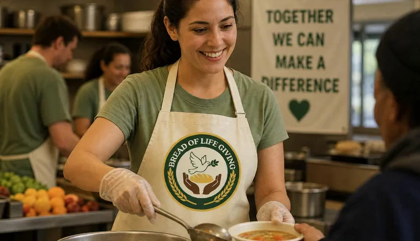
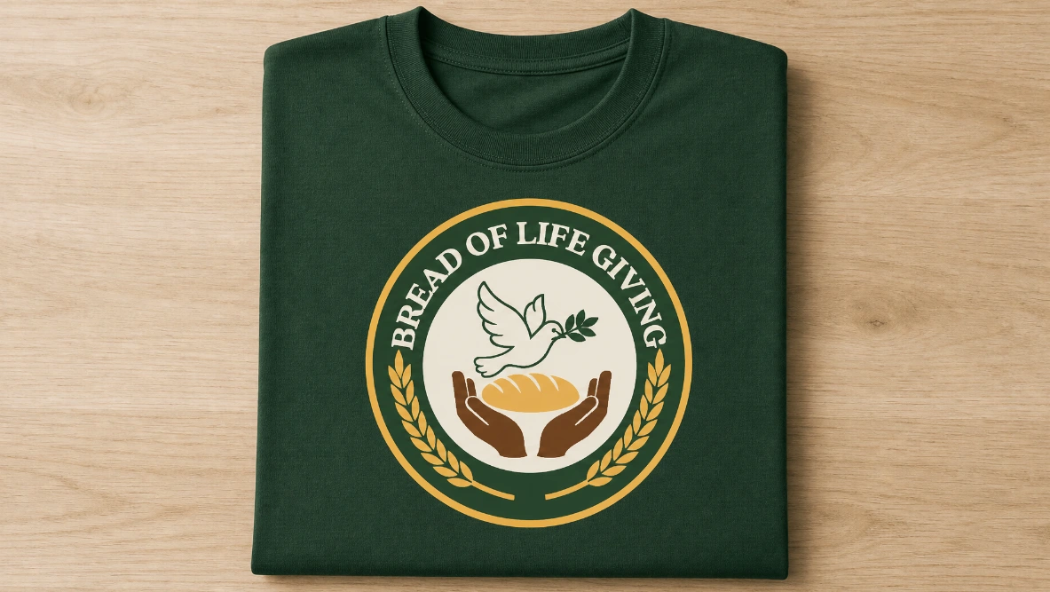
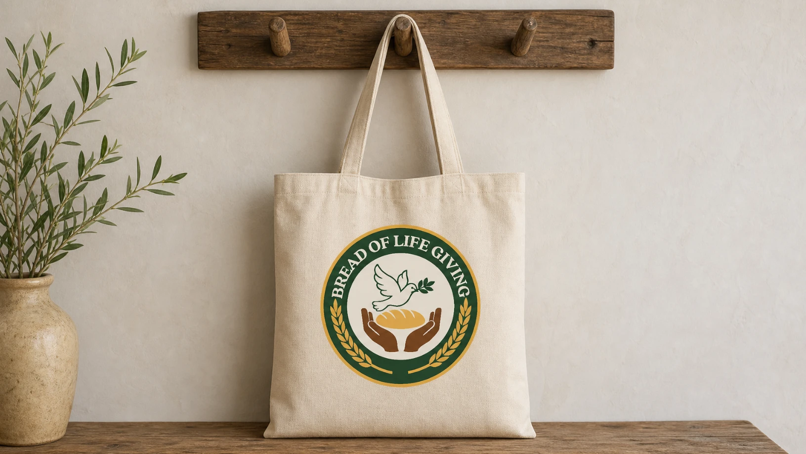
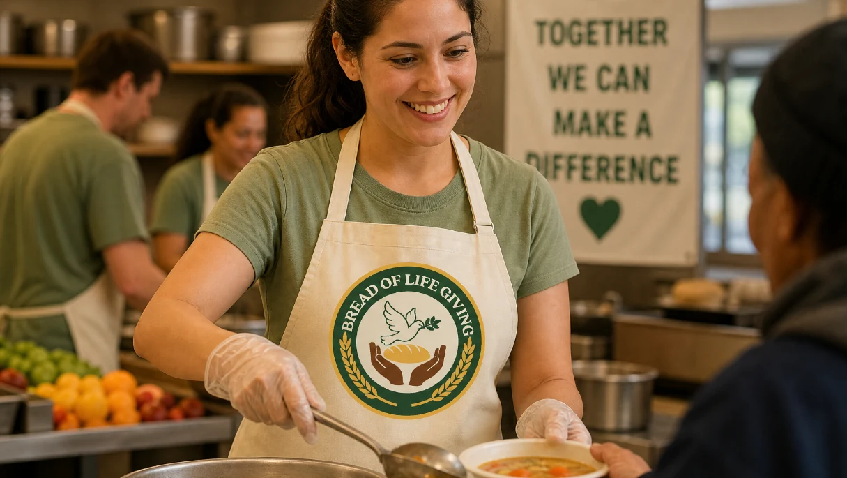
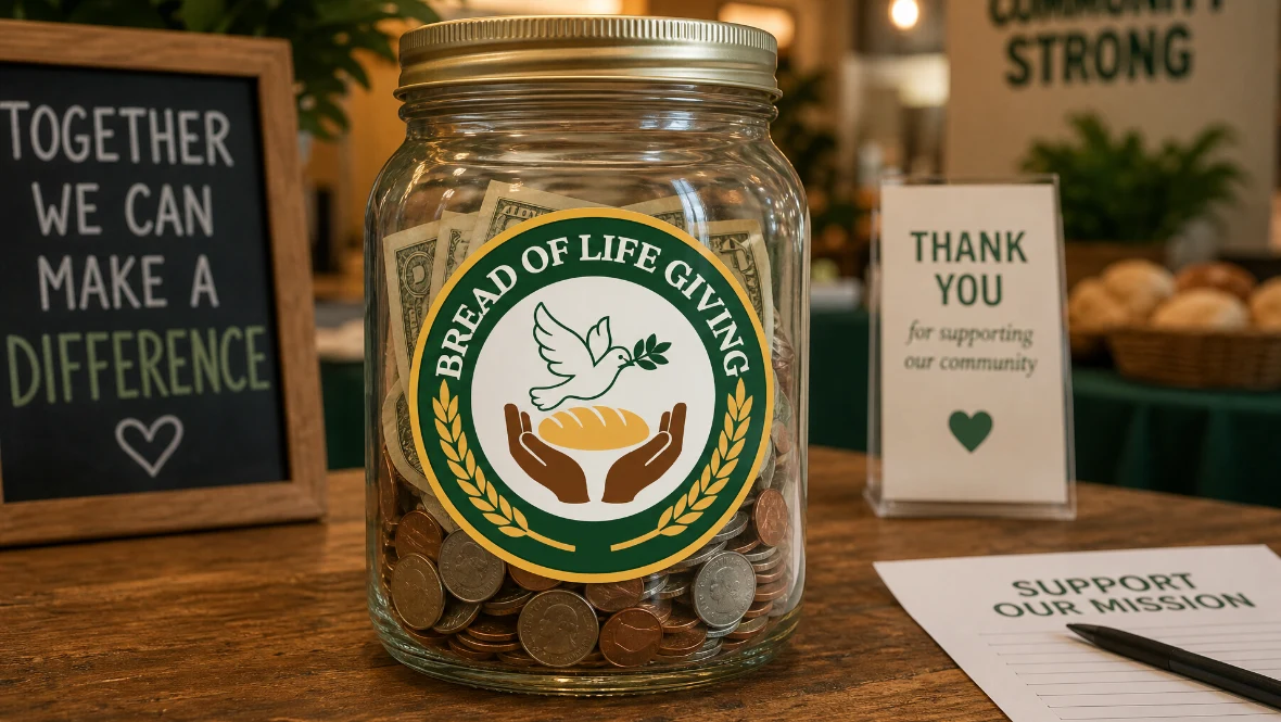
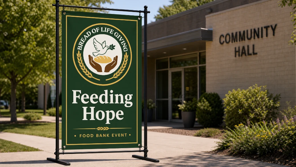
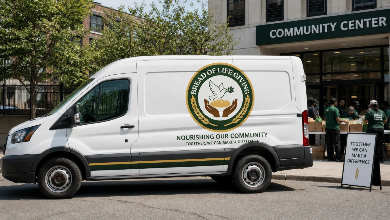
The color palette was deliberately restrained — a deep forest green paired with warm gold and earthy brown tones — to evoke stability, growth, and warmth, while keeping the design approachable and community-focused rather than corporate. The typography wraps organically along the circular edge, reinforcing the seal-like structure while keeping the name legible at any size, from a small app icon to large signage or vehicle branding. This adaptability was a key design goal, since nonprofit logos need to perform across everything from donation boxes and volunteer T-shirts to social media and printed banners.
Overall, the goal was to create a mark that feels warm, trustworthy, and full of quiet hope — a visual identity that communities can rally behind and donors can immediately connect with emotionally.

Interested in a professional logo design or branding? Let's work together: https://dribbble.com/services/62588-Quality-Brand-Sprint
Like this project

Posted Oct 17, 2026

The color palette was deliberately restrained — a deep forest green paired with warm gold and earthy brown tones — to evoke stability, growth, and warmth, while keeping the design approachable and community-focused rather than corporate. The typography wraps organically along the circular edge, reinforcing the seal-like structure while keeping the name legible at any size, from a small app icon to large signage or vehicle branding. This adaptability was a key design goal, since nonprofit logos need to perform across everything from donation boxes and volunteer T-shirts to social media and printed banners. Overall, the goal was to create a mark that feels warm, trustworthy, and full of quiet hope — a visual identity that communities can rally behind and donors can immediately connect with emotionally.