Design App for Home Credit Bank

👋 Hello everyone! We are excited to announce a new project - a redesign of the main screen of the mobile app and the payment transfer screen for Home Credit Bank.
Getting started and Brief
The Kazakh representative of Home Credit Bank contacted our company to ask us to adapt the mobile app to the local market of banking services. They also wanted to add some unique features that would be more relevant to the region.
Preparatory work
Before starting to create our prototype, my team and I conducted a research on our competitors to understand what features they offer in their banking applications.
Next, we conducted a survey among the users of their current mobile app. After a thorough analysis, we decided to "reimagine" the main screen as it did not meet users' needs.
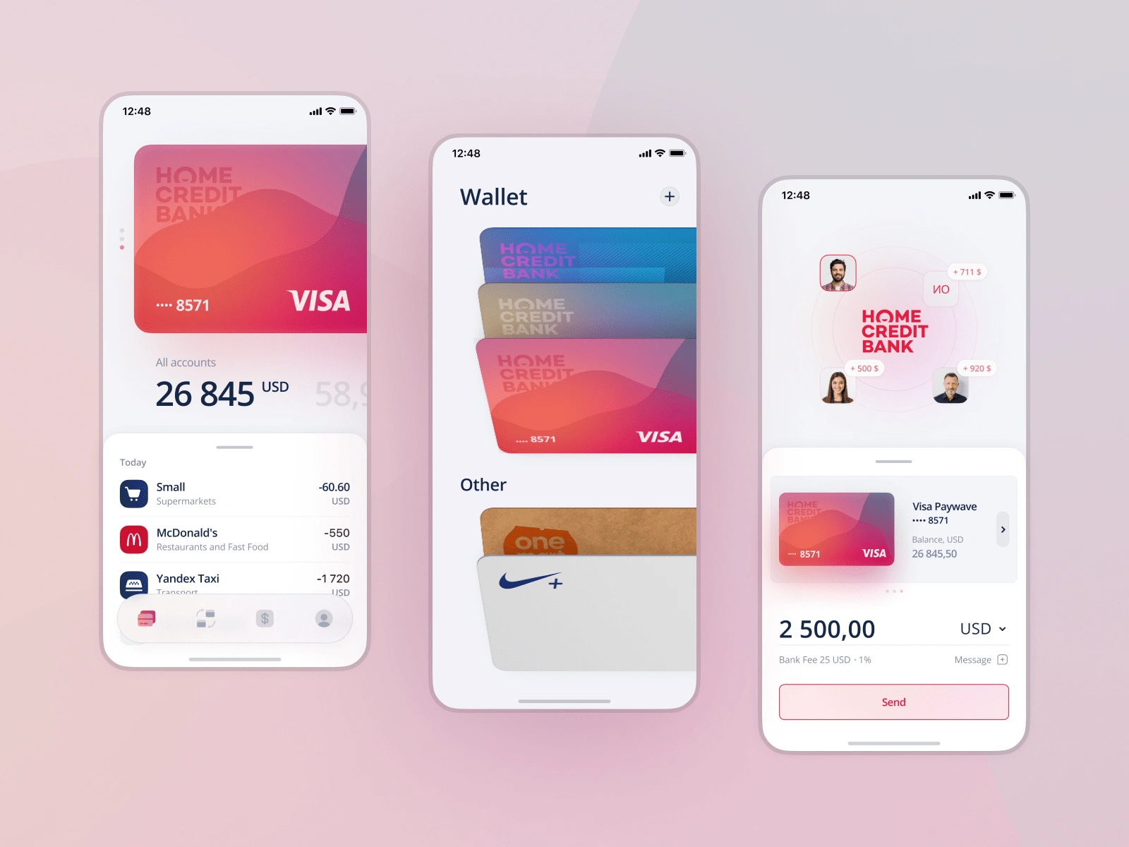
See the number of bank cards or accounts issued on the main screen, along with the remaining balance.
To be able to check the balance in different currencies in one move, as users often send their funds to neighboring countries
Track your transaction history instantly, without having to switch to another tab
Redesign of the main screen
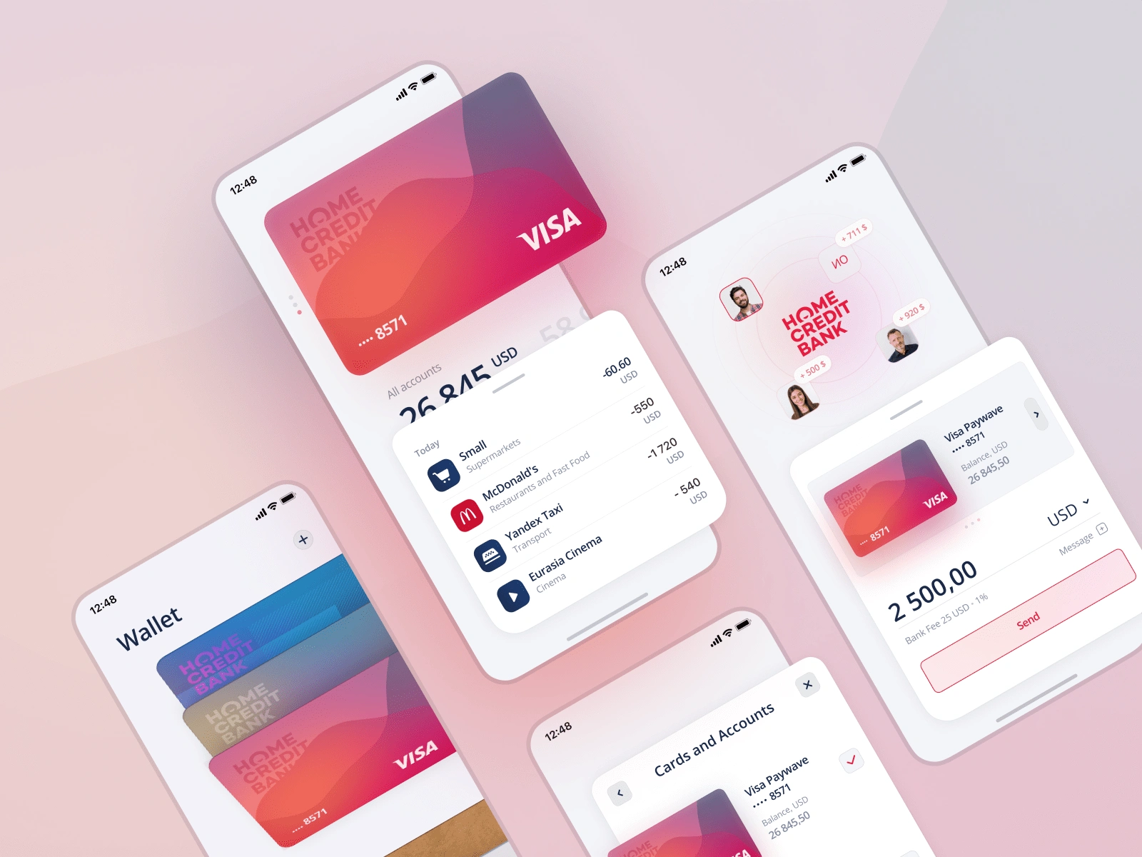
We have provided users with the ability to easily switch between cards and accounts by simply swiping up or down. To ensure maximum convenience, we have also increased the size of the map, so that it is easy for users to reach the slider with one hand, even on devices with larger diagonals
One of the features we have decided to implement is the integration of various types of discount and loyalty cards into our banking app. This has helped to increase the frequency of visits to the app and the time users spend in-app
By swiping to the left users can easily switch the main currency of their card or account
We have designed a bottom sheet to show the transaction history so the user can always swipe it up to use the full screen

Transaction / Transfer Screen
Next, we designed the transaction screen into operation. During our interviews with users one of their most common requests was to reduce the number of steps in daily transfers.
When switching to the transaction list, the user will see the most frequent transfers at the top of the screen. If the photo has not been uploaded, the initials of the recipient will be displayed. Next is a list with all the contacts.
By tapping a photo or a contact line a bottom sheet opens to select a card and enter the amount. Moreover, the user can change the currency and write a message. This window also provides information about any commission fees.
To quickly change the recipient, there is no need to go back to the previous page - just tap on another recipient and all the information will be saved, because the user have not left the current screen.

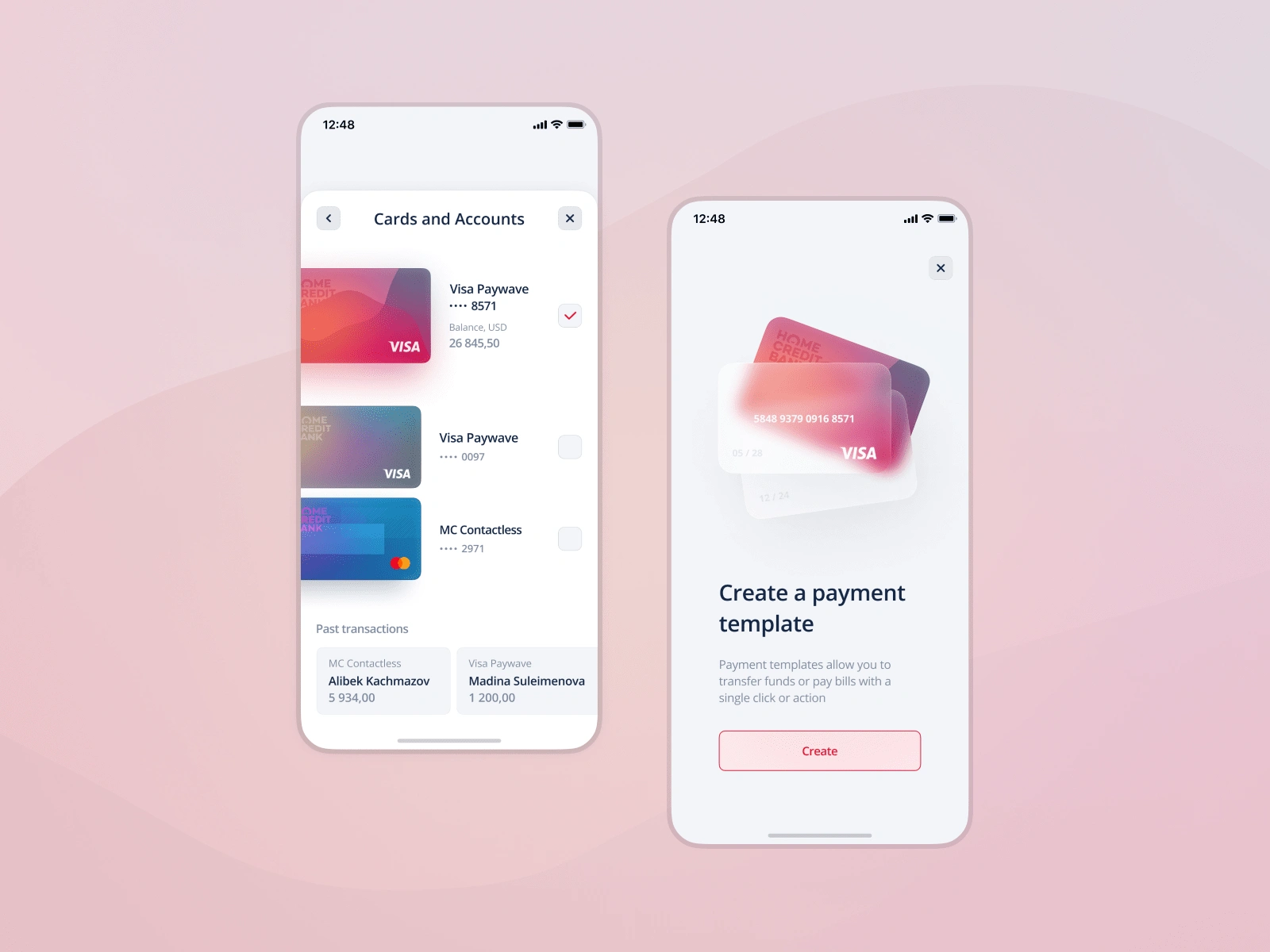
The user will be able to swipe and choose the card or account from which the transaction will be made. For convenience, we have left the option to select a card from the list of existing accounts. In order to go to this screen, just tap on the block with the card. When the necessary card is chosen, there is a hint at the bottom with the latest transactions.
After completing a transaction, we recommend to create a template for future payments to make the process even more convenient.
Continuation of work and desktop version
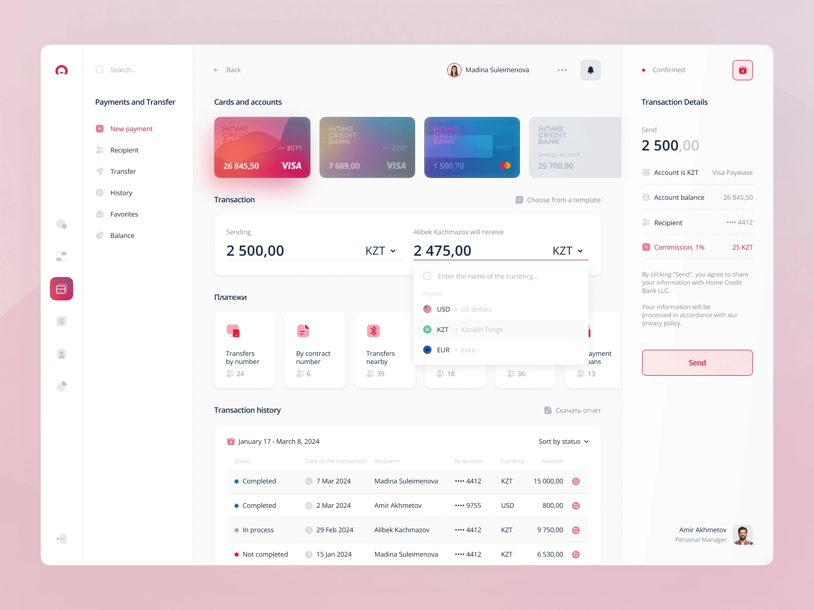
You have seen only a small glimpse of the work that went into redesigning the banking app. At the moment, we are finishing its implementation and have already created a new interface for the desktop version. Soon, we will share more details about this exciting update...

And if you also need help with a mobile or desktop app design, please don't hesitate to contact me. We can work together to bring your digital vision to reality!
Like this project
Posted Jul 13, 2024
Hello everyone! We are excited to announce a new project - a redesign of the main screen of our mobile app and the payment transfer screen for Home Credit Bank
Likes
1
Views
10
Clients
Home Credit as


