Iceland Player
Getting started and a Brief
A small startup that promotes and promotes modern indie musicians and local folk artists.
The founders of the company were inspired by the idea of creating an innovative application that would showcase not only artists signed to their label, but also other talented local musicians. They wanted to create a platform similar to a radio with selections to help promote lesser-known bands and solo artists. For such a unique project, a distinctive design was essential. And here we come to the rescue!
We set ourselves the goal of creating a simple app that allows users to play music from their favorite local bands with just two taps. This could be a famous musician, or a neighbor, or colleague, who writes songs in their free time with other musicians. At the same time they don't have to switch between streaming services to find new music.
Preparatory work
The task seemed rather complicated, so we began preparing carefully:
We listened to dozens of tracks by indie artists.
We conducted a survey among our test group to find out what features they lacked in the apps they used every day.
We surveyed our target audience to find out where they listened to music most frequently: while commuting to work, during sports, while doing household chores, and while preparing for school.
And, of course, we gathered references. One of these references was the iPod, which was chosen as the basis for our app design. Later we explain why.
Design
When we tested different layouts on real users, one of the most recognized interfaces was the iPod. The shape of the device, the placement of the function buttons, and the ratio of screen to workspace - all these factors led users to believe that this was the perfect form factor for listening to music. This inspired us to create one of the main screens for the player in a style reminiscent of the legendary iPod.

Functional
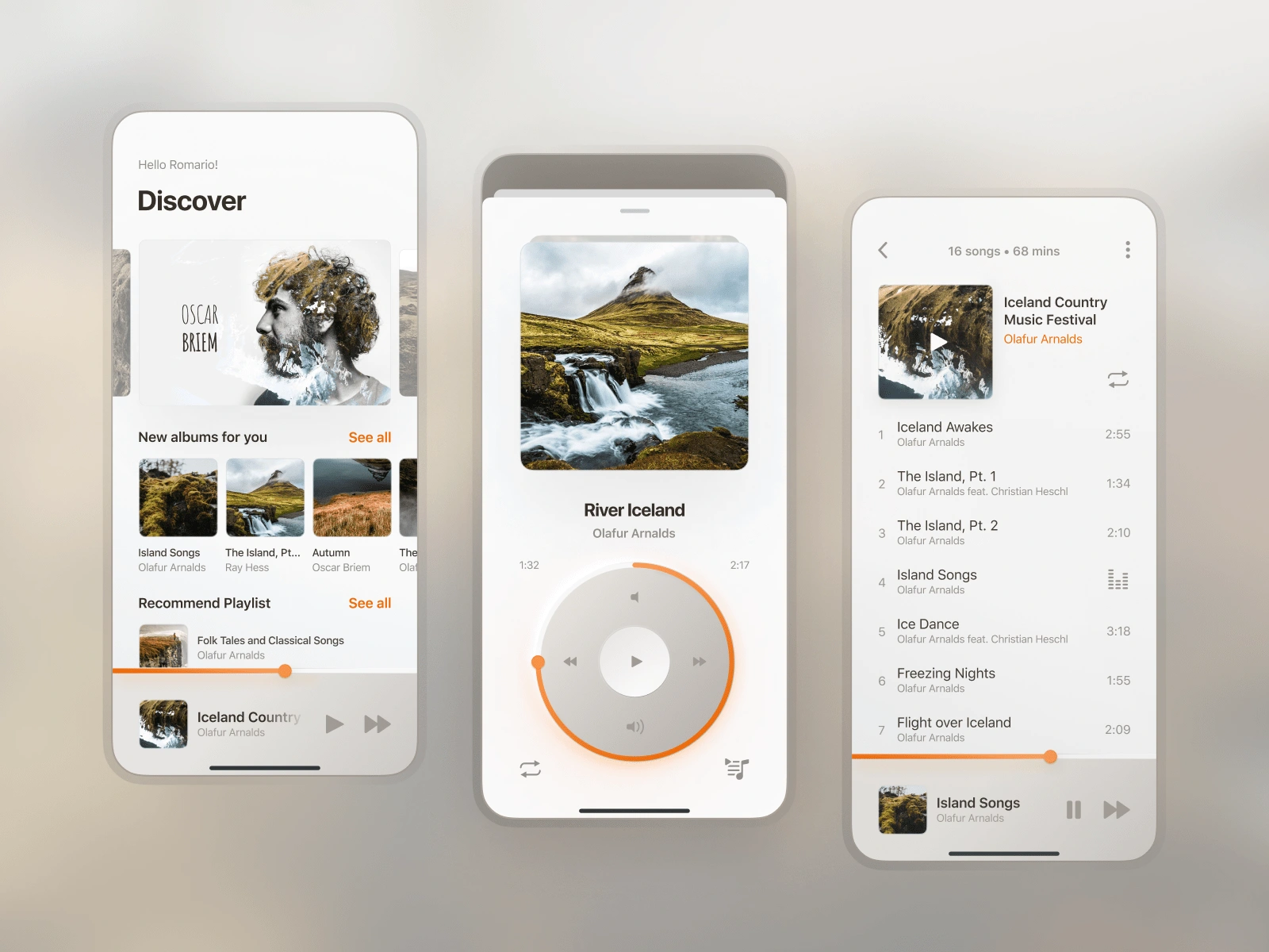
The main screen is divided into several sections:
A slider with a list of recommendations from the editorial team, including local artists and their songs.
Personal album selections, which are tailored to each user's musical preferences.
Playlists from other users with similar musical tastes.
When a user taps on an album or collection, they are taken to a screen that provides detailed information about it. This screen also displays a list of all the songs in the selected album or collection.
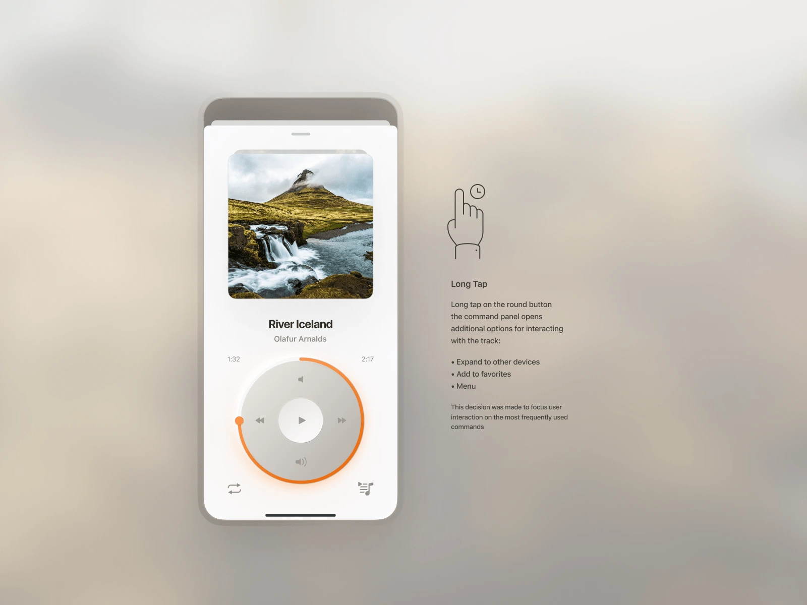
When playing a song, a player screen appears in front of the user.
In the upper part the album cover is displayed, allowing the user to swipe to switch tracks.
At the bottom there are buttons for interacting with the song. We have specifically positioned the most commonly used buttons near the bottom of the screen, so that users can easily reach them while holding the device with one hand, when jogging or driving.
There is a slider surrounding the functional area, allowing users to quickly navigate through a song and select a specific part.
If the user long taps the functional area, additional commands will appear. The position of the buttons depends on how frequently they are used: the most commonly used commands are displayed at the bottom of the player.
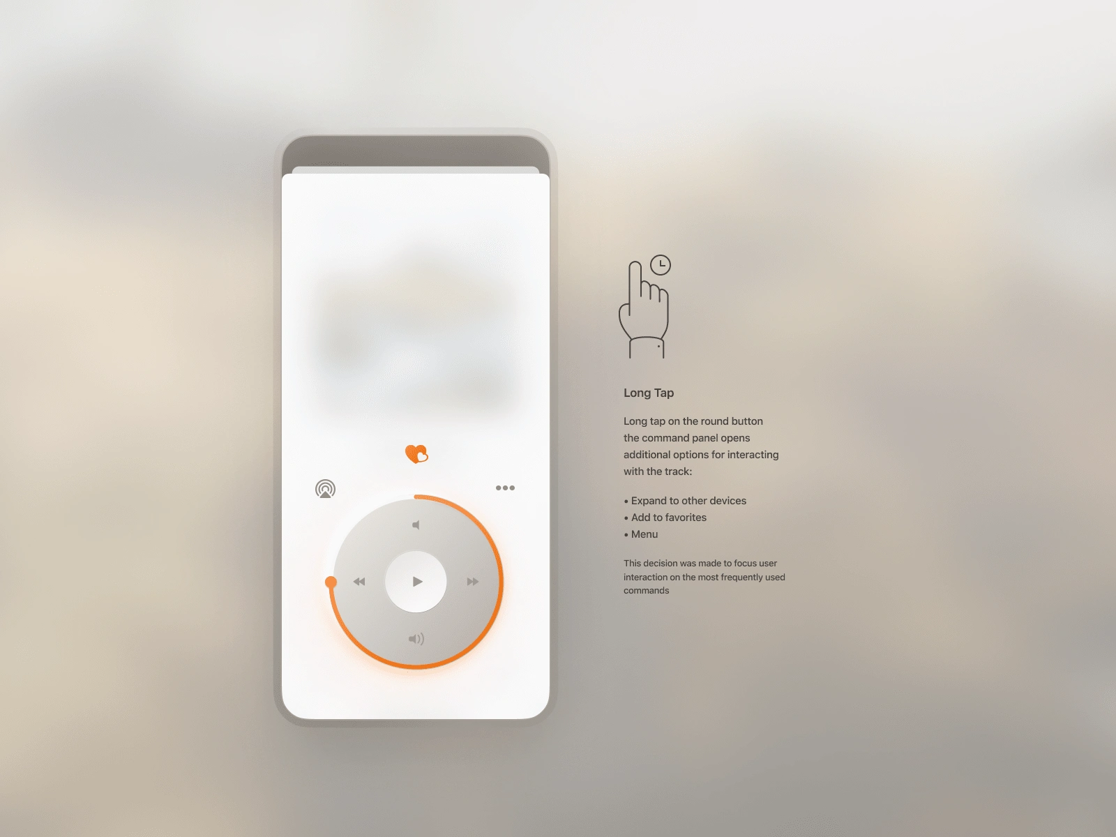
The player screen becomes a bottom sheet when the user swipes it down. Now it is compact and can be easily accessible on all screens of the app. This solution allows the user to pause playback at any time or switch to another song.
...
We have shared only a small glimpse of the process we go through when working on a prototype for an app. This might help you better understand the principles and methods that guide our team as we work on product design.
If you are the owner of a startup or a large company with a million-strong audience and you need an app to help grow your business, we can help!
We will create a design concept that will bring your ideas to life and provide you with advice on all matters that interest you. Let's cooperate to achieve your goals!
Like this project
Posted Jul 13, 2024
This is a design for an audio player app. The goal was to create a clean and simple audio player with an intuitive interface
