Jobs Board Web Design
Jenna Edgar
Graphic Design Jobs UK
Design and build of a fully responsive jobs board website. The website was to provide a one-stop index for junior and early career designers in the UK.
Challenge
Graduates and early career designers need a comprehensive and trustworthy location to find and apply to job listings for permanent and freelance roles in the UK, and to get guides and advice to help them with their careers. We will know this to be true when we see users visiting and engaging with the site, applying to listings, and reading the guidance content available.
Solution
Implementing a user centric design methodology to create a jobs board where employers can pay to posting design job listings, and employees can quickly and easily find and apply to these listings.
Outcome
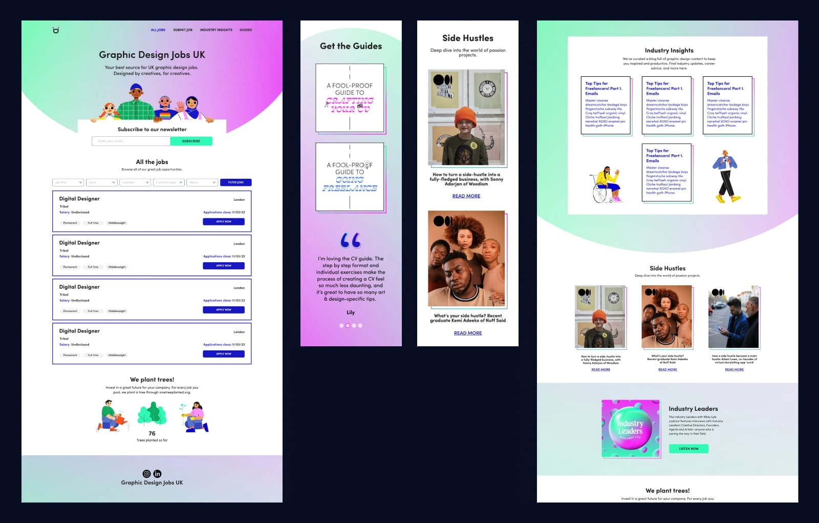
Graphic Design Jobs UK is a fully responsive web app where anyone looking to hire designers can pay a fee to list their vacancies. Designers can search, browse and apply for jobs directly from the site, and also access content to help them in their career progression such as guides, insights and advice from people within the industry.

Define
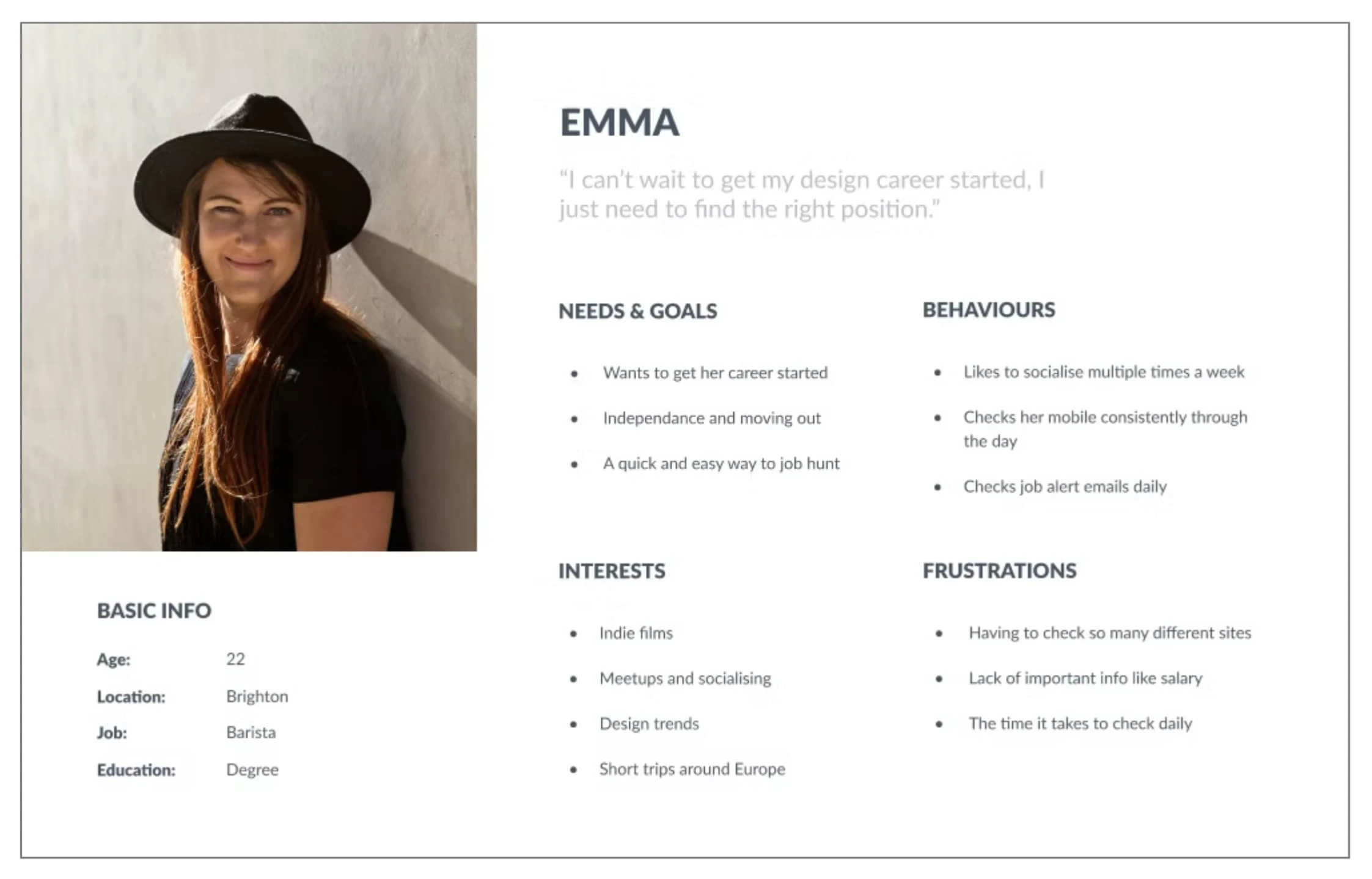
Persona creation
From the client's provided market research and interviews, I created a persona of the early career job hunter, so we could better understand potential users' goals, needs, experiences, and behaviours. This persona would help guide my ideas and sketches throughout the project
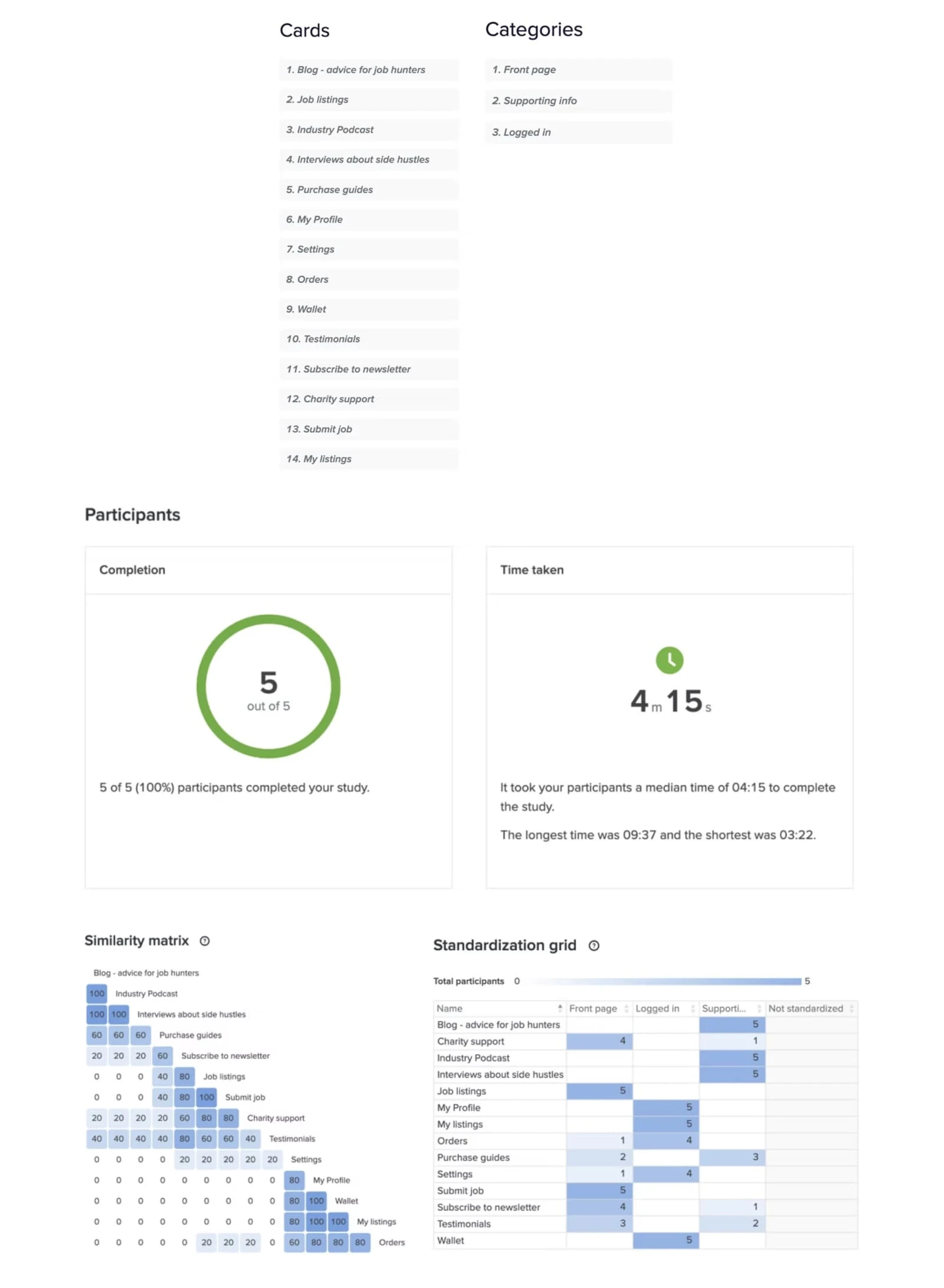
Card sort
The purpose of this card sort exercise was to make sure the categories and navigation followed a familiar pattern so that users could access all they need to. From this I could see that participants defined the Job Listings, Job Submit, Newsletter and Charity Support to be the main content for the site. For supporting content the Blog, Podcast, and Interviews were consistent selections. The third category contained all personalised content that can only be accessed by logging in and cards such as Profile, Settings, Wallet and Orders were selected.
Sitemap
Using the results from the card sort, the below sitemap was developed:

Ideate
Sketches & Wireframes
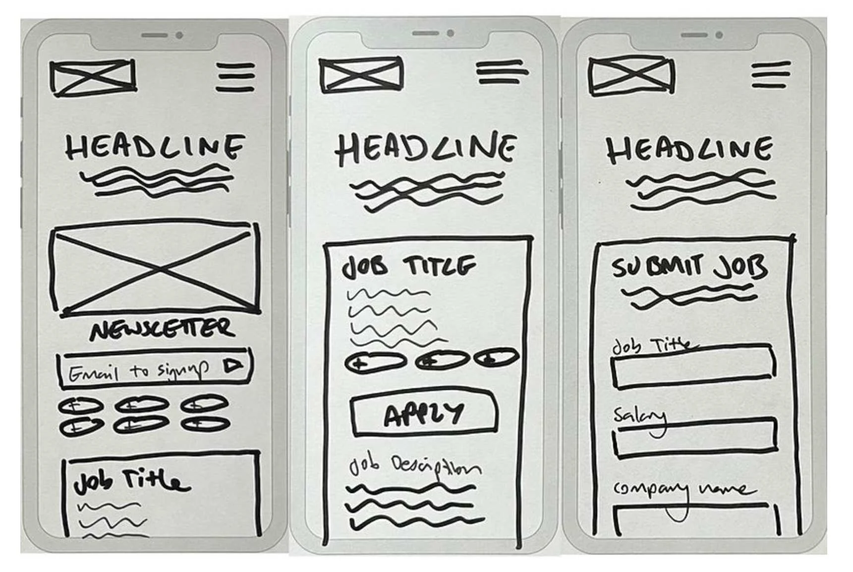
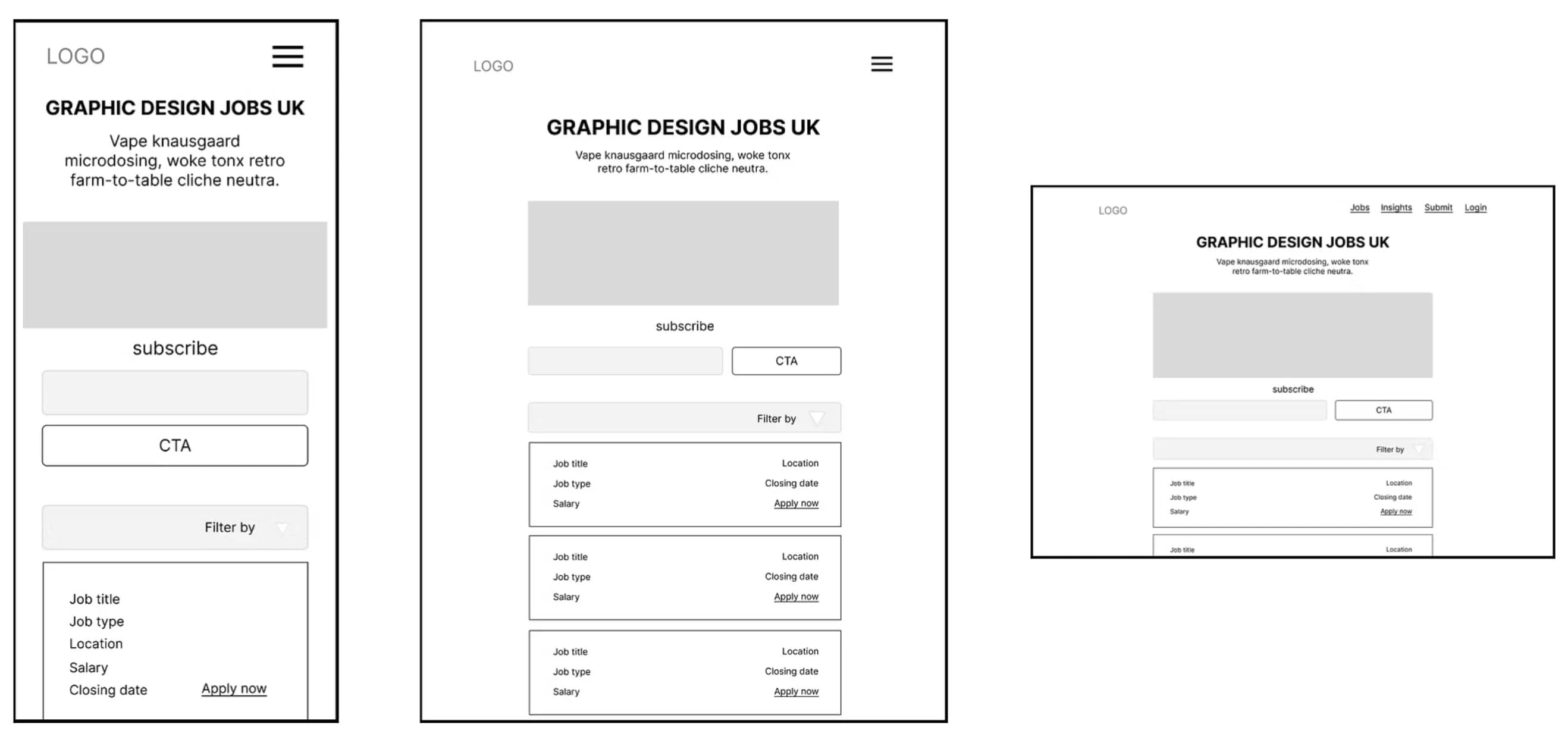
At this stage I created a series of sketches and wireframes. These helped to refine how the features would come together on screen and to accelerate decision-making through visualisation without losing time, the mid fidelity wireframes were then created in Figma.
I came back to the sketches & wireframes throughout the entire design process to make sure that I didn’t lose sight of our primary goals and ideas.
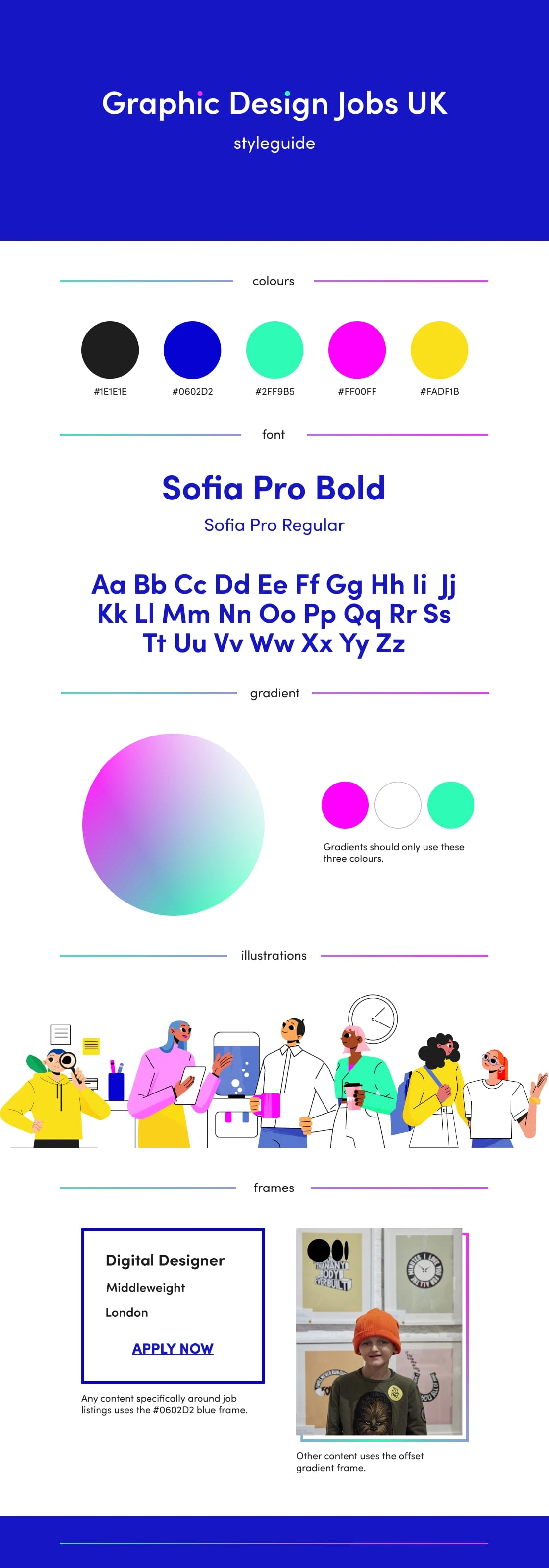
Brand Identity
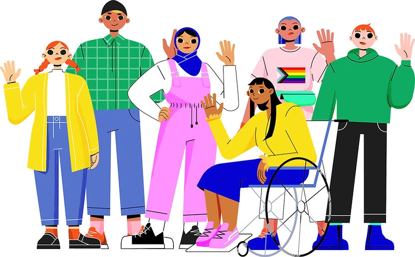
This website is to be a sister brand to that already established by my client, so I selected a few key elements from that identity such as the pink/green colours, the gradients, and circles of colour. As the message of the new brand is that of growth and inclusivity, I used a collection of illustrated young people who will represent the diversity of opportunity that GDJUK provides.
Used throughout all branded visual identity, the people add a youthful energy, sense of fun, and help to illustrate the excitement of getting started in your creative career.
Final Designs
Prototypes
Mobile
Tablet
Desktop
Like this project
Posted Mar 24, 2025
Design and build of a fully responsive jobs board website. The website was to provide a one-stop index for junior and early career designers in the UK.
Likes
0
Views
11
Timeline
Jun 1, 2022 - Oct 31, 2022