Motocross E-commerce Landing Page Design
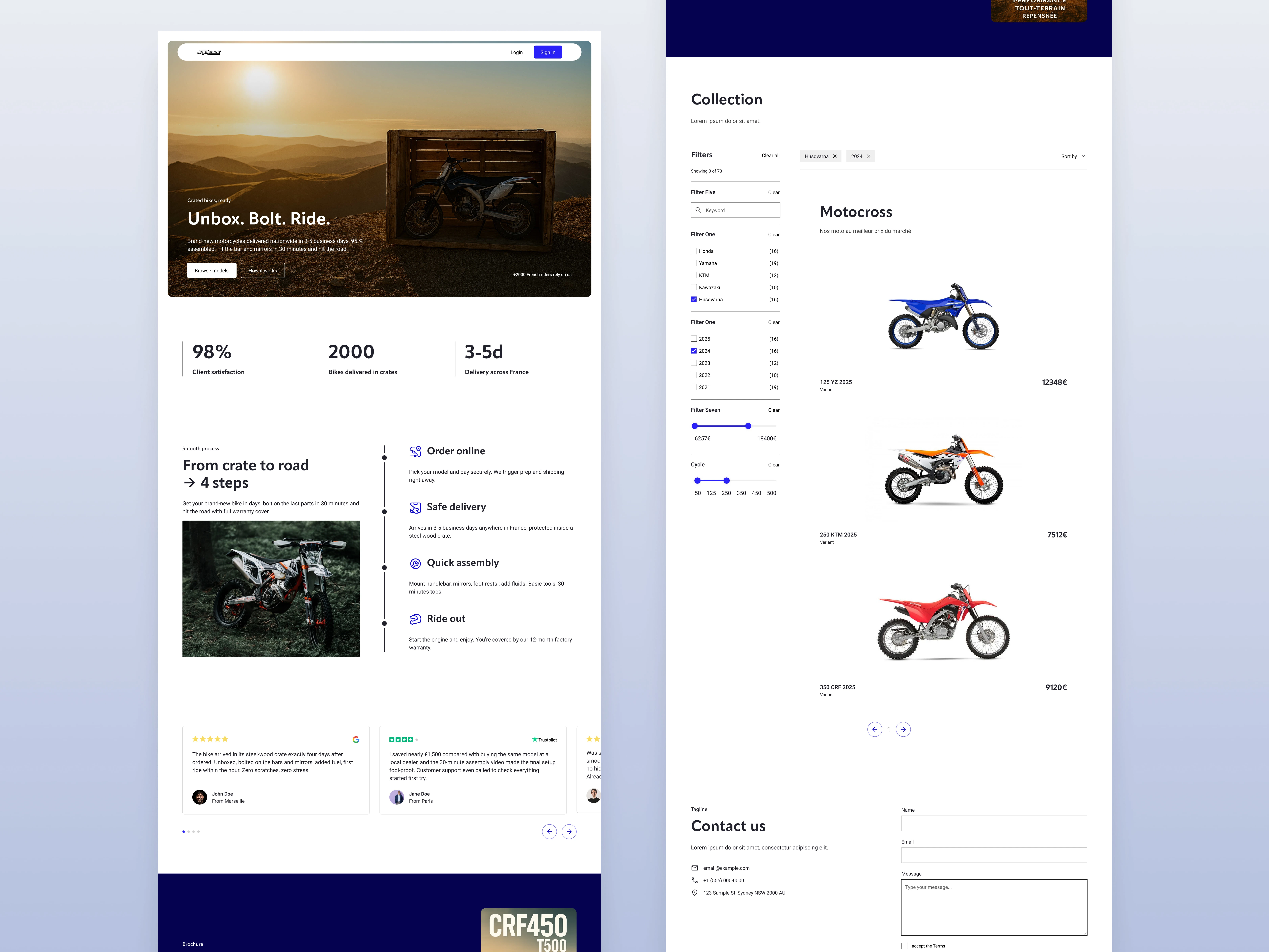
Landing page for Motocross e-commerce
📋Project Overview
I designed a full landing page for a fictional motocross e-commerce brand, focusing on conversion, clarity, and credibility.
The challenge: make users trust the product and guide them naturally toward action (buy or contact), without the visual noise often seen on niche e-commerce pages.

🧠 My Role & Methods
I led the full product design process, from layout and visual hierarchy to UI design and hero art direction.
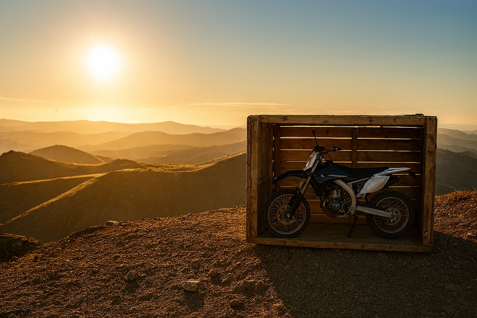
To create an immersive hero section that supports conversion, I started by sketching the scene in Blender to define structure, lighting, and composition.
Then I used Substance 3D Viewer and Adobe Firefly to generate a first version of the image using AI. But due to multiple inconsistencies and rendering errors, I refined the result by asking ChatGPT’s image tool to recreate the same scene in a more realistic and clean style, while keeping my original structure.
The rest of the page follows a conversion-driven UX strategy:
visual hierarchy guides the user toward action
value props are clearly segmented
testimonials and key metrics build trust
the product listing integrates filters without cognitive overload
The design is fully responsive and optimized for clarity and engagement, with a minimalist but bold aesthetic that highlights product visuals.
🎯 Strategy & UX Decisions
1. Hero section
A powerful emotional hook. The hero image immerses the user into the motocross experience from the first second, desert vibes, dramatic lighting, and the unboxing moment to spark desire.
Primary CTA placed immediately, simple copy, no distractions.
2. Social proof & guarantees
98% satisfaction, 2000+ bikes delivered, 3–5d delivery in France.
Each metric is bold and reassuring, placed high enough to reduce friction fast.
3. “From crate to ride” section
Clear 4-step process. Helps users understand that ordering is safe and easy, even for non-technical buyers. Icons and visuals reinforce the feeling of trust.
4. Testimonials
Social validation is key. Instead of generic “happy client” blurbs, I used layout and spacing to make each review feel credible, real, and easy to read.
5. Collection view
Filtering is essential. I created a filter panel to let the user explore bikes by brand, price, color, year, and engine size, all with minimal visual overload.
6. Contact section
The form is placed at the end, because users who scroll this far are typically ready to convert. I reduced the number of fields and added clear labels to make it frictionless.
🧪 Design Principles
• Strong visual hierarchy
• White space to breathe and guide
• Minimalist UI, no distractions
• CTA placed with strategic intent
• Easy navigation, especially on collection view
• Conversion > decoration
📈 Section “From crate to road → 4 steps” , Conversion rationale
This section plays a key role in removing friction and boosting user confidence during the decision-making process. Here's how:
Breaks down complexity: buying a motocross bike online might feel intimidating. By structuring the process into 4 short, reassuring steps, we remove the perceived difficulty.
Visual timeline with icons: users instantly grasp the flow without reading. This makes it accessible even for fast scrollers or mobile users.
Left image anchors the promise: seeing the bike “in the wild” while reading the steps makes the final outcome tangible.
Step titles are verbs (“Order”, “Assemble”, “Ride”), creating a momentum that makes the user imagine themselves going through it.
Reassuring copy: short delivery time, basic tools, full warranty, each point answers a potential objection without creating anxiety.
Contrast and white space guide attention**: the eye moves naturally down the vertical line, reinforcing the idea of progression.
→ In short: this section acts as a conversion bridge, it transforms curiosity into confidence by making the experience look simple, fast, and trustworthy.
🧱 Tools used
• Figma (UI design)
• Blender ( 3D Hero image )
• Substance 3D Viewer + Adobe Firefly (3D Hero image)
Impact
This project resulted in a high-converting landing page that elevates the perceived value of the bikes while minimizing friction for potential buyers. Every design decision was made to support the user's path to action:
Immersive first impression through the 3D hero scene, which emotionally anchors the product in a lifestyle moment rather than just a technical object
Clarity of information, with stats and steps displayed early to build immediate trust and reduce uncertainty
Segmented storytelling: each scroll reveals a reason to believe, from the brand promise to testimonials to detailed specs
Conversion-oriented flow: no visual noise, only key elements kept, CTA buttons are spaced and styled for action without pressure
Visual consistency creates confidence: clean filters, sharp typography, aligned spacing, the whole layout feels reliable, not experimental
Scroll triggers are well-paced to avoid fatigue while progressively increasing engagement
This page structure can serve as a base template for other vehicles or physical products where technical trust and emotional desire must be balanced to convert users.
Like this project
Posted Jul 19, 2025
Designed a high-converting landing page for a motocross e-commerce brand.
Likes
2
Views
8


