Registration Form Redesign for Béthune Mosque

Minarat Studio

Registration Form Redesign – Béthune Mosque
Context
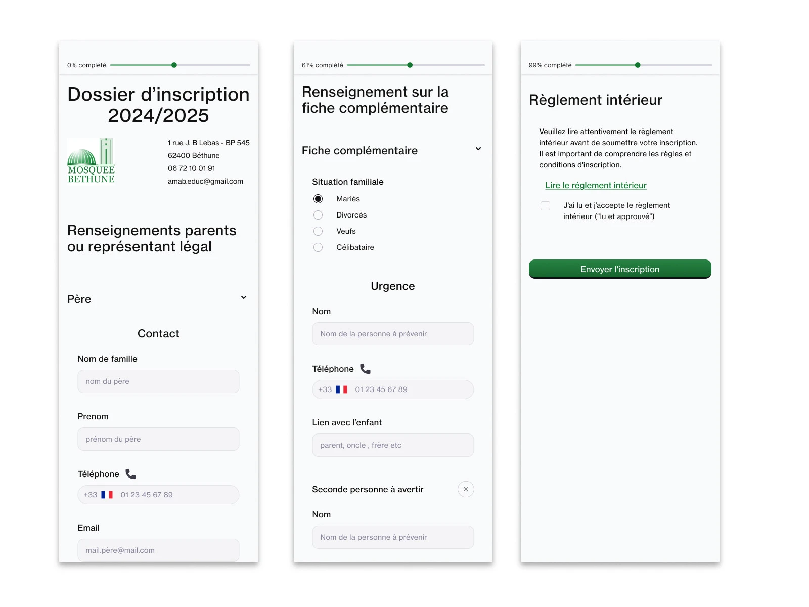
A volunteer from the mosque in Béthune contacted me to redesign their student registration form.
The original form looked long, flat, and discouraging to fill out, especially for parents or older users unfamiliar with digital tools.
This was a private, volunteer-based project with the goal of improving clarity and completion rates.
Objectives
Make the form feel shorter and easier to complete
Create clear separation between different sections (student info, parent info, schedules, etc.)
Build trust and reduce cognitive fatigue during the process
Ensure full responsiveness and mobile usability
Design Approach
I rebuilt the entire layout with a focus on structure and user flow.
Each group of fields is visually separated using consistent spacing, dividers, and headings, which allows users to progress step-by-step without feeling overwhelmed.
To support that structure, I also implemented a progress bar at the top of the form, showing the percentage completed.
This reduces friction and gives users a clear sense of how far they’ve come, especially helpful for long forms.
Layout & Spacing Logic
I defined precise spacing rules for:
Label to input distance
Space between two questions
Space between two sections
This follows the law of proximity, a Gestalt principle stating that elements placed close together are perceived as related.
By applying this rule, users naturally understand the grouping of information without additional visual clutter.
Design for development
To ensure easy implementation, I structured the layout with Figma auto-layouts and variable-based spacing and colors.
This made the integration cleaner and scalable, and simplified the work for the dev team.
Accessibility
To improve accessibility, I also designed each button with all necessary interaction states, including
hover, active, and especially focus, for users navigating via keyboard or with visual impairments.
This ensures the form can be used by a wider range of people in real-world conditions.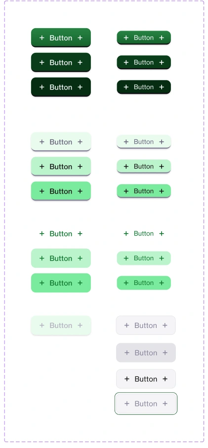
Button Design system
Confidentiality
For privacy reasons, I’m not sharing the live link to the form or any personal data structure in this case study.
Only the public-facing design logic is documented here.
Press Z to scale the prototype
Results
A visually organized, mobile-ready form
Better perceived simplicity without removing any required fields
Clear progress indicator for user reassurance
Consistent layout logic that can be reused across other internal forms
Positive feedback from local users and the mosque staff
This project is a strong example of how UX principles and simple design improvements can radically improve even the most basic interactions.
Like this project
Posted Jul 5, 2025
Redesigned Béthune Mosque's student registration form for better usability and clarity.
Likes
2
Views
9