Oakley Wilsons | Brand Identity
Andrei Sirbu

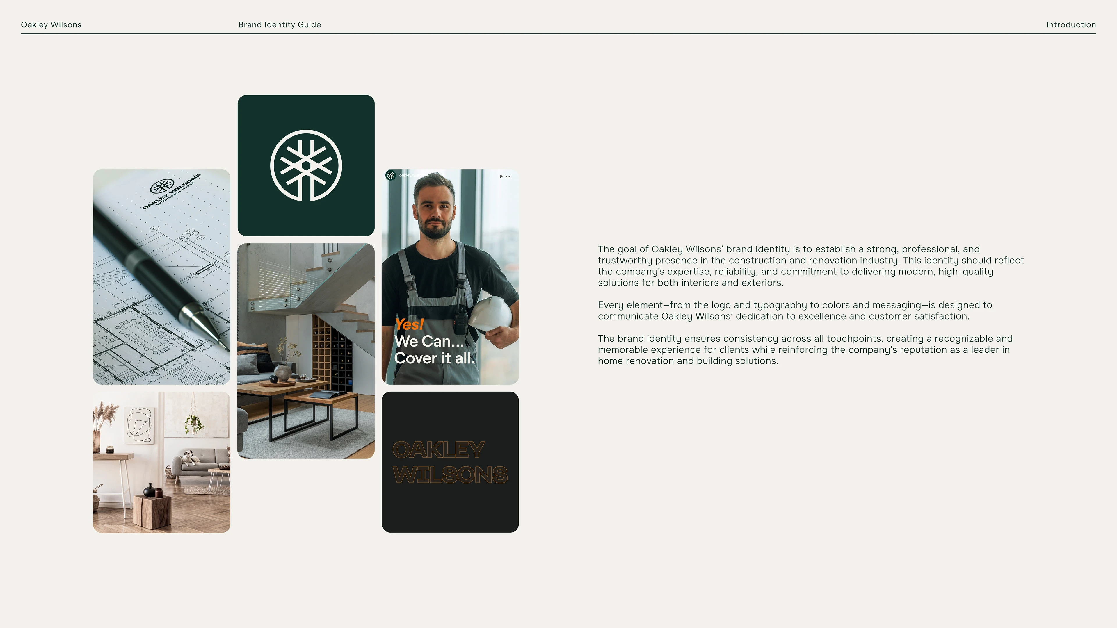
Oakley Wilsons is a UK-based construction and renovation company focused on high-quality, modern, efficient building solutions. My objective was to develop a brand identity that communicates craftsmanship, trustworthiness, and a contemporary edge.
Approach & Strategy
I began by diving into Oakley Wilsons’ market positioning: a land brokerage business transitioning into a broader construction and renovation presence. The visuals needed to reflect solidity, expertise, and modern reliability—all while being approachable to homeowners and commercial clients alike.
Identity Development
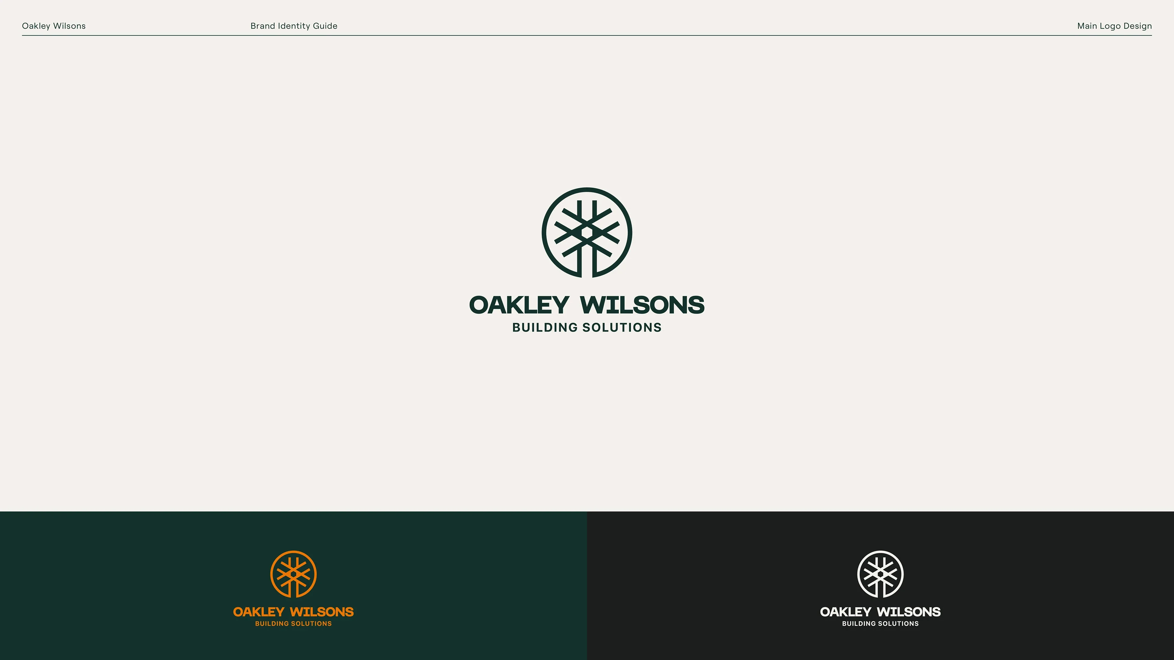
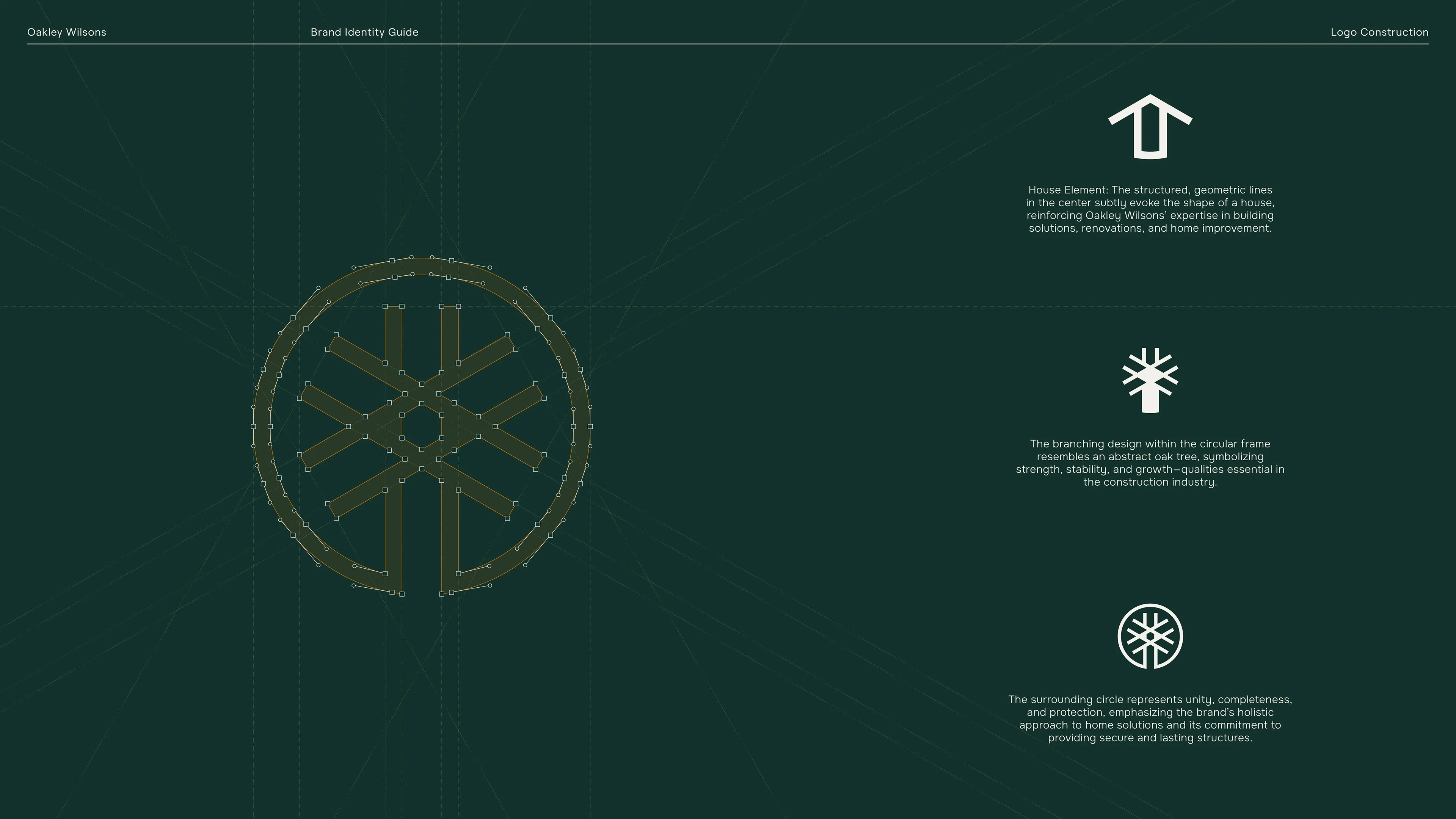
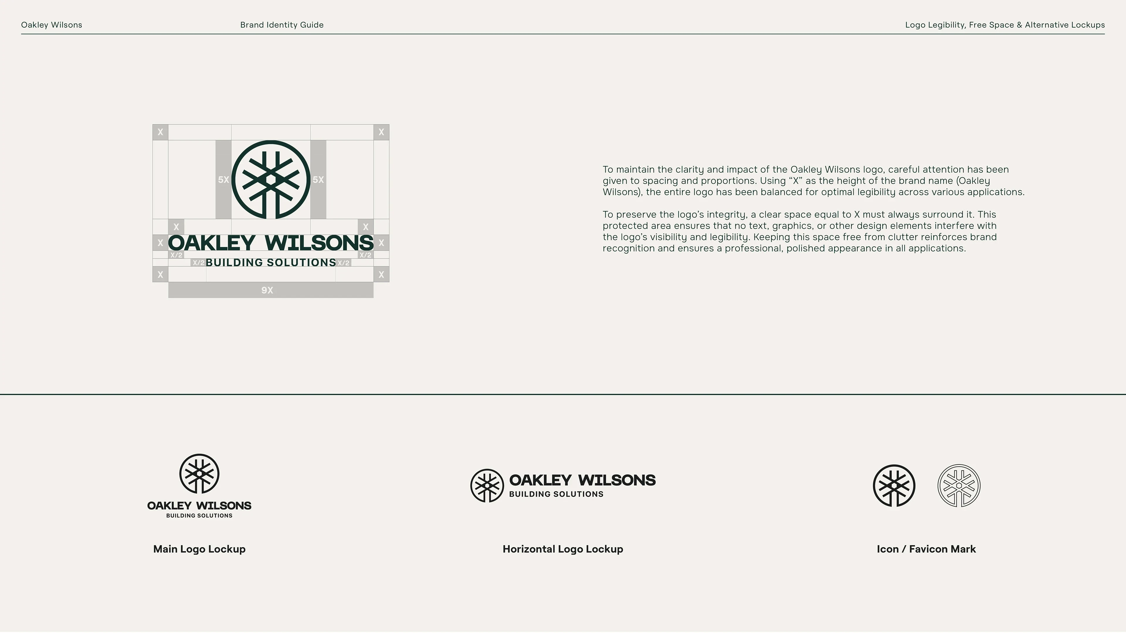
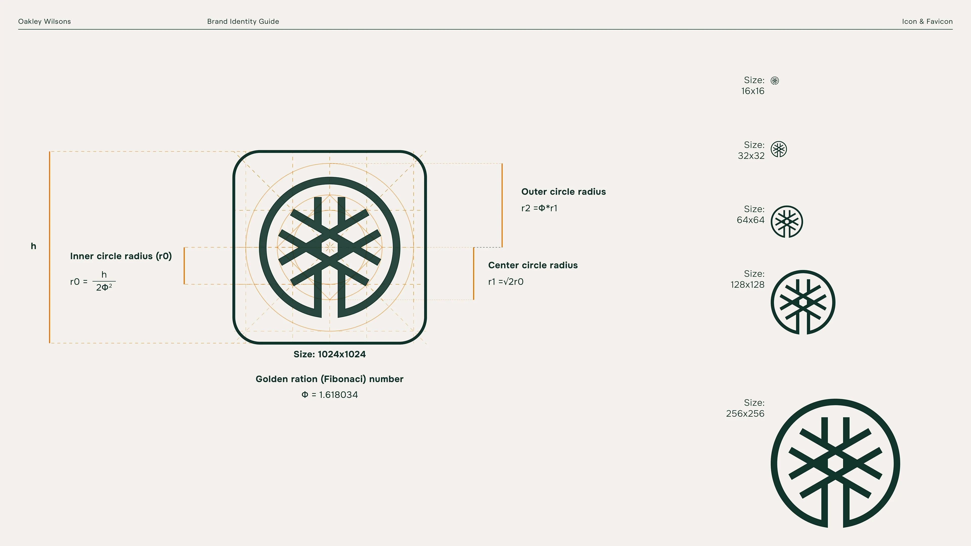
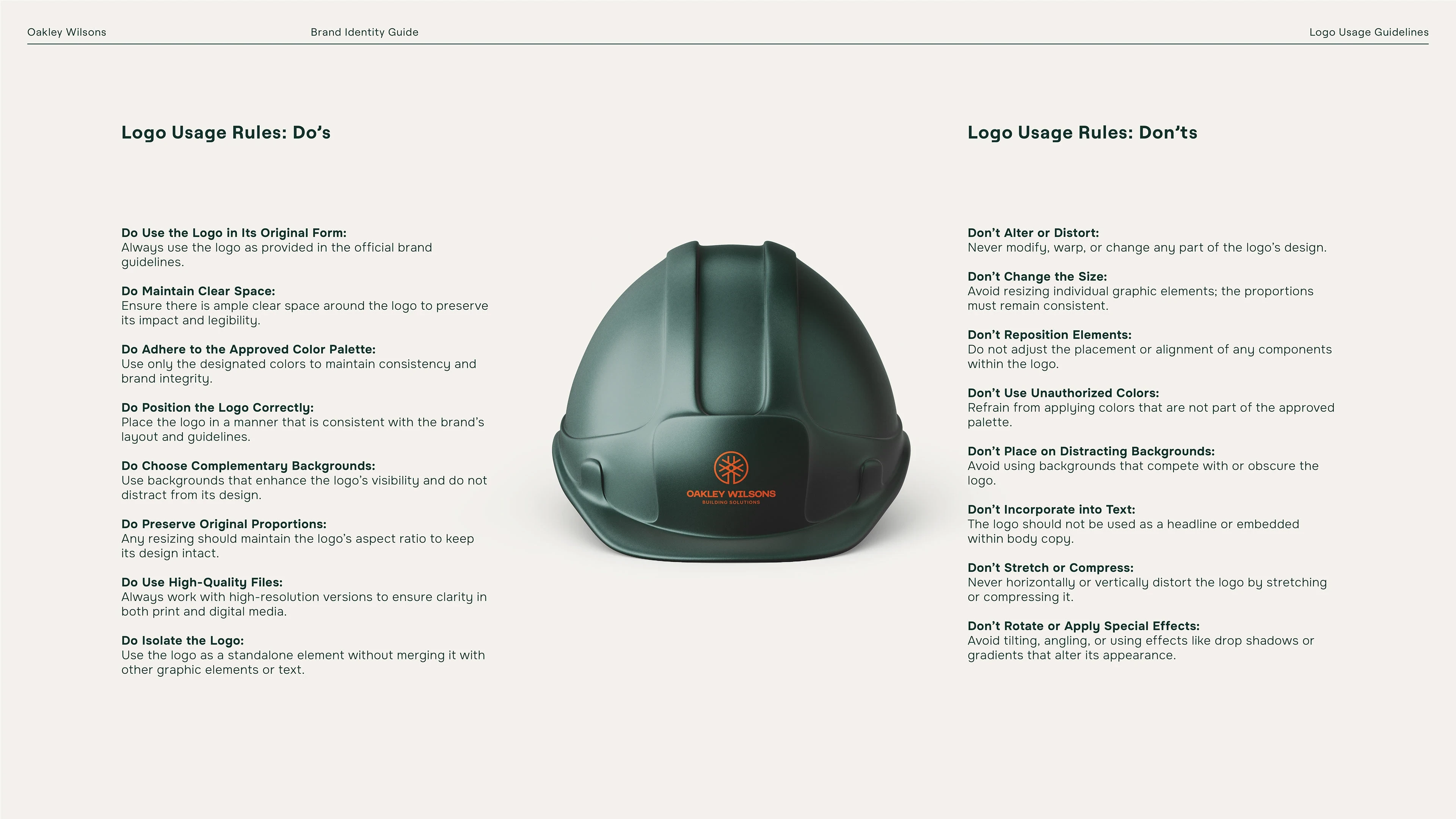
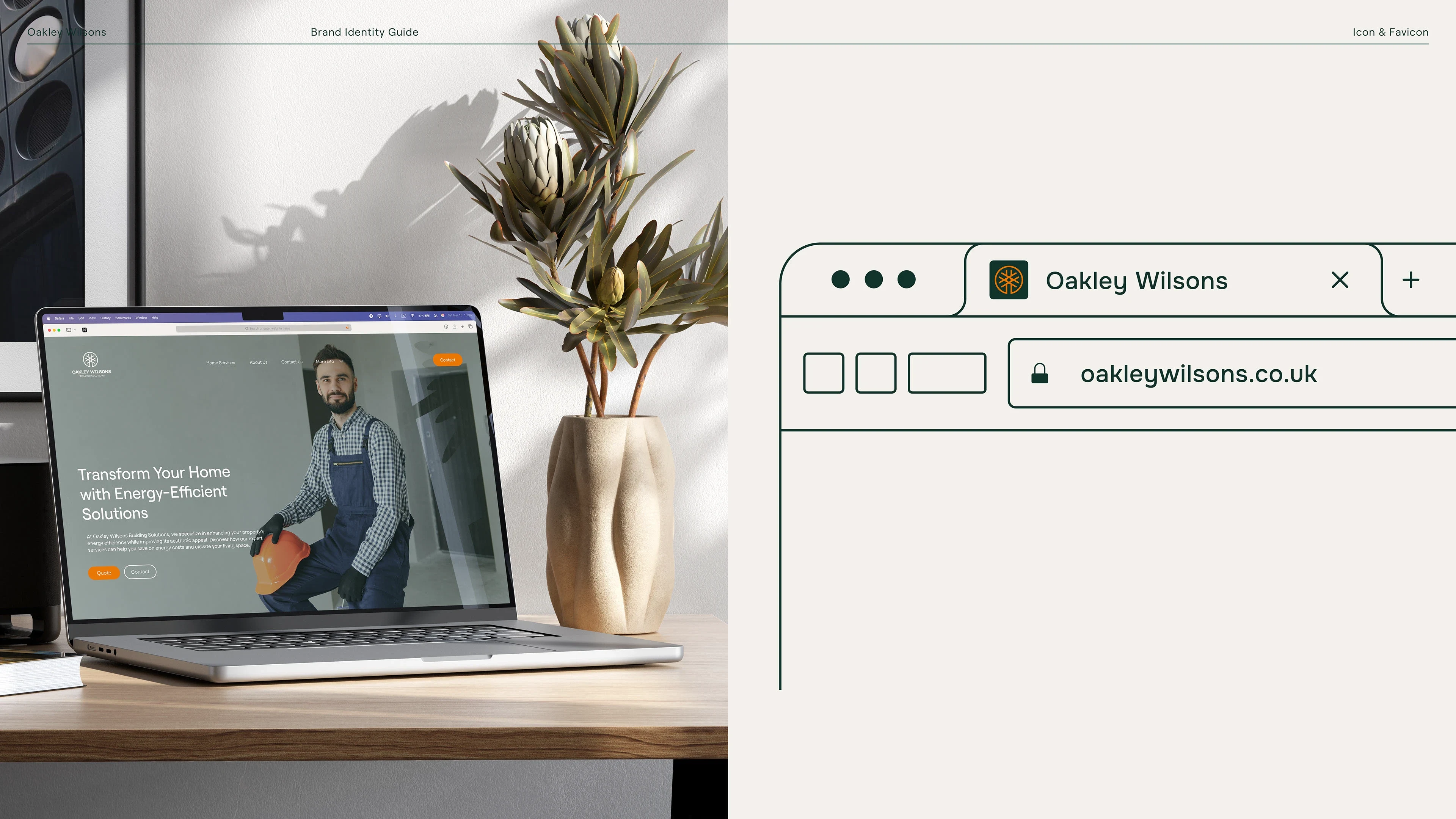
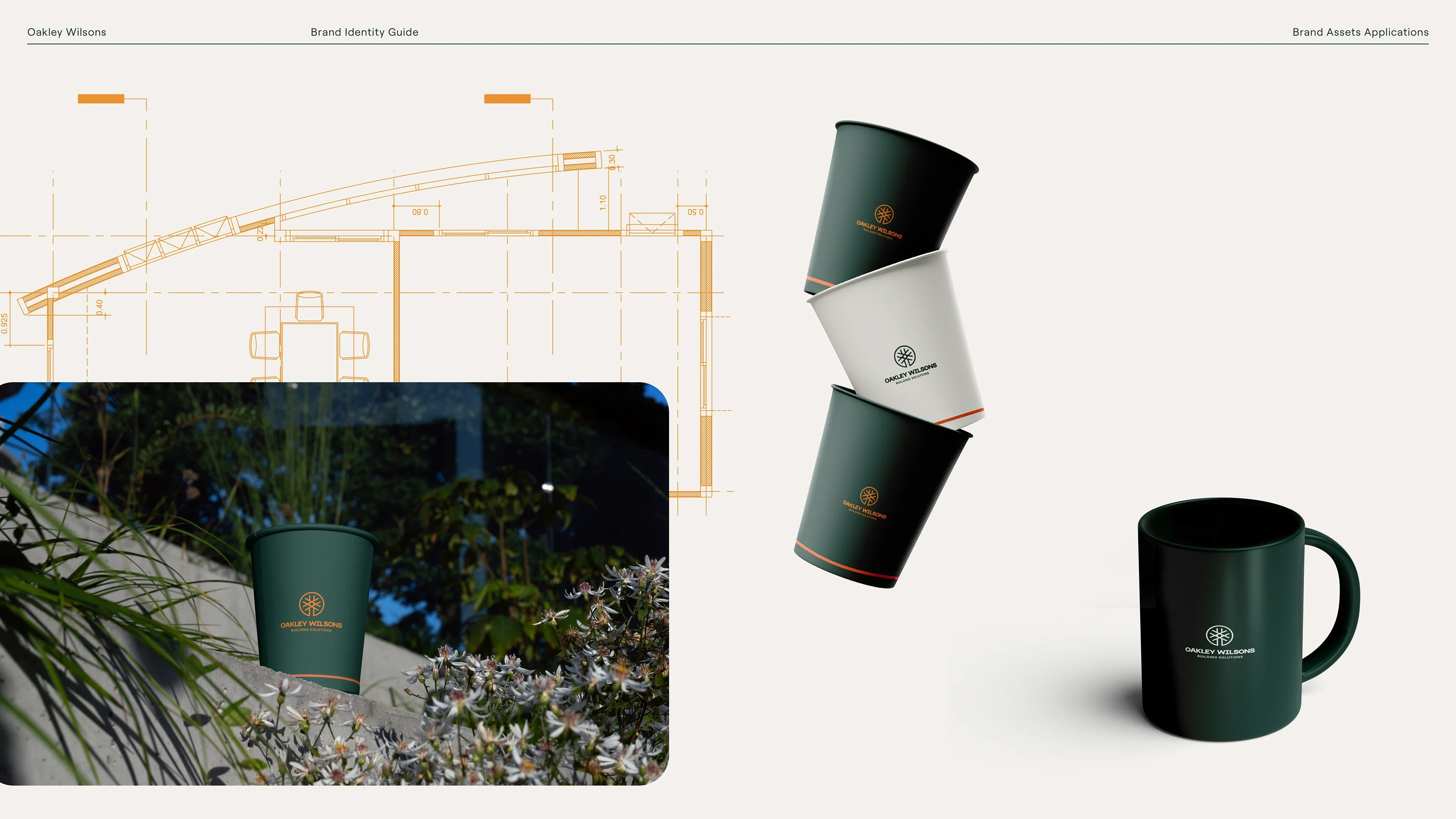
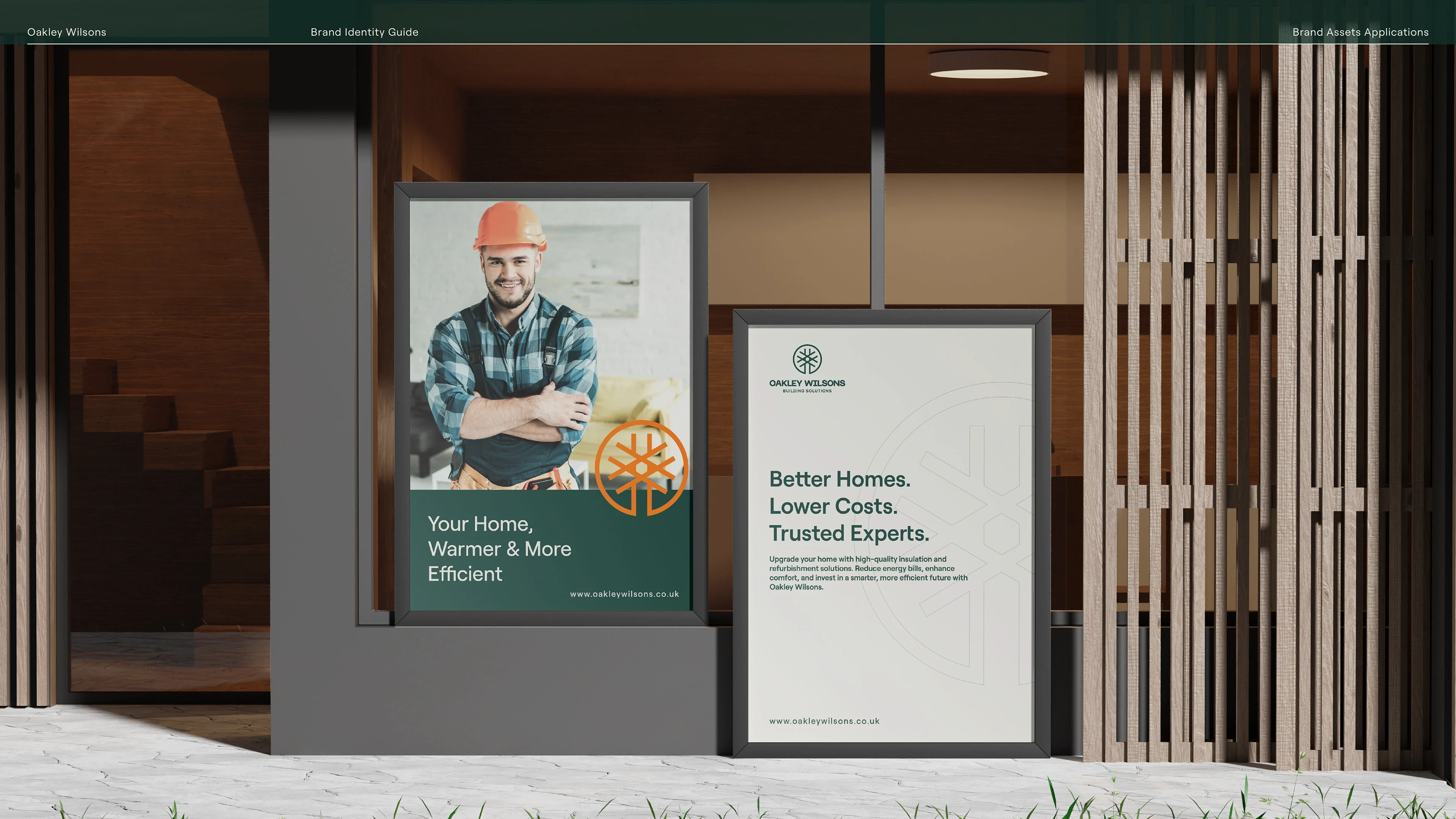
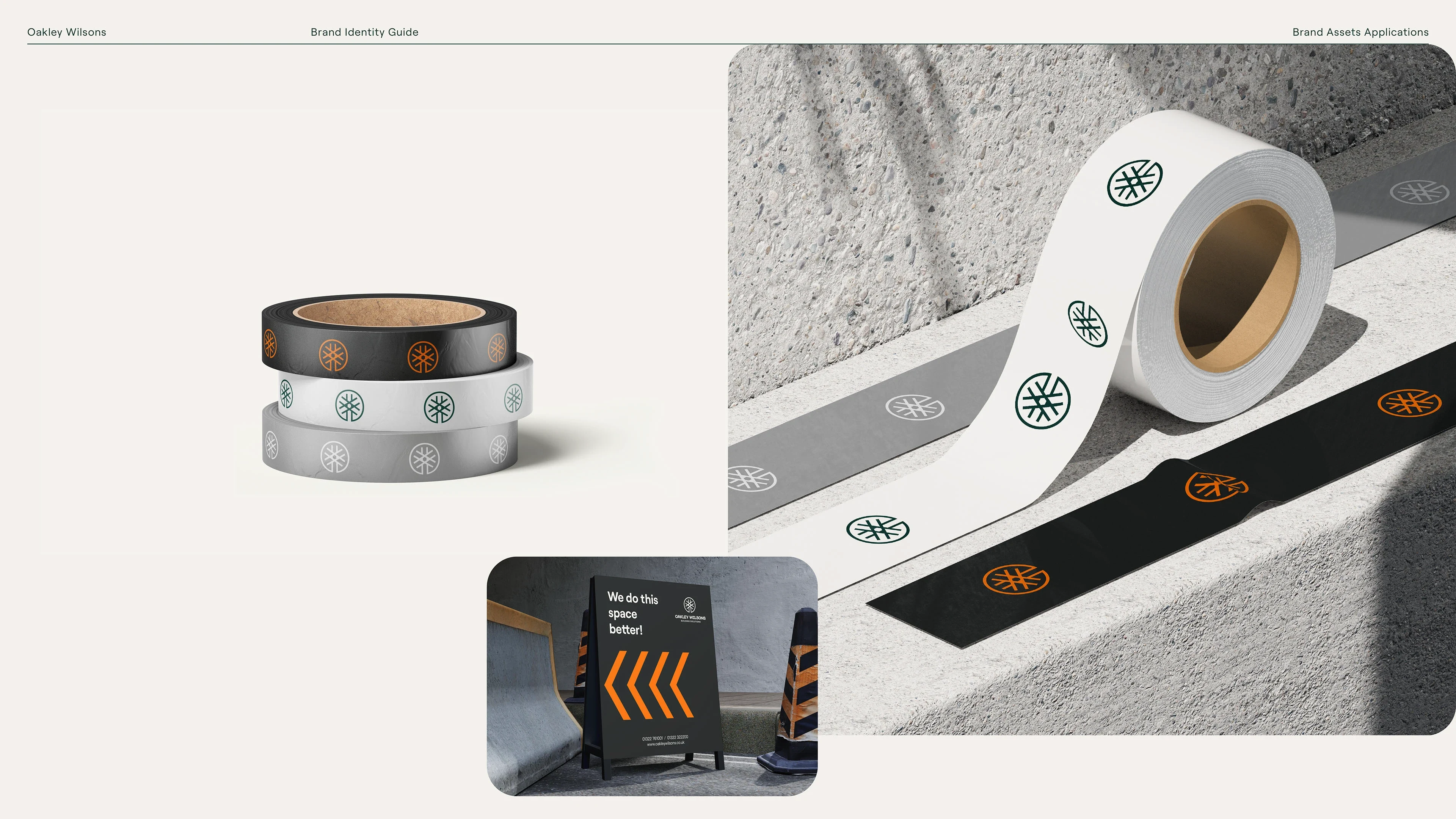
Logo & Icon: Designed a strong, distinct logo that clearly expresses Oakley Wilsons’ refined construction identity.
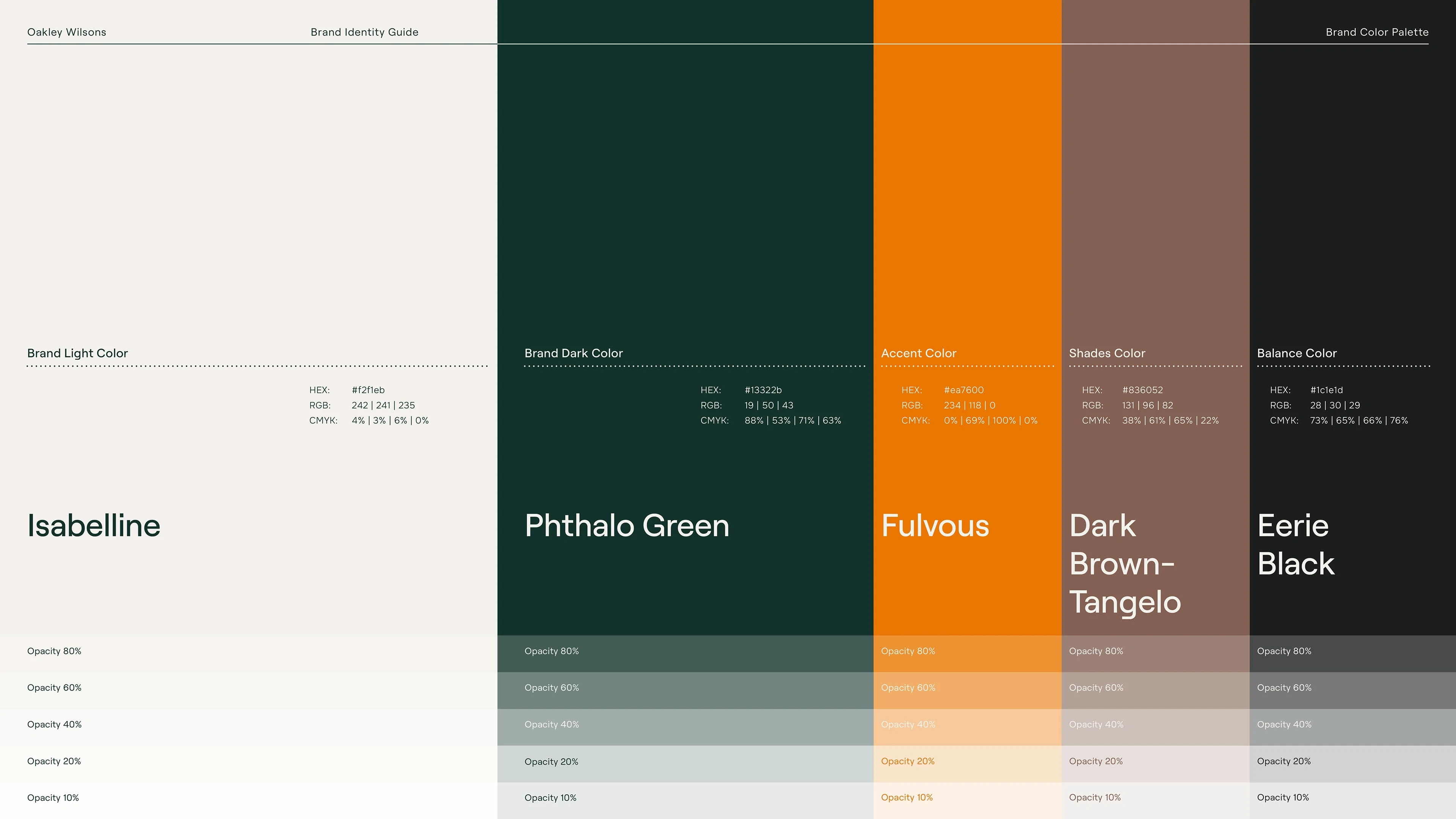
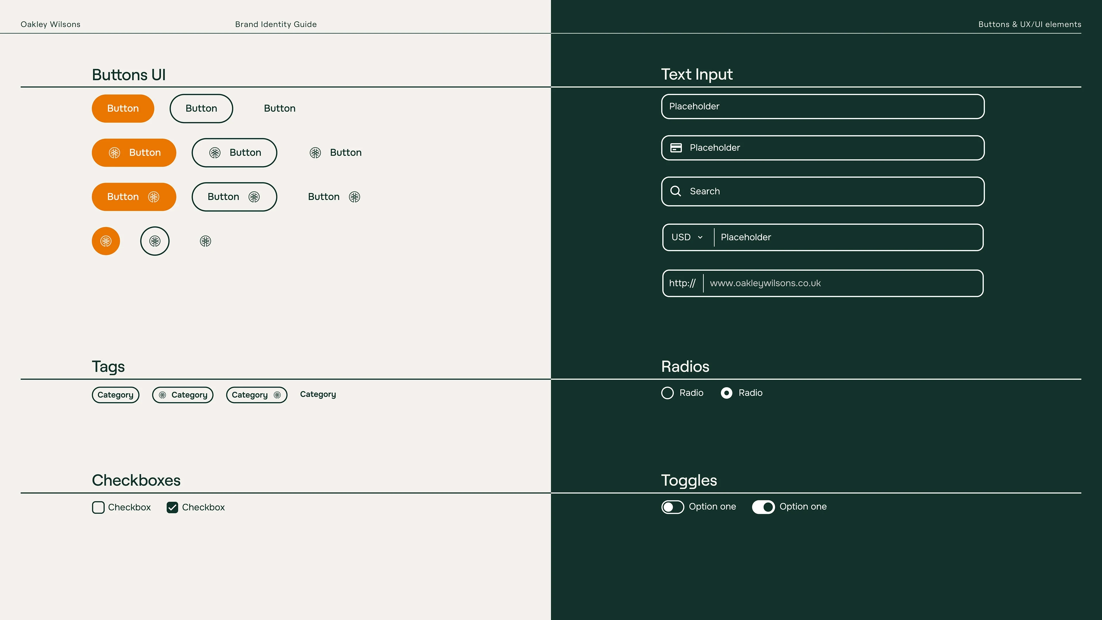
Color System: Established a modern palette aligned with high-quality construction services—strong tones paired with neutral accents for versatility.
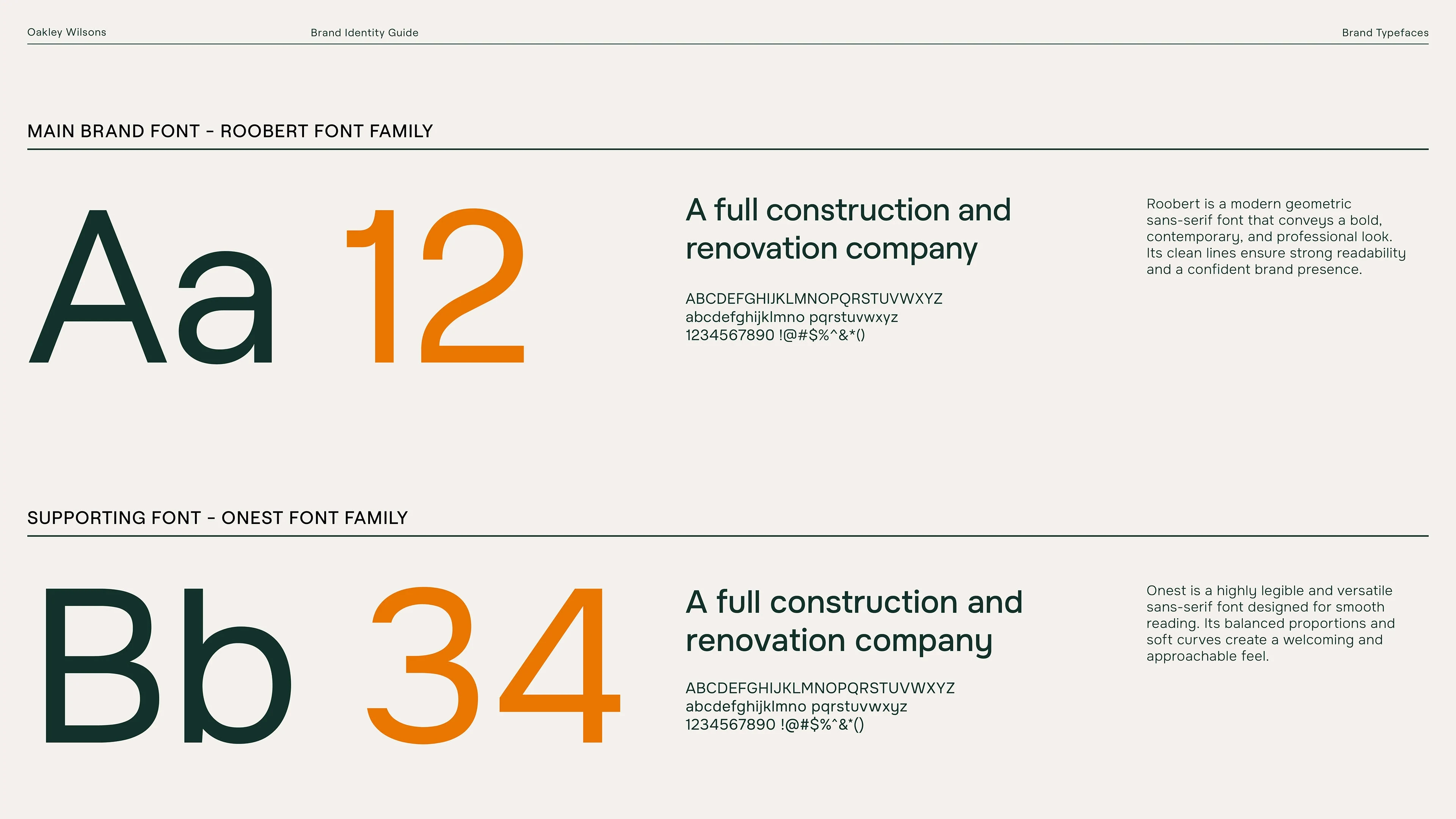
Typography: Selected typefaces suitable for both digital and print usage, ensuring legibility and brand personality across all materials.
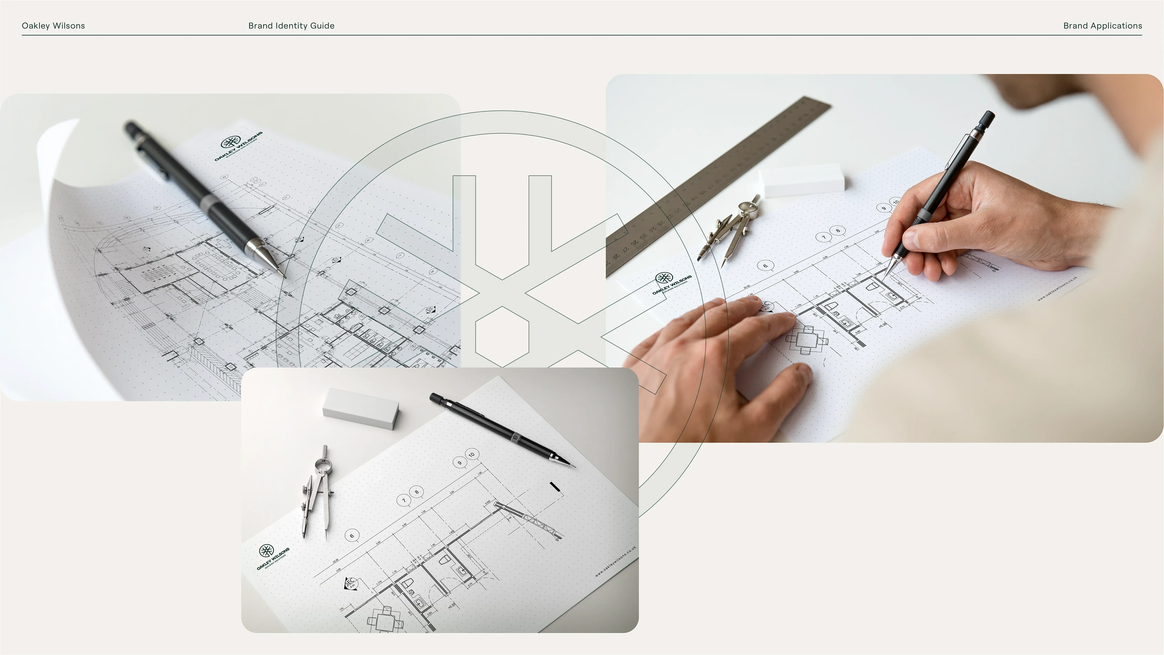
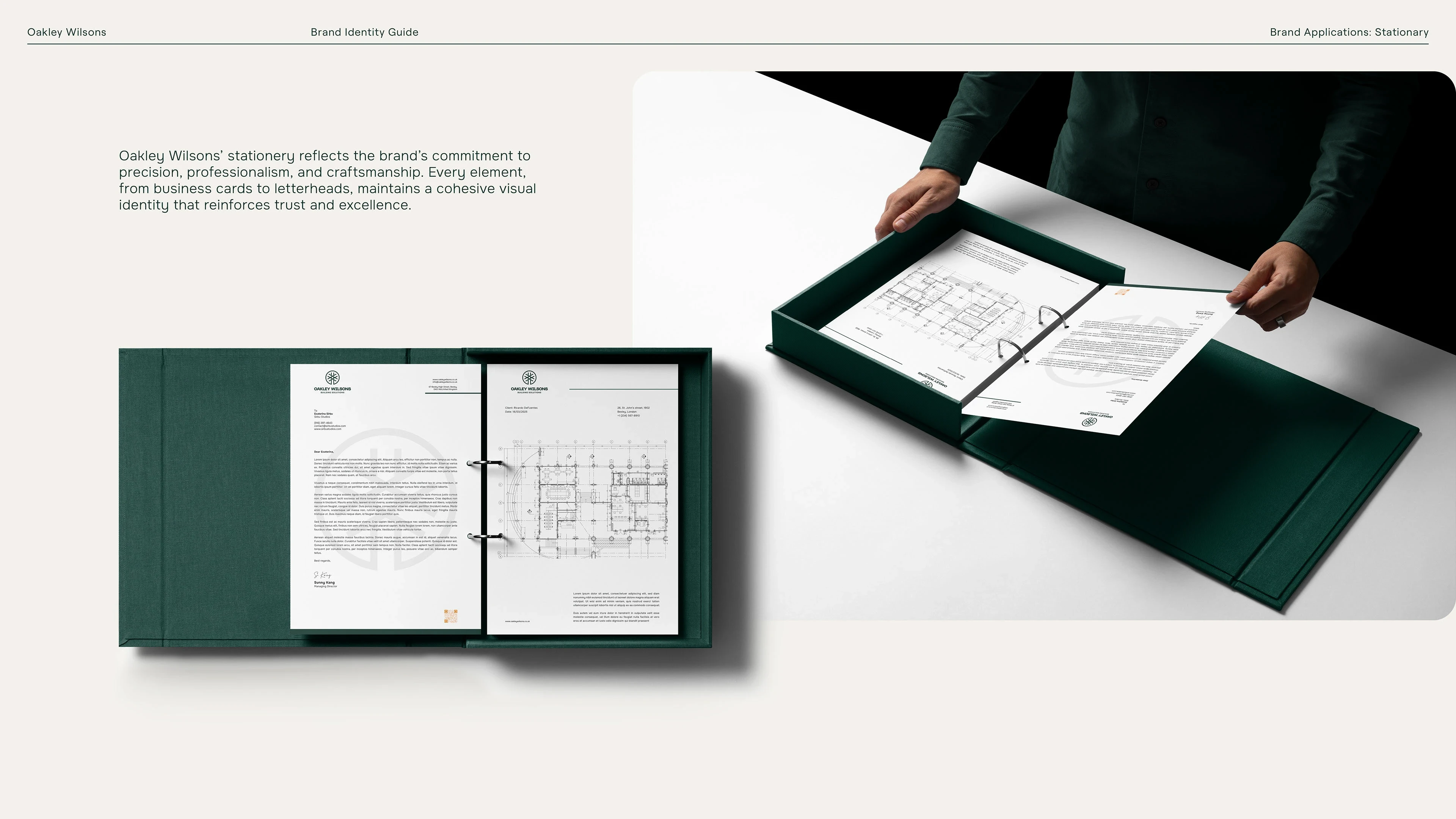
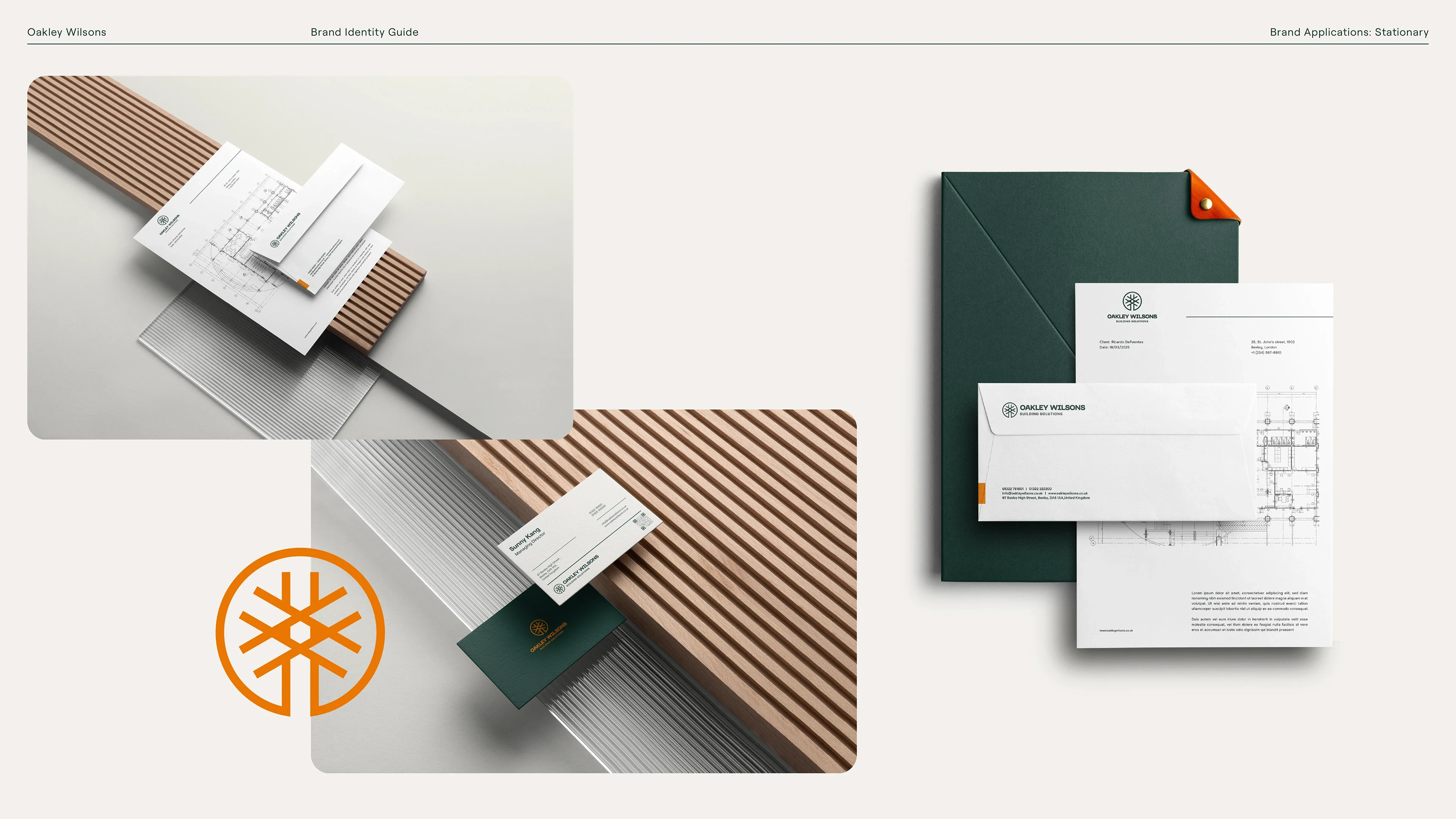
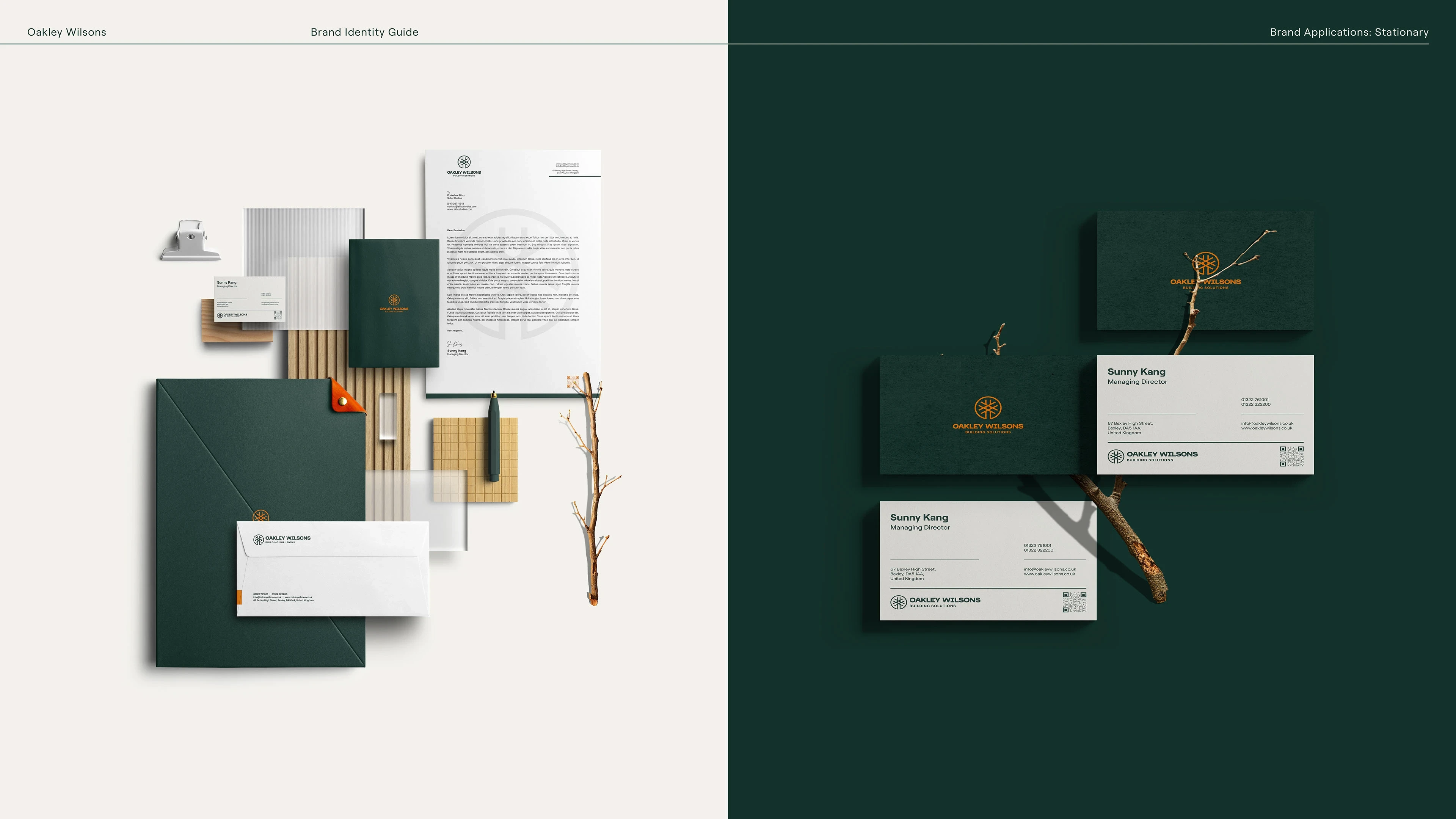
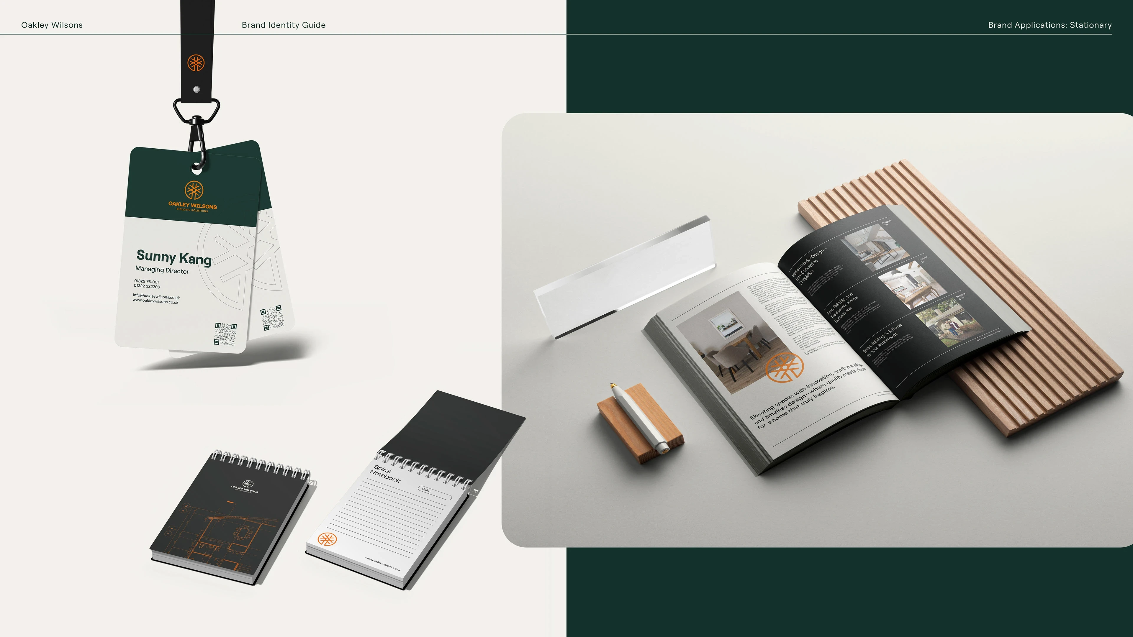
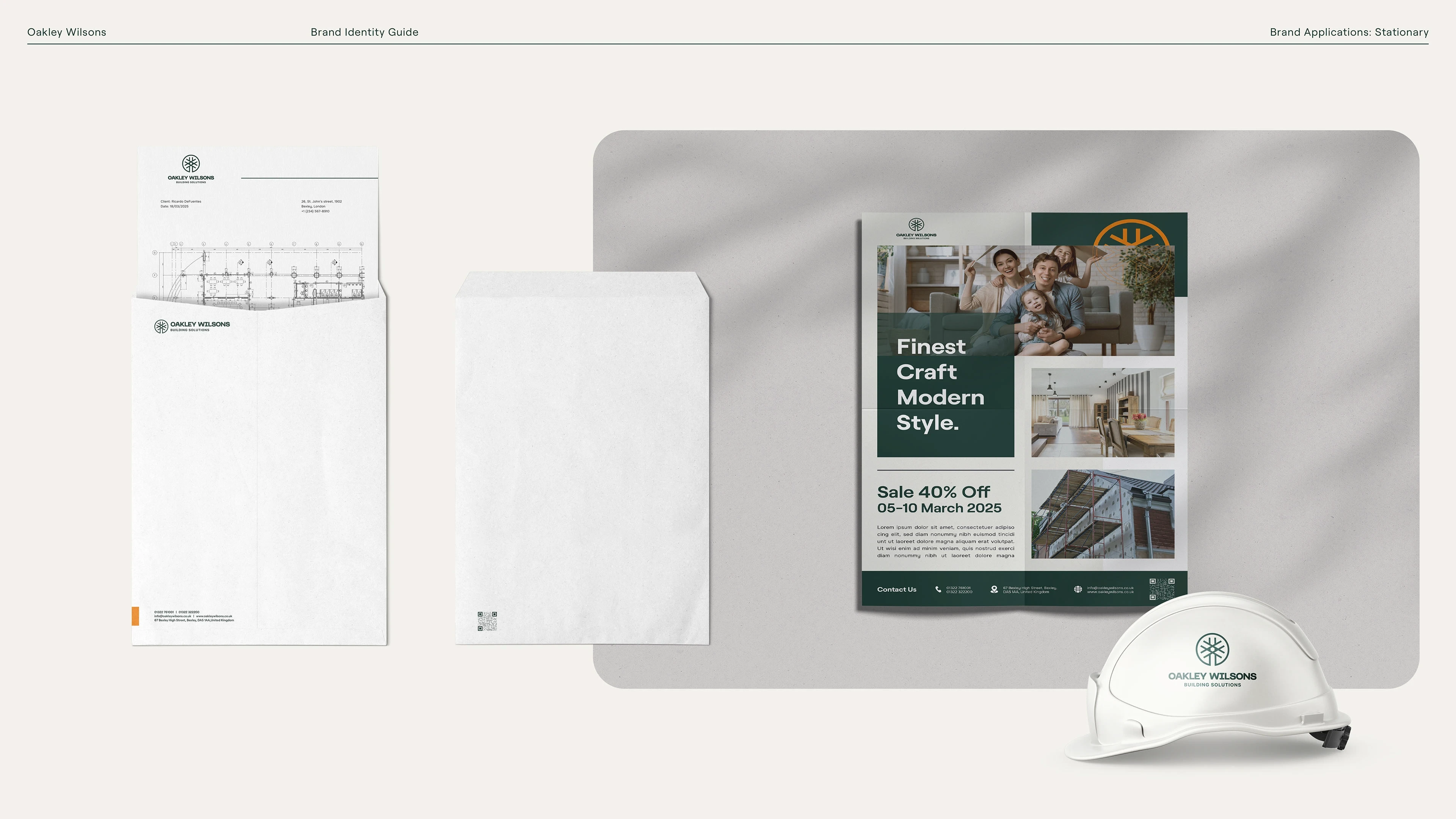
Stationery & Touchpoints: Created business cards, letterhead, envelopes, and other branded collateral.
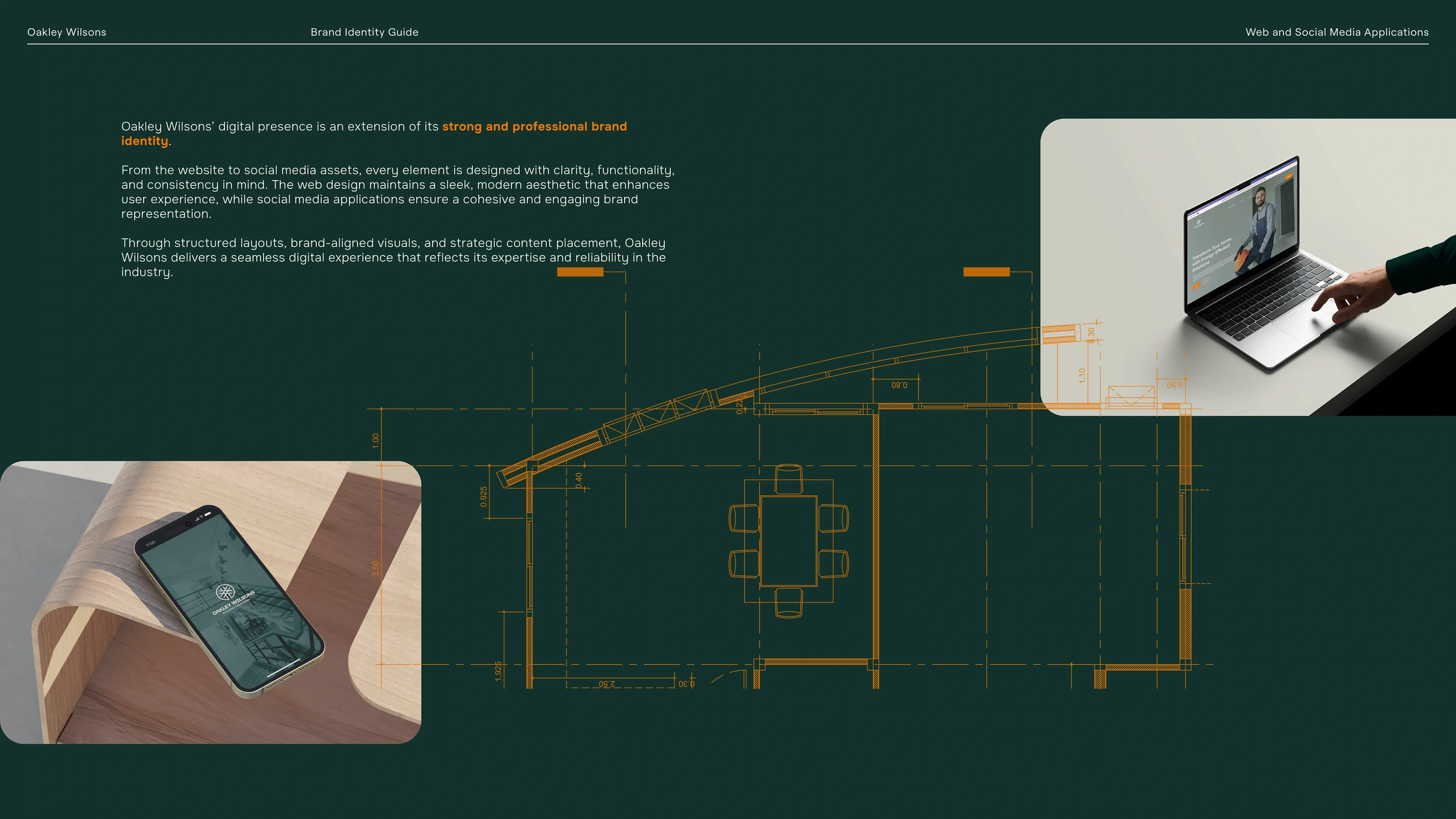
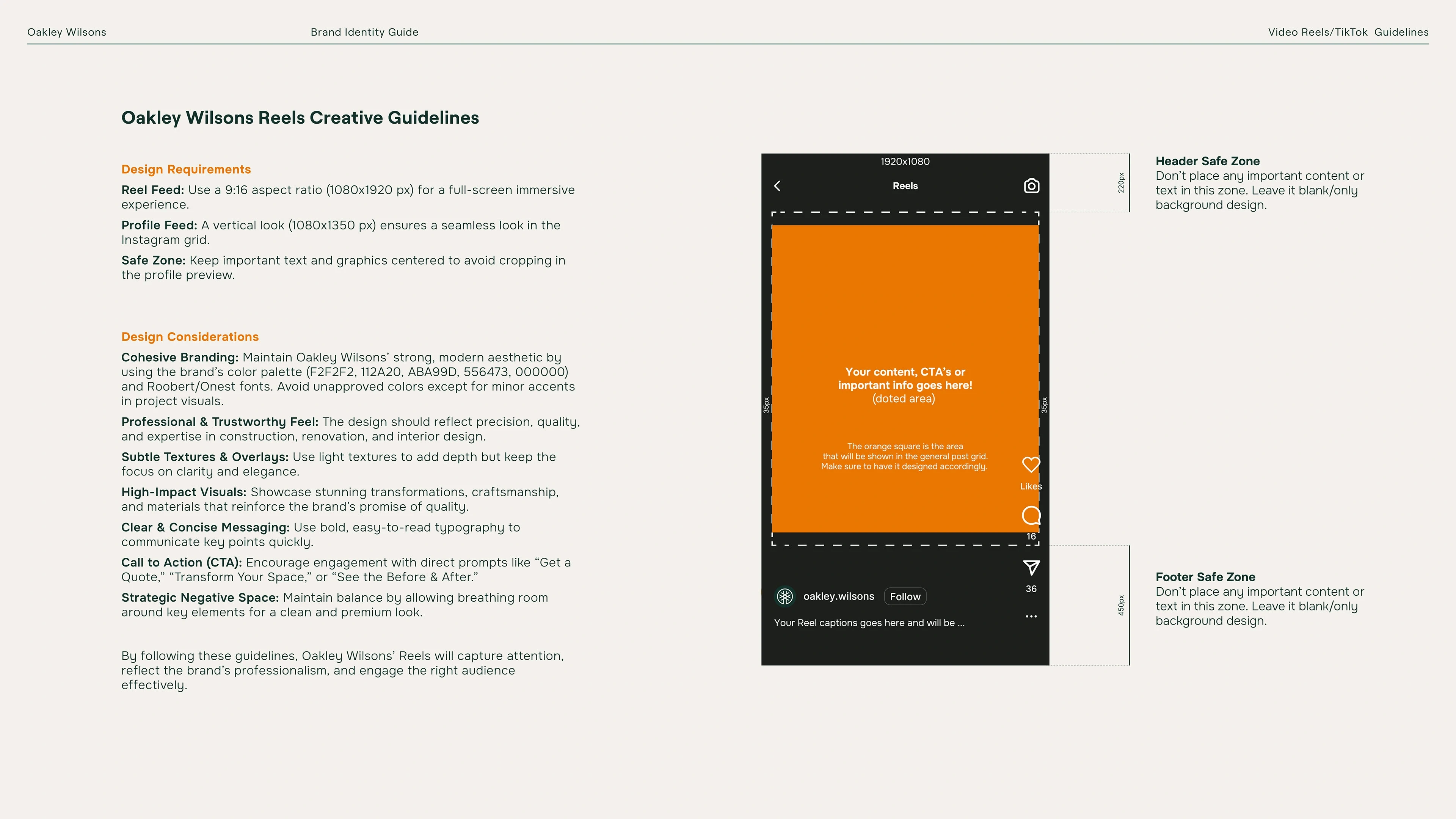
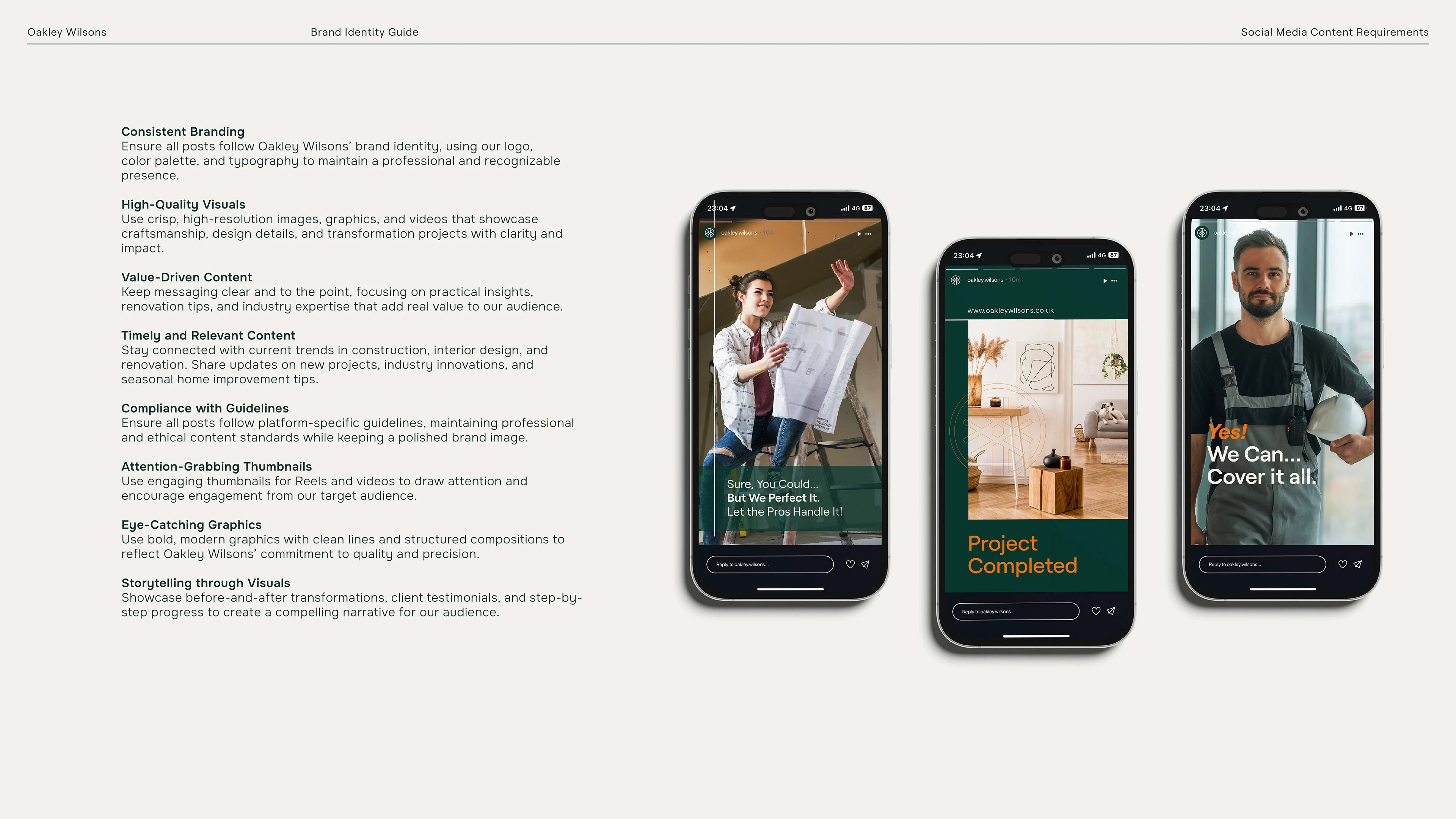
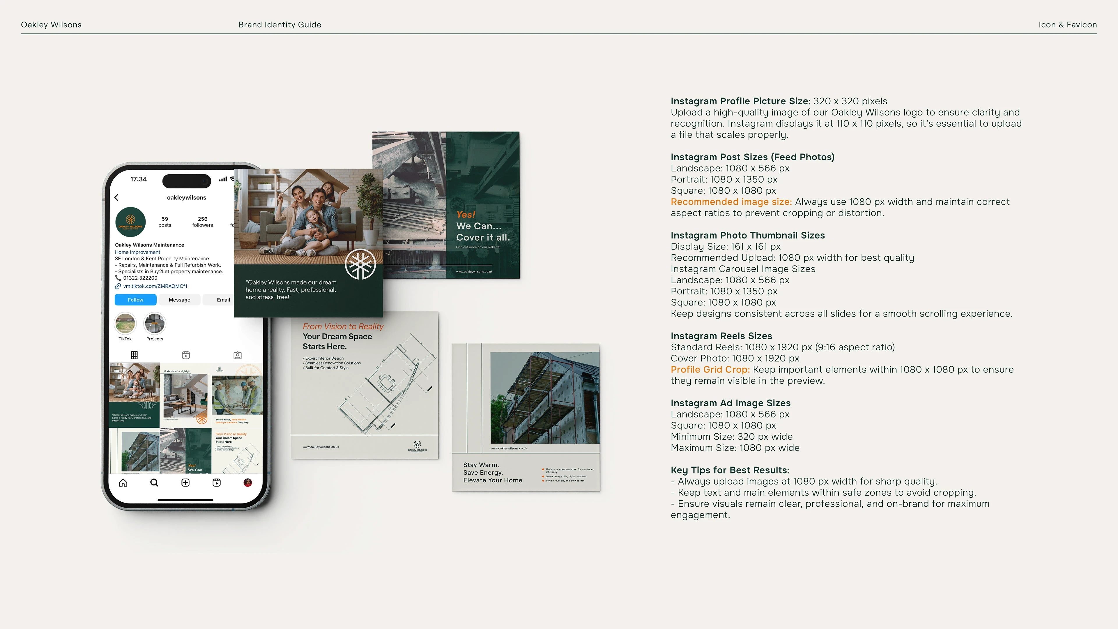
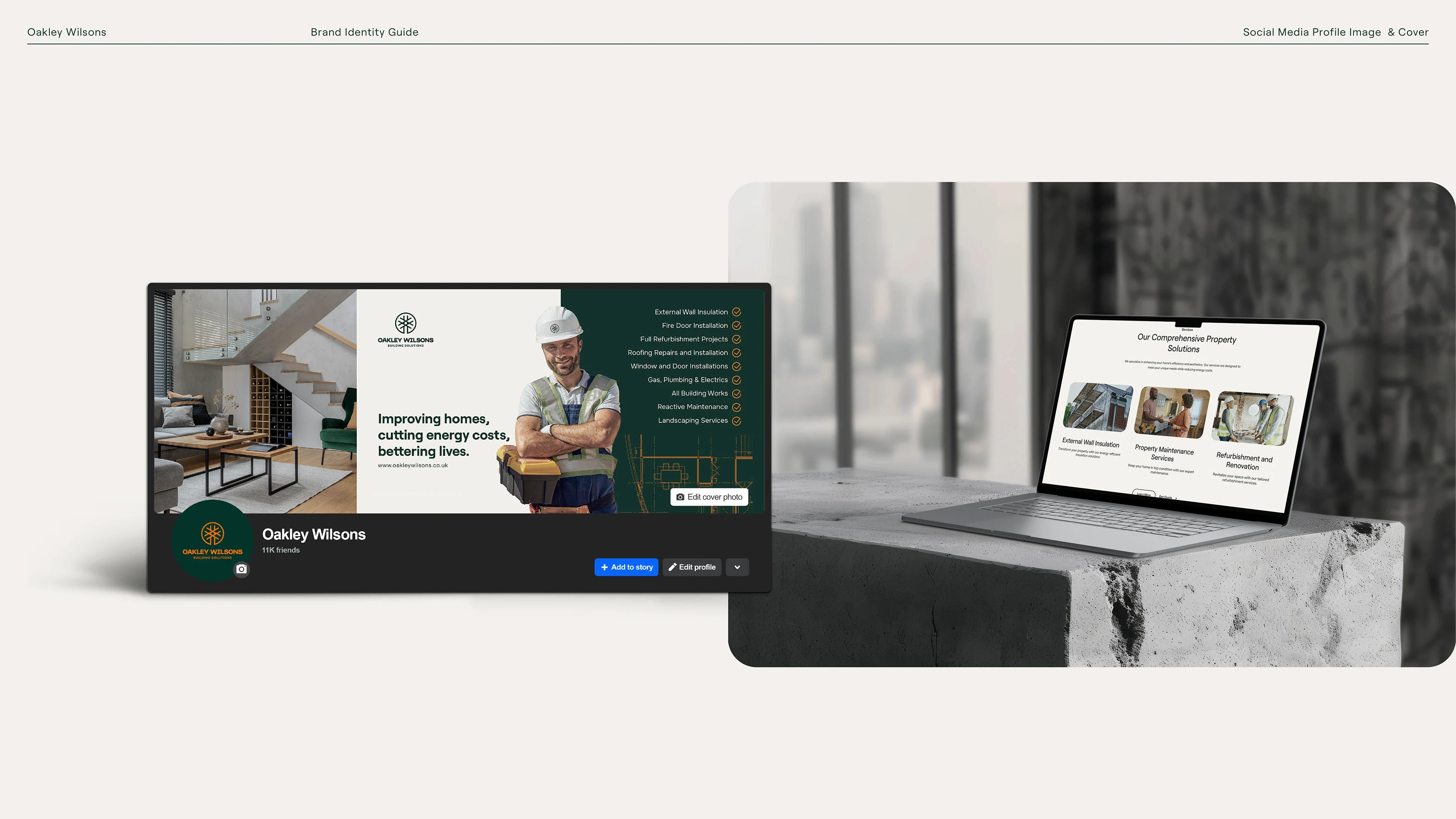
Web Elements: Designed favicon, website buttons, and social media direction to maintain brand coherence across digital platforms.
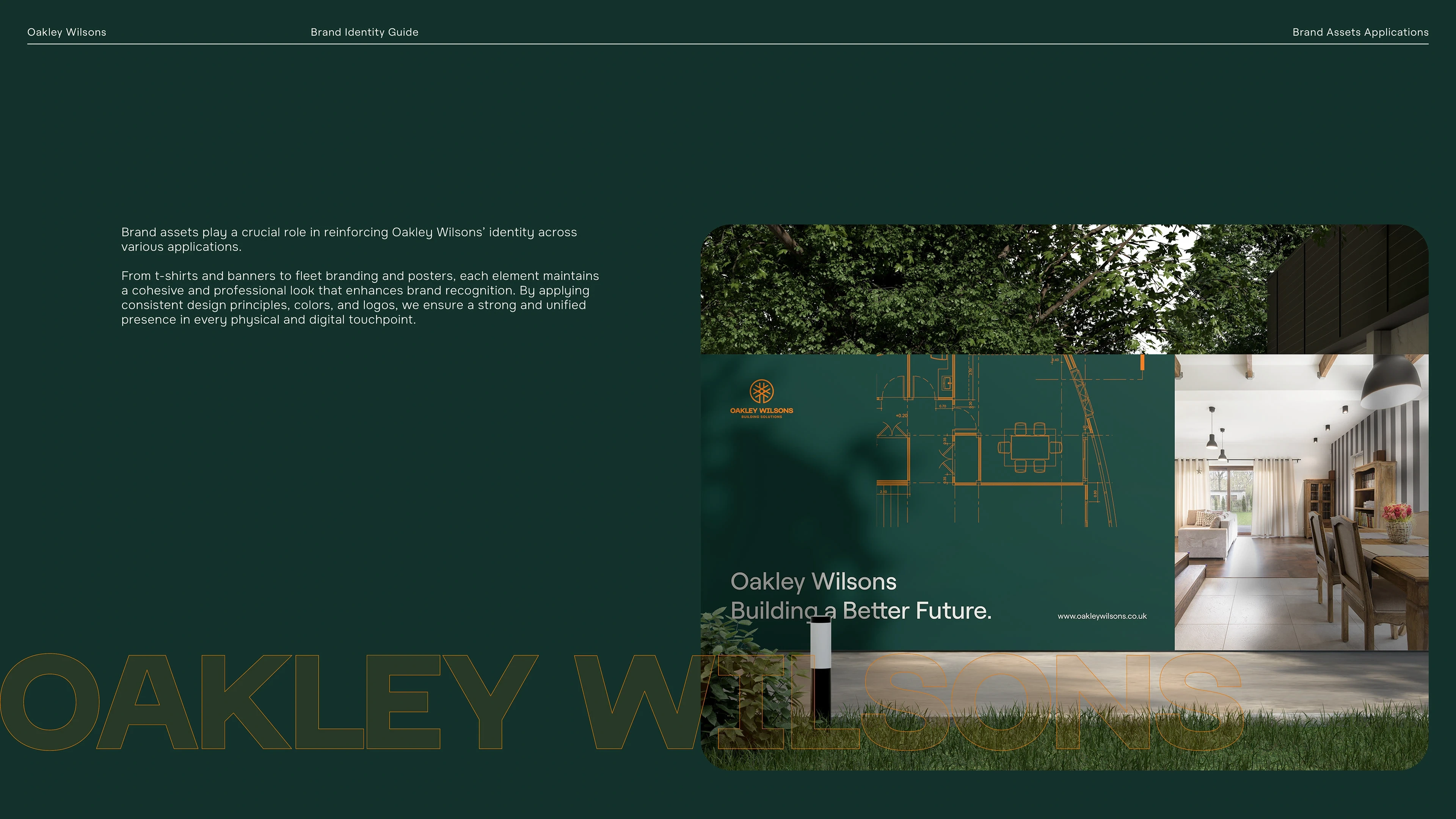
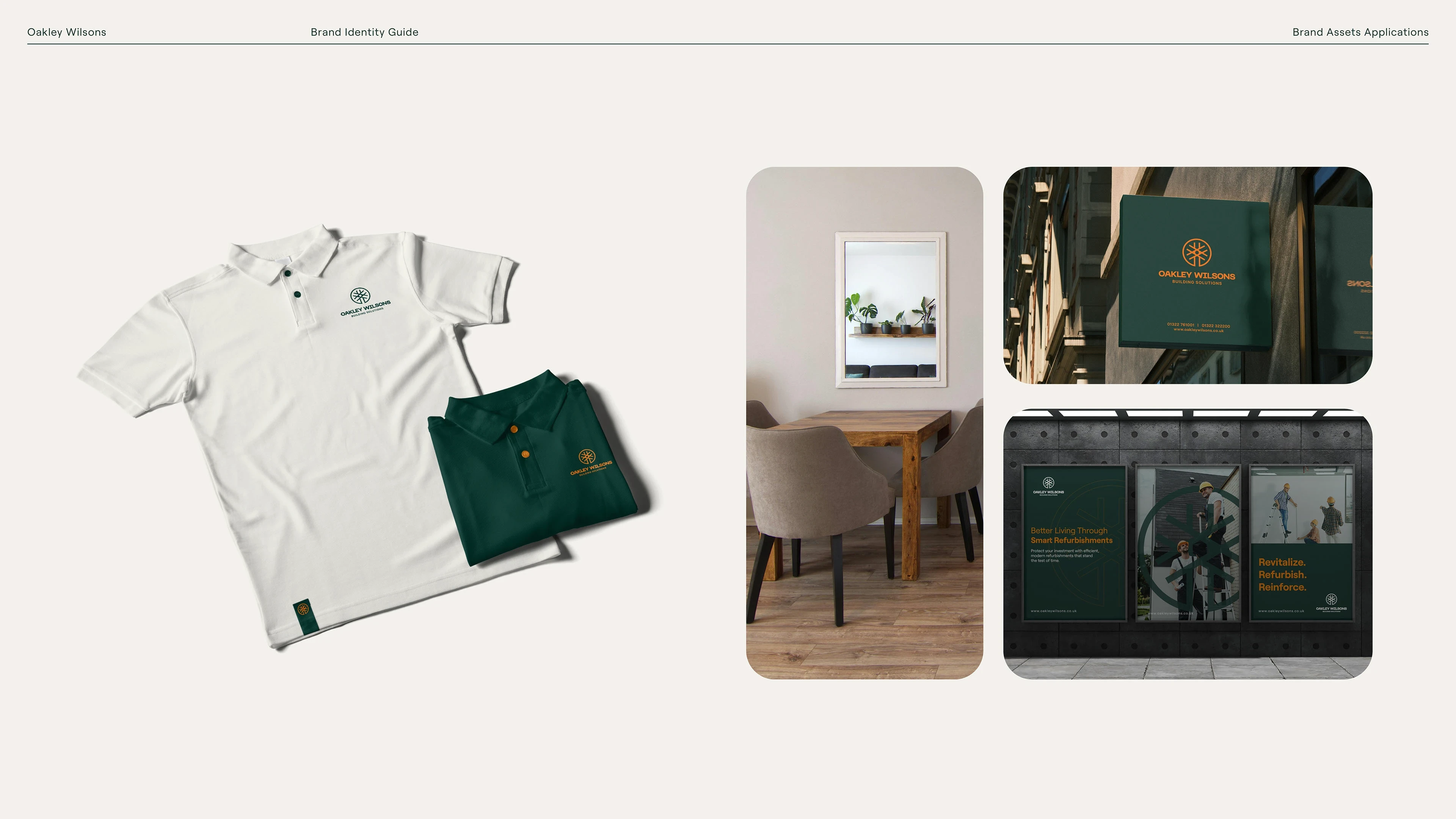
Branded Merchandise & Vehicles: Developed designs for truck wrap, t-shirts, mugs, rubber items (promotional goods), so the brand is present in physical environments and marketing swag.
Brand Guidelines / Book: Compiled a comprehensive brand book detailing logo usage, color codes (HEX/RGB/CMYK), typography hierarchy, layout rules, and applications in digital and physical contexts.
Tools & Workflow
The work was carried out using Adobe Illustrator for logo and vector assets, Photoshop for mock-ups and printed material visualization, InDesign for the brand book layout, and Figma for social media templates and digital hand-off. This ensured consistency, scalability, and ease of application across all platforms.


Like this project
Posted Nov 18, 2025
Oakley Wilsons is a modern construction and renovation brand focused on quality and trust. I designed their full brand identity and visual guidelines.