Quiron | Brand identity
Franco Gómez
The Challenge
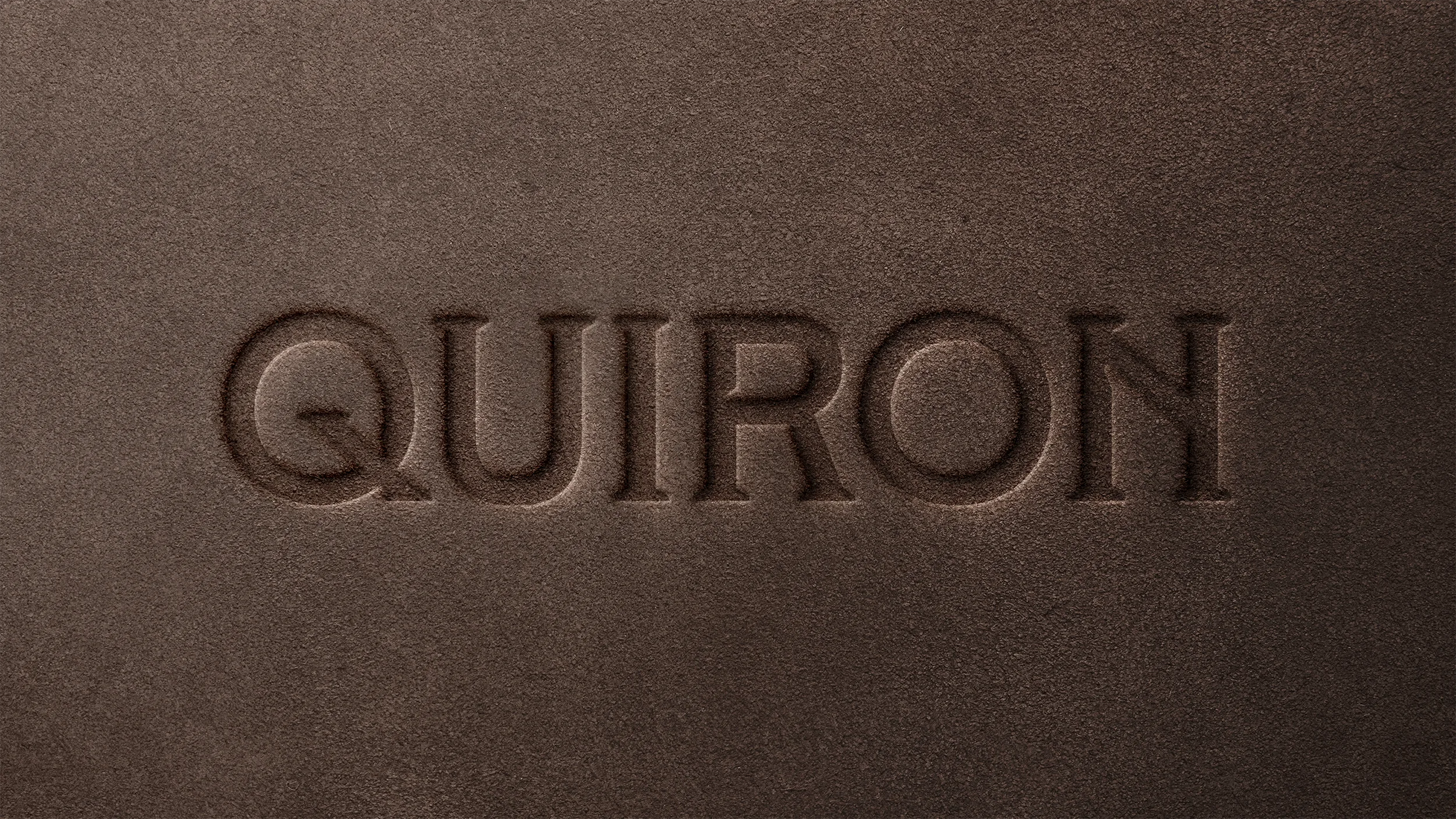
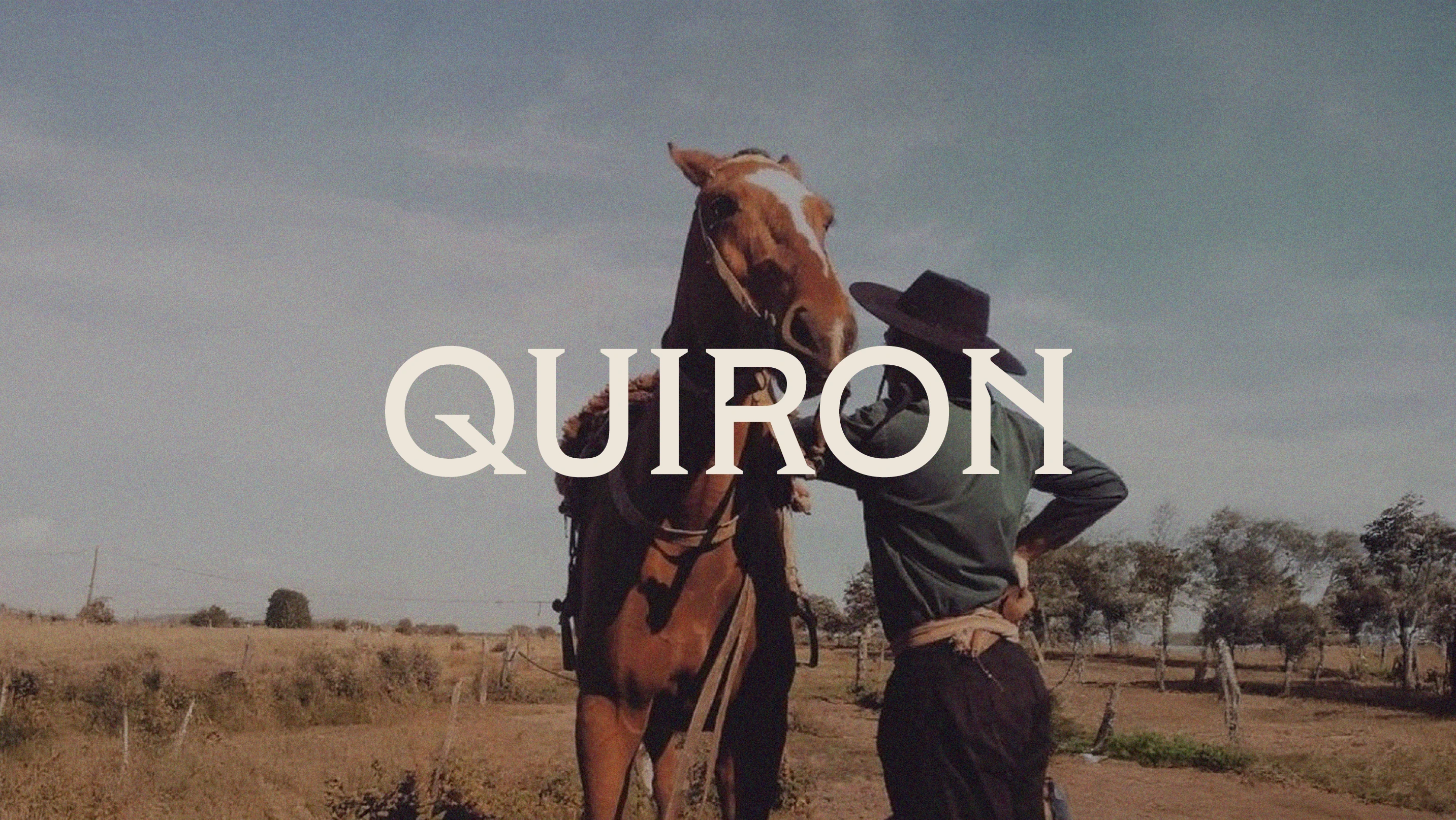
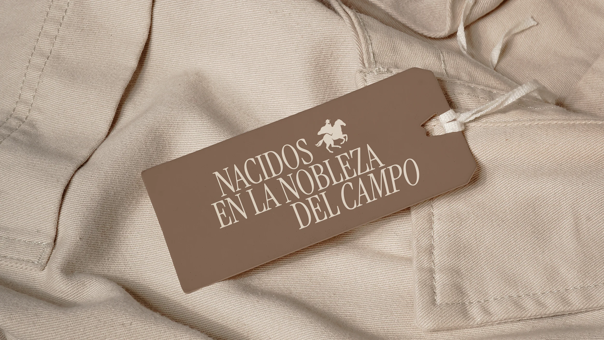
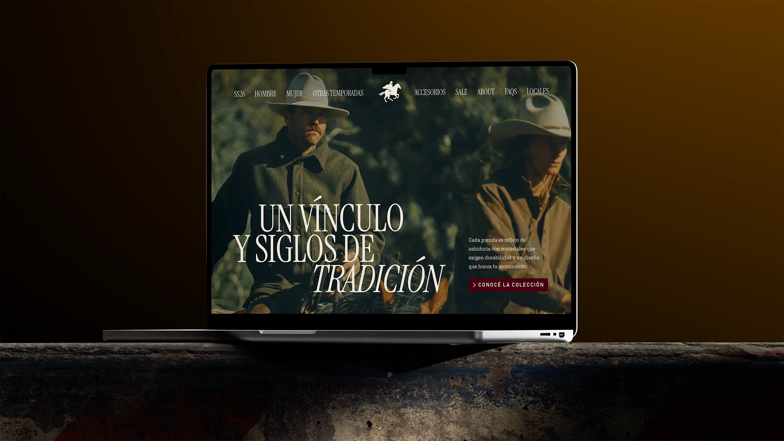
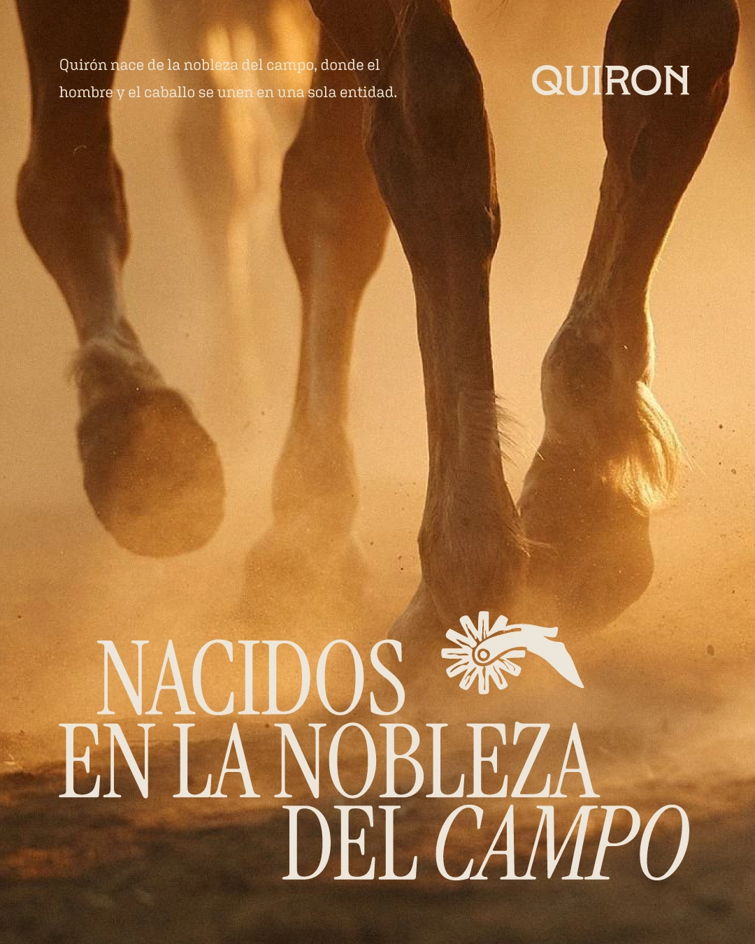
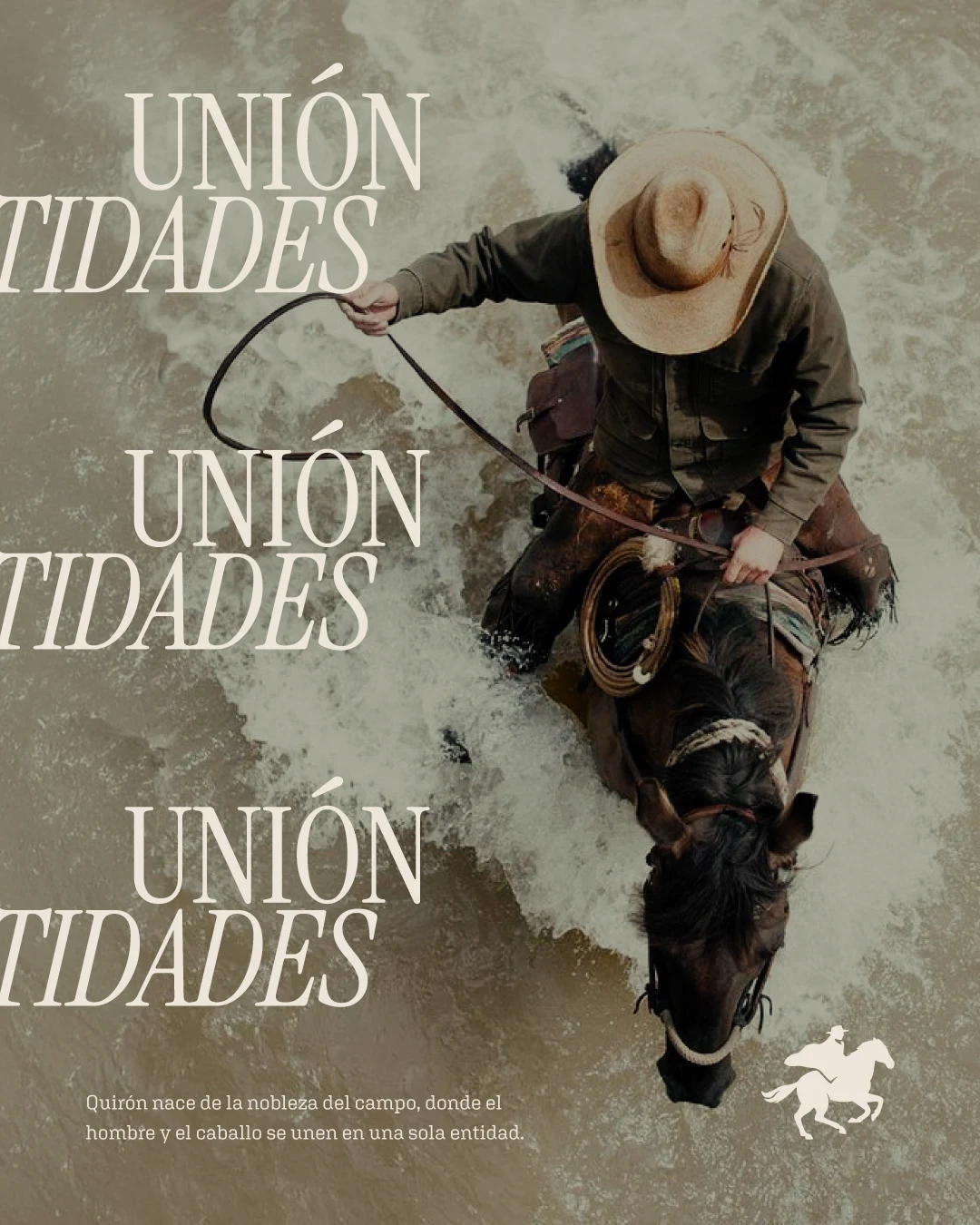
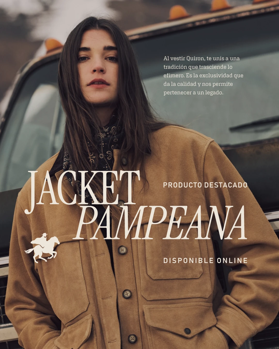
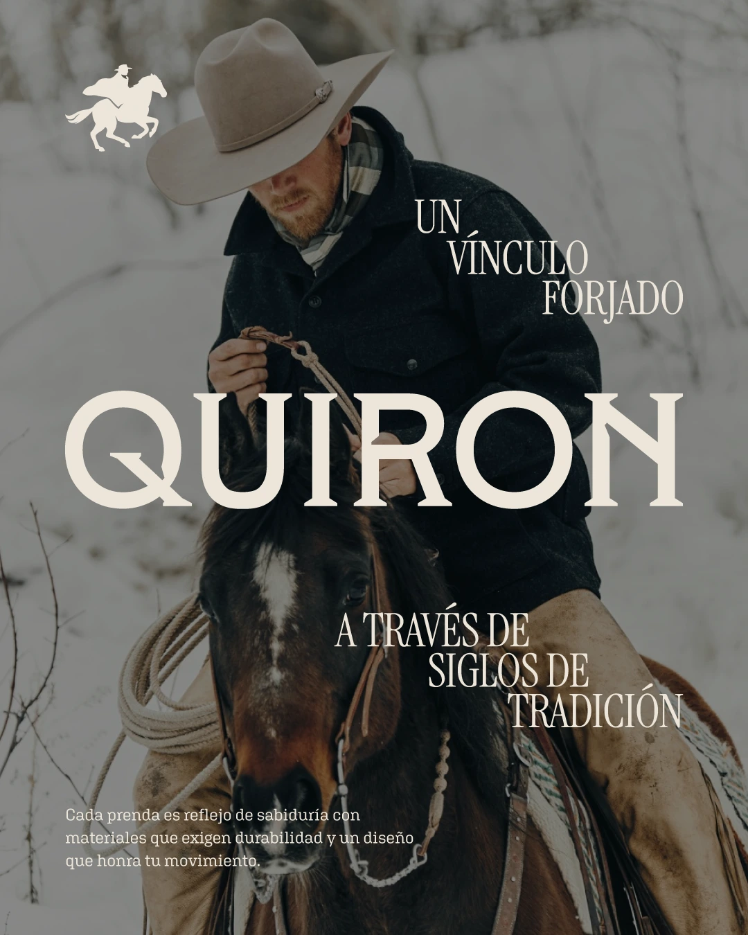
The objective was to build a visual identity for QUIRON, a premium workwear brand rooted in the "nobleza del campo" (field nobility). The main challenge was to translate an ancestral, visceral bond—the symbiosis between man and horse—into a sophisticated visual language.
We needed to bridge the gap between the ruggedness of traditional rural work and the exclusivity of a high-end lifestyle brand. The brand had to feel centuries-old yet perfectly adapted to modern, high-performance standards, ensuring it resonated with a community that values durability as much as legacy.
The Result
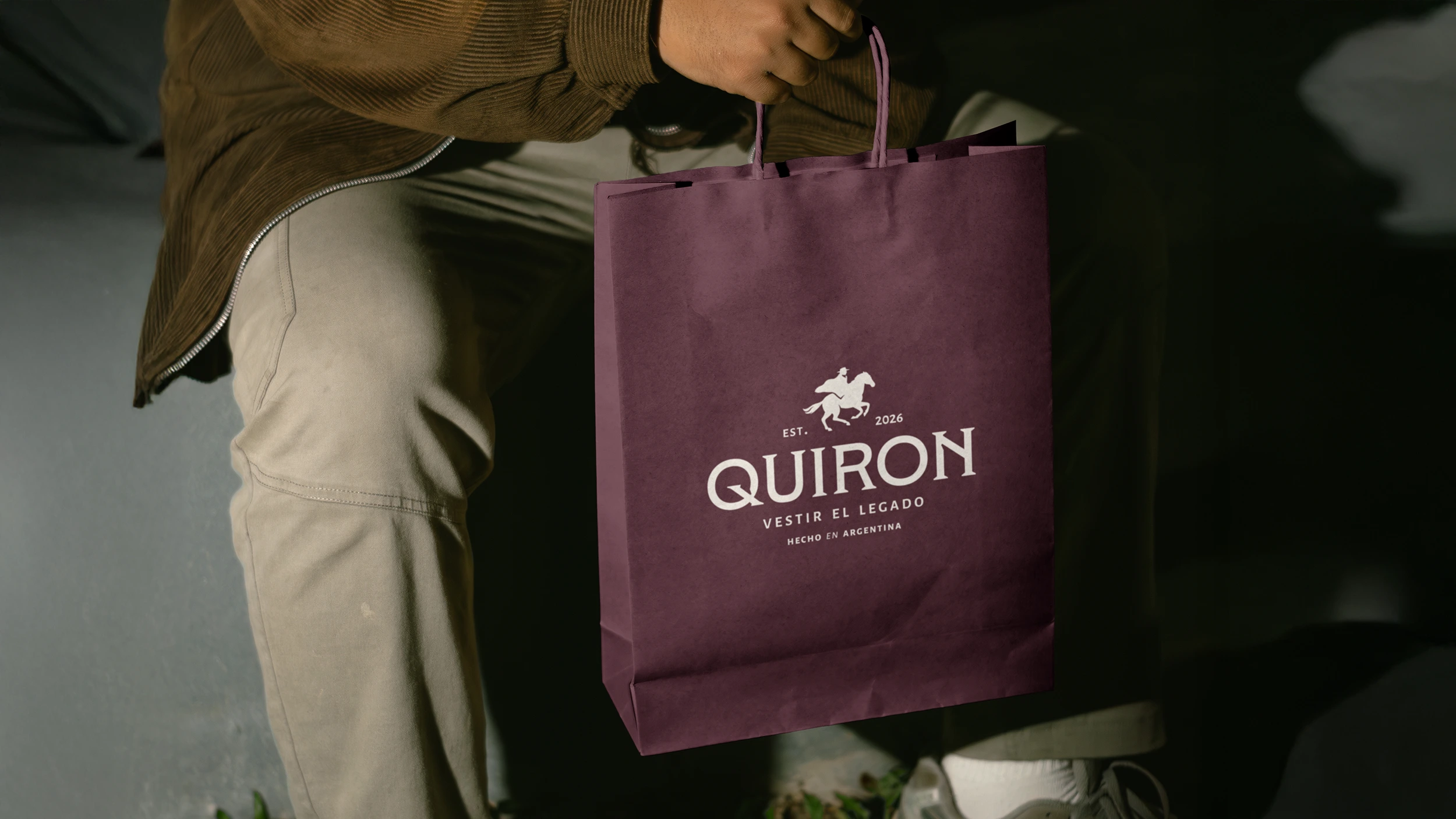
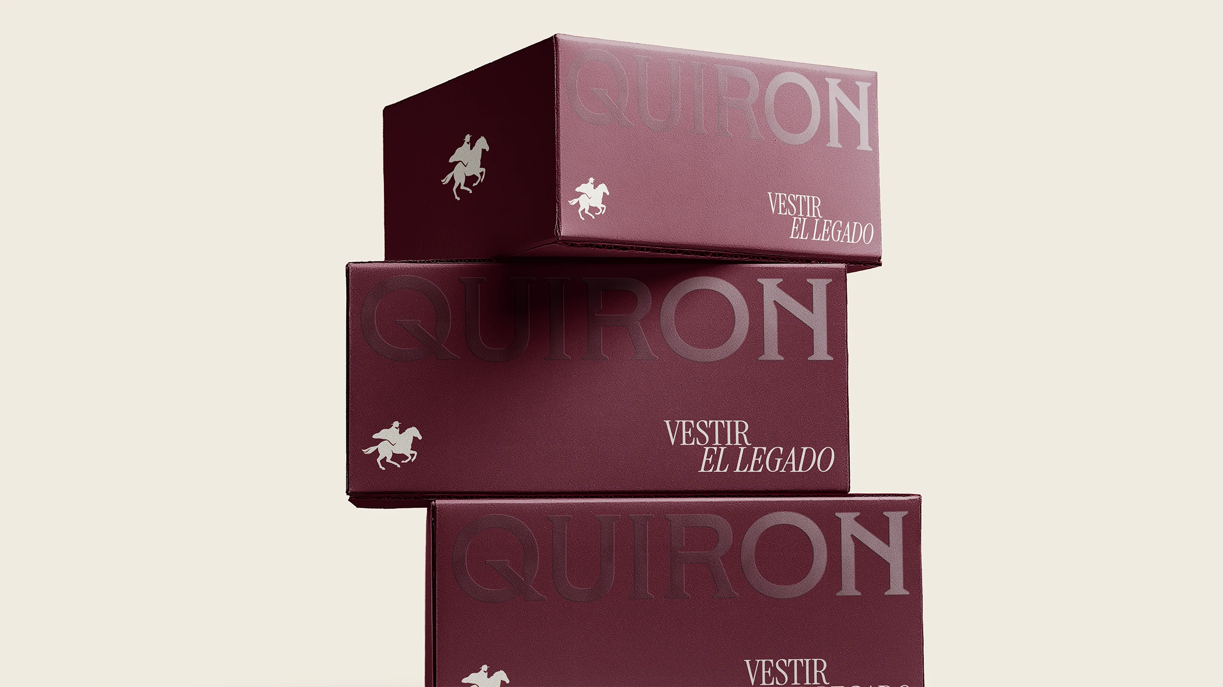
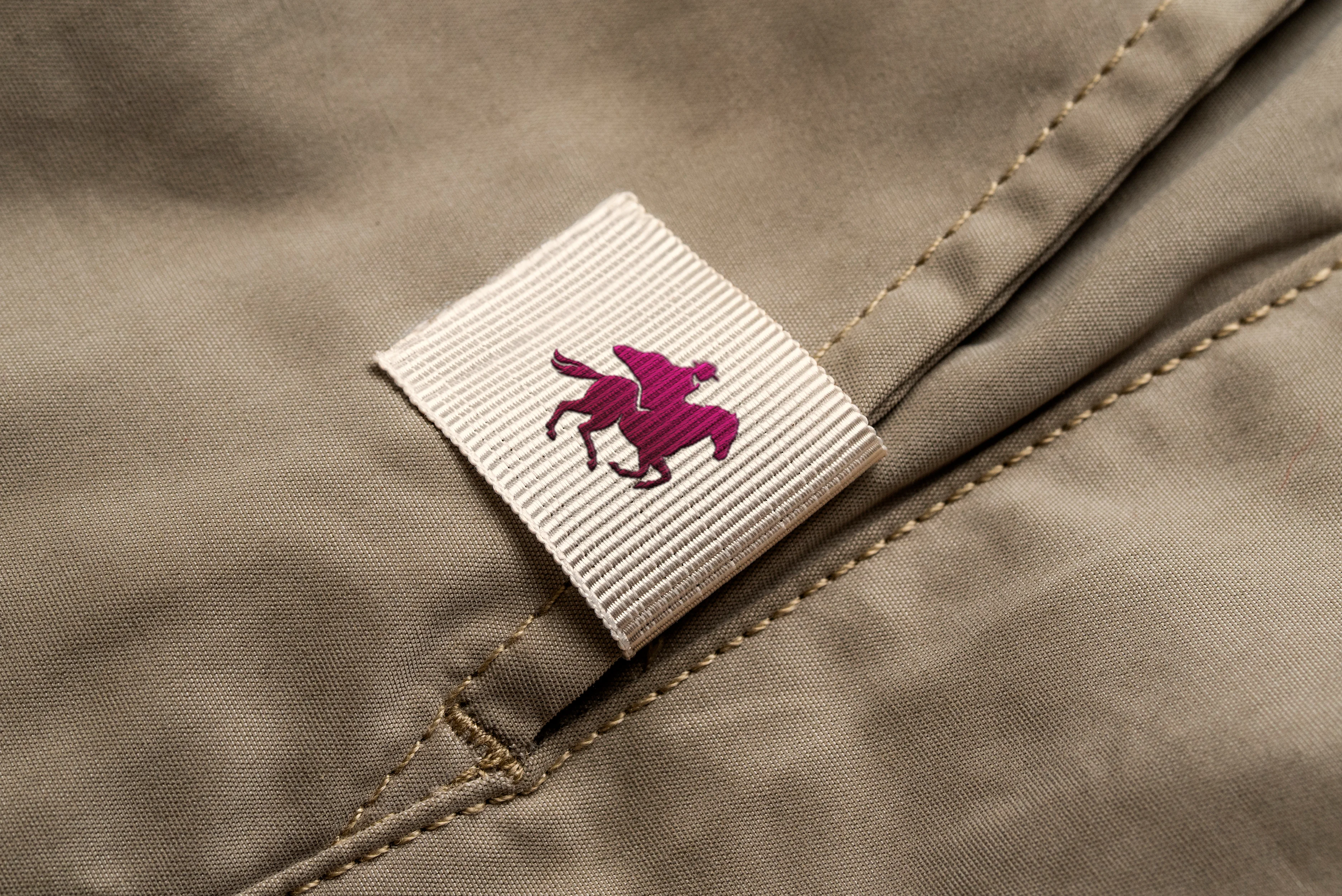
I developed a comprehensive brand system centered on the concept of "Union of Entities." The centerpiece is a modular symbol that honors the man-horse connection through a clean, heraldic aesthetic.
The final delivery included a robust visual universe: from a palette of earthy, noble tones to a typographic system that balances tradition with functional clarity. By focusing on "Dressing the Legacy," the identity successfully positions QUIRON not just as an apparel brand, but as a symbol of belonging to a shared culture of wisdom, craftsmanship, and endurance.
Like this project
Posted Mar 14, 2026
Brand identity developed for a premium workwear brand
Likes
1
Views
8