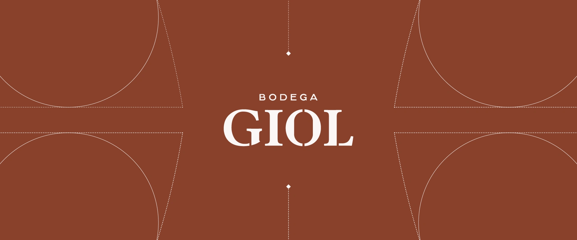
Bodega GIOL | Brand Identity
Franco Gómez
— Challenge
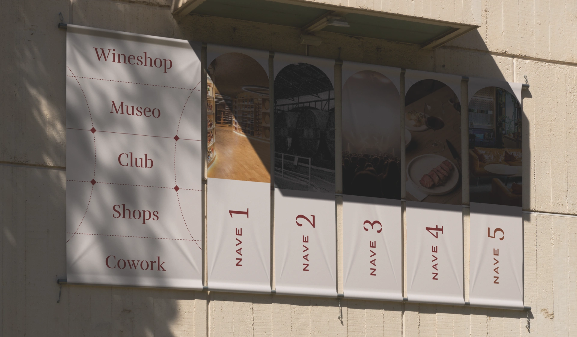
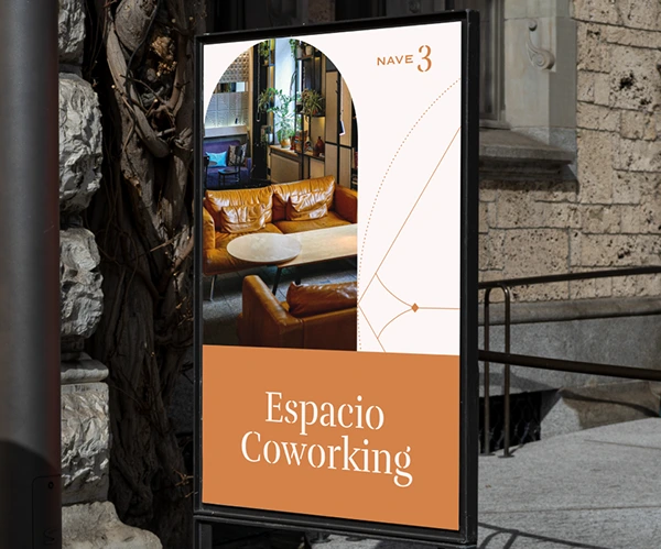
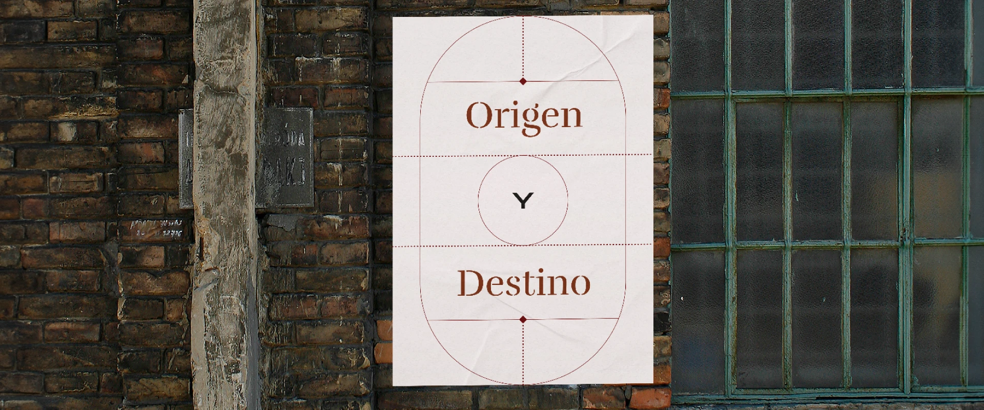
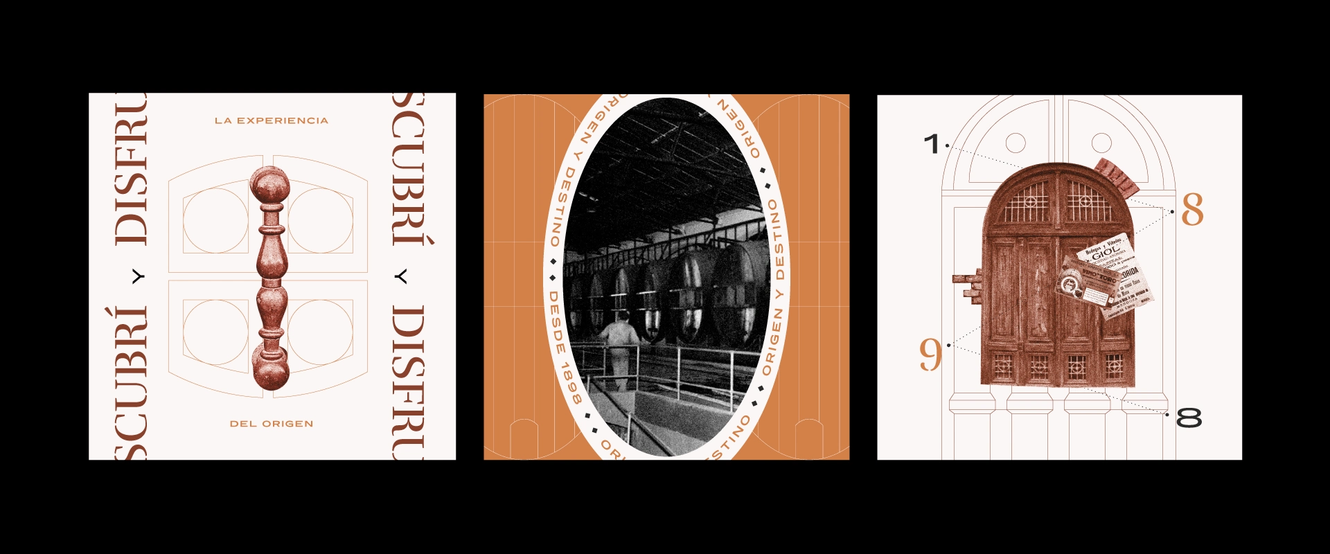
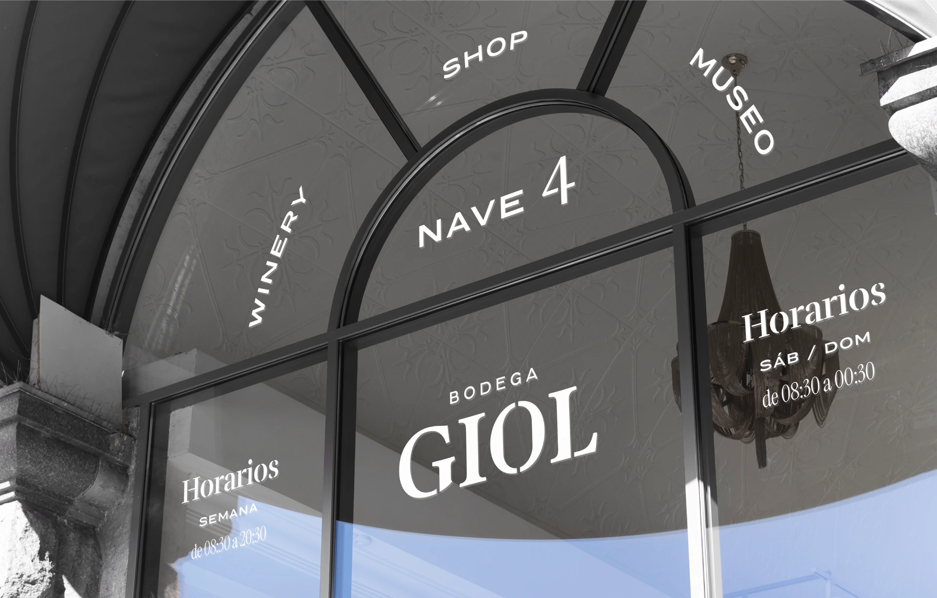
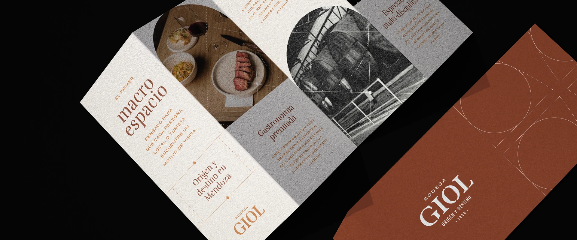
The challenge was to create a visual identity, capable of representing the historical heritage of great renown in the city. At the same time, this new brand had to be able to define a macro-space, that is, a physical space that hosts a universe of activities and possibilities.
— Result
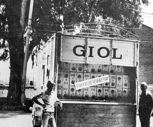
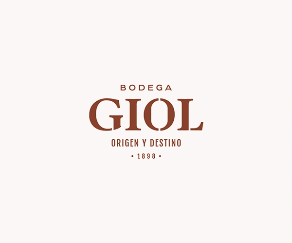
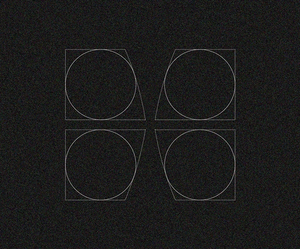
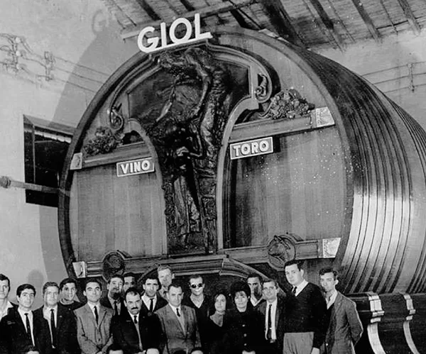
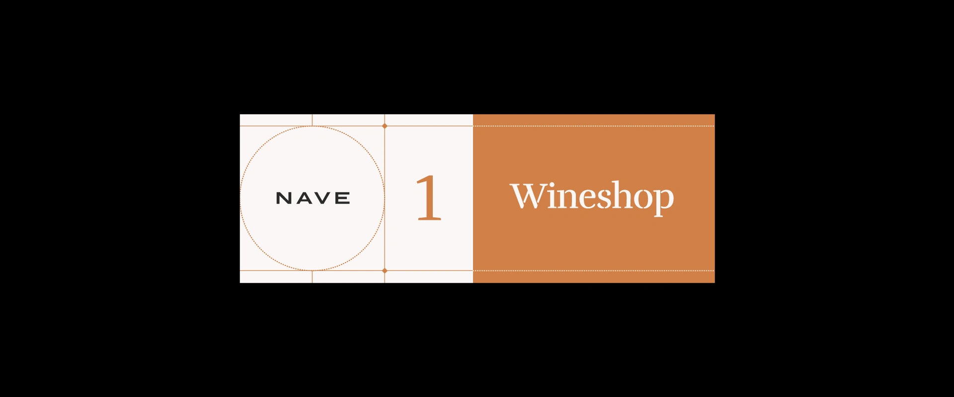
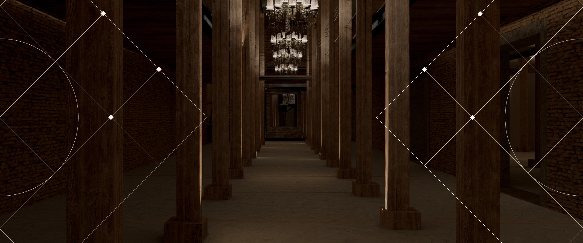
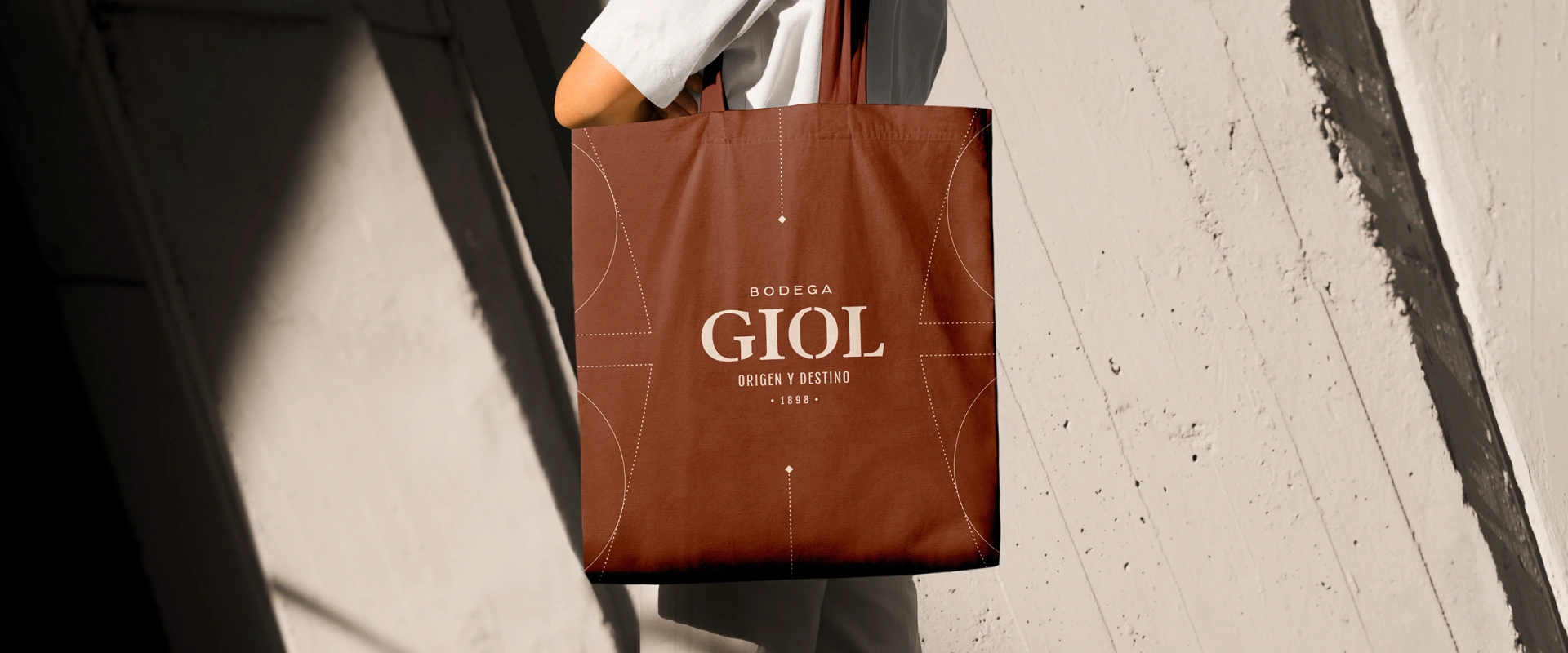
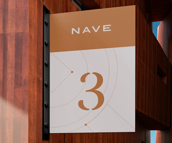
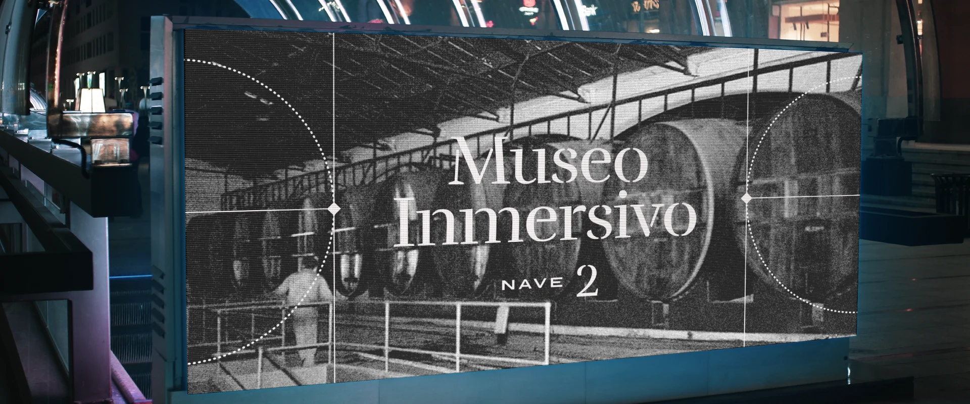
Through a historical study of the word GIOL and its graphic representation through time (+100 years of history), we came up with an imposing logotype with a historical wink in each of its letters, with enough personality to represent the trajectory side that this new macro-space needed. We paired this logo with a dynamic visual identity, to represent the constant movement of this cultural space, along with graphic elements based on architectural pieces of the place. We devised a design system with a fresh, contemporary layout, and with the exact dose of history.

Like this project
Posted Mar 14, 2026
Bodega GIOL is a macro-space designed in a historic winery in the city of Mendoza.
Likes
0
Views
4