Leyton | Rebranding
Franco Gómez

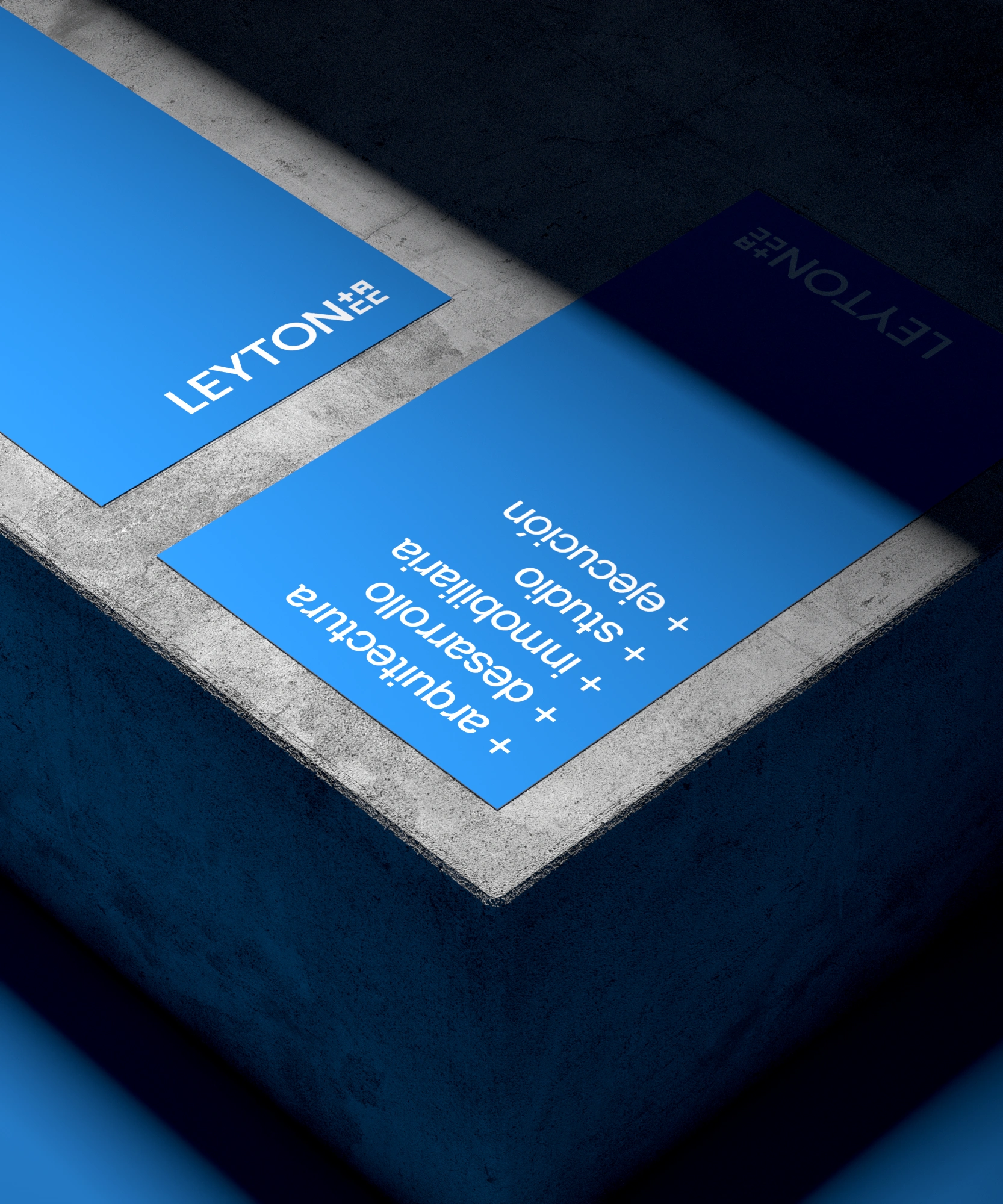
- Challenge
With decades of experience in the real estate market, Leyton Inmobiliaria approached us to revamp its outdated and unpolished brand identity. This rebranding aimed not only to modernize its image but also to communicate the company’s expanded range of services, which now includes architecture, construction, and property commercialization.
- Result
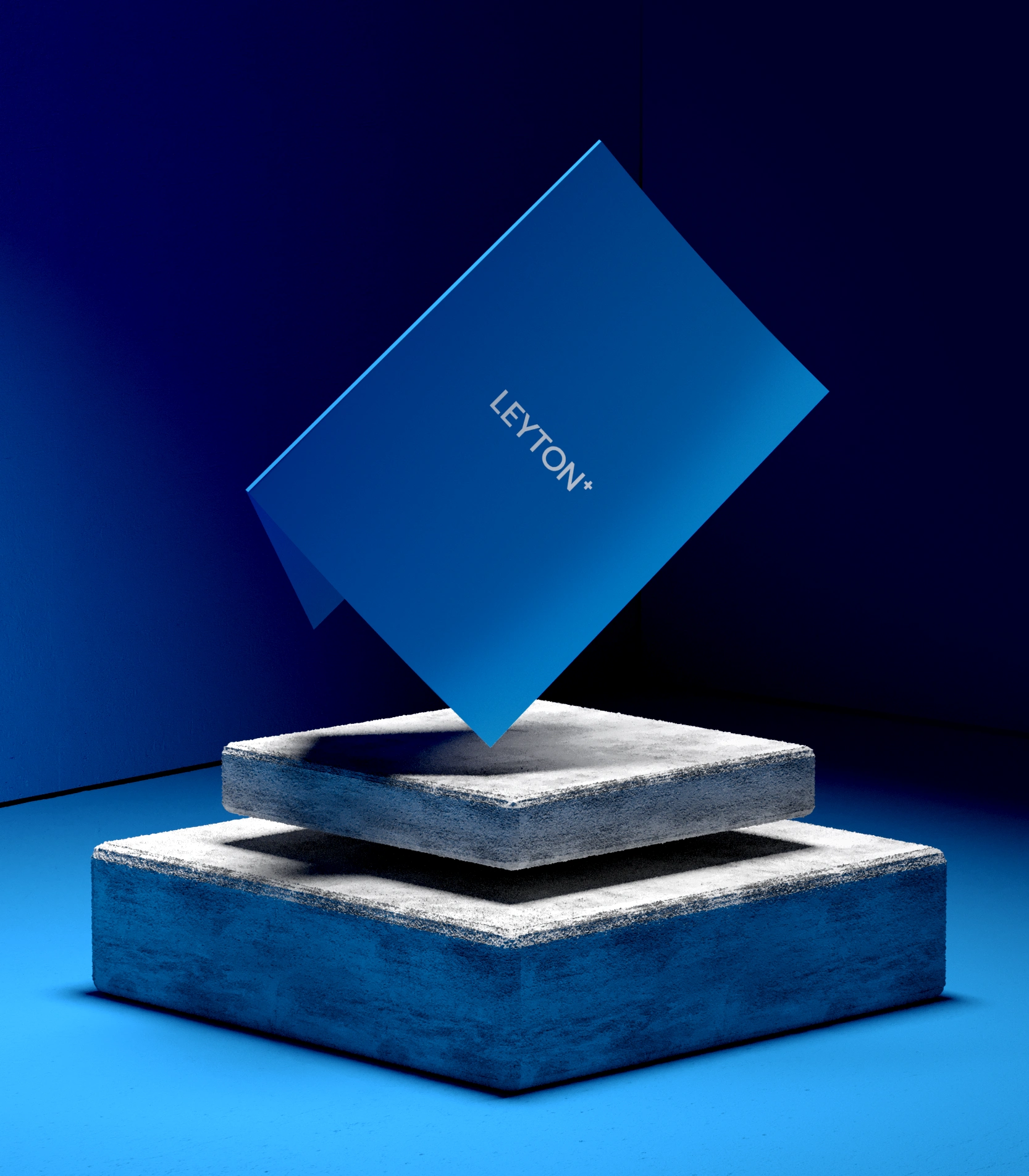
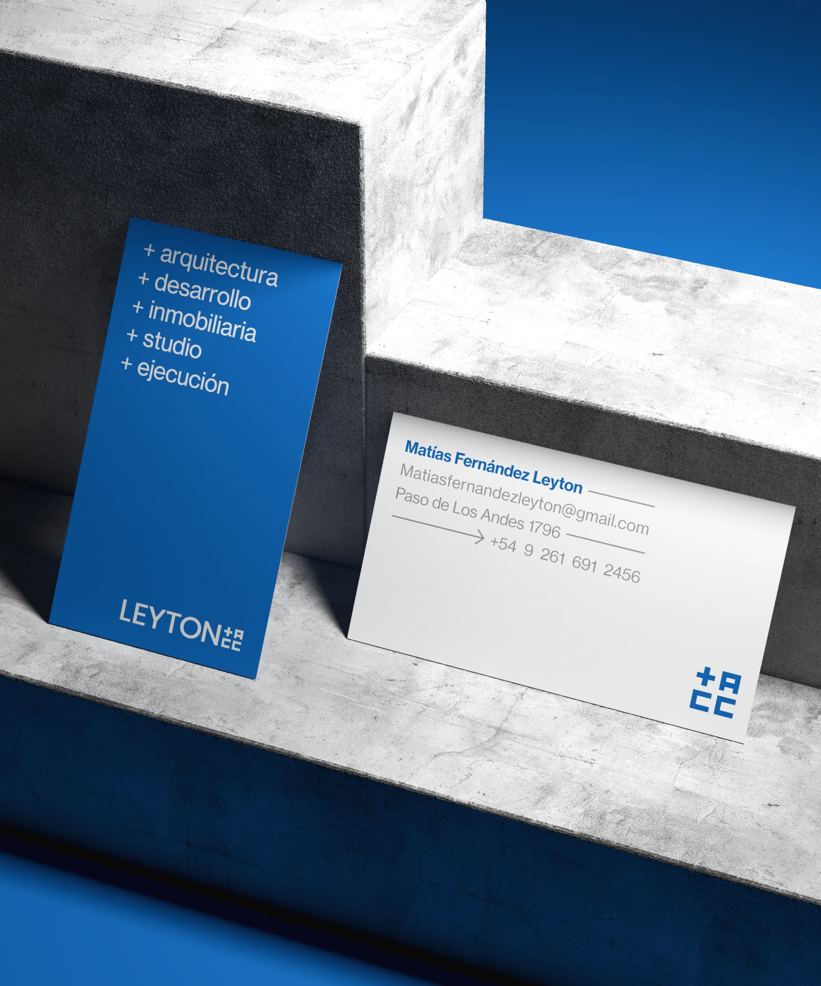
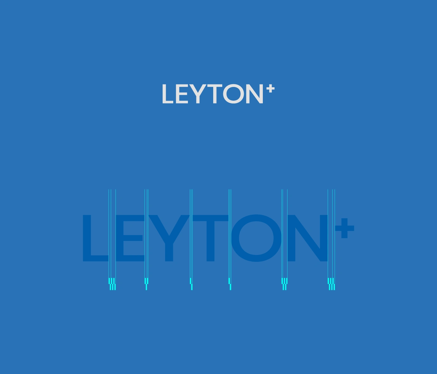
The rebranding of Leyton Inmobiliaria established a refined and modern visual identity that communicates both its legacy and its new ambitions. A sleek, minimalist logo with shades of blue reflects professionalism and trust, while the addition of a "+" symbolizes the expansion into architecture, construction, and commercialization.
To enhance the brand’s versatility, an alternative logo was developed, integrating the initials "A," "C," and "C" (for Architecture, Construction, and Commercialization) within a square. This design aligns with the clean, modular aesthetic requested by the owners, encapsulating the company’s forward-thinking vision.

Like this project
Posted Mar 14, 2026
Rebranded Leyton Inmobiliaria with a modern visual identity and logo.