nomos — Universal Device Connection
Felix Finger
Logo animation
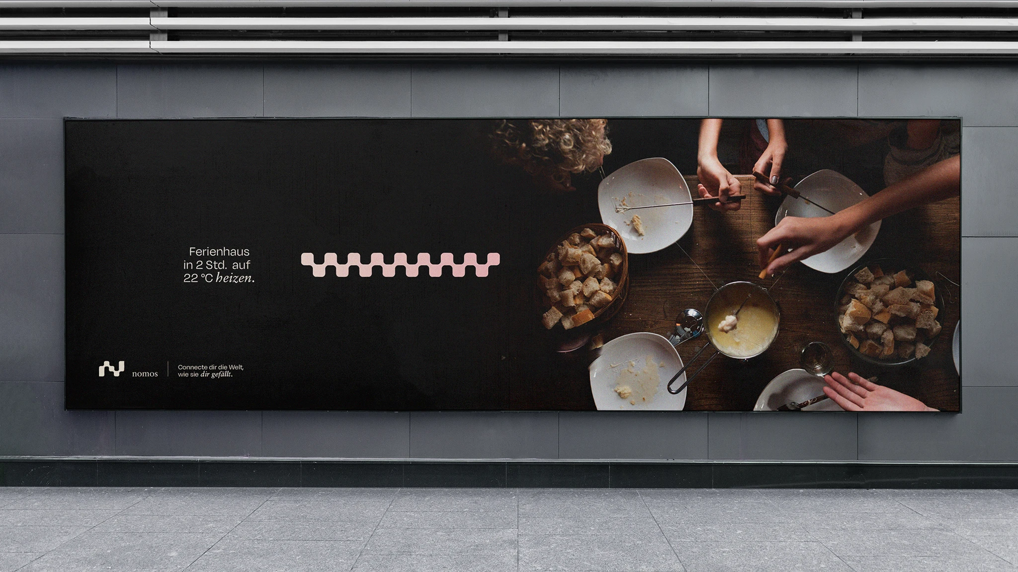
Connect the world the way you want
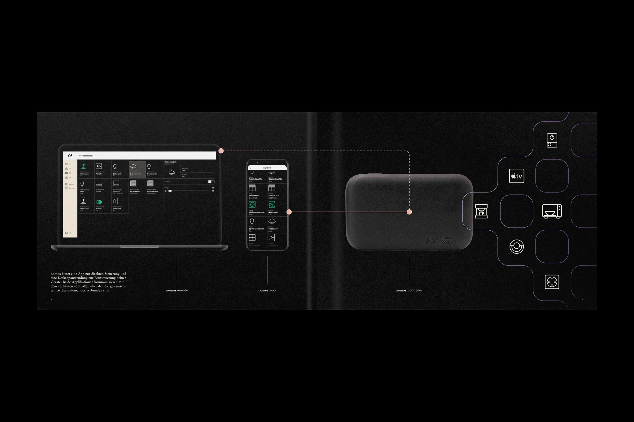
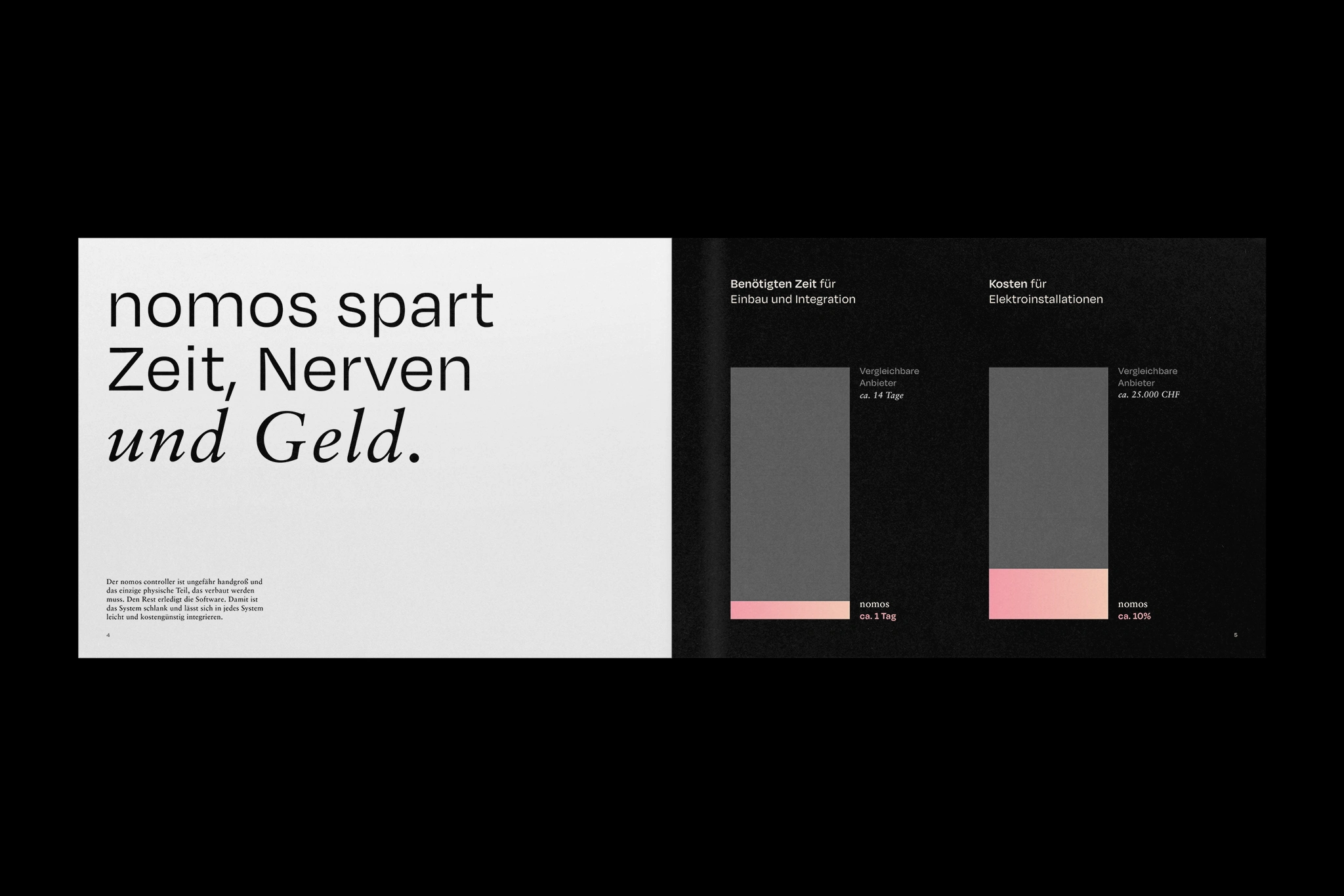
nomos system AG is a Swiss-based company that has set itself the task of standardizing the networking and control of different devices and technologies. The unique software engine developed for this purpose understands all common software protocols and is constantly being expanded. This engine thus acts as a universal connector that couples and allows the desired components to communicate – regardless of manufacturer and device type. As a result, there are now no limits to creativity in control and automation.
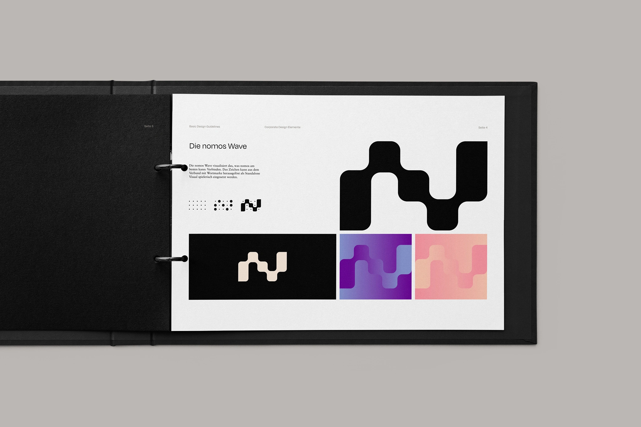
In collaboration with ONNNE, this innovation and technology-driven DNA has now been made visible as part of the brand's visual realignment. Just as nomos connects technologies with each other and these with people, the brand identity also merges human warmth with technological straightforwardness. The N-shaped figurative mark represents the lowest common denominator of technical and human communication: a wave. It creates light, sound and electrical radiation. It stands for connectivity and resonance. The wave is a simple but powerful and dynamic sign and symbolizes what drives nomos: A simpler world through connectivity. The design of the figurative mark is based on a fluid connection of different dots on a grid, providing the starting point for a consistent, identity-creating formal language for various design elements such as the iconography or the brand pattern.
Typography, color and imagery also contrast human and technical traits: warm and cool tones, curved and constructed typefaces, people in a rational, calculated photographic composition. In this way, the appearance makes the symbiosis of people and technology visually tangible.
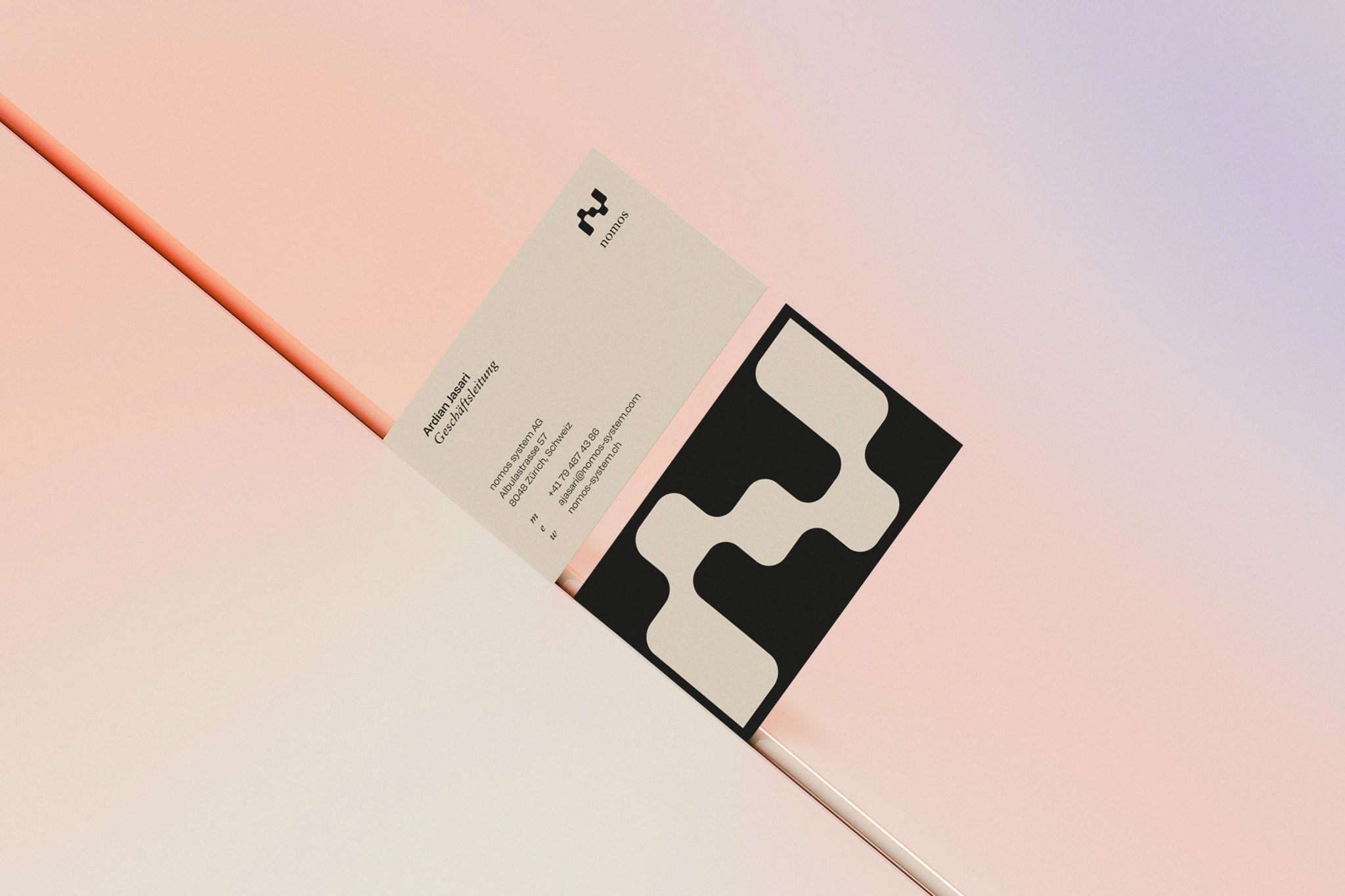
Business cards
Brochure
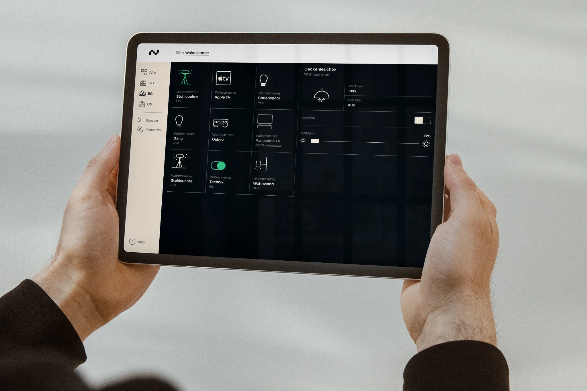
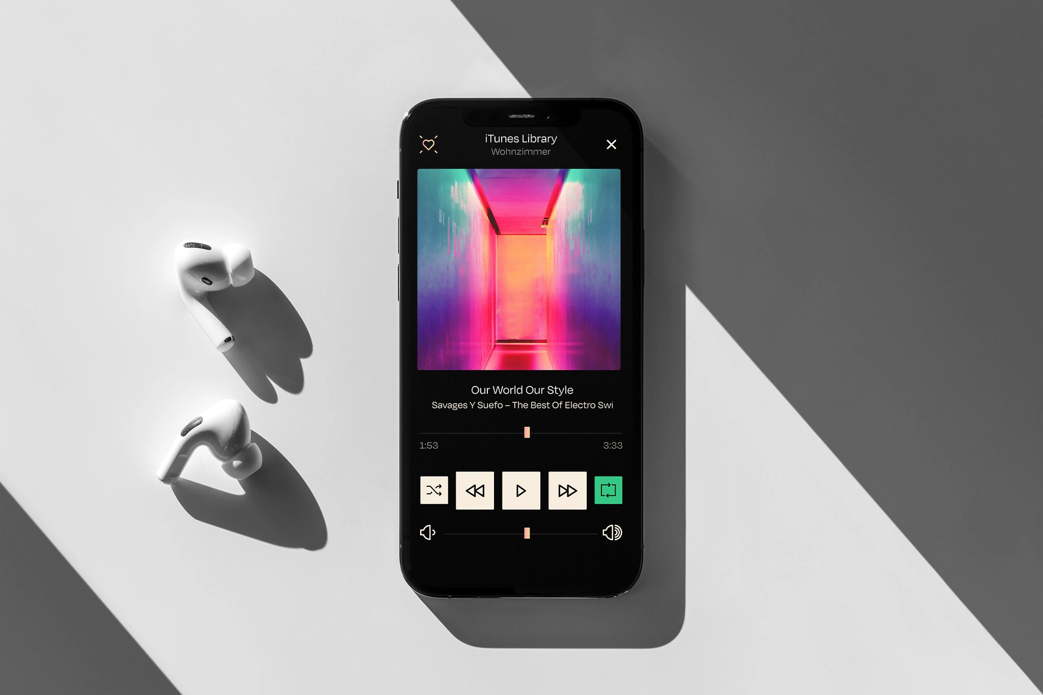
App
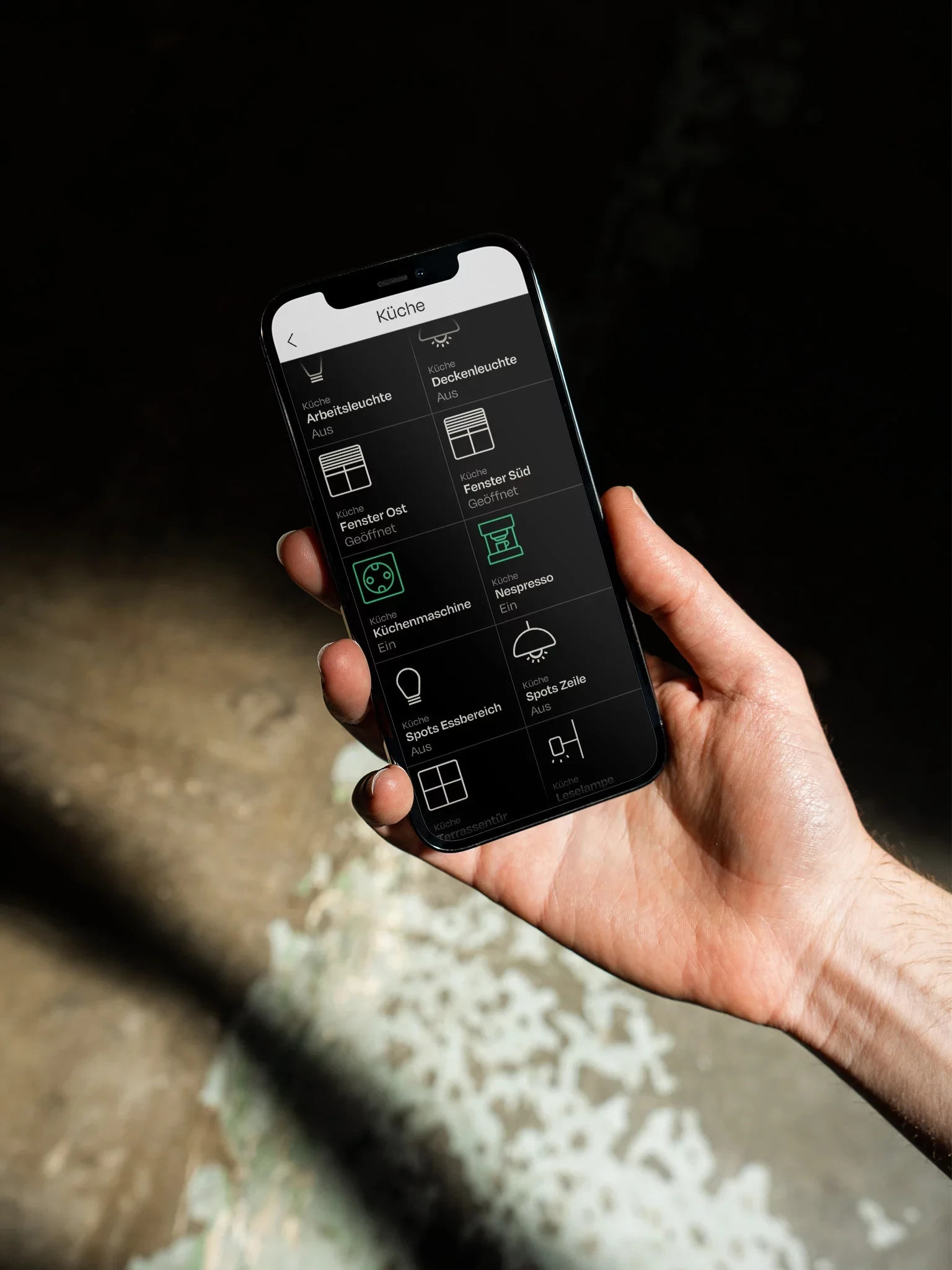
App
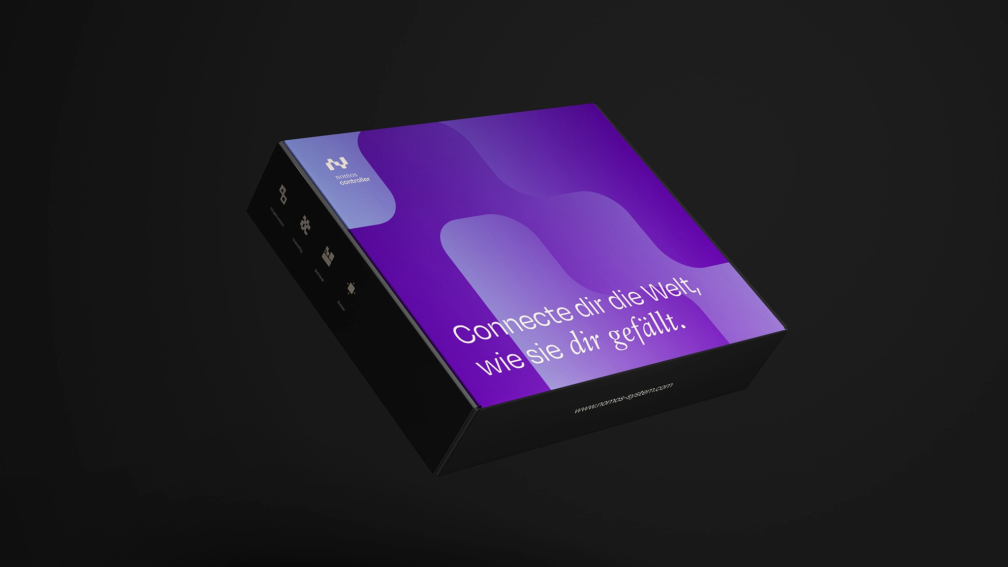
Packaging
Brochure
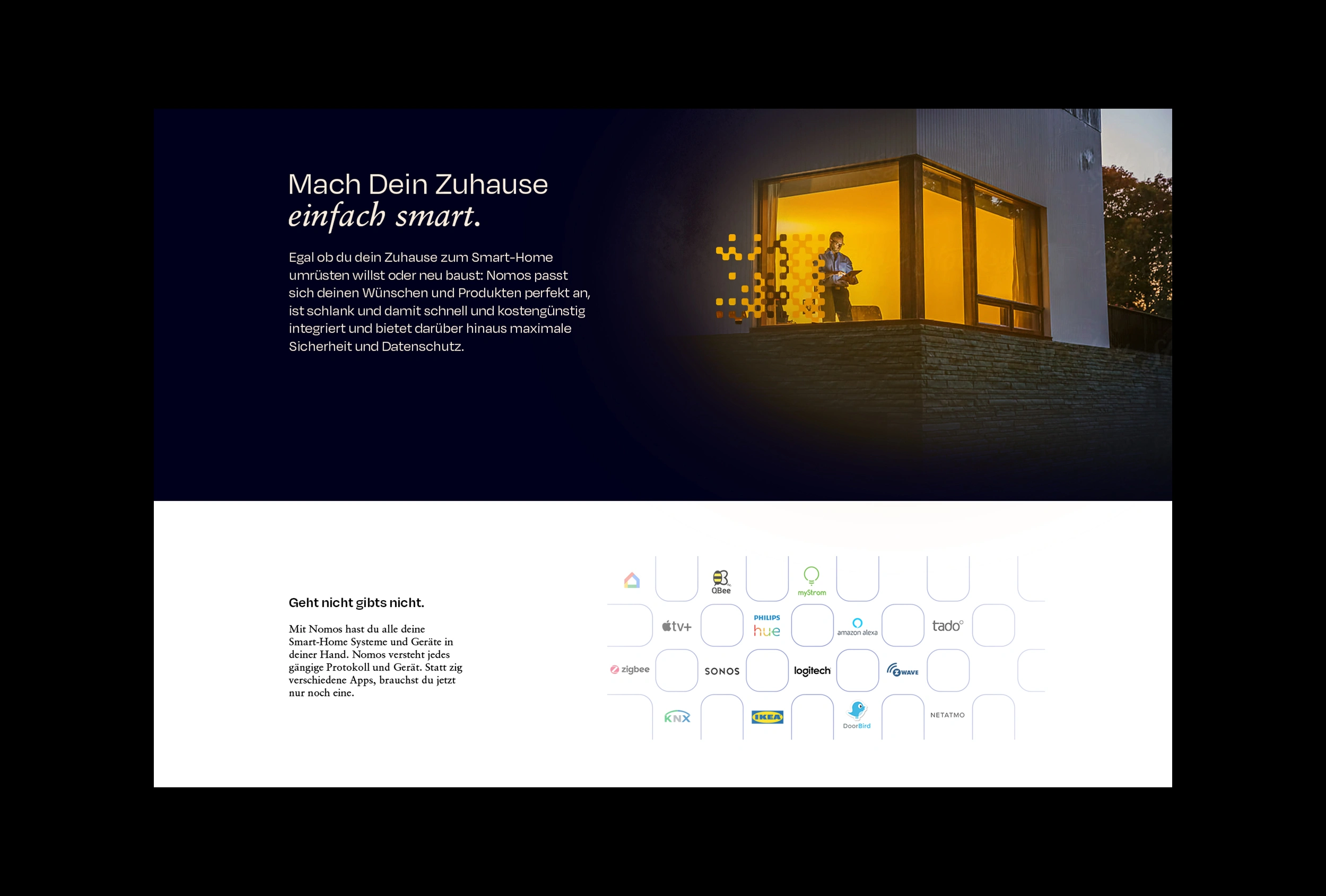
Website
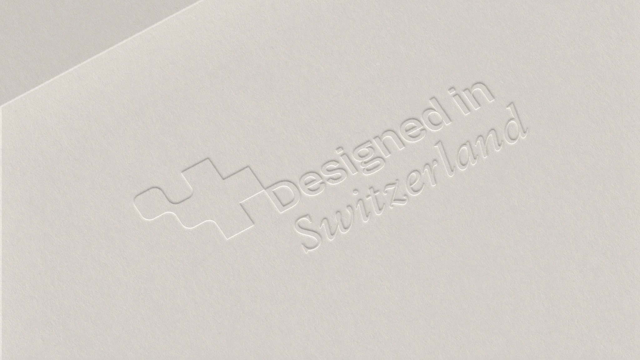
Debossing
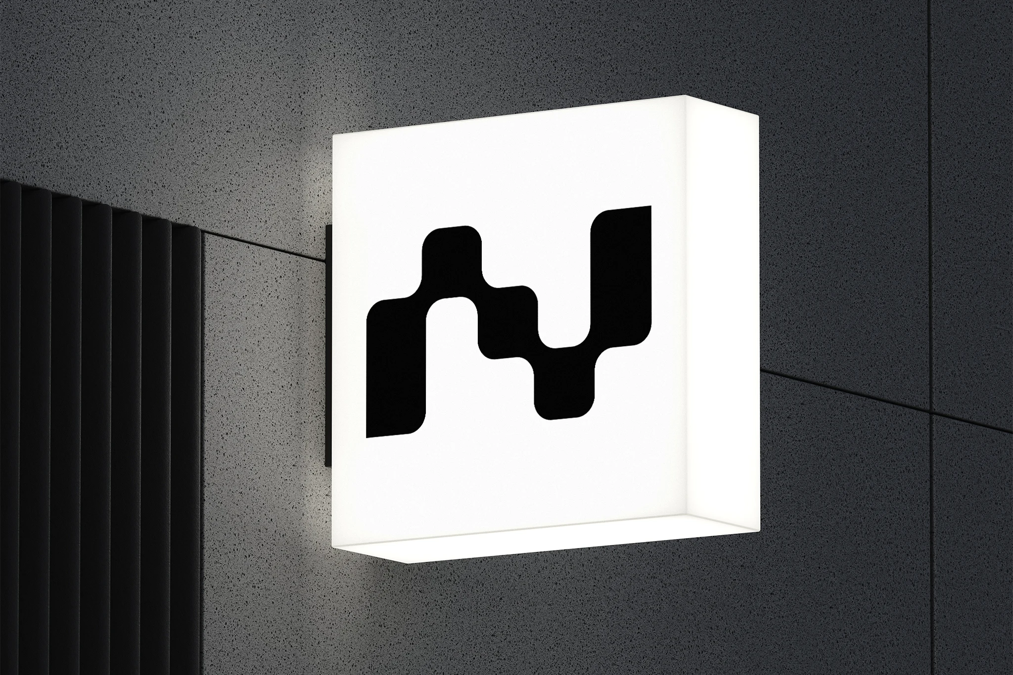
Sign
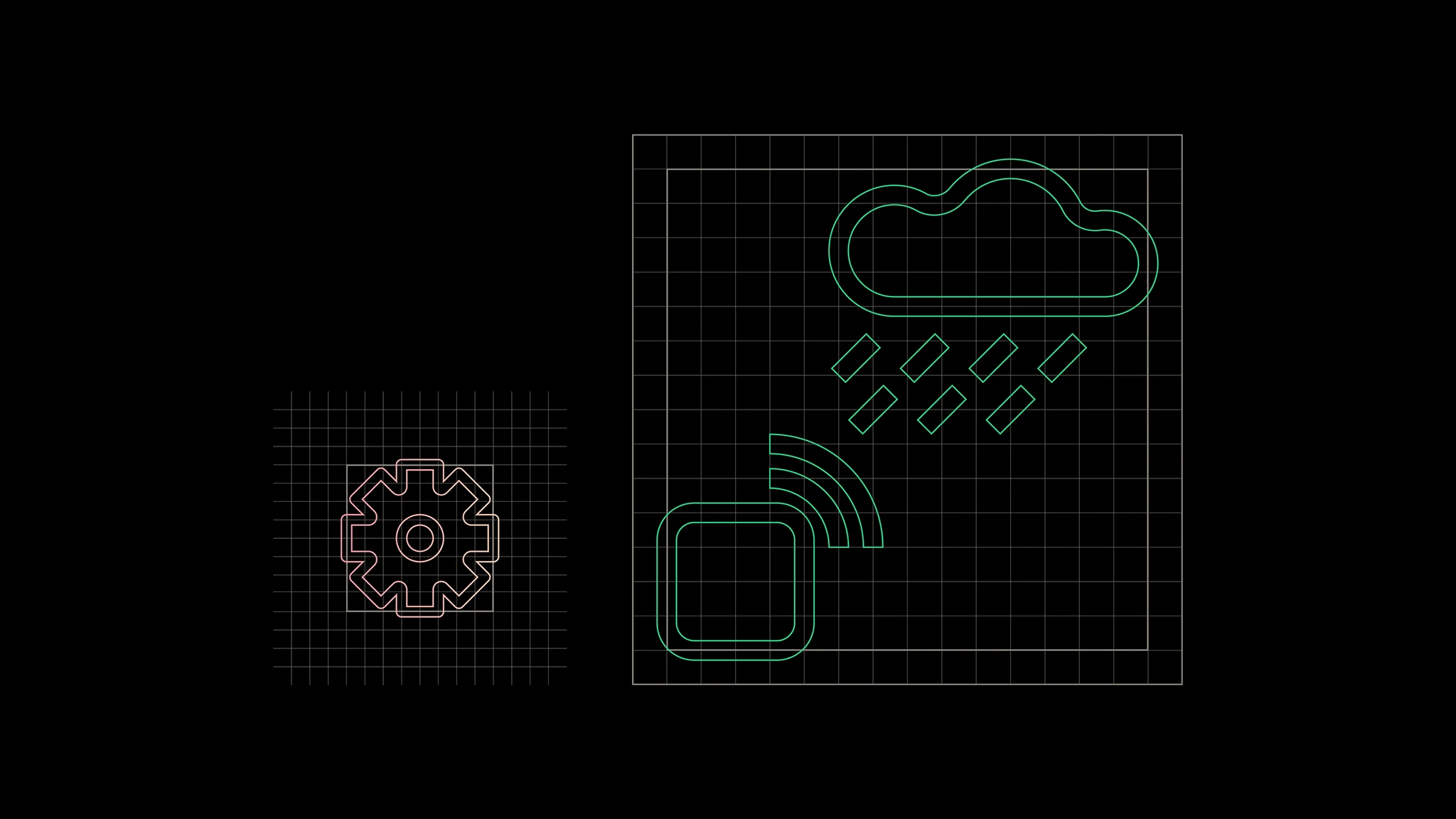
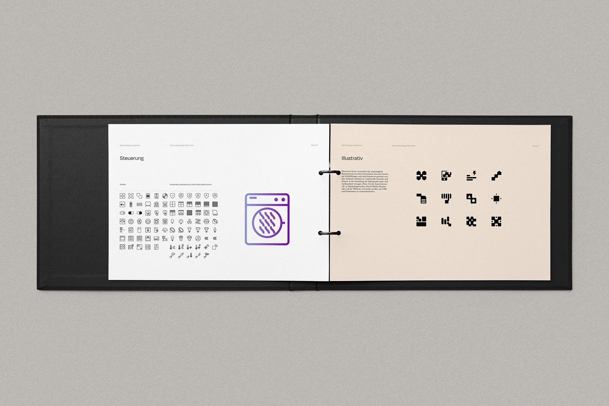
Icon system
App
Website
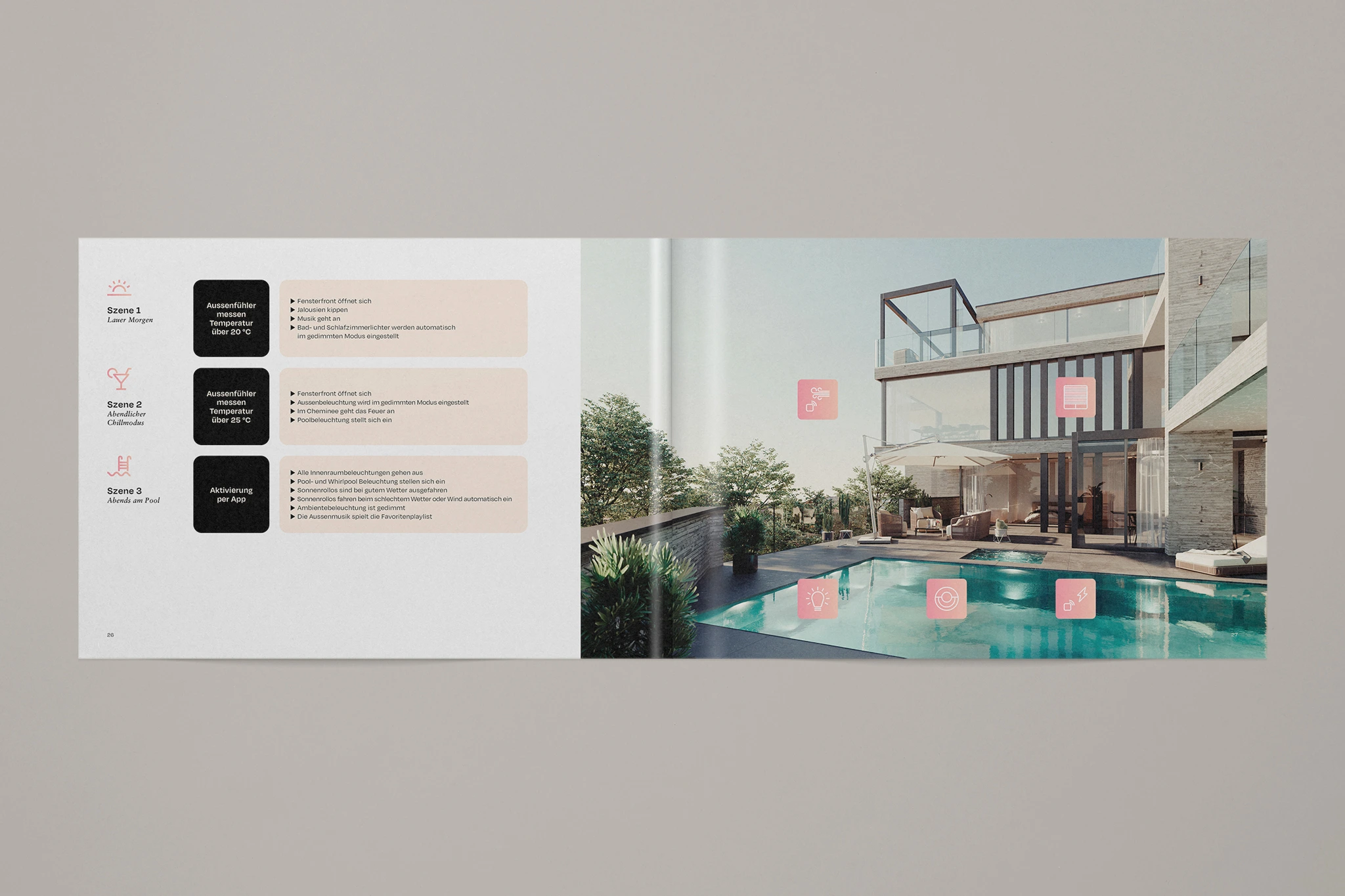
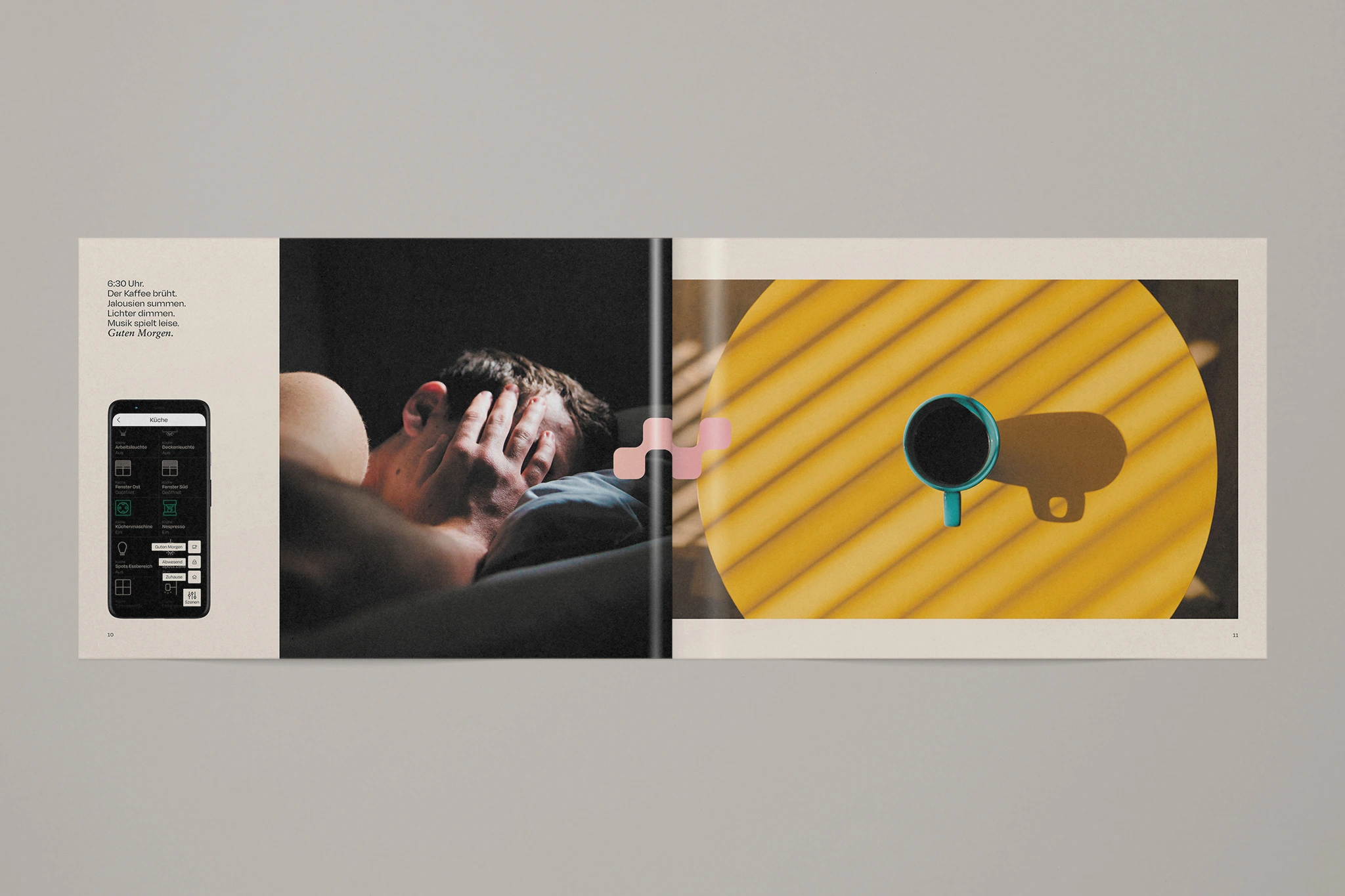
Brochure
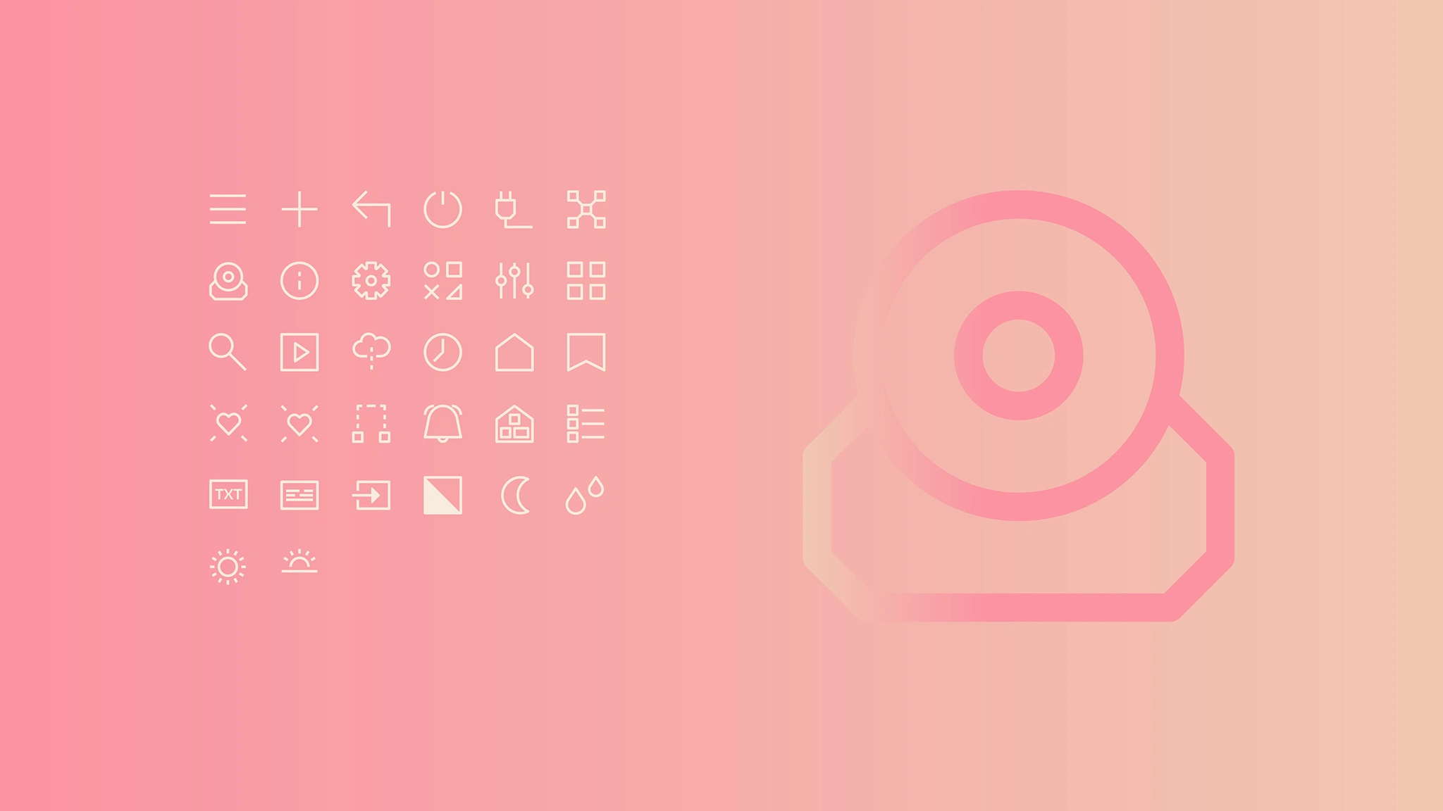
Icon set
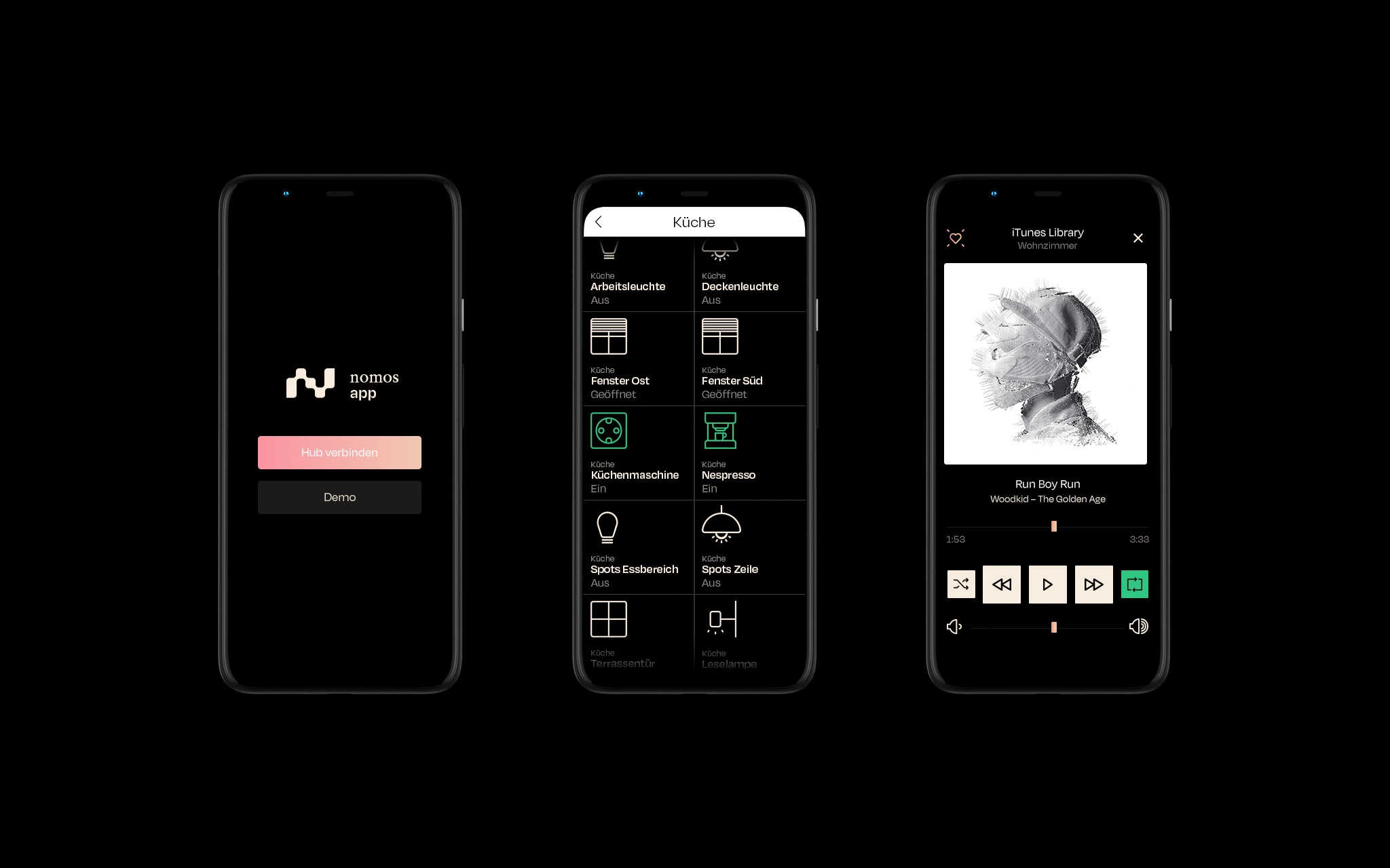
App
Brandbook
Brochure
OHO
Tape
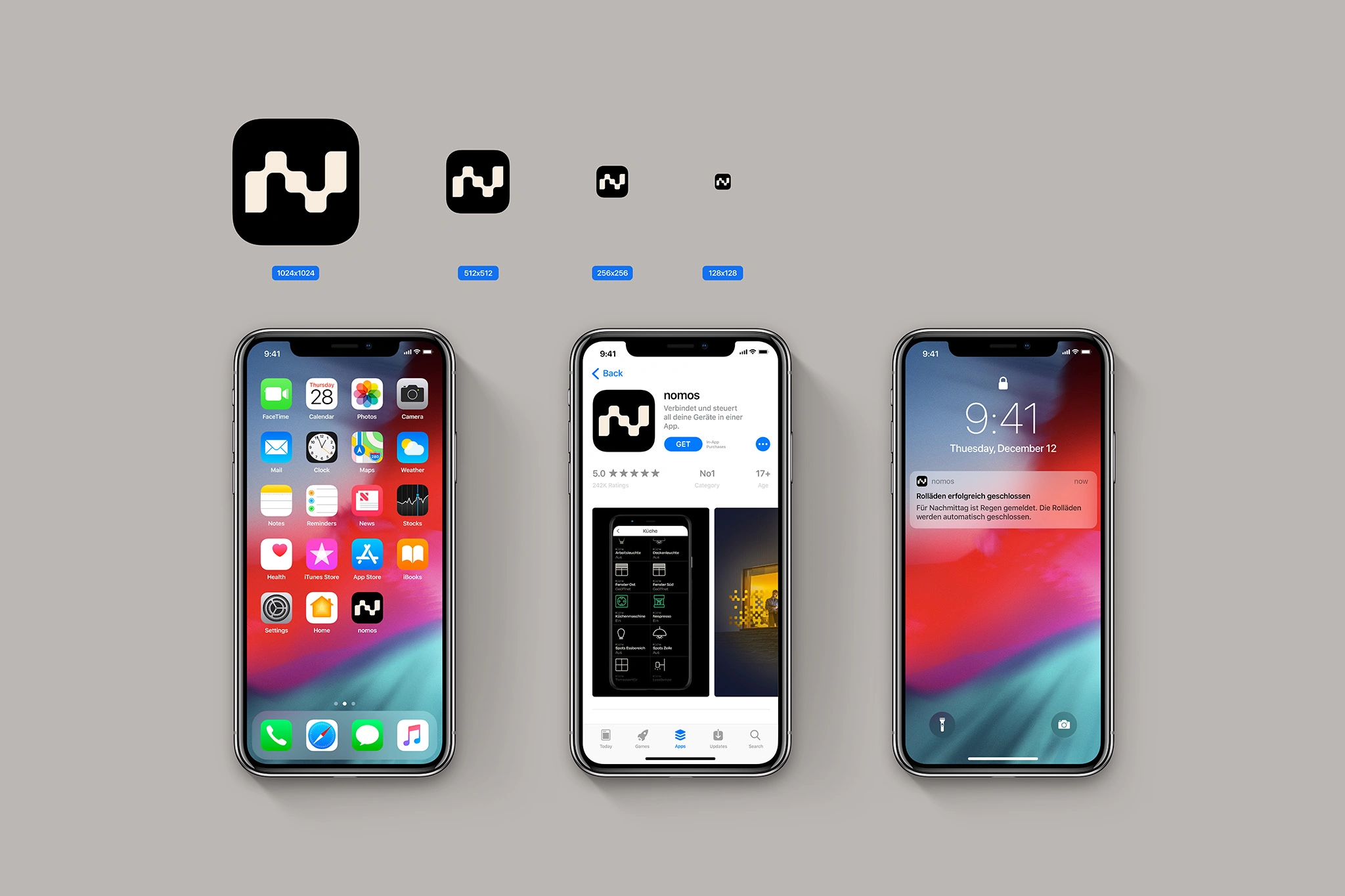
App icon
Brandbook
Let's start your project
Like this project
Posted Oct 21, 2025
Nomos simplifies connectivity by uniting devices, people & tech. Its new visual identity visualizes this harmony through wave, form & design.