OptimallyMe — Health Platform Branding
Felix Finger
Website
Action before treatment
Less alcohol and sugar. Regular exercise. Superfoods. Intermittent fasting. The topic of health is a huge reservoir of generally valid rules, beliefs and dogmas. What is often neglected is the real person with all his or her idiosyncrasies and individual needs.
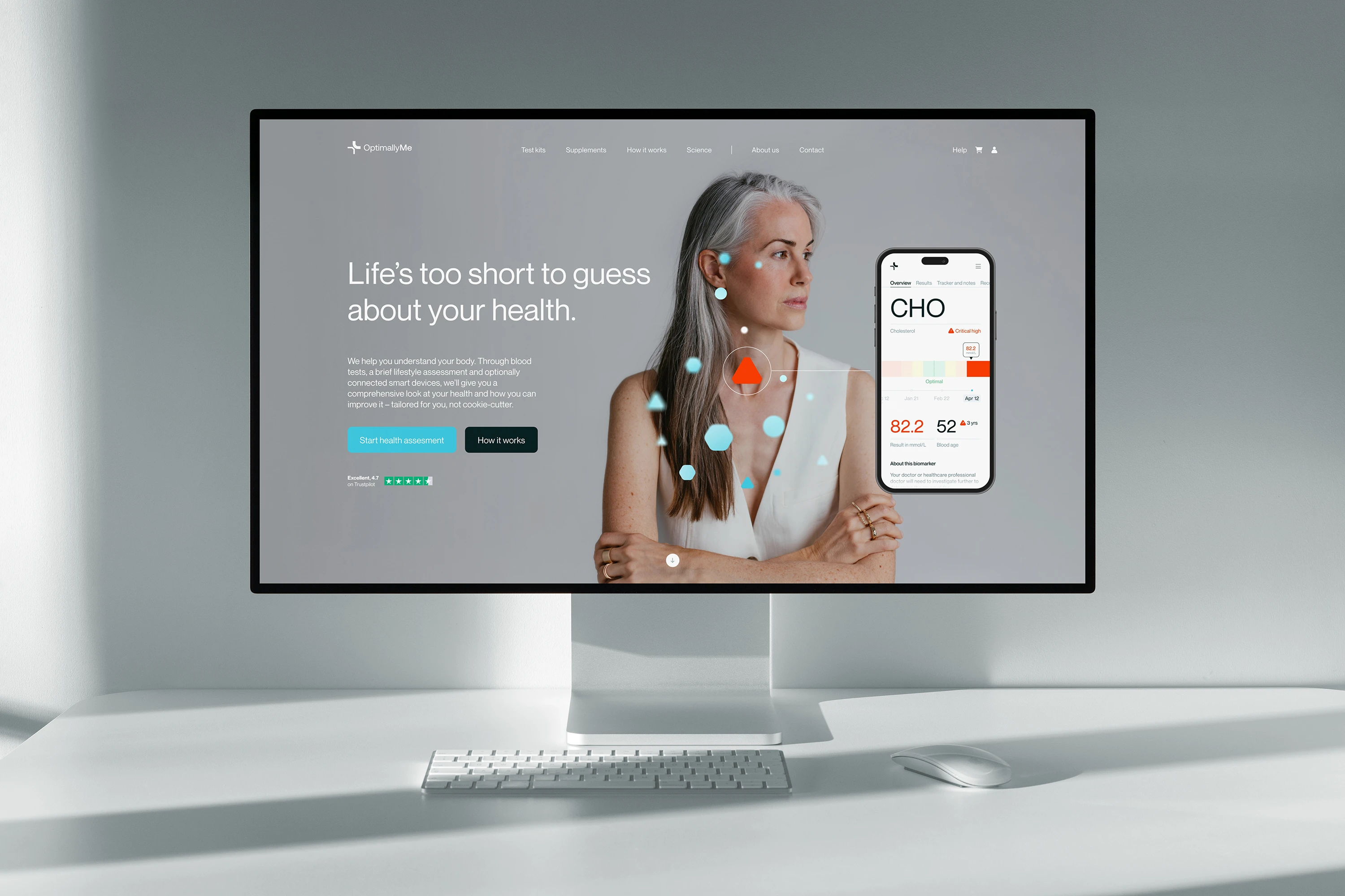
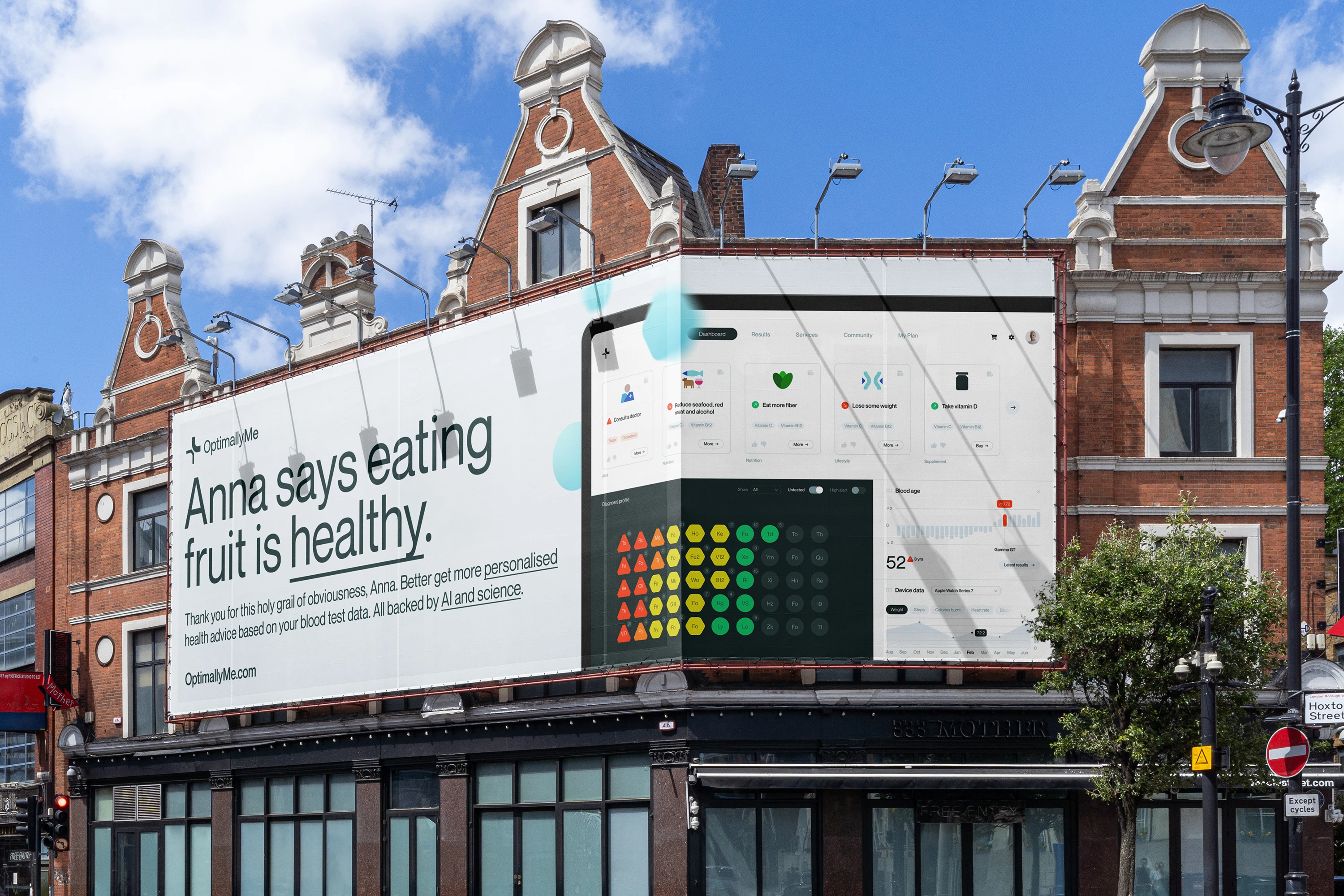
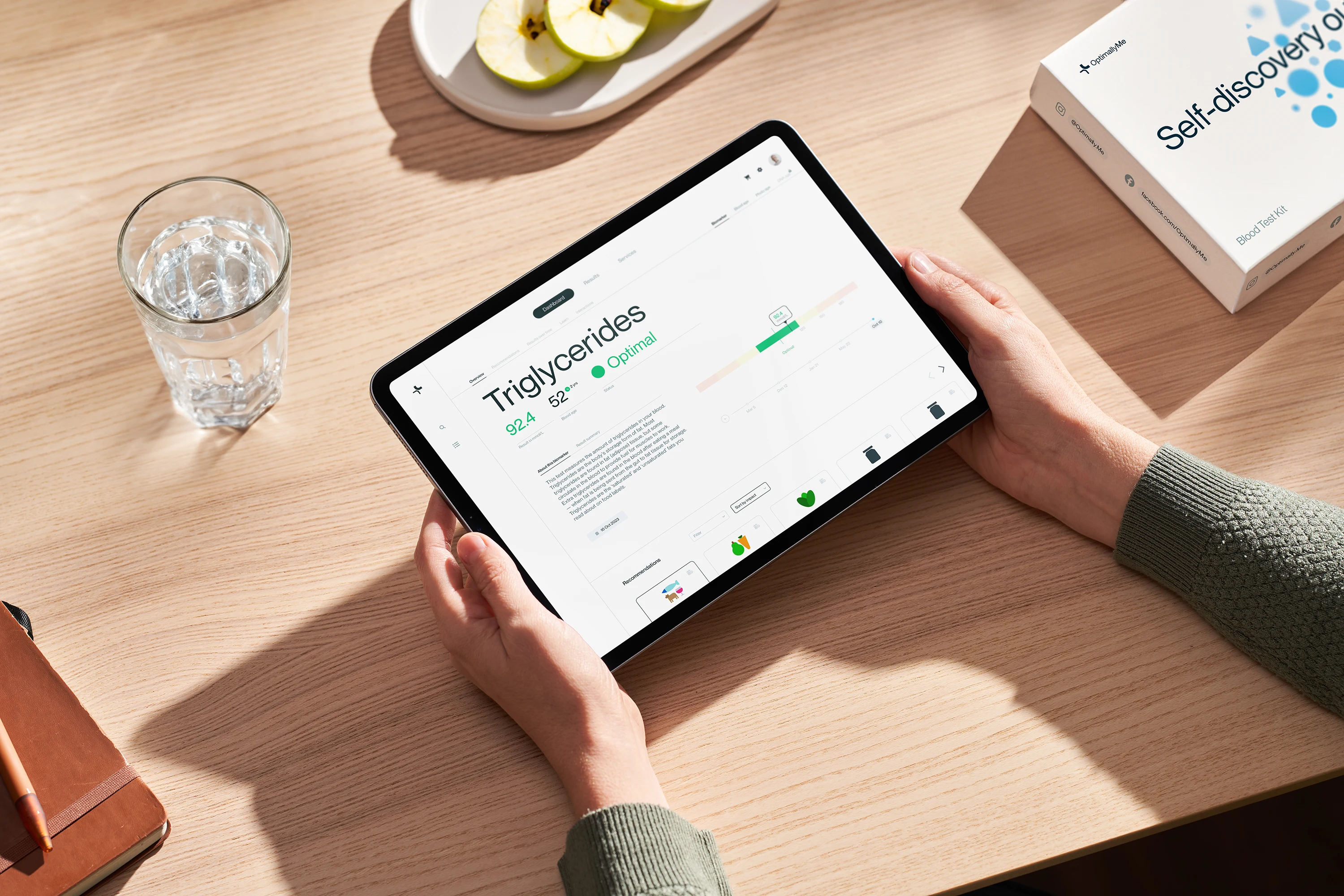
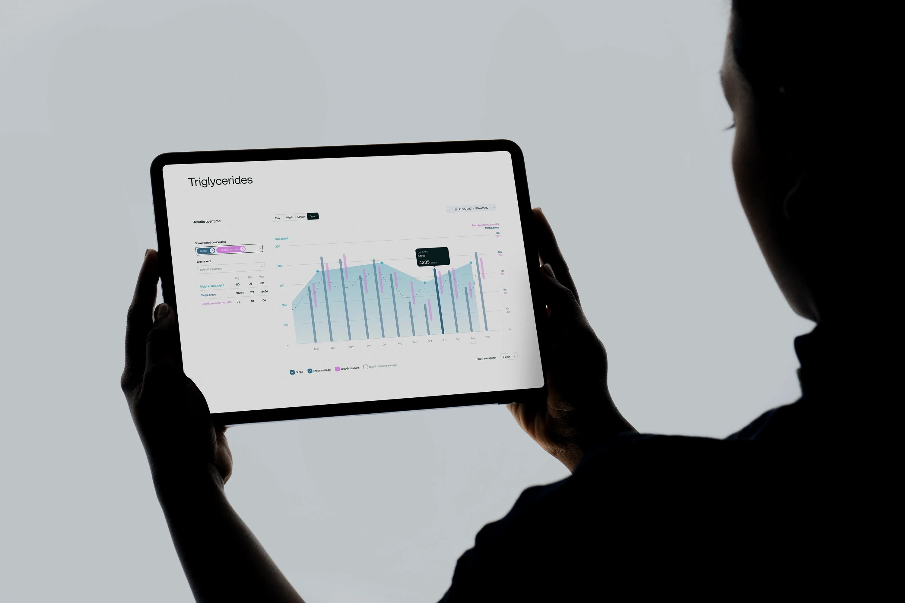
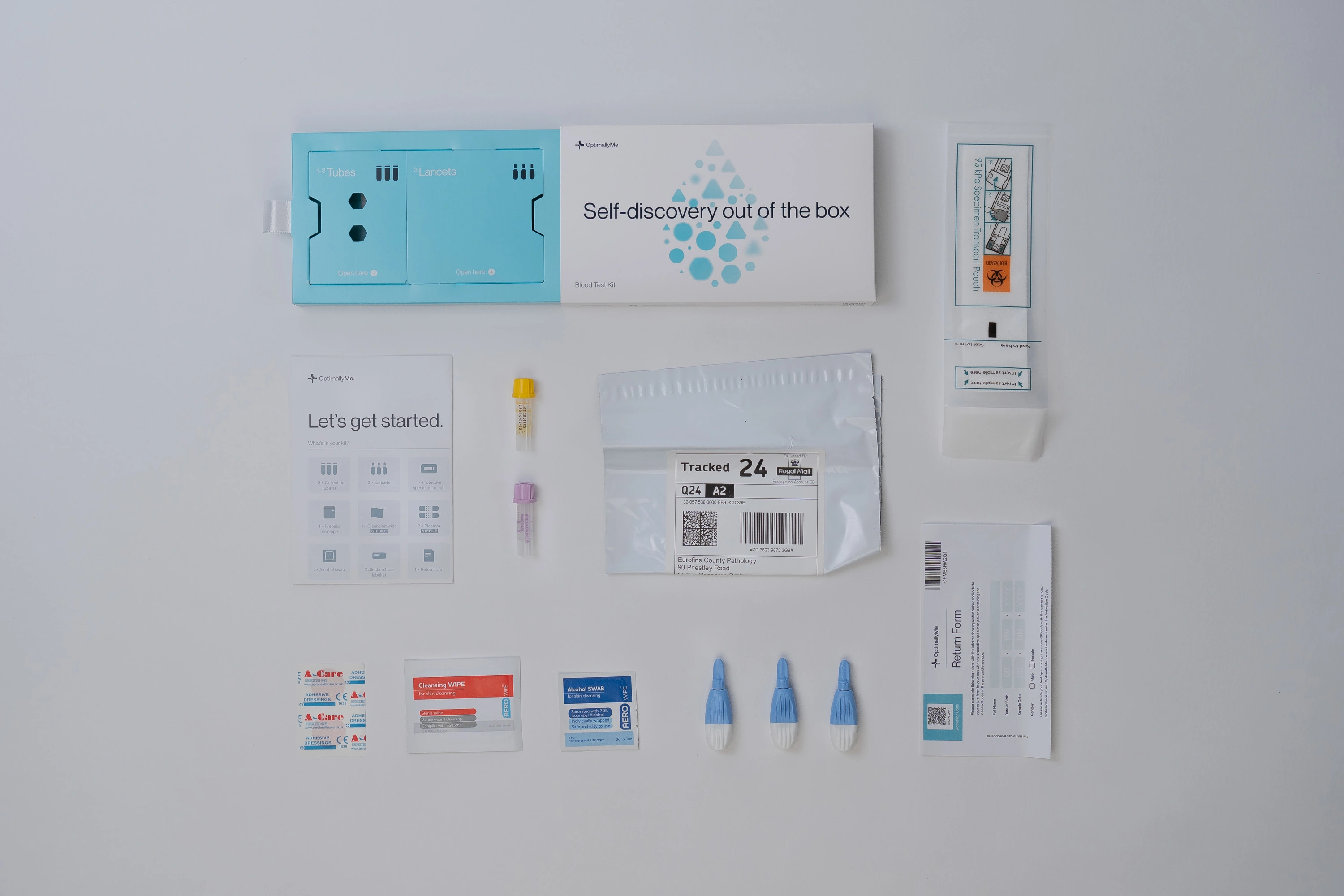
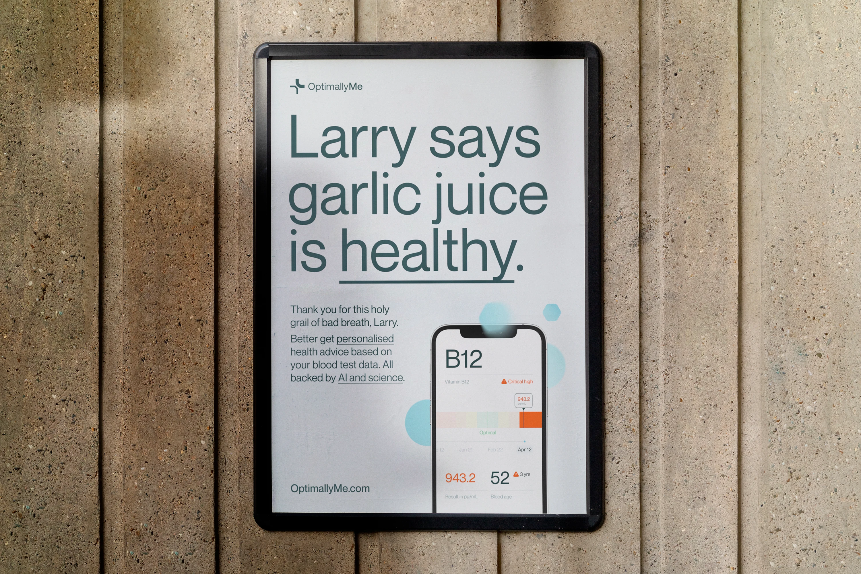
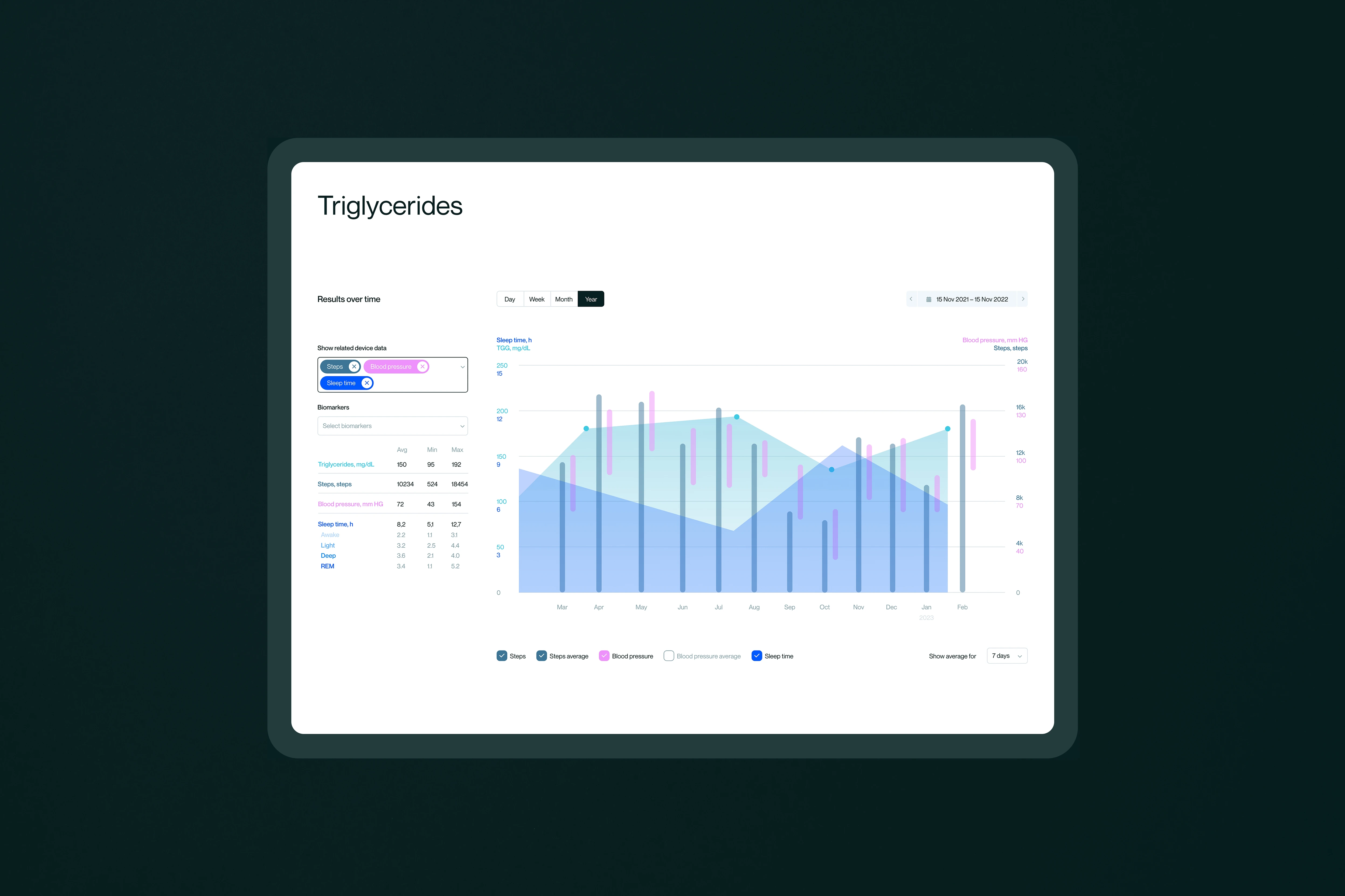
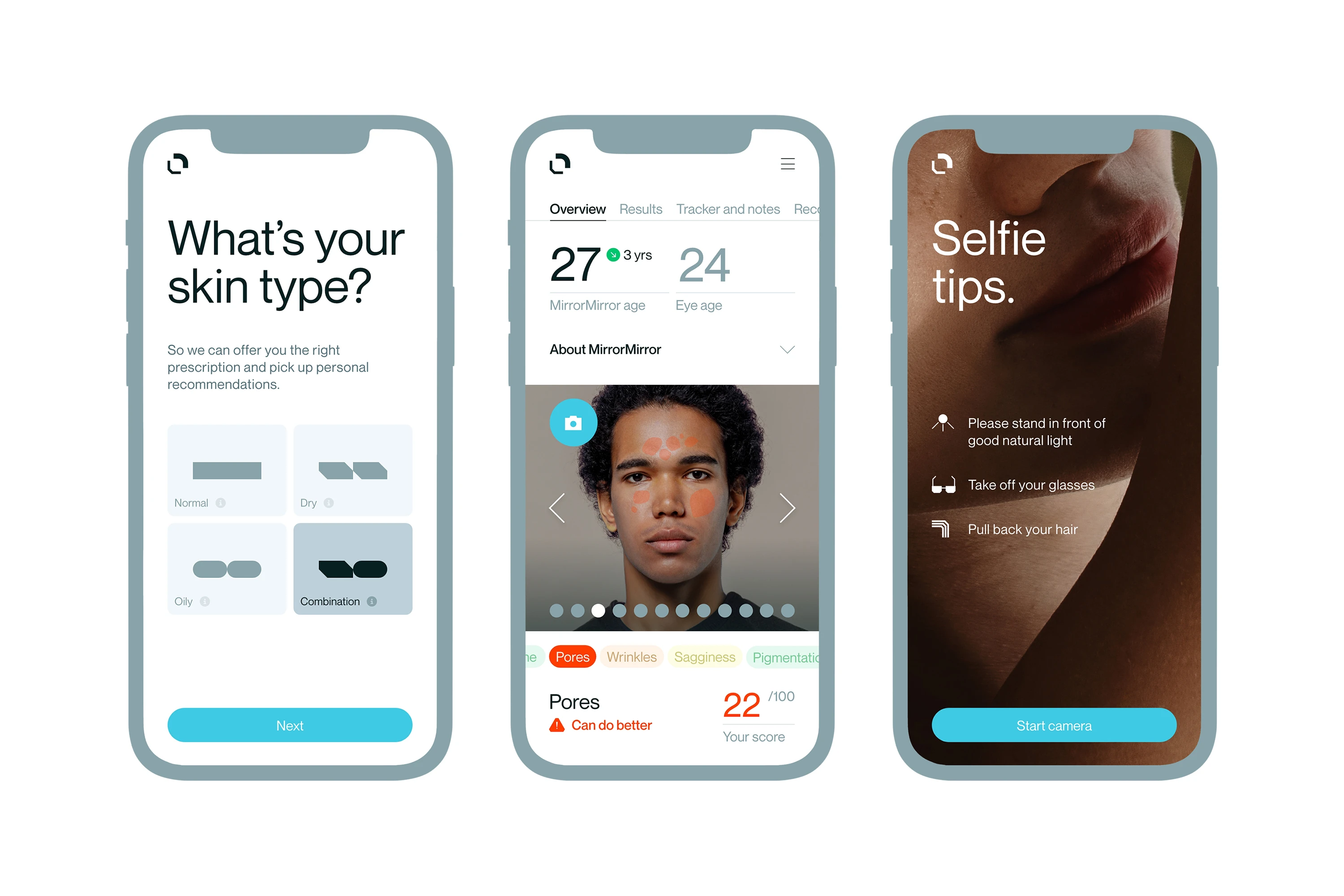
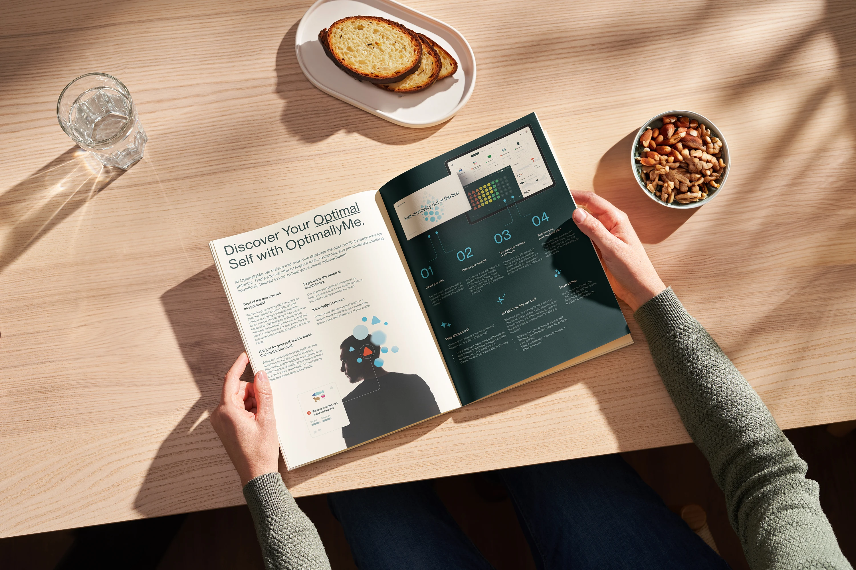
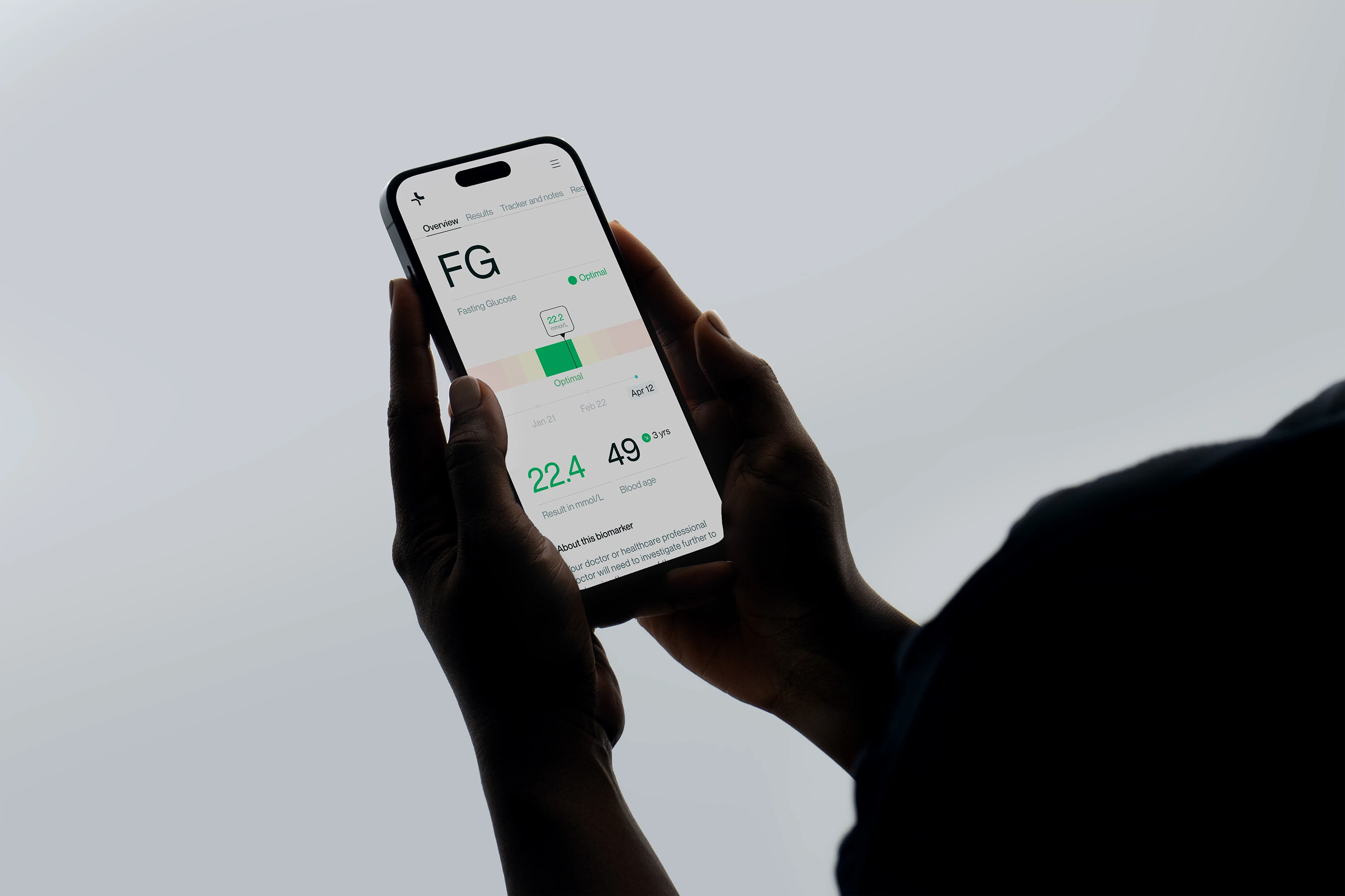
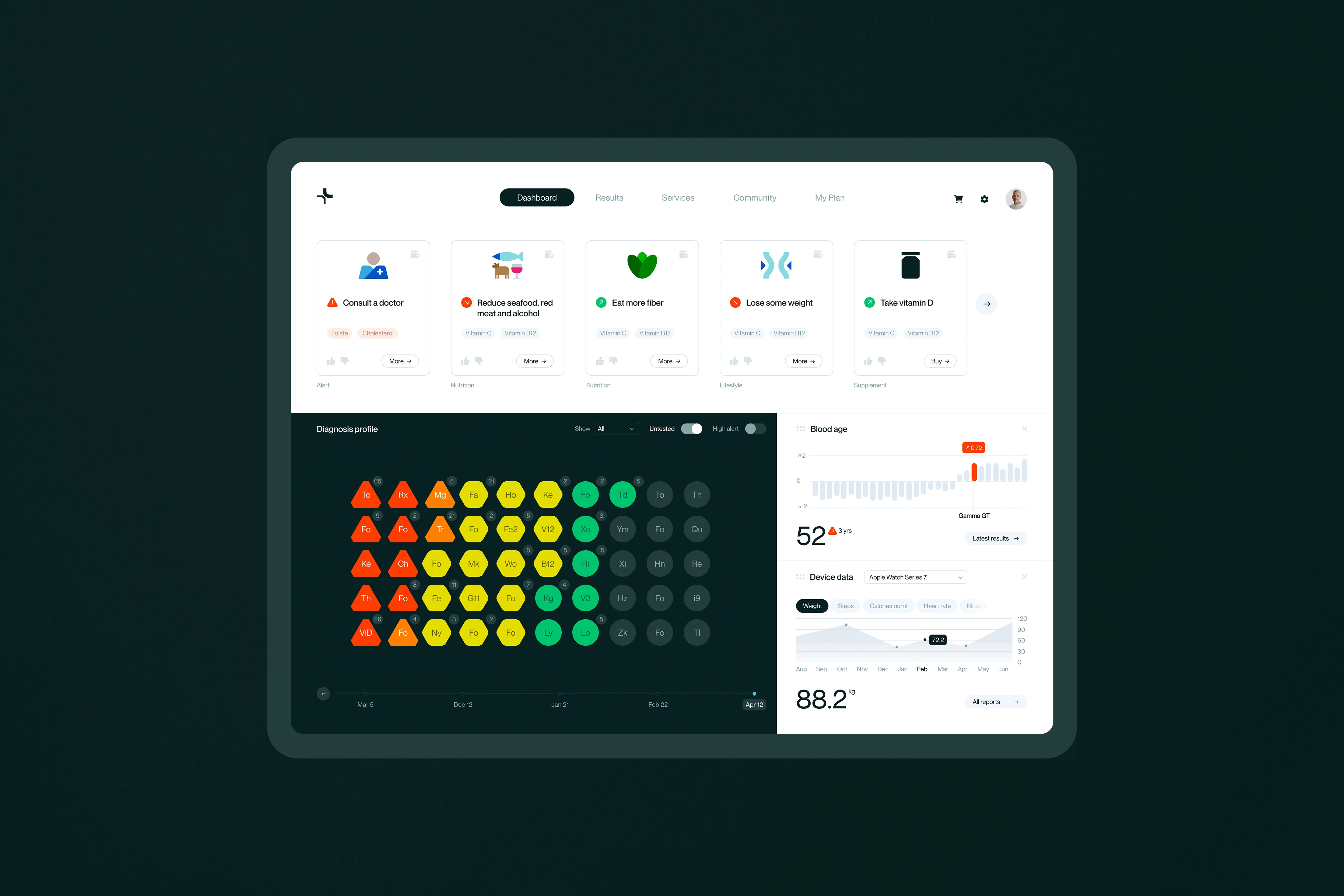
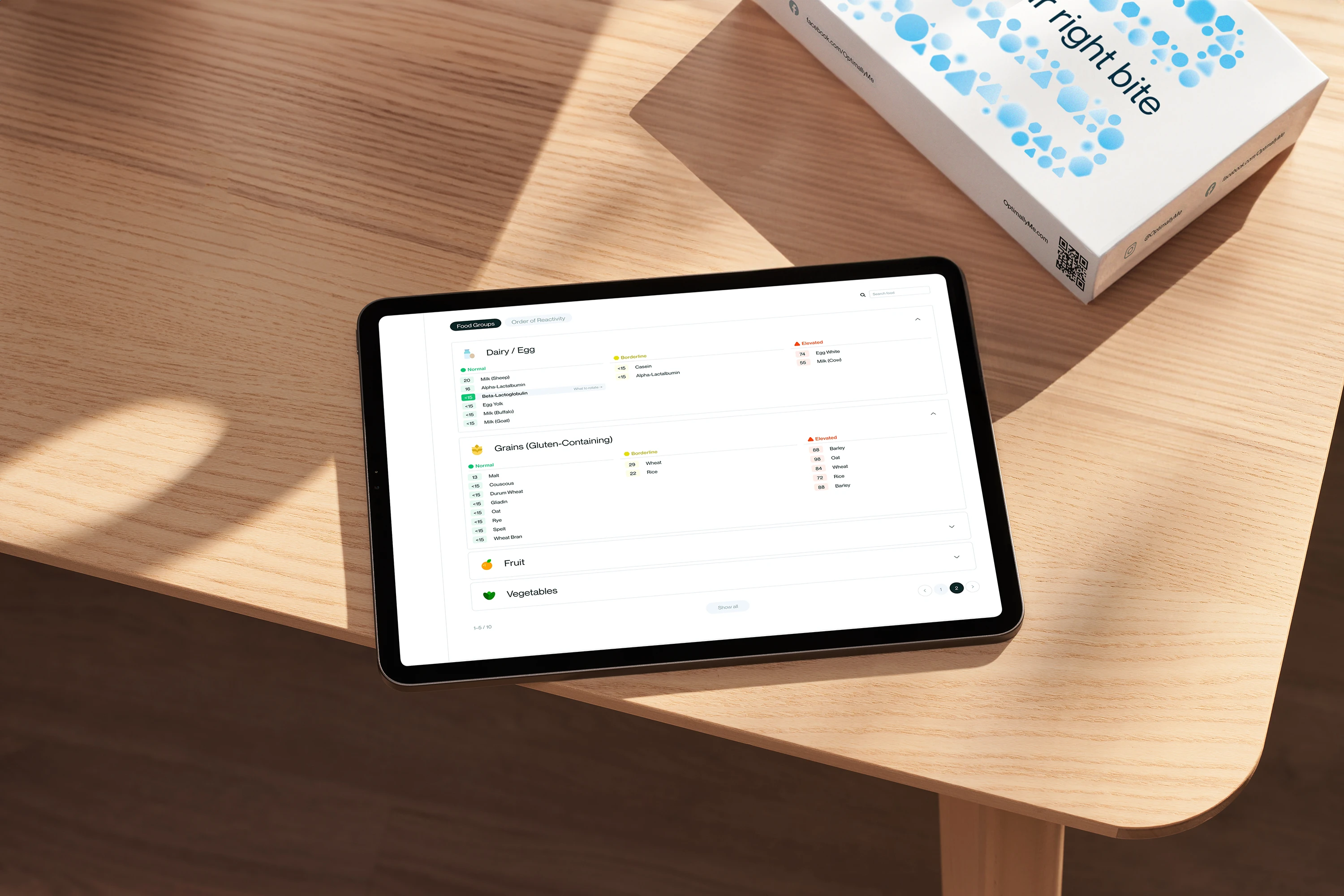
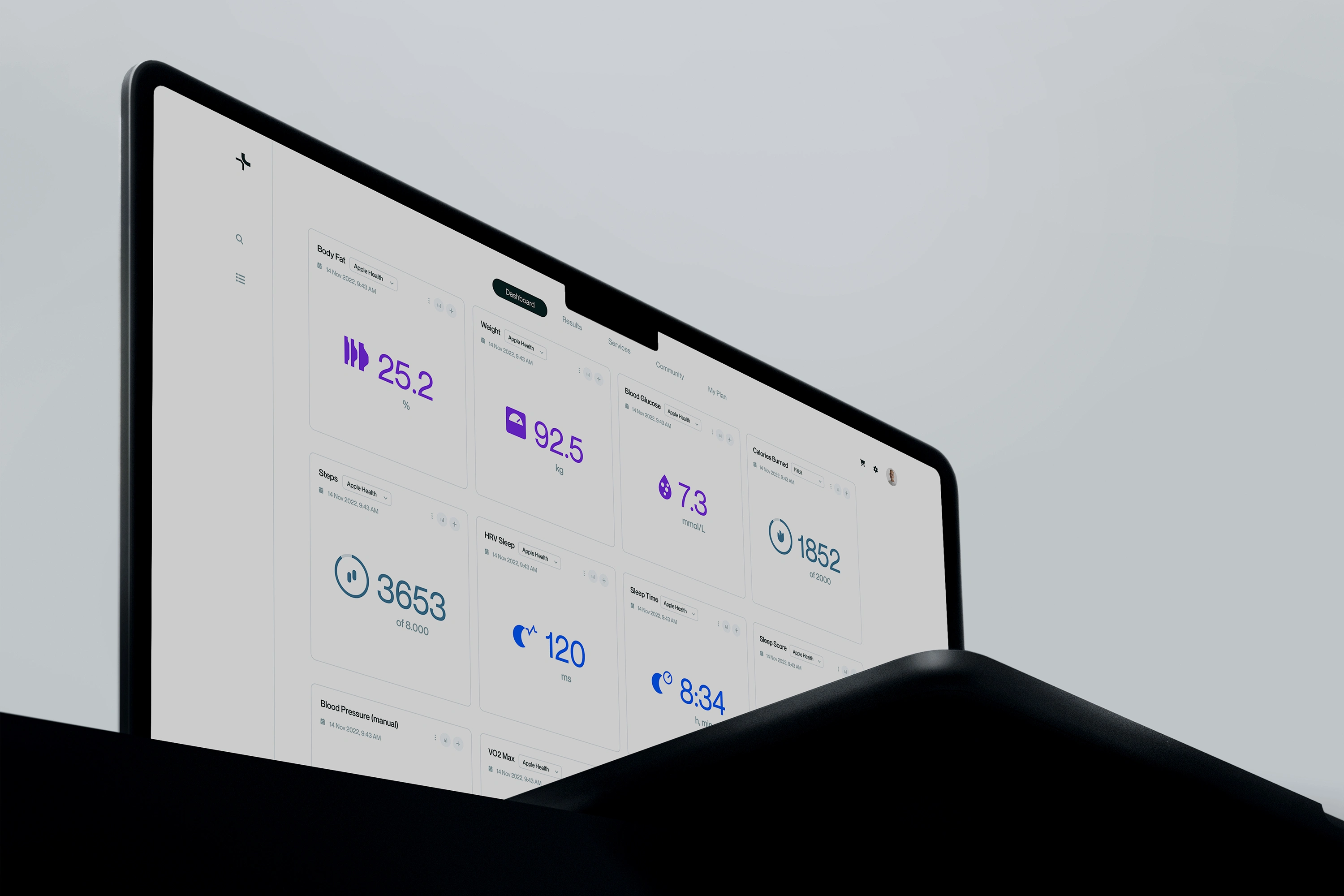
OptimallyMe, a company based in the United Kingdom and Switzerland, wants to start there and provide more clarity. The newly created digital health platform helps to better understand one's own body and current state of health and to improve it in a targeted manner. The results of the autonomous blood tests are visualised, explained and classified in terms of risks. On the basis of these blood values, personal information and synchronised health data, the user is then given specific suggestions on how he can improve his values and what long-term effects this may have on his health. This knowledge is intended to raise the user's awareness of their own health and help them to take targeted and proactive action instead of always reacting to symptoms.
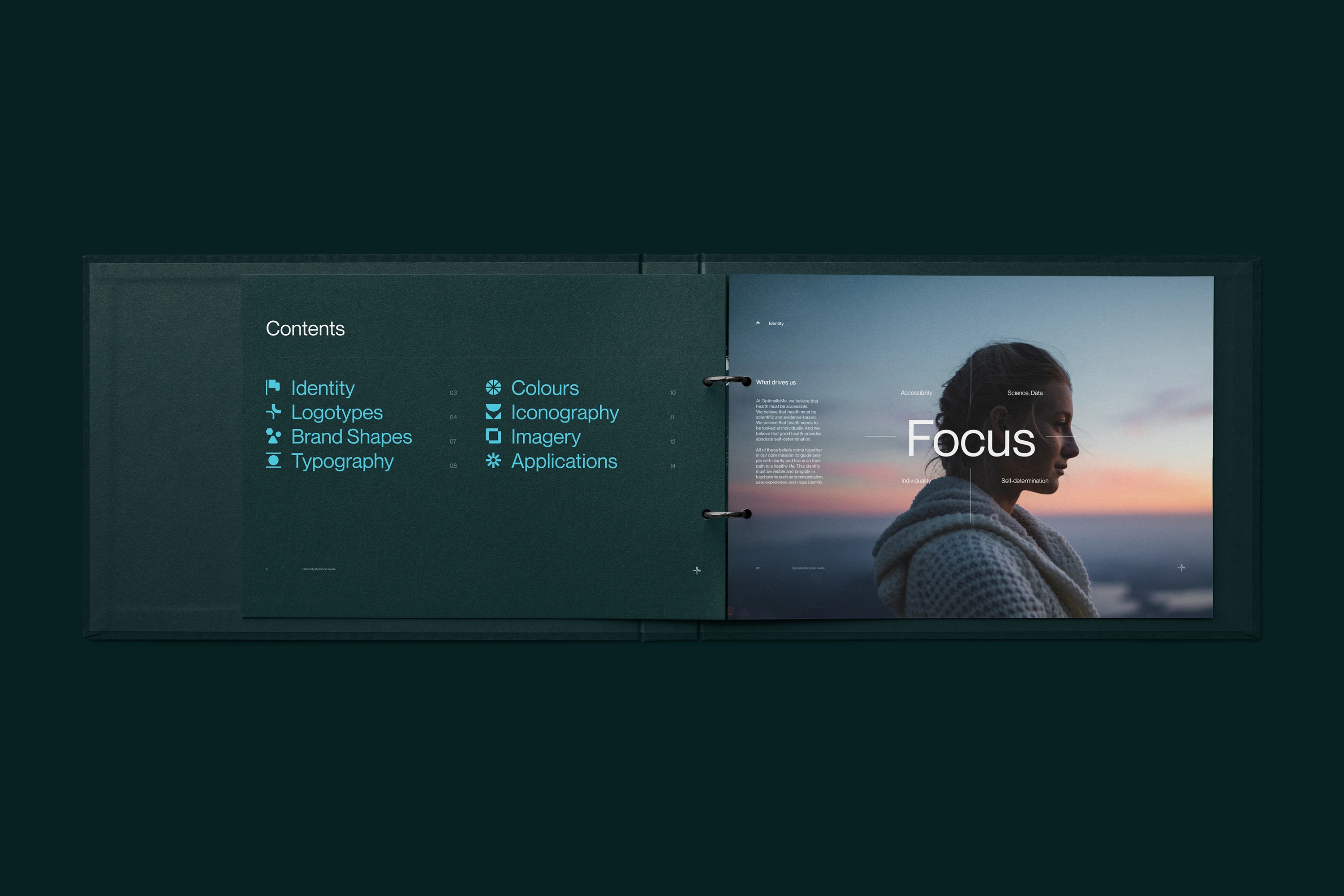
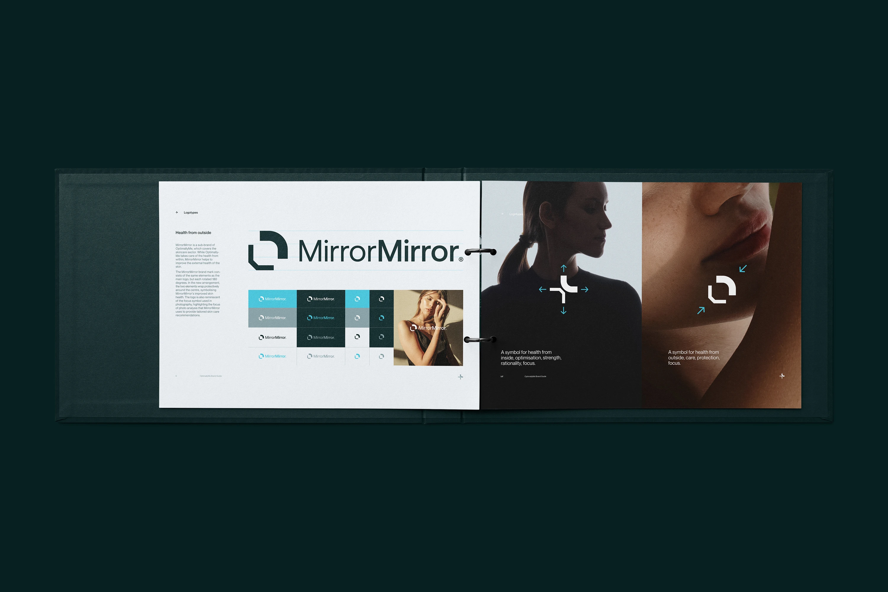
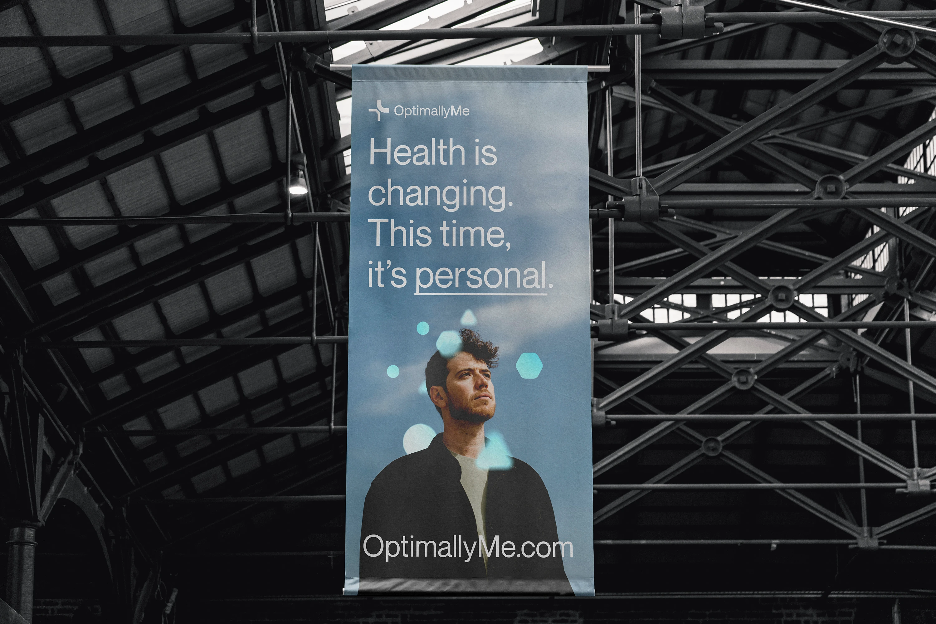
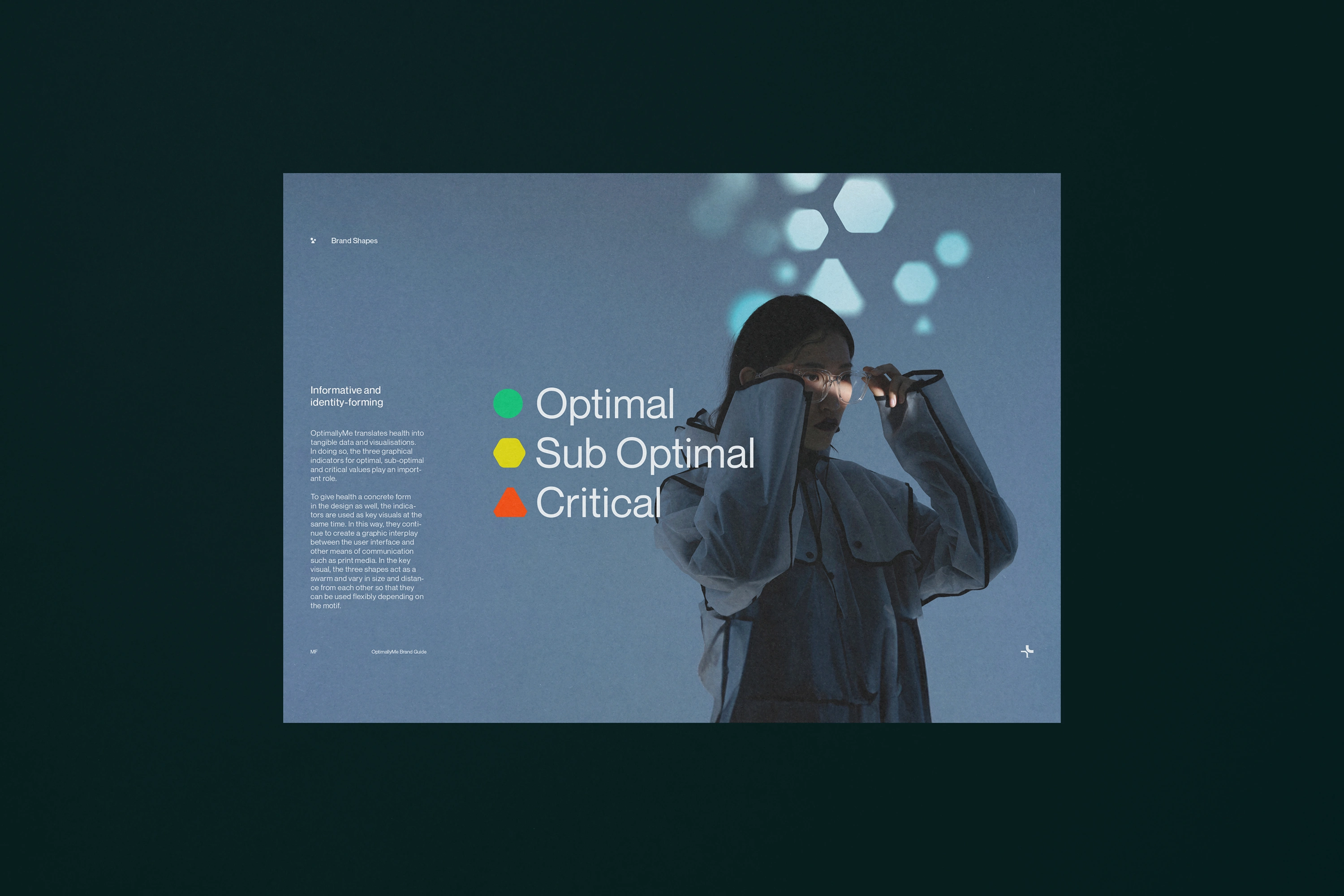
The core promise: Providing clarity to people on their path to a healthier life. Individualised. Fact- and data-based. Self-determined. This aspirational attitude is also reflected in the newly created visual identity. In line with the brand's self-image, the graphic language, the imagery, the colour palette, and the font family (New Montreal, Pangram Pangram Foundry) are also primarily clear and rational. The graphic indicators for risk assessment (Optimal, Suboptimal, Critical) simultaneously serve as a flexibly applicable, identity-creating key visual and thus create a graphic link between UI and other means of communication such as packaging design or motion design. The key visual also shows the data-driven dynamics, responsiveness and individuality of the platform.
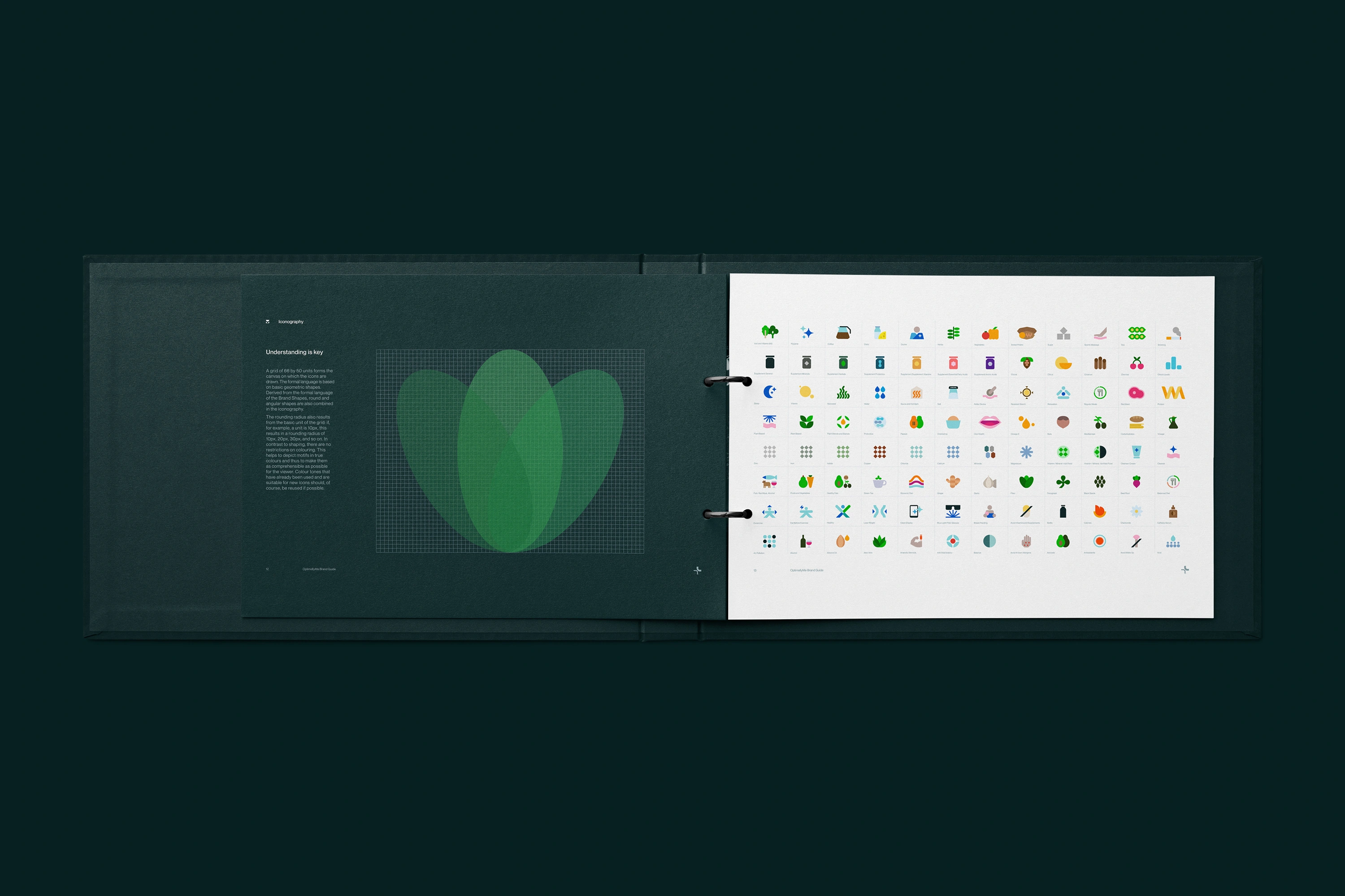
Parallel to the clear line, graphic conciseness is created primarily through the use of striking typography, colour accents in iconography and data visualisations, as well as strong light-dark contrasts. These contrasts create visual validity and thus communicate what it ultimately means to take health into one's own hands: Strength and self-determination.
Brandbook
Bag
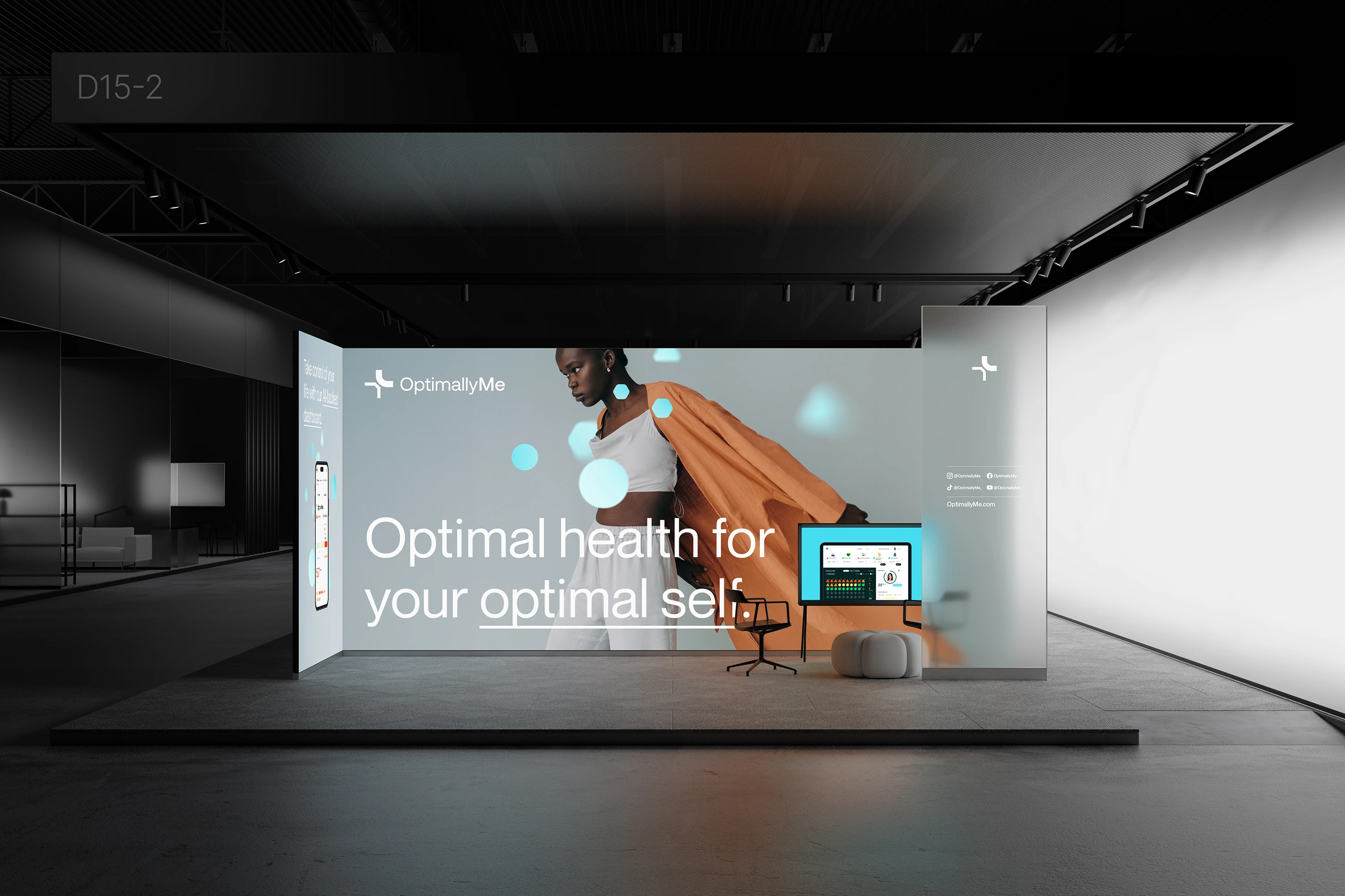
Exhibition stand
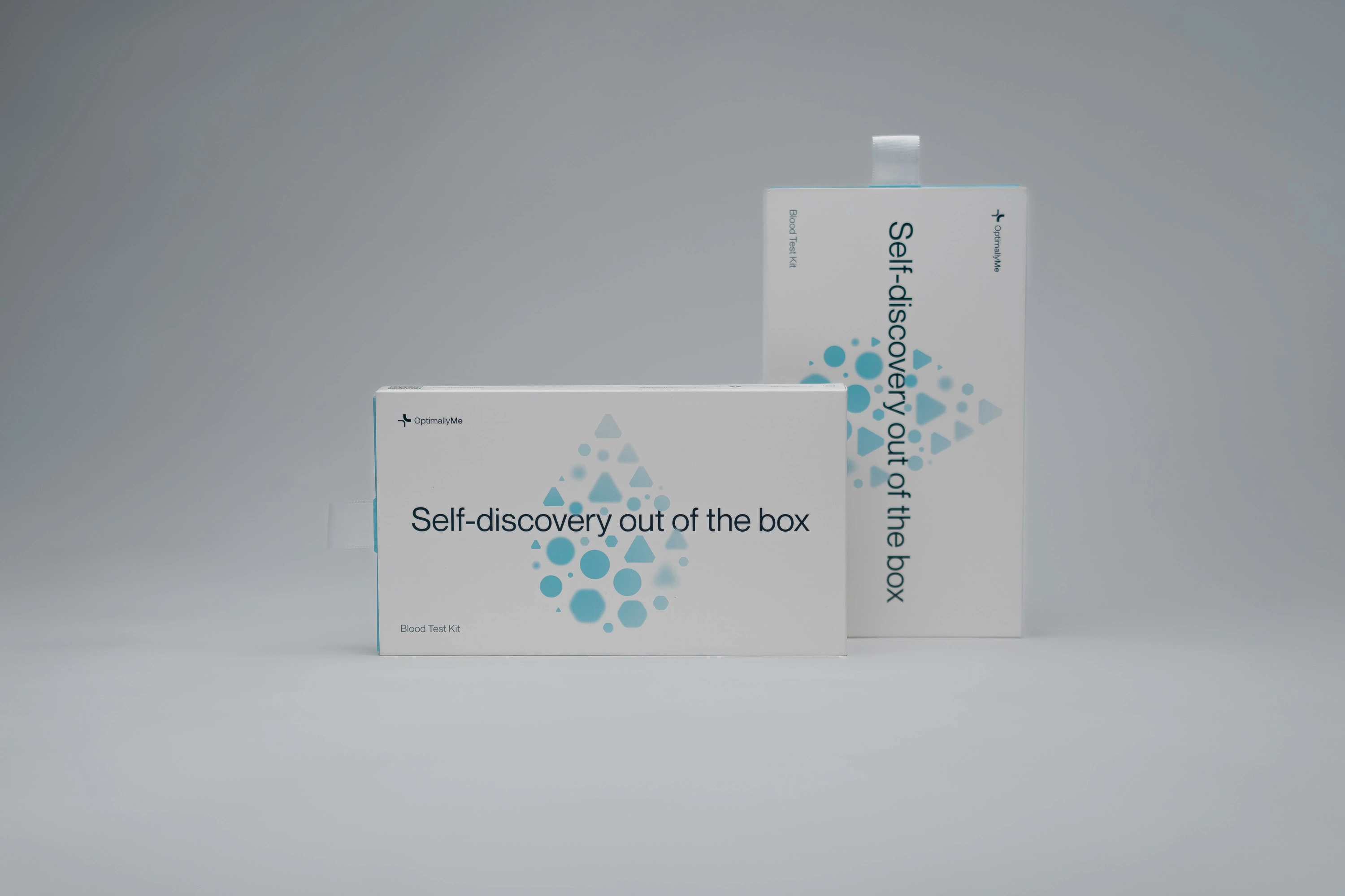
Packaging
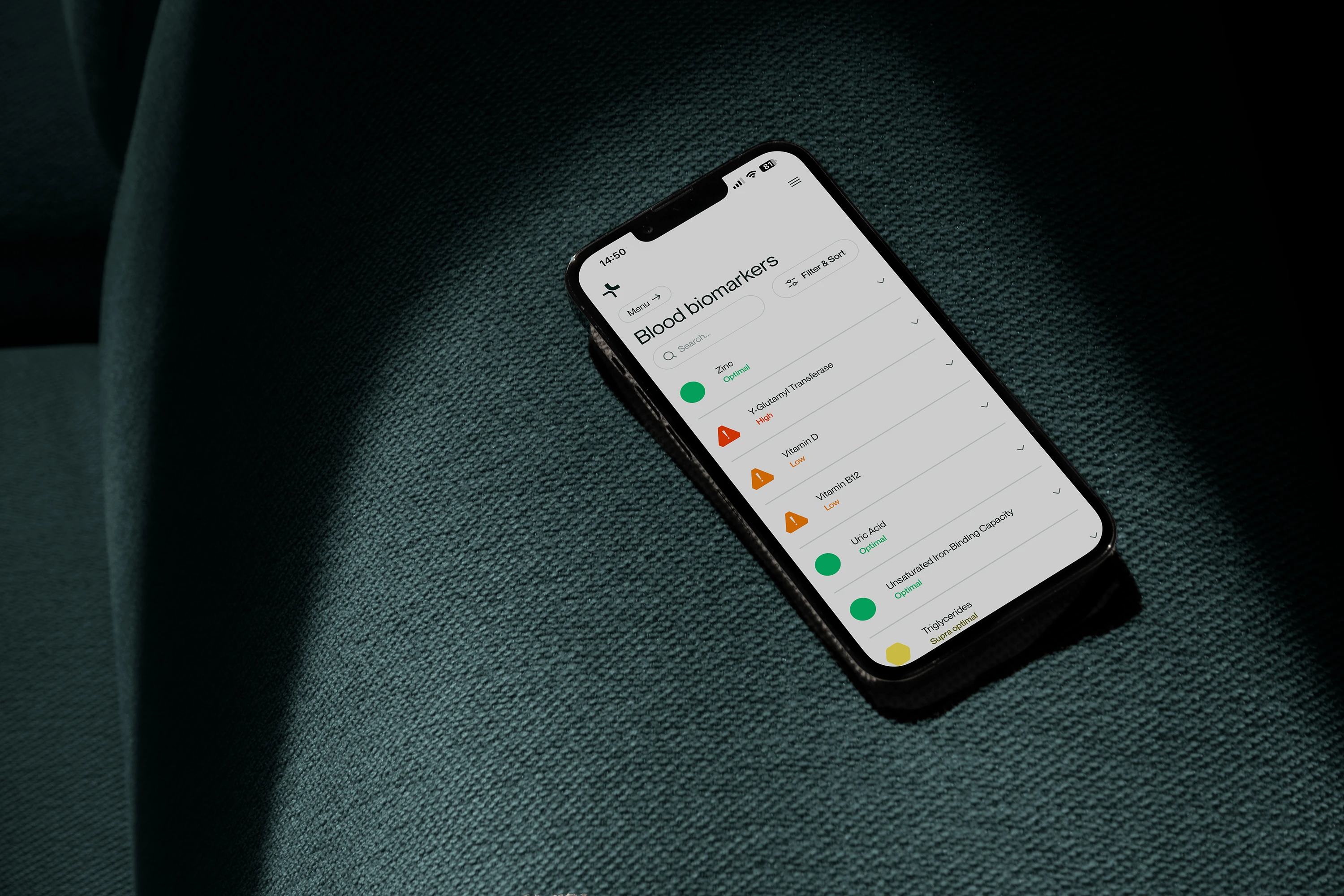
App
OHO
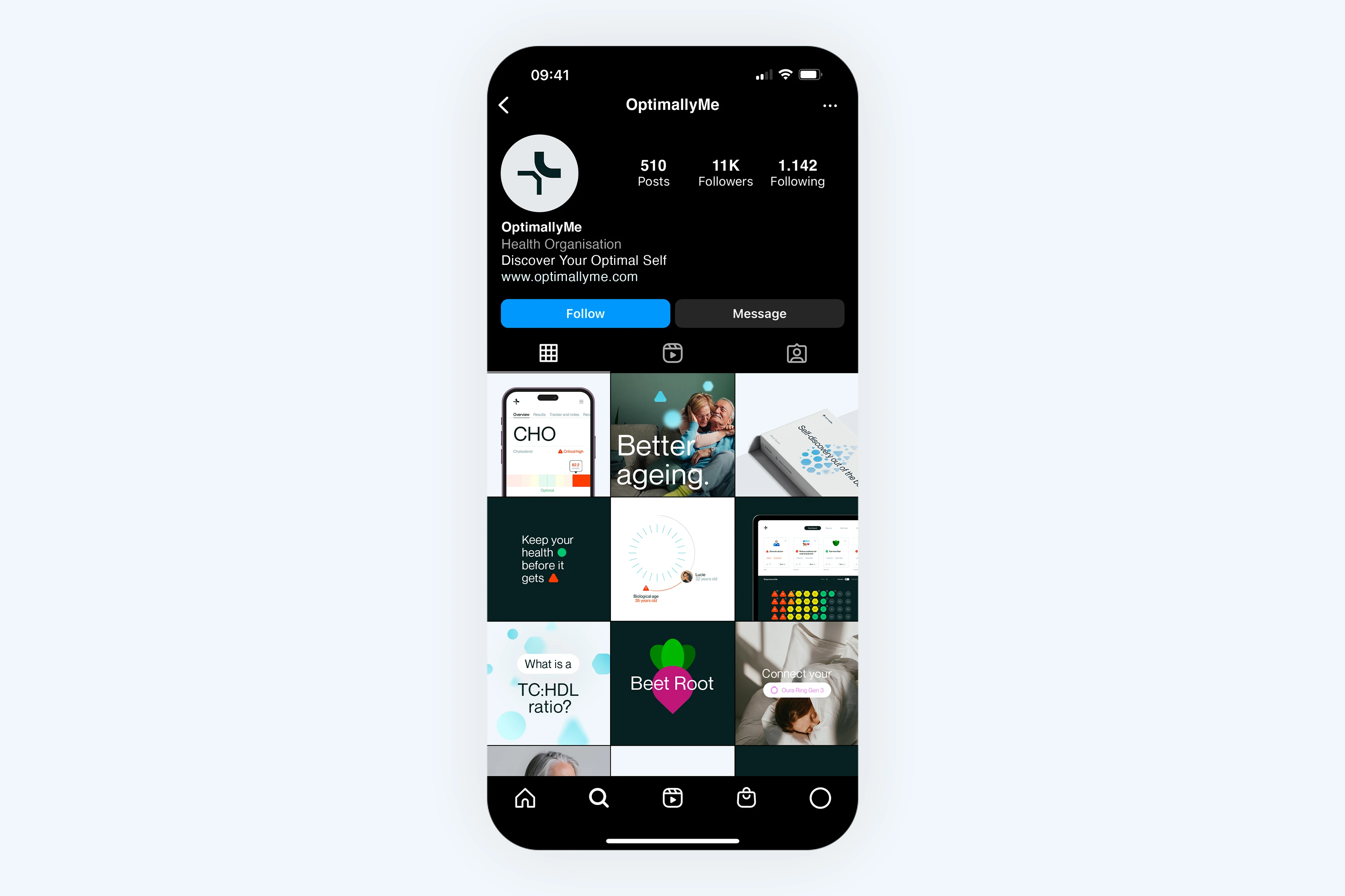
Social feed
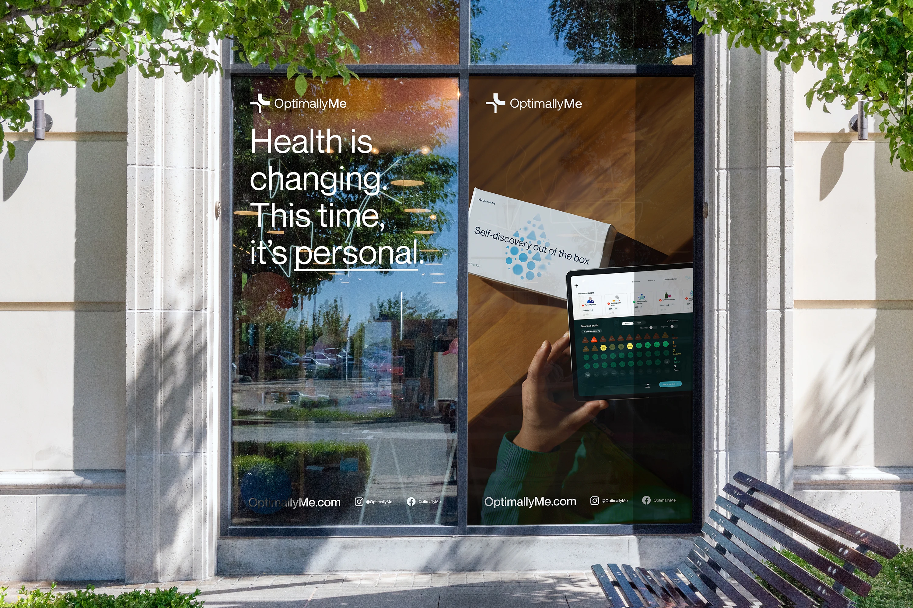
Window graphics
Brandbook
Logo animation
App
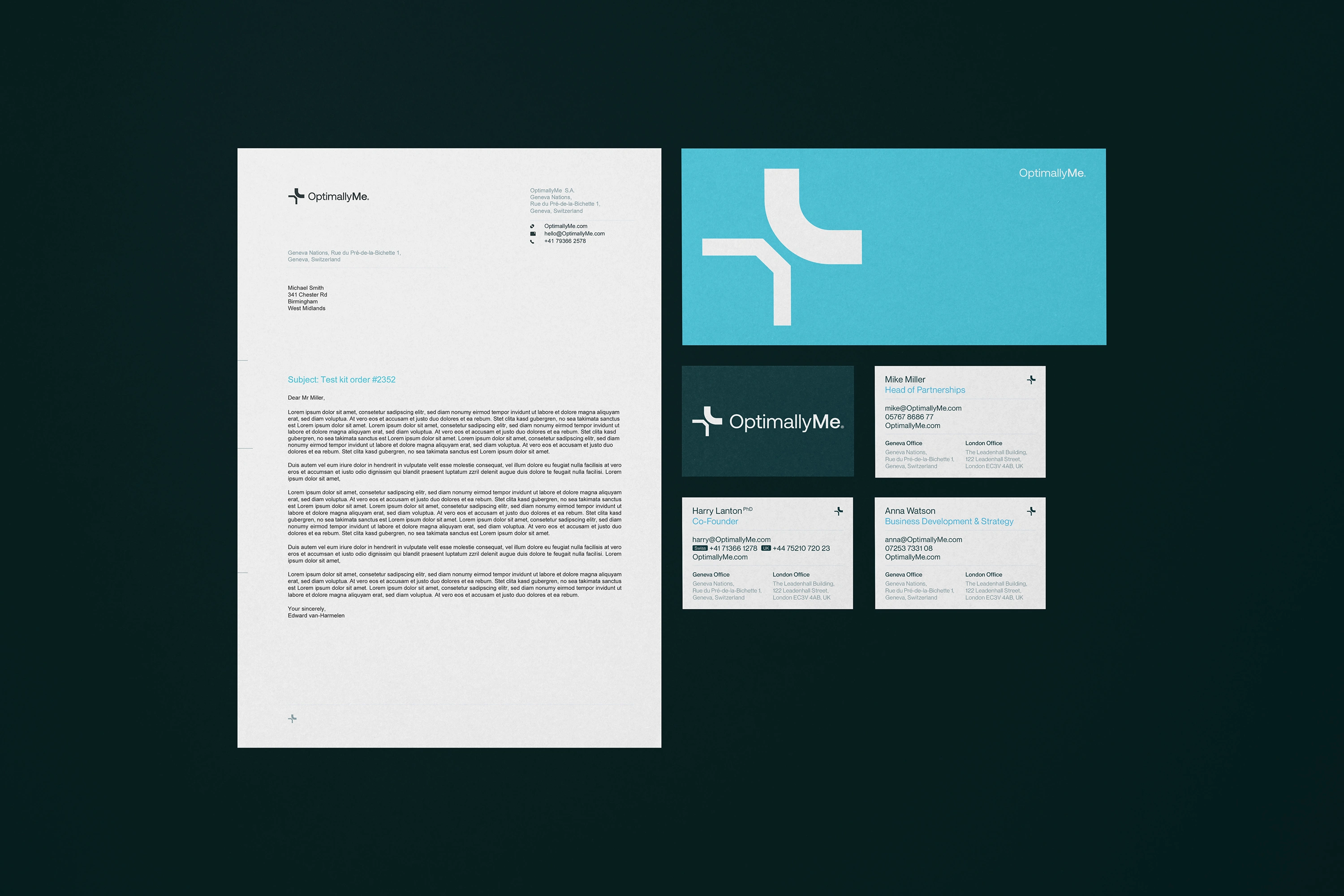
Business stationery
App
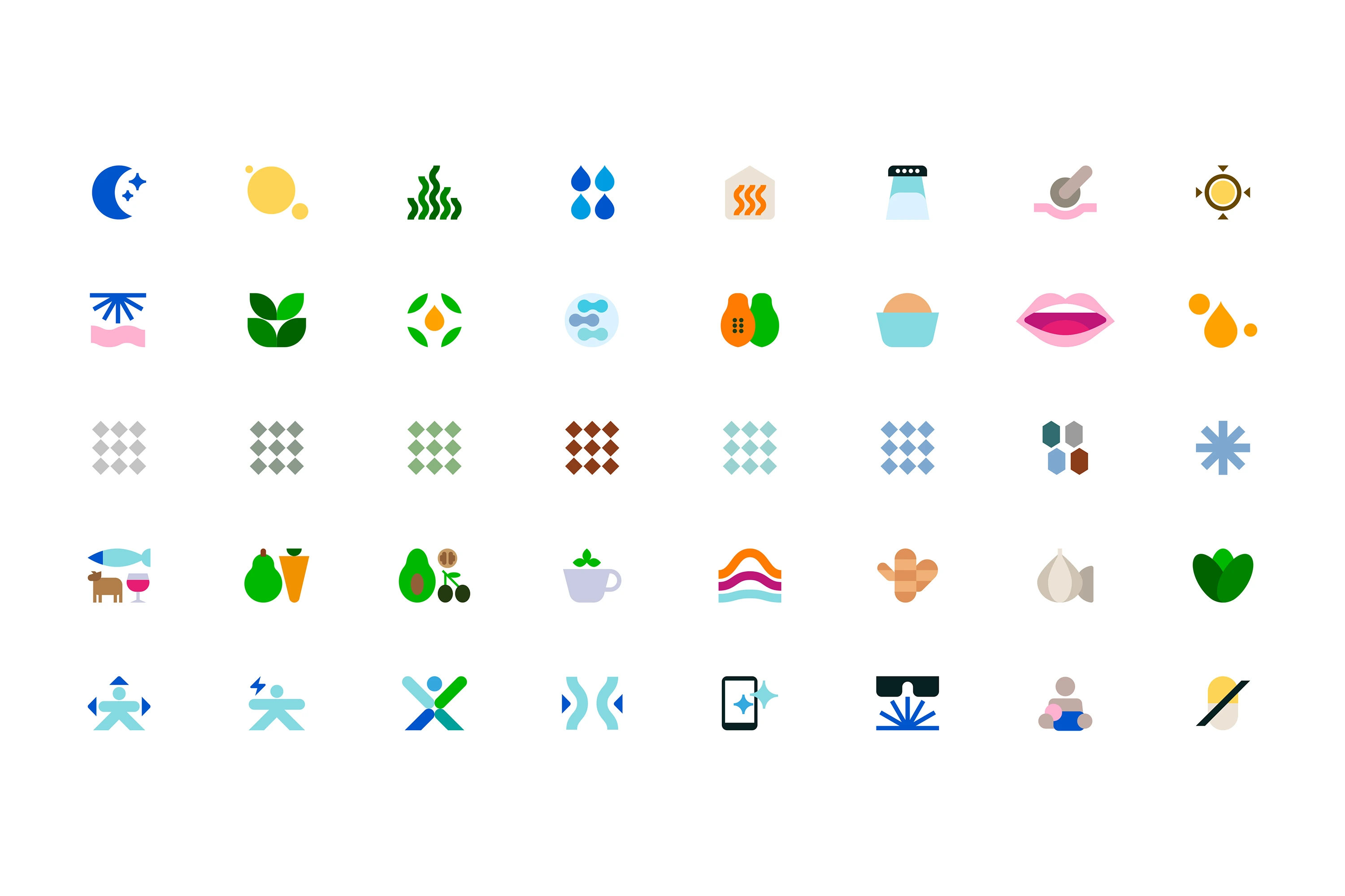
Icons
Brandbook
OHO
Product
OHO
App
App
Brochure
Packaging
App
Keyvisual
App
Motion design
App
Brandbook
App
Let's start your project
Like this project
Posted Oct 15, 2025
Clarity & empowerment: New visual identity with bold typography, dynamic key visuals, strong contrasts & data-driven design.
Likes
0
Views
7
Timeline
Jun 1, 2022 - Aug 1, 2023