4 logo designs (face/human shapes)
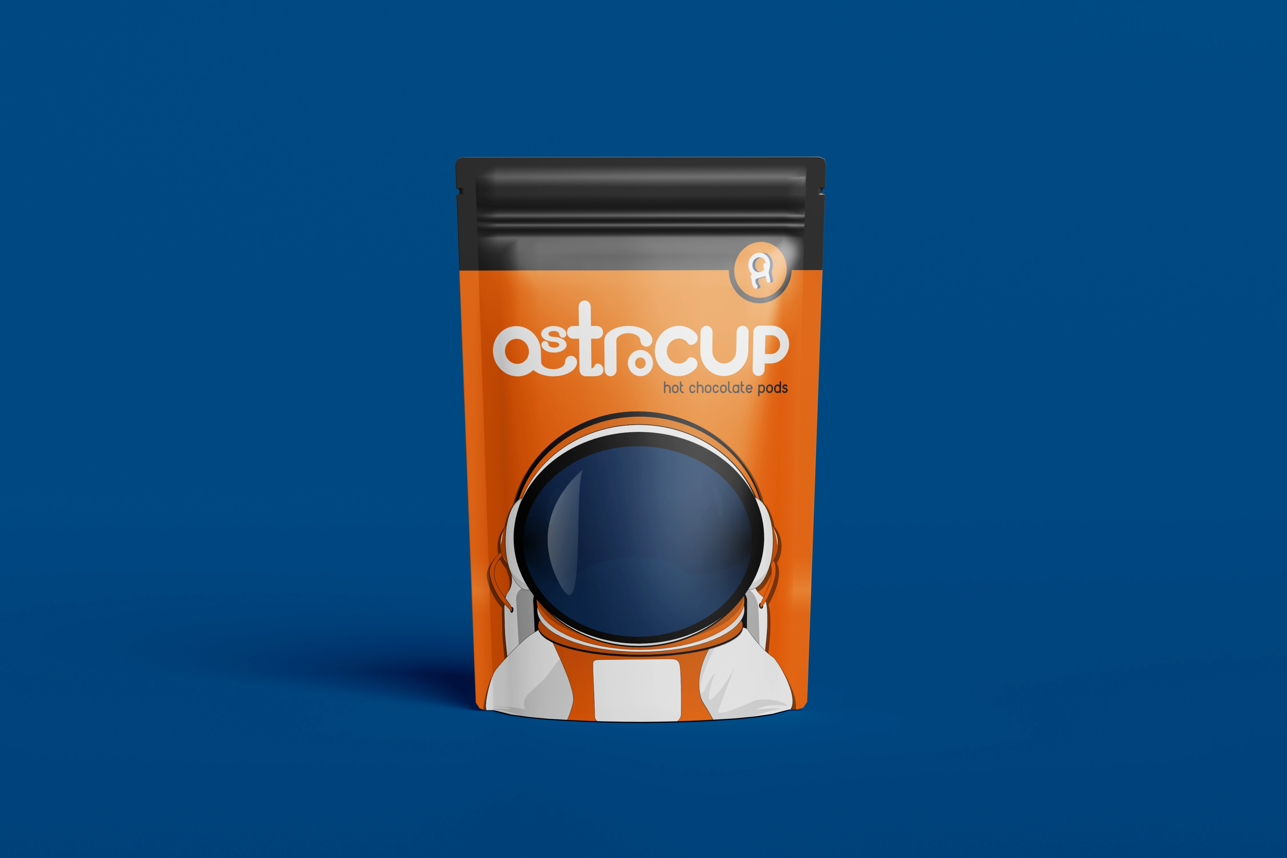
1. Astrocup
I created the astronaut shape from the letters "a" and "T" contained in "Astro" to create a similarity between the logo and typeface. When put in a circle, the logo looks like an astronaut jumping off a planet, the distance being suggested by the shadow behind.
The typeface should have a playful vibe and be easy to recognize. Little differences in typography help the audience separate "Astro" from "cup", making it faster to read.

2. TapeX
The logo was designed using three simple shapes to keep the style minimalistic. The "xx" used for the eyes suggests the focus of the DJ on the turntables. This logo is balanced, and the spacing of the typeface makes the typography easy to center.


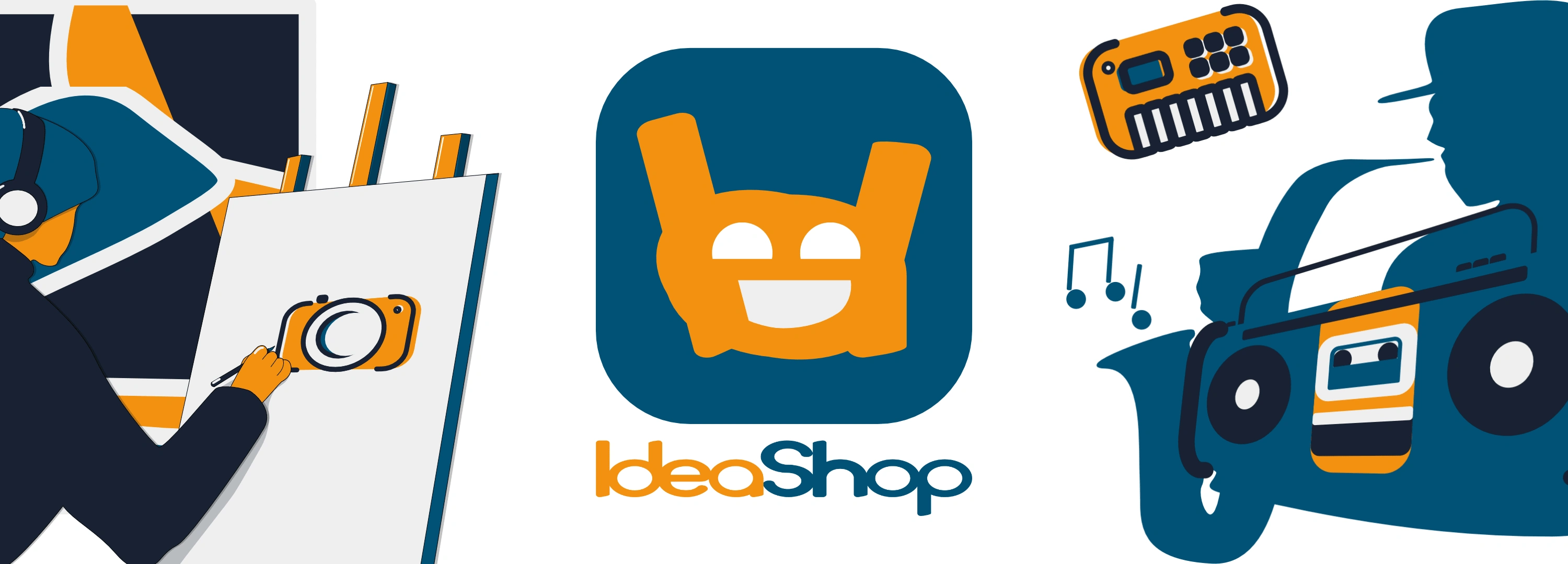
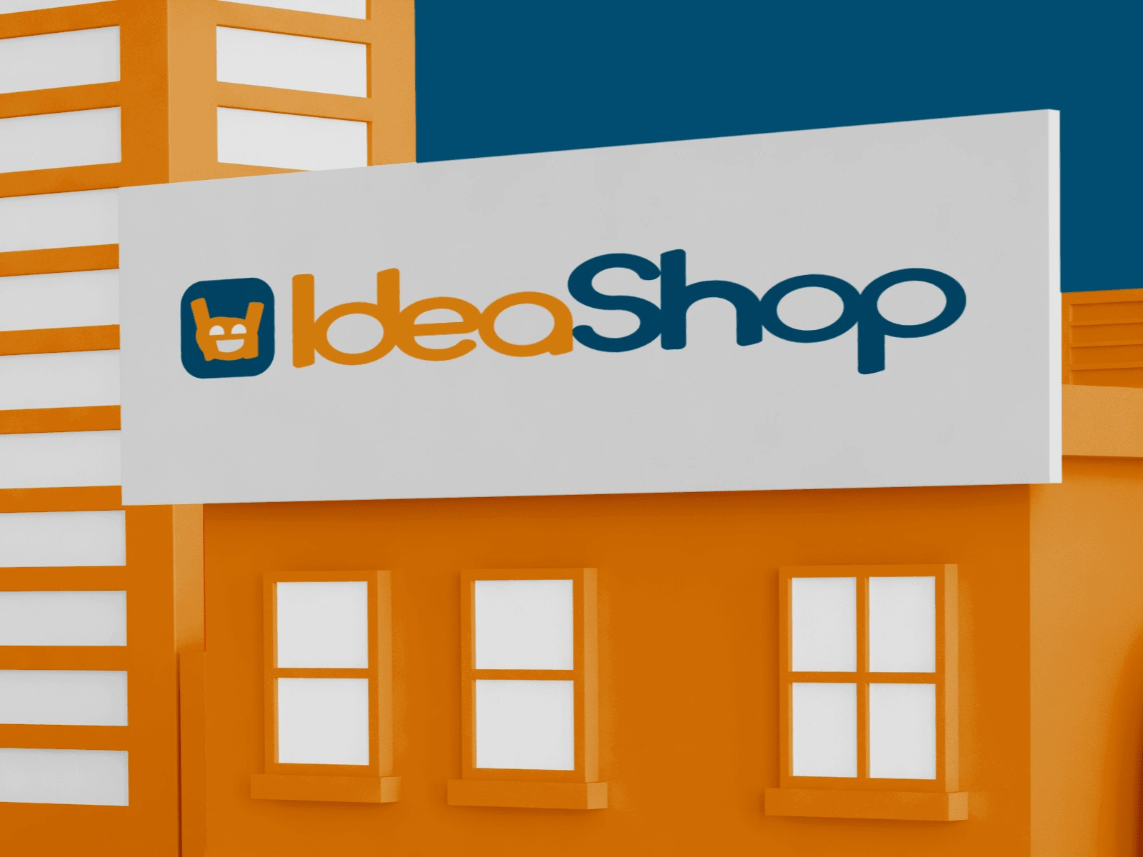
3. IdeaShop
The logo was created using the letters of the word "ideas" and was inspired by the "Rock And Roll Hand Sign" to induce the idea of energy. It also has a vintage look. :D
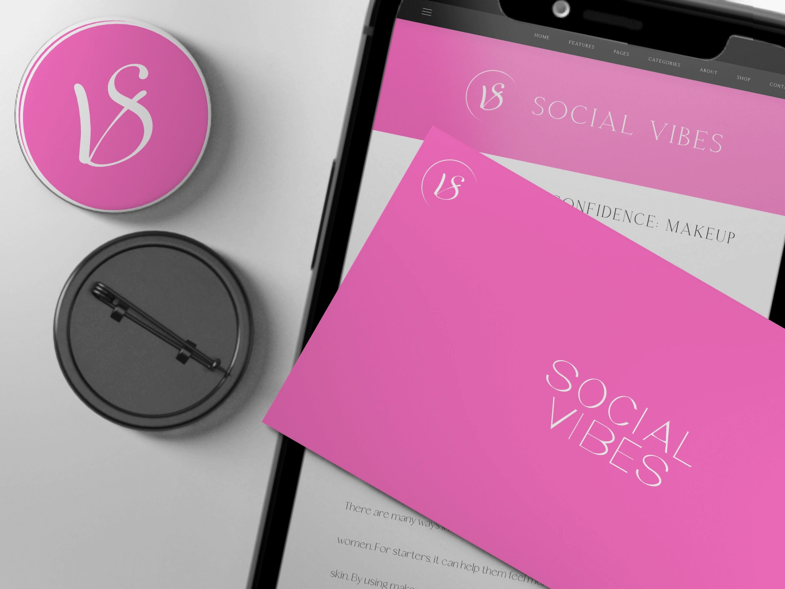
4. Social Vibes
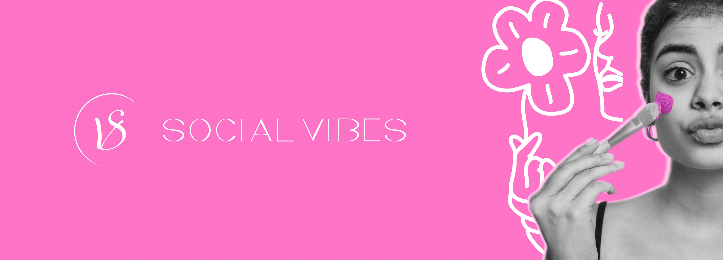
This is a brand I designed for one of my friends. She wanted me to use pink and white and make the logo look feminine. She is a social media manager so I decided that combining the letters "S" and "V" to create something similar to a person working on the laptop would be interesting. The shield is actually an offset she can use for creating social media templates that match the brand. In the animation process, the offset can be used to create bubbles suggesting networking.
Thanks for watching!
Like this project
0
Posted Mar 7, 2024
A collection of passion projects.
Likes
0
Views
27


