Drivers of Onboarding Drop-Off
Magdalena Cucu

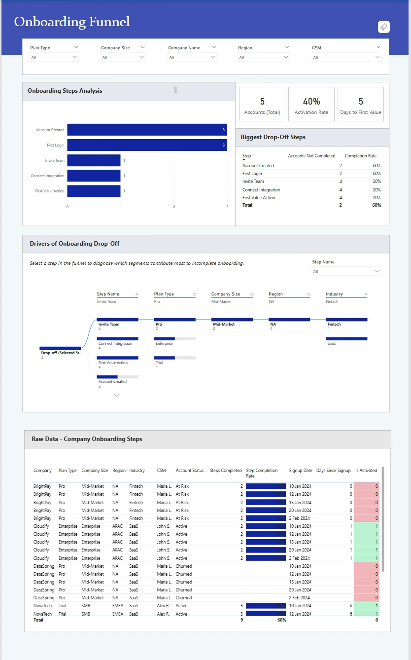
Drivers of Onboarding Drop-Off
A data-driven analysis that reveals where users disengage during onboarding and why, so teams can prioritize fixes that improve activation and time-to-value.
Problem :
As the product scaled, the team lacked clear visibility into where users were dropping off during onboarding and why activation was stalling. Data existed across multiple tables, but insights were fragmented, slow to extract, and difficult to act on.
Solution :
I designed an end-to-end Onboarding Funnel dashboard that combines:
A clear step-by-step funnel view
Activation and time-to-value KPIs
Segment-level diagnostics to explain why drop-offs happen
Drill-through access to raw company-level data for validation
The result is a single source of truth that connects symptoms → causes → actions.
Challenge :
The main challenge was turning raw onboarding event data into a decision-ready view that could answer:
Which onboarding steps cause the biggest drop-offs?
Which segments are most affected (plan, company size, region, industry)?
How long does it actually take users to reach first value?
All without overwhelming stakeholders with noisy or misleading metrics.
Summary :
This dashboard enables product, growth, and customer teams to:
Spot onboarding friction instantly
Prioritize fixes based on real user behavior
Align decisions across product, CS, and leadership
Instead of guessing where onboarding fails, teams can now see it, explain it, and fix it.
Like this project
Posted Feb 2, 2026
Analysed onboarding data to identify drop-off drivers and trends. Built a Power BI dashboard that highlighted friction points and retention improvements.
Likes
0
Views
3