Simple and soothing web for psychotherapy office
Eva Neprasova
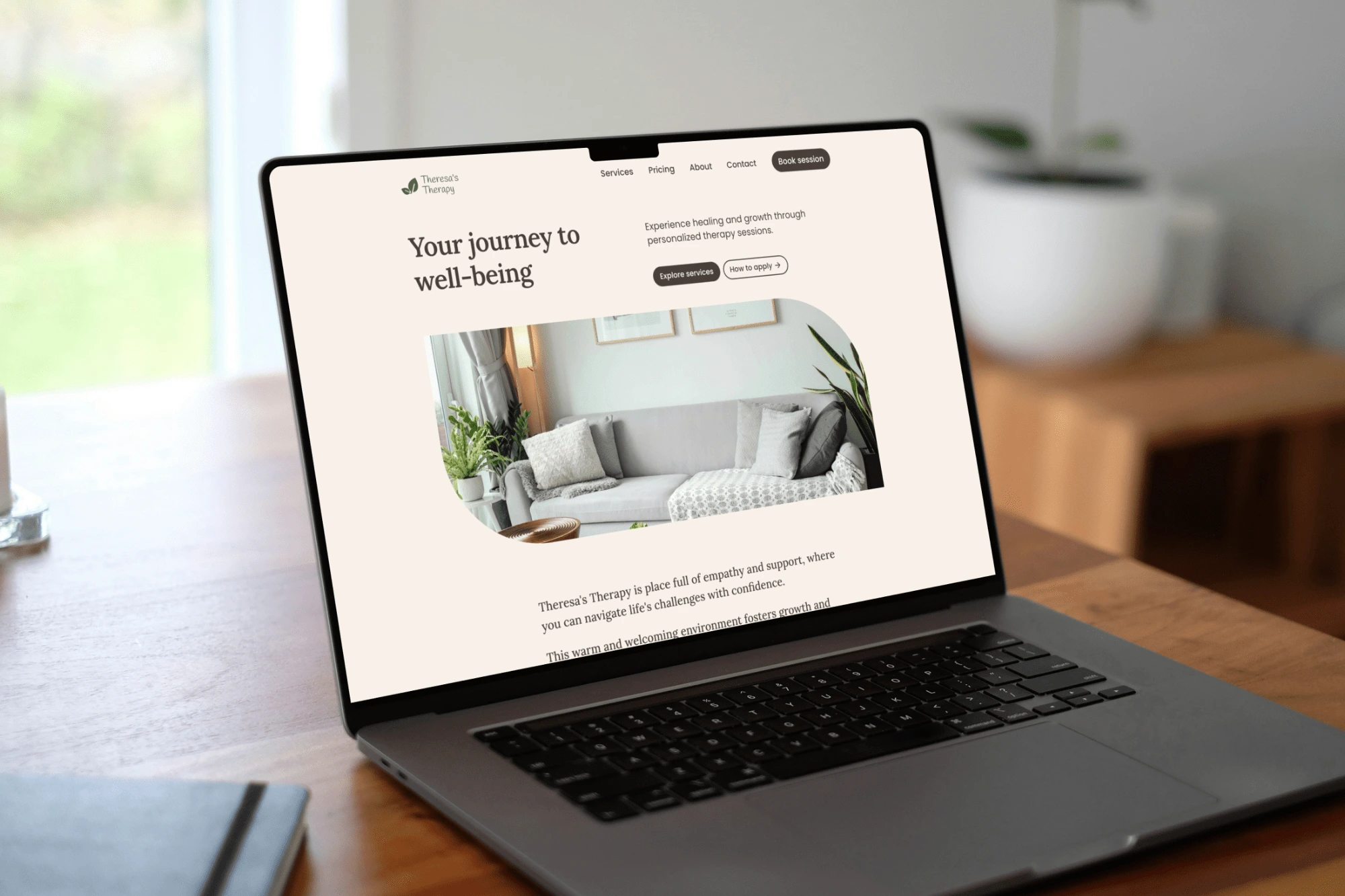
Website homepage
Please note that this is just a portfolio project. In case you are interested in getting similar looking site, I'll be happy to assist and tailor it to your needs ✨
You can check the website here
I have built and launched this project using Framer - a popular no-code website builder. It comes with an easy-to-use content management system so it's no big deal to keep your content up to date.
The goal
Although this is a website for a fictional client, I approached the design as if it were a real project. Theresa's Therapy represents an established and trustworthy psychotherapy office.
I created a simple, soothing, and user-friendly website highlighting Theresa's professionalism and supportive environment.
The visual identity
I chose a muted colour palette inspired by nature - to induce a sense of security, peace, and comfort.
The primary tones are beige and brown with an accent of green. Beige provides a good balance of neutrality, calm, and comfort. Brown is associated with reliability, healing, and strength. Green represents healing and motivation.
The structure
Since there is a lot of information to be communicated, I had to create multiple subpages. Not only did I add informative content such as a price list, services overview or "about" introduction. I also involved the testimonials section as social proof - to create a sense of credibility.
For such a multipage website, the "Basic" hosting plan is a suitable hosting option. The "Pro" version is required where Google Analytics are in use.
Gallery
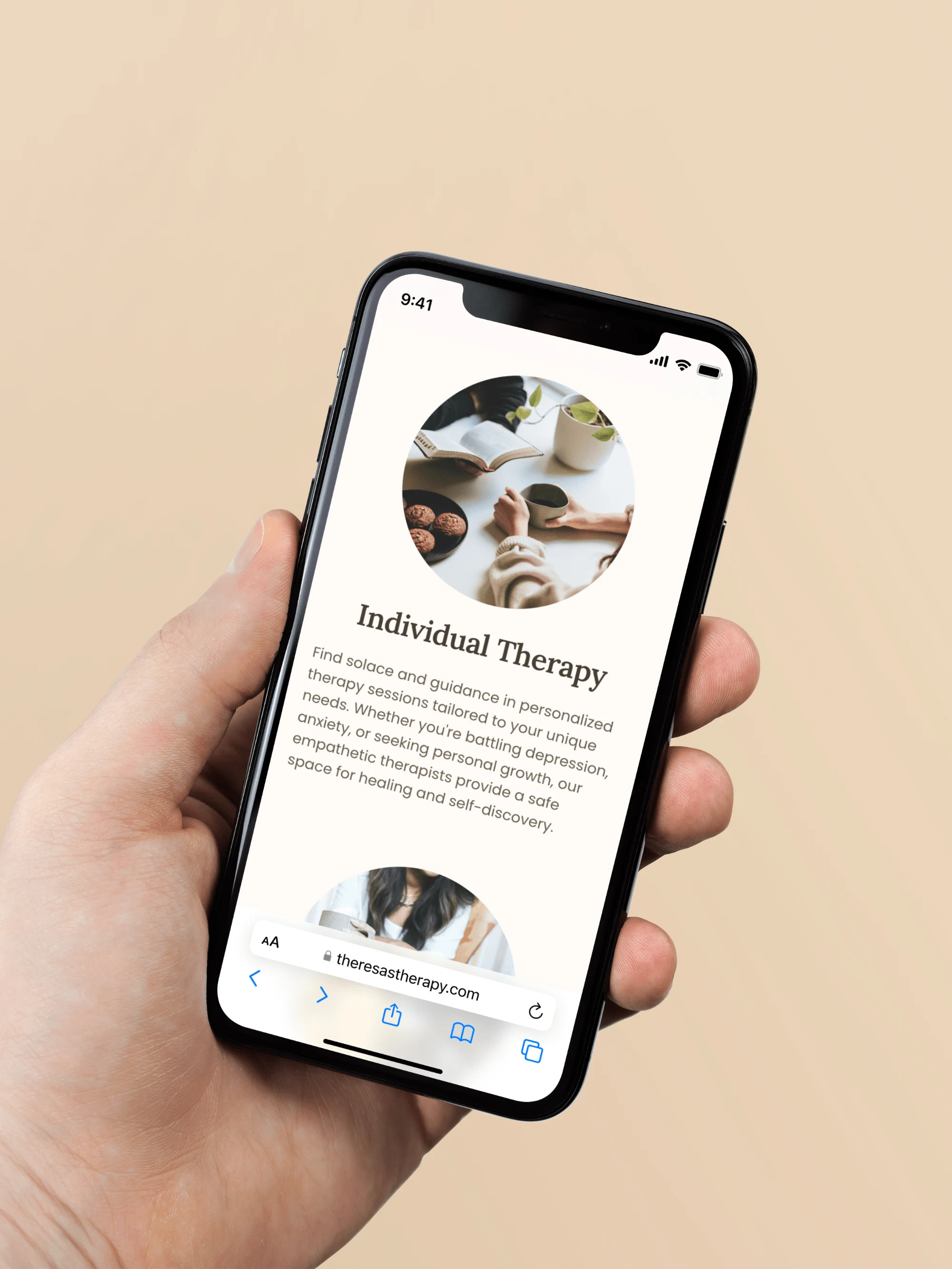
Services overview
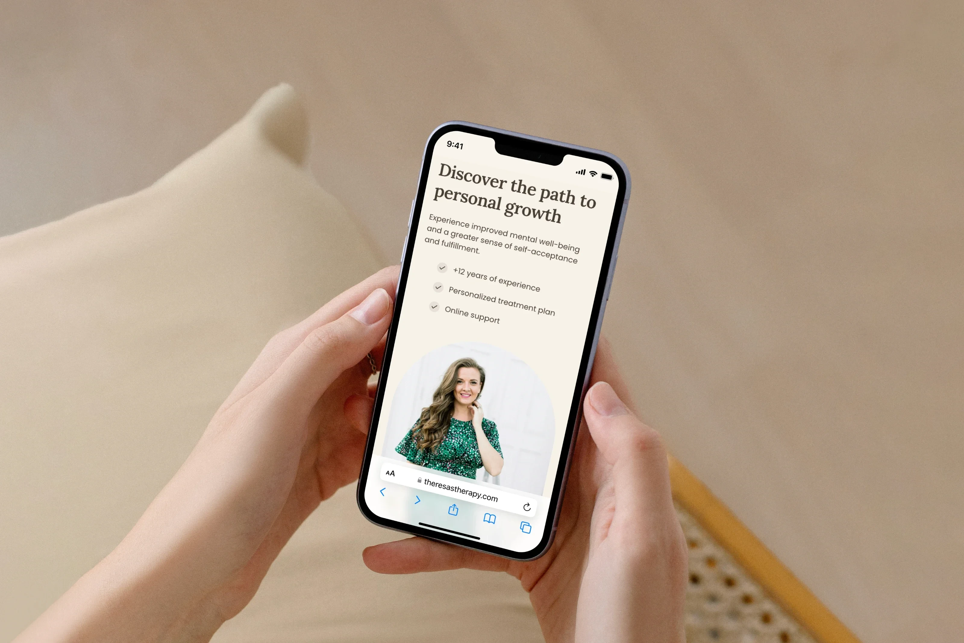
List of Theresa's unique selling points (advantages over her competitors)
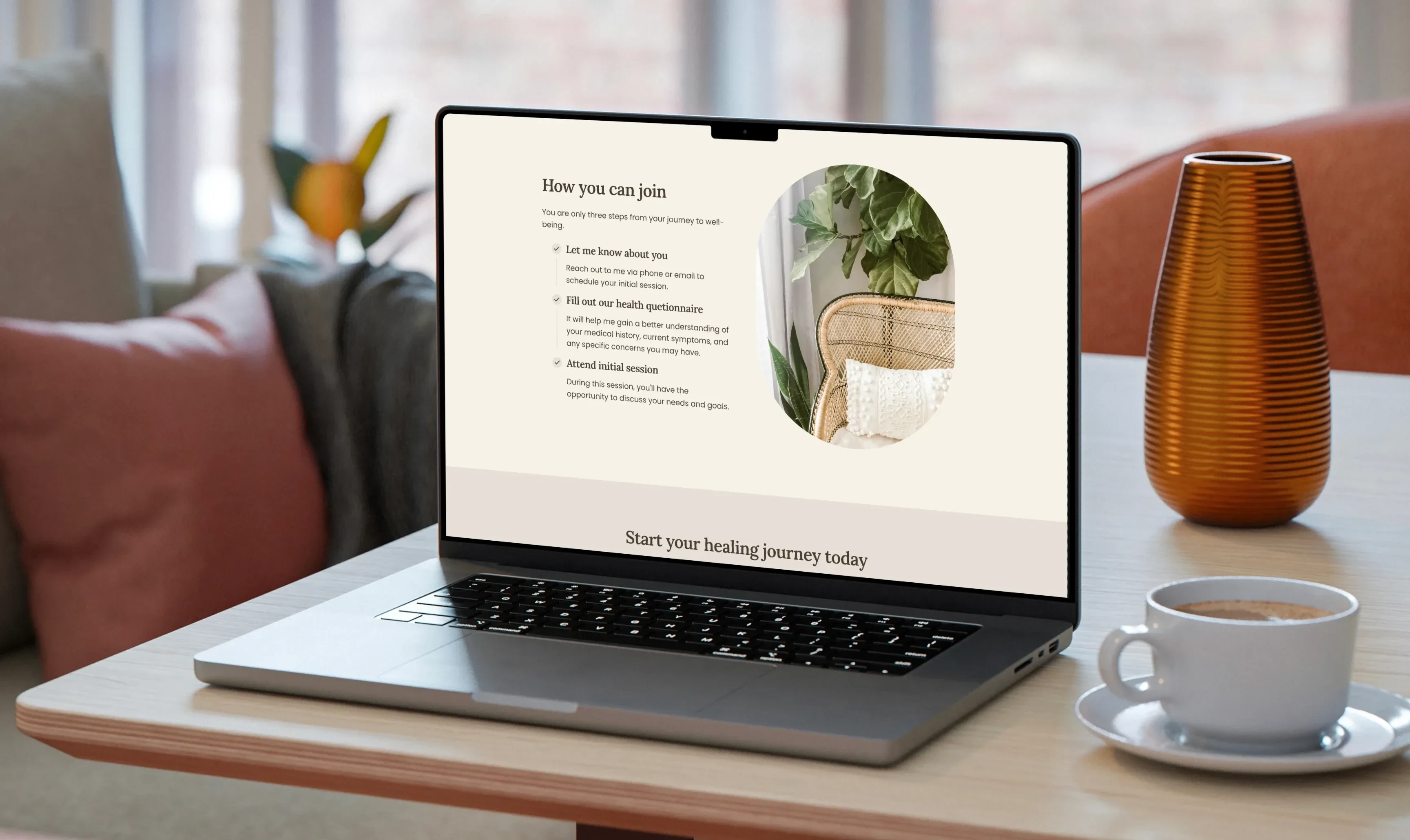
Information about the application process
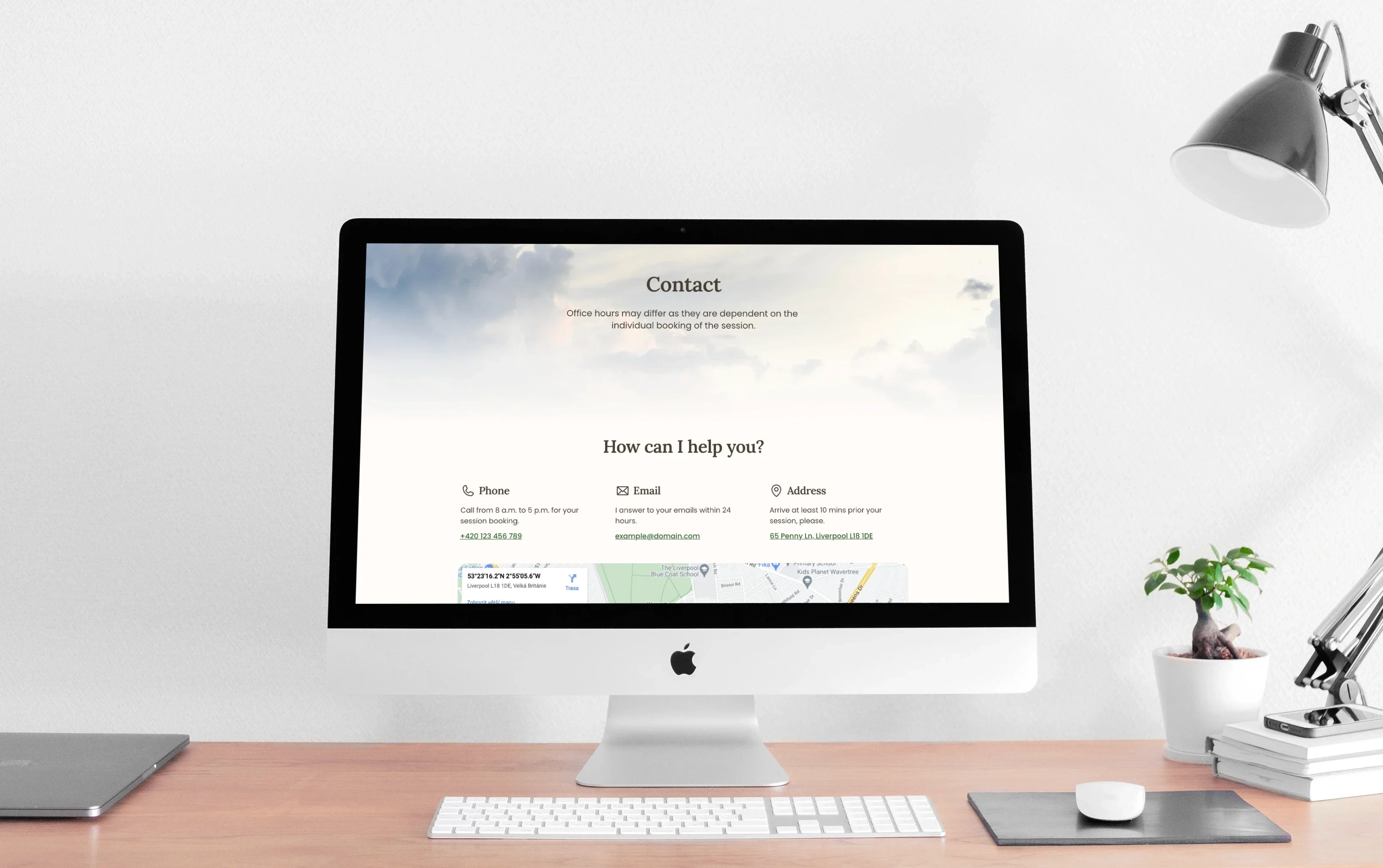
Contact page
Do you want to impress your customers?
It's hard to do with outdated and boring pages and visuals. Get yourself a partner who knows how to help you grow. Say goodbye to unreliable and mediocre websites or unattractive brand identity. Leave your competition far behind.
Book a free discovery call. Tell me more about your challenges and needs
📅 Pick a time slot from my Calendly
📥 hello@nueva.design
💬 +420 775 255 265 (WhatsApp friendly)
Like this project
Posted Jul 13, 2024
Theresa's Therapy is an established and trustworthy psychotherapy office. I aimed to create a website that reflects a sense of support, peace, and empathy.