100% fresh visual identity for green bistro
Eva Neprasova
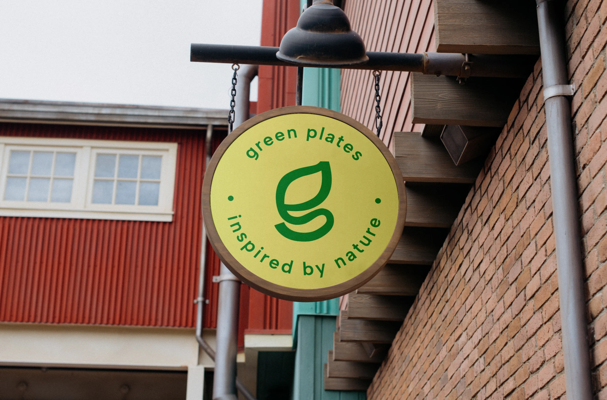
Circle sign outside the bistro
Please note that this is just a portfolio project. In case you are interested in getting a similar-looking identity, I'll be happy to assist you and create your own ✨
For a quick overview, go check the Brand Guideline Sheet at the end of the page.
The Goal
Although this is a brand identity for a fictional client, I approached the design as if it were a real project. Green Plates represents an innovative bistro focused on vegetarian and vegan dishes. Not only do they serve delicious meals, but they also promote sustainability and healthy living, using locally sourced and organic ingredients.
Their core values are Sustainability, Health, Community Support, Innovation, Ecology, and Quality.
The owners want their target audience to feel inspired, refreshed, and connected to nature. The logo should convey their commitment to sustainability, health, and innovation in vegetarian and vegan cuisine.
The Target Group
Their target audience includes health-conscious individuals, vegetarians, vegans, environmentally-conscious people, and those looking for innovative and delicious dining options. Primarily aged 25-45, living in urban areas.
Customers expect fresh, high-quality vegetarian and vegan food that is both delicious and healthy. They also expect a dining experience that aligns with their values of sustainability and community support.
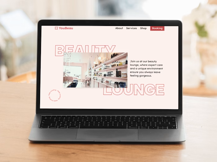
I decided to create a simple, visually appealing, and user-friendly website that highlights their expert care and unique environment.
The Main Visual Theme
The main visual theme focuses on nature and urban life, blending green, leafy elements with modern, clean lines to represent our commitment to sustainability in an urban setting.

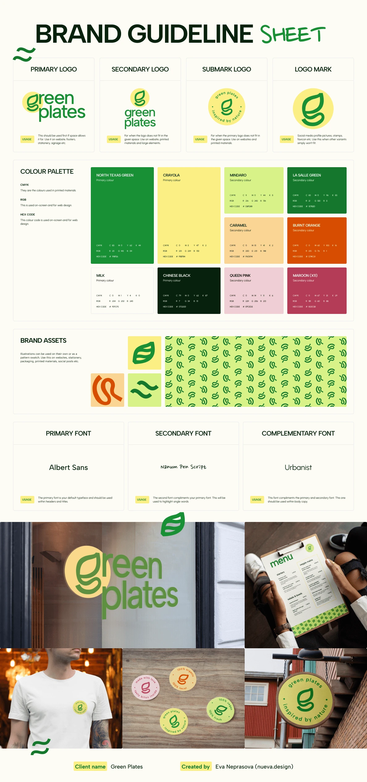
The anatomy of Green Plates' logo
The Colour Palette
To evoke positive emotions and link to healthy food, I chose a playful colour scheme with multiple vibrant colours. The main inspiration was all kinds of vegetables that are the main ingredients of the bistro. The colourful palette also expresses their friendly approach.
Green
Green is strongly associated with nature, health, and sustainability. It evokes feelings of freshness, tranquillity, and renewal, making it an ideal colour for a bistro focused on healthy, plant-based, and eco-friendly dining.
Yellow
Yellow represents happiness, energy, and optimism. It can stimulate mental activity and encourage a sense of warmth and welcome. For a bistro, yellow can be used to create a cheerful and inviting atmosphere, encouraging customers to feel joyful and energized during their dining experience. It's perfect for adding a lively touch to the brand's identity.
Orange
Orange combines the energy of red and the happiness of yellow. It is associated with enthusiasm, creativity, and vitality. In a bistro setting, orange can stimulate appetite and social interaction, making it a great colour for encouraging a vibrant, friendly, and engaging dining environment. It conveys a sense of playfulness and creativity, aligning well with innovative and exciting menu offerings.
Pink
Pink is often linked to feelings of compassion, warmth, and nurturing. It creates a sense of calm and comfort, which can enhance the dining experience by making customers feel cared for and relaxed. In the context of a bistro, pink can be used to highlight elements of indulgence and treats, such as desserts, or to add a touch of sophistication to the overall brand image.
The Typography
I decided to choose sans serif font as the primary and complementary typography. I also included a secondary typeface that can be used for highlights, quotes, and other elements that require a more informal and friendly feel.
Albert Sans (Primary)
Albert Sans is a clean and modern sans-serif typeface that exudes simplicity and readability. Its versatile design makes it ideal for primary headings and titles, creating a contemporary and approachable look for Green Plates.
Nanum Pen Script (Secondary)
Nanum Pen Script is a casual, handwritten typeface that adds a personal and warm touch to the brand.
Urbanist (Complementary for Body Text)
Urbanist is a versatile sans-serif typeface designed for readability and clarity. As a complementary font for body text, it ensures that all written content is easily legible, contributing to a pleasant reading experience for menus, descriptions, and other detailed information.
Gallery (of usage examples)
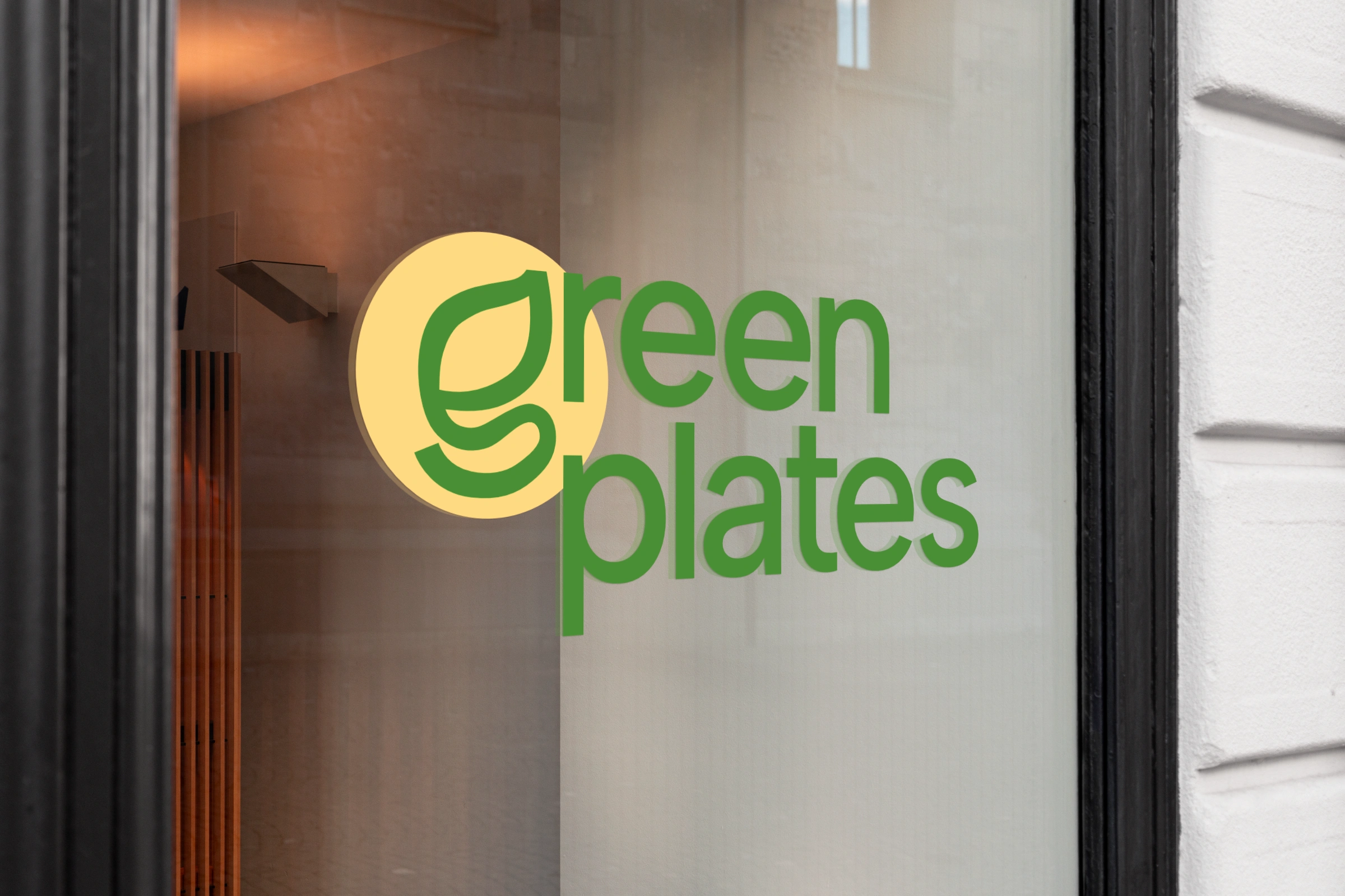
Window sign
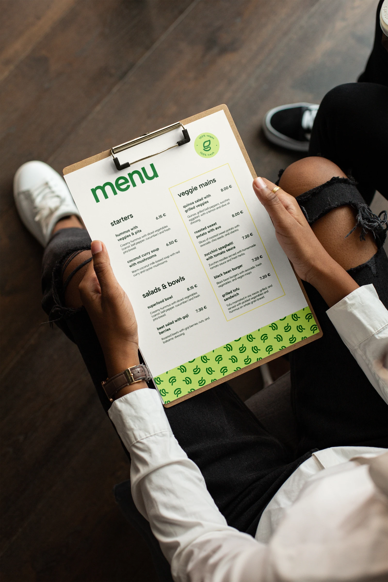
Menu
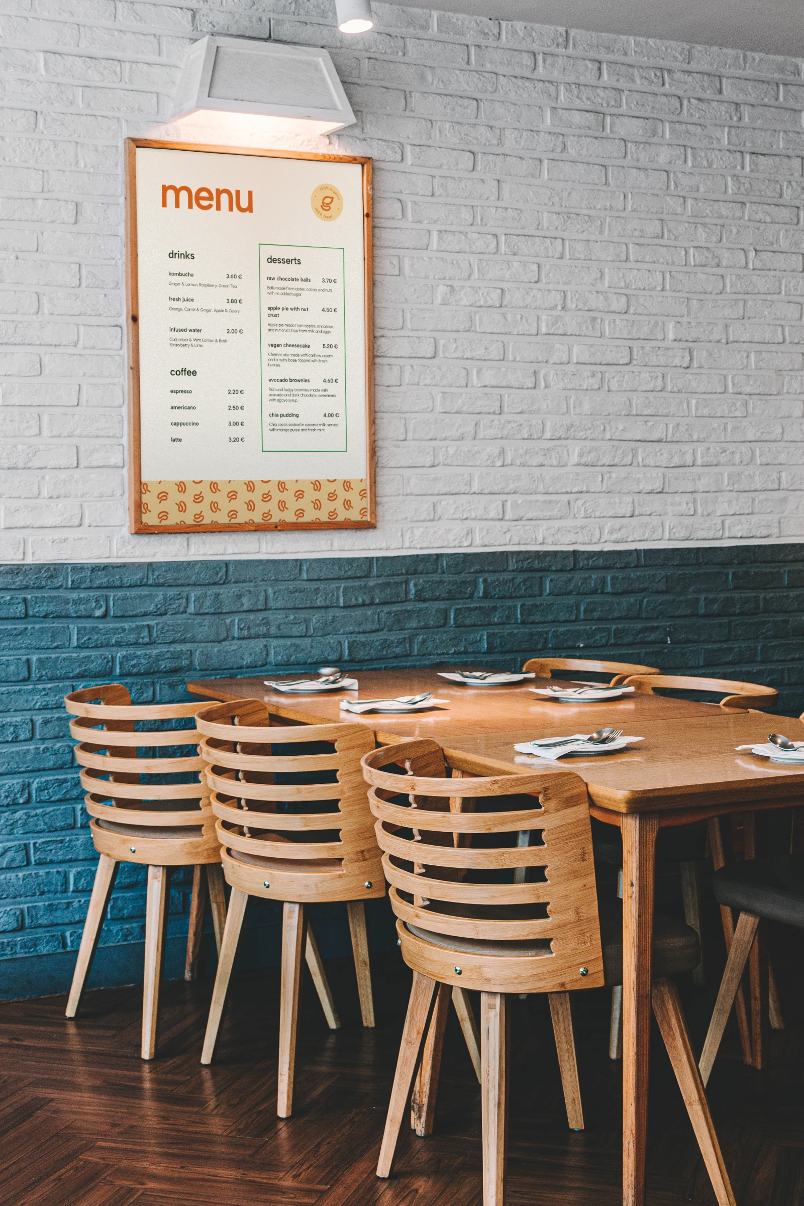
Poster with menu
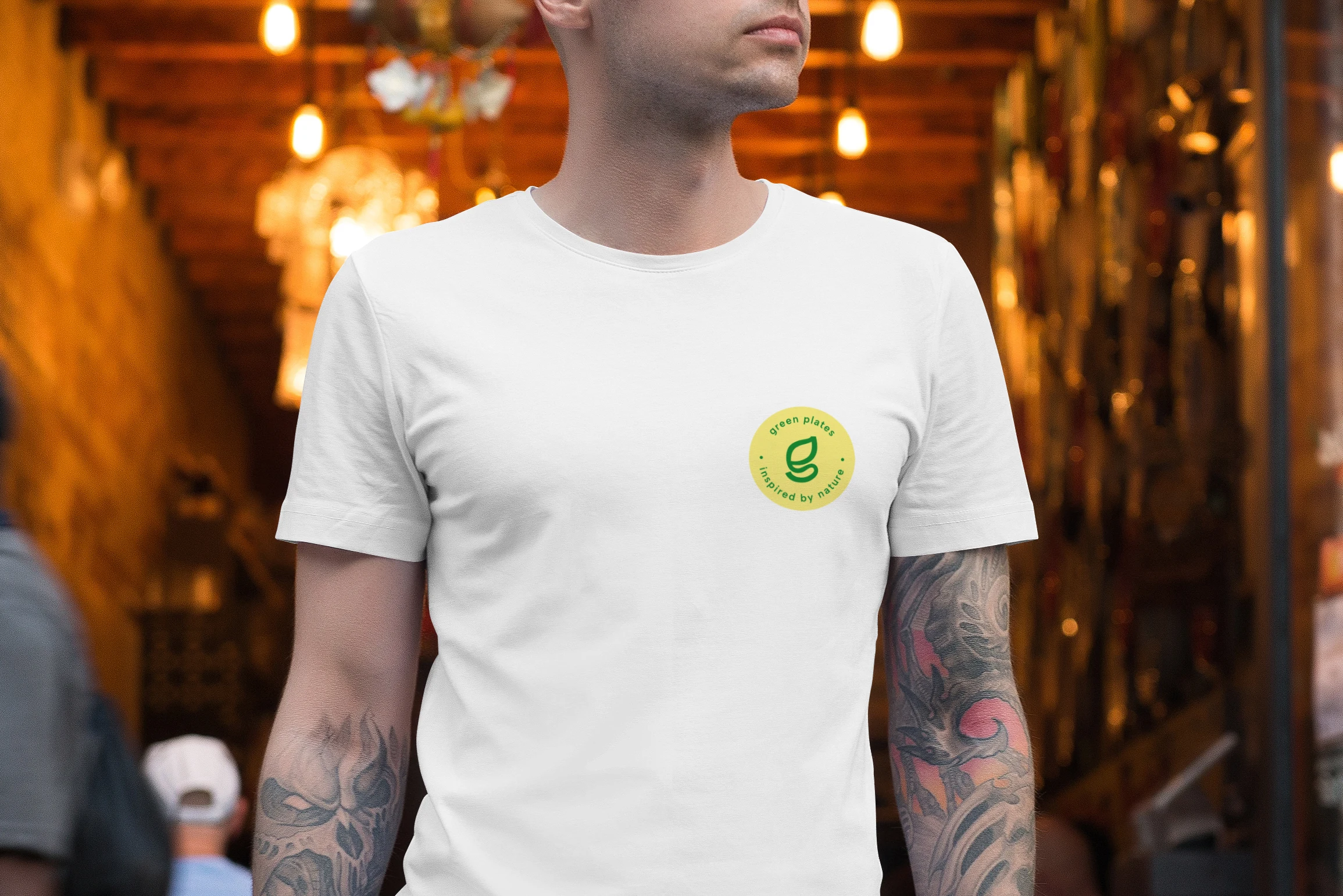
Branded t-shirt
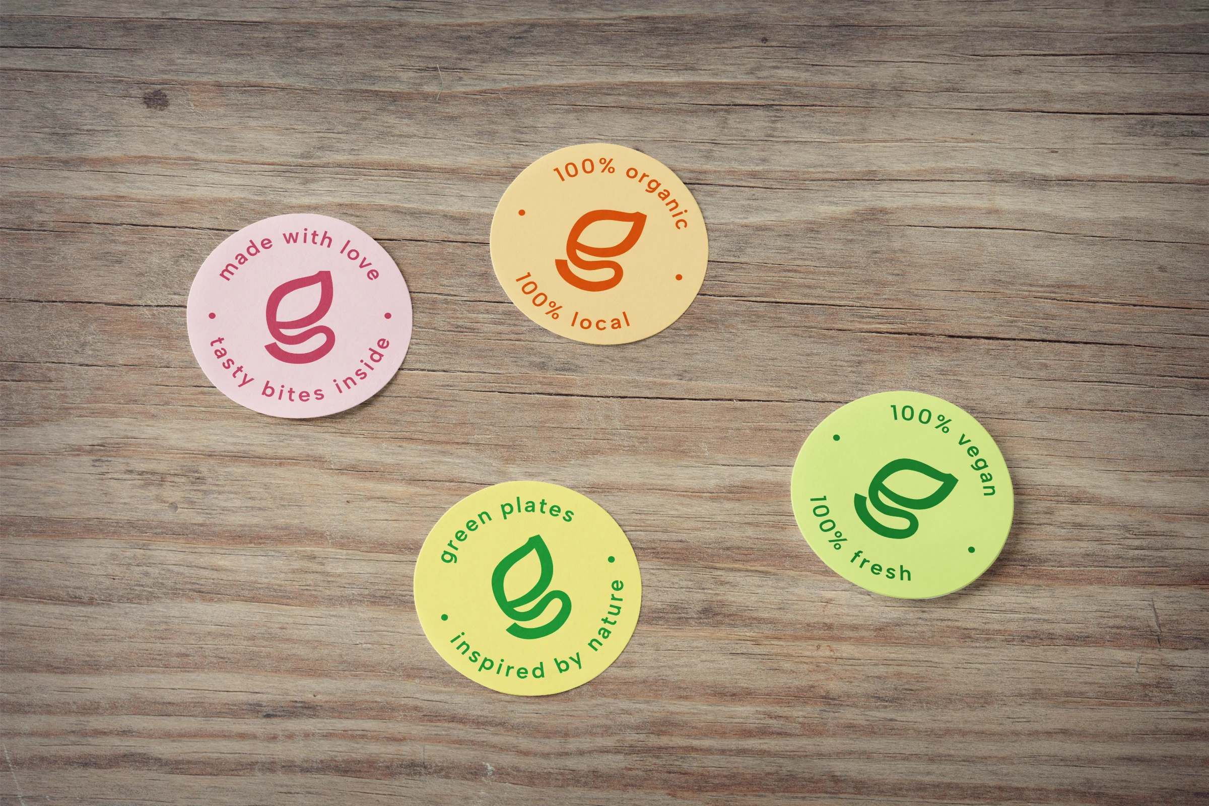
Branded stickers
Do you want to impress your customers?
It's hard to do with outdated and boring pages and visuals. Get yourself a partner who knows how to help you grow. Say goodbye to unreliable and mediocre websites or unattractive brand identity. Leave your competition far behind.
Book a free discovery call. Tell me more about your challenges and needs
📅 Pick a time slot from my Calendly
📥 hello@nueva.design
💬 +420 775 255 265 (WhatsApp friendly)
Brand Guideline Sheet
Like this project
Posted Jul 21, 2024
A vibrant visual identity for 'Green Plates', a health-focused bistro, incorporating modern fonts, vibrant colours, and nature-inspired elements.
Likes
0
Views
31