City Of Piqua Municipal Branding Concept
Austyn McFadden
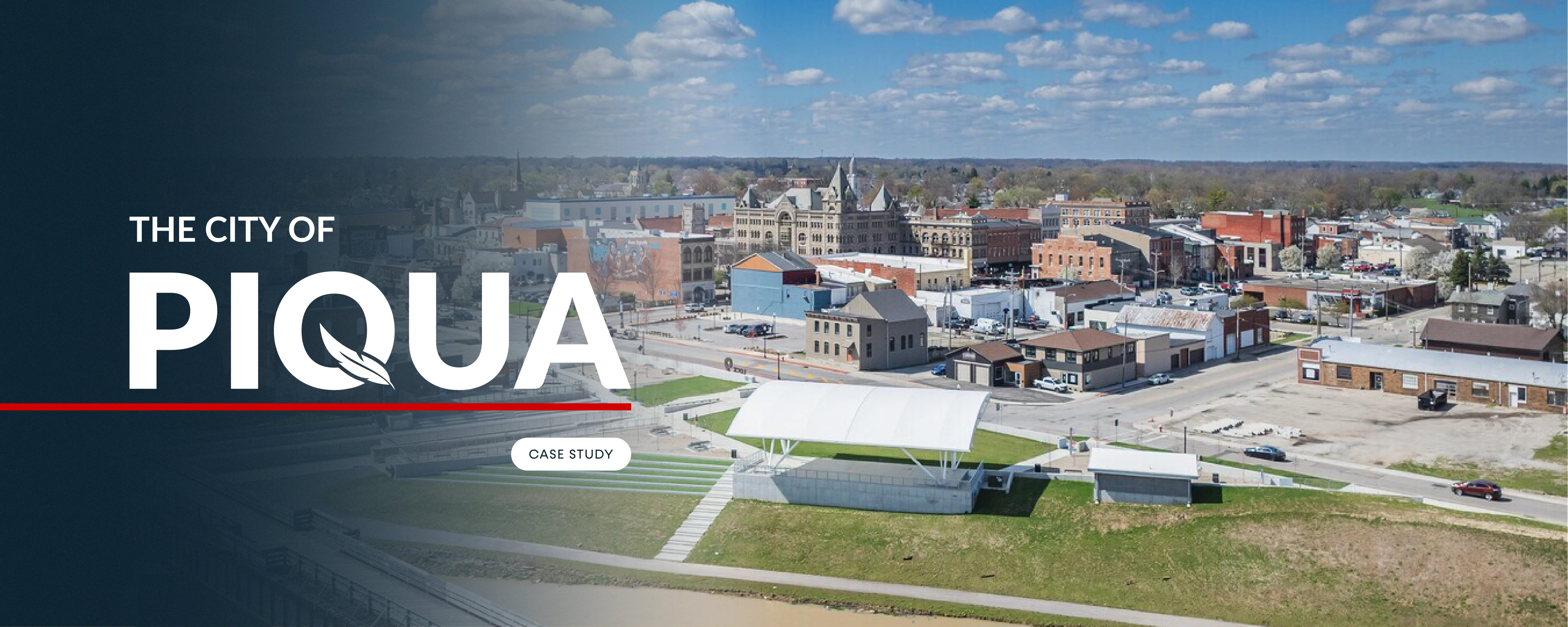
City Of Piqua Rebrand Concept
Overview
This project is a self-initiated municipal rebrand concept exploring how a city identity can be rebuilt with clarity, history, and community alignment at its core. The goal was to rethink how the City of Piqua could visually represent itself in a way that feels authentic, functional, and future-ready.
This concept was created independently for exploration and portfolio purposes, using publicly available insights to inform a more grounded and enduring civic brand system.
The challenge
Piqua is a historic Midwestern city with strong architectural character, natural assets, and a deeply engaged community. The city previously partnered with an agency on a rebrand that was supported by research and strategy. However, the final identity struggled to resonate with residents and was ultimately set aside after public feedback.
While the outcome did not land, the agency later shared their process publicly, including the research themes and community insights that informed their work. Those findings highlighted an important gap. The problem was not a lack of insight, but a disconnect between what the community valued and how those values were expressed visually.
The challenge became clear. How could those same insights be used to create an identity that feels rooted, recognizable, and genuinely reflective of Piqua’s story?
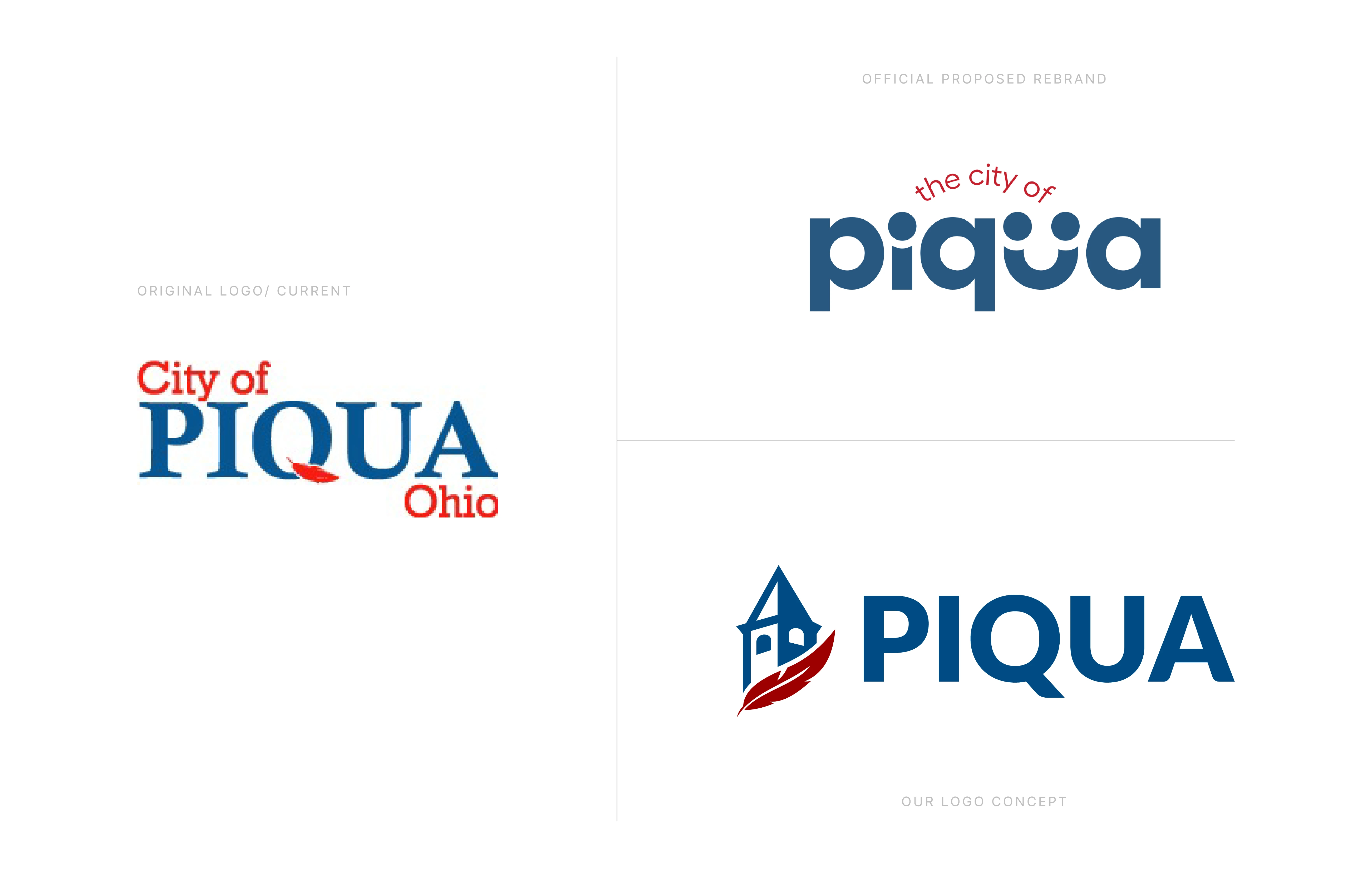
All 3 Piqua logos
Formerly a historic hotel, Fort Piqua Plaza is now the library and the main focus of our logomark.
Process and approach
As I reviewed city forums, public discussions, and the shared research from the original rebrand effort, one theme surfaced consistently. Residents wanted an identity that tied back to Piqua’s history. Even subtle references mattered. People wanted to see themselves, their landmarks, and their story reflected rather than abstracted.
That insight reframed the direction of the concept. It led to a simple question. What symbol best represents Piqua in a way that feels authentic and earned?
The answer was the historic Piqua Hotel. Once a destination that hosted presidents and prominent figures, the hotel remains one of the city’s most recognizable symbols of pride, permanence, and place.
To bring the concept full circle, I reintroduced the feather that once lived inside the “Q” of the PIQUA wordmark. This legacy detail, familiar to many residents, helped bridge past and present while reinforcing continuity rather than reinvention for its own sake.
From these ideas, a clear strategic foundation emerged, guided by attributes such as connected and creative, hopeful and driven, welcoming and human, and authentic and enduring.
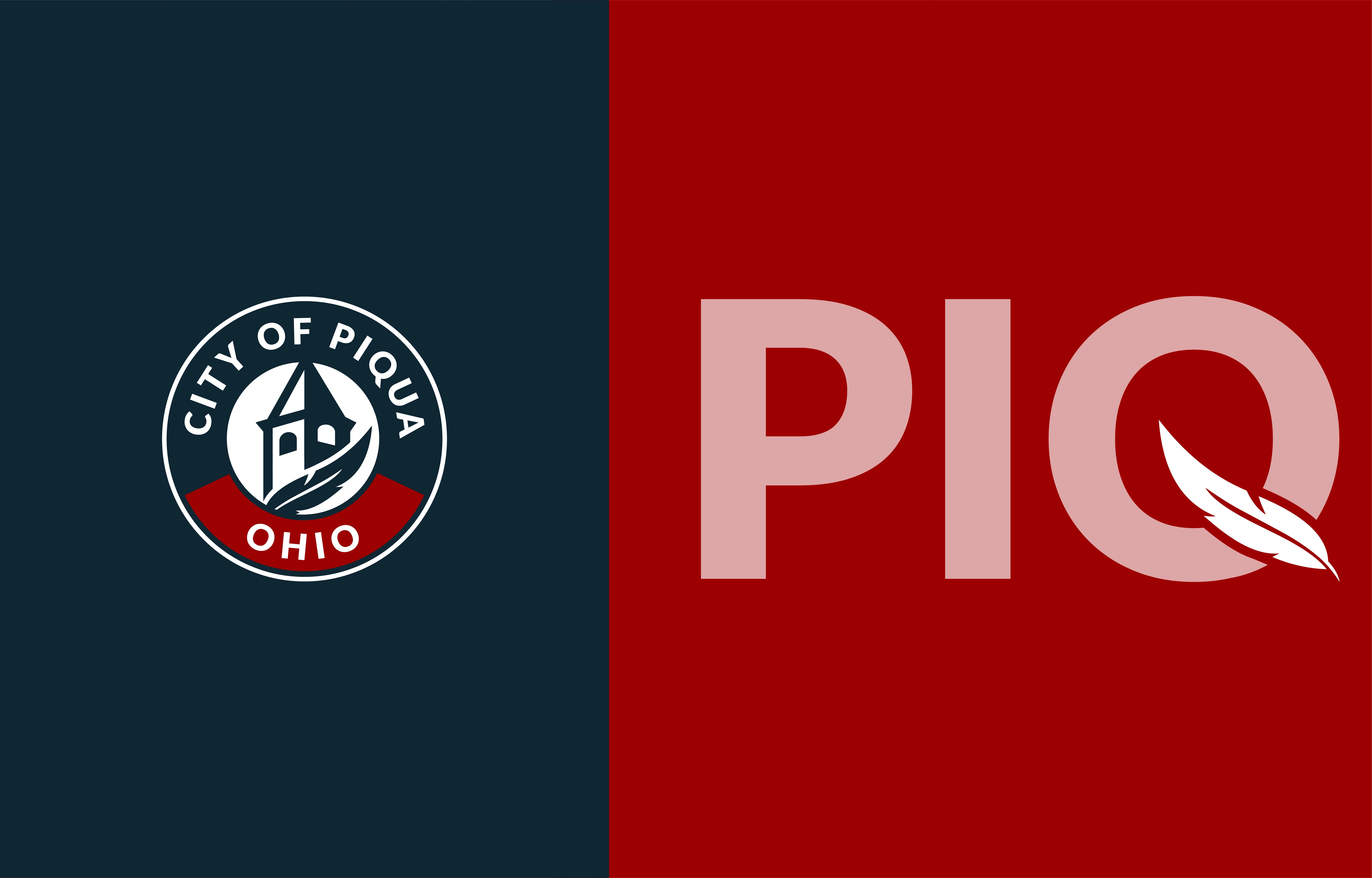
City of Piqua, OH badge concept and modern PIQUA wordmark with a feather integrated into the Q.
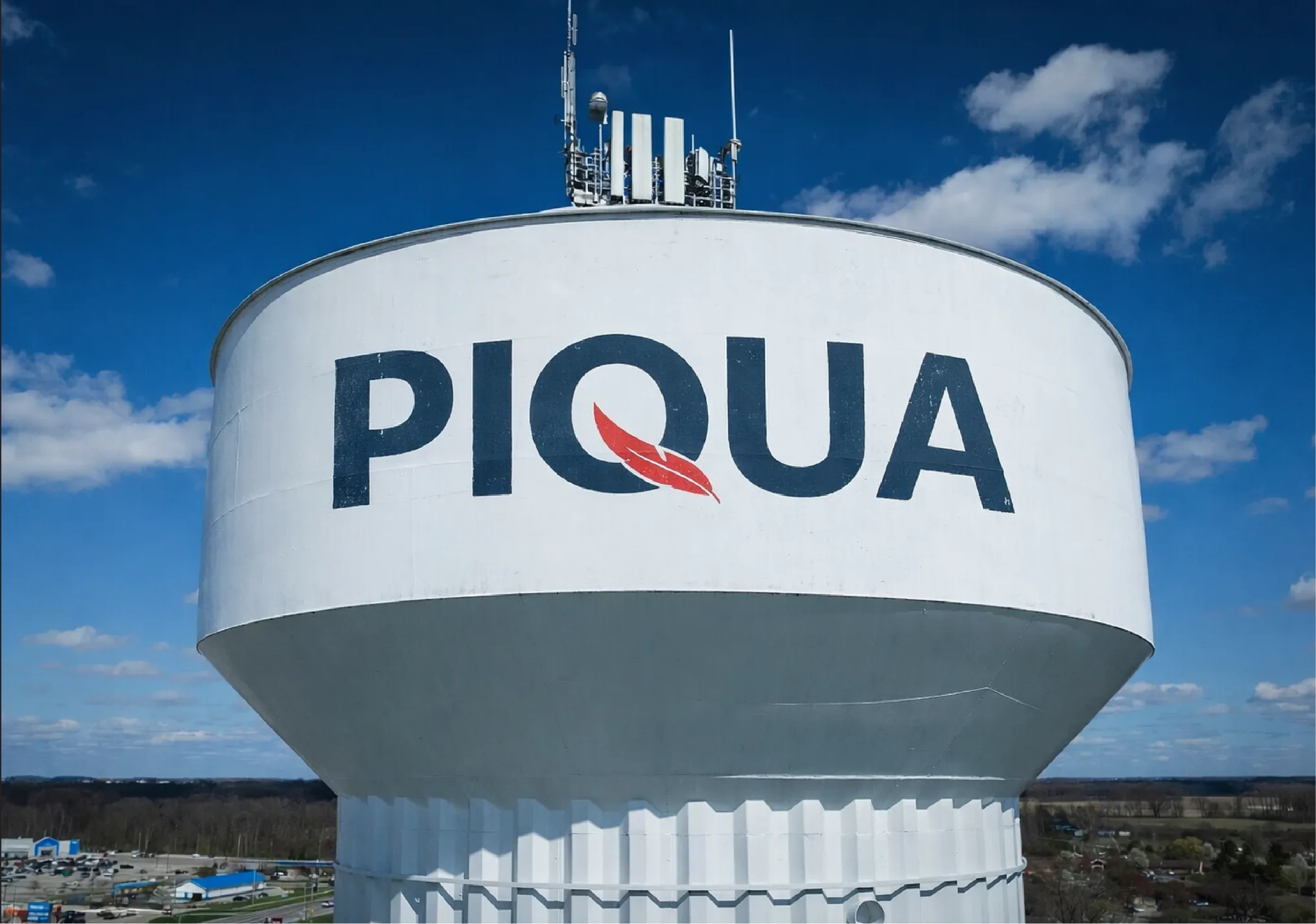
Piqua, OH water tower with the new wordmark branding.
The solution
The resulting identity centers on a simplified silhouette of the Piqua Hotel paired with a refined, forward-moving feather. Together, these elements communicate heritage and momentum in equal measure.
The system includes a primary civic badge, horizontal and vertical logo lockups, a standalone PIQUA wordmark with an integrated feather, supporting badges, and a flexible color palette designed for real-world municipal use.
Every element was designed with scalability and clarity in mind. The brand is built to perform across signage, vehicles, uniforms, environmental graphics, digital platforms, and large-scale infrastructure such as water towers, while remaining legible at small sizes for social and internal communication.
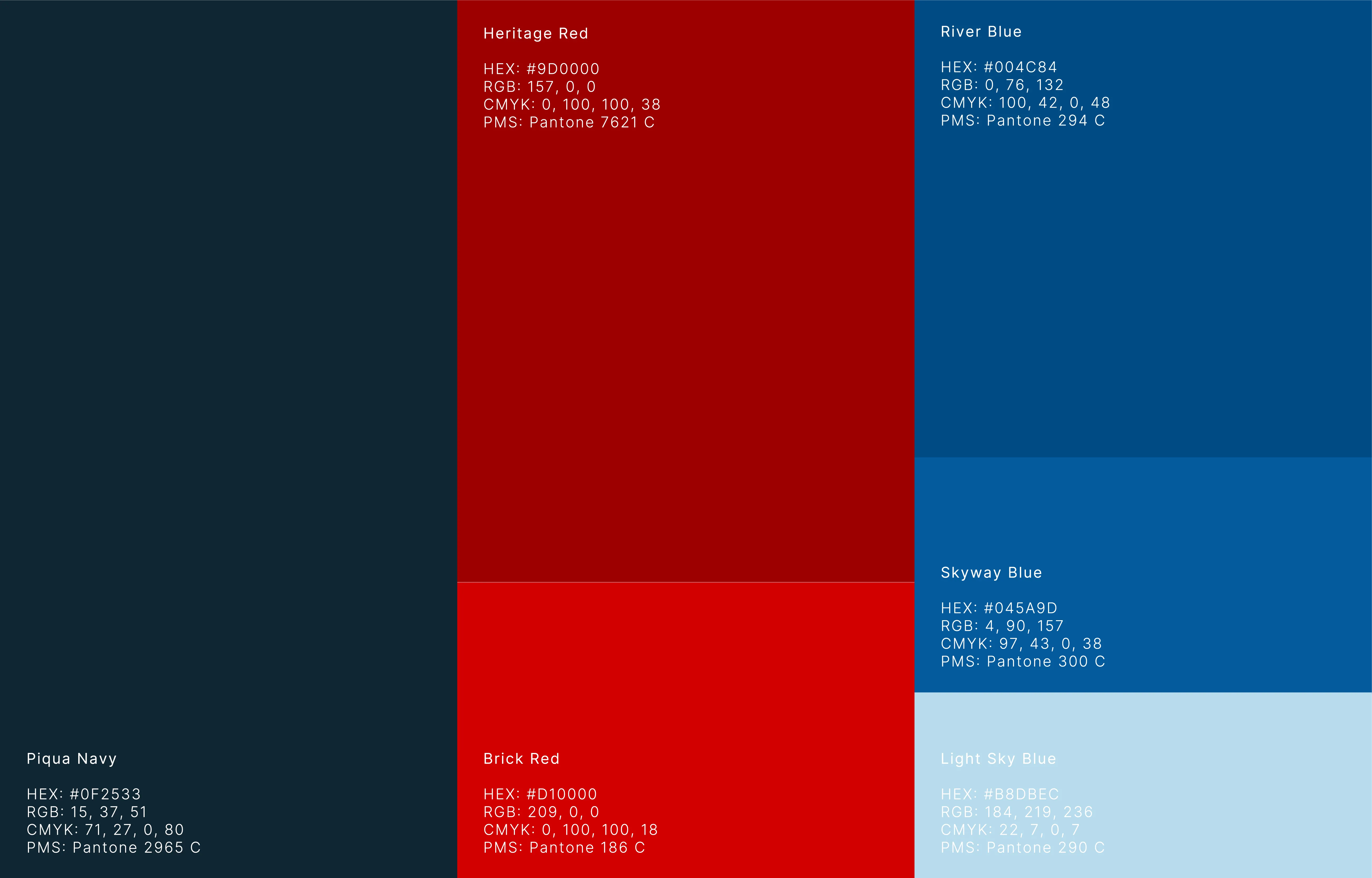
The City of Piqua, OH Color Palette
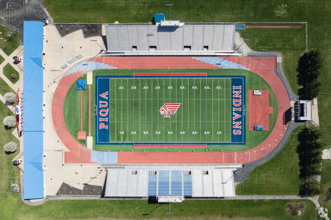
Alexander Perk Stadium in Piqua, OH
Outcome and impact
While this was a concept project, it demonstrates how listening closely to community feedback and existing research can lead to a more resonant and usable civic identity. The system presents a clearer story for Piqua, one that honors its history without feeling dated and supports growth without losing character.
This project reflects a strong interest in municipal branding and a belief that cities deserve identities built with care, strategy, and respect for the people they serve. Civic brands shape how people feel about where they live, work, and invest. I would love the opportunity to bring this approach to a real city partnership in the future.
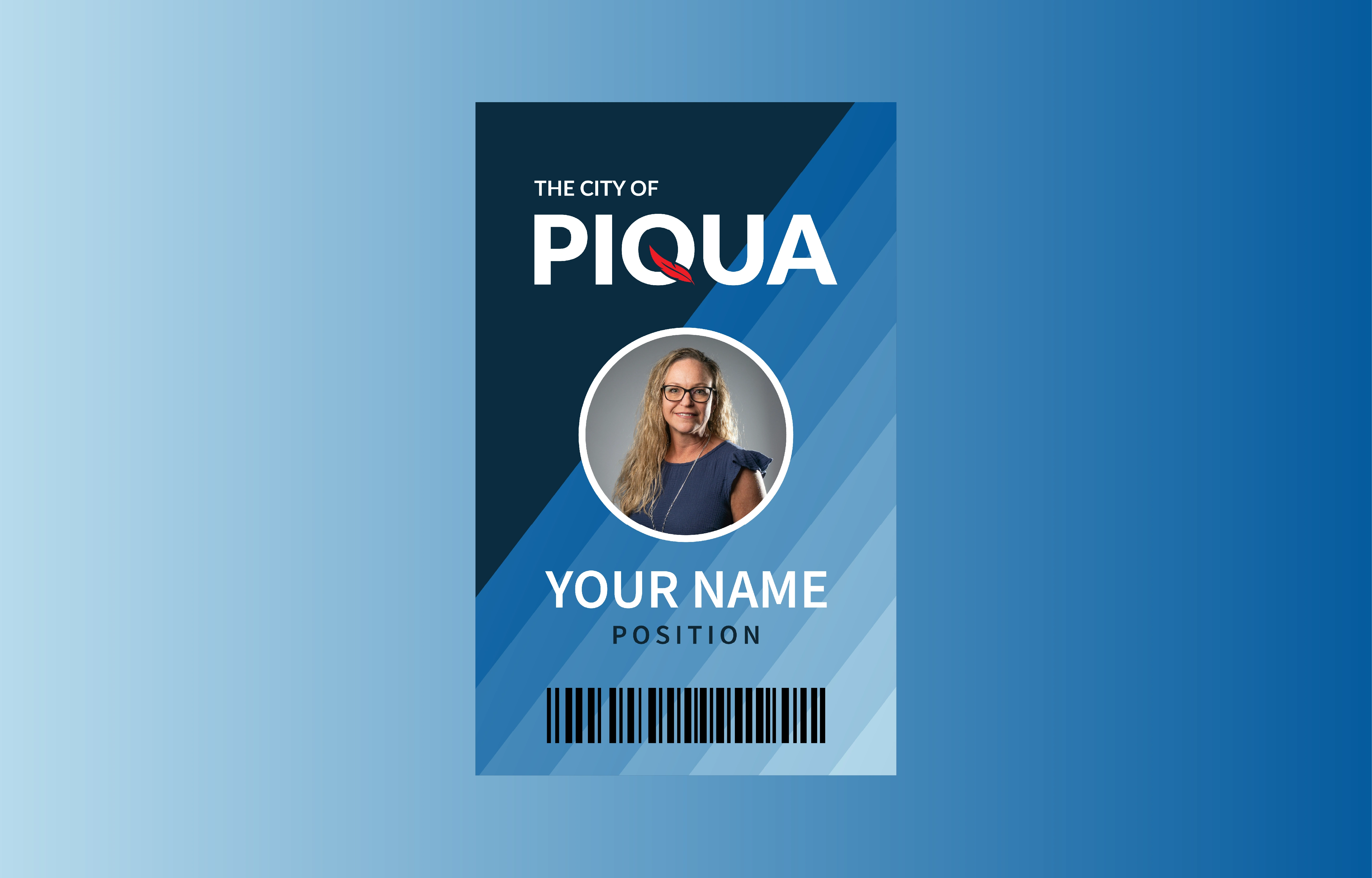
City of Piqua, Employee Badge Concept
Like this project
Posted Jan 19, 2026
A self-initiated municipal rebrand concept focused on civic identity design, logo systems, and using historic symbols to create a future-ready city brand.
Likes
1
Views
1
Timeline
Nov 18, 2025 - Jan 1, 2026