Branding, Visual identity, Social Media | Facial harmonization

Juliana E. Escaleira


Branding, Visual identity and Social Media for dentist specialized in facial harmonization
CHALLENGE
The main challenge was to develop a brand that would visually communicate technical expertise and professionalism, while also evoking warmth, softness, and trust — key feelings for clients seeking treatments that impact not only their appearance, but their confidence and self-image.
STRATEGY & SOLUTION
Creating the visual identity for a facial harmonization specialist required more than aesthetic sensibility — it demanded precision, balance, and a deep understanding of the emotional journey behind choosing an aesthetic procedure.
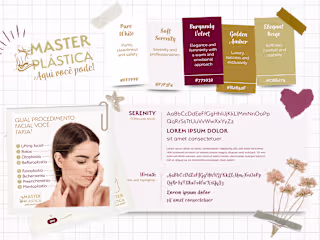
Main color palette
Each color in this palette was carefully selected to reflect the core values of a brand focused on facial harmonization, where aesthetics, care, and technical excellence come together to deliver natural and confident results. The chosen tones convey cleanliness, tranquility, professionalism, and elegance — all essential qualities in the universe of advanced aesthetic dentistry.
Pure Balance (#FFFFFF): Symbolizes visual purity and cleanliness. This tone conveys the sense of symmetry, lightness, and hygiene that are foundational to facial harmonization, reinforcing the brand’s commitment to natural and balanced results.
Soft Harmony (#D7DFE8): A soft, calming blue that brings serenity and emotional comfort to the patient experience. It represents the subtlety and delicacy of aesthetic procedures, helping to create a welcoming and reassuring environment.
Contour Precision (#406995): This sophisticated blue carries weight and clarity, communicating technical expertise and the precision required in facial contouring. It reinforces trust in the practitioner’s skill and reflects a modern, innovative approach to aesthetics.
Deep Trust (#3F4549): A deep gray that evokes strength, discretion, and long-term reliability. It anchors the palette with a sense of professionalism and refined elegance, conveying the confidence patients can place in the brand and its results.
Typography
The selected fonts work in harmony to reflect the brand’s dual essence: technical precision and human connection. The combination of a serif font, a handwritten style, and a clean text typeface ensures both readability and emotional resonance, elevating the visual communication in every brand application — from digital content to printed materials.
Logo
VISUAL IDENTITY APPLICATIONS
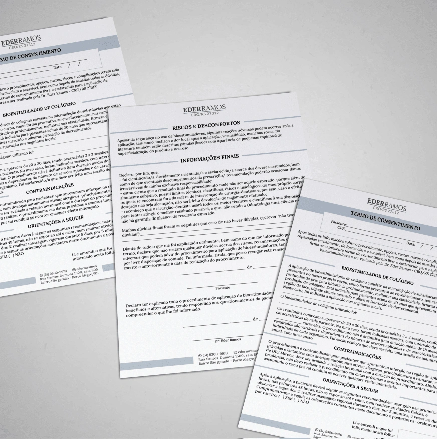
Branded stationery

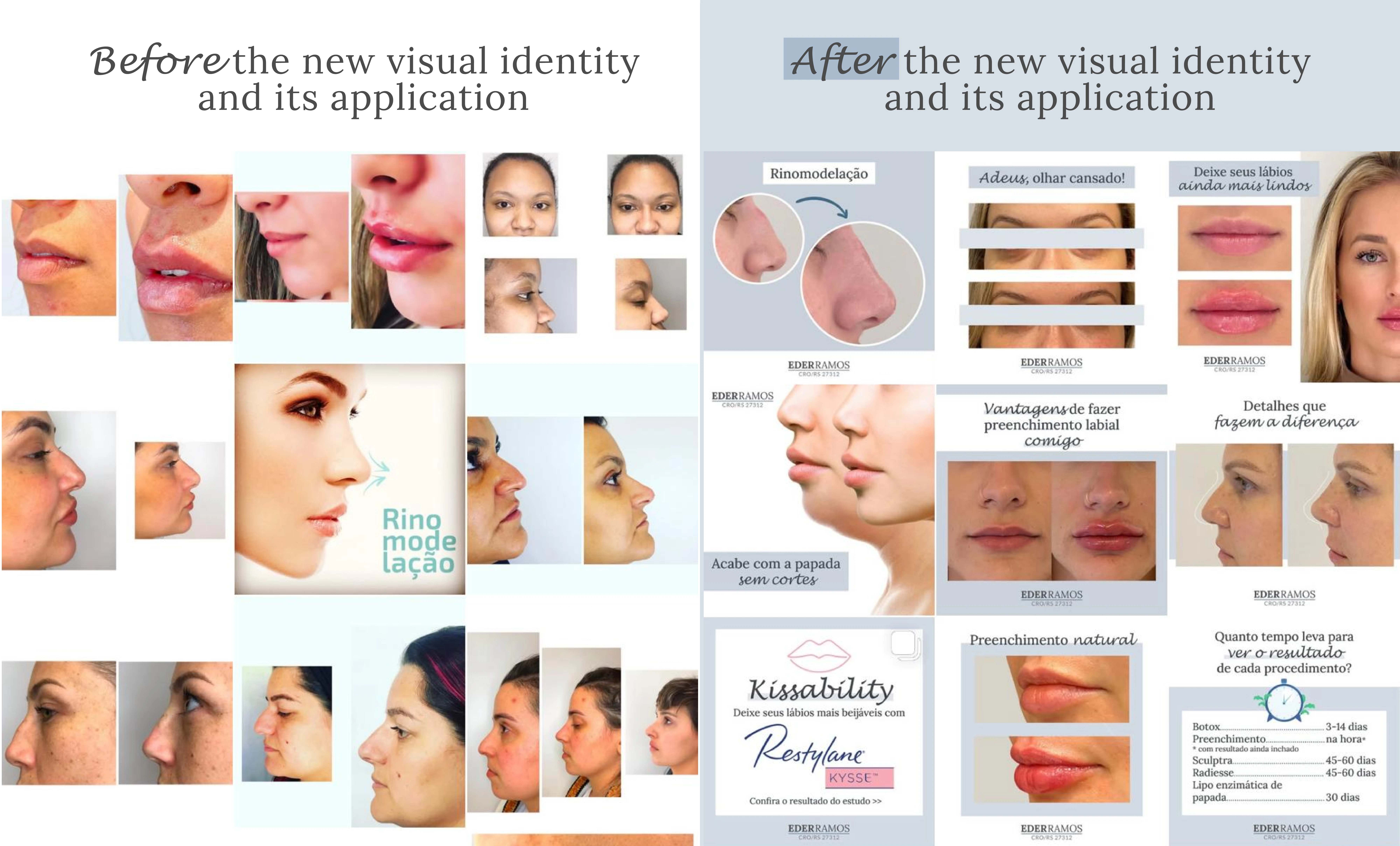
Social Media | Before & After
This comparison illustrates the strategic impact of applying a cohesive visual identity across social media. On the left, the before reveals a fragmented brand presence — with inconsistent layouts, uncoordinated typography, and a lack of visual hierarchy. These elements weakened the perception of professionalism and made it difficult for the brand to stand out or build recognition in a competitive, image-driven market.
On the right, the after reflects a clear strategic shift. Through the consistent use of a defined color palette, typography system, and visual structure, the brand achieves stronger recognition and communicates its core values more effectively. The redesigned assets not only enhance aesthetic appeal but also support clarity of information, making each post more accessible, trustworthy, and aligned with the expectations of an audience seeking expertise and refinement in facial harmonization.
This transformation is not just visual — it strengthens the brand’s positioning and elevates the overall customer experience through every digital touchpoint.
Social Media | Before & After
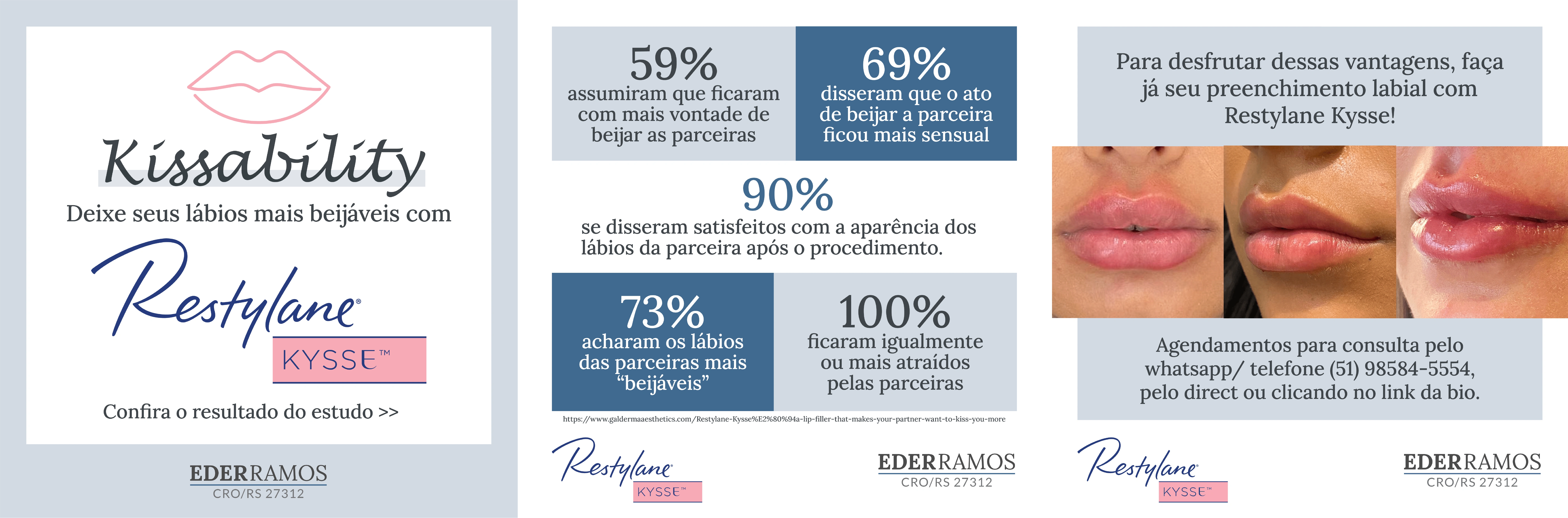
Social Media | After
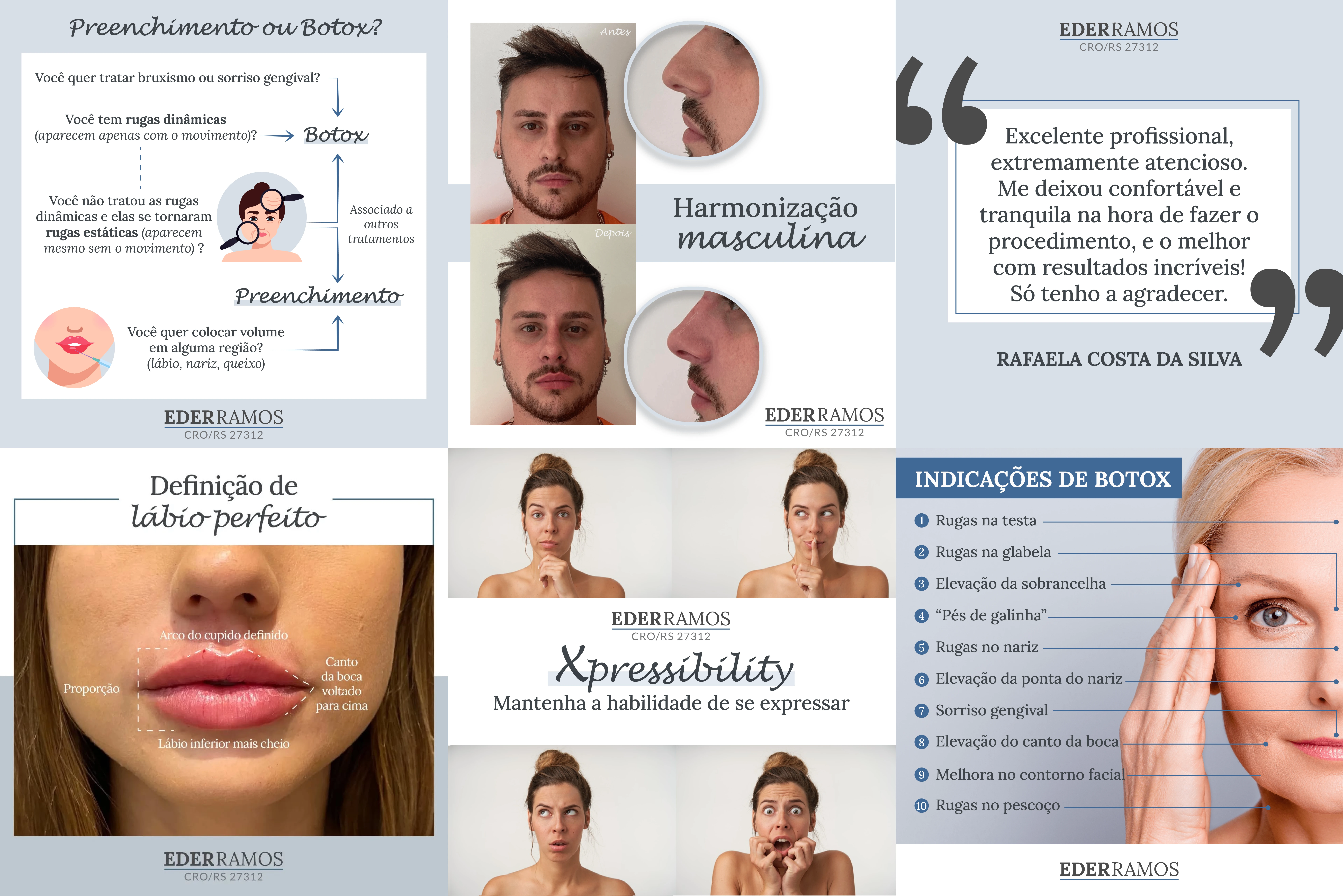
Social Media | After
Ready to create an identity that conveys your brand values and creates a connection with your consumers?
Let’s talk! 😊
Like this project
Posted Apr 15, 2025
Strategic visual identity for a facial harmonization specialist, combining elegance, trust, and precision across branding and social media


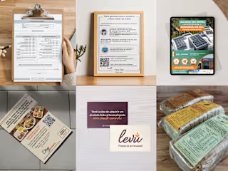
Printed Design solutions | Various industries
Rebranding, Visual Identity, Branding | Plastic surgery clinic
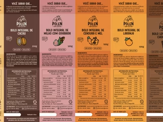
Packings, tags and labels | Gluten free products

Education | Marketing strategy, social media design & Ads