Rebranding, Visual Identity, Branding | Plastic surgery clinic
Juliana Eisenhardt Escaleira
CHALLENGE
The rebranding project aimed to enhance the brand value through a modernization of its visual identity.
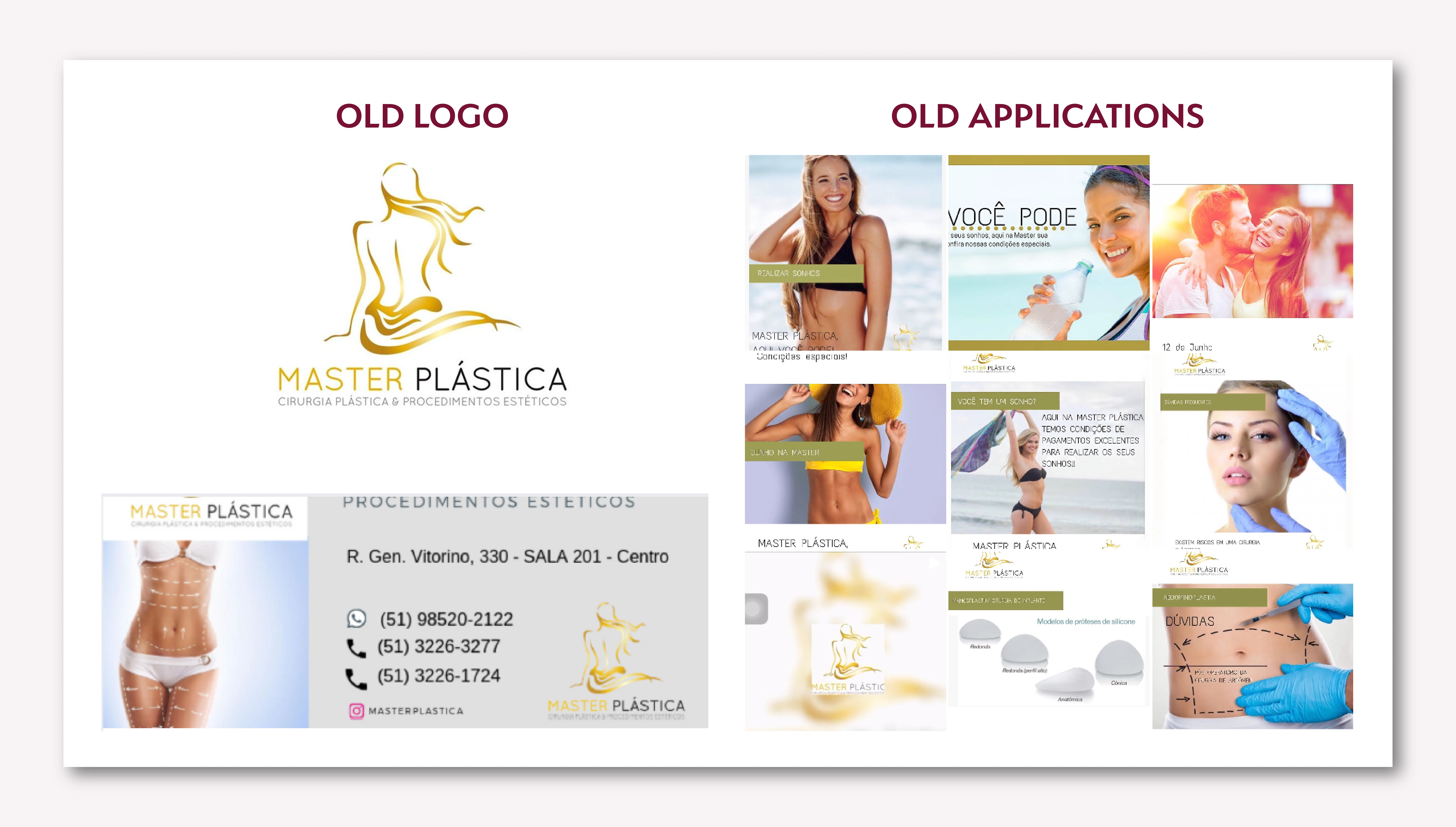
Problems identified
The brand had an incomplete visual identity, limited to a logo that had several structural and conceptual problems, including:
Generic and disconnected font: The typography used did not reflect the essence of the brand nor was it aligned with the industry.
Inadequate distribution of elements: The composition lacked visual balance, compromising the harmony of the whole.
Exaggerated contrast: The contrast between the parts of the name created an imbalance, damaging the visual unity.
Poorly functional description: The descriptive text was in a reduced size and with low contrast, making it difficult to read and contributing to visual pollution.
Inconsistent color palette: The colors were not well defined, limiting the coherence and applicability of the visual identity.
These flaws compromised the effectiveness of the communication and the perception of the brand's professionalism.
STRATEGY & SOLUTION
The strategy behind the rebranding of ‘Master Plástica’ focused on differentiating the clinic in a competitive market, revitalizing its visual identity and aligning it with the premium quality of the services offered. The goal was to communicate a clear message of sophistication, cutting-edge technology and personalized patient care, attracting more clients
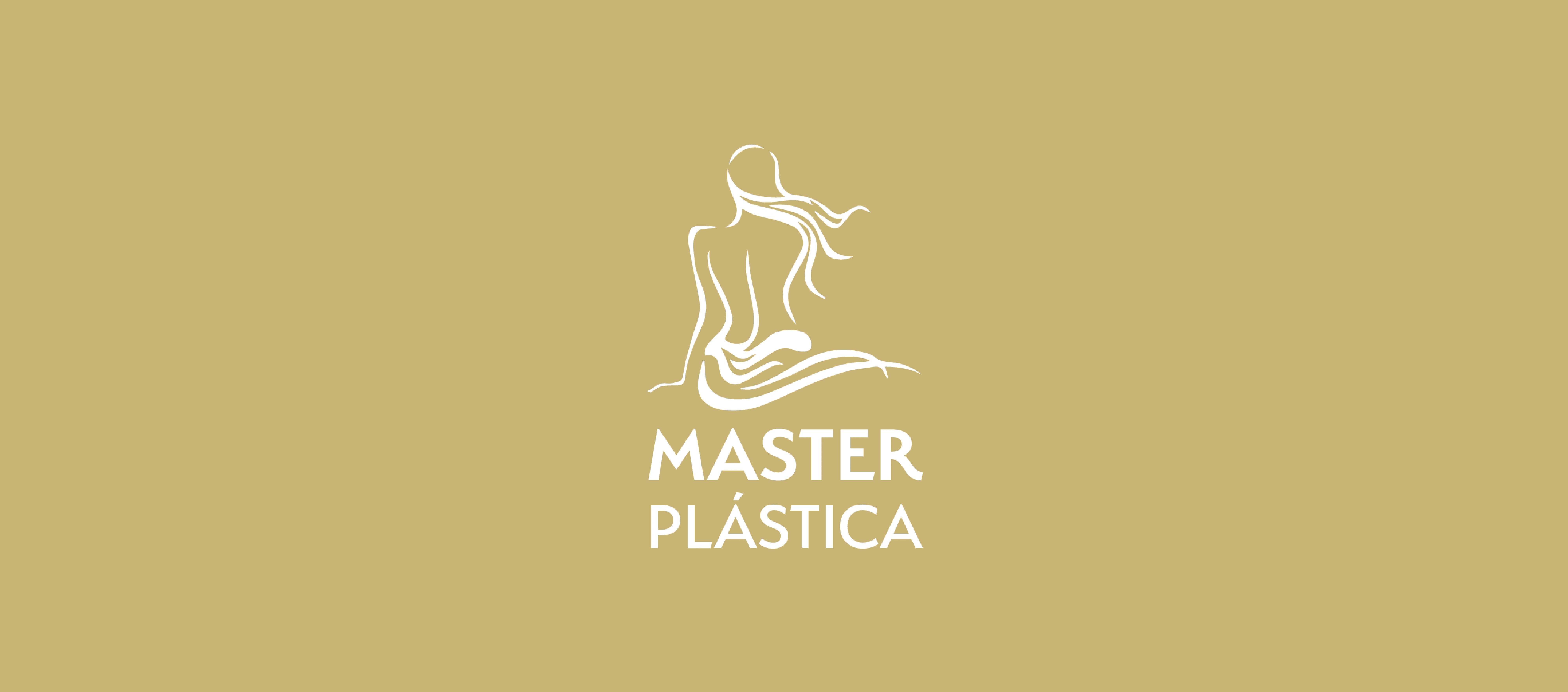
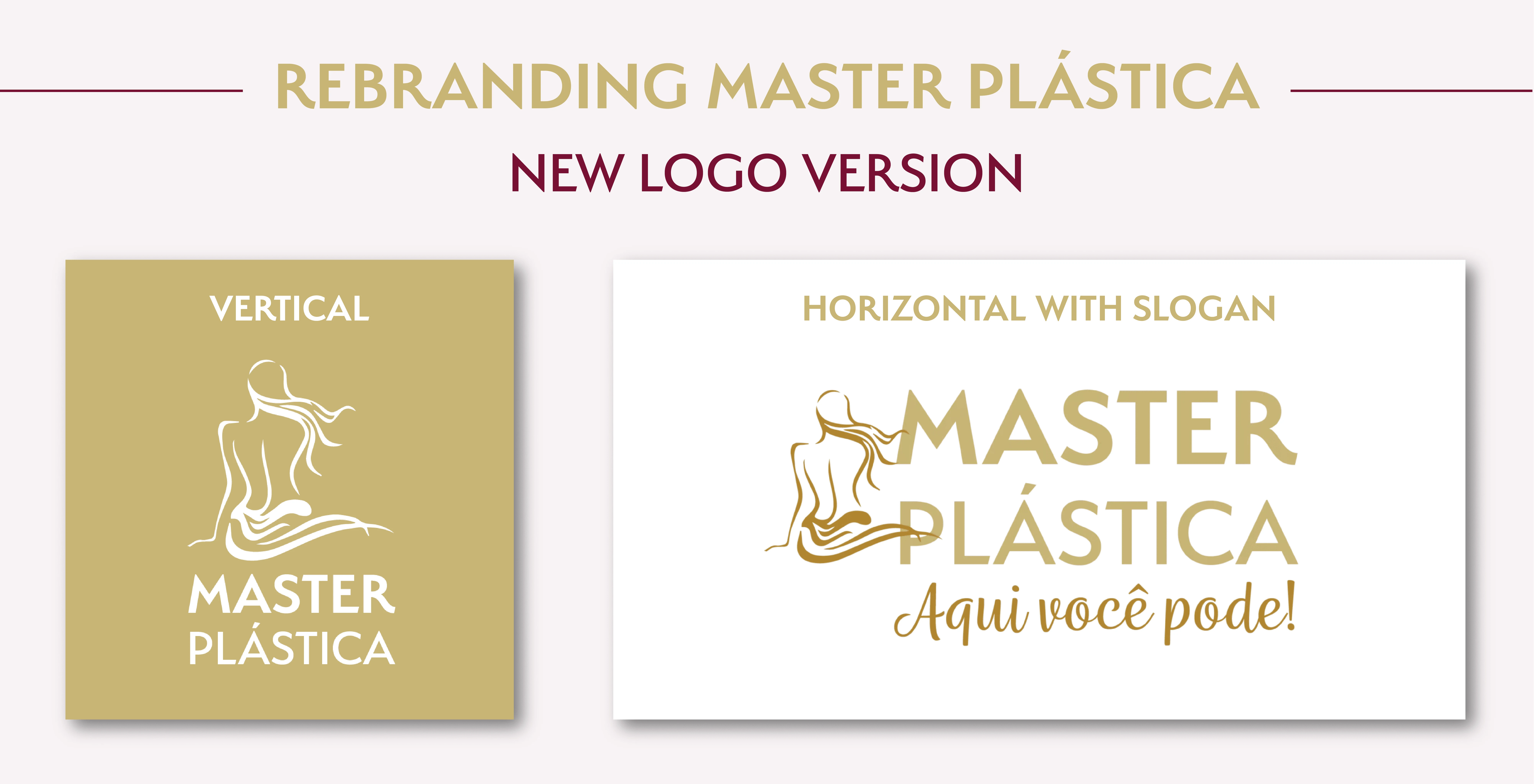
New logo
The new logo was redesigned to emphasize visual harmony and balance, implementing structural adjustments and strategic refinements that enhance the brand’s identity and project professionalism and sophistication.
Refined and minimalist silhouette: The logo's design was streamlined by reducing its size and simplifying its silhouette, removing any gradients to ensure a more balanced and contemporary look. This minimalist approach aligns with the brand's identity and enhances versatility across various applications.
Horizontal version: A horizontal version of the logo was developed to offer flexibility in its use across different media formats. This version is particularly effective for use in narrower spaces where a compact and elongated form factor is required, such as on the clinic's website header, business cards, or promotional banners. This horizontal orientation ensures that the logo remains legible and aesthetically pleasing in all formats, maintaining brand consistency across all touchpoints.
Structural reorganization: Adjustments in the vertical and horizontal arrangement of the elements—both graphic and textual—have been made to convey greater stability, harmony, and visual solidity. This reorganization allows the logo to be more impactful and easily recognizable, which is crucial for building brand recognition.
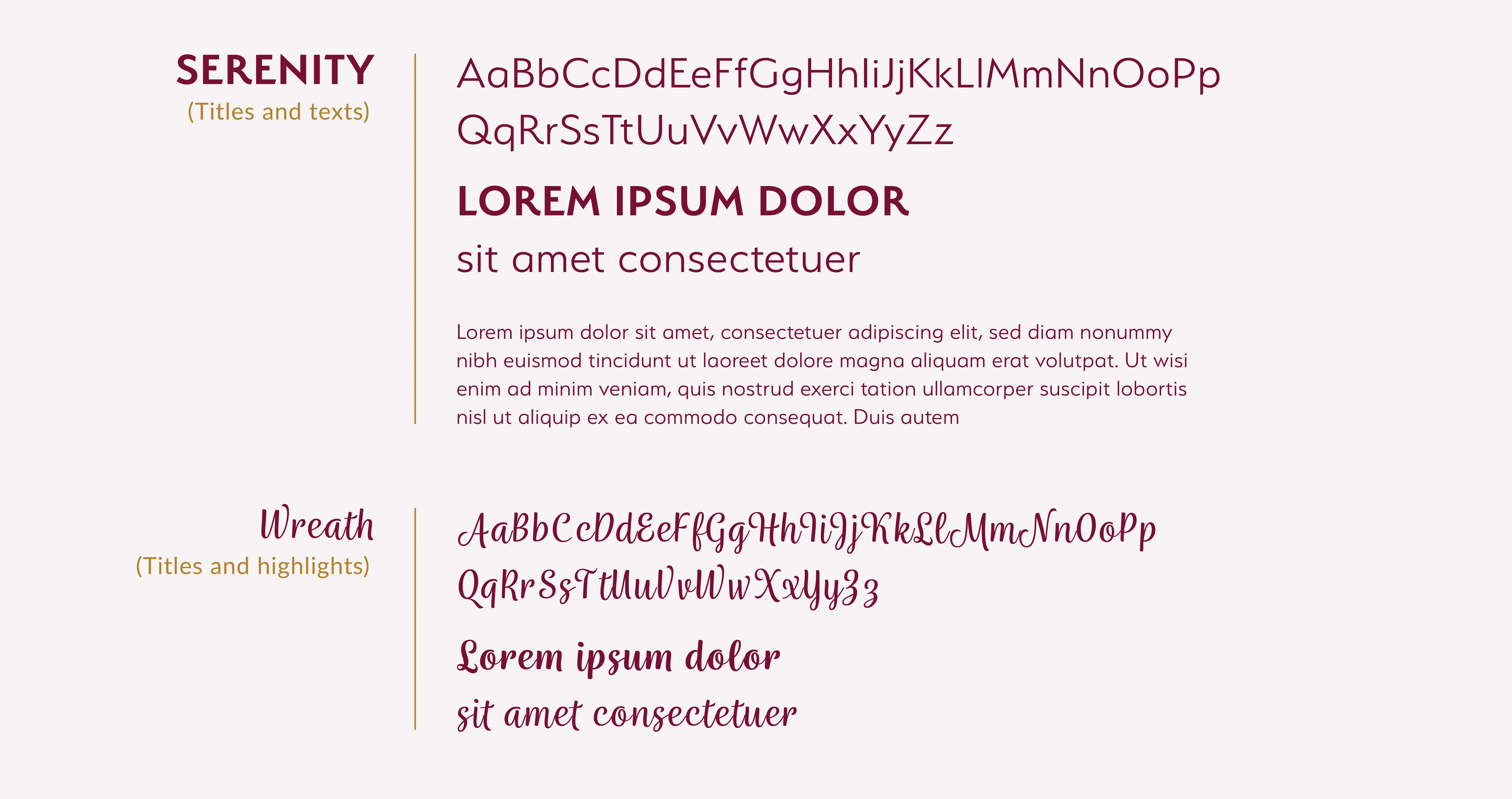
New typography
The typographic choice was rethought to provide greater impact and sophistication, highlighting the brand's presence in a memorable way and aligned with the values of beauty and elegance that it represents.
Serenity: communicates trust and professionalism with its uncluttered, contemporary design, ensuring that all communications are clear and accessible. This font reflects the precision and meticulousness expected in surgical procedures, supporting the clinic's reputation for high standards and patient care.
Wreath: conveys a sense of elegance and sophistication, adding a distinctive flair that complements the straightforward Serenity. The font's detailed serifs and graceful curves echo the artistry and attention to detail inherent in plastic surgery.
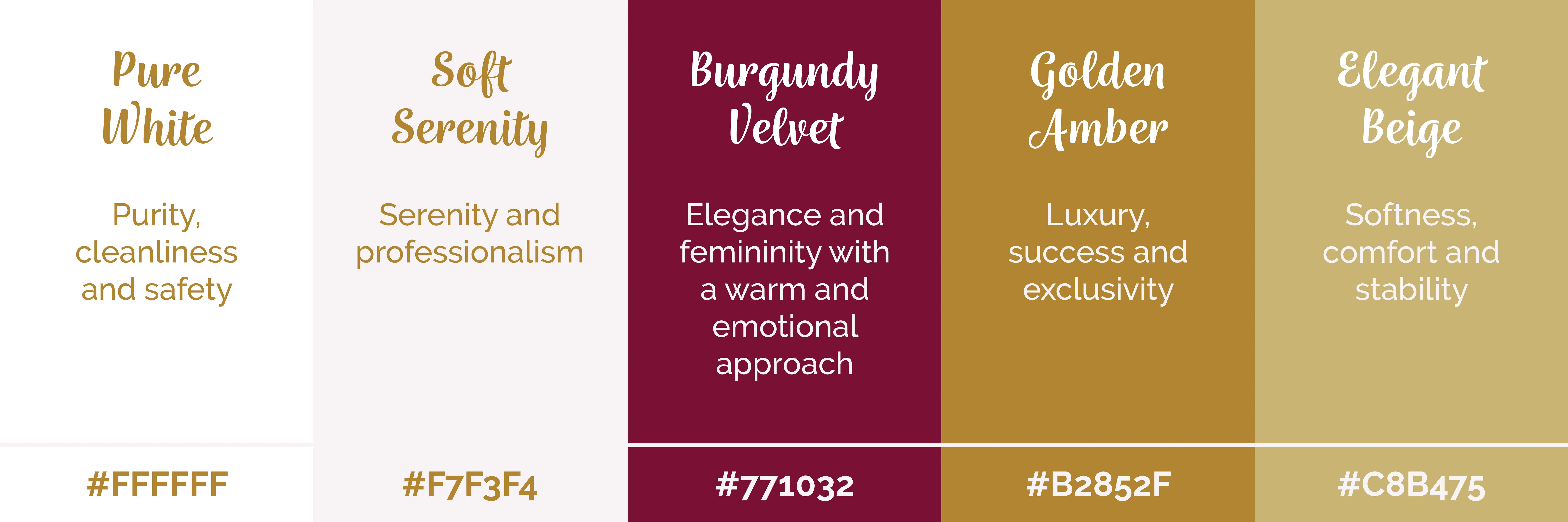
A complete pallete of colors
A complete color palette was created for ensuring consistency across all uses of a visual identity, making it easier for brands to maintain a coherent and attractive appearance. The colors were carefully chosen to highlight essential attributes valued by customers seeking plastic surgery procedures: exclusivity, quality and safety.
APPLICATION
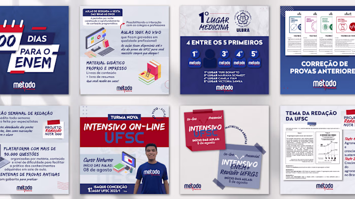
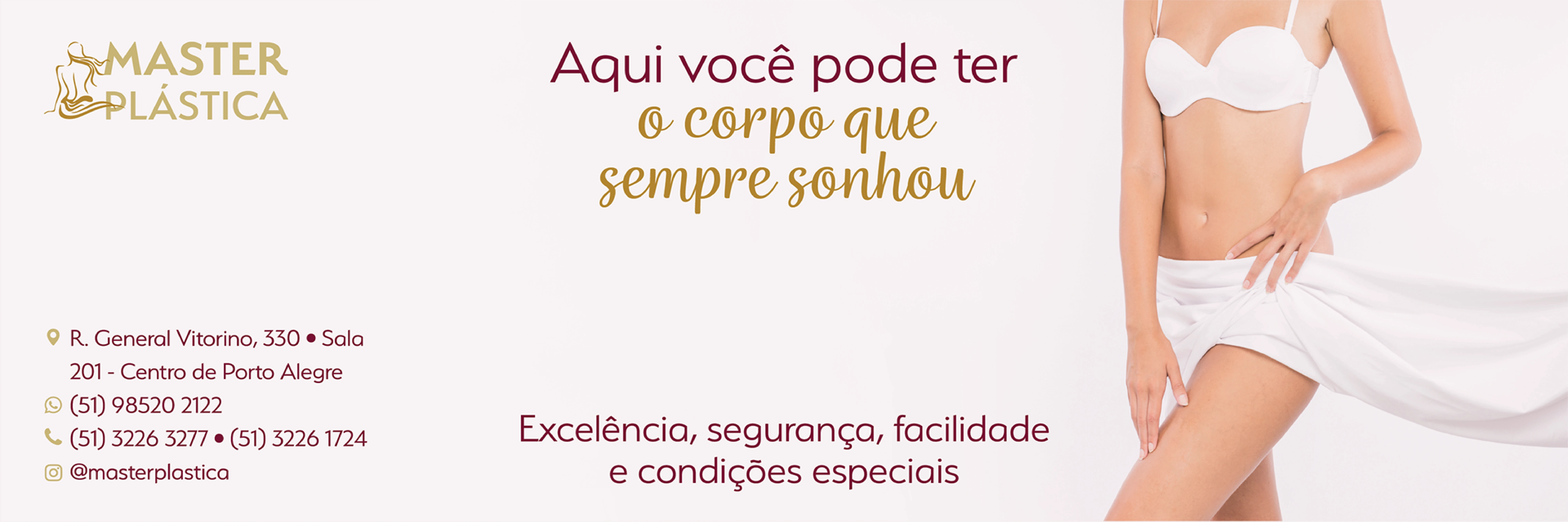
Banners
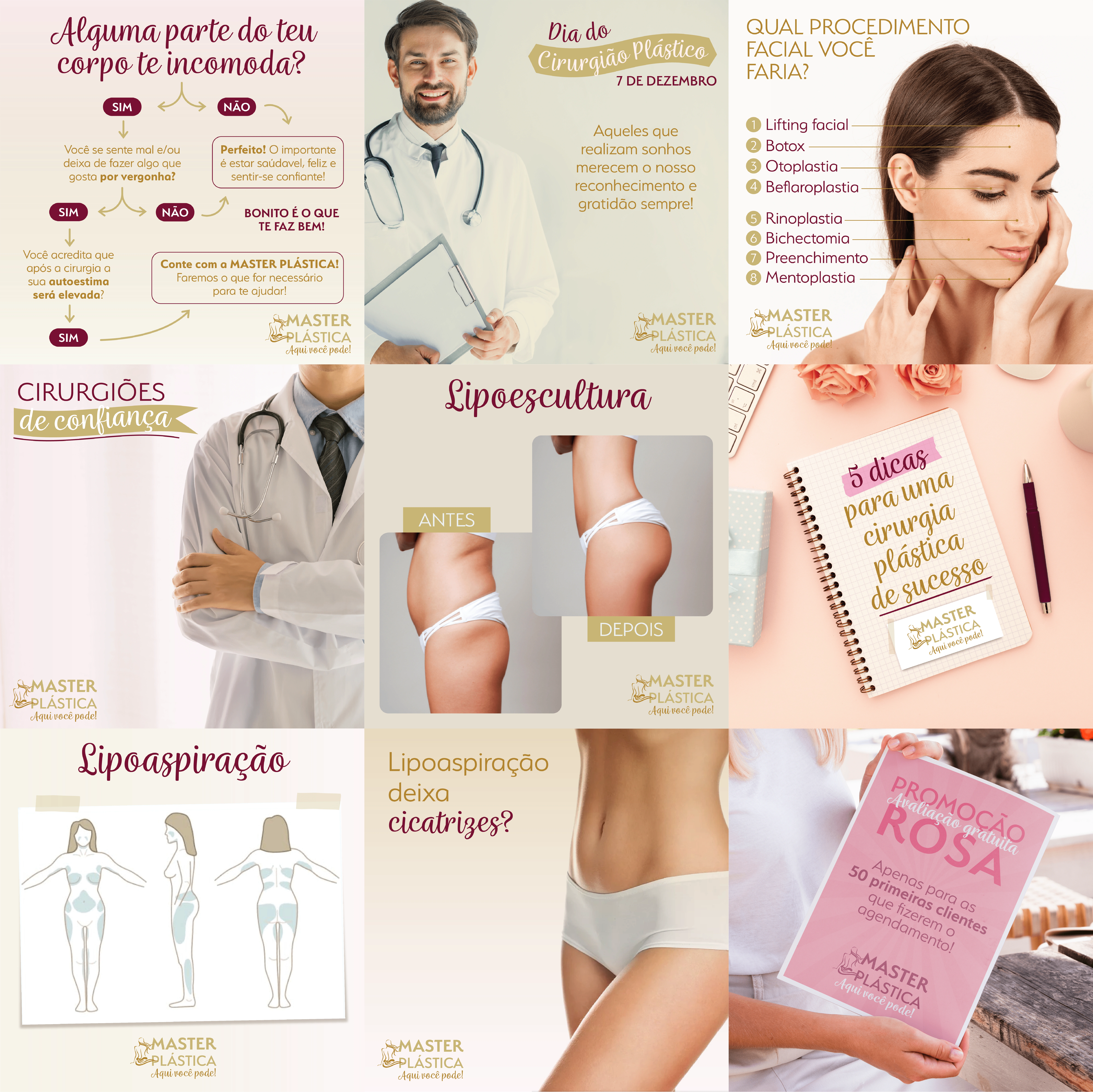
Social Media
Flyer
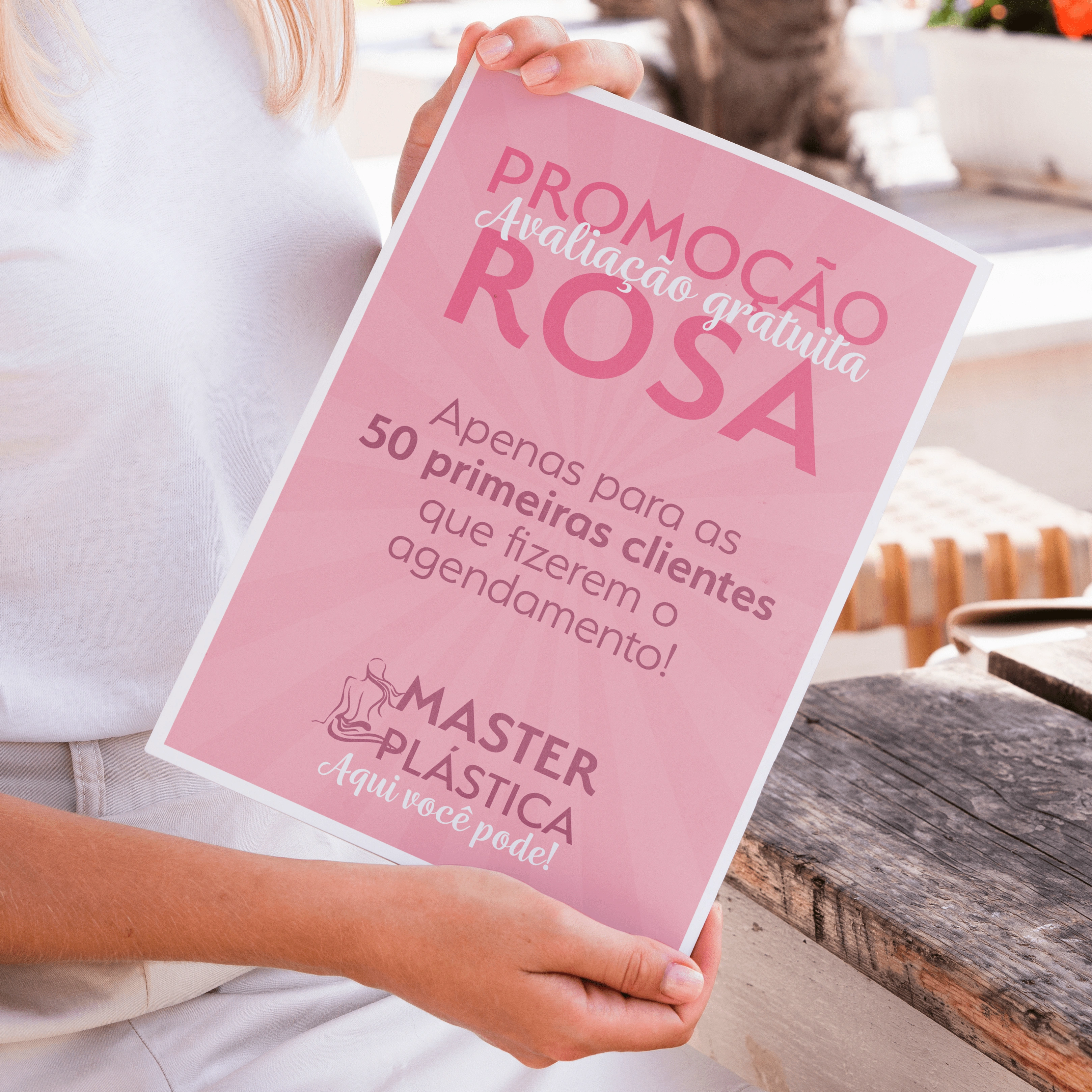
Flyer with adaptation of the visual identity for the pink October campaign (breast cancer)
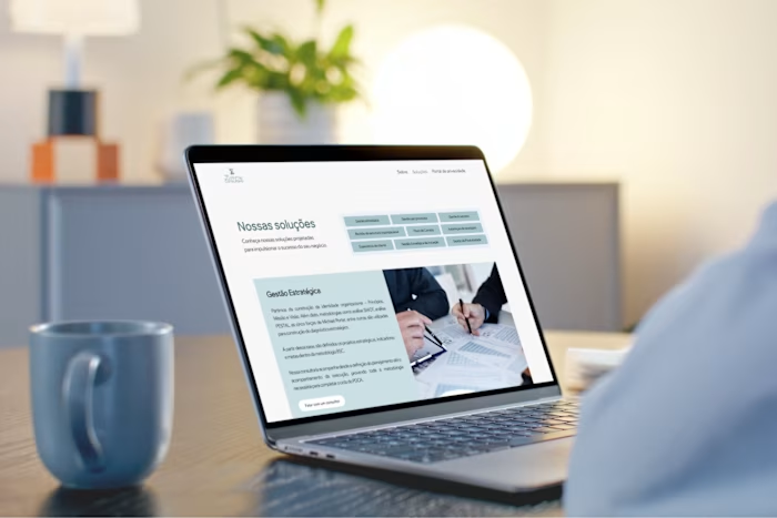
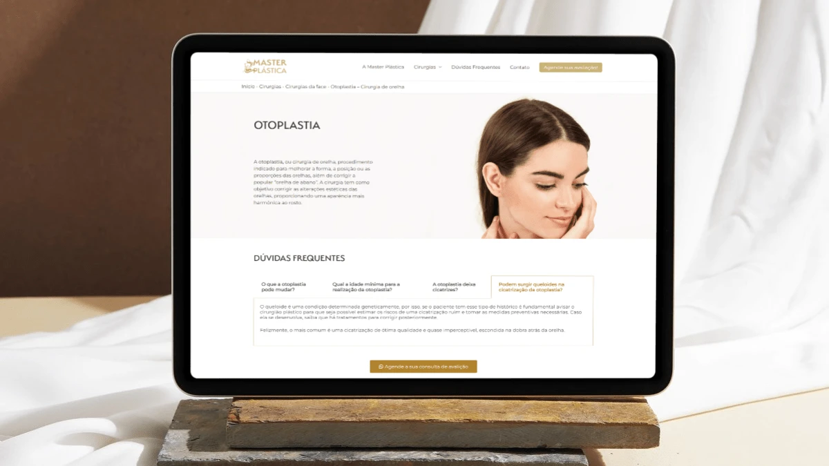
Site
Ready to create an identity that conveys your brand values and creates a connection with your consumers?
Let’s talk! 😊
Like this project
Posted Apr 8, 2025
Rebranding project of a plastic surgery company with the aim of modernizing and increasing the brand value