Tech Company | Brand Identity Development
Juliana Eisenhardt Escaleira
Branding construction
Naming
The name Redline IT was developed based on a direct insight from the company’s operations: the use of red cables (Redline) as a key element in their connectivity services.
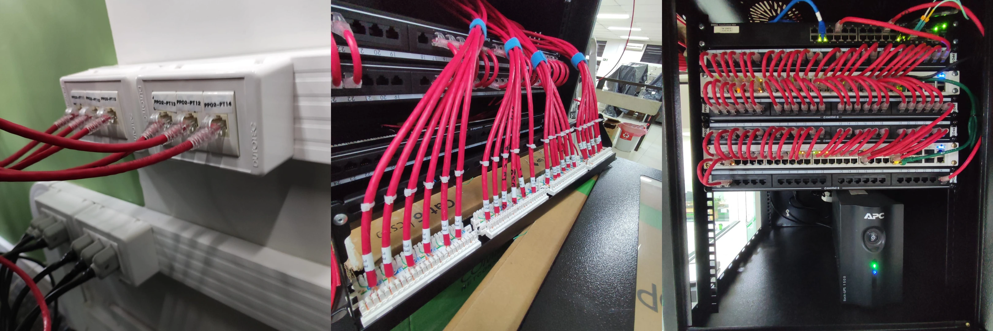
This cables symbolizes attributes such as speed, energy, and precision — all essential in the tech industry.
The addition of “IT” (Information Technology) clearly positions the brand within its market, ensuring immediate recognition by its target audience.
The combination of both terms results in a strong, technical, and visually striking name that accurately reflects the company’s core pillars: connectivity, innovation, and efficiency.
Graphic element
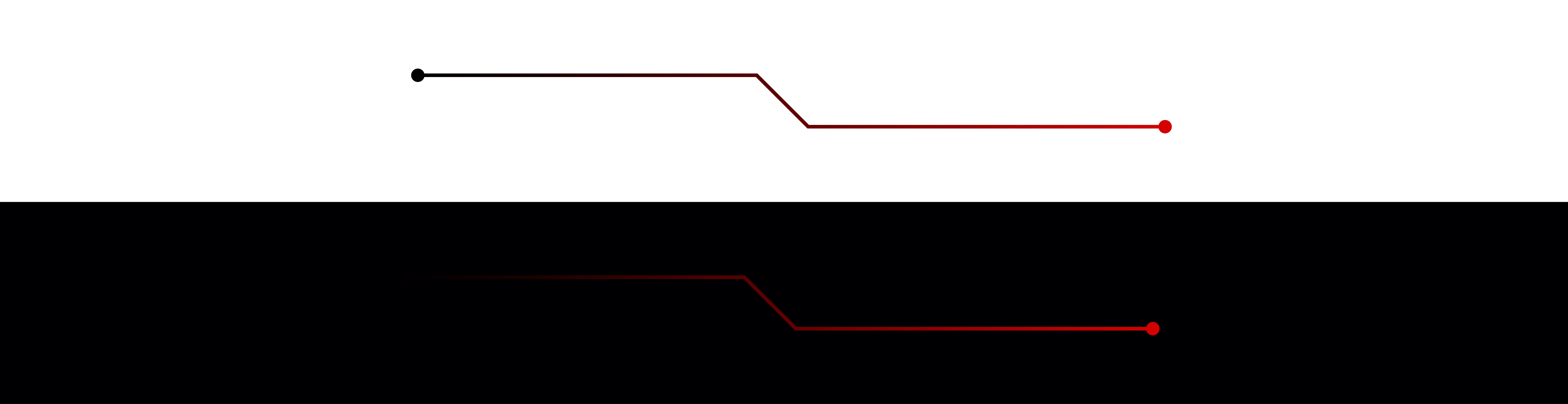
The graphic element consisting of straight lines connected by dots, characteristic of Redline IT's visual identity, transcends the decorative and assumes a practical function by highlighting concepts of movement and progression, fundamental in the technology industry. It is a visual marker of the company's agility and its readiness to adapt and lead in the face of rapid technological changes.
The consistent implementation of this graphic element, originating from the logo, across various platforms and media, aims to solidify a cohesive visual identity. This promotes an immediate sense of unity and facilitates brand recognition, ensuring a striking and integrated presence across all of the company's communication media.
Color palette
The brand identity uses the colors red, black and white to reflect its values and purpose.
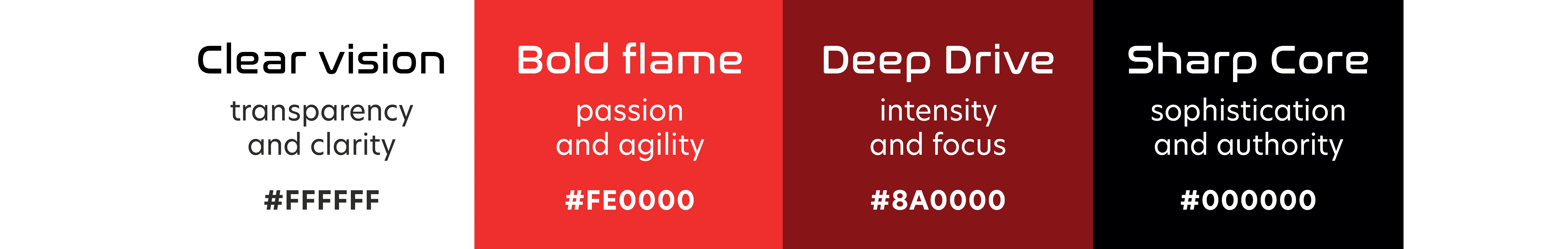
• Red symbolizes the brand's passion and energy, suggesting speed and efficiency.
• Black brings sophistication and professionalism, representing the seriousness and quality of the services offered.
• White offers a contrast that increases legibility, contributing to transparent and effective communication. This color combination creates a distinct visual identity, facilitating recognition and strengthening the brand's presence in the market.
Gradient
Gradients suggest movement and transition, which reflects the ever-evolving nature of technology and the company’s adaptability to new trends and market demands. This combination and smooth transition between colors not only creates an appealing aesthetic, but also helps to communicate a message about the brand: it is dynamic, modern, and constantly moving forward, just like the technology it represents.

Typography
The fonts selected for this brand reflect a combination of functionality and style, adapting to different aspects of the company’s visual communication.
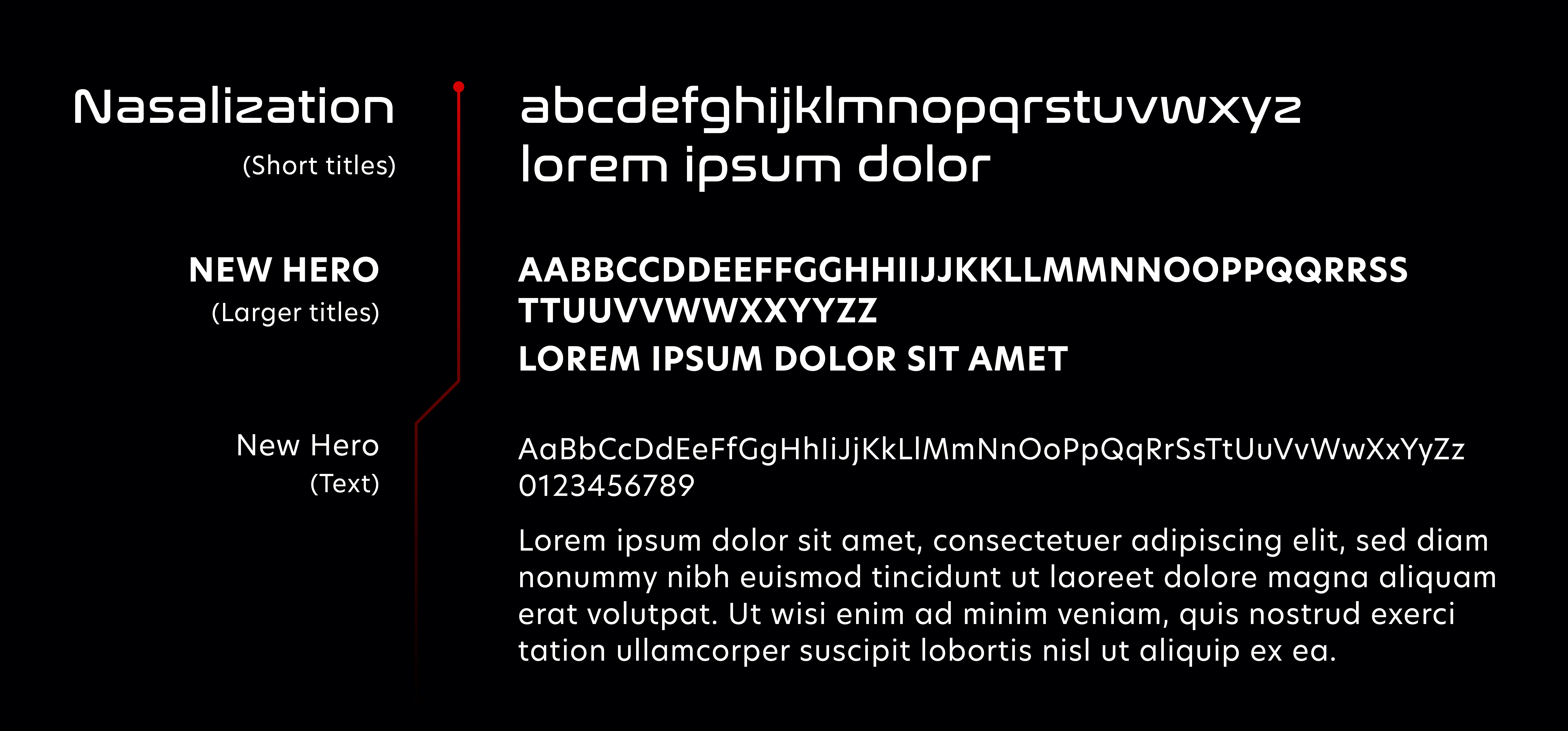
Nasalization Regular is a font with a technical and futuristic character, which resonates well with an innovative and technology-driven company. Its use for smaller headlines and short headlines suggests that it was chosen to grab attention and make an impactful statement, ensuring that important messages stand out without losing legibility.
Use: Smaller headlines and short headlines
On the other hand, “New Hero” is selected for both long text and larger headlines in all caps, offering versatility in its use. With clean lines and a modern shape, it provides a pleasant read for longer content and maintains a strong visual impact when used in large headlines. Its clarity and readability are key to keeping readers engaged, while the use of all caps for larger headlines adds a dose of authority and presence that can set the brand apart in a competitive landscape.
Use: Larger titles - in capital letters - or long texts
Logo construction
The creation of the Redline IT logo follows a strategic and technically refined approach, combining graphic and typographic elements to clearly and consistently communicate the brand’s values and industry.

Concept and Meaning
To visually express the “Redline” concept, a continuous graphic element was created to run through the logo, representing electronic circuits and hardware boards — key icons of the technology, IT, infrastructure, and automation sectors.
This line symbolizes connectivity and data flow, conveying performance, precision, and dynamism. At its ends, circular nodes represent connection points, inspired by printed circuit boards. These points reinforce the idea of beginning and end of processes, representing a complete and interconnected technological solution.
Visual Structure
Custom Typography
The typography was specially adapted to integrate organically with the red line graphic, resulting in a fluid and highly readable composition. A kerning of 30 pts was applied to ensure legibility and versatility across different formats and applications.
The color division also follows a semantic logic:
“red” in white,
“line” in red,
“it” again in white.
This strategy enhances readability and emphasizes the structure of the name, making it instantly understandable.
Colors and Gradients
The graphic line features perfectly aligned top and bottom gradients, creating a continuous visual flow that seamlessly connects to the gradient applied to the word “line.” This movement reinforces the concept of data in motion, while also communicating energy, modernity, and sophistication.
Grid and Alignment
The logo construction is based on a precise modular grid, ensuring:
Horizontal and vertical alignment of all characters;
Balanced proportions of x-height, ascenders, and descenders;
Harmonious spacing between typographic and graphic elements.
The red line integrates seamlessly into the grid, connecting its endpoints with precision and reinforcing the logo’s cohesive structure. Each endpoint was designed using a perfect circle inscribed within the grid’s spacing module, ensuring symmetry and visual consistency.
This logo is more than just a visual identity — it is an intelligent, technically grounded, and aesthetically impactful system that clearly communicates the world of Redline IT, positioning the brand with authority, innovation, and solidity in the technology sector.
Like this project
Posted May 28, 2025
Visual identity - including naming and logo - for a tech brand driven by speed, precision, and connectivity.
Likes
2
Views
18
Clients
redlineIT Technology Solutions