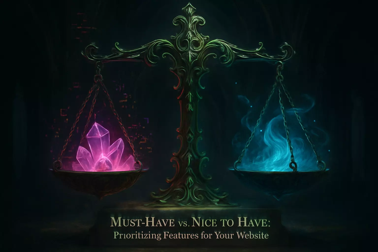
Must-Have vs. Nice-to-Have: Prioritizing Features for Your Website
Rebecca Person
Must-Have vs. Nice-to-Have: Prioritizing Features for Your WebsiteThe Core of Every Great Website: Universal Must-Have FeaturesMobile-Responsive DesignFast Loading SpeedClear Navigation and User-Friendly LayoutSecurity (SSL Certificate)Easy-to-Find Contact InformationA Framework for Prioritization: How to Choose Your FeaturesStart with Your Core Business GoalsThe MVP (Minimum Viable Product) ApproachThe MoSCoW Method (Must-have, Should-have, Could-have, Won't-have)Common 'Nice-to-Have' Features (That Can Often Wait for Phase 2)Advanced Search FunctionalityAn Integrated BlogCustomer Login PortalsComplex Animations and InteractionsBuilding a Phased Roadmap for Your Website's FutureYour Launch is Just the BeginningUsing Analytics to Guide Phase 2Communicating Your Roadmap to Your DesignerReferences
Must-Have vs. Nice-to-Have: Prioritizing Features for Your Website
When planning a new website, it's easy to create a long wishlist of exciting features. From chatbots and animations to social media feeds and complex calculators, the possibilities seem endless. However, trying to build everything at once is a surefire way to blow your budget and delay your launch. The key to a successful project is learning to distinguish between 'must-have' and 'nice-to-have' features.
This prioritization allows you to focus your resources on what truly delivers value to your users and your business from day one. Understanding your project timeline and working with a skilled web designer can help you make these critical decisions and build a strong foundation for your site.
The Core of Every Great Website: Universal Must-Have Features
Before diving into fancy features, let's talk about the basics. These are the non-negotiable elements that every website needs in 2025. Without them, you're basically building a house without a foundation.
Mobile-Responsive Design
Here's a reality check: more than half of all web traffic comes from mobile devices. If your site doesn't look good on a smartphone, you're essentially turning away half your visitors at the door.
Mobile-responsive design isn't just about making things smaller. It's about creating an experience that adapts seamlessly to any screen size. Your navigation needs to be thumb-friendly. Your text must be readable without zooming. Your buttons should be large enough to tap without accidentally hitting something else.
Google takes this seriously too. They've been using mobile-first indexing for years now. This means they primarily look at your mobile site when deciding where to rank you in search results. A site that isn't mobile-friendly? It's practically invisible in search.
Fast Loading Speed
Three seconds. That's all you've got.
Research shows that users expect pages to load in under three seconds. After that, they start leaving. And they leave fast. A one-second delay can reduce conversions by 7%. Think about that for a moment.
Speed isn't just about keeping visitors happy. It affects everything. Your bounce rate goes up when your site is slow. Your search rankings drop. Even your brand perception takes a hit. Nobody associates "slow" with "professional."
The good news? Basic speed optimization isn't rocket science. Compress your images. Choose reliable hosting. Minimize unnecessary code. These simple steps can shave seconds off your load time.
Clear Navigation and User-Friendly Layout
Ever walked into a store where you couldn't find anything? That's what poor navigation feels like on a website. Your visitors should know where they are and where they can go within seconds of landing on your site.
Good navigation starts with a clean menu. Stick to clear, descriptive labels. "Services" beats "What We Do" every time. Keep your main menu items to seven or fewer. Any more than that, and people get overwhelmed.
Your layout matters just as much. White space isn't wasted space – it helps users focus on what's important. Group related information together. Make your most important content easy to find. Remember, confused visitors don't become customers.
Security (SSL Certificate)
That little padlock in the browser bar? It's not optional anymore. An SSL certificate encrypts data between your website and your visitors. Without it, browsers display scary warnings that send visitors running.
Beyond scaring away customers, an unsecured site is a liability. Even if you're not handling payments directly, you're probably collecting email addresses through contact forms. That data needs protection. Plus, Google gives ranking boosts to secure sites. It's a small investment that pays off in trust and visibility.
Easy-to-Find Contact Information
This sounds obvious, but you'd be surprised how many websites hide their contact details. Your phone number, email, or contact form should be easy to find from any page. Many sites put this in the header or footer for good reason.
Don't make people hunt for ways to reach you. If someone's ready to contact you, that's a hot lead. Making them search through multiple pages just to find an email address? That's leaving money on the table.
A Framework for Prioritization: How to Choose Your Features
Now that we've covered the essentials, let's talk strategy. How do you decide what else to include when everything seems important?
Start with Your Core Business Goals
Every feature should serve a purpose. And that purpose should tie directly to your business goals.
Running an e-commerce site? A smooth checkout process beats a fancy about page every time. Building a site for lead generation? That contact form better be prominent and easy to use. Opening a restaurant? Your menu and hours matter more than a blog.
Write down your top three business goals for the website. Now look at each feature on your wishlist. Does it directly support one of those goals? If not, it might be a nice-to-have.
This approach keeps you focused. It's easy to get distracted by cool features you've seen elsewhere. But if they don't serve your specific goals, they're just expensive decorations.
The MVP (Minimum Viable Product) Approach
Here's a secret from the startup world: you don't need everything perfect on day one. In fact, trying to be perfect often means never launching at all.
The MVP approach means launching with just enough features to solve your users' main problem. Everything else can wait. This isn't about cutting corners. It's about being strategic.
Let's say you're a consultant launching a website. Your MVP might include a clear description of your services, some testimonials, and a way to book consultations. That blog you're planning? The resource library? The client portal? Those can all come in phase two.
Launching lean has huge advantages. You get to market faster. You start generating leads or sales sooner. Most importantly, you get real feedback from actual users. That feedback is gold. It tells you which nice-to-have features are actually worth building.
The MoSCoW Method (Must-have, Should-have, Could-have, Won't-have)
This framework makes prioritization crystal clear. Take your feature list and sort everything into four buckets:
Must-have: These features are critical. The site literally won't work without them. For an online store, this includes product pages and a shopping cart.
Should-have: Important features that significantly improve the experience but aren't absolutely critical for launch. Maybe that's a wishlist function or customer reviews.
Could-have: Nice additions that would enhance the site but won't make or break it. Think social media integration or a fancy image gallery.
Won't-have: Features that are out of scope for now. Be honest about what you won't include in this phase. It helps manage expectations and budget.
This method forces tough decisions. But that's exactly what you need. Clear priorities prevent scope creep and keep your project on track.
Common 'Nice-to-Have' Features (That Can Often Wait for Phase 2)
Let's get specific about features that often end up on wishlists but rarely need to be there on day one.
Advanced Search Functionality
Basic search? Often helpful. Complex filtering with multiple parameters? That's usually overkill for a new site.
Advanced search makes sense when you have hundreds of products or articles. But if you're launching with 20 products or 10 service pages, visitors can browse just fine. Your navigation and categories should handle the job initially.
Save the development time and budget. Launch with solid navigation and clear categories. Add fancy search features once you have enough content to justify them. You'll also have user data by then to show you exactly what search features people actually want.
An Integrated Blog
Blogs are great for SEO and establishing expertise. But here's the thing: an abandoned blog looks worse than no blog at all.
If you're not ready to commit to regular posting, skip the blog at launch. A simple, professional site beats a site with a blog showing "Coming Soon" or posts from six months ago. You can always add a blog later when you have the time and content strategy to maintain it.
Focus on getting your core pages perfect first. Your services, about page, and contact information will do more for your business initially than a half-hearted blog.
Customer Login Portals
Unless your business model requires user accounts, this feature can wait. Login systems add complexity, security concerns, and development time.
Think about it: does a local bakery need customer accounts? Does a freelance designer? Probably not. Even many service businesses can handle everything through email initially.
Save the login portal for when you have a clear need. Maybe that's when you want to offer exclusive content, track order history, or provide personalized experiences. By then, you'll understand exactly what features your portal needs based on real customer feedback.
Complex Animations and Interactions
Fancy animations can look impressive in demos. But they often slow down your site and distract from your message. Worse, they can break on different devices or browsers.
Simple, clean design usually wins. A fast-loading site with clear information beats a slow site with spinning graphics every time. Your visitors came for information or to complete a task. Help them do that quickly.
This doesn't mean your site should be boring. Good typography, quality images, and thoughtful use of color create visual interest without the technical overhead. Save the complex interactions for when you have the budget to do them really well.
Building a Phased Roadmap for Your Website's Future
Thinking of your website as a one-time project is a mistake. The best websites evolve continuously based on user needs and business growth.
Your Launch is Just the Beginning
Shift your mindset from launching the "perfect" website to launching a solid foundation you can build on. Version 1.0 doesn't need every feature you'll ever want. It needs to work well and serve its core purpose.
This approach takes the pressure off. You don't have to predict every future need. You don't have to build features "just in case." You can focus on doing a few things really well, then expand based on real-world use.
Think of successful websites you use regularly. They didn't launch with every current feature. Amazon started selling books. Facebook was just for college students. They evolved based on user needs and opportunities. Your site can too.
Using Analytics to Guide Phase 2
Here's where launching lean really pays off. Once your site is live, you get actual data about how people use it. This data is incredibly valuable for planning phase two.
Maybe you thought people would love your product comparison tool, but analytics shows nobody uses it. Meanwhile, your contact form gets tons of traffic, but people abandon it halfway through. That tells you where to focus next.
Set up Google Analytics from day one. Watch which pages get the most traffic. See where people drop off. Track which buttons they click. After a few months, you'll have clear insights about which nice-to-have features would actually add value.
User feedback matters too. Pay attention to questions you get repeatedly. If five customers ask about gift cards, that feature just moved up your priority list. Real user needs beat assumptions every time.
Communicating Your Roadmap to Your Designer
Your web designer isn't just building your current site. They're laying the groundwork for its future. Share your full vision, including the features you're postponing.
A good designer will build with expansion in mind. They'll choose systems and structures that can accommodate future features without major rebuilds. They might suggest ways to make future additions easier or more cost-effective.
Be clear about your phases. "We want to launch with basic e-commerce, then add subscriptions in six months" gives your designer crucial context. They can make technical decisions now that will save you time and money later.
Keep the conversation going after launch too. Regular check-ins about performance and future plans help ensure your site grows strategically, not haphazardly.
Remember, the goal isn't to build everything at once. It's to build the right things at the right time. Start with must-haves that serve your core business goals. Launch clean and fast. Then use real data and feedback to guide your growth.
Your website is a tool for your business. Like any tool, it should be fit for purpose. A simple hammer that works beats a Swiss Army knife with broken parts. Focus on what matters most, execute it well, and build from there. That's how you create a website that truly serves your business and your users.
References
Like this project
Posted Jun 30, 2025
Feeling overwhelmed by feature requests? Learn how to prioritize what's essential for your website launch versus what can wait. Focus your budget and efforts on what truly matters.