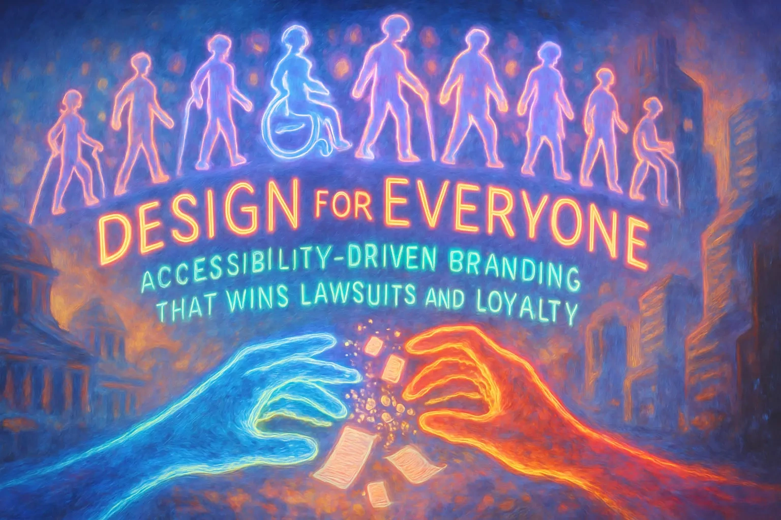
Design for Everyone: Accessibility-Driven Branding That Wins Lawsuits and Loyalty
Rebecca Person
Design for Everyone: Accessibility-Driven Branding That Wins Lawsuits and LoyaltyThe 'Why' of Accessible Branding: More Than Just ComplianceThe Legal Landscape: Avoiding Costly LawsuitsThe Business Case: Reaching a Larger, Untapped MarketThe Loyalty Factor: Why Inclusive Design Builds Super-FansCore Pillars of an Accessible Brand IdentityColor and Contrast: The Foundation of LegibilityTypography and Readability: Choosing and Setting Type for AllIconography and Imagery: Communicating Clearly Without WordsThe Freelancer's Role in Championing AccessibilityEducating Your Clients on the Importance of InclusivityConducting an Accessibility Audit as a Value-Added ServiceBuilding Accessibility into Your Workflow from Day OneSolving for One, Extending to ManyReferences
Design for Everyone: Accessibility-Driven Branding That Wins Lawsuits and Loyalty
Is your brand unintentionally excluding millions of potential customers? Accessibility in design is no longer optional; it's a legal and ethical imperative that also happens to be great for business. This article explains how to build a brand identity from the ground up with inclusivity at its core. This approach of creating a better experience for everyone aligns perfectly with the goals of Green Brands, which aim for a better planet. The next frontier of inclusivity will be designing for virtual spaces, a challenge we tackle in our guide, Into the Metaverse. To build these robust, inclusive systems, companies hire brand designers who prioritize accessibility.
Think about the last time you squinted at tiny text on a website. Or struggled to tap a button on your phone while walking. These everyday frustrations give us a glimpse into what millions of people with disabilities face constantly. When brands ignore accessibility, they're not just breaking laws—they're leaving money on the table and missing the chance to build genuine connections with customers.
The 'Why' of Accessible Branding: More Than Just Compliance
Let's get real for a second. Most businesses think about accessibility only when someone mentions lawsuits. But that's like buying car insurance after you've already crashed. Smart brands understand that accessible design isn't just about avoiding problems—it's about creating opportunities.
The truth is, accessible branding makes good business sense. It opens doors to new customers, builds fierce loyalty, and yes, keeps lawyers happy too. But more importantly, it's simply the right thing to do.
The Legal Landscape: Avoiding Costly Lawsuits
Here's something that might keep you up at night: accessibility lawsuits are skyrocketing. In 2023 alone, thousands of businesses faced legal action for having inaccessible websites and digital properties. The Americans with Disabilities Act (ADA) isn't just for physical spaces anymore—courts have made it clear that digital accessibility matters too.
The Web Content Accessibility Guidelines (WCAG) set the standard for what makes a website accessible. Think of WCAG as your safety net. Meeting these standards isn't just about checking boxes; it's about protecting your business from costly legal battles that can drain resources and damage your reputation.
But here's the kicker: most accessibility lawsuits are completely preventable. A few smart design decisions upfront can save you from six-figure settlements down the road. That's not fear-mongering—that's just good risk management.
The Business Case: Reaching a Larger, Untapped Market
Let me hit you with some numbers that might surprise you. Over one billion people worldwide live with some form of disability. In the US alone, that's about 61 million adults. That's not a niche market—that's a massive opportunity most brands completely ignore.
People with disabilities control over $13 trillion in annual disposable income globally. Yet most brands act like this market doesn't exist. They create beautiful designs that look great in portfolios but fail miserably when real people try to use them.
Here's what's even more interesting: when you design for accessibility, you often improve the experience for everyone. That high-contrast text that helps someone with low vision? It also helps someone checking their phone in bright sunlight. Those clear, simple navigation labels? They help everyone find what they need faster.
The Loyalty Factor: Why Inclusive Design Builds Super-Fans
Want to know a secret about building brand loyalty? People remember how you make them feel. When someone with a disability visits your website and everything just works, that's not just a good user experience—that's a moment of recognition and respect.
I've seen firsthand how inclusive brands create passionate advocates. These aren't just customers; they're people who will tell everyone they know about your brand. They'll defend you on social media. They'll choose you over competitors even if you cost more.
Why? Because you saw them. You considered their needs. You didn't treat accessibility as an afterthought or a burden. You built it into your brand's DNA. That kind of thoughtfulness creates emotional connections that transcend typical brand-customer relationships.
Core Pillars of an Accessible Brand Identity
Now that we understand why accessibility matters, let's dive into the how. Building an accessible brand identity isn't rocket science, but it does require intention and knowledge. The good news? Once you understand these core principles, they become second nature.
These pillars form the foundation of any inclusive brand system. Master these, and you'll create designs that work beautifully for everyone.
Color and Contrast: The Foundation of Legibility
Color is probably the first thing people notice about your brand. But here's what many designers miss: if your colors don't have enough contrast, a huge chunk of your audience literally can't read your content.
The WCAG provides specific contrast ratios that ensure text remains readable for people with various vision conditions. For normal text, you need a contrast ratio of at least 4.5:1 against the background. For large text, 3:1 is the minimum. Want to go above and beyond? Aim for AAA compliance with 7:1 for normal text.
But don't panic—you don't need to do the math yourself. Tools like WebAIM's contrast checker or the Stark plugin for design software make it easy to test your color combinations. I use these tools constantly, and they've saved me from countless accessibility issues.
Here's a pro tip: build your color palette with accessibility in mind from the start. Choose primary colors that naturally have good contrast with white or black backgrounds. Then create variations that maintain accessibility across different use cases. This approach is much easier than trying to fix contrast issues after the fact.
Typography and Readability: Choosing and Setting Type for All
Typography might seem straightforward, but it's where many brands stumble. The fanciest typeface in the world means nothing if people can't read it comfortably.
Start with font selection. Look for typefaces with clear, distinct letterforms. Avoid fonts where similar letters (like 'I', 'l', and '1') look identical. Sans-serif fonts generally work better for body text on screens, though well-designed serifs can work too. The key is clarity over cleverness.
Font size matters more than you think. Body text should be at least 16 pixels on web—and honestly, 18 pixels is even better. Yes, that might seem large if you're used to tiny type, but remember: we're designing for everyone, including people who might be reading on small screens or from a distance.
Line height and line length affect readability too. Aim for line heights of 1.5 times your font size or more. Keep line lengths between 45-75 characters for optimal reading flow. These aren't arbitrary rules—they're based on how our eyes and brains process text most efficiently.
Iconography and Imagery: Communicating Clearly Without Words
Icons seem simple, right? Just pick something from a library and you're done. Not quite. Accessible iconography requires thoughtful consideration of how different people interpret visual symbols.
The best icons are universally understood. A house for 'home', an envelope for 'email', a shopping cart for... well, shopping. When you get creative with icons, you risk confusing users who rely on clear visual communication. Save the artistic expression for other brand elements.
But here's the crucial part many designers miss: every meaningful image needs alt text. This isn't just for photos—it's for icons, infographics, charts, and any visual element that conveys information. Screen reader users depend on alt text to understand what sighted users see instantly.
Writing good alt text is an art. Be descriptive but concise. Focus on the image's purpose, not just its appearance. For a photo of your team, don't write "image of people." Write "Our diverse team of five designers collaborating around a conference table." See the difference?
The Freelancer's Role in Championing Accessibility
As a freelance designer, you have more power than you might realize. You're not just creating pretty pictures—you're shaping how brands connect with people. That comes with responsibility, but also incredible opportunity.
Clients often don't know what they don't know about accessibility. They hire you for your expertise, and that expertise should include inclusive design. Here's how to position yourself as an accessibility champion while growing your business.
Educating Your Clients on the Importance of Inclusivity
Most clients care about three things: making money, saving money, and avoiding problems. Lucky for us, accessibility hits all three.
When talking to clients, lead with benefits, not obligations. Instead of "You need to be WCAG compliant," try "An accessible brand can reach 20% more customers while reducing legal risk." See how that shifts the conversation from compliance to opportunity?
Share specific examples relevant to their industry. If they're in e-commerce, mention that 71% of customers with disabilities will leave a website that's difficult to use. That's lost revenue they can actually picture. If they're B2B, explain how accessibility demonstrates professionalism and attention to detail—qualities their clients value.
I keep a simple one-page PDF with accessibility stats and benefits. It's not preachy or technical—just clear facts about market size, legal trends, and competitive advantages. Clients love concrete information they can share with their teams.
Conducting an Accessibility Audit as a Value-Added Service
Want to stand out from other designers? Offer a basic accessibility audit as part of your discovery process. This positions you as a strategic partner, not just a pixel pusher.
The audit doesn't need to be exhaustive. Focus on the big issues: color contrast, font sizes, alt text, and basic navigation. Use free tools like WAVE or axe DevTools to identify problems quickly. Document your findings with screenshots and specific recommendations.
Present the audit as an opportunity, not a criticism. Frame it as "Here's how we can improve your brand's reach and user experience" rather than "Here's everything you're doing wrong." This positive approach opens doors to larger projects and ongoing relationships.
Many of my best projects started with a simple audit. Clients appreciate the proactive approach and often expand the scope once they understand the value of accessible design.
Building Accessibility into Your Workflow from Day One
The secret to sustainable accessible design? Make it part of your standard process, not an add-on service. This might seem like more work initially, but it actually saves time and prevents costly revisions.
Start with your design tools. Set up color palettes that include contrast ratios. Create type scales that meet size requirements. Build component libraries with accessibility baked in. These upfront investments pay dividends on every project.
Include accessibility checkpoints at each project phase. During mood boards, ensure proposed colors meet contrast standards. In wireframes, plan for clear navigation and content hierarchy. Before final delivery, run everything through accessibility validators.
Document accessibility decisions in your style guides. Don't just say "Use blue for links." Specify "Links use Blue 600 (#0066CC) which maintains 4.5:1 contrast on white backgrounds." This level of detail helps clients maintain accessibility long after your project ends.
Solving for One, Extending to Many
Here's the beautiful thing about accessible design: when you solve problems for people with permanent disabilities, you create better experiences for everyone. This isn't feel-good rhetoric—it's proven design methodology that the world's best brands embrace.
Think about curb cuts—those ramps at street corners originally designed for wheelchair users. Today, parents with strollers use them. Delivery workers with hand trucks use them. Travelers pulling luggage use them. Even skateboarders use them. What started as an accommodation became a universal improvement.
The same principle applies to digital design. Captions designed for deaf users help people watching videos in noisy environments or quiet offices. Voice controls created for people with motor disabilities benefit drivers and multitaskers. High contrast designs that aid low vision users help everyone using devices in bright sunlight.
This is called the "curb cut effect," and it's powerful. Every accessibility feature you implement has ripple effects you might not anticipate. That clear, simple navigation helps users with cognitive disabilities—but also benefits anyone in a hurry or using an unfamiliar device.
I once worked with a client who resisted making their app more accessible, worried it would look "boring." We redesigned with accessibility principles, and something interesting happened. User engagement went up across the board. Support tickets went down. Sales increased. Turns out, when you make things easier for some, you make things better for all.
The future of branding isn't about choosing between beauty and accessibility. It's about recognizing that true beauty comes from designs that welcome everyone. When you embrace this mindset, you don't just avoid lawsuits or tap new markets—you create brands that genuinely matter to people.
So next time you sit down to design, ask yourself: Who might I be excluding? How can I open this door wider? The answers to these questions won't limit your creativity. They'll expand it in ways you never imagined.
Because at the end of the day, great design isn't about impressing other designers. It's about connecting with humans—all humans. And that's a brief worth pursuing.
References
Like this project
Posted Jun 19, 2025
Accessibility is not just a feature, it's a necessity. Learn how to build inclusive brand identities that are legally compliant and create deep customer loyalty.