Great Falls Travel | Brand design + landing page + copy
Great Falls Travel is a multi-day, educational group tour operator that curates curriculum inspired tours for students and educators.
Challenge 🔴
Come up with a tagline that communicates the brand USP at a glance
Create a text-based logo (I ended up convincing the client an icon would be best through a compelling case and sheer audacity)
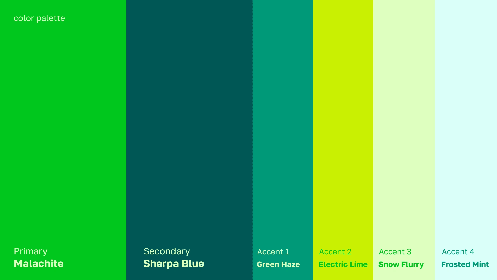
Create a brand identity that is friendly, vibrant and minimal
Bring it to life in a new landing page with a simple UX for conversion rate optimization
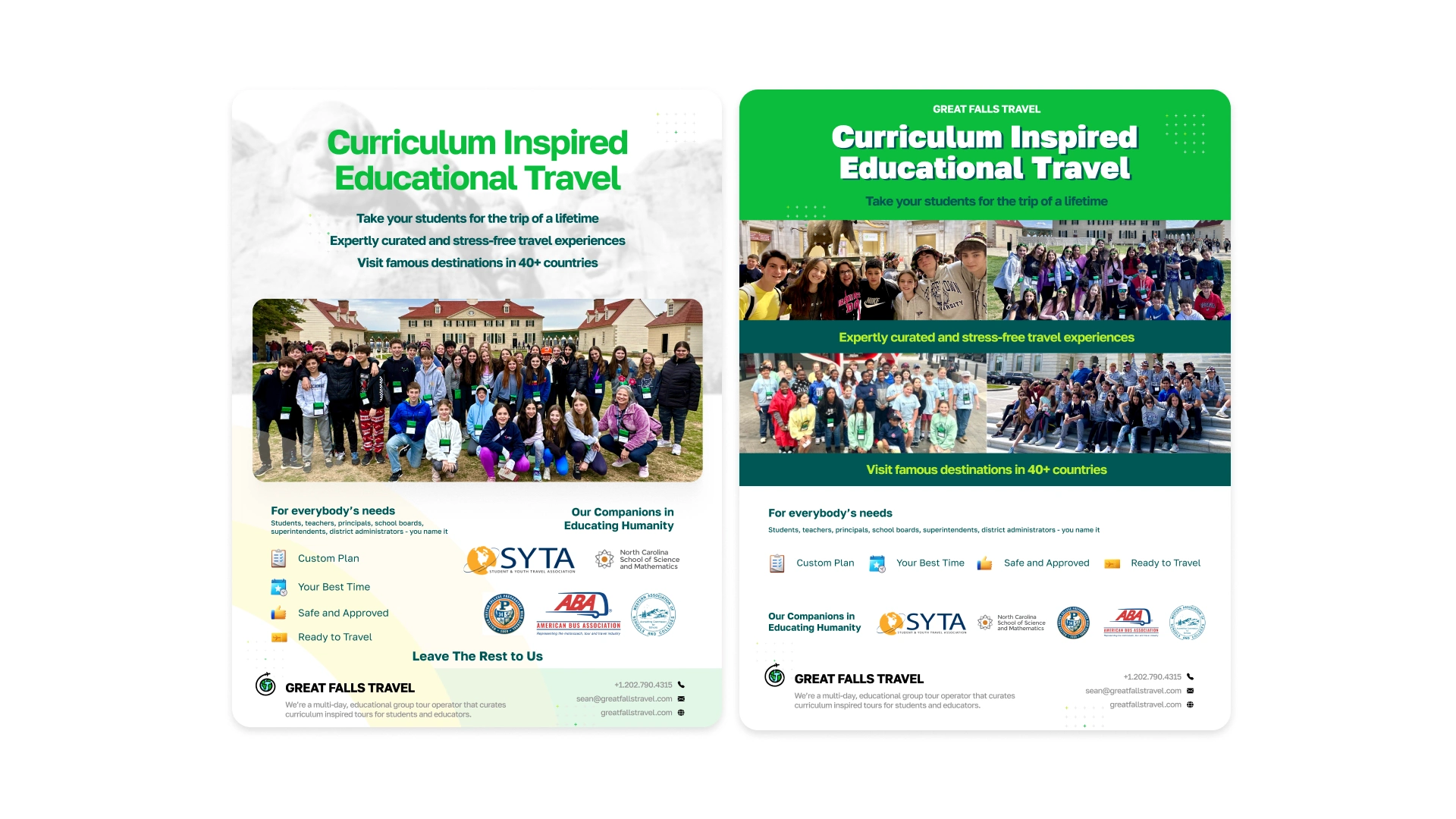
Design a one-pager for events and out-of-home marketing.
My Role 🟢
Understanding what the client actually liked and wanted
Researching and making multiple logos till one clicked
Building a visual identity system around the final logo
Trying out 3 different no-code tools and settling with Typedream for the landing page
Designing the landing page for a smooth user experience
Creating a one-pager that was simple enough for anyone to understand
Round 1
Client mentioned he liked serif typefaces. But I'm extra so I made 2 options. First attempt at the tagline = brain fart.
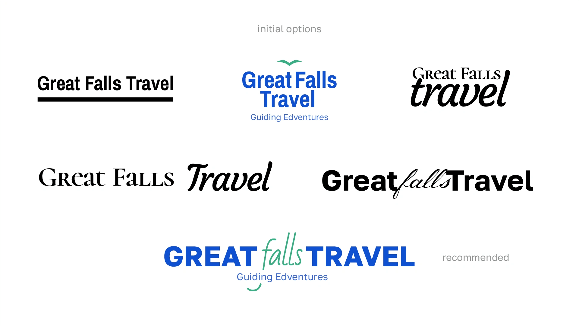
I recommended the last one because at first glance, the words "Great Travel" stand out. Competitors could never.
Round 2
Client liked the initial options but wanted some more + another color palette because a competitor really used the crap out of them already. I mean, the education industry really has a chokehold on blues and greens. What's up with that?
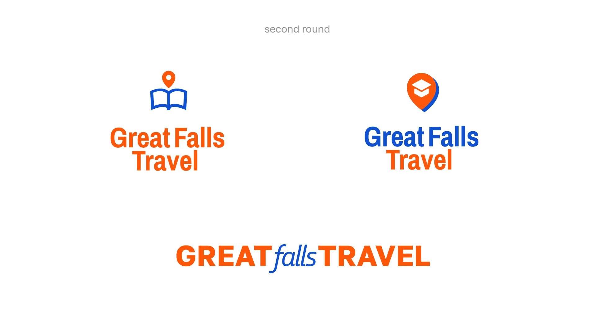
Frankly, I thought this round was crap.
Round 3
Client (obviously) wanted more options. Second attempt at the tagline was based on hours of research. A bit long, but the target audience would eat it up like licorice.
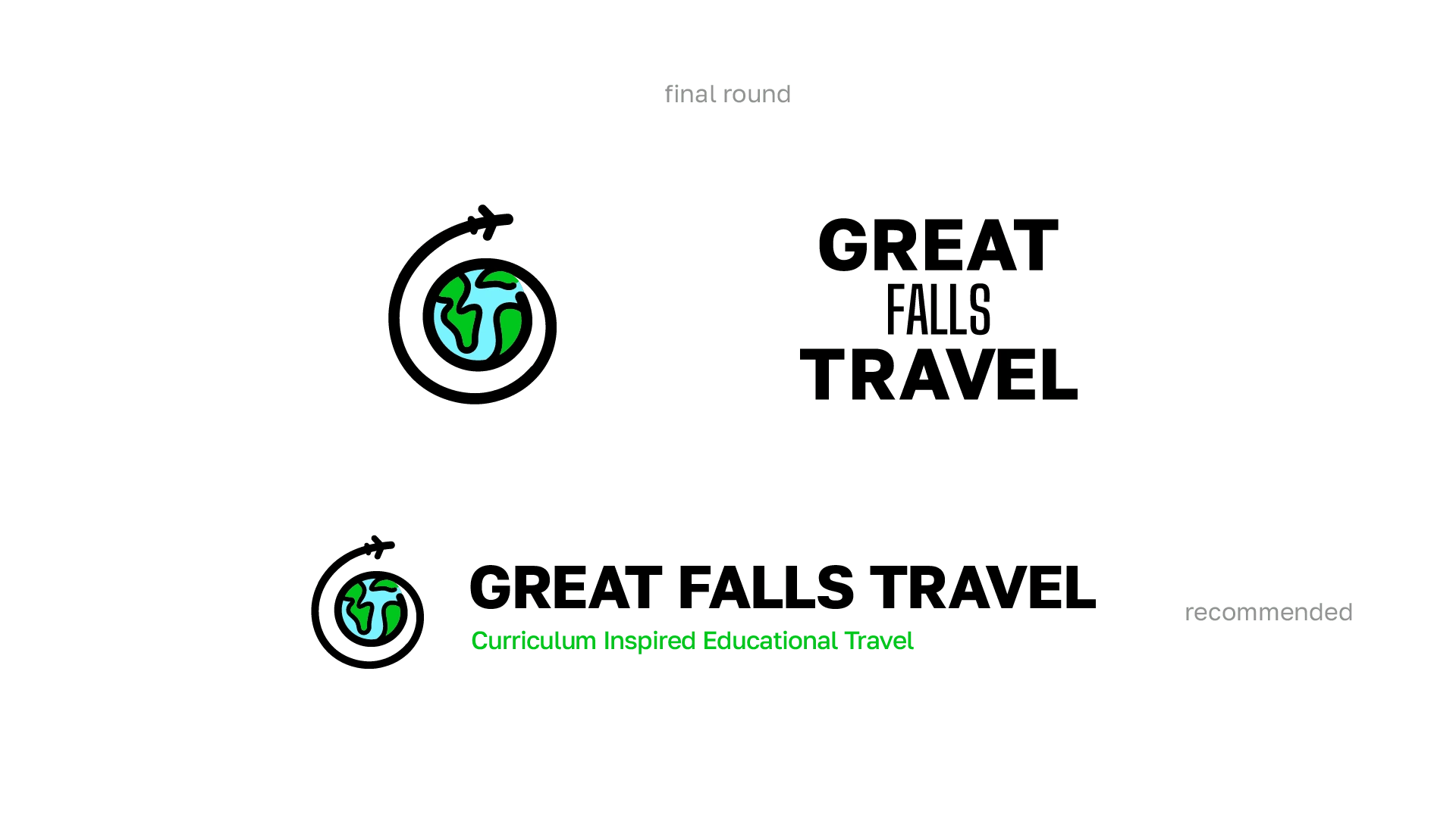
Full disclosure: Found this illustration on Freepik. It fit perfectly. Unrelated, but have you read anything by Austin Kleon?
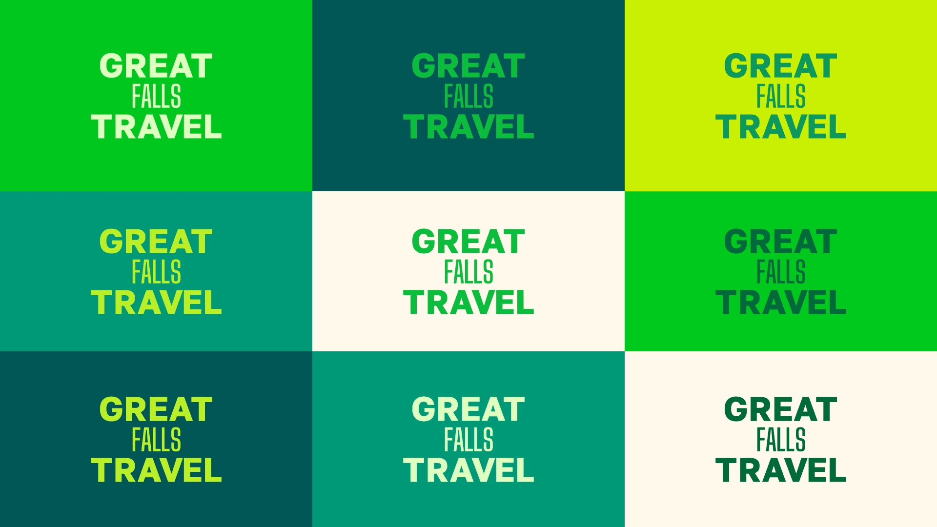
Client decided to use all of these.
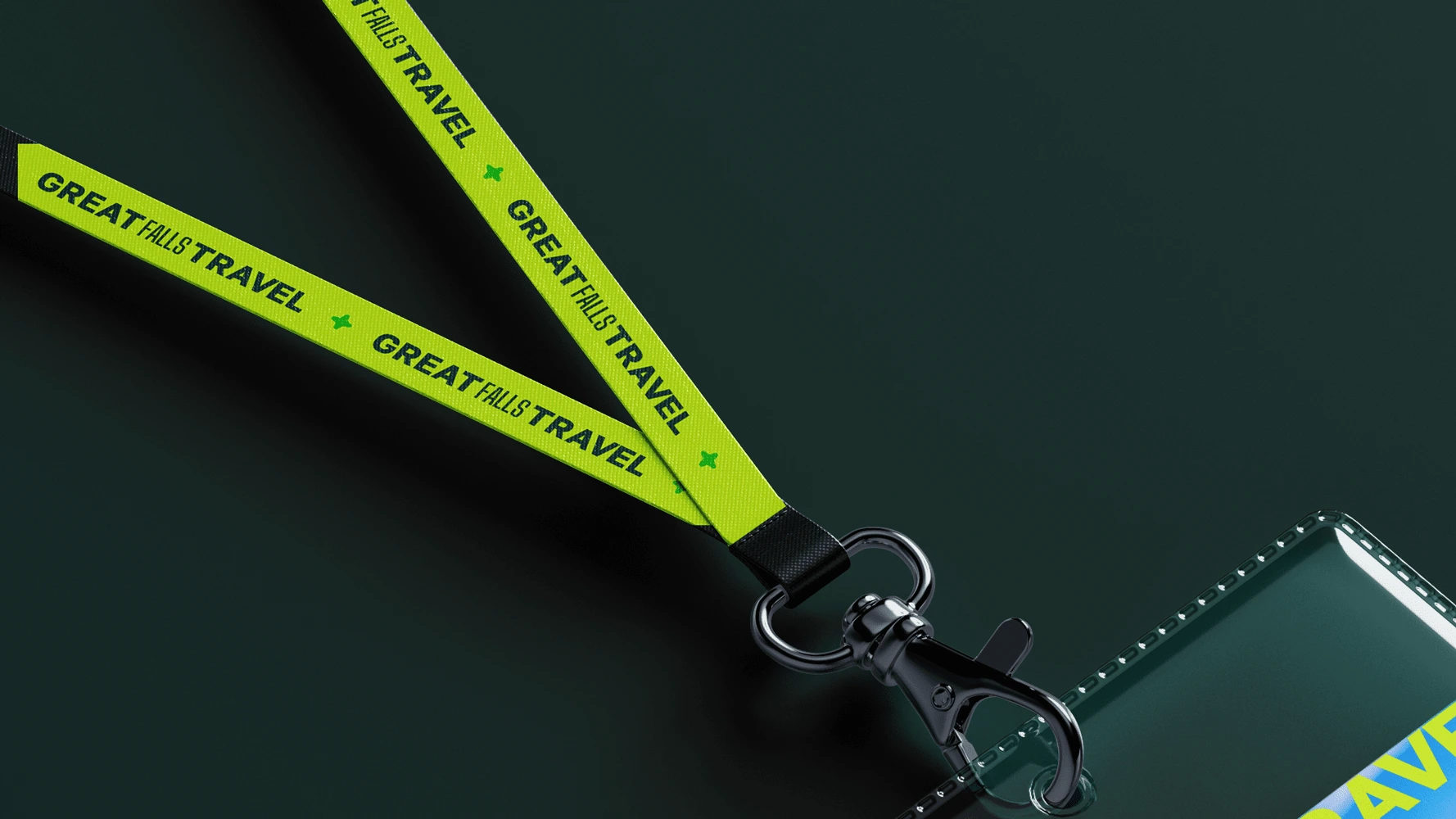
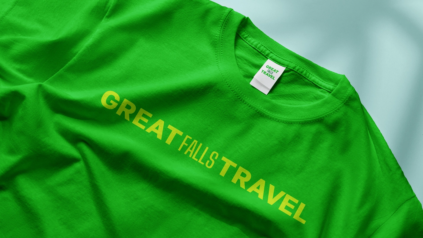
Single-page flyers
Landing page design
Conversion-optimized landing page made in Typedream, ready to go live in < 2 hrs.
🤑 👉 View it here 👈 🤑
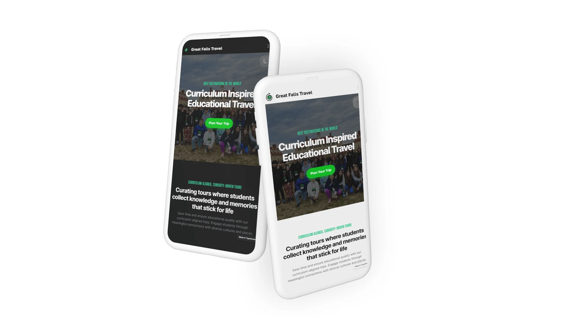
This is an ever-evolving project. Check back for more.
If your brand looks bad, you look bad.
Change that today. Schedule a free 15-30 minute strategy call with me through Calendly. 🏃♂️
Like this project
Posted Jul 16, 2024
Did not back down when a client was making a bad decision. Delivered more than asked. Stole a design.
Likes
0
Views
34
