Multi-Brand, Multi-Theme Component Library
Pavle Golubovic
In partnership with Profit Optics, we have built a robust Component Library for use as a Starter template for all of their new projects. With close work with developers and scalability in mind, we were able to create a working framework with UI developed in isolation with Storybook and Figma document that supports multiple brands and multiple themes per brand.
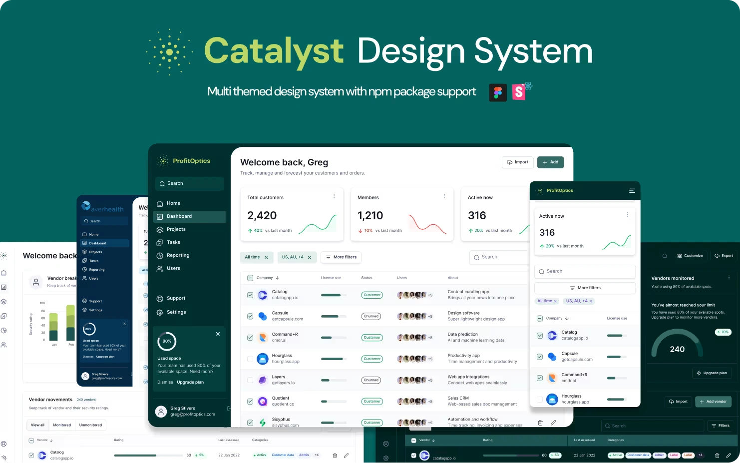
Catalyst Design System
My Role
System Design
Design System
UI/UX Design
Prototyping
Developer Handoff
The Challenge
Scalability was the biggest concern here, as we were instructed to think of this as a starter template for a project, where there will always be different branding and different number of themes withing the brands. White-labeling was needed as well as template pages for showcase purposes.
The Results
With the help of Figma’s variable modes, we were able to scale to the appropriate needs of the Management, making it possible to implement multiple client brands and keeping the design consistent.
Planning and Architecture
First things first, we had to accommodate the system to ensure it can support new brand properties in a way it doesn’t disrupt our workflow in the future.
Using Figma’s native variables, and carefully orchestrating them, we were able to change themes across the board with just a click!
At first, we had to support a basic Theme, with light and dark variants, and also another client Averhealth with light and dark theme also.
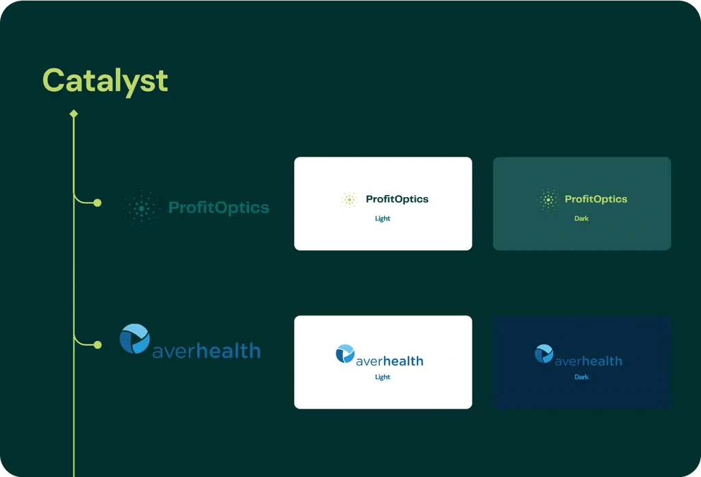
Architecture of Catalyst
Tokens
So with a lot of brainstorming, we decided that Figma variables will carry the bulk of the logic in theme switching, our job was to carefully create them and ensure clear communication with development on any changes to the variables.
We are using a component based token system ( Primitives -> Semantic Tokens -> Component Tokens )
While this requires a lot o pre-work in creating a brand new component, this has proven to be infinitely scalable and worked wounders for us.
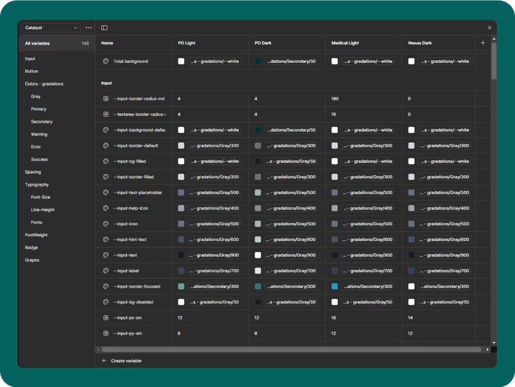
Tokens Library
Basic Components
As any design system, we had to include the basic UI components that follow the latest trends and best practices in UX, but for we went far and beyond and included different variants of charts.
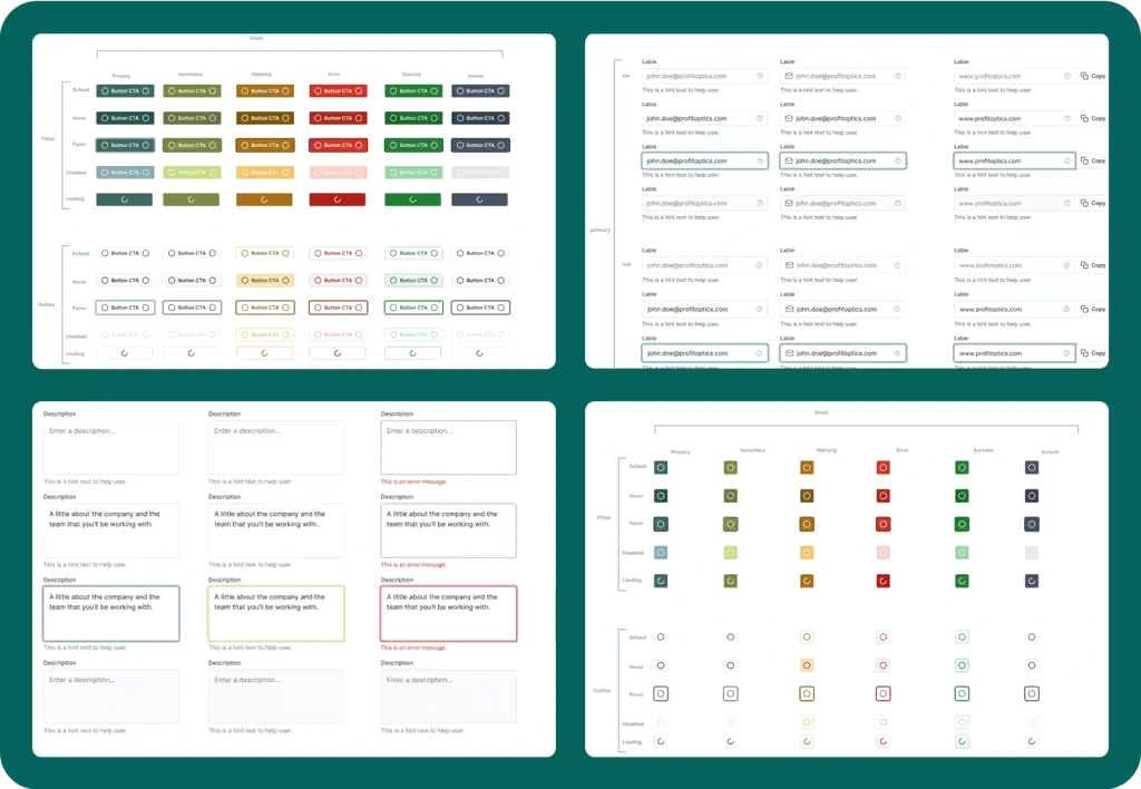
Some Basic Components
Templates
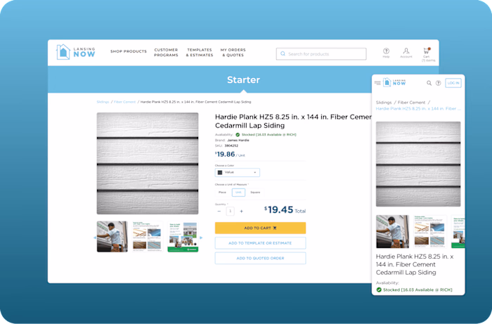
The plan was to create some Dashboard templates for sales purposes, showing how our white-label solution works, but also real use case screens for Averhealth at this time.
We took inspiration from viral UI designs for the sales part of the templates, and we worked closely with Averhealth’s PO for creating pages for specific Averhealth use case.
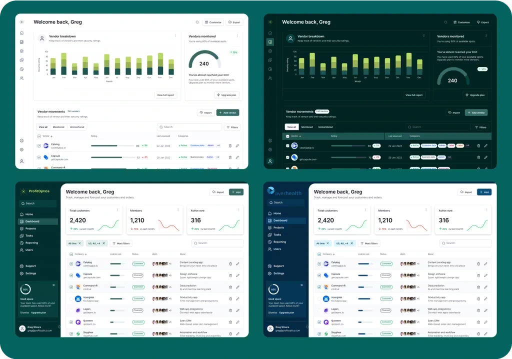
Showcase of different Page templates and different Branding on templates
Conclusion
After we had completed the MVP and after Figma components were reflected in Storybook and a component library package was created, the solution was put in alpha testing for Averhealth’s solution. We are having daily meetings with them to ensure smooth user experience and we are working on enhancing our system while still thinking on scaling for future clients.
Like this project
Posted Dec 21, 2024
In partnership with Profit Optics, we have built a robust Component Library for use as a Starter template for all of their new projects.
Likes
0
Views
17
Clients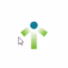
Profitoptics