Built with Lummi
Bluestout Website Redesign
Peter umeh
Bluestout Website Redesign Case Study Presentation
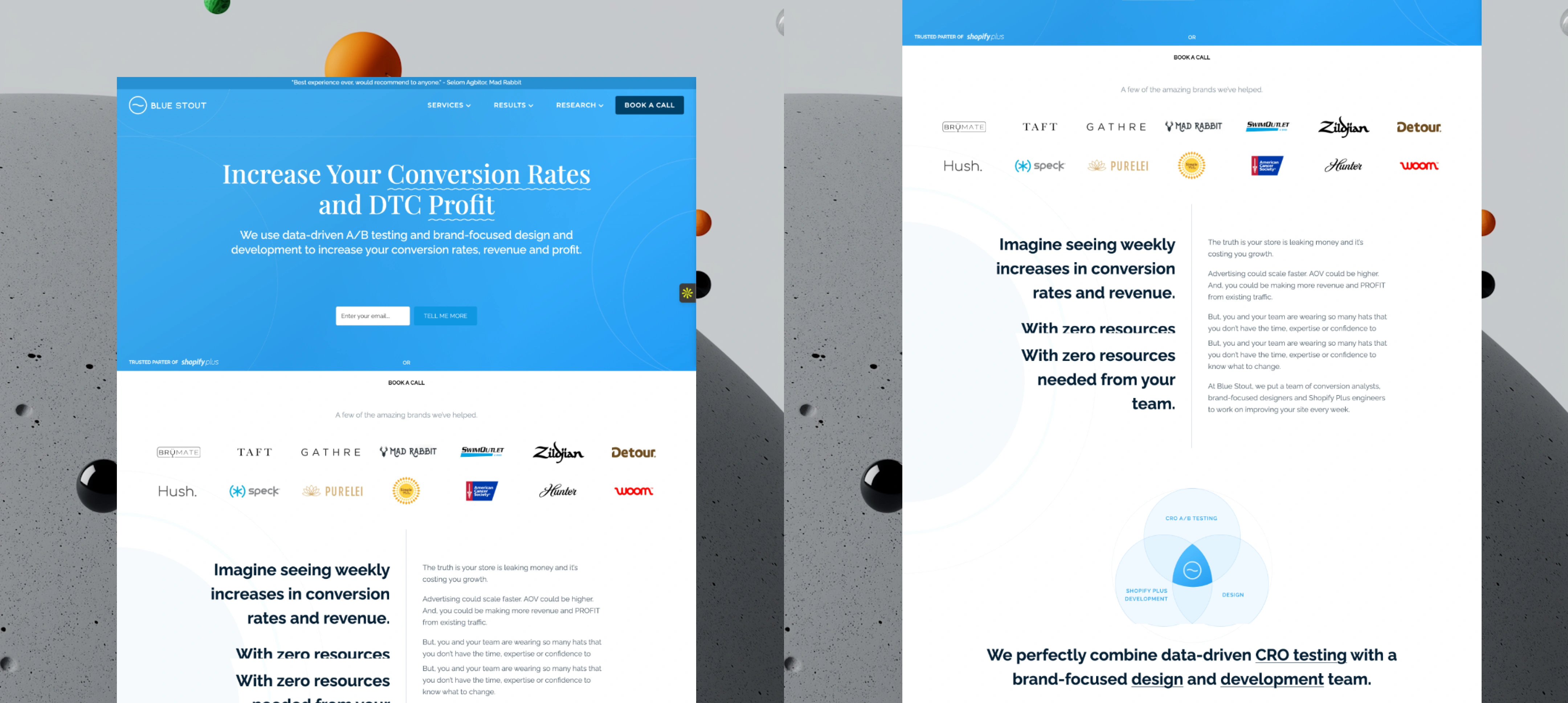
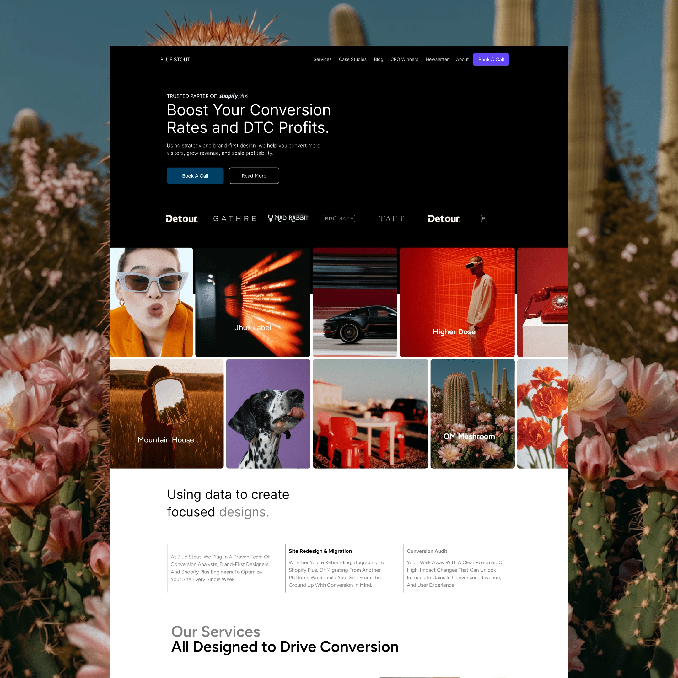
The old Blue Stout website
Why we needed to redesign.
Original site lacked visual hierarchy and emotional pull.
Case studies and services were buried, reducing conversion opportunities.
No clear differentiation between Bluestout and competitors.
Limited emphasis on social proof and brand legacy.
The logo's in this area are animated and slide beautifully from left to right.
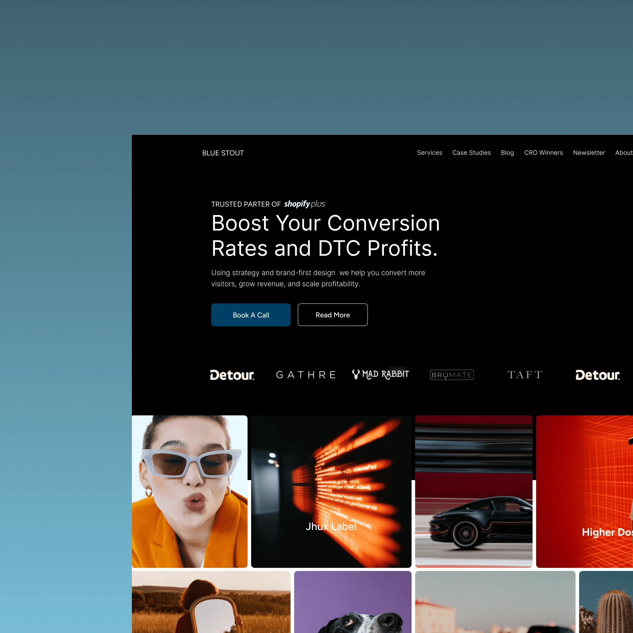
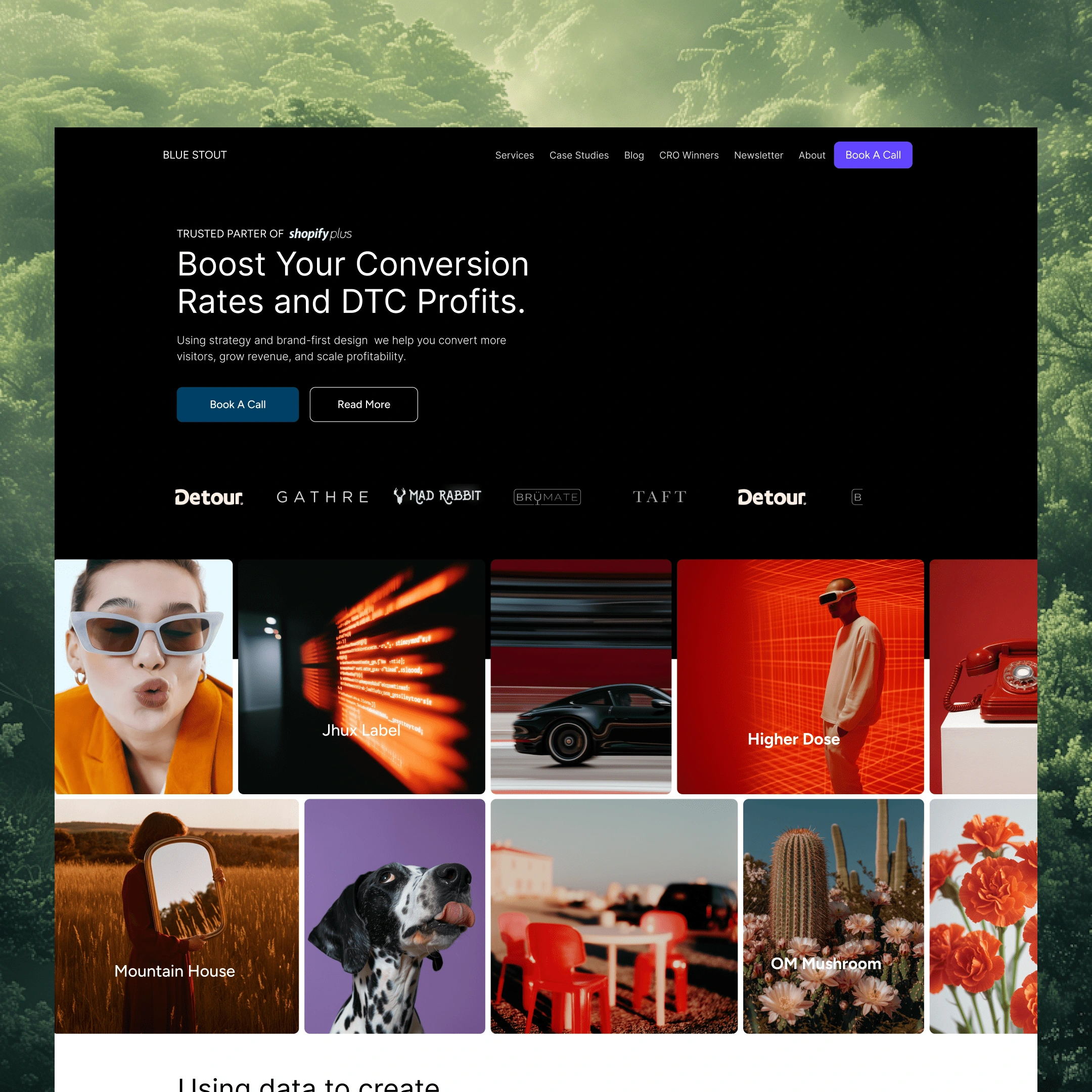
1. Hero Section & Visual Branding
Dynamic Video/Image Collage: Featured brands like GATHRE, BRUMATE, and OM Mushroom to create instant credibility.
Shopify Plus Badge: Prominently displayed to highlight partnership (inspired by Aftersell’s tech partner showcase).
Embedded CTA: "Book a Call"
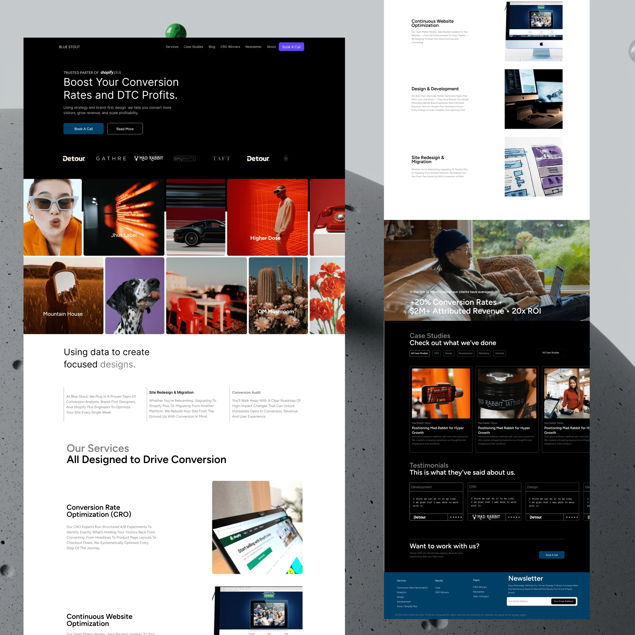
2. Data-Driven Storytelling
Problem/Solution Framework: Short, punchy copy addressing client pain points (e.g., "Remove Relationship Uncertainty") paired with Bluestout’s unique value (10+ years, 22M+ attributed revenue).
Services Breakdown: Clear sections for CRO, Design & Development, and Audits, adopting Darkroom Agency’s simplicity.
The redesign positions Bluestout as a hybrid leader, merging Aftersell’s visual rigor, Darkroom’s clarity, and Vaan’s innovation. The benchmark analysis confirms superiority in technical performance, conversion pathways, and unique lead magnets—key drivers for enterprise client acquisition.
If you're a DTC founder, Shopify brand, or B2B team looking to redesign your site with CRO + UX in mind, I’m currently open for new projects.
Like this project
Posted May 9, 2025
Redesigned Bluestout's website to enhance visual hierarchy and conversion. a blueprint for blending data rigor with brand-first design
Likes
0
Views
20
Timeline
May 2, 2025 - May 8, 2025