Built with Jitter
Forma Studios Brand Identity Redesign
Peter umeh
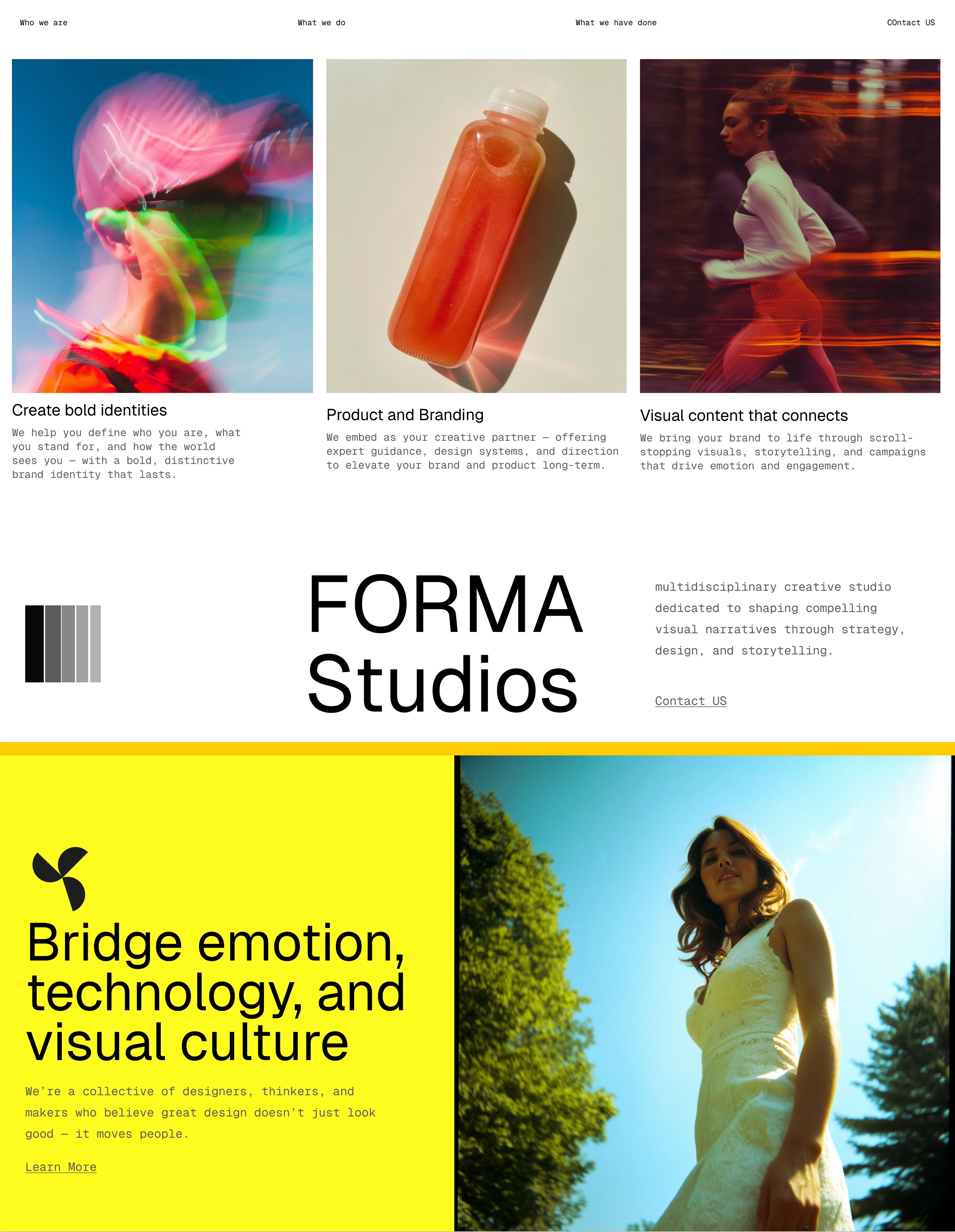
3 a.m., coffee #4, and a Figma file named “FINAL_FINAL_V12.” Forma Studios needed a brand that felt like a lightning strike—bold, charged, impossible to ignore. But their early drafts? Safe. Forgettable.
Video
Instead of starting with visuals, I asked their team: “What keeps your clients up at night?” Turns out, their clients weren’t just buying design—they were buying courage. So we rebuilt Forma’s identity around that: jagged typography for edge, cinematic gradients for depth, and micro-interactions that clicked like a rallying cry.
When I designed Forma Studios, the first question wasn’t “What do we look like?” It was “What do we move people to DO?”
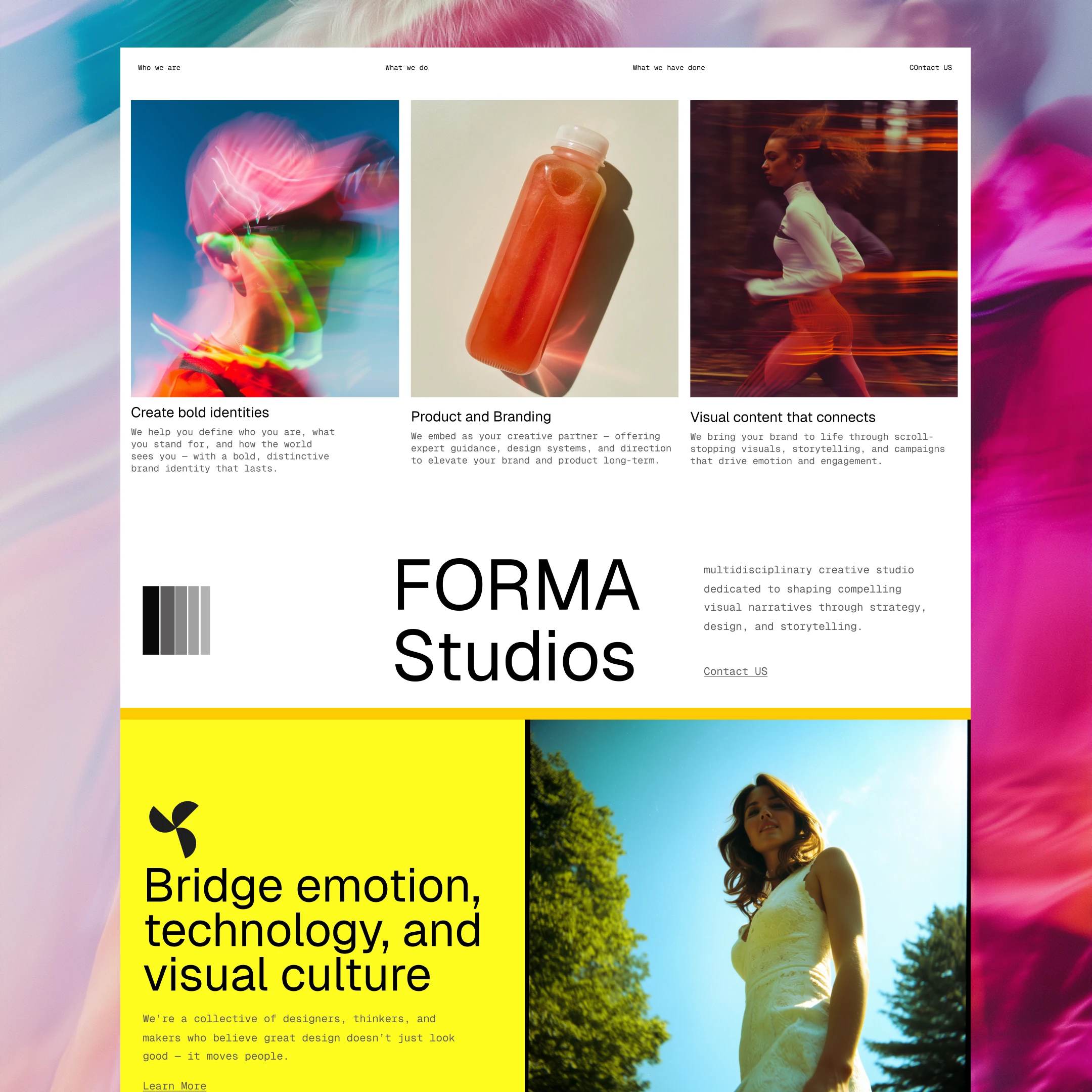
I architected FormaStudios’ bold identity to provoke, not just please. ◾️ Brutalist-inspired typography ◾️ Cinematic gradients that feel alive ◾️ Micro-interactions that click like a manifesto
Follow me on Instagram to see more of my old designs
Like this project
Posted May 1, 2025
Forma Studios is a multidisciplinary creative studio dedicated to crafting bold, enduring brand identities that resonate on a visceral level.
Likes
20
Views
166