Fitness platform | App & Dashboard design | StayActive
Capi Product
Verified
🏋️♂️ StayActive – Fitness Platform | App & Dashboard Design
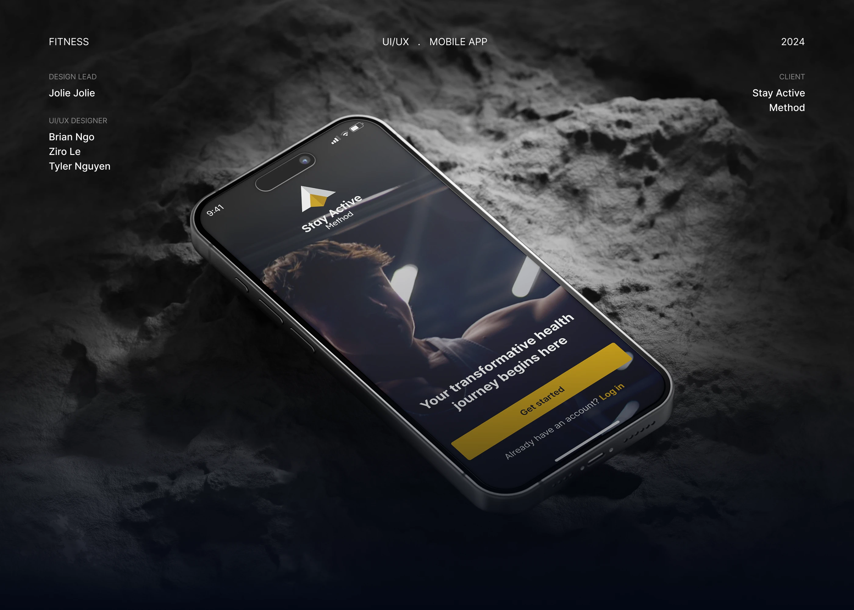
Client: StayActive
Agency: Capi Product
Service: UX/UI Design – Mobile App & Admin Dashboard
Timeline: July – September 2024
1. Overview
StayActive is a new digital fitness and wellness platform that helps users choose their training path, track daily progress, and stay motivated through guided programs and coach support.
From the very beginning, StayActive’s vision was to build a different kind of fitness experience — not loud or superficial, but focused on long-term motivation and personal transformation.
Capi Product was brought in to design both the mobile experience for users and the management dashboard for trainers and gyms.
“Your transformative health journey begins here.”
This became the guiding message that shaped the entire experience — motivational, trustworthy, and human-centered.
2. Context & Challenges
As a brand-new product, the challenge wasn’t to redesign, but to define the very first experience — one that makes users understand what StayActive stands for within seconds.
We faced three core challenges:
Defining product identity from day one
StayActive aimed to stand out in a crowded fitness market. It wasn’t just a workout app — it was about helping users change habits and mindset with the support of coaches.
Designing two products in sync
The mobile app (for users) and the trainer dashboard had to be connected by a single experience logic, not feel like two separate tools.
Creating a “premium yet approachable” look & feel
The visual identity needed to communicate strength and focus, while remaining modern, minimal, and emotionally engaging.
3. Design Goals
Build a holistic digital ecosystem for users, trainers, and gym operators.
Deliver a motivating, intuitive onboarding flow that feels personal from the start.
Design a dashboard interface that allows trainers to monitor performance and guide clients efficiently.
Create a scalable design system to support future expansion (AI coaching, wearable sync, community features).
4. Process & Solutions
(a) Product Discovery
We collaborated closely with the founders to define target personas — beginners, regular gym-goers, and trainers.
Mapping out the user journey from first launch to daily routine revealed the emotional checkpoints that mattered most:
Choosing the right fitness path
Completing the first workout
Reaching the first milestone (7 days, 30 days)
These insights guided the product’s structure and content hierarchy.
(b) Mobile App Design
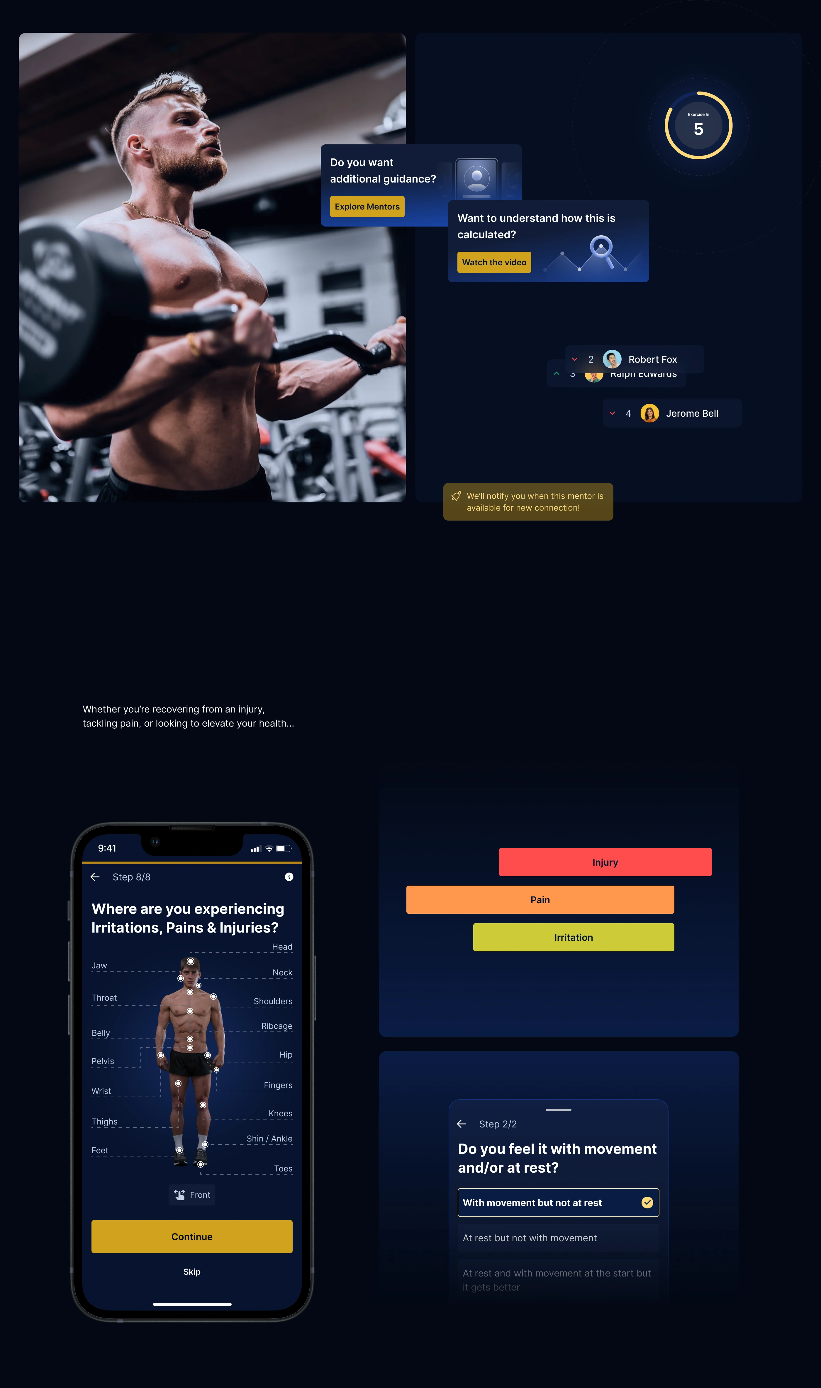
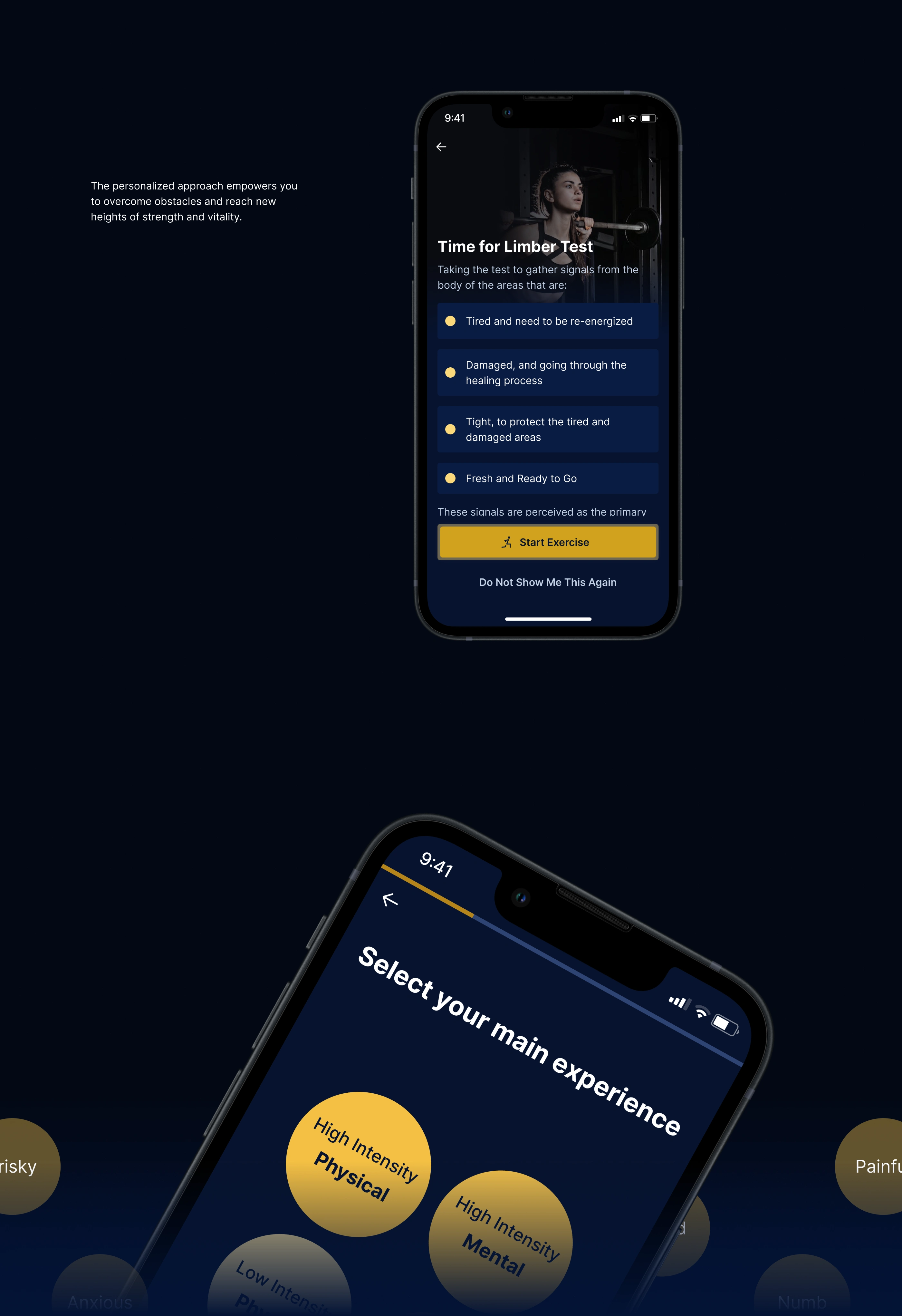
1. Onboarding & Experience Selection
The first screen — “Select your main experience” — lets users define their fitness intention:
High-Intensity Physical
Mental Focus
Balanced Journey
This design decision emphasizes self-awareness and ownership from the first tap.
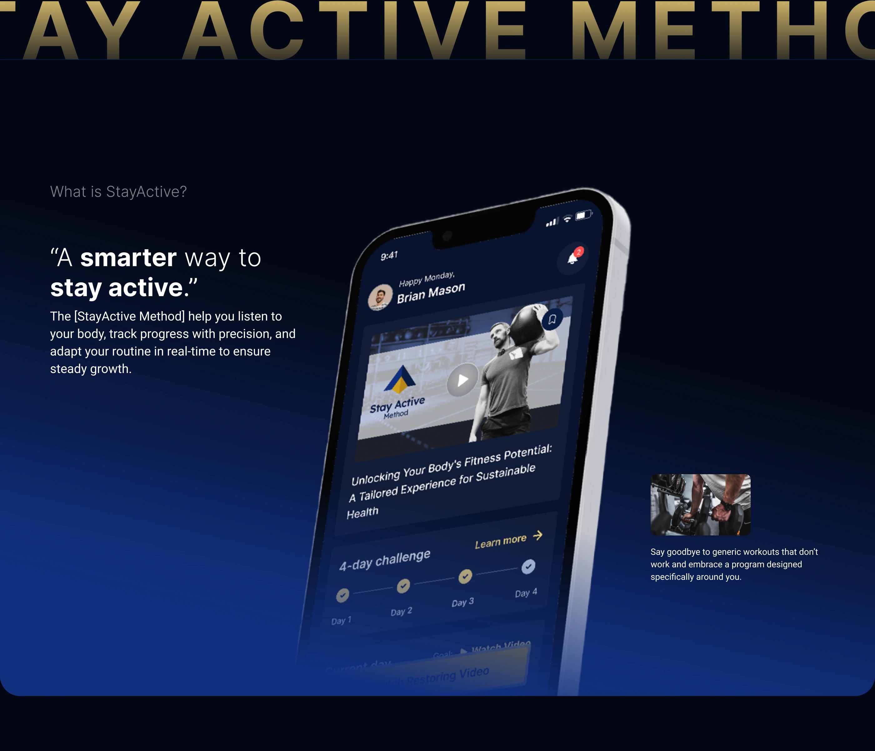
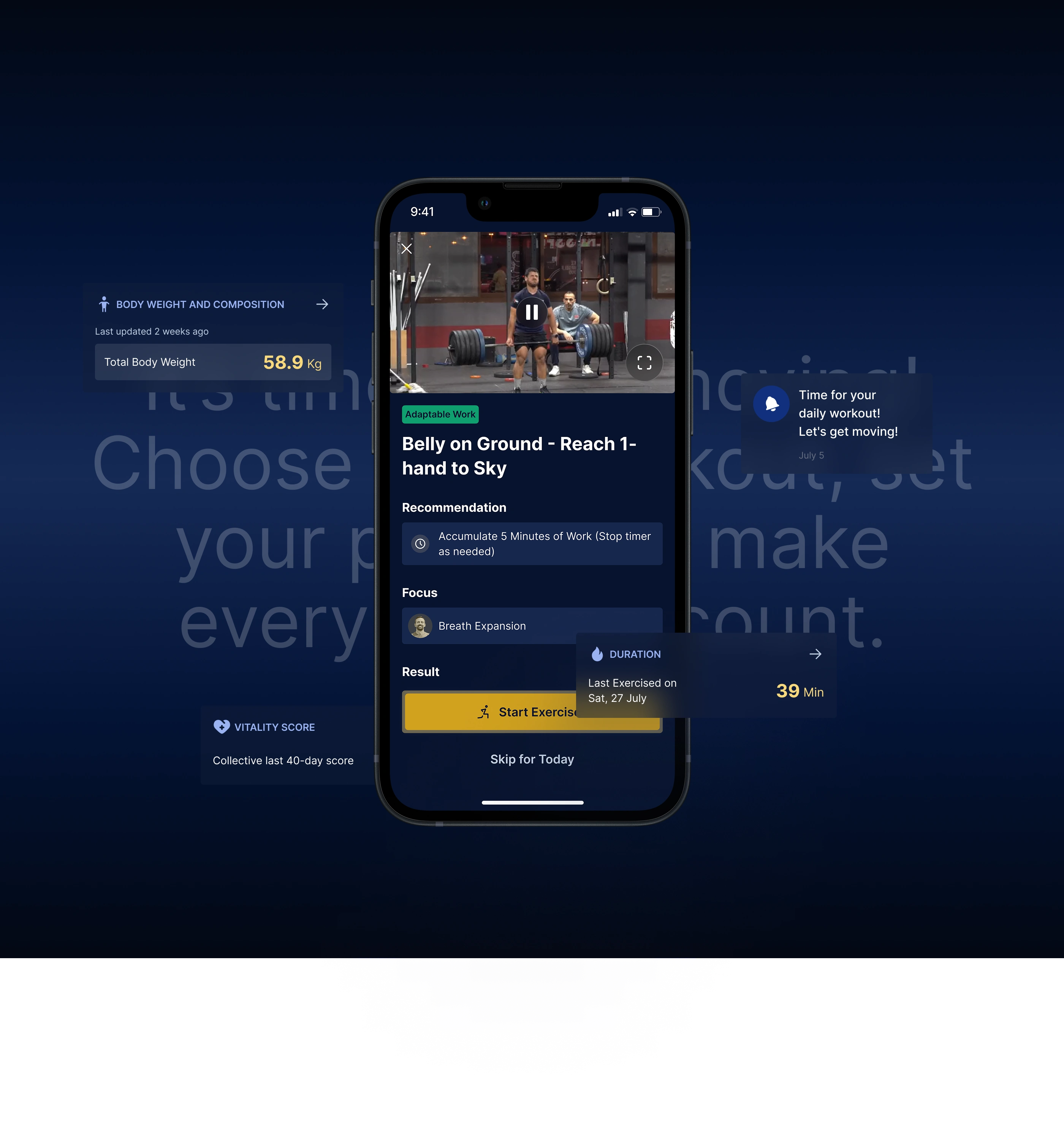
2. Home Dashboard
Displays upcoming workouts, weekly progress, and streaks.
Uses a clean card layout for quick scanning in 3–5 seconds.
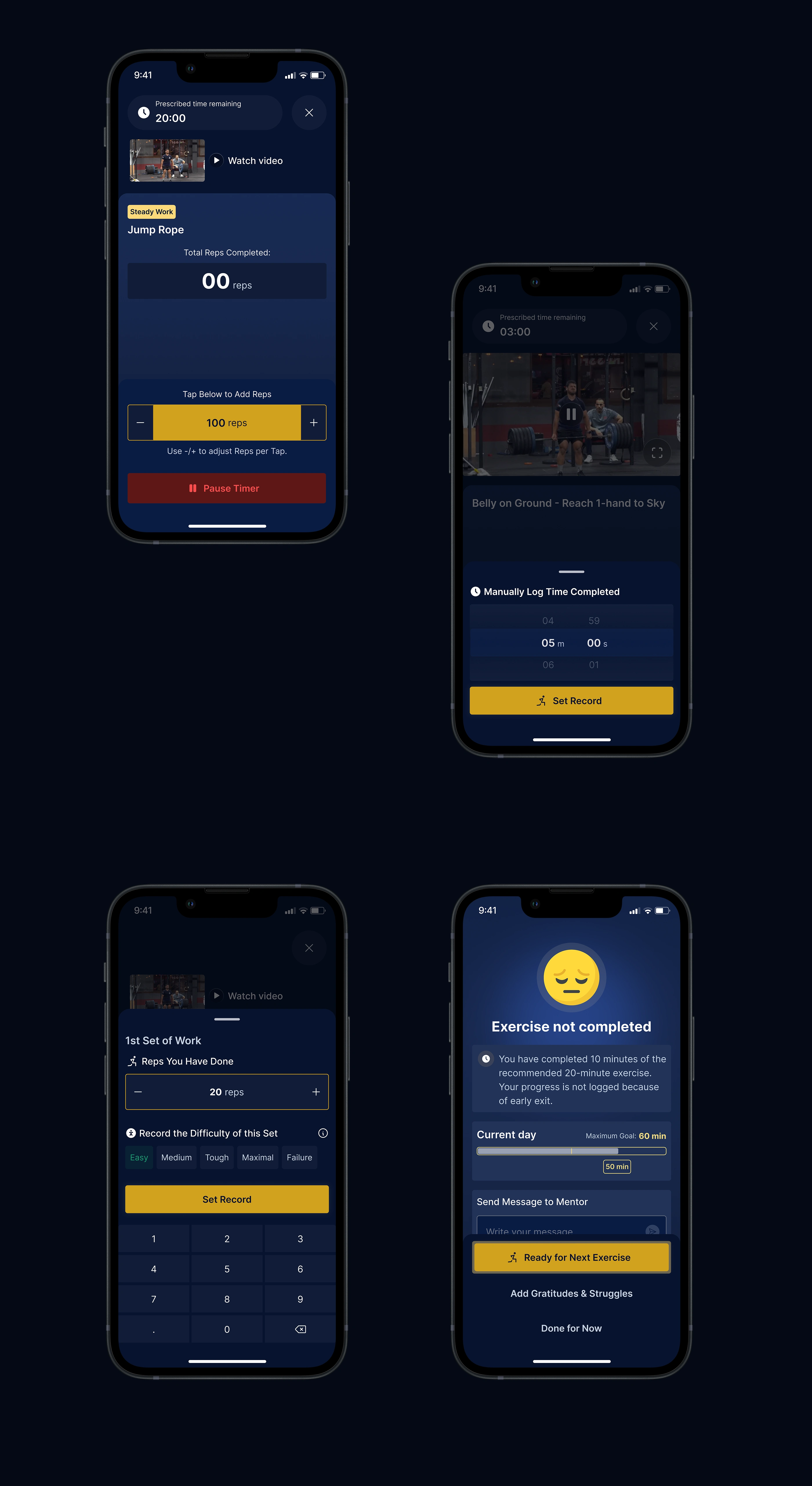
3. Workout Session Screen
Minimal and focused layout with key actions: Start, Pause, Complete.
Intuitive visual hierarchy for metrics (time, reps, sets, calories).
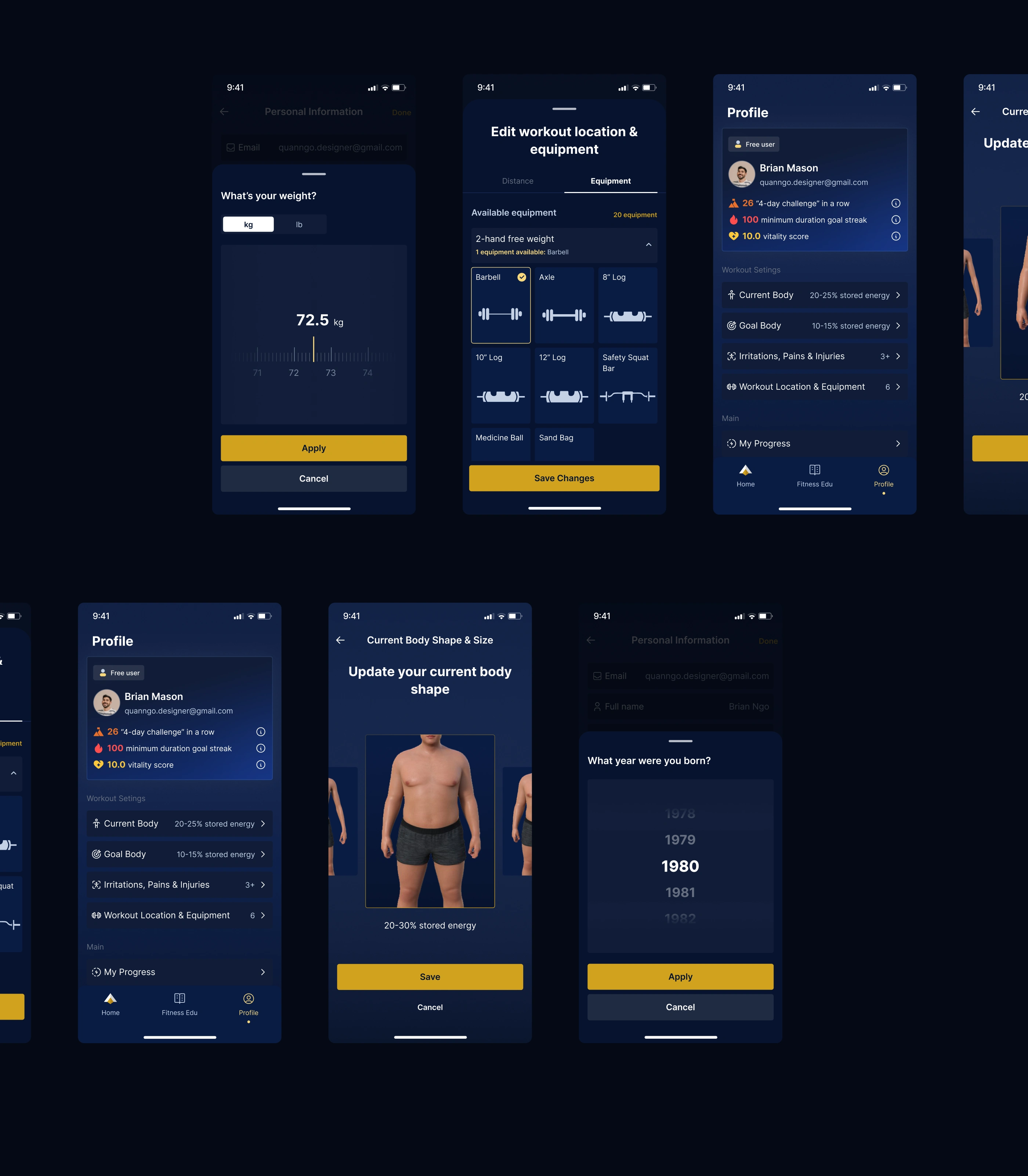
4. Visual Direction
Dark mode base to evoke focus and discipline.
Gold gradients and circular elements representing strength, energy, and progress loops.
Typography: Bold sans-serif for confidence, with clear contrast for readability.
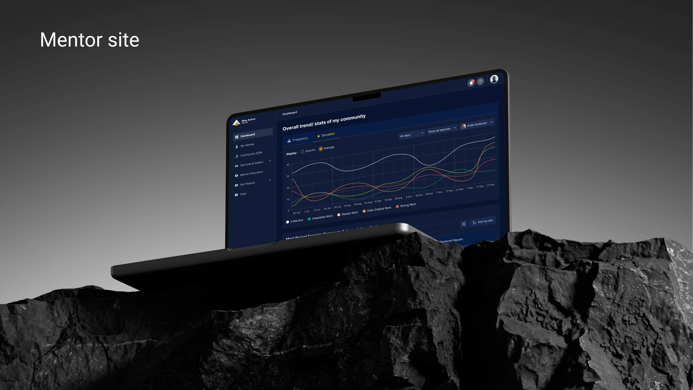
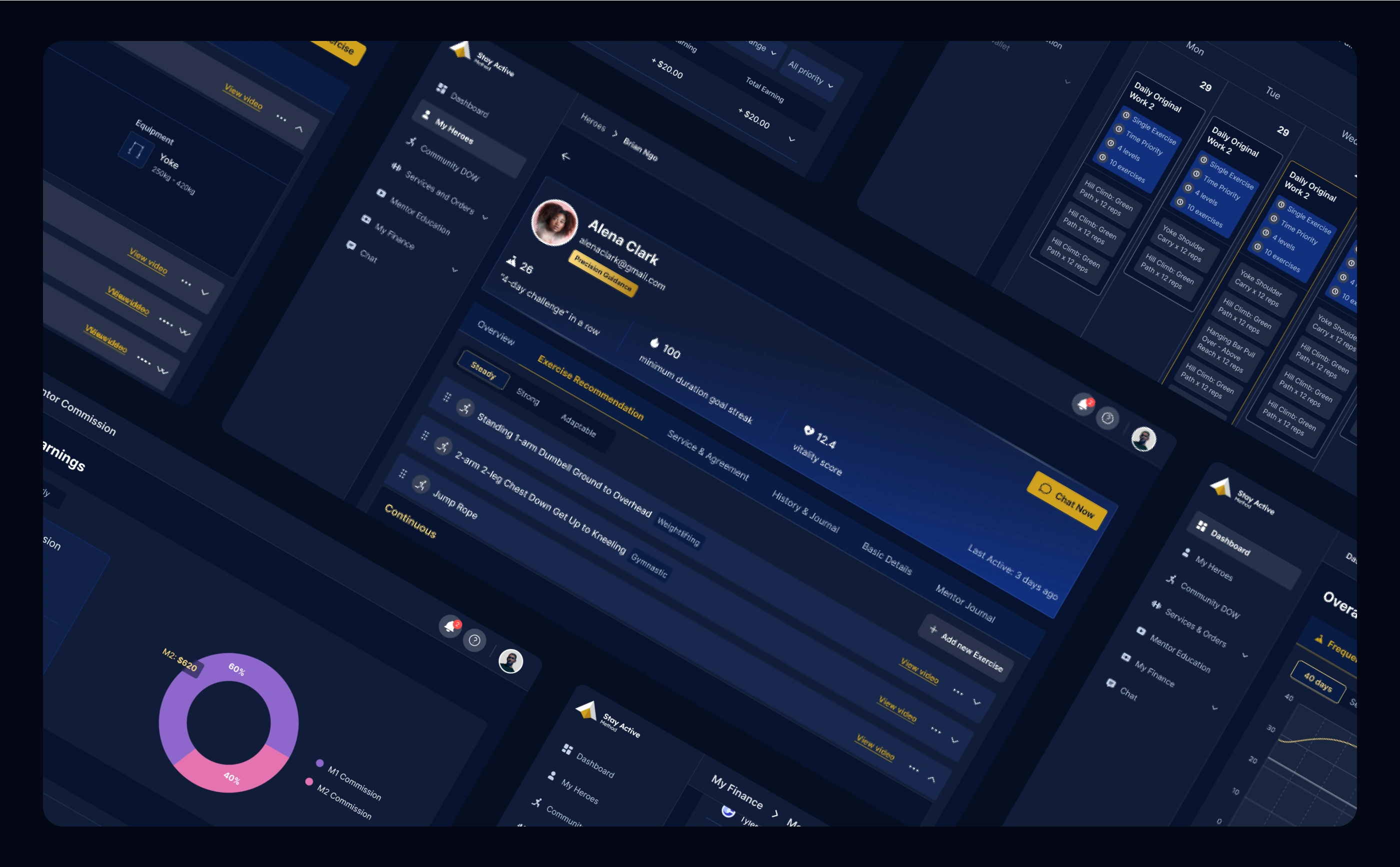
(c) Trainer Dashboard Design
Key Features:
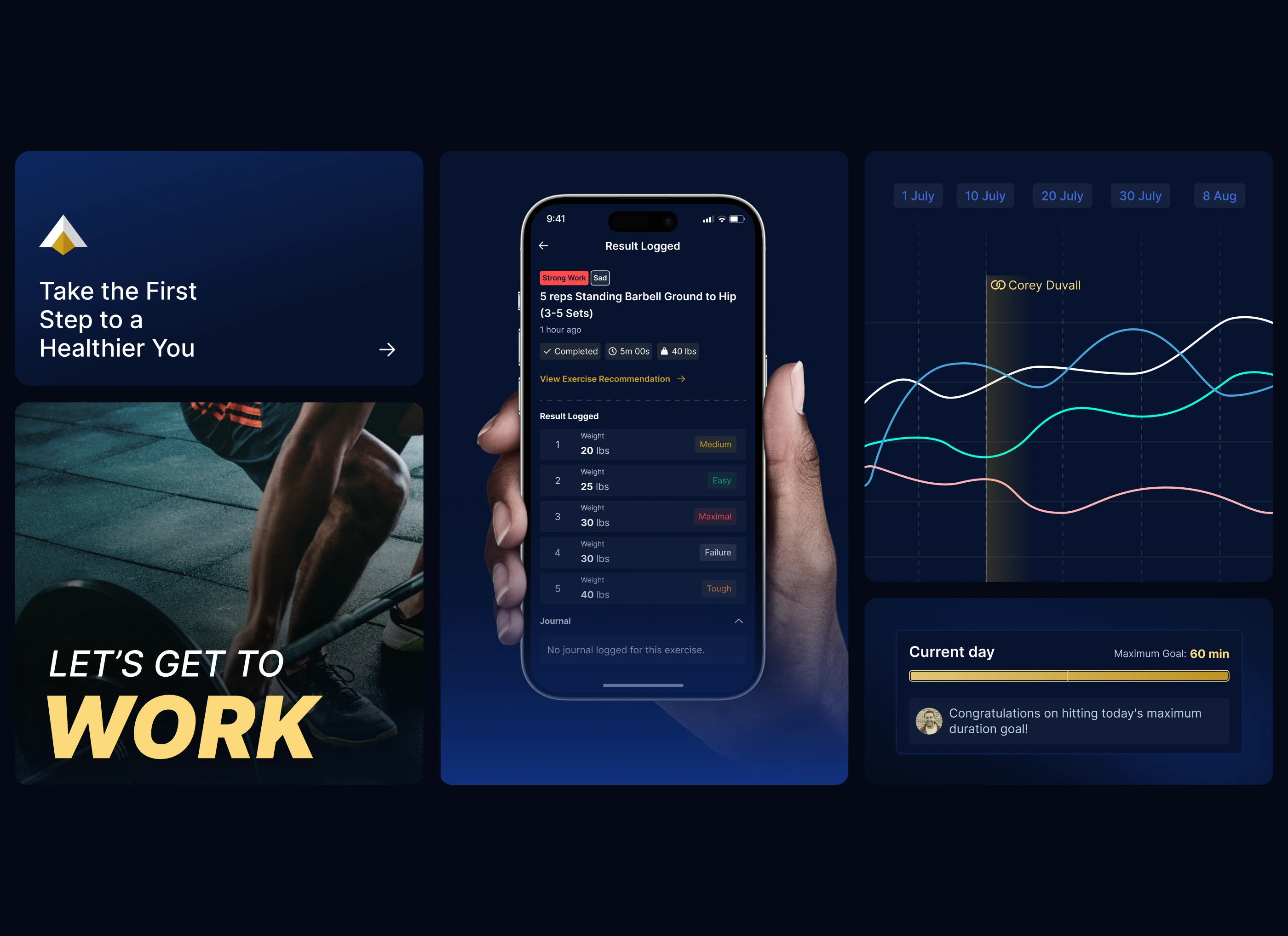
Client Overview: Real-time data on user activity, completion rates, and churn risk indicators.
Program Builder: Drag-and-drop interface to create and customize training plans.
Analytics: Charts and insights showing overall performance, popular programs, and weekly engagement trends.
Goal: Enable trainers to make quick, data-driven decisions without complexity.
(d) Design System
From day one, we established a token-based design system using Figma Variables:
Core colors, spacing, and elevation tokens.
Component library for both app and dashboard.
Documentation for developers to ensure visual consistency and speed up implementation.
5. Outcomes & Impact
✅ Clear and unified design language across app and web.
✅ Smooth onboarding with 100% completion rate in user tests.
✅ Strong brand perception — “premium, calm, and reliable.”
✅ Ready-to-scale design system for future feature rollout.
6. Reflection
“StayActive was about more than fitness — it was about motivation and consistency.
We designed a system that moves with users — visually, emotionally, and physically.”
This project highlights Capi Product’s approach to building design foundations for new ventures — where UX is not only about usability but about emotional connection and brand longevity.
7. Deliverables
Product Discovery Report & User Journey Map
UX Wireframes (App & Dashboard)
UI Design (Mobile + Web)
Design System (Figma Tokens & Documentation)


Like this project
Posted Apr 15, 2025
A complete fitness platform connecting users and trainers through a seamless app–dashboard ecosystem — built for motivation, progress, and clarity.
Likes
2
Views
32
Timeline
Jul 1, 2024 - Jan 15, 2025
Clients
BuckMoon InfoTech