UI/UX for an Adventure Time Mobile Application
Radmila Ciric
Adventure Time
App for booking adventures in a couple of clicks
Overview & Project Goals
Adventure Time is not just an app about booking trips but about curating moments. The heart of the app is the exploration itself. The main features are throughout filtering, easy booking, options for contacting the organizers, and very detailed adventure descriptions so the user never has to worry about what is included in their package and what is not. The app is useful for every traveler – whether they are solo travelers, couples, friends, or family – with kid and pet-friendly options.
Transportation, accommodation, food, and entertainment are all organized with every adventure, so a user can focus on embracing the journey itself. From adrenaline-pumping escapades to serene getaways, the app tries to encapsulate it all.
But Adventure Time is not just about exploration; it’s also about connection. The app's interface not only reflects the diversity of experiences but also the communities users will encounter, with a friendly option for chatting and connecting with other participants who are going on the same adventure as you.
So, whether you're taking a leap from an airplane or simply your cozy couch, Adventure Time is your passport to a world of awe and inspiration. Let's embark on this journey together – where design meets wanderlust, and every tap is an invitation to uncover the extraordinary.
Timeline 1 week
Project Type Personal Study
Research
User Demands
Based on the competitor's research, my idea of the application, and interview sessions with 20 potential users, I have created a list of user demands.
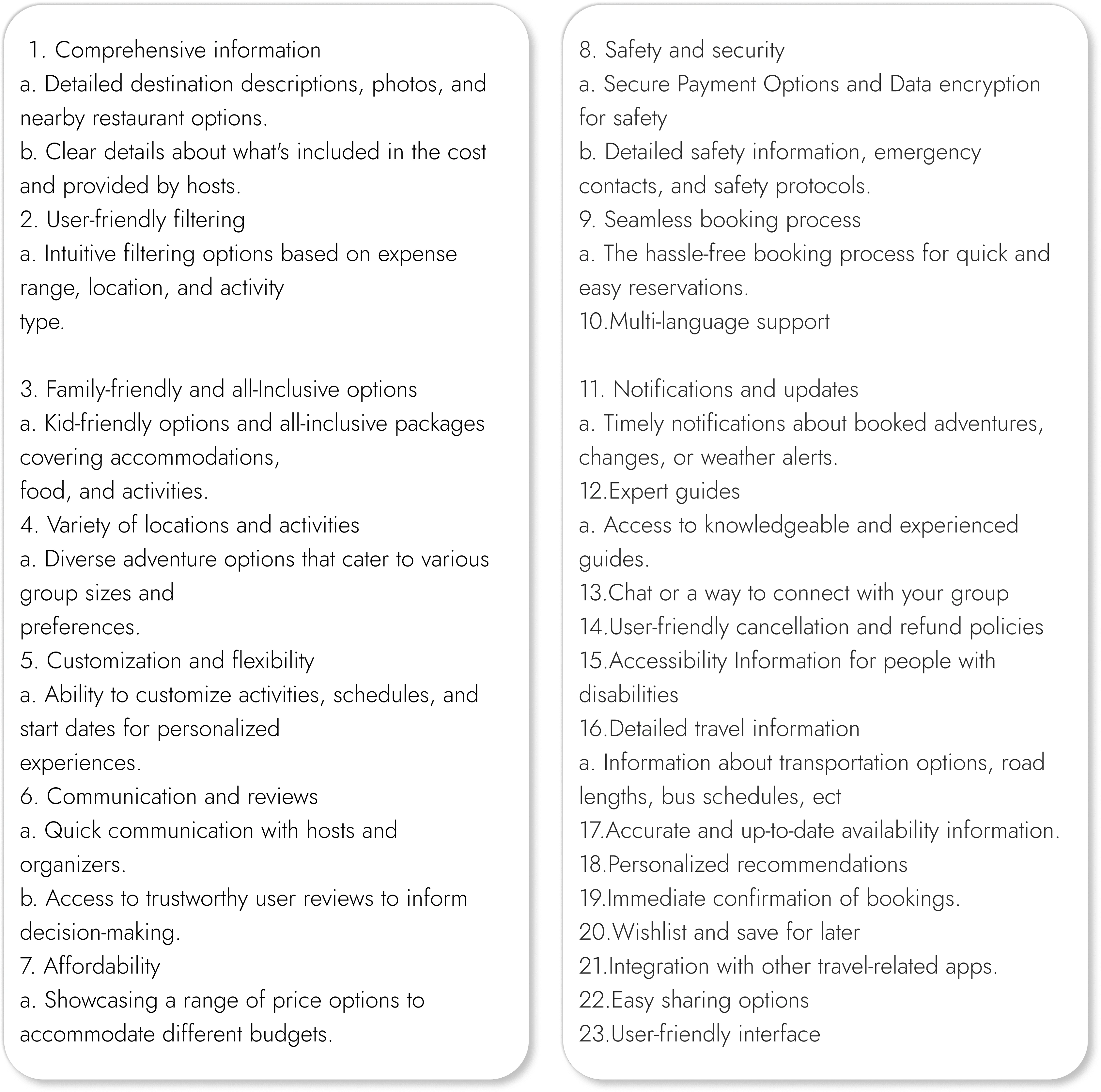
User requests
User Persona
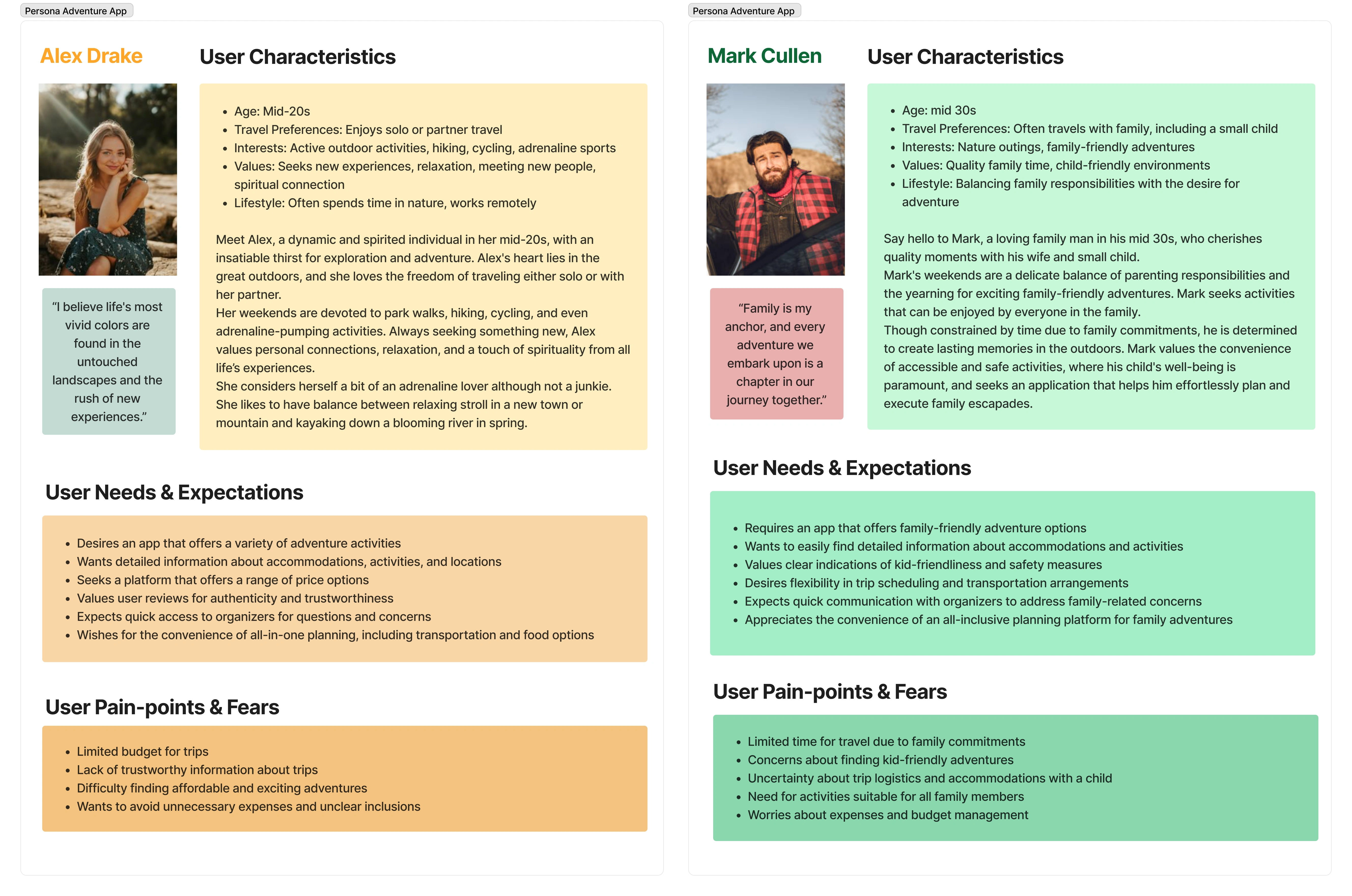
Two user personas
Application structure
Based on the user requirements, and affinity diagram, I have structured all of the features and divided them into 5 main menu sections: Explore, My Trips, Likes, Profile, and Chat.
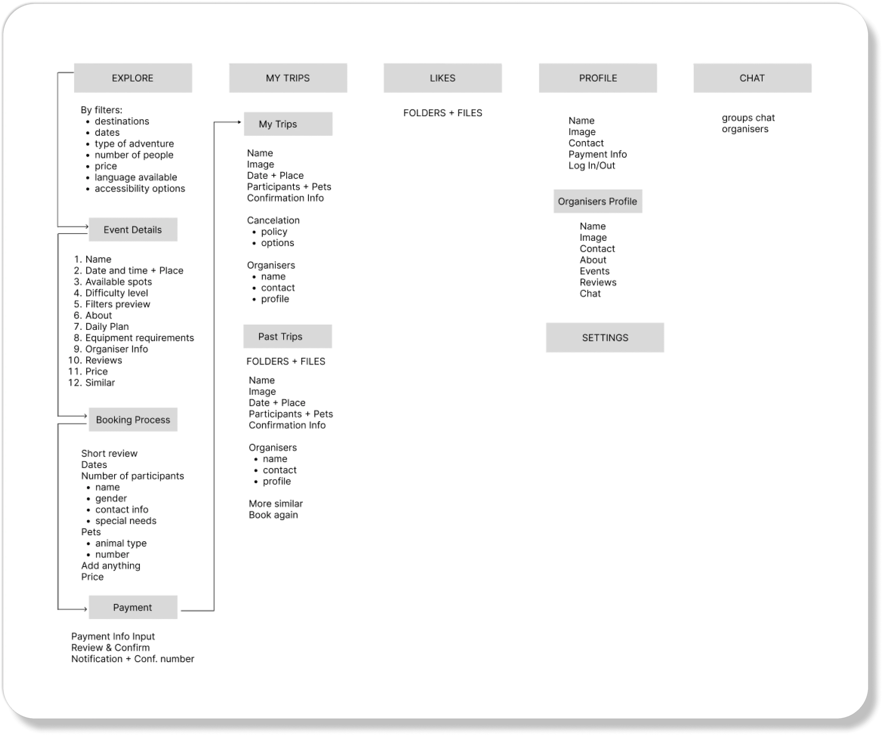
Structure
Wireframes
When I started to work on the Lofi wireframes the biggest challenge was how to design an interface for filtering since I wanted to have a lot of options. I decided to look for inspiration in some of the most popular applications such as Airbnb, Ryanair, Wizzair, etc. After reading a couple of studies, and witnessing how evolved and user-friendly Airbnb application was, I wanted to learn firsthand what the designers did. So Adventure Time, at that moment, became also a small study of the Airbnb app, and that is why you will see a lot of similarities in the interface design. I tried to take what I thought was the best but put my own twist on it.
Lofi wireframes
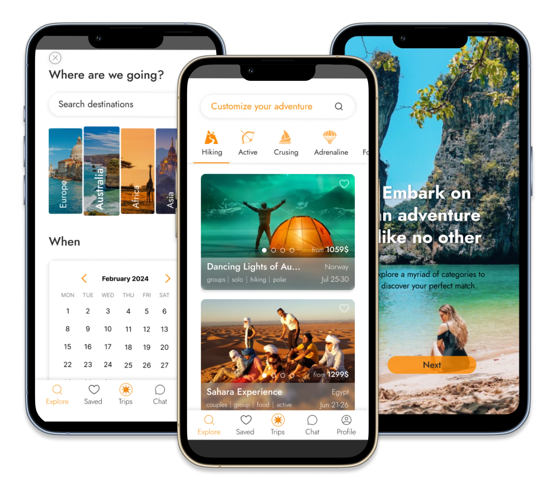
Final Designs
For all screens, please check the prototype link at the bottom or beginning of this project.
The final design of some screens
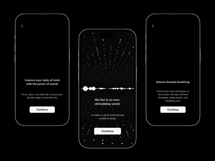
Onboarding Flow
Onboarding flow
Like this project
Posted Oct 20, 2023
Are you an adventure junkie, a busy parent who wants to explore outdoors with their kids or a couple looking for an escape-Adventure Time has something for you.