Branding for an NGO - Artesano
Project Overview
Client: Artesano – a Serbian NGO dedicated to bettering mental health, exploring art, and keeping old crafts alive in a local community.
Concept: The name "Artesano" stems from the Spanish word for "handcraft" or "artisan," while "arte" and "sano," when written separately, mean "art" and "health." This reflects the organization's mission to improve mental well-being by using art as a medium (similar to art therapy).
Goal: Design a brand identity that embodies Artesano's core values (connection, expression, and creation), and supports its mission (empowering self-discovery through art). This brand focuses on young people, although it's not exclusive to this age group.
Deliverables:
Visual Identity Guidebook | 2. Illustrations & Patterns | 3. Merchandising & Stationery
Branding Board Preview

Branding Board - Artesano
Visual Identity
Developing the Concept
The development of Artesano’s visual identity began with a clear goal: to avoid the stereotypical symbols often associated with art and therapy, such as brains, neurons, plants, paintbrushes, easels, or palettes. While these elements naturally connect to the themes of art and health, I aimed for a more unique approach—one that would immediately set the brand apart.
The solution was to create a stylized typographic logo where the brand name itself would convey its essence. My vision was to design a visual identity that evokes trust, childlike wonder, and positivity. To achieve this, I leaned towards a more elegant aesthetic with a touch of vintage character. This vintage quality was inspired by the association of long-standing, trusted brands with tradition and reliability, while the modern elements ensured the design would resonate with both younger and older audiences.
Balancing modernity and tradition became the core of Artesano’s visual language. To bring this vision to life, I developed a moodboard that captured the emotional tone and stylistic direction of the brand, serving as the foundation for the creative process.
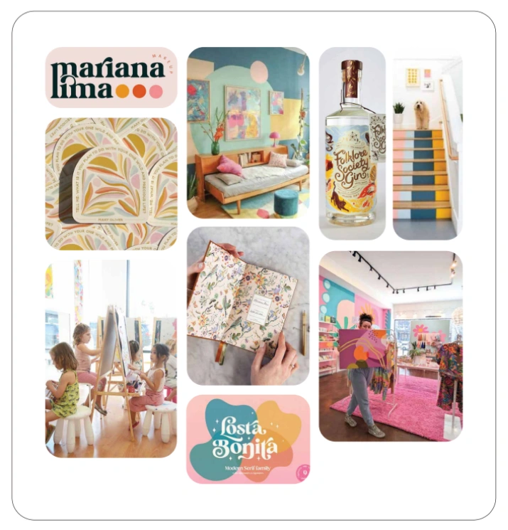
Moodboard
Logo
The creation process began with font selection. The chosen font, Glory Sunshine, was customized to add an elegant yet playful and vintage aesthetic by adjusting letter arrangements to evoke a dynamic feel while maintaining readability and adding a serif extension to the letter "t," symbolizing both a brush tip and a leaf, subtly referencing the organization’s purpose.

First logo layout
After testing with a focus group, I realized that the logo can be read incorrectly and that there is confusion with serif endings, so the new adjustments were made:
Shortened the letter "t" for improved readability.
Simplified the decorative “e” to avoid confusion.
The result is a contemporary, elegant, and playful typographic logo with a slight vintage vibe.
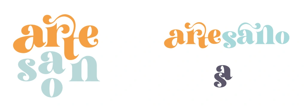
Primary logo, horizontal and miniature version
Safe Zones
To ensure clarity and flexibility, the logo requires a buffer zone around it, equivalent to the height or width of the initial "A." Exceptions to this rule are allowed when the logo is part of a patterned illustration.
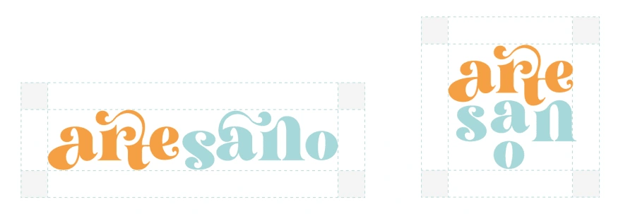
Safe zones of a logo
Secondary Logos
Nine variations of the logo were created for versatility. These include integrated backgrounds and the brand slogan, allowing the logo to stand alone. Background and document colors can match or contrast to create different effects.
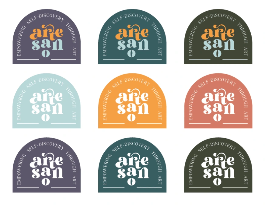
Secondary logo and it's color combinations
Rules for Logo Usage
To maintain brand integrity, the logo should never be altered.
Do not:
Use a different font or attempt to replicate it with the same font.
Apply colors outside the brand palette.
Swap or alter the placement of the orange and blue parts.
Use colors for the logo that blend with the background.
Rotate or distort the logo.
The logo can be used as part of phrases but must remain intact and unaltered.
Color Palette
Primary Colors
The two main colors are orange and blue, representing:
Orange: Creativity, optimism, and joy.
Blue: Calmness, trust, tenderness, and health.
These colors are primarily used for the logo, headings, and accents.
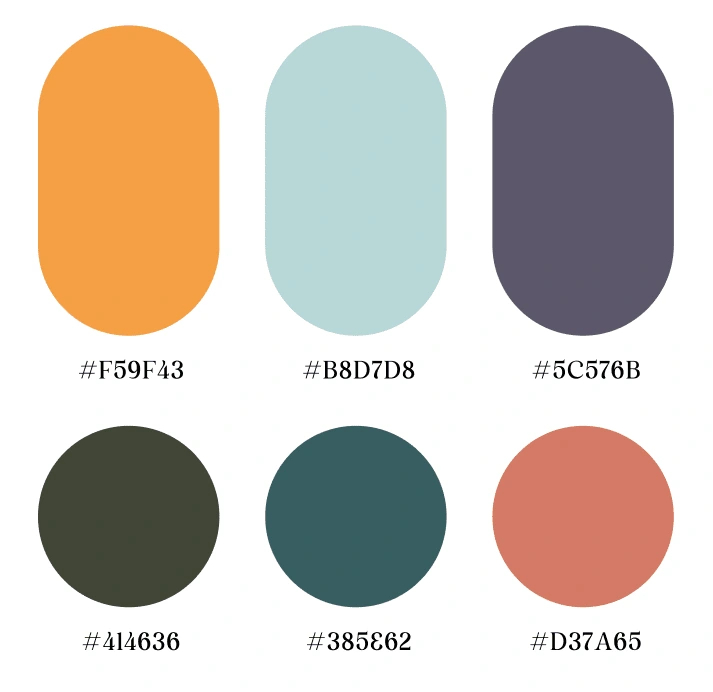
Color Palette
Supporting Colors
Purple: Often used as a background color.
Teal: Adds a spiritual and intriguing touch.
Olive Green: Symbolizes nature and healing.
Red: A complementary color, reserved for small details.
Color Combination Rules
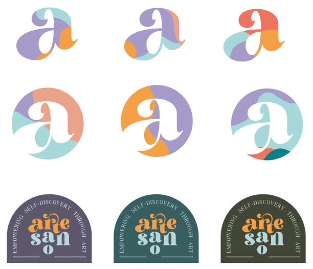
Color combination examples
To maintain harmony and visual clarity:
Allowed combinations:
Both primary colors can pair with any of the darker tones.
Single primary colors can pair with any supporting color except red.
Restrictions:
Darker tones cannot be combined without a primary color.
Red should only be used for subtle details.
Exceptions:
Monochromatic variations of the colors can be combined, as long as there’s sufficient contrast.
Typography
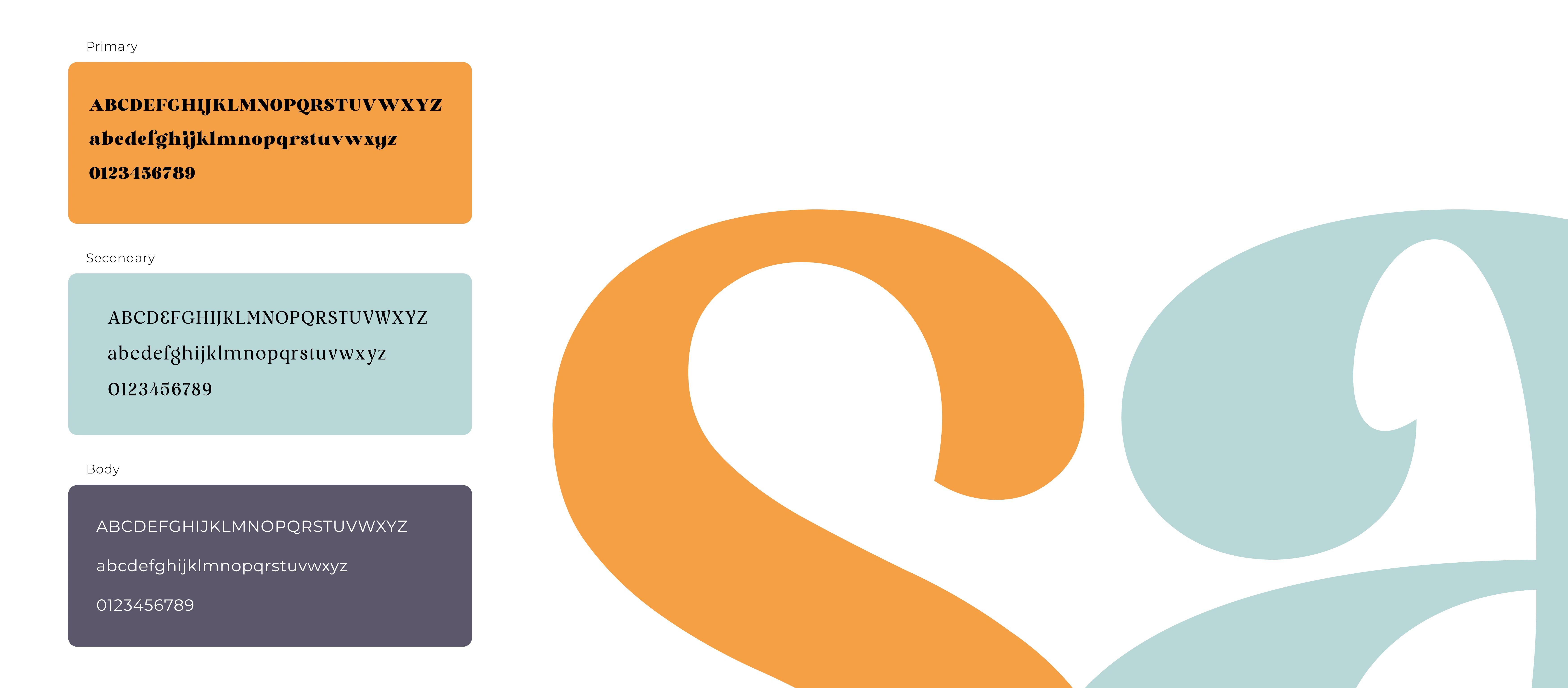
Primary, secondary and body fonts
Primary Font: Glory Sunshine
Used in the logo design and suitable for headings.
Features a dynamic, elegant style with a vintage touch.
Best for short titles or impactful text, as its ornate design is less suitable for longer passages.
Secondary Font: Salute
A versatile, elegant, and legible typeface.
Used for titles and emphasized text in presentations and documents.
Serves as a substitute for Glory Sunshine when extended text or more than a few words are required, as it closely complements the primary font’s aesthetic.
Body Text Font: Montserrat
Ideal for longer text, offering simplicity and versatility.
Its range of weights provides flexibility, while the lightweight adds an elegant touch that aligns with the brand’s style.
Illustrations & Patterns

Illustrations
The illustrations reflect both the artisanal (hobby-related motifs) and health-oriented (flora) aspects of the brand. These illustrations are versatile and can be used on both light and dark backgrounds.
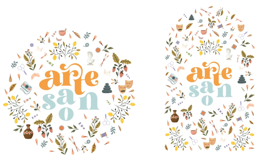
Illustrative brand motifs
Additional branding elements
These additional elements enhance the brand’s visual language, making it more dynamic and adaptable across different applications.
Logo and slogan integrated for signs or stickers.
Shapes created from parts of the logo, the "a" shape and the serif extensions on the letters "t" and "a," repurposed as decorative elements.
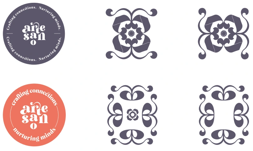
Additional brand elements
Merchandising & Stationery
Business Cards
Artesano's business cards should be made from Kunstdruk paper (350g), and laminated with a matte finish on both sides. The cards are cut using a rounded method, where the top edge is curved into a semicircle, resembling slightly open doors. This distinct design enhances visibility and memorability.
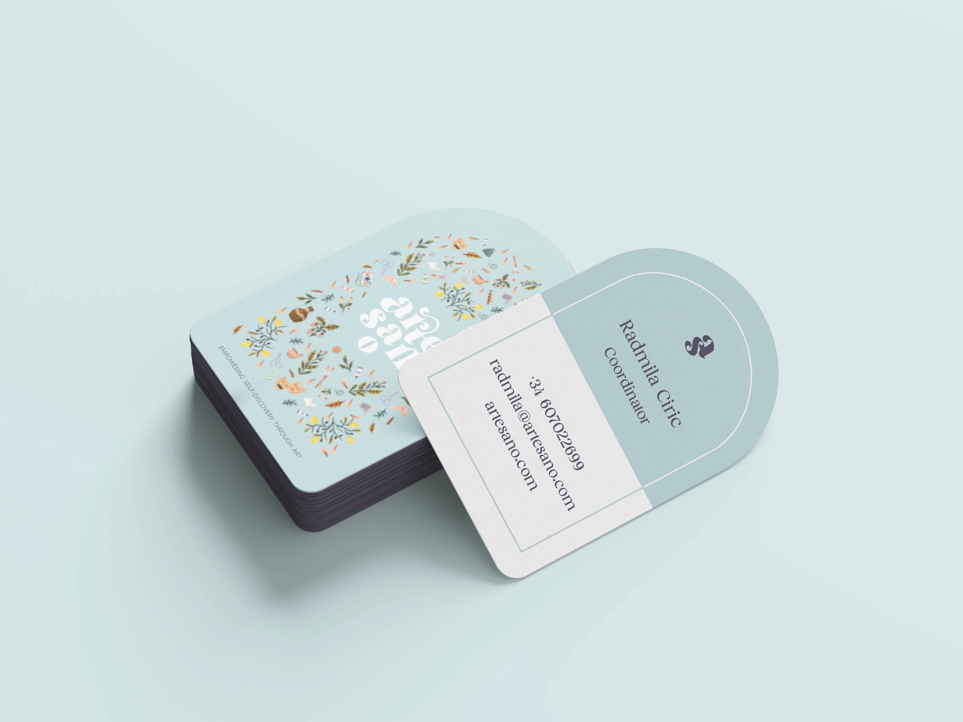
Business cards design
Apron
The apron is essential for Artesano’s workshops, designed for both adults and children. It features the secondary logo on the chest, paired with a brand message, and branded illustrations near the hem in a semicircular shape, strategically placed there to avoid wear and tear.
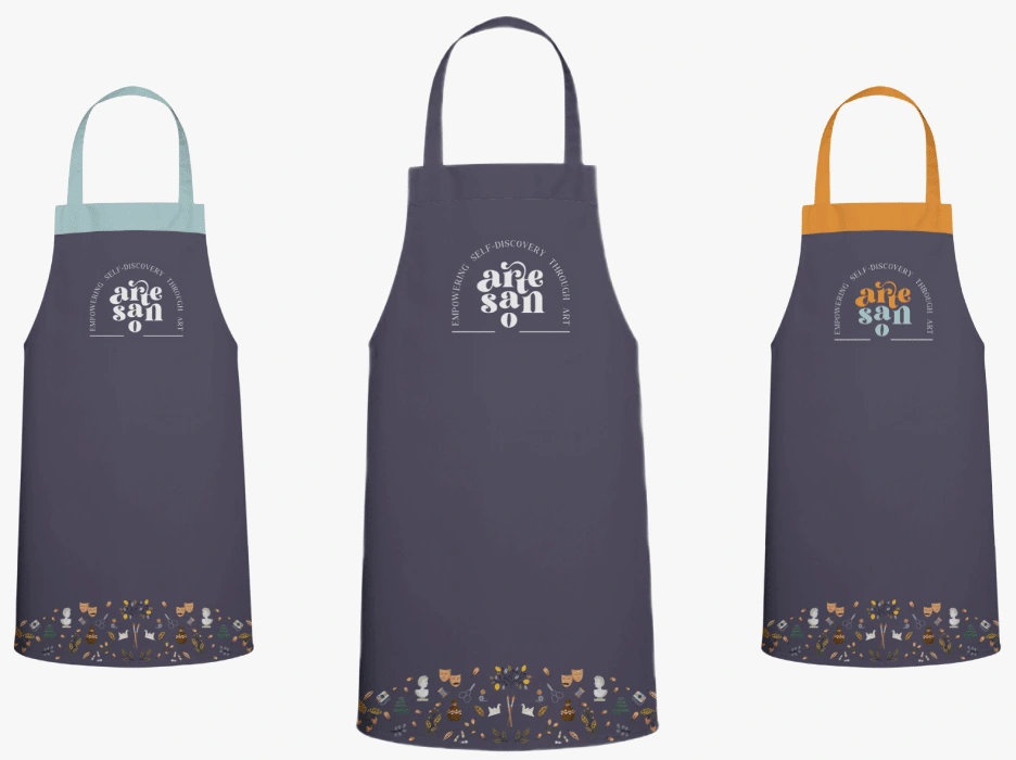
Apron design for workshops
The Gentle Journal / Emotional Tracker
This journal serves as a notebook, tracker, and goal-setting tool. The introductory pages guide users on setting and evaluating goals, breaking down large goals into manageable steps for clear progress tracking.
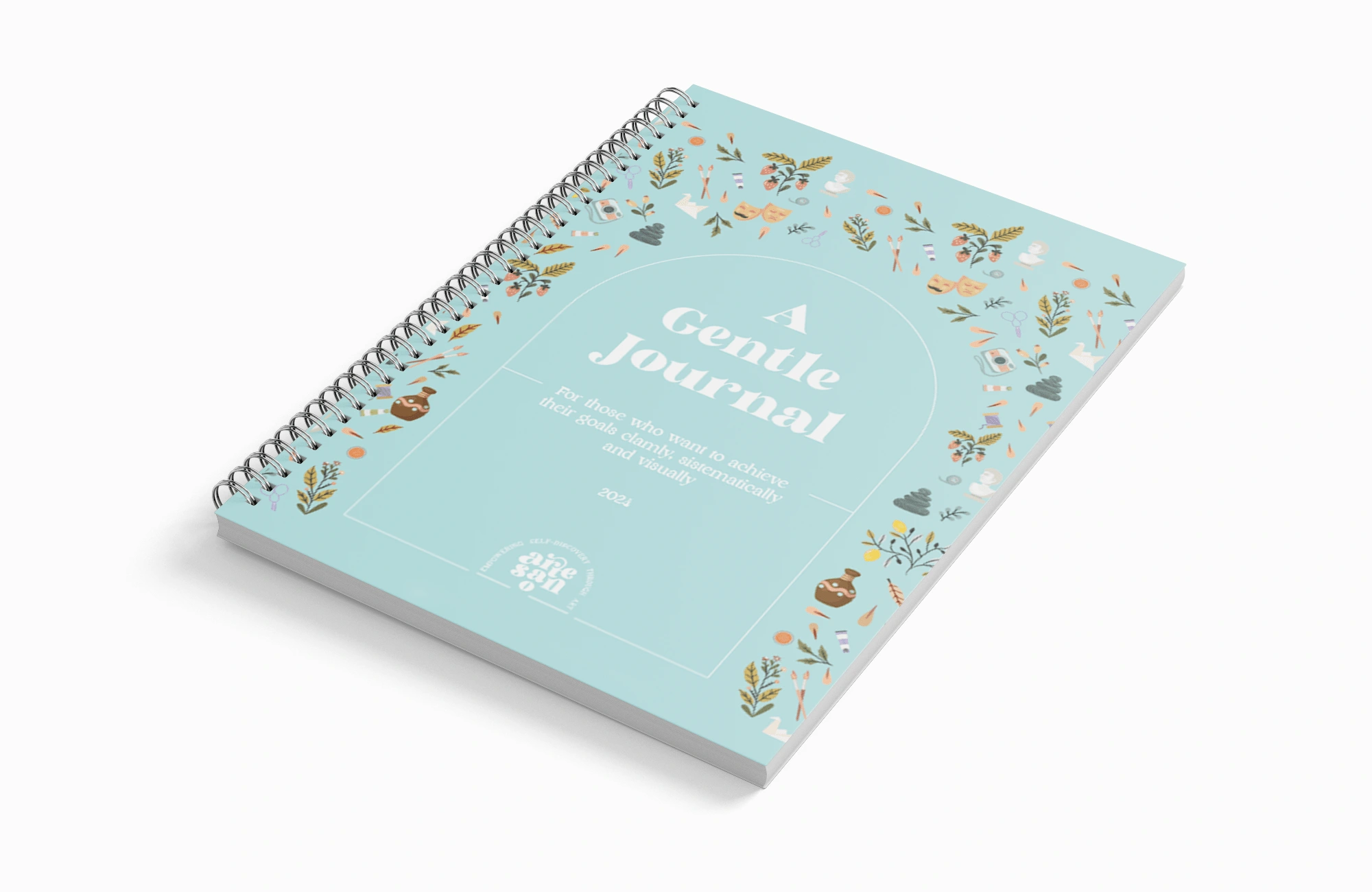
Journal for goal setting and emotion tracking
Tote Bag
The tote bag design features brand illustrations combined with the logo. The slogan and website are discreetly placed on the back or bottom. The illustrations are centered and extend across the tote's surface, maintaining necessary spacing from the edges for a clean, balanced look.
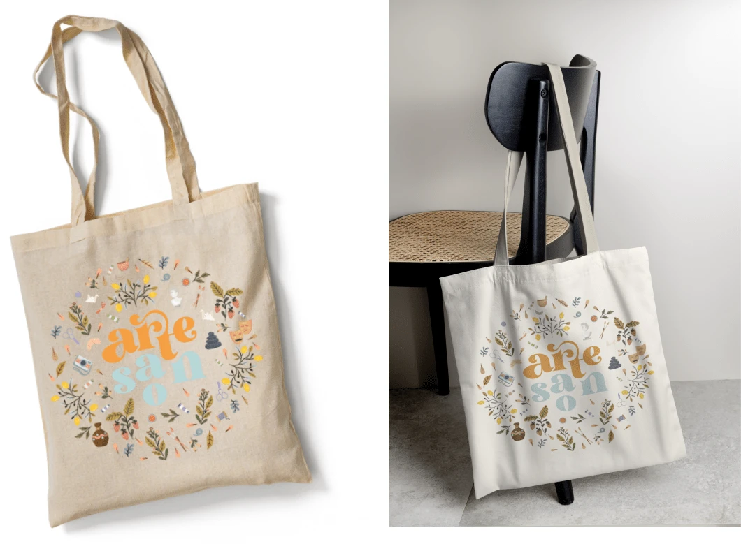
Tote bag design
Pens and Keychains
The pen design features the horizontal logo, with space for the slogan. Ideal pens are metallic, white, and elegant, with branding printed for a clear, professional look.
Keychains and stickers use only the logo symbol on a solid background, keeping the design minimalistic and impactful.
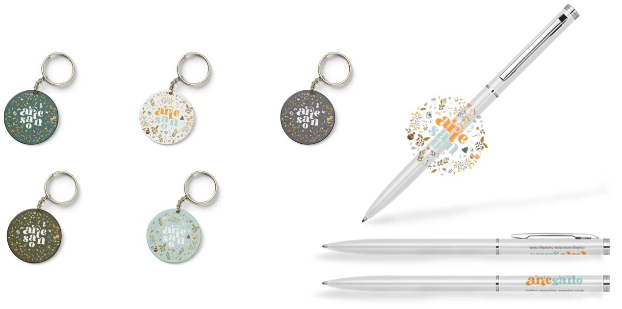
Pens and keychains
Stickers
Branded stickers are designed to be playful and motivational, focusing on mental health themes. Available in English and Serbian, they serve as a fun way to promote Artesano's mission. The designs are bold and humorous, creating an engaging connection with the audience.
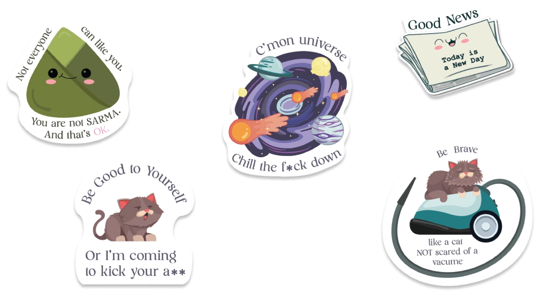
Artesano Stickers
The Book of Standards
The book of standards defines the brand’s specifications, guidelines, and usage rules for all elements of the visual identity. It includes the criteria for material selection, production techniques, and permissible uses of branding elements.
This comprehensive book ensures consistency and quality across all branding applications.
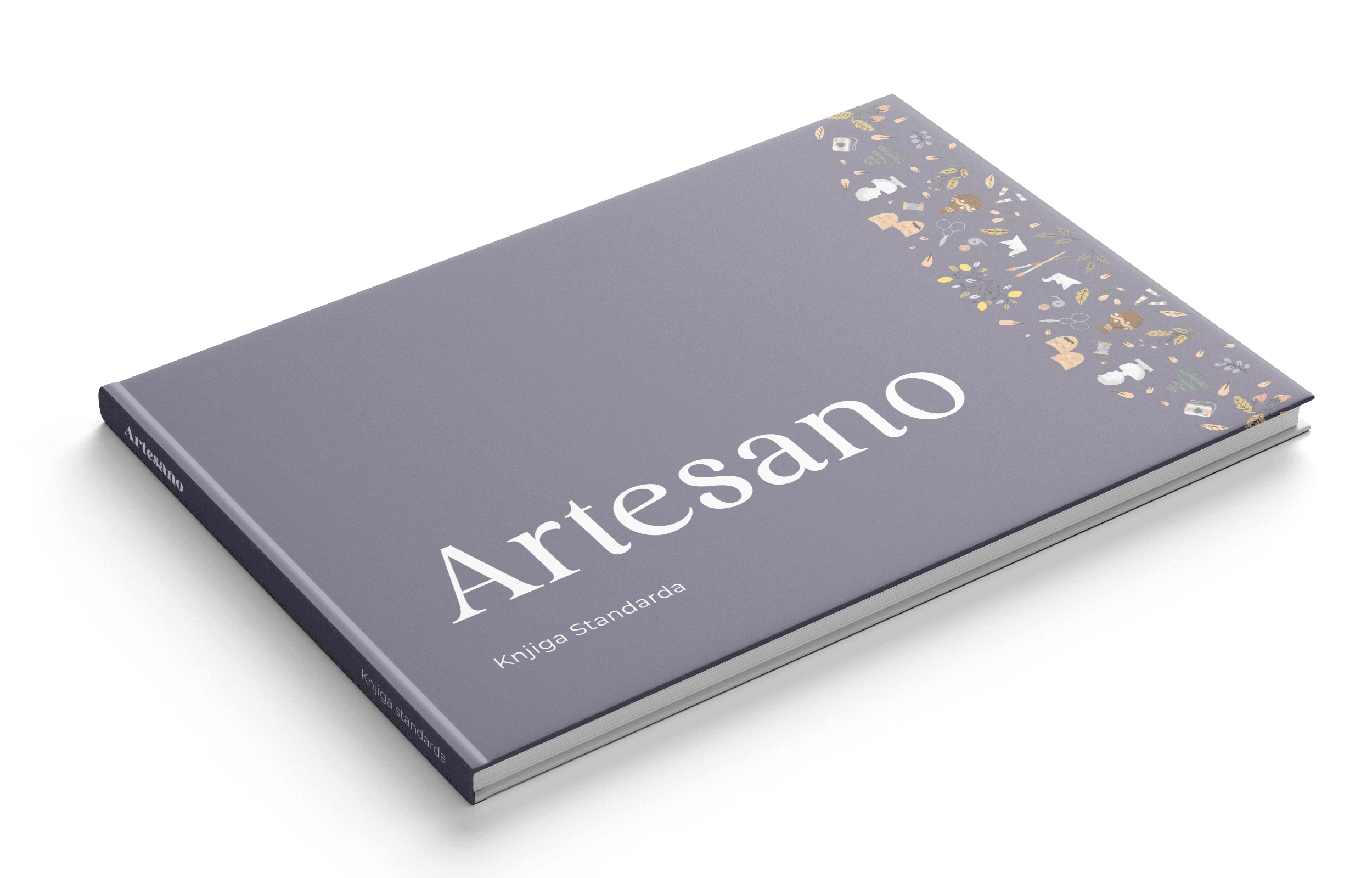
Artesano Book of Standards - Cover
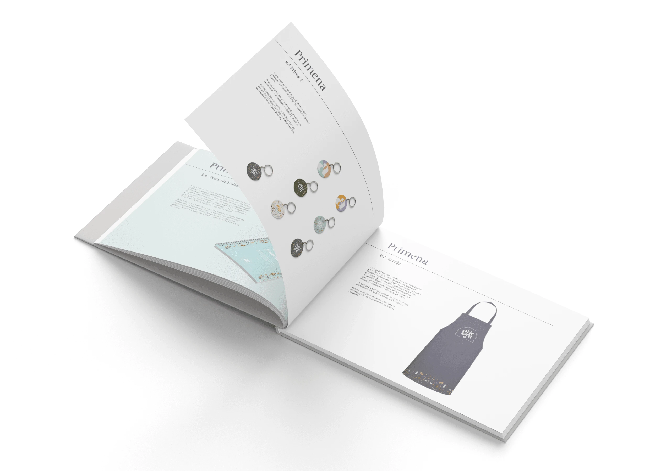
Artesano Book of Standards - Preview of inner pages
The interactive flipbook:
Key Achievements
Delivered a flexible branding system with a strong visual identity.
Created tools to engage audiences, from workshop materials to a unique journal design.
Captured Artesano’s mission through thoughtful and inspiring design.
Like this project
Posted Nov 25, 2024
Complete Visual Identity for an NGO focusing on mental health and restoration of old arts and crafts. Creation of concept, name, positioning and brand elements.

