Xpert Assistant: AI Hiring & Resume Screening SaaS

AI Resume Screening App UI/UX Design Case Study: How We Designed Xpert Assistant, an AI Hiring Platform
Industry: Recruiting · HR Tech · SaaS
Our role: Solution Architecture, Product Design, UI/UX Design
Deliverable: A complete recruiter-facing platform: marketing site, conversational onboarding and full web app
Tools: Figma
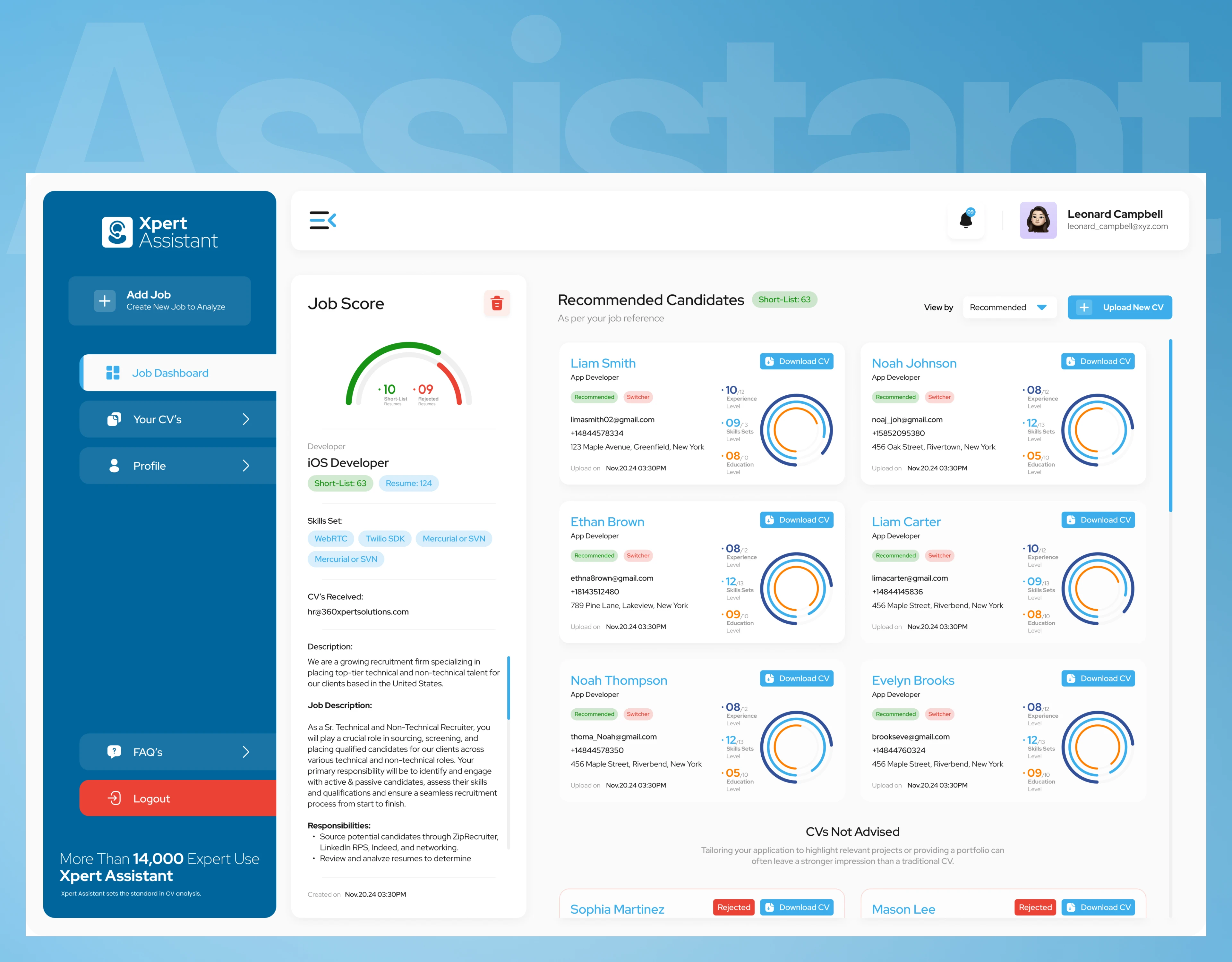
Job analysis detail screen with AI candidate scoring, HR dashboard UX
The one-line summary
A recruiter doesn't need another place to upload resumes — they need a reason to trust what the system tells them about each candidate. We designed Xpert Assistant so that every score, every shortlist and every rejection is visible, explainable and consistent from the dashboard all the way down to a single candidate's card.
The challenge: hundreds of resumes, one recruiter, no time to read them all
Xpert Assistant needed a platform that could take a job description and a stack of resumes and turn them into a ranked, trustworthy shortlist. That's harder than it sounds, because:
Recruiters need to screen candidates against their own bar, not a generic one, and still understand why the AI ranked someone the way it did.
Candidates are represented only by a resume and a score — the UI carries the weight of being fair, not just fast.
Hiring teams need to go from "job open" to "shortlist ready" in one sitting, without re-explaining the role to every new user.
Every score the AI produces is a decision that affects a real person's chance at a job. The brief was never "make an AI dashboard look smart". It was:
How do you design a system where a recruiter can trust an AI's judgment at a glance, for every candidate, every time?
Our approach: map the hiring journey first, design screens second
Before drawing any screen we mapped one hiring cycle from start to finish: job created, resumes uploaded, AI evaluates, candidates ranked, shortlist reviewed, CVs downloaded. Each step became a clear, repeatable screen pattern so a recruiter never has to relearn the product as a job moves through its stages.
We then designed the product around its three real jobs-to-be-done:
Job to be done:
Onboard fast
Post a job
Trust the shortlist
The recruiter's main question:
"Can I start without a 20-field form?"
"How do I tell the AI what I'm looking for?"
"Why is this candidate recommended?"
What we designed:
A conversational, chat-style signup flow
A 3-step job wizard: details, resumes, results
A consistent scoring language reused everywhere
The solution: five design decisions that make an AI hiring platform work
1. A landing page that shows the product, not just the pitch
Instead of illustrations, the "How to Start" section on the homepage uses real UI mockups of the actual 3-step flow, next to the headline promise: "Hire Warriors 10x faster" with an AI Automated Solution, and the supporting line "Train it once with your team profiles and it will score applicants on your unique scale." Social proof (14,000+ users, 4.9★ and 4.7★ ratings) and a usage-based pricing table sit below the fold.
Business impact: Visitors see the real product before they sign up, which shortens the trust-building step that most AI tools struggle with.
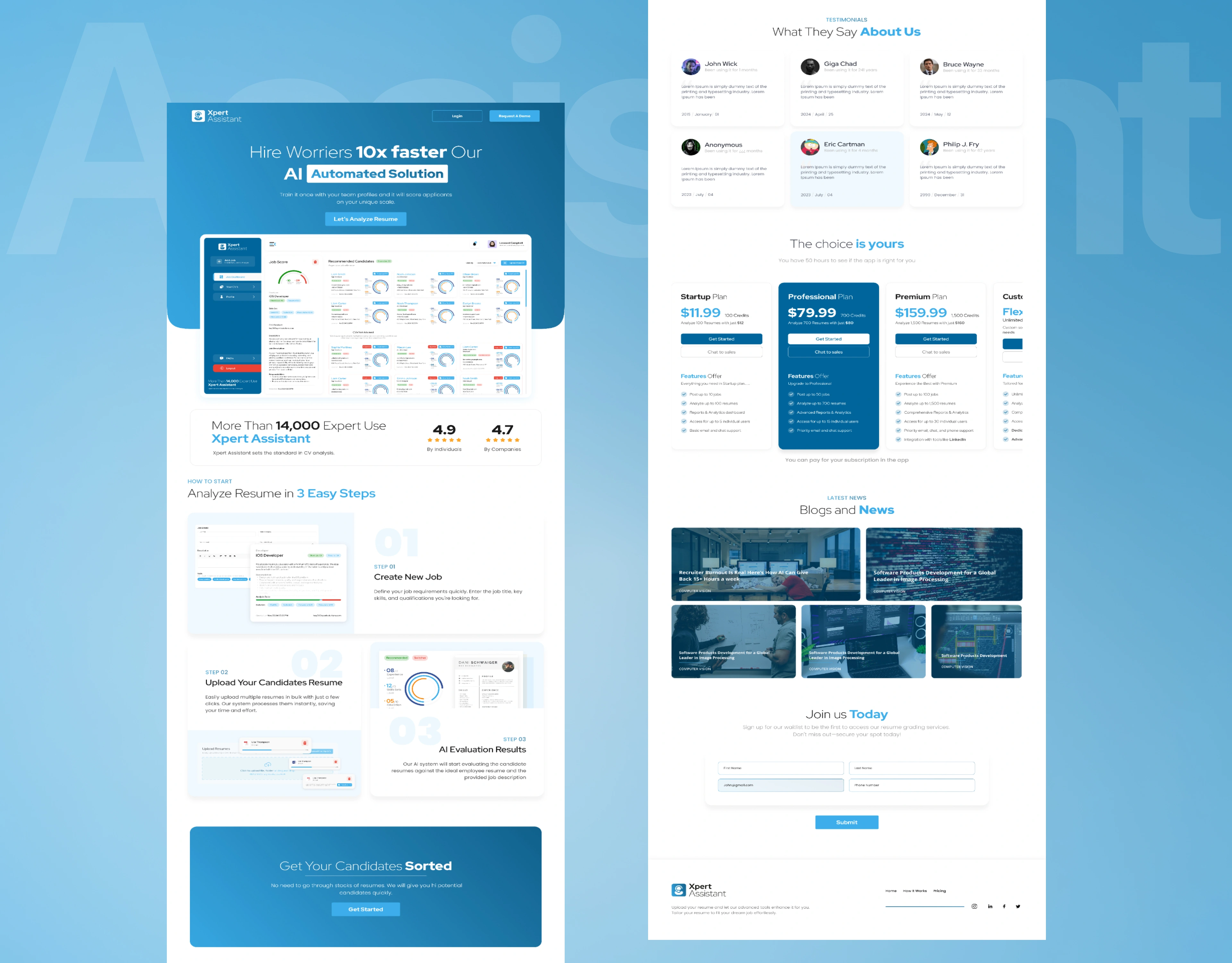
AI resume screening landing page with hero and how-it-works steps, SaaS marketing design
2. A split-screen login that sells the product on the way in
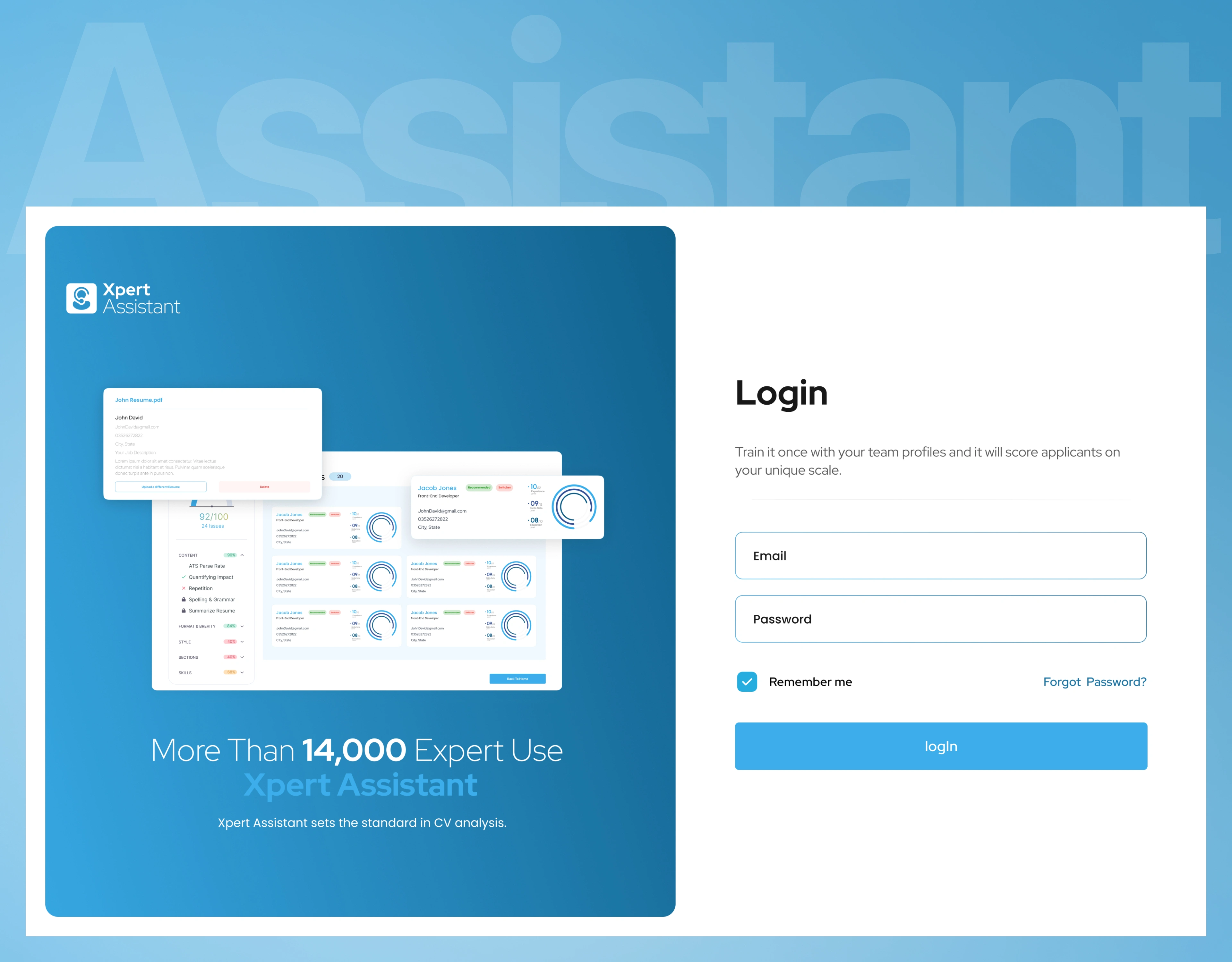
The login screen pairs a short email/password form with a navy gradient panel showing a live screenshot of the dashboard — including real score badges — plus the "14,000 Expert Use Xpert Assistant" trust line.
Business impact: Even a returning user is reminded of the product's value every time they log in, reinforcing retention.
AI resume screening landing page with hero and how-it-works steps, SaaS marketing design
3. Conversational onboarding instead of a 5-field wall
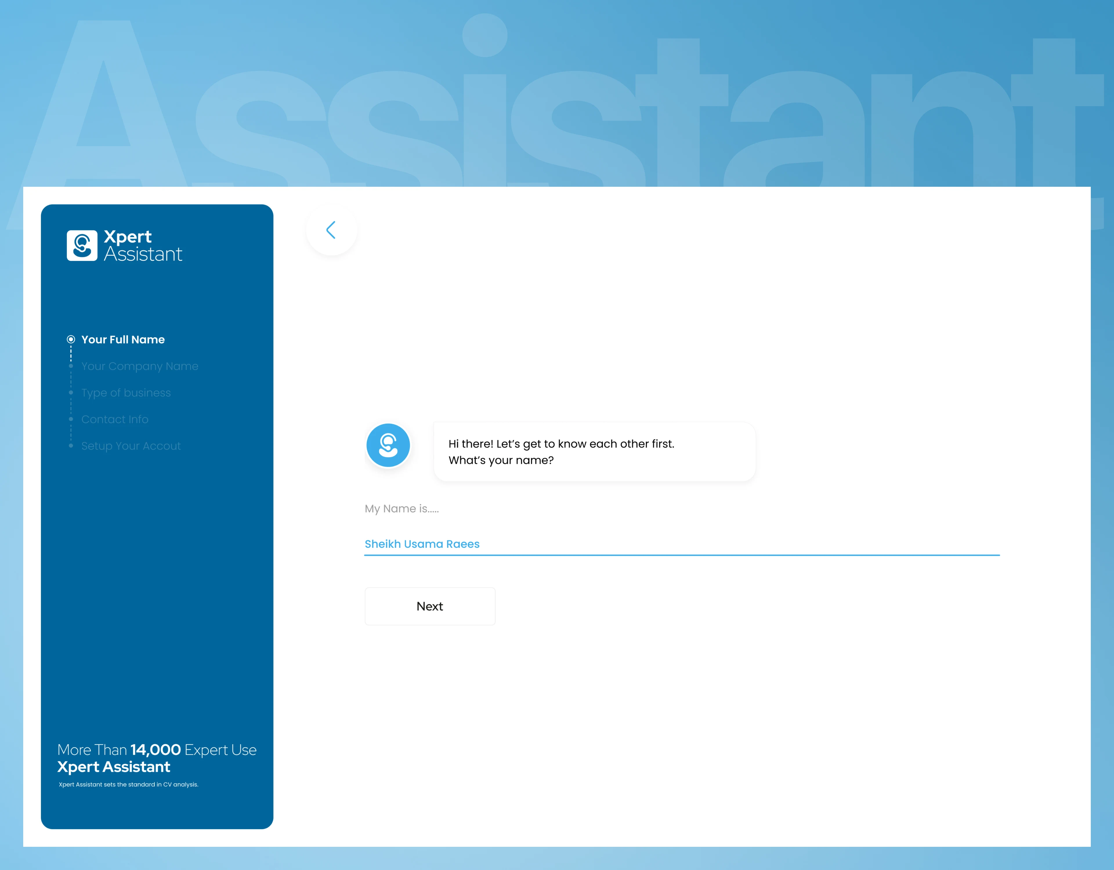
New accounts go through a chat-bubble flow — "Hi there! Let's get to know each other first. What's your name?" — with a visible progress rail (Full Name → Company Name → Type of Business → Contact Info → Setup Your Account) and the user's own answers echoed back as styled chat bubbles.
Business impact: A standard signup form becomes a low-friction, on-brand first impression instead of a drop-off point.
AI resume screening landing page with hero and how-it-works steps, SaaS marketing design
4. One scoring language, reused at every zoom level
Every job card on the dashboard shows a green/blue/red Analysis Ratio bar — a one-glance read of how many applicants are recommended, borderline or rejected — plus short-list and résumé counts and top skill tags. The same visual language scales down to each individual candidate later in the flow.
Business impact: A recruiter scanning 20 open roles can spot which jobs need attention without opening a single one.
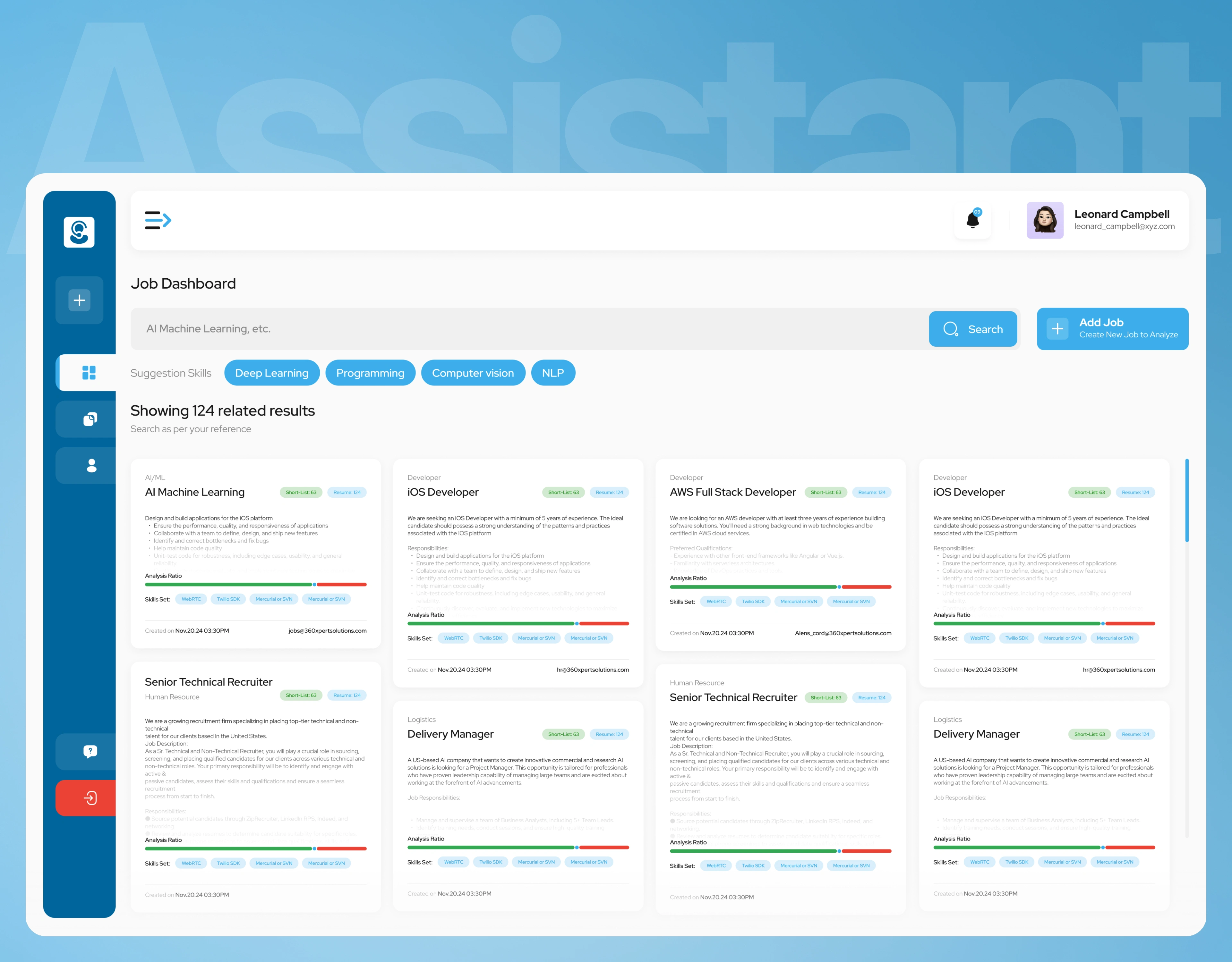
ob dashboard with AI candidate match ratio, recruiting SaaS UI design
5. A job analysis screen that shows its work
Opening a job reveals a dedicated Job Analyzer panel with a donut score chart and a short-list/rejected count, next to a scrollable, sortable candidate grid. Each candidate card breaks the AI's judgment into Experience Level, Skills Set Level and Education Level fractions (e.g. "10/12"), carries a Recommended or Switcher tag, and offers a one-click Download CV. Candidates who don't make the cut aren't just hidden — a "CVs Not Advised" section explains, in plain language, that a tailored application or portfolio can sometimes leave a stronger impression than a traditional CV.
Business impact: Recruiters can defend a shortlist decision in a hiring meeting, and the product never feels like a black box.
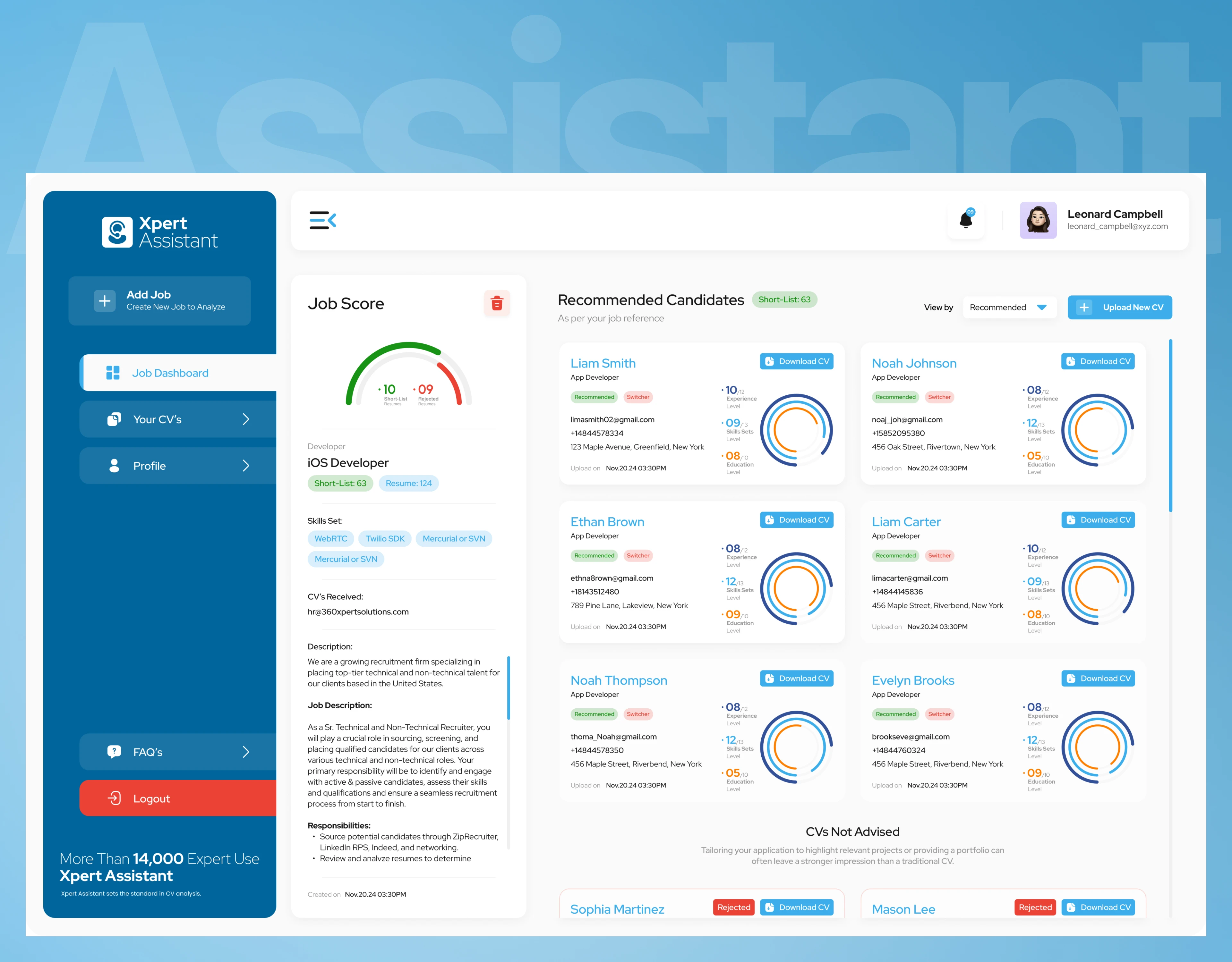
Job analysis detail screen with AI candidate scoring, HR dashboard UX
The core loop: job creation to AI results, in three steps
The 3-step wizard is the engine of the product, and it's the same flow previewed on the landing page and built out in full inside the app:
Create New Job — title, category/job code, an embedded-email field, a rich-text job description, and a tag-based skills field capped at 10 keywords.
Upload Candidates' Resumes — bulk drag-and-drop or folder upload (PDF/DOCX, 5MB max), live per-file progress, and a shortcut to pull from a user's own CV library instead of re-uploading.
AI Evaluation Results — the system scores every resume against the job description and produces the same Experience/Skills/Education breakdown used throughout the product
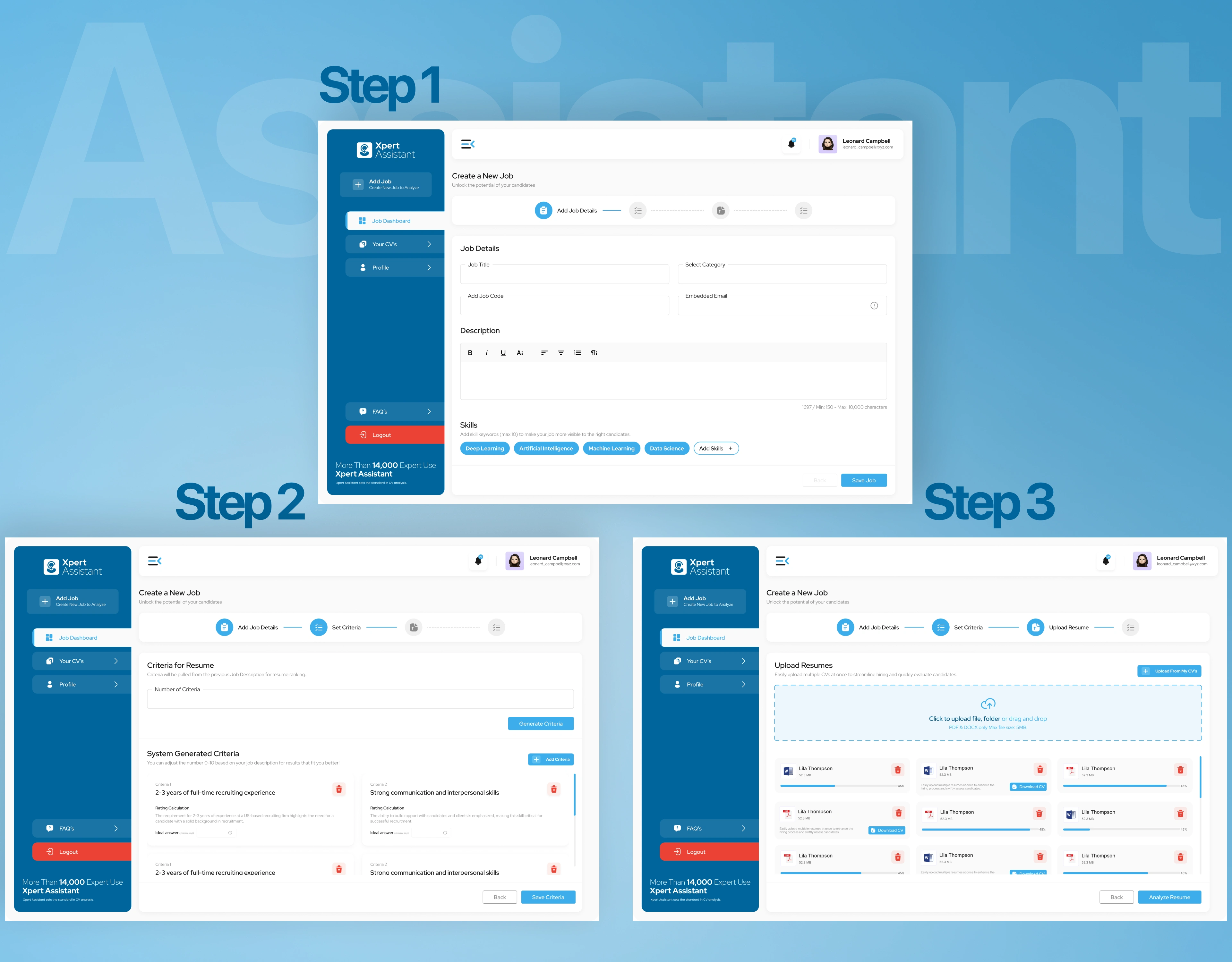
Three-step recruiter workflow: create a job, generate AI-based resume screening criteria, and upload multiple resumes for analysis.
Beyond the main screens: a complete product, not a highlight reel
The project covers the full recruiter journey across marketing, auth and the logged-in app, including:
Marketing: Landing Page, a fully localized Arabic landing page for MENA expansion, blog/news detail pages
Auth & onboarding: LogIn, SignUp (form-based), SignUp Chat (5-step conversational flow)
Core app: Job Dashboard / Job Board, Step-1 / Step-2 / Step-3 job creation wizard (plus lighter-weight "Simple" variants of each), Job Analysis Detail, Your CV's library, Add Criteria, Profile, Teams, and an in-app Membership Plans / billing screen
Shared system: one persistent navy sidebar shell, one card and pill-tag component set, and one scoring visual language used from the dashboard down to a single candidate
Every flow shares one component library and one status language, so developers can build it consistently and new roles or features can be added without redesigning the foundations.
Need an AI product, SaaS dashboard or recruiting platform? Here's what we bring
Your challenge
"Our AI feels like a black box to users"
"Our signup form is losing users"
"Our dashboard is cluttered"
"Developers keep asking what to build"
What we bring
A scoring system that's visible and consistent everywhere it appears
Conversational, chat-style onboarding flows
Clear, data-dense screens that still read at a glance
Complete Figma coverage of every screen and state
Services: AI/SaaS product design · recruiting and HR tech platforms · admin and analytics dashboard design · conversational onboarding UX · Figma design systems · solution architecture for startups
Let's talk
We help founders and teams turn complex, AI-driven ideas into products people can actually trust and use every day.
Have an AI, SaaS or recruiting platform idea? Book a free 30-minute discovery call and we'll map your first three priorities.
Case study based on real project work. Full walkthrough available on request.
Related searches: AI recruiting app design · resume screening UI design · HR SaaS dashboard UX · candidate scoring app design · conversational onboarding design · admin panel design for AI apps
0 likes · 1 view · Oct 30, 2026
Designed an AI recruiting platform: landing site, chat-based onboarding, and a recruiter dashboard with AI candidate scoring from job creation to shortlist.