Email Match Making: AI Vendor Email Dashboard

Email Management Software Design Case Study: How We Designed Email Match Making, a Vendor Email Dashboard with AI Reply Writing
Industry: Business-to-Business (B2B) Communication · Procurement and Vendor Management · Productivity Software
Our role: Product Design, User Interface and User Experience (UI/UX) Design
Deliverable: A desktop web application that collects vendor emails, matches each one to the right conversation, and helps the team write and send replies with artificial intelligence (AI)
Tools: Figma
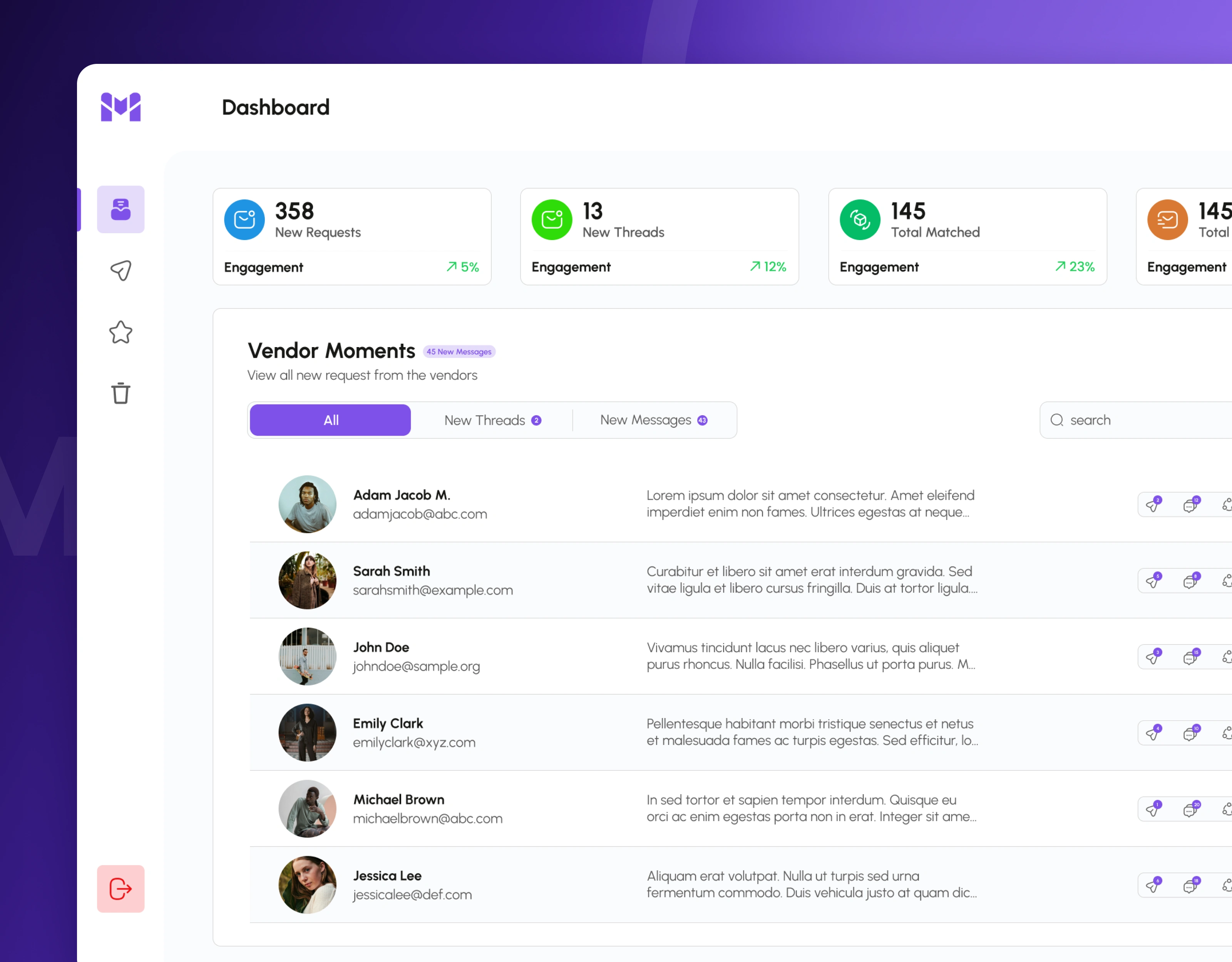
Email matching dashboard with vendor request counts, matched emails and a list of vendor messages
The one-line summary
Businesses that buy from many suppliers receive a steady stream of vendor emails: new orders, price list requests, order confirmations, sample feedback and shipping questions. Email Match Making brings all of those messages into one dashboard, matches each new email to the conversation it belongs to, and lets the team answer with an AI-written draft they can review and send in a few clicks.
The challenge: vendor emails arrive faster than a team can sort them
For a purchasing or operations team, the inbox is where the real work happens, but a normal email inbox was never designed for it:
Requests get buried. A new order request sits in the same list as newsletters, internal messages and old replies, so urgent vendor emails are easy to miss.
Conversations get split. The same order can produce a request, a revised order sheet, a price question and a confirmation, often from different people and with different subject lines. Without matching them together, nobody sees the full picture.
Replies take too long. Most vendor replies follow the same structure: confirm details, list the key points, attach the documents, and ask for a confirmation. Writing each one by hand slows the whole team down.
The goal was not "build another inbox". It was:
How do you help a team see every vendor request at a glance, understand the full conversation behind it, and reply correctly in minutes instead of hours?
Our approach: design around the life of one vendor request
Before designing the screens, we followed one vendor request from the moment it arrives to the moment it is answered: the email comes in, it is matched to an existing conversation (or starts a new one), a team member opens it, reads the earlier messages, writes a reply, attaches the documents and sends it. Each step became a clear place in the product: the dashboard for spotting new work, a side panel for reading a full conversation, an AI writing panel for replying, and simple folders for sent, saved and deleted emails.
What is new today. Main question: "How many vendor requests and conversations need attention?" What we designed: Summary cards for new requests, new threads and matched emails, each with an engagement trend.
Who sent what. Main question: "Which vendors wrote to us, and what do they want?" What we designed: A "Vendor Moments" list with each vendor's name, email, message preview and counts for sent emails, threads and matches.
The full conversation. Main question: "What has already been said about this order?" What we designed: A detail panel that opens beside the list, with sender, recipients, copied contacts, attachments and earlier replies.
The reply. Main question: "How do I answer quickly and correctly?" What we designed: An AI email generator with a text editor, attachments and a single Send button.
The solution: five design decisions that make a vendor email platform work
1. A dashboard that shows the workload before the first email is opened
The dashboard opens with four summary cards: new requests, new threads and matched emails, each showing an engagement figure and a percentage trend. Below them, the "Vendor Moments" section lists every vendor who has written in, with a badge showing how many new messages are waiting. Tabs filter the list by all messages, new threads and new messages, and a search bar and filters help the team find a vendor quickly. Each row shows the vendor's photo, name, email address and message preview, three small counters (emails sent, conversation threads and matches) and a clear View button.
Business impact: The team knows how much work is waiting and which vendors need attention first, without opening a single email.
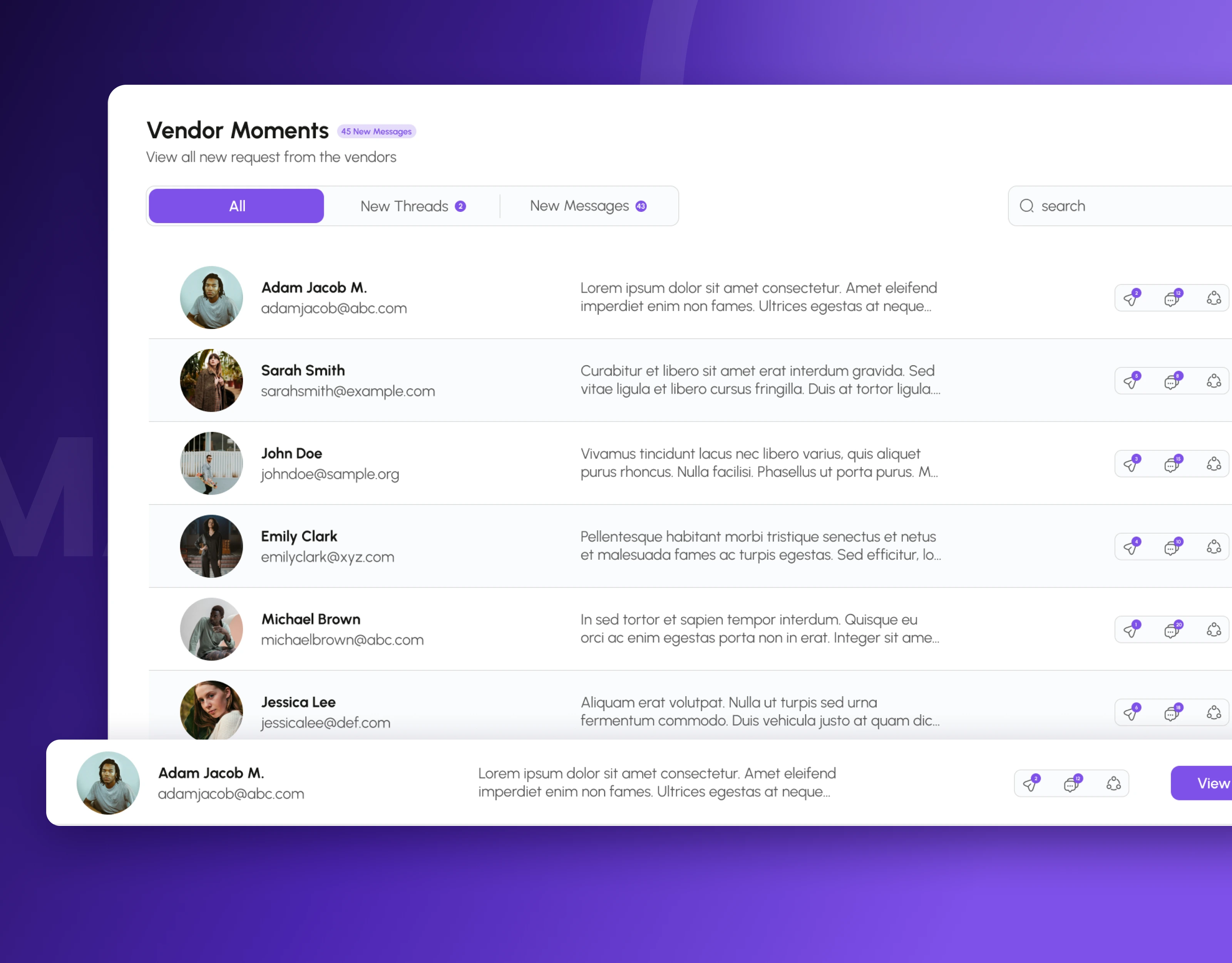
Vendor Moments list showing each vendor’s message preview, email activity counts and a View button
2. Conversations that open beside the list, not on a new page
Clicking View opens the email in a side panel that slides over the dashboard, so the team never loses their place in the list. The panel shows the subject, who sent the email, who received it and who was copied, the full message, attached files with their type and size, and Reply, Reply All and Forward buttons. Underneath, earlier messages in the same conversation are listed in order, with replies marked by an arrow, so the history of the order is always one scroll away.
Business impact: Team members read the full context before they answer, which reduces mistakes such as confirming an old version of an order.
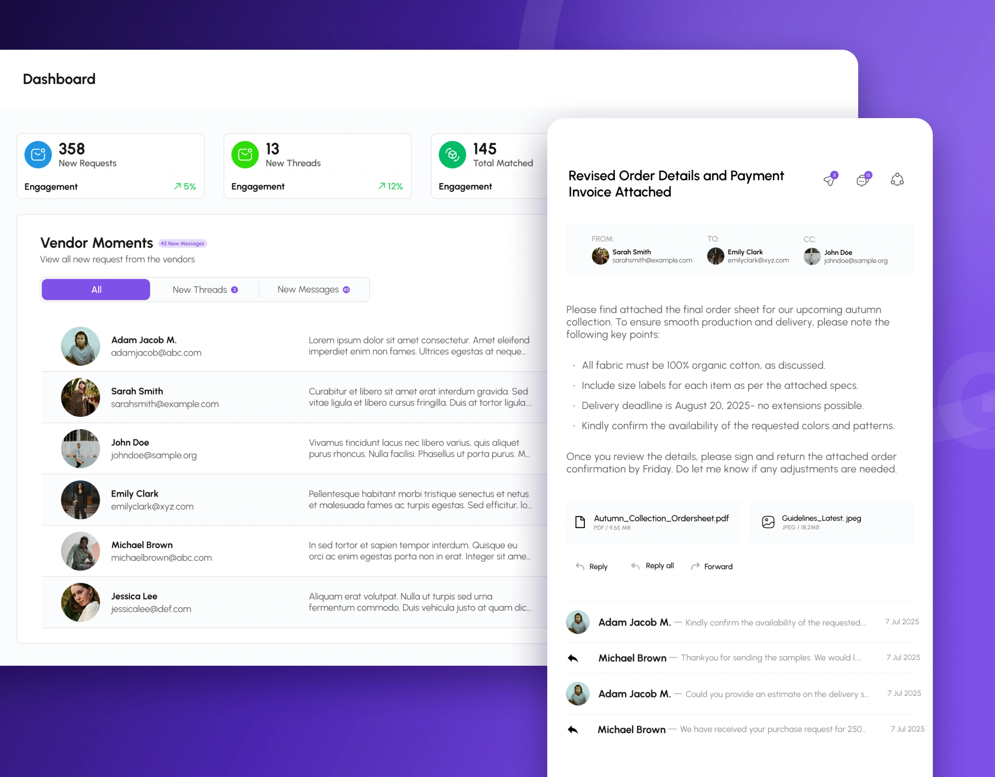
Email detail panel opening beside the dashboard with sender, recipients, attachments and earlier replies
3. A requests panel that sorts new vendor emails by what they are about
A dedicated "Requests" panel lists every incoming vendor email with the sender, the subject line and a two-line preview, plus how long ago it arrived. Subjects such as "New Order Request", "Request for Updated Price List", "Order Confirmation", "Feedback on Product Sample" and "Inquiry About Shipping Times" make the type of request clear at a glance, and the total number of open requests is shown at the top. Each request card opens straight into its conversation.
Business impact: Requests can be picked up in the order they matter, instead of the order they happened to arrive.
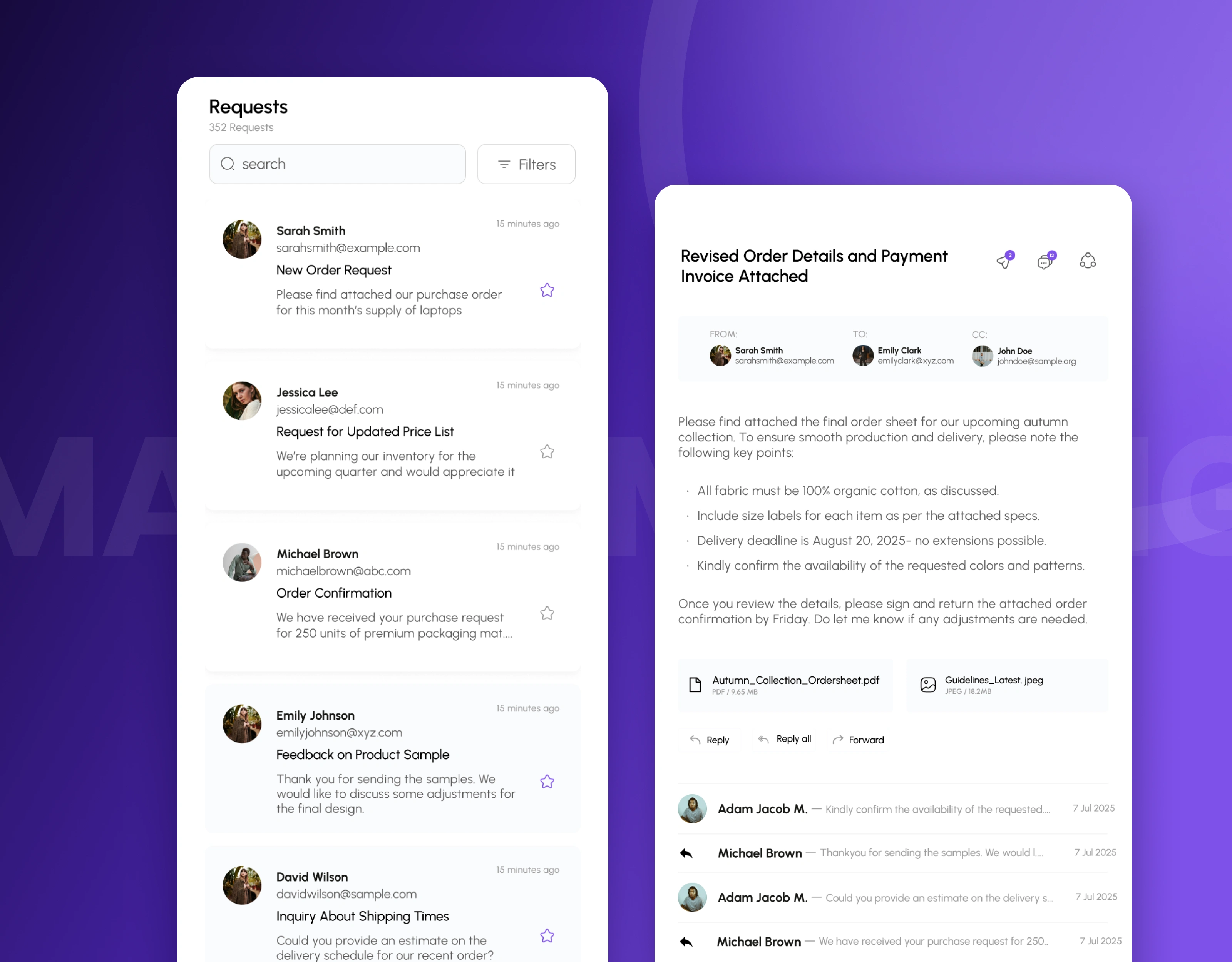
Requests panel listing new vendor emails with subject, preview and time received
4. AI reply writing that the team stays in control of
From any email, the team can open the "Generate Email" panel. It keeps the original email and the sender's details at the top for reference, and a Generate button writes a full reply draft: an opening line, the key points as a list, a clear request for confirmation, and the right attachments. The draft sits in a normal text editor with bold, italic, underline, alignment, heading and link tools, so the team can correct anything before pressing Send. A short confirmation, "Your Email has been Sent", closes the loop.
Business impact: Replies that used to take many minutes to write are drafted in seconds, while a person still checks every message before it reaches a vendor.
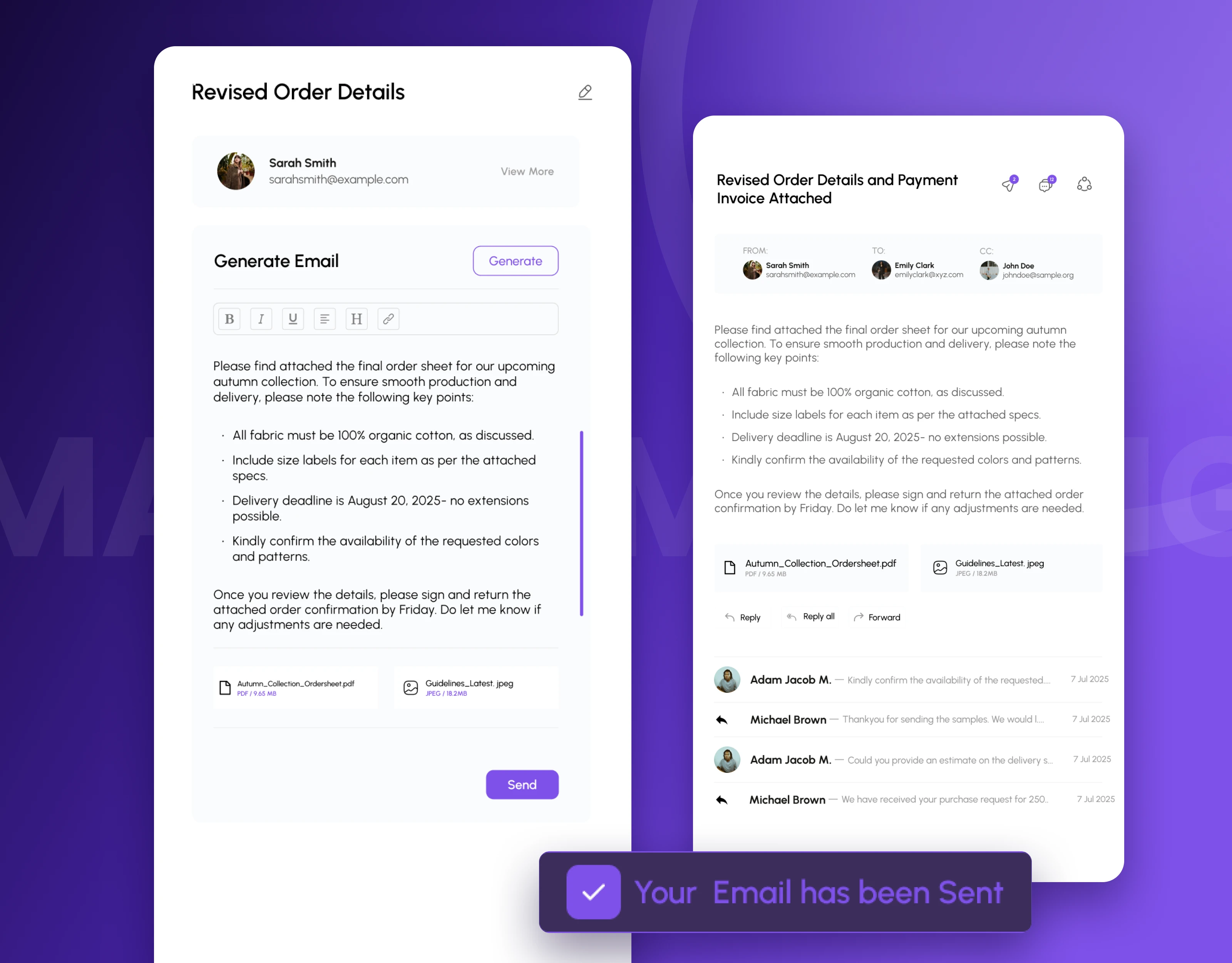
AI email generator writing a reply draft, with a confirmation once the email is sent
5. Simple folders for everything that has already been handled
Sent, Saved and Trash each have their own screen with the same search and filters as the dashboard, so the team never has to learn a new layout. Every row shows the contact, the subject, a preview and the date. The Sent screen opens each email in full with its conversation, Saved keeps important emails for later, and Trash explains clearly that messages older than 30 days are deleted automatically, with an "Empty Trash Now" option for anyone who wants to clear it straight away.
Business impact: Past orders and confirmations are easy to find again, and nothing is deleted by surprise.
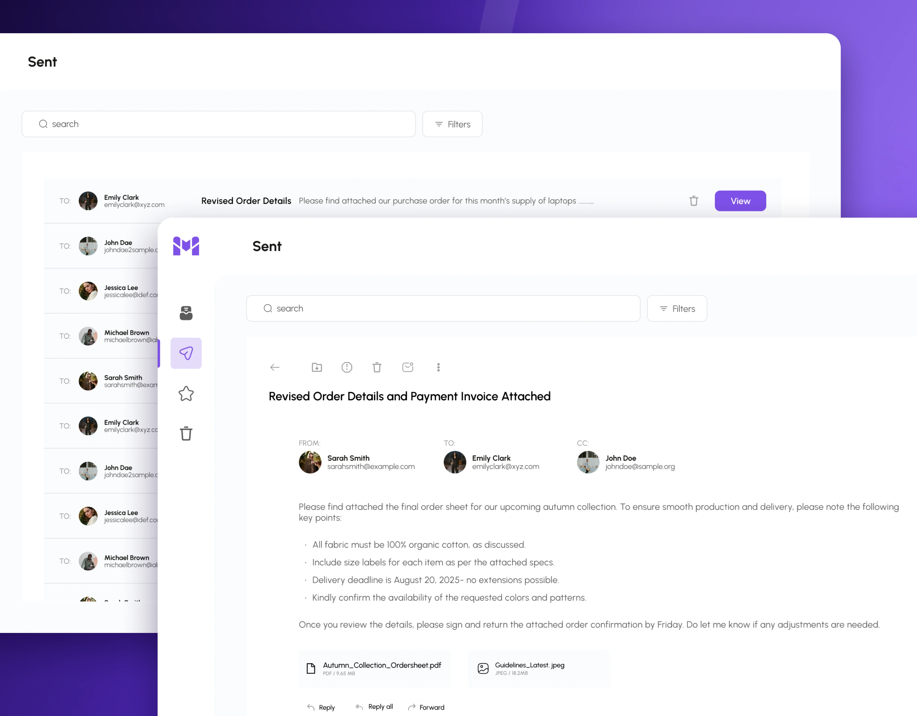
Sent emails list and sent email detail with the full conversation
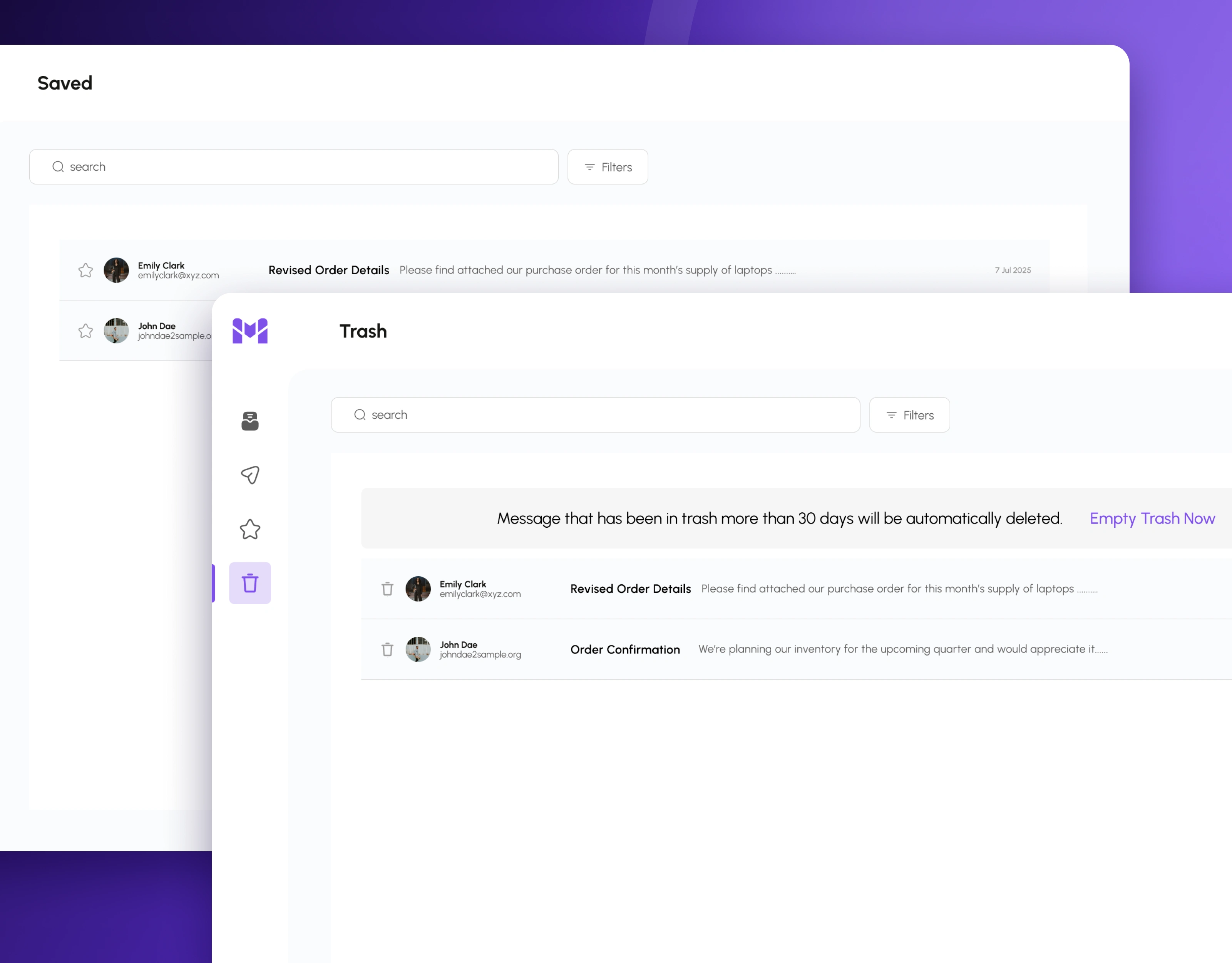
Saved emails and trash screen with a 30-day automatic deletion notice
Beyond the main screens: a complete product, not just a few highlights
The design covers the full daily workflow of a team that handles vendor emails:
Secure sign-in: login with an email address and password
Dashboard: new requests, new threads and matched email counts with engagement trends, plus the "Vendor Moments" list with tabs, search and filters
Requests: a panel of incoming vendor emails grouped by subject, with time received and total count
Email detail: sender, recipients and copied contacts, full message, attachments, Reply, Reply All and Forward, and the earlier messages in the same conversation
AI email generator: one-click reply drafts with a formatting toolbar, attachments, an edit option for the subject and a Send button
Reply shortcuts: a quick reply view of the conversation for fast answers
Folders: Sent, Sent Details, Saved and Trash with 30-day automatic deletion
Confirmation messages: a clear "Your Email has been Sent" notice after every reply
Every screen uses one visual system: a purple brand colour for actions and highlights, a narrow icon sidebar for Inbox, Sent, Saved and Trash, a red logout button kept apart at the bottom, and reusable components for email rows, request cards and the email detail panel. This means developers can build it consistently, and new features can be added without redesigning the foundations.
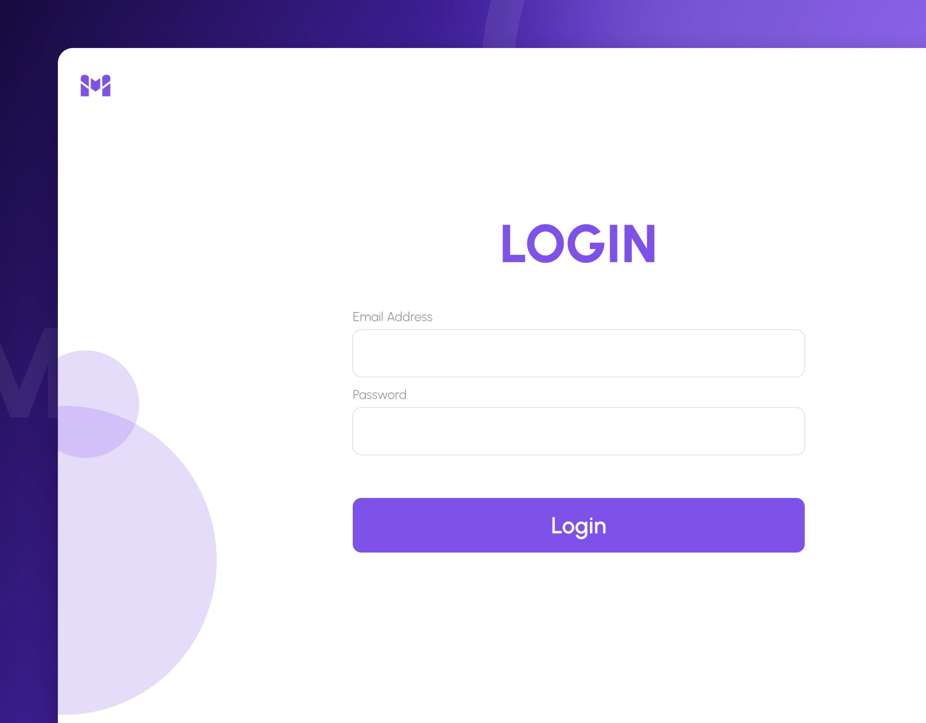
Login screen for the vendor email matching platform
The outcome
Email Match Making now has a complete, ready-to-build design for a vendor email platform: a dashboard that shows the day's workload at a glance, conversations that are matched and readable in one panel, and AI reply writing that keeps a person in control of every message.
[ ✏️ ADD YOUR REAL NUMBERS HERE if you have them: project timeline, number of screens delivered, how many vendors or emails the client handles, time saved per reply. Even one honest number makes this section much stronger. Please don't invent figures. ]
Need an email tool, AI assistant or business dashboard? Here's what we bring
Your challenge: "Important vendor emails get lost in our inbox"
What we bring: A dashboard that pulls vendor requests out of the noise and counts what needs attention
Your challenge: "We can't see the full history of an order"
What we bring: Conversation matching with a side panel that shows every earlier message
Your challenge: "Writing replies takes our team too long"
What we bring: AI reply drafts that the team can edit and send in one place
Your challenge: "Our tools look different on every screen"
What we bring: One visual system with reusable components across the whole product
Your challenge: "Developers keep asking what to build"
What we bring: Complete Figma designs for every screen and state
Services: email and communication tool design · AI assistant interface design · B2B and procurement software design · admin and reporting dashboard design · software-as-a-service (SaaS) product design · Figma design systems
Let's talk
We help founders and teams turn busy, manual workflows into clear products that people enjoy using every day.
Building an email tool, AI assistant or business dashboard? Book a free 30-minute discovery call and we'll map out your first three priorities.
🌐 https://360xpertsolutions.com · 💼 www.linkedin.com/in/360xpertsolutions
Case study based on real project work. Full walkthrough available on request.
Related searches: email management software design · AI email assistant UI design · vendor communication dashboard · procurement inbox design · B2B SaaS dashboard design · email thread matching tool
0 likes · 1 view · Nov 3, 2026
End-to-end UI/UX for a vendor email platform: dashboard, request matching, conversation panel and AI reply writing, so teams answer suppliers in minutes.