Digital Transformation for Ashurst Advance Digital
✦ Jasmine Law
A Digital Transformation for Legal Innovation
Legal Tech | Internal Portal
Client: Ashurst
Agency: Futurice UK
Location: London, UK
Deliverables: Brand Strategy Workshop | Visual Identity | UX/UI Design | Design System
Project Page: Ashurst Portfolio Page
About The Project
Overview
Ashurst LLP, a multinational law firm headquartered in London, sought to transform its digital space through Ashurst Advance Digital. The firm aimed to position itself as one of the world’s most progressive law firms by developing a single digital platform that would not only serve internal stakeholders but also create a new revenue stream.
Key Challenges
As Ashurst re-evaluated its business model post-COVID, it became clear that their digital ecosystem required a strategic overhaul. The challenge was to establish a distinct identity for Ashurst Advance Digital (AAD) while maintaining cohesion with the corporate brand, ensuring that the platform remained both recognisable and functionally scalable.
Balancing brand differentiation and cohesion, ensuring AAD stands out while aligning with Ashurst LLP.
Defining AAD’s product position, clarifying its commercial relationship with the core brand.
Establishing a design system that enables consistency across digital touchpoints.
Developing a responsive web experience, ensuring accessibility across desktop, tablet, and mobile.
To future-proof AAD’s digital platform, a structured branding and UX/UI strategy was necessary.
Approach
Brand Strategy Workshop
To emerge as a law firm with progressive values, Ashurst Advance Digital adopted a new visual identity to differentiate itself from Ashurst LLP’s corporate branding. Three key steps were taken to understand the stakeholder’s product vision.
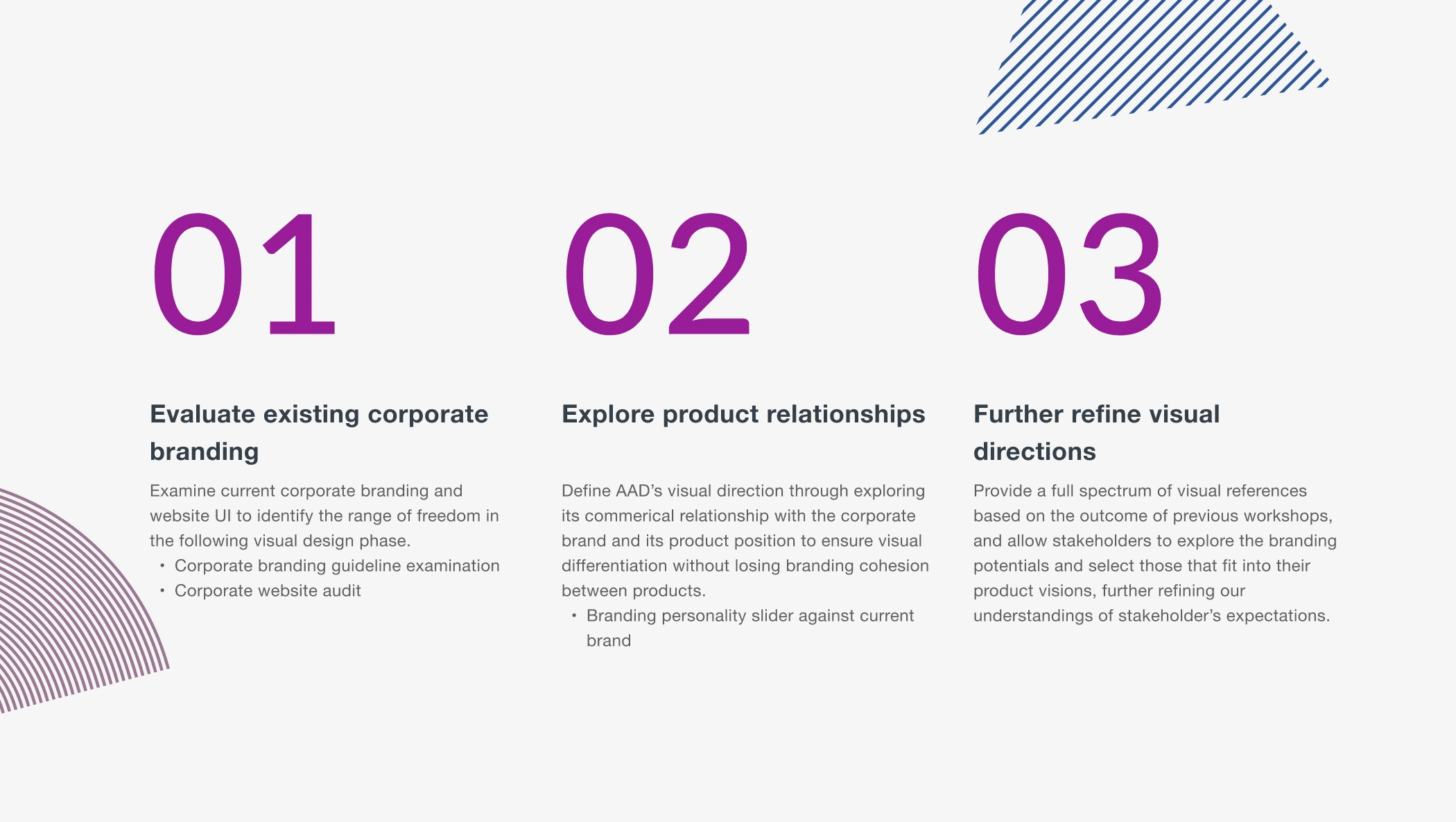
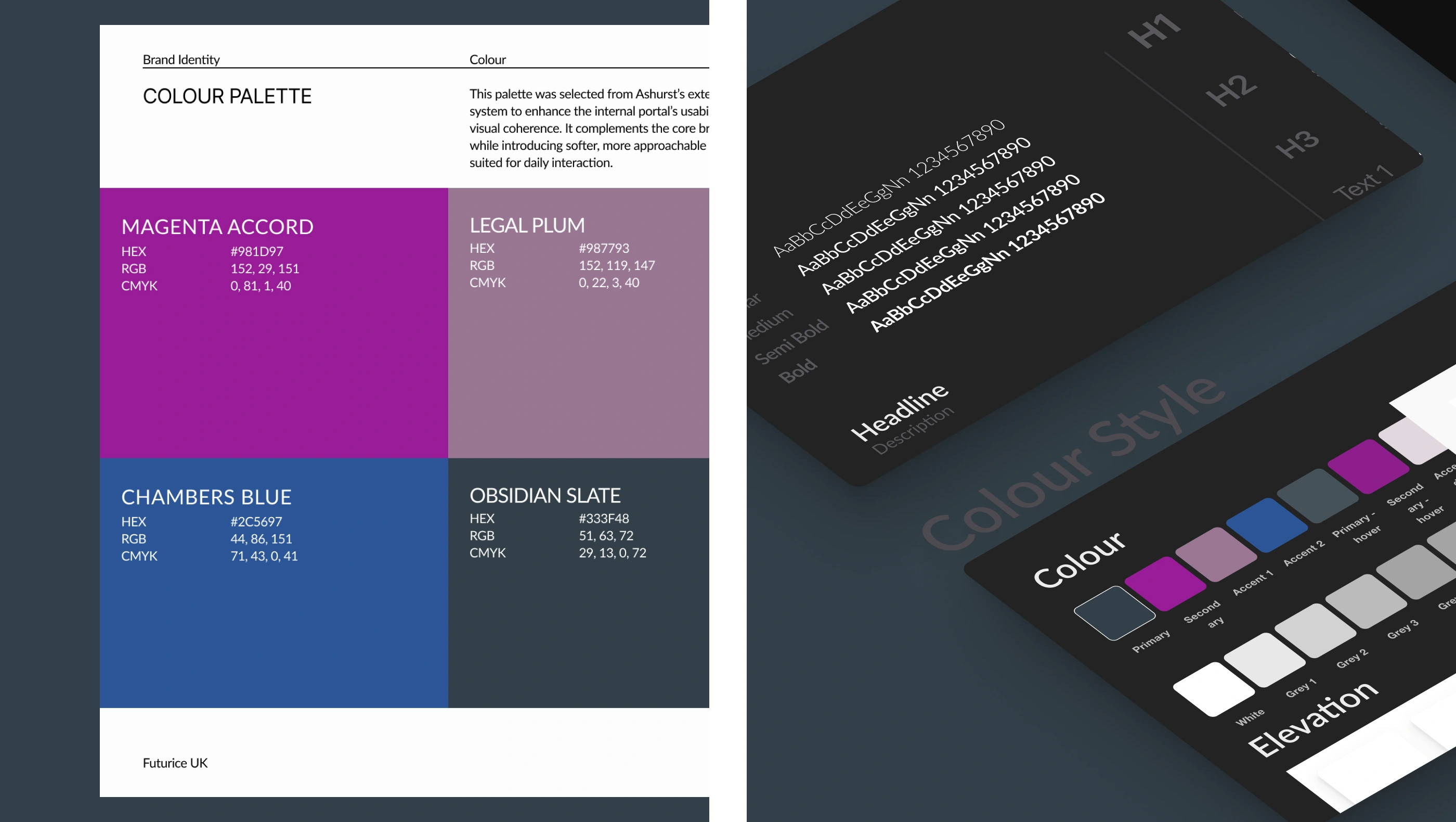
Visual Exploration Within Corporate Constraints
While colour palette and typography were predefined as part of the corporation’s wider sub-branding, we explored how to bring visual distinction and motion into the brand. The focus was on translating the core visual language into a digital-first context, using geometry, rhythm, and subtle interaction to give the experience its own character while staying on-brand.
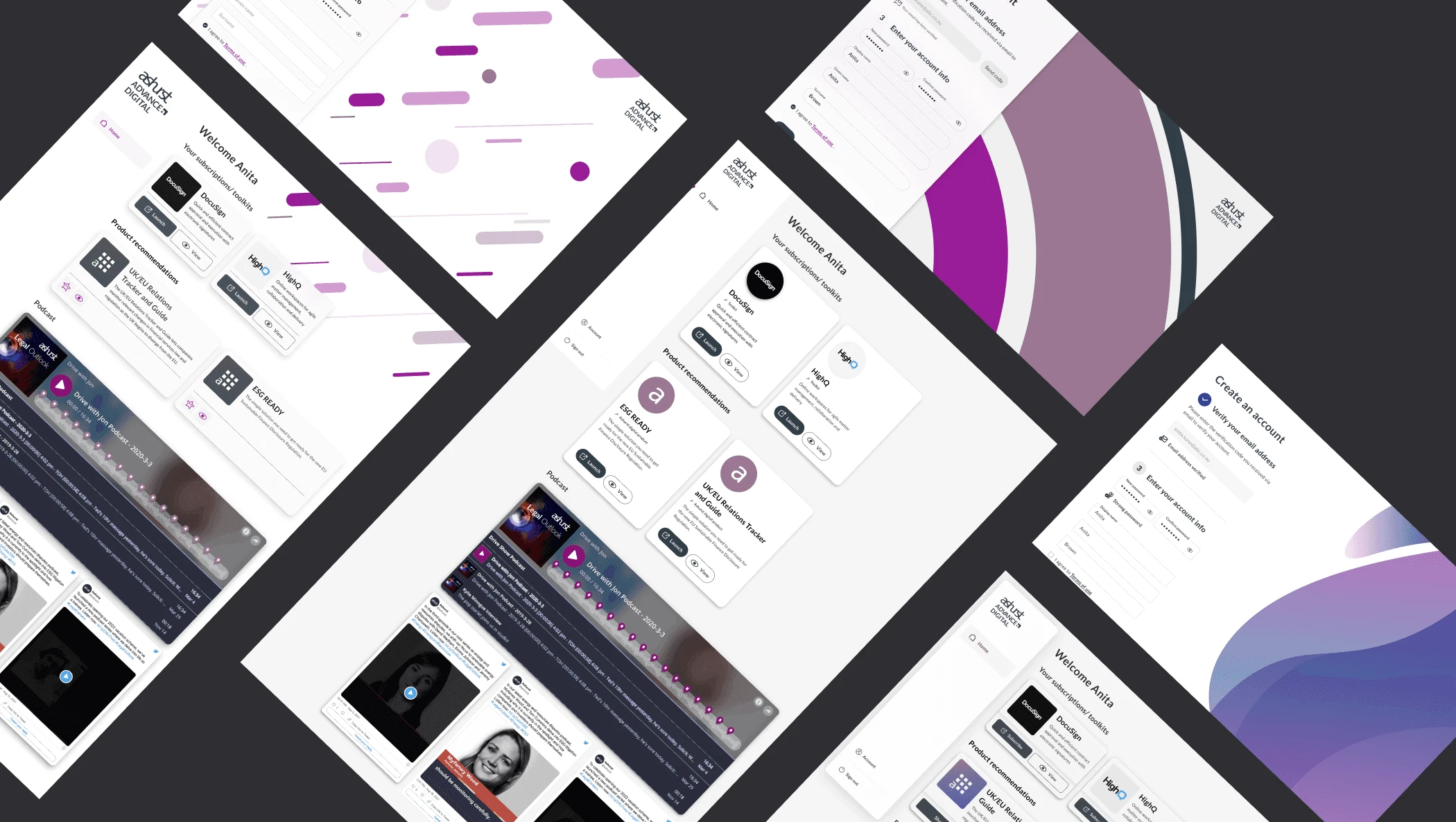
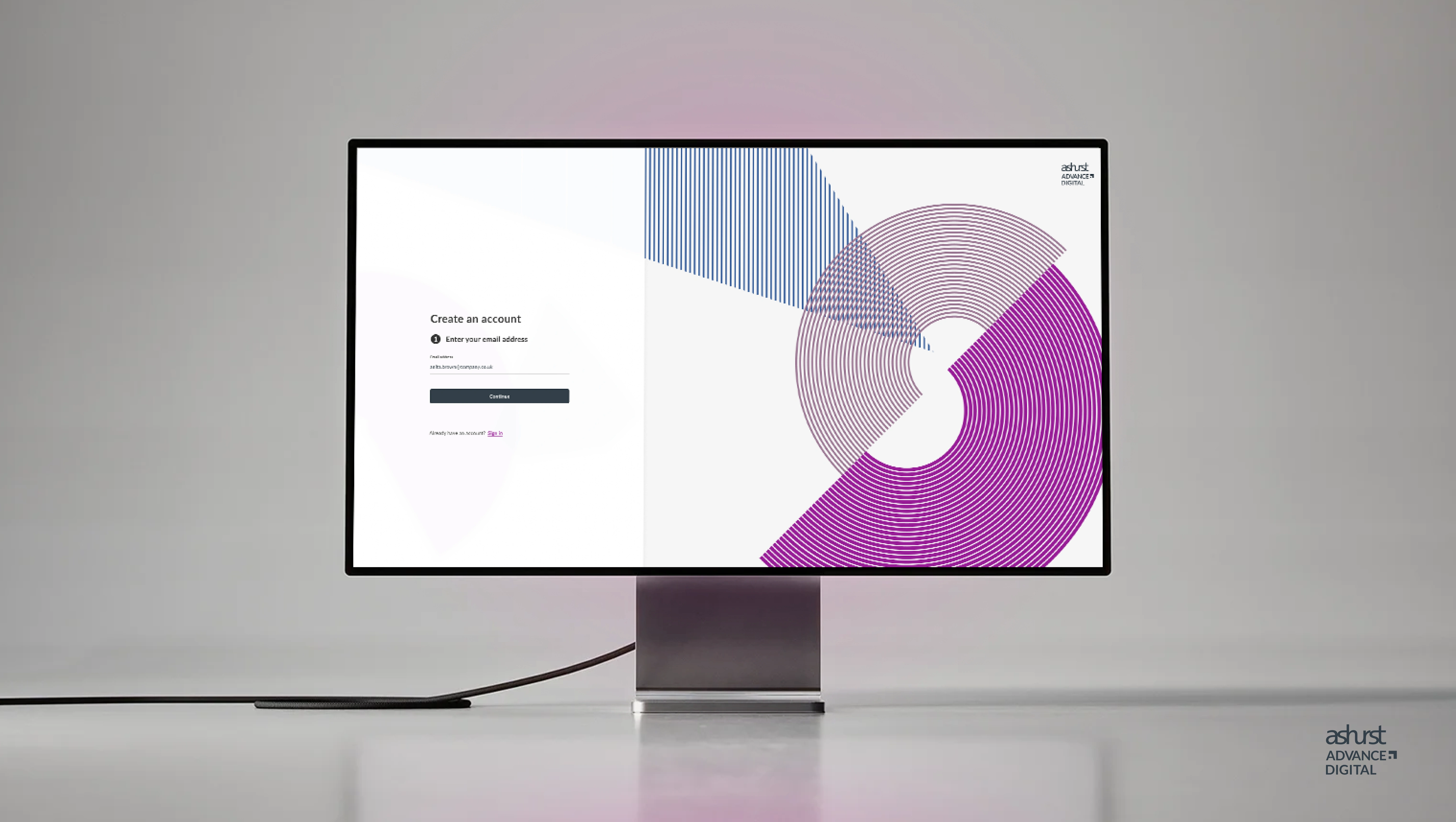
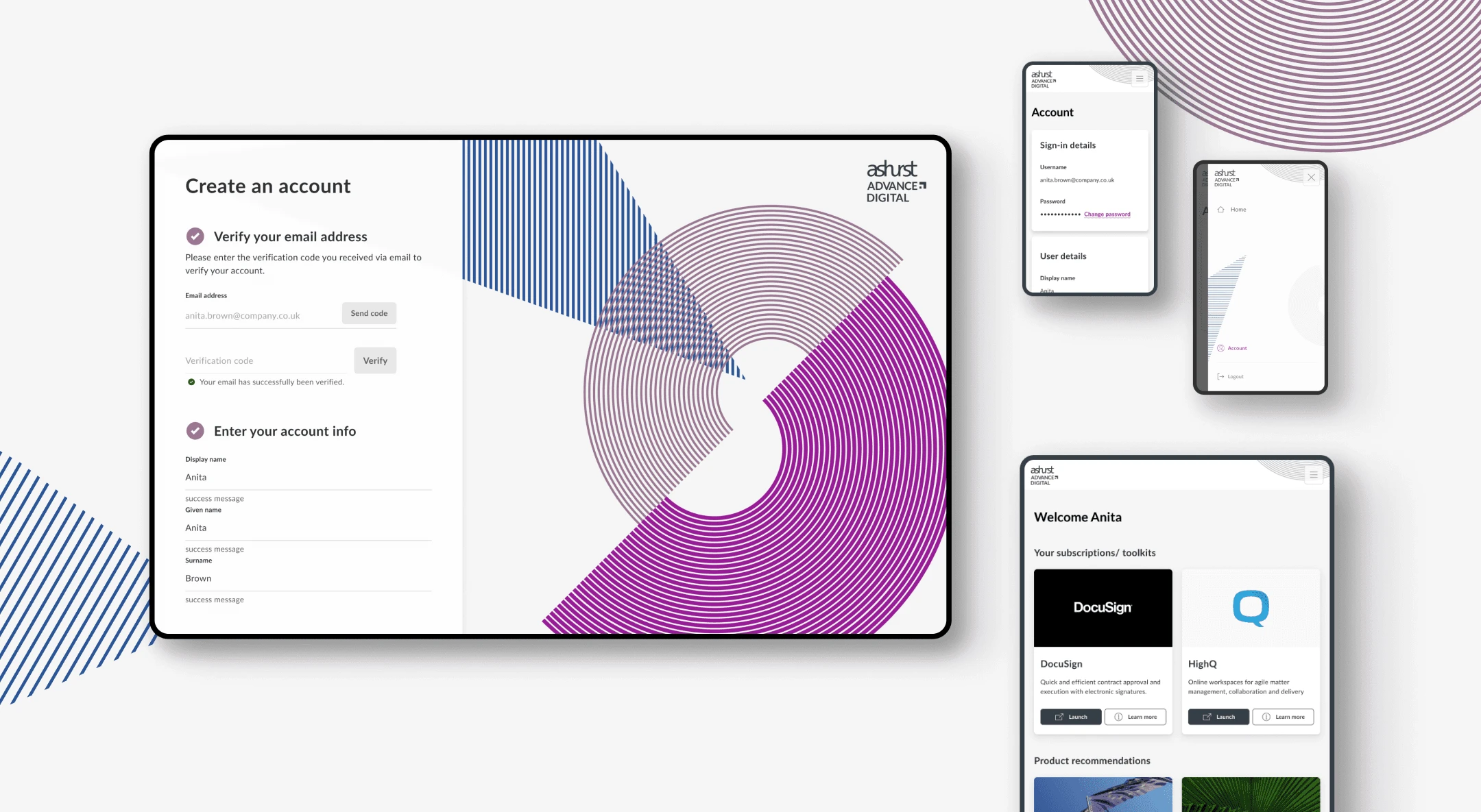
MVP Delivery: Authentication & Core Platform Screens
The MVP scope included designing the core account experience—from authentication to dashboard. This included the full sign-in and account creation flows, as well as key product screens like the home page, user dashboard, and account settings. The goal was to ensure a smooth onboarding journey and a clean, accessible foundation for future feature expansion.
Like this project
Posted Jun 10, 2025
Designed Ashurst’s MVP internal portal with a new visual identity and intuitive UX/UI to lay the foundation for an enhanced employee experience.
Likes
1
Views
20
Clients
Ashurst