Optimising B2B Course Purchasing for Higher Conversions
✦ Jasmine Law

Optimising B2B Course Purchasing for Higher Conversions
Education & Professional Training | Website | B2B
Client: BSI
Agency: Elixirr
Location: London, UK
Deliverables: UX Strategy | E-commerce Optimisation | User Research | Conversion Rate Optimisation
Tools used: Figma | Figjam | Google Hangouts
Project Page: BSI Portfolio Page
About The Project
Overview
BSI, a global leader in standards and professional training, sought to enhance its e-commerce experience to improve user engagement and conversion rates for its course purchasing journey. My role as Lead Product Designer was to identify UX pain points, streamline the buying process, and improve overall efficiency through a data-driven, user-centric approach.
Key Challenges
BSI's existing online purchasing experience presented multiple friction points that led to high drop-off rates, inefficient navigation, and poor data tracking. The challenge was to simplify the course selection and purchasing journey while ensuring users had access to relevant information for decision-making.
Lack of clear and transparent course information, delaying purchasing decisions due to budget approvals.
Inconsistent UI and navigation issues, leading to a frustrating user experience.
High cart abandonment rates, caused by complex registration and checkout flows.
Limited personalisation, failing to cater to different user needs.
Inefficient data collection, missing opportunities to improve marketing and operational insights.
Poor mobile experience, negatively impacting accessibility and engagement.
BSI needed a conversion-focused redesign to reduce friction, enhance usability, and increase course sales.
Approach
A User-Centred, Data-Driven Optimisation Approach
To improve BSI’s B2B course purchasing journey, we developed a strategic UX optimisation plan focused on reducing friction, enhancing usability, and increasing conversion potential. This approach involved stakeholder alignment, in-depth user research, and iterative design improvements, ensuring a seamless experience from course selection to checkout.
Identifying Key Usability Issues Through a UX Audit
A comprehensive UX audit was conducted to analyse information architecture, navigation, visual design, and usability patterns. This revealed pain points in content structure, unclear purchasing steps, and inconsistent user pathways, making it difficult for businesses to confidently complete their course bookings.

Aligning Business & User Needs Through Stakeholder Interviews
To bridge the gap between business goals and user pain points, we conducted stakeholder interviews with key teams across marketing, product, and operations. These discussions helped define technical limitations, commercial priorities, and friction in the approval process. Following these sessions, we developed a high-level flow to visualise decision-making points in the purchasing journey, ensuring clarity before any design implementation.

Defining Personas & Mapping User Journeys
Using insights from research, we created user personas that reflected key customer segments, each with distinct needs and purchasing behaviours. A detailed user journey map outlined touchpoints, friction areas, and conversion blockers, allowing us to develop a targeted strategy. Before implementing changes, we proposed high-level solutions and page-level adjustments to stakeholders, ensuring alignment on key design decisions.
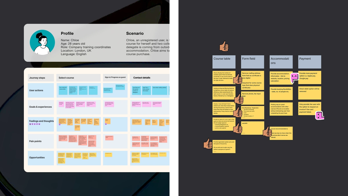
Refining Checkout & Course Selection for a Smoother Experience
The course selection page and checkout process were redesigned to reduce friction. Enhancements included simplified filtering, clearer pricing visibility, and a structured order summary, allowing users to make informed decisions faster. Additionally, we streamlined data collection by removing redundant steps and pre-populating fields, reducing delays in the approval process. The impact of these improvements was visually documented through before-and-after comparisons, highlighting clearer navigation, an optimised layout, and a more intuitive user experience.

Like this project
Posted Jun 9, 2025
Optimised BSI’s e-commerce experience to drive higher user engagement and boost conversions through streamlined UX and design.