Kraft Heinz – BI Dasboard UX Design
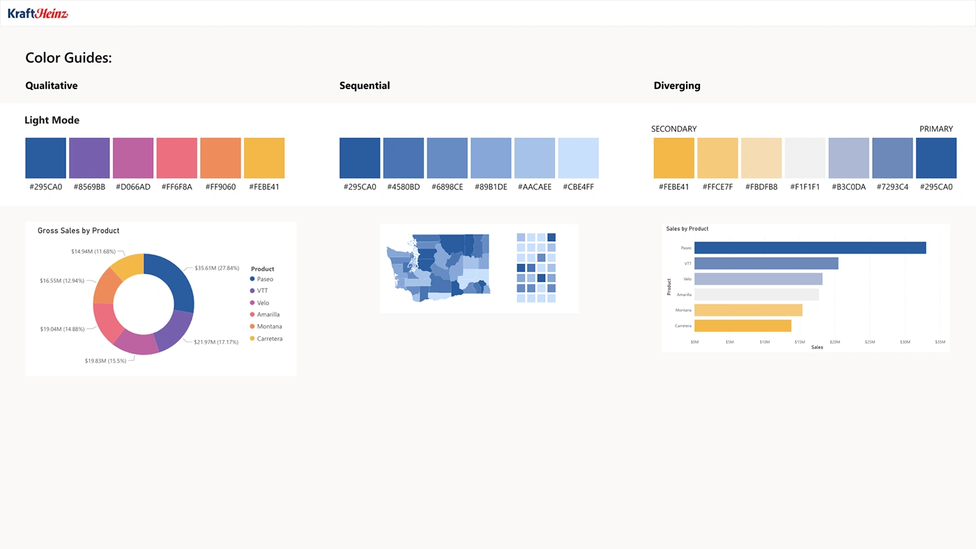
Color Guides & Consistency
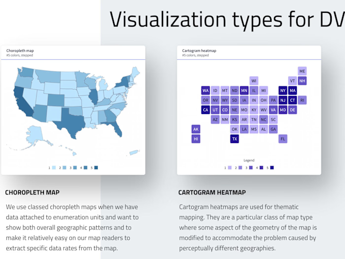
One of the core objectives of this project was to maintain consistent brand identity across all data visualizations. I developed a comprehensive color guide (Qualitative, Sequential, and Diverging) aligned with the Kraft Heinz brand to ensure visual coherence. This allowed users to interpret data consistently across different dashboards, whether they were reviewing sales, operational performance, or transportation disruptions. These guides, optimized for light mode, provided a visual hierarchy that improved the user experience by aiding in the quick identification of trends and exceptions.
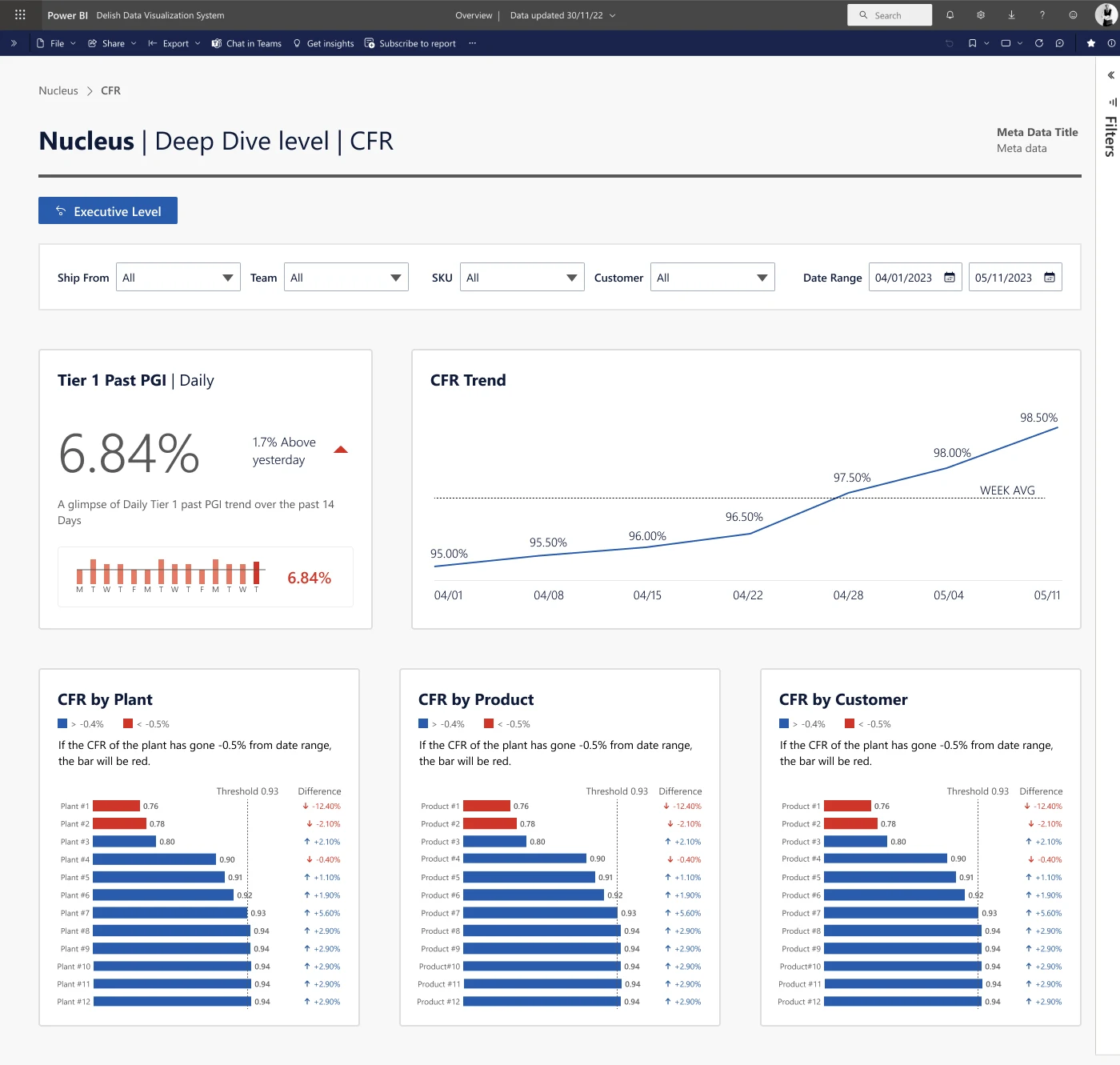
Nucleus | Deep Dive Level
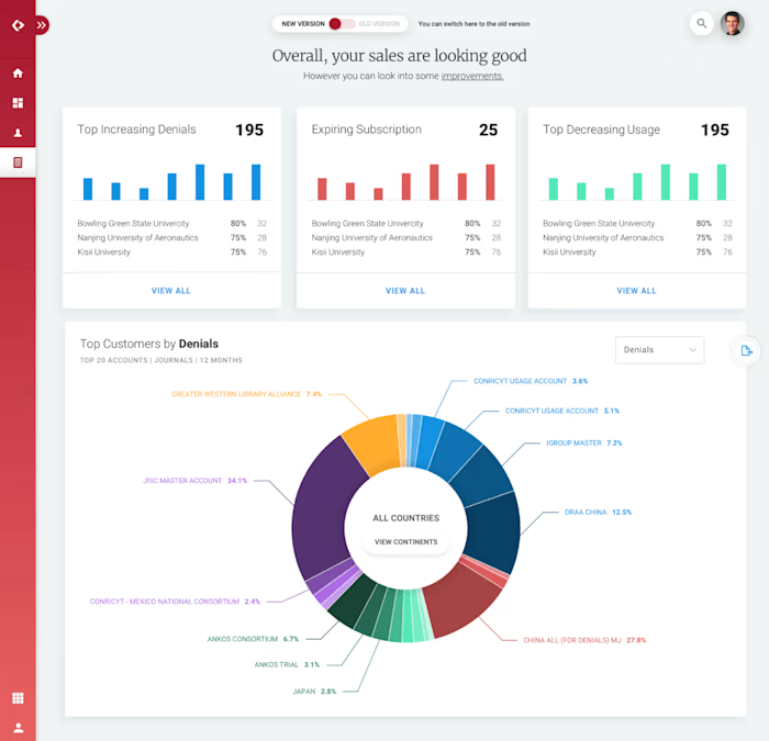
The “Nucleus” dashboard is one of the key performance monitoring tools for Kraft Heinz. This dashboard gives executive-level insights into critical metrics such as Customer Fill Rate (CFR), Plant Performance, and Sales by Product. I focused on creating a clear layout that places the most important KPIs front and center, allowing stakeholders to track changes at a glance. The dashboard was designed with interactive filtering options that provide flexibility for various departments to dig into the data relevant to their role. For example, trends and comparisons by product, customer, and plant are easily accessible through well-organized, color-coded bar charts.
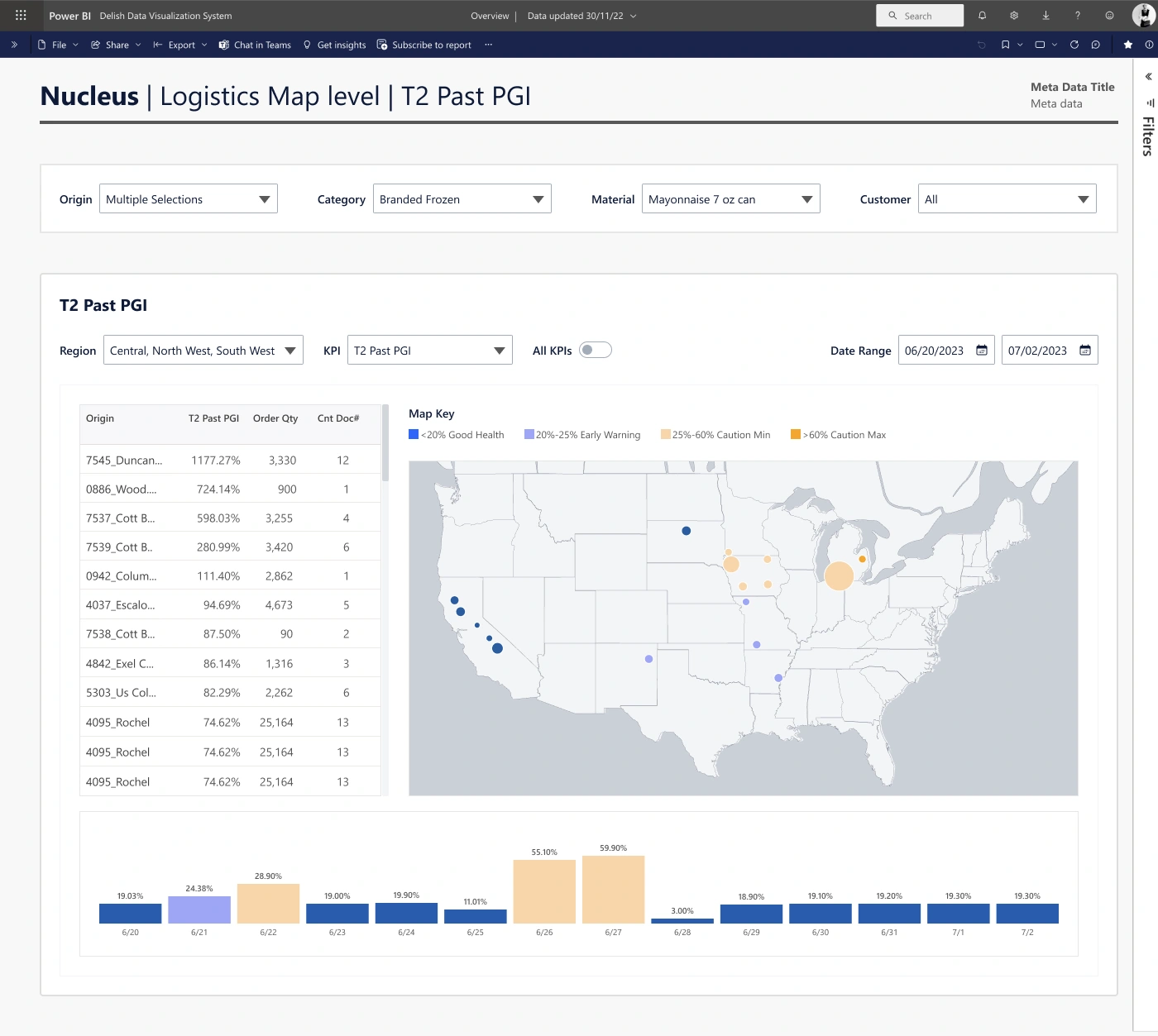
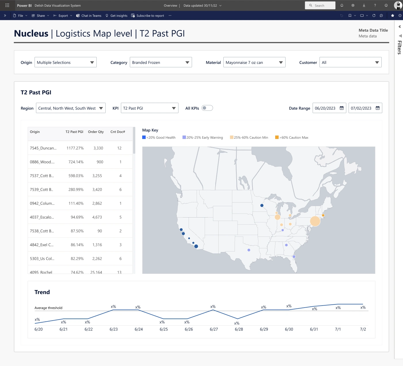
Logistics Map
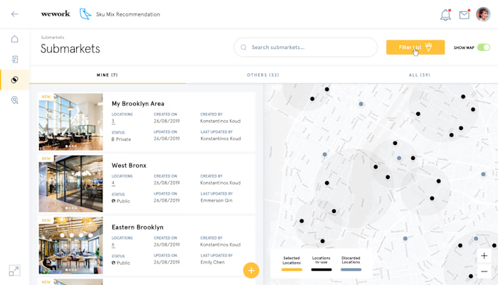
Another essential dashboard was the “Logistics Map,” which visualizes the past performance of shipments using a geographic overlay. This design integrated map-based data views with performance KPIs, enabling the logistics team to track shipment health across regions. Interactive filters allow users to toggle between regions, categories, and KPIs, ensuring they can always focus on the specific insights needed. Health indicators like color-coded performance markers quickly signify areas of concern, improving response times in addressing potential logistical issues.
ORDD EDM
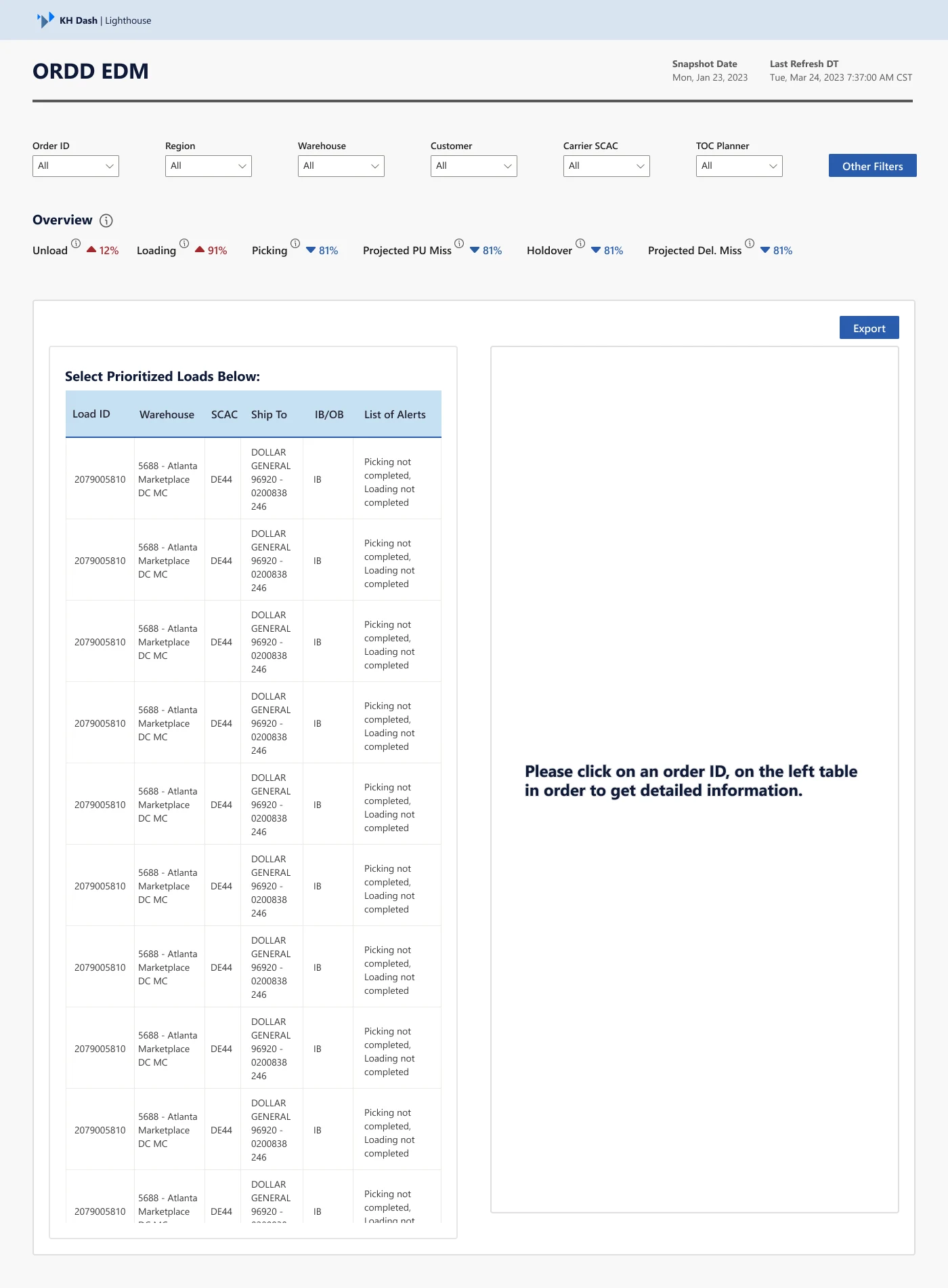
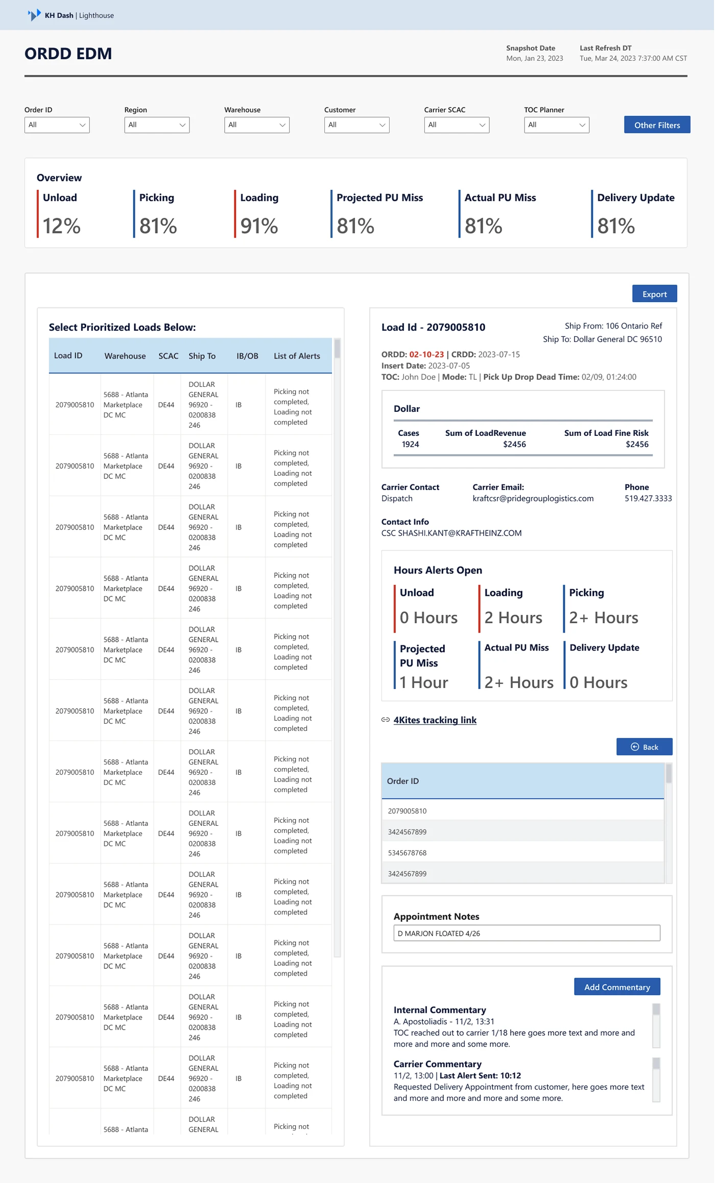
The ORDD EDM dashboard is critical for tracking warehouse operations. The interface provides a live overview of key operational statistics such as Picking, Loading, and Projected Delivery Misses. I created an interactive table where users could prioritize loads based on warehouse or customer needs, with additional drill-down capabilities for deeper analysis. Alerts and notifications for critical issues, such as missed pickups or incomplete loading, were made more prominent, ensuring that the team could address issues as they arise in real time.
Transportation Planning & Disruption Monitoring
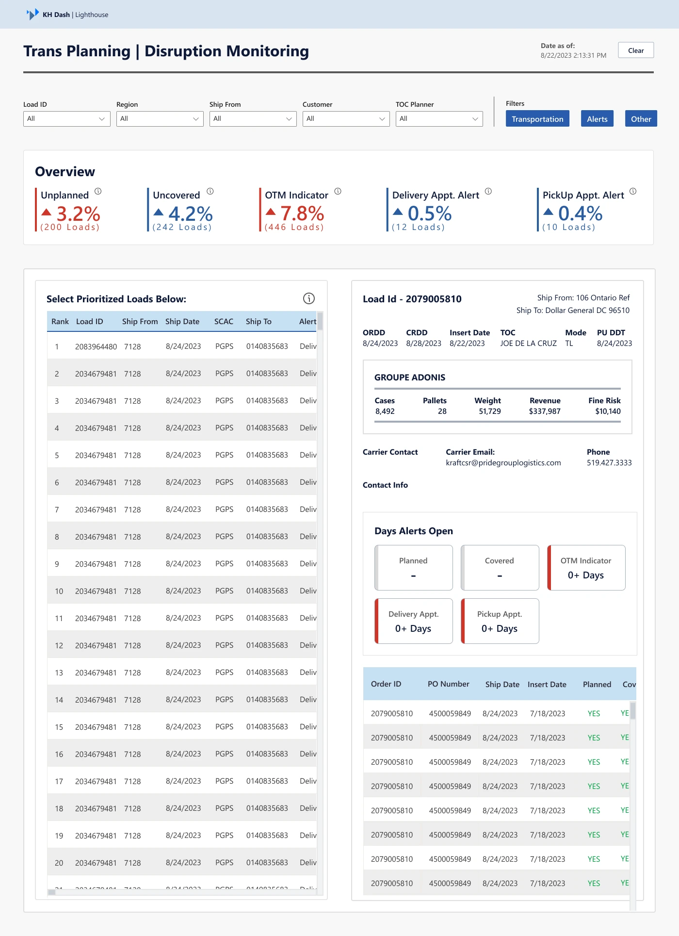
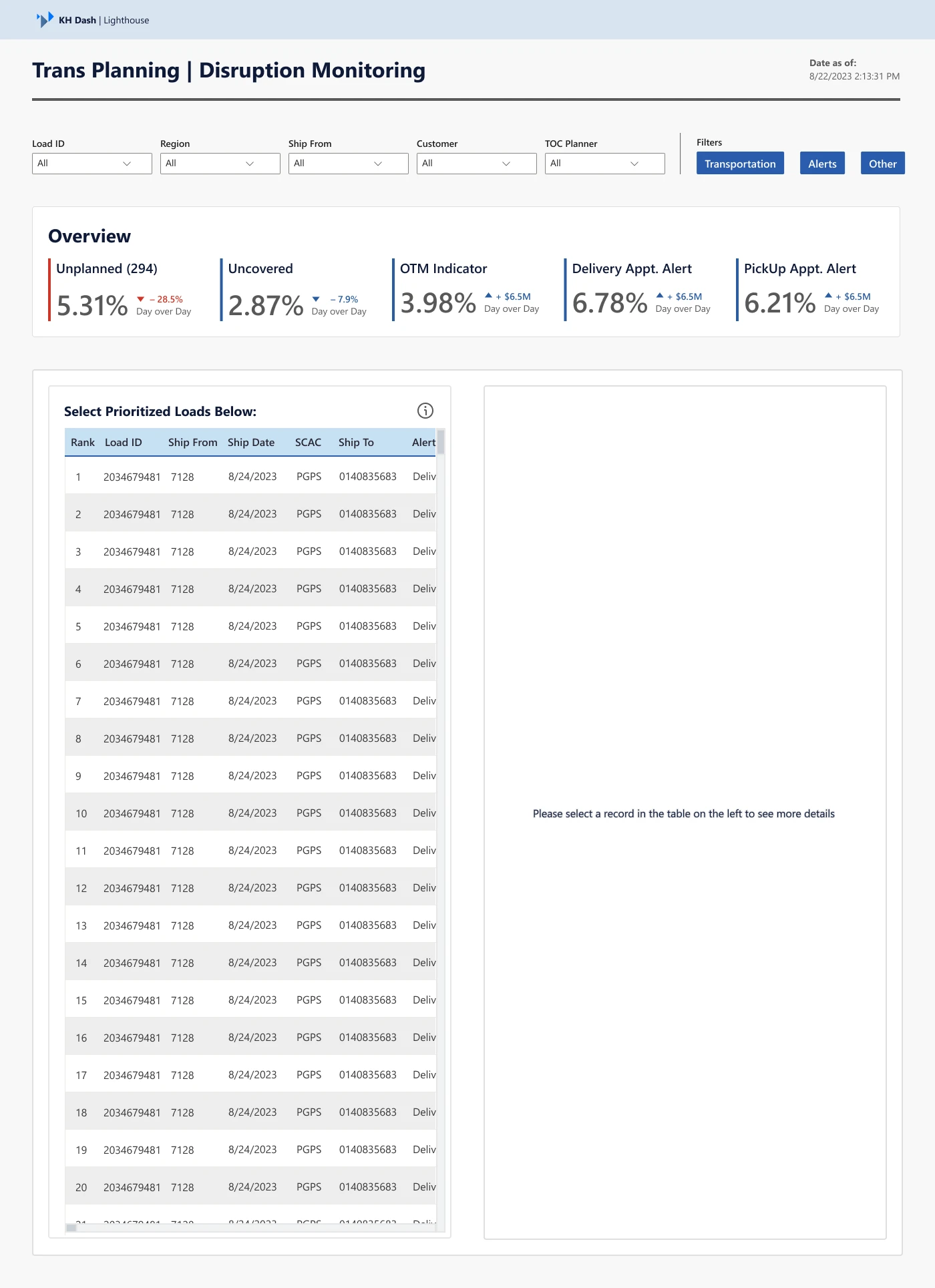
The “Trans Planning | Disruption Monitoring” dashboard was designed to provide actionable insights into the transportation logistics of the company. It highlights unplanned or uncovered loads, as well as potential alerts related to delivery appointments and pickups. I focused on creating an intuitive, alert-driven interface where users could drill down into specific disruptions. The dashboard allowed for the identification of trends across regions and shipment types, ensuring that transportation teams could act on disruptions with a clear understanding of their root causes and potential resolutions.
Conclusion
The redesign of these dashboards optimized the decision-making process across various departments within Kraft Heinz. The dashboards are now not only more visually cohesive but also more functional, providing actionable insights with minimal friction. By focusing on ease of use, data clarity, and brand consistency, these dashboards have become essential tools in driving operational efficiency within the organization.
Like this project
Posted Nov 22, 2024
As a Senior UX Designer at Kraft Heinz, I was tasked with redesigning and optimizing critical Tableau dashboards.

