Redlink (Atypon) BI Dashboard UX Design
Akis Apostoliadis
Atypon (Redlink) has a unique perspective on networked information and provides its customers — libraries, publishers and end-users — with affordable services that produce powerful capabilities. My team and I revamped their Dashboard and helped their clients make more data driven decisions, go deeper for more robust analysis, save time, use facts to allocate their budget and easily compare usage data by source.
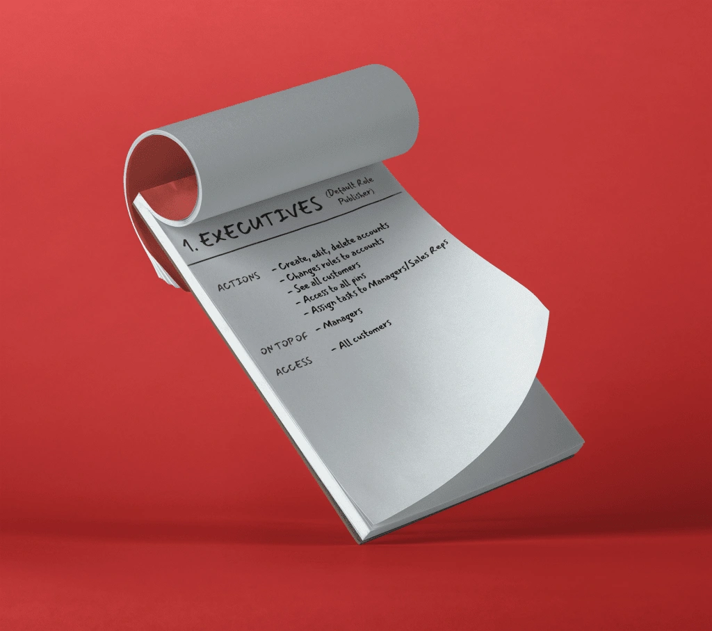
Executive persona
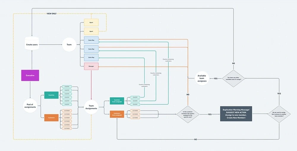
User flow
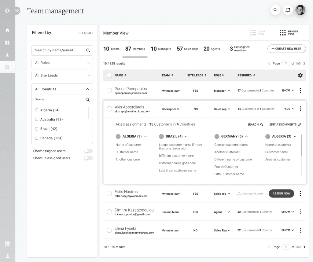
Team management wireframe
UI Design
Methodology
Redlink was exceptional in – always – providing us with a detailed and insightful brief that helped us a lot, from the start. We provided them with a robust UX/UI design methodology, tailored to their specific needs. We deciphered the brief, broke it into use cases, personas, designed the IA, the user flows, wireframes (both in analog and digital form) and finally transformed the wireframes in UI screens and created a clickable prototype based on them.
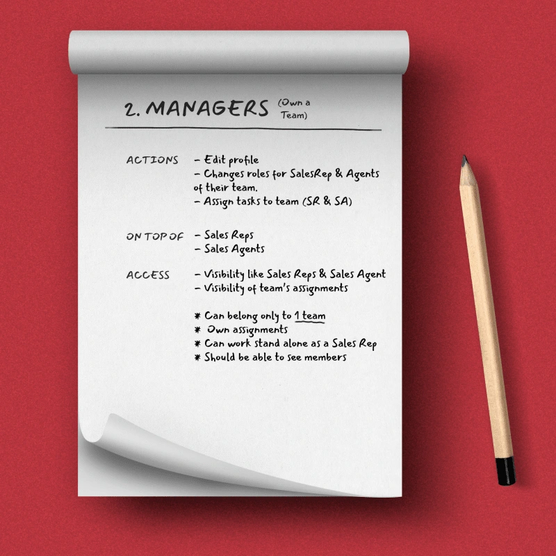
Manager persona
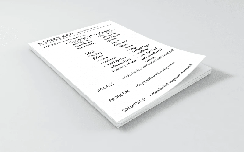
Sales Rep persona

Agent persona
Understanding the User
We had – from the start – a clear understanding of each task at hand and that helped us in extracting the use cases and the personas.
Hierarchy of roles was the first checkpoint to start in order to begin the information breakdown and design the information flow.
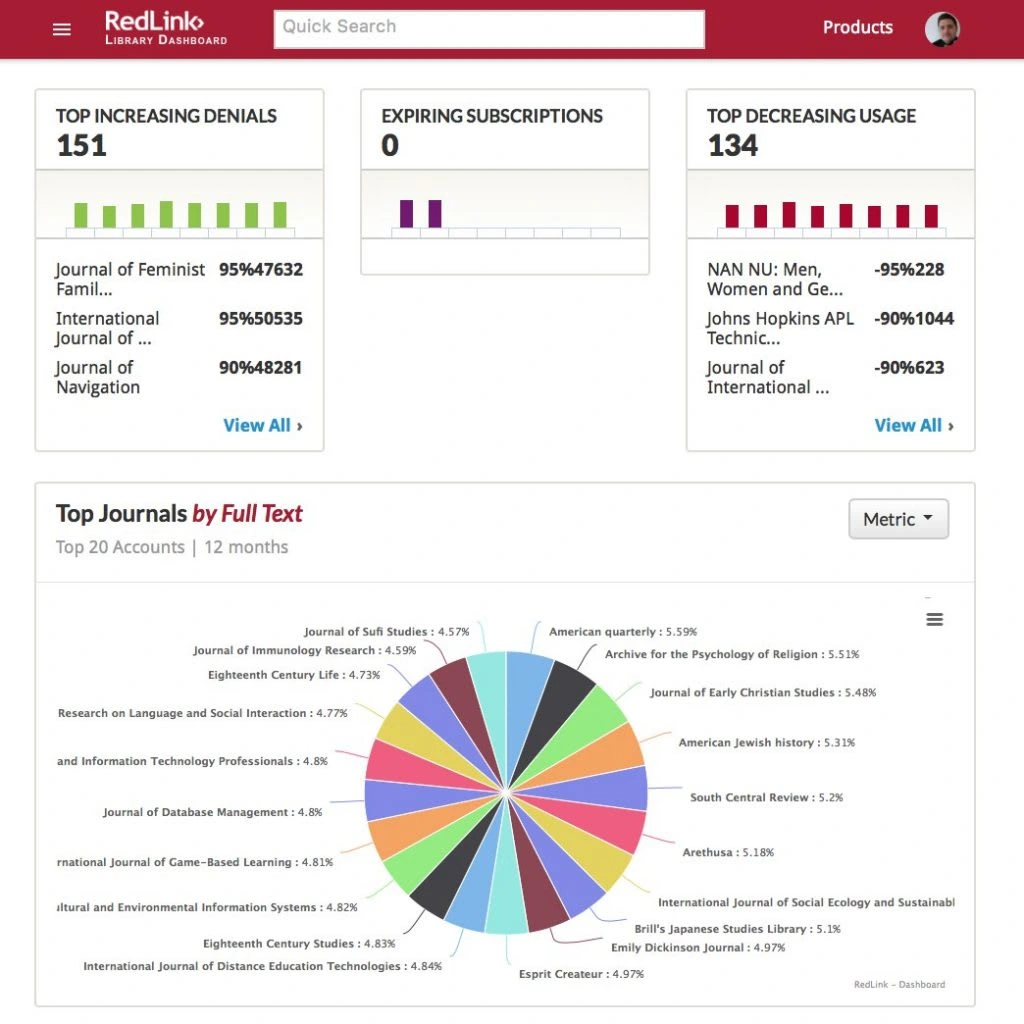
UI before redesign
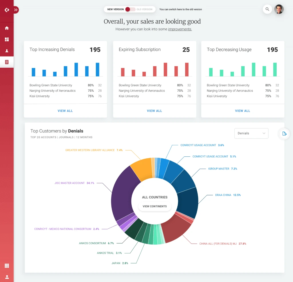
UI after redesign
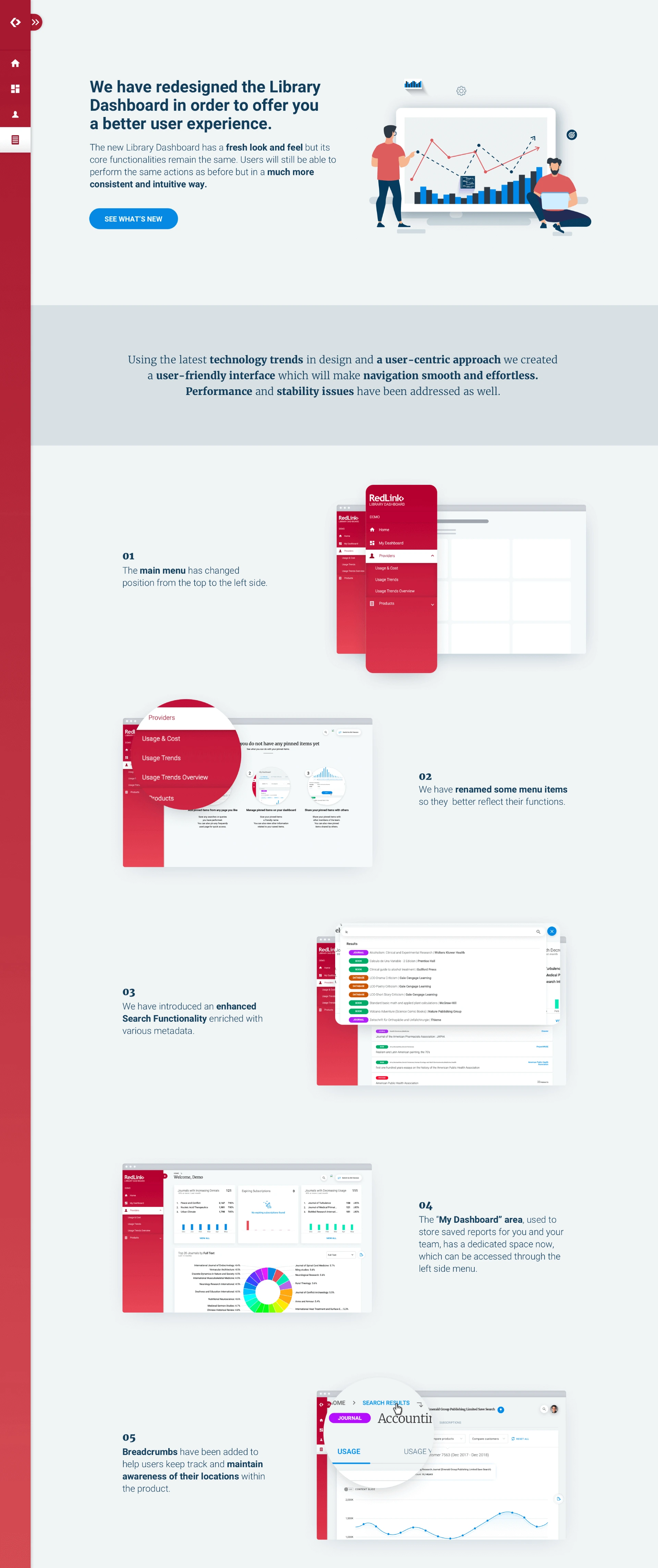
Pains & Results
The users were accustomed to a User Interface that was outdated, inconsistent and counterintuitive. Using the latest technology trends in design and user-centric approach we created a user-friendly interface which made navigation smooth and effortless, we improved the UX Copywriting, we enhanced the search functionality and last but not least we added the “My Dashboard” area, for better customization.
Landing experience
Landing Experience
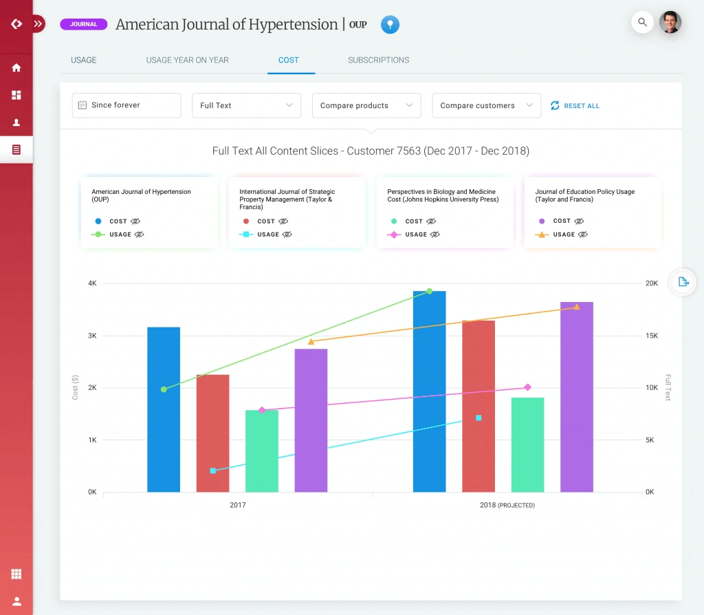
We focused on a fresh look and feel UI and a revamped landing experience, that carries itself throughout the rest of the dashboard, via major improvements in the UX.
Like this project
Posted Nov 23, 2024
Designing an intuitive interface for a complex data analytics platform, enhancing user experience through clear data visualization and streamlined navigation.
Likes
0
Views
17