ACEA Landing Page Redesign
*Please see the link above for more details.
Project Overview
Homepage redesign, development and visual (motion & graphics) design for the healthcare app company, ACEA. In collaboration with the UX team and the founder on user analyses and content strategies, I initiated the redesign project and led in visual/motion design, web interactivity, and UI development.
Context
The company's main product is an application for tracking medical and pharmaceutical credentials. Target client groups include employers, enterprises managing employee credentials, healthcare institutions, and medical associations and educators. The challenge is to effectively address each client's needs on the landing page, increasing engagement and showcasing services clearly and concisely.
Comparative Analysis
Researching competitor websites reveals that successful landing pages focus on essential content and minimal navigation elements. They prioritize guiding users efficiently to needed information, employing a color palette typically ranging from green to blue and often utilizing clean images for a professional look. Detailed design goals:
Simplify content and images, retaining only essential information that directly addresses client needs.
Optimize buttons to lead users to critical client-specific information.
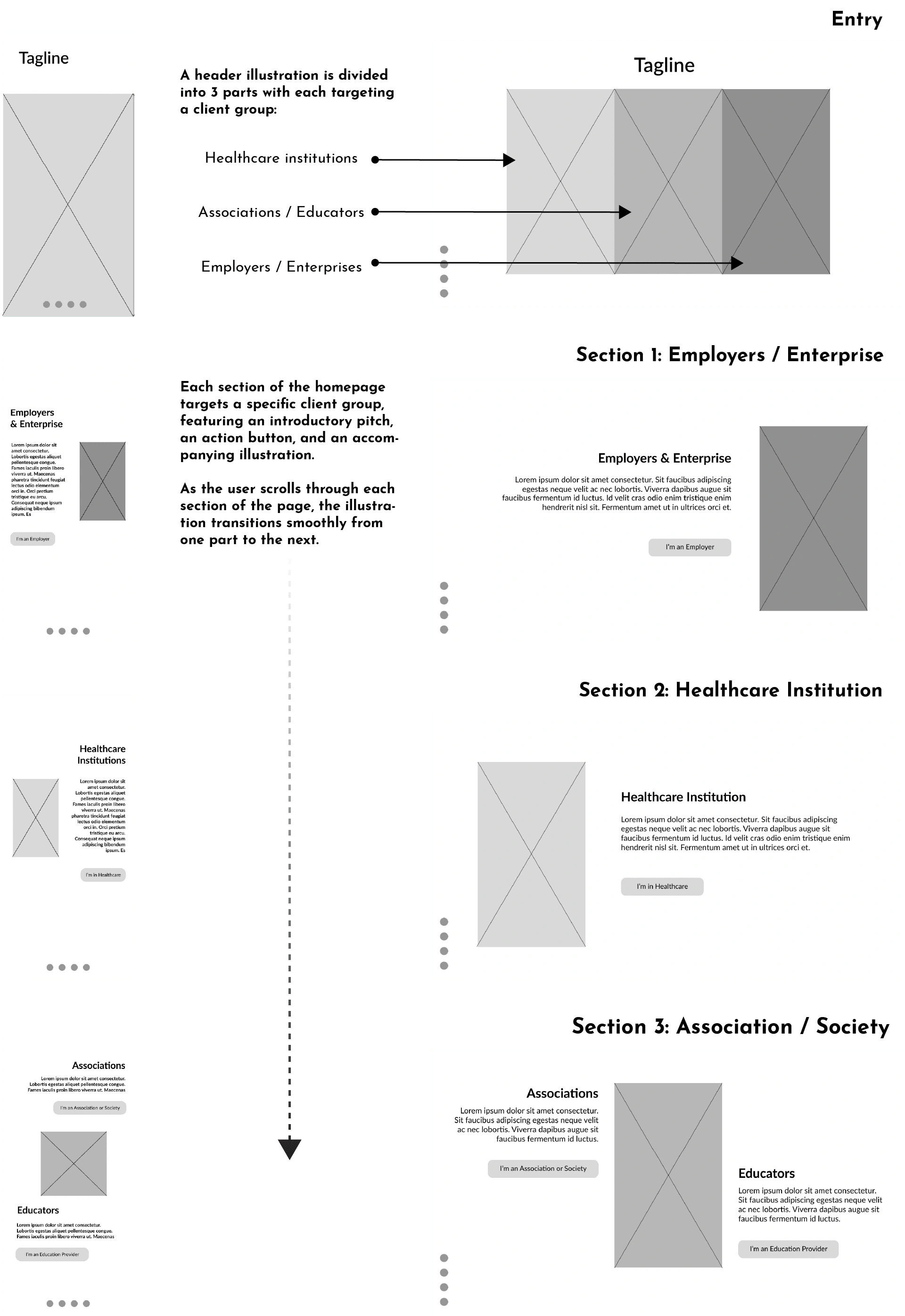
Structure the page into clear sections, each catering to a distinct client group, using transitions and animations for intuitive navigation.
Implement a blue/magenta/white color scheme consistent with our new design system.
Enhance visual appeal with custom illustrations and animations, replacing stock images for a unique and polished presentation.
Design Specifics
The design for the landing page contents is to be incorporated in WordPress. So it excludes design for menu, logo/title, credentials, footers that’s already built in the WordPress template.
Role
UI/UX, Visual Design (Motion & Graphics), Front-end Development, Design system(Collaboration).
Tool
HTML, CSS, JavaScript, SVG, Adobe After Effects, Adobe Illustrator, Lottie Animation, Figma, WordPress
Flow & Wireframe

Final Web Page

Landing Page Entry

Landing Page Section 1 & 2
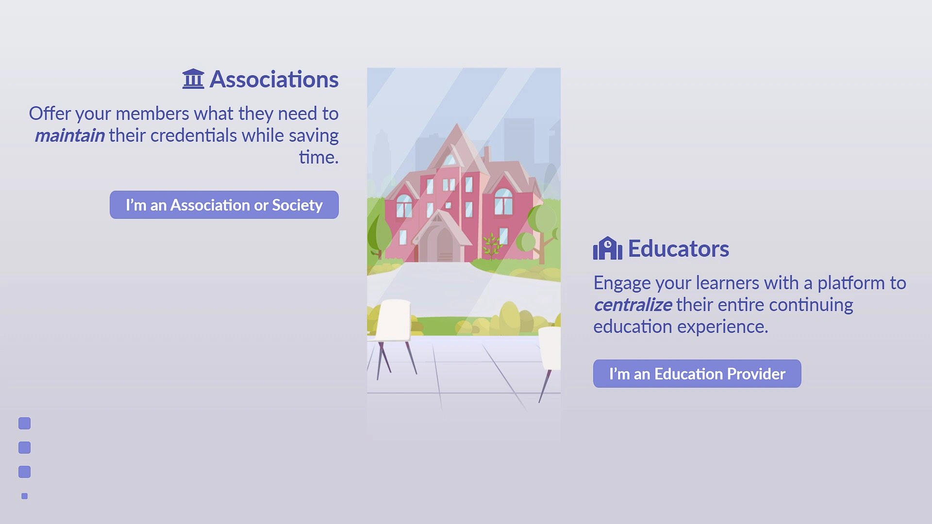
Landing Page Section 3
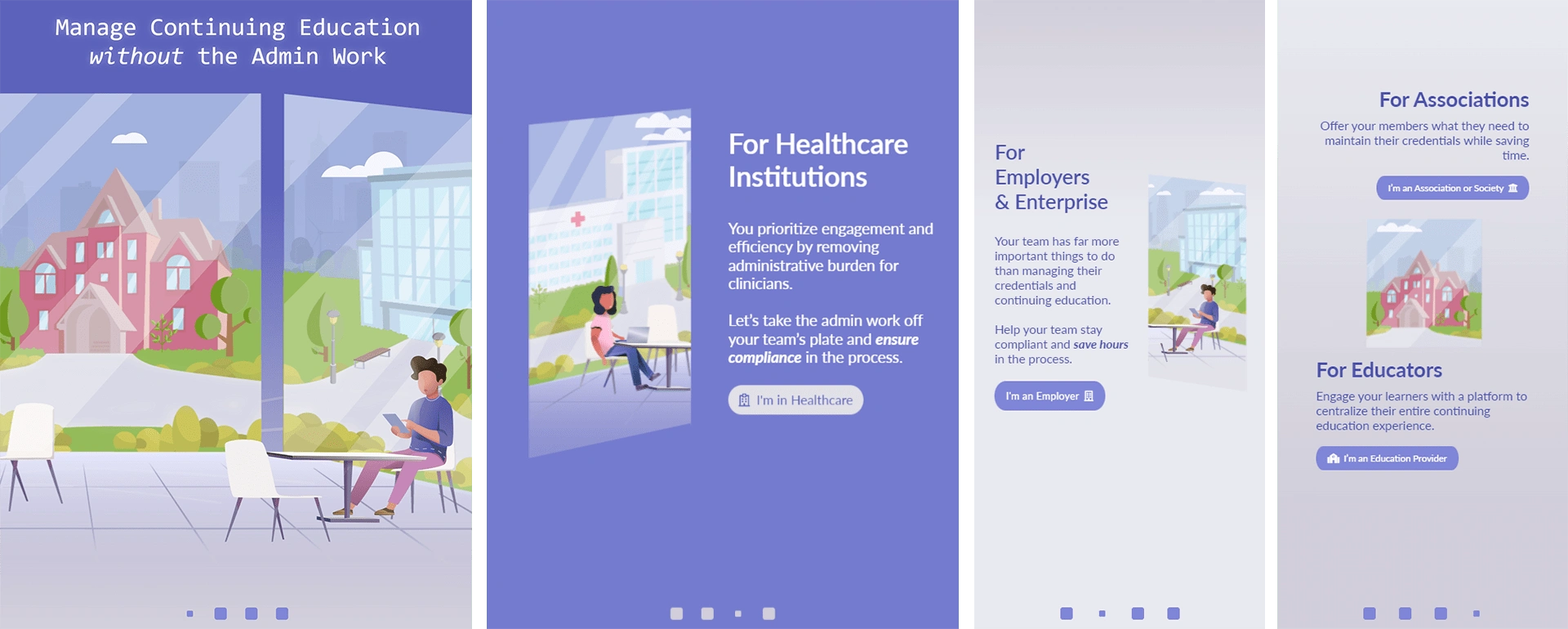
Tablet & Mobile
Other Works: Web Marketing Animation
Like this project
Posted Sep 22, 2024
Homepage redesign, development and visual (motion & graphics) design for the healthcare app company, ACEA, within 3 months.
