Bellyrubs Shopify Storefront Design and Development
Naveen Shopify Developer
🔗 Live Site: https://bellyrubs.in/
🛠️ Shopify Development | Figma Design Implementation
🔍 Snapshot
I designed and developed the Shopify storefront for Bellyrubs — a pet-nutrition brand focused on safe, natural products for dogs.
The goal was to build a modern, trustworthy, and easy-to-navigate online store that highlights brand values, improves product clarity, and streamlines the shopping journey for pet parents.
🐾 About the Brand
Bellyrubs provides high-quality dog food, treats, and nutrition products backed by clean ingredients and a strong focus on pet health.
The store needed to feel:
friendly and warm
clean and minimal
trust-focused
informative, not overwhelming
simple for first-time visitors
The design blends brand personality with conversion logic.
❗ Problems Identified (Initial Audit)
Before the redesign/build, several UX gaps were identified:
product information scattered across sections
lack of trust cues like quality highlights, ingredient transparency, or benefits
limited storytelling around brand purpose and product standards
navigation was not optimized for fast product filtering
visual hierarchy needed structure (typography size, spacing rhythm, scan-flow)
mobile shopping felt slightly dense and scroll-heavy
To match their premium pet-nutrition promise, the site needed clarity, warmth, and trust.
💡 Strategy & Core Design Principles
1️⃣ Friendly & Warm Visual Language
Bellyrubs is a pet brand — the UI must feel caring, soft, and welcoming.
I crafted a visual system using clean typography, balanced spacing, and subtle brand accents to build comfort and emotional connection.
2️⃣ Ingredient-First Storytelling
Pet nutrition buyers seek trust.
So I integrated UI blocks for:
ingredient breakdown
health benefits
certification highlights
vet-backed validations (if applicable)
These sections reduce doubt and support buying confidence.
3️⃣ Conversion-Optimized Structure
Each section of the store was arranged with a UX purpose:
hero section communicates brand promise instantly
benefits placed before product grids for reassurance
CTAs positioned within natural eye-flow
simple PDP layouts with ingredient & benefit highlights
quick-view product structure for faster decision making
The goal was clarity, not clutter.
4️⃣ Mobile-First Thinking
Since many pet-care purchases happen via mobile, layouts were rebuilt for:
thumb accessibility
shorter scan length
improved reading rhythm
quick access to products & actions
🎨 Visual Showcase
Homepage
🖼️ Hero & Category Introduction
Clean, friendly visual layout that instantly communicates brand values and guides shoppers toward core product categories.
Benefits & Trust Sections
Dedicated blocks for health benefits, ingredient quality, and commitment statements — designed to build trust before checkout.
Product Grid
🖼️ Collection Layout
Simplified product cards, clearer spacing, and structured product information for faster decision-making.
PDP Structure
🖼️ PDP Redesign
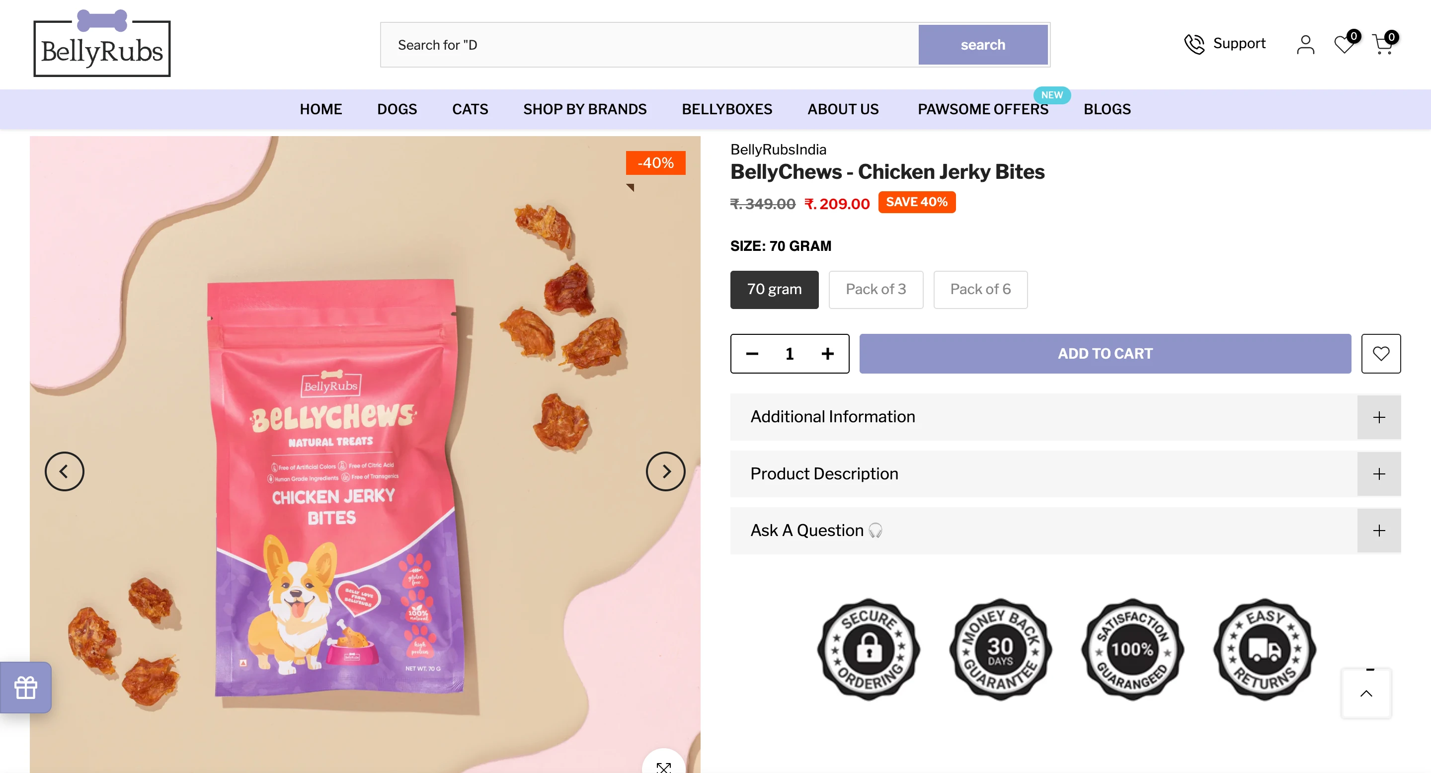
Calm typography, story-driven layout, ingredient clarity, and stronger CTA positioning for better conversions.
Mobile Experience
Improved navigation, thumb-friendly buttons, product highlights above fold, and smoother scrolling behavior.
📊 UX Improvements
(Even if exact numbers aren’t available, these outcomes align with common storefront improvements)
Faster product discovery due to clearer content hierarchy
Improved trust perception via ingredient & benefit storytelling
Increased add-to-cart interactions through simplified PDP layouts
Higher engagement on collection pages and product grids
More meaningful scroll-depth due to balanced section spacing
The storefront now feels premium, structured, and emotionally aligned with pet-care customers.
🛠 Execution & Build
Theme customization & layout structuring
UX audit and flow mapping
UI design system (spacing, typography, grid logic)
Custom section components in Shopify (Liquid)
PDP information hierarchy
Navigation simplification
On-brand visuals and iconography sets
Responsive mobile reflow
Tech & Tools:
Shopify, Liquid, HTML, CSS, UX frameworks
👨💻 My Role
I handled the full build and UX direction:
storefront architecture
brand-aligned UI
conversion-oriented layout decisions
custom components
responsive execution
PDP storytelling and clarity blocks
Every design decision supported trust, simplicity, and faster purchase decisions.
🙌 Final Outcome
The Bellyrubs online store now:
✔ feels warm, trustworthy, and brand-true
✔ educates customers through ingredient transparency
✔ simplifies product evaluation
✔ guides discovery through clean UX patterns
✔ encourages confident purchasing through clarity
It’s more than a pet store — it’s a digital expression of care, quality, and nutrition.
📩 Want a similar redesign or full Shopify build?
If you’re looking to launch or elevate your D2C store with targeted UX, modern UI, and conversion strategy — let’s talk. I’d love to help build something meaningful for your brand.
Like this project
Posted Dec 3, 2025
Designed and developed a user-friendly Shopify store for Bellyrubs, a pet nutrition brand.
Likes
3
Views
8